Let’s Talk About Color: Red
May 16, 2007 § Leave a comment
 Personally, I can’t live without red. To me, it generates a warmth and energy that every home needs. At least to some degree. And the right red looks great with woods and white and just about everything. Ben Moore’s moroccan red has a hint of orange in it that adds spice to a kitchen backsplash or a breakfast nook and even makes old golden oak cabinets look revived. Confederate red has a pinker tone and is perfect for a dining room. Nothing stimulates lively conversation and dining like the glow of candlelight off red dining room walls. I know it’s been done before, but there’s a reason for that. Red walls work.
Red does give off a lot of energy, however, so if you want a restful bedroom, I would avoid red walls there unless you’re a kid or a teenager. My son’s walls are a dark red-orange with big red dots and a golden yellow ceiling. Just painting the room raised my blood pressure a bit, but he loves it! And it is definitely cheerful. I cooled the room down with black and white striped pillows on his bed and a big blue beanbag chair.
If you can’t stand the thought of red walls in your home or if you just don’t have enough light to make them work, try red as an accent color. With green as its compliment, red makes the greens greener. Red accents warm up a blue and white room, add drama to a neutral color scheme, and look terrific with red’s warm analogous colors like yellow and orange.
If you do paint your walls red, just make sure you add enough white in the room to balance the scheme and reflect light. Go ahead. Spice it up a bit. Try red.
Let’s Talk About Color: Orange
May 14, 2007 § Leave a comment
 Orange is a terrific color for stimulating creativity and enthusiasm. That’s why my office walls are orange. I find that paired with dark woods and lots of white, orange walls are like a sunrise in the morning and a sunset at night. And whereas red can be dark, orange is always bright and cheerful. Blue-green is orange’s complementary color so the two make a very dramatic pair. Turquoise, light blue, and green (all cool colors) balance the heat of the orange and look great as accessories.
For a really spectacular orange, try Sunset Boulevard (#082) by Benjamin Moore. Use it as a backsplash in a kitchen, an accent wall in a family room, or any place where you would like a splash of bright, sunny color.
The real key to painting your walls a bright, clear color value, as opposed to a grayed-down shade, is to use a lot of white, either in the trim or with furniture and accessories. White makes the color “pop” or stand out to the eye and also gives the eye a place to rest from all that terrific color.
If your own style dictates a more neutral wall color palette, try orange pillows on the sofa, a bowl of oranges on the kitchen table, and of course, orange flowers in a vase. I add orange to my neutral living room every summer. It perks me up. Try it.
Choosing a Tasteful House Color
May 7, 2007 § 66 Comments
I do a lot of driving. And as a decorator, what I find myself doing for much of the time is looking at house colors and analyzing them. From Upstate New York to Massachusetts, I’ve seen everything from spearmint green to black. Some colors really work and by that I mean that they draw your eye to the house and the surrounding landscape, but they allow your eye to move on. Other colors draw your eye directly to the house colors themselves and you don’t notice anything else. And you find yourself staring at the color and wondering, “What were they thinking!!”

Here’s what I suggest when it’s time to choose an exterior house color. This is particularly important if you’re selecting permanently installed siding as you’re stuck with the color for 20 years or more.
1. Look at nature. If you live in Florida, nature gives you everything from wonderful pastel shell tones like light pinks and peaches to bright hibiscus reds. And the sky and ocean provide the cool side of the palette. So when you’re choosing a house color, select colors that you see in your surroundings. A bright coral house in Florida looks perfectly acceptable because the color appears naturally in that environment.
If you live in Wisconsin or Vermont, however, that’s a different story. Nature in the north gives you earth tones like browns and olive greens and rust and even black. Spearmint green really stands out against a backdrop of evergreens and that’s not a good thing. So when you’re choosing a house color in New England, choose a color and a hue value that appear in nature. That would not include bright turquoise but might include a grayed-down slate blue like Benjamin Moore’s Jamestown Blue (HC-148).
2. Look at your neighbors. It’s the reverse of “keeping up with the Joneses.” You do not want the same house color as your next-door neighbor even if he stole your favorite color.
3. Respect history. If you live in an old house, choose a color that might have appeared on the original. There are many colors in the historical palette, but there are several that are not. When in doubt, stick with the tried and true historical palette, such as Benjamin Moore’s HC colors. This tasteful array of hues suits most homes, especially traditional style colonials, old or new. Richmond Gold (HC-41) looks great with black shutters and cream trim. And the greens, such as Louisburg Green (HC-113) blend beautifully with natural surroundings.
4. White works. White homes have a presence, a traditional elegance that fits in many historic areas. But in the winter, they either get washed out or they look dirty gray. White works if you keep up with the paint job and keep the house’s exterior clean. Be sure to add color with your door and landscape plantings. And black or dark green shutters.
5. Victorians follow their own rules. If you live in an old Victorian home, do some research and discover all your color combination options. All rules of conventional taste can be broken when you’re highlighting the detailed trim on an old painted lady.
6. Where to use purple. There’s an old brick house in Cambridge, Massachusetts, with a dark purple metal roof and dark purple front door. The combination is quite stunning. Purple is great as an accent color on front doors, wreaths, and landscape plantings. A little purple can go a long way, but used carefully, it’s a great color.
7. Blend or be seen. The bottom line for house color is to decide whether you want your house to blend tastefully with the others in the neighborhood or stand out as the focal point on the block. If you decide to go off the natural palette and opt for a crayola-bright color, consider using that hue for a door color or some other accent instead of the house color. You’ll make just as big a statement and stay within the realm of good taste.
One more thing. House color is important to your children. When I was away at camp one summer, my parents painted our house orange with green shutters. (Orange was supposed to be gold but the paint store messed up and my parents did not have the color sense to stop the presses.) Horrified is the word to describe my shock when I returned from camp. From that point on, my house was known and identified around town as “the pumpkin house.” Don’t do that to your children!
Follow the guidelines and select a paint color for your home that will show your good taste and make your home look its best.
Let’s Talk About Color: Yellow
May 1, 2007 § Leave a comment
Yellow is a great color if you like sunshine — and who doesn’t. The problem with yellow is that if you end up with a hue that is too lemony, it can really make the energy in the room a bit too intense. Even agitated. But if you select a hue that has a touch of red in it, you get a wonderful golden glow.
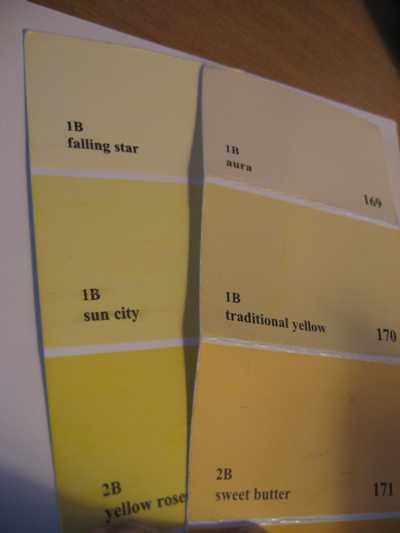
If you have a Benjamin Moore fan deck (or you’re headed to the paint store) check out the difference between sun city (352) and traditional yellow (170). The effect on a room is huge. Although the lemon yellow looks great on the paint chip, picture your whole room in that color. Acrid comes to mind. On the other hand, the orangey lemon is warm and enveloping, like the glow from a candle. If you do decide to use a lemon on your walls, you can temper the color with lots of white and black.
Let’s Talk About Color: Blue
April 27, 2007 § Leave a comment
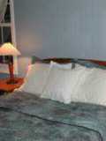
From the sky to the ocean to a baby’s blanket, it’s no wonder that everybody loves the color blue. As a cool color, blue recedes making rooms appear larger. As a color pulled from nature, blue represents relaxation and peace and is perfect for rooms like bedrooms, babies’ rooms, living rooms, porches, guest baths, and just about every other room where you want to relax. But choosing the right blue can be a real challenge because what appears to be a pretty blue in the paint store may turn out to be a vibrating horror on your walls.
Here’s an exercise. Next time you’re in the paint store, pull a bright clear blue (like Highland Breeze #786 from Benjamin Moore) from the sample rack and put it on a piece of white paper. Then pull what might appear to be gray (like Silvery Blue #1647 from Benjamin Moore) and put it on a different piece of white paper. Now stand back and try to picture what each of those colors will look like on all four walls of your room. What happens with the clear blue is that it feels like it’s vibrating. The clarity of the color makes it so intense in the room that the effect is far from restful, at least for an adult. (Kids and teenagers love clear colors so something like highland breeze might work for their rooms, but make sure you temper the color with a lot of white.)
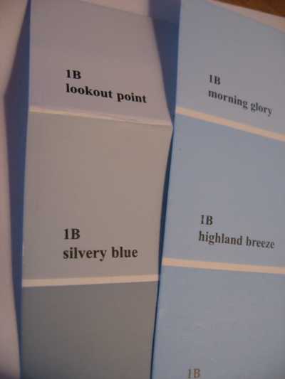
The more restful shade of blue is the silvery blue because it is greyed down. It tends to blend and recede as a restful backdrop and is perfect for any bedroom.
The message to share is that you should notice more than the wall color when you enter a room. If all you see is the walls, then the room is not working. To avoid that wall color trap, look for greyed-down shades and avoid crystal clear hues that resemble the contents of a crayon box. You’ll be happier with the result.
Let’s Talk about Color: Taupe
April 26, 2007 § Leave a comment

Taupe is one of those colors that drive interior decorators crazy. It is fickle. One moment it is a wonderful neutral backdrop to rich woods, cream, and warm autumn colors. The next moment you’re seeing green. Then the next moment you’re seeing pink. Yikes!
All color is influenced and dependent upon light. From sunlight in the afternoon to incandescent bulbs at night to those awful fluorescents that we’re using more and more, the lighting in the room will change the color you actually see on your walls. That’s why the color you choose under the fluorescent lights in your paint store may not turn out to be the color you want in your home.
When you’re selecting color, the best thing to do is buy a little paint (companies are accommodating this practice by offering little pots of selected colors) and paint up a foam core board. Then tape it to the wall in your room and observe the color at different times of the day. And on sunny and cloudy days. Is it the color you want?
This exercise is especially important with taupe. Moving out of the gray tones of taupe and into a warm camel brown (like C2 Paints’ Chai) might solve the chameleon color dilemma in your neutral room.
Let’s Talk About Color: Green
April 25, 2007 § Leave a comment
 As a decorator, paint color in my house changes so often that my husband and kids just roll their eyes when they open the door and smell the fumes. They hardly notice any more. But I sure do. I change room color to experiment with light and shadow and depth of color as well as different color combinations and color placement. So wouldn’t you know that two days before my mother-in-law was to arrive, I decided to repaint our master bedroom. Deadlines seem to inspire me.
My jumping-off point was the area rug, a mixture of greens and salmon pinks. I had lived with a light shell pink on the walls for quite awhile and was ready for something richer. So I selected a beautiful soft green, not too olivey and not too sagey. Benjamin Moore’s High Park (#467 from their Classic Collection). It turned out to be a very relaxing color, perfect for a bedroom. And mixed with white and cream, the color “pops” (as we too often say).
The upholstered headboard (see other blog entry) was another last-minute inspiration as were the large pillows.
If you’re looking for a soothing, relaxing, ahhhhhh kind of bedroom, consider a soft green. Other favorites are Benjamin Moore’s historical greens like Kennebunkport Green (HC-123) and Nantucket Gray (HC-111). Both work really well in a bedroom and look spectacular with wood. And if you look at nature through your windows, you’ll feel like you’re in a tree house.
