Balancing Color, Pattern, and Neutral
August 21, 2017 § Leave a comment
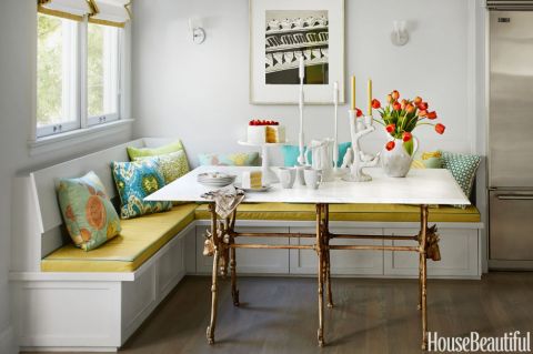
There is so much to love about this breakfast nook (designed by Martha Angus and Katie McCaffrey), I’m going to dive right in.
What’s to Love?
-The light gray walls. By staying with a light cool neutral on the wall color, you allow the pops of warm vibrant color to do just that: pop.
-The simple breakfast nook construction in the same wall color. What happens? The banquette disappears making the room look bigger and less chopped up.
-The wood floor. No doubt it carries throughout the public space making the whole house feel open and unified.
-The table from Paris (yeah, I know). The point is that the table is a unique piece and it’s not only functional but a conversation piece and a memory back to a really nice trip.
-The black and white print. Sure, you can add a vibrant picture there, but the neutral wall hanging allows the colors to take center stage. And they do.
-The yellow leather cushion. It’s yellow but in a fabric that’s easy to wipe up. Essential.
-And those pillows! In colors that coordinate with each other but refuse to look matchy-matchy. (And you just know that the rest of the house pulls colors from that lovely summer palette.)
Take Home Message:
If you want to show off color (or many colors), don’t overdo it. Leave spots empty and devoid of pattern for the eye to rest. And pick a palette of colors (5 is a good number) that you can carry throughout the house in various ways — wall color, furniture, art. The result will be a home that is balanced, unified, has flow from room to room, and that makes you happy every time you open the door.
Where to Splash Your Kitchen Color
June 9, 2016 § Leave a comment
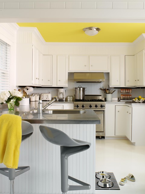
 White kitchens are, again, all the rage, but what keeps a white kitchen from becoming too cold and uninteresting? You guessed it. Color.
What I love about this white kitchen from Traditional Home is the strategic placement of color where it will 1) have the biggest impact; and 2) be inexpensive to change over time.
Where to put the color?
Backsplash. Since the cabinetry and counter tops are white, the backsplash is a logical place for applying a splash of color. Plus, since it’s a relatively small area in the kitchen, you can be bold with your tile choices knowing that replacing the backsplash when styles change down the road will not break the bank.
Furniture. Splashy citron breakfast bar chairs give the neutral kitchen a modern vitality that pairs very well with the traditional cabinetry. The chairs keep the traditional cabinet design and the timeless marble counter top from being too stuffy. And because there are just two chairs, theoretically you could switch them out seasonally if you wanted to and change the look of the kitchen completely.
Accessories. Always a place to introduce color, the accessories like dishes and canisters and placemats and other easily switched-out items add splashes of color all over the kitchen and are temporary. Again, you’re not locked into a color scheme that will go out of favor in a year or two. Bringing in new accessories in a new color palette will freshen up the kitchen at practically no expense.
No wonder white is such a popular color for the kitchen. It is timeless, and it goes with every decor and season. Plus by adding color in places where new color can be infused without redoing the entire kitchen, you’ve added longevity to your original white kitchen design. Smart thinking!
Here’s the link: http://www.traditionalhome.com/kitchens/design-ideas-white-kitchens?page=0
Quick Old-Kitchen Updates
April 27, 2016 § Leave a comment
 You inherited your kitchen. We get it. No money for a costly re-do. We hear ya. But there are a few things you can do to lighten and brighten your dark, dated kitchen while you pour money into other fun things.
- Replace the door handles and drawer pulls. There are so many new metal options out there, and many of them are quite inexpensive. Some even come by the bagful. So there’s no excuse for keeping these.

- Paint the old golden oak cabinets. It may sound hard, but anything is better than the dated, dry and grainy orange beauties many of us were stuck with for awhile. Painting takes patience: in a nutshell, remove the doors, take off all the hardware, sand the cabinets and doors to give the surface “tooth,” prime everything with a really good primer and then paint the doors outside on a horizontal surface to prevent drips. I like to use a cabinet-grade enamel that holds up pretty well. Stay neutral for longevity although painted cabinets are all the rage. So pick a color you’ll love for a long time. Here’s what the Pros recommend for a really nice finish. http://www.thisoldhouse.com/toh/how-to/intro/0,,20315665,00.html
- Switch out the overhead lighting. This is a really cheap, DIY project (remember to turn off the power first!!). There are so many options way more creative than the central overhead ceiling light or the yellowy brass candleabra over the kitchen table.
- Add under-cabinet lighting. This is a great way to add both task lighting to an old kitchen counter space and ambiance. If you don’t have a tile backsplash, make sure that area is freshly painted as it will show up now. Here’s a link for the many options and how-to’s. http://www.lowes.com/projects/kitchen-and-dining/under-cabinet-lighting-buying-guide/project
- And don’t forget to paint the walls. The easiest, cheapest, and quickest update to any room is a fresh paint job. If you need help with color, let’s work together.
Now, isn’t that easy? You will love pouring your morning coffee in your face-lifted new kitchen. Yes, you still have the old layout and probably none of the new gadgets currently available, but your kitchen will feel brand new. And think of the fun you can have with all your saved money! Enjoy.
(Photo: Brian Wilder for This Old House Magazine)
Not-So-New Kitchen Flooring Ideas
June 2, 2014 § 2 Comments
 Kitchen floors always pose a challenge. Do we continue the not-always-practical hardwoods throughout or do we interrupt the flow with a more indestructible surface alternative? In this kitchen by Designer Sarah Richardson, she used a linoleum tile to create a colorful and durable floor to complement the light pastel blue and white palette. What we do not see is the adjoining room and how the two areas are connected.
Here is my rule of thumb:
If you have a small house, continue the hardwood floors throughout the downstairs public areas (living room, dining room, family room if there is one, and kitchen). That way, the house will appear larger and less chopped up into individual rooms.
If you have an old house (or a large one) with distinct room divisions, go ahead and select an alternative flooring that offers color or durability (although carrying the hardwood throughout is okay too). I recommend using the color palette to pull the public areas together so in Sarah’s case, the adjoining room would have some light blue in it. Mixing and matching within the color palette will create the feeling of a larger, more pulled-together house — even if the rooms are boxy and divided by walls and small doors.
Just like there are more options than granite and Formica for your kitchen counter top, there are now numerous exciting alternatives to wood and tile on your kitchen floor.
Mixed Metals Get My Rave Review
January 24, 2014 § Leave a comment
 Gold and brass are finally officially back. The cheerful, dressed-up metal color has been scorned and ostracized for years, it seems, with homeowners rushing to change out everything from drawer knobs to door hinges. Well, hold up.
Over the past couple of years, we have watched brass trickle back into design (you knew it would) but have been waiting for the main stream to catch on. Now we’re seeing a mix-and-match approach that seems to fit everybody’s home style.
In this kitchen by architect William Hefner (http://www.williamhefner.com/) we see dramatic gold accents along with the other metals (chrome sink and wrought iron light fixtures). What I’m sensing, as with fashion, is that you can pick your accent metal like you pick your hem length. If it works for you, then go for it. We love that approach as it allows you to update your home without having to replace everything in it all at once. Casual acceptance of materials seems way more sensible than dictating that “Metal X” (whatever that turns out to be) is totally OUT.
Hurray for sensible design.
Spring Into Unexpected Color
January 22, 2014 § Leave a comment
Designers are adding pops of color to the previous year’s light neutral color palette and in the most unexpected places. Look up for an opportunity to add color to your white kitchen. Pull some of that ceiling color down into the room with dishes, placemats, and other accessories. And create “flow” between rooms by adding a touch of your ceiling color to the adjoining room.
Color trends like this year’s fuschia are fun when you can add the color with inexpensive pillows or a single upholstered chair (http://www.worldmarket.com/product/fuchsia-nina-chair.do). Keeping the base of the room neutral lets you change your color palette when fresh new opportunities arise. Or with the seasons.
Do You Know How Easy This Is??
January 18, 2014 § Leave a comment
 This update, to state the obvious, is the easiest project short of rolling paint on a wall. So easy that many of you will skip over this post or roll your eyes that I’m even mentioning it. But just in case you are still looking at stained seat covers on your kitchen chairs, you have no more excuses.
- Turn the chair upside down.

- Take your handy-dandy screwdriver (yes, you should have your own) and twist out the 4 screws.
- Next, go to your local fabric store and pick out a nice pattern and color that will look good in your room.
- Buy 1 1/2 yards (of a 50-54″-wide) fabric. If you’re at JoAnn’s Fabrics and Crafts, go to the “Home Dec” section so the fabric is sturdy enough to hold up. You don’t want quilting cotton — too flimsy.
- Lay the fabric upside down on a large table or the floor. Place your seat upside down on the fabric and cut out the new seat cover, leaving at least a 2-3″ margin after you lift the fabric up to cover the sides of the seat. Cut the fabric. (Don’t stress about the cutting — the edges are not going to show.)
- Next. If you don’t already have a staple gun (sigh), you need one. So many uses.
- Pull the fabric taut over the seat and put one staple in the center front underside of the seat.
- Turn the seat around and pull the fabric taut again putting one staple in the center back underside of the seat. Repeat with the sides, making sure the fabric pattern is straight (turn the seat over and check).
- Then pulling the fabric taut, staple the fabric onto the seat, moving toward the corners. Fold the corner pieces and staple underneath.
- Trim the fabric excess. Turn the seat over. Place it back on the chair and put the screws back in.
VOILA!
Painting Over Tradition But Maintaining the Soul
August 26, 2013 § Leave a comment
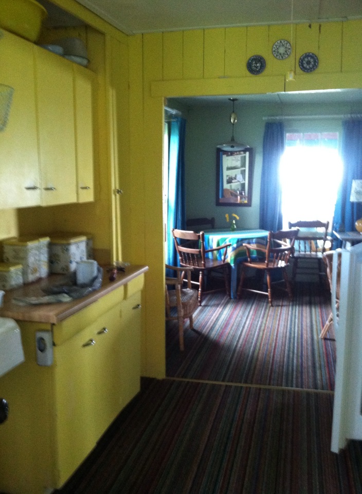 Make no mistake. This is my mother’s kitchen. She painted it this bright yellow probably 60 years ago, and up until this past summer, it stayed that way.
With my mother’s passing and the rebirth of the cottage as a rental property, I decided to tone down the walls in the kitchen a bit. I considered sea foam greens, light ocean blues, and beach sand beiges, but I ended up with a light peachy cream-yellow (Windham Cream HC-6, Ben Moore) as it kept the cheerful sunny aura of the space but took some of the harshness away.
I brought the blue in with the window treatment, kept all the old furnishings like the metal paper towel dispenser and bottle opener, and the yellow tub that we all took baths in as kids. I think Mother would be pleased. And that’s important to me.

Kitchen Cabinet Color: Move over Back Splash
January 30, 2013 § Leave a comment
Kitchen cabinet color is in. From yellow to navy to this refreshing mint, cabinets and kitchen islands are getting a paint job. And it’s not just old cabinets that are being refreshed. New kitchen designs are showing painted cabinets in colors that were once reserved for bathrooms and laundry areas. And it’s a bold move because, unlike wall color, you are unlikely to re-do cabinet paint color anytime soon. Call it confidence or general optimism (or a craving for it) but cabinet color will be here to stay for some time.
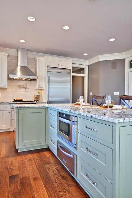
If you’re a little unsure of painting all your cabinets a particular color, try painting the back of an open cabinet or the center island first. That’s what I did. And I was hooked from that point on. (My cabinets have had two color transformations since discovering color in the kitchen.)
One suggstion for choosing a paint color for your cabinets: take a look at the colors in adjoining rooms and pick a color that will pull the public areas together. A pillow color in the adjoining family room might make a terrific cabinet color in the kitchen. You are limited only by…hmmmm… nothing really. Enjoy!
What’s All the Buzz about Undertones?
December 28, 2012 § 5 Comments
Determining a beige color undertone (defined by color expert Maria Killam as “a colour applied under or seen through another colour”) can be tricky. Beige can have one of several undertones: pink, yellow, or green are the basics. If you have dining room furniture with a decidedly yellow/orange hue and walls with a pink undertone like Benjamin Moore’s Georgetown Pink Beige HC-56, then yikes, you have a problem. Off to the paint store.
Bottom Line: Mixing pink-beige with yellow-beige (or yellow/orange) is a big no-no. Fix: Choose a paint with a different (non-pink) undertone like Benjamin Moore’s Monroe Bisque HC-26 that has a yellow undertone and looks great with the golden oak.


If you avoid the mistake of mixing pink and yellow undertones, you’re on your way to understanding them. The other nuances of what undertones to mix and not to mix will come much easier. Note: Mixing pink and yellow vibrant hues is perfectly okay. It’s just the dreaded undertones that can trip you up. Beware.
