COLOR: Where We’ve Been –Where We’re Going
February 17, 2023 § 2 Comments
Should you care about color trends? When it comes to predicting what paint colors will be popular in the year ahead, are you in one of these groups?
- Ds & Ds (Decorators and DIYers. We love color trends, whether we follow them or not.)
- Non-Ds (Non-Decorators. These people are not watching HGTV or Nick on YouTube. But maybe they should.)
- HS & HBs (Home Sellers and Home Buyers. Both groups are aware of color trends because realtors talk about them a lot.)
- RPs (Regular People trying to furnish or update their homes.)
Regardless of which group you’re in, if at some point you want to refresh your home for yourself or you want to sell it for top dollar, you will bump into the latest color trends.
One Caveat: History is the boss of me

Historic homes often celebrated color, florals, and large patterns all at the same time. If you own an historic home, you are exempt from color trends of all kinds except those associated with the original style of your home. You know who you are. But if you want to see the angst that other people experience when it comes to color in their homes, read on.
Jumping ahead a few decades …
Here’s Where We’ve Been
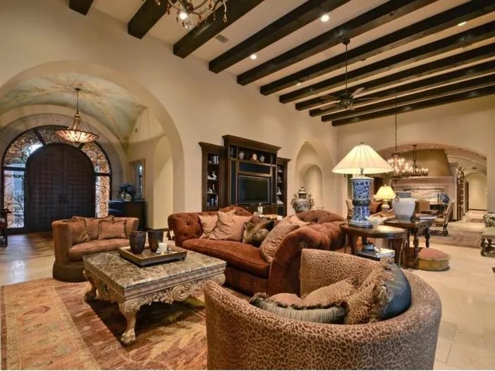
The Tuscan Trend
This Mediterranean-inspired period started in full swing in the 2000s, particularly in new construction. There was lots of beige and taupe with wrought iron, ornate carvings, faux finishes, and cabinet door glazes. Many people who were building or renovating at the time seemed to want to live in Tuscany.
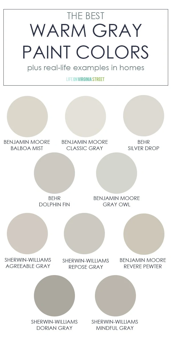
The Gray Trend
Then in 2010 when stainless appliances were well-ensconced in new construction and renovated kitchens, Sherwin Williams coined the phrase, the “Graying of America,” and introduced a palette of gray wall colors that replaced beige in a major design shift. Builders and renovators jumped on board.
But people turned to gray in kind of a big way. Over a short amount of time everything turned gray: bedding, walls, furniture, and even flooring. Colors from previous color trends were gone from the shelves. Finding peach towels, for example, was all but impossible in this decade.

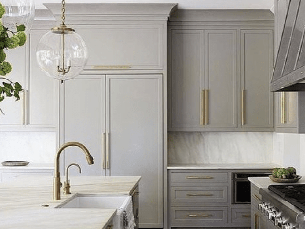
Re-Enter Brass Metal
In some parts of the country where sunshine is infrequent, homes that were entirely gray began to feel a bit chilly inside. A resurgence of brass (but in a more modern finish) entered the scene and started to warm up the grays.
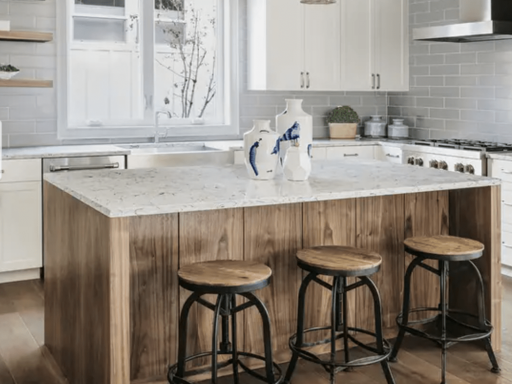
Enter Farmhouse Wood and White
Then with the popularity of the architectural Farmhouse Style, people were drawn to reclaimed wood, which again warmed up the grays, and white kitchen cabinets that lightened and brightened the previous all-gray scheme.
Before long, everyone wanted white walls. Regardless of house style. Light, airy and open was the mantra with minimal window treatments.

But the thing about white walls is that they can look chalky or just overly bright if there is too much natural light.
Enter Greige (and how DO you pronounce it?)
Greige (a gray-beige pronounced, big surprise, GRAYge) parachuted into real estate as stagers tried to hit the middle between gray, beige, and white to satisfy the largest swath of buyers. And greige became the go-to bank of paint colors. Greige is warmer than white but it does not darken the room or look drab. Benjamin Moore’s Classic Gray was a favorite.
Time to Move On
Yet right on cue, the design community and countless influencers, including companies that want to sell paint, moved to creamy off-whites and back to beige. For those of us in the business awhile, it was like coming full circle. But alas this is not a new Tuscan Trend.
OKAY, pause here.
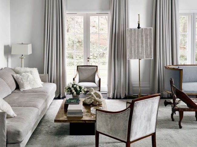
If you have a recently painted gray interior and you love it, keep it. You do not have to repaint. In some cases gray is the perfect neutral and regardless, we can work with it. You are in a prime position to hop on the color trend and ride into the future.
Here’s Where We’re Going
COLOR! Big art, colorful accessories. Regardless of your wall color, adding art and accessories will refresh your space.


If you need help with color, feel free to comment below, hit the button for a Color Consultation, or shoot me an email at yourcolorcoach@gmail.com.
I would be happy to help you.
Hope you have a Colorful Day!
Barbara, Your Home & Color Coach
Where Color Trends Dare You to Go
February 12, 2023 § Leave a comment
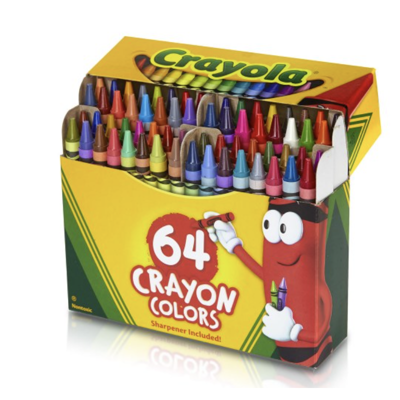
Were you the kind of kid who rearranged your crayon box? Maybe lining up all the cool blue-greens with the cobalt blues? Then putting the grass-greens and sunny yellows together? Or did you make a rainbow or go from light to dark? Just curious.
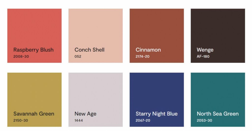
If you like a color organizing challenge, here’s one — the Color Trend Palette for 2023 from Benjamin Moore.
Okay let’s unpack this crayon box
Benjamin Moore calls this paint color grouping a “palette.” Personally, I think of a palette as a combination of hues and hue values that coordinate together and tell a story or express a mood. Something that signifies a color direction or coming design trend. But I looked it up anyway.
Googled “color palette”
“A color palette refers to the actual colors that you’ve chosen, based on your color scheme. A color scheme is based on color theory, like a monochromatic scheme. ” Diana Hathaway Timmons
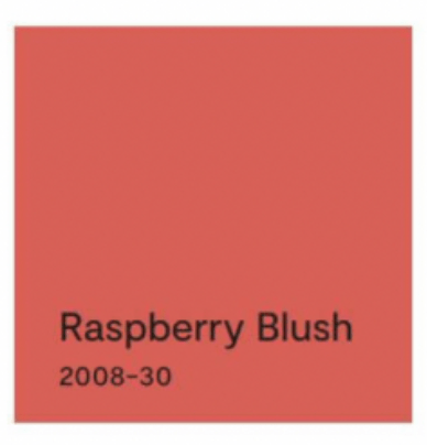
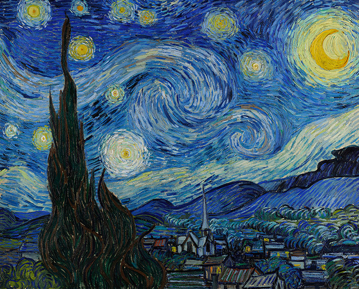
So if you decide to paint your living room blue and you have all different shades of blue (navy blue sofa, light blue chair), then you have chosen a monochromatic color scheme for your living room. The actual color palette might include the paint color Starry Night Blue, but it would not include all those other paint hues because your color scheme is monochromatic — just one color.
Painting on canvas versus decorating a room
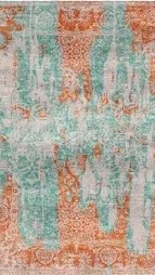
If you paint on canvas, not walls, your palette may look like this!

Artists can mix paint colors and create art. But decorating a room is different from painting a picture. Colors in a room are not blended — they are placed next to each other, in front of each other, and over, behind, and on top of each other. And depending on the light in the room, one color can influence the color next to it. And sometimes, they just don’t work (see discussion of clean and dirty colors in What Color Trends Don’t Tell You).
Back to the Color Trend Palette for 2023
In case there is some confusion, the hues in the Benjamin Moore Color Trend Palette for 2023 (above) were not chosen because they all go together. The paint company is not expressing a particular mood or design style we can expect to see or even create in our own homes in 2023.
They have simply compiled eight separate hues (ideas, if you will) that their designers have determined, from global trends and design tea leaves at home, will hit the paint stores and home goods stores this year.
But to soothe my Kindergarten color-arranging sensibilities, I will rearrange their paint color palette anyway.
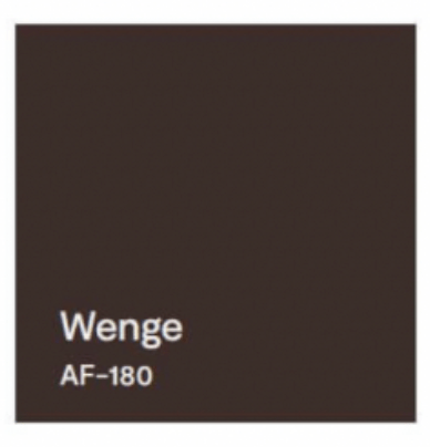
First up? Raspberry Blush
The first color, Raspberry Blush, is the Benjamin Moore Color of the Year for 2023. What a lovely stand-alone color for a dining room wall or an accent wall behind a white fireplace.

It can be paired with Wenge from this Color Palette.
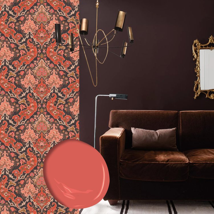

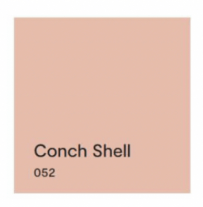
Next up? Conch Shell.
If you saw the previous post, we talked about clean and dirty colors. Conch Shell is clearly a “dirty” color that does not pair well with any “clean” colors. So in this palette, other than pairing with a neutral, I would line it up with New Age, and that’s it. These two “dirty” hues look great together. And Conch Shell would be a pleasant hue to add to the palette of a gray paint color scheme in your home if you’re trying to add some warmth for 2023.


Next up? Cinnamon.
Cinnamon is a rich warm color that conjures up a timeless Southwest palette so it is fitting to pair it with a teal like North Sea Green that reminds us of turquoise.


Flash Back and Flash Ahead
Lastly, I would flash back to the blue & green decades from the past to pair the last two sultry hues. And I’m not talking about the ’70s. Art Deco (from the 1920s and early ’30s) with its rich jewel tones and luscious velvet textures is on trend at the moment, and these two colors will fit right in.


But if you dare to go there…
If you are not afraid of color and have an eye for modern, eclectic, live-what-you-love design, then throw out all those color-matchy-matchy Crayola crayon pairings and toss the whole batch of 2023’s trending paint colors into the room.
Because when it comes to loving YOUR home, there simply are no rules.
If you need help with color, do not hesitate to comment below, hit the button for a quick color consult, or shoot me an email. I would be happy to help you.
Hope you have a Colorful Day!
-Barbara, Your Home & Color Coach
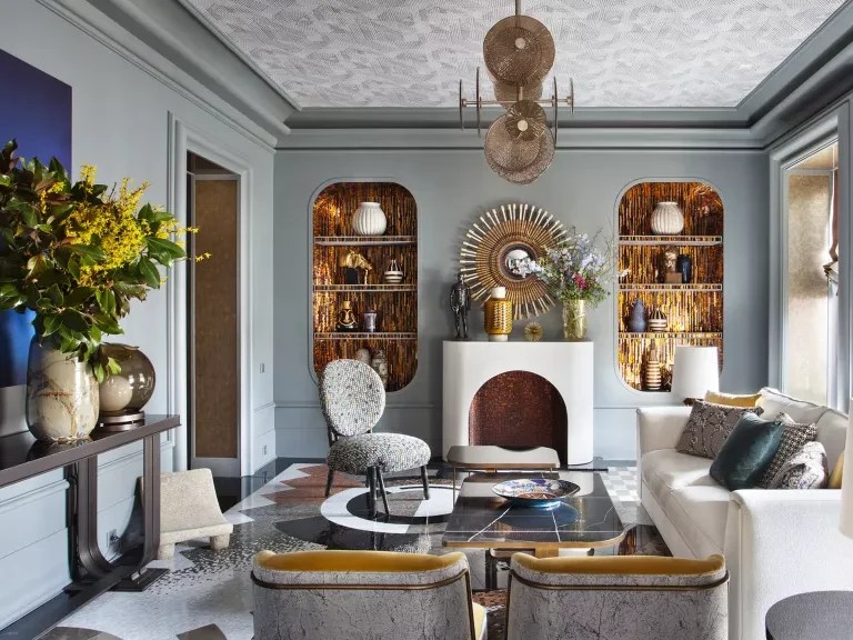
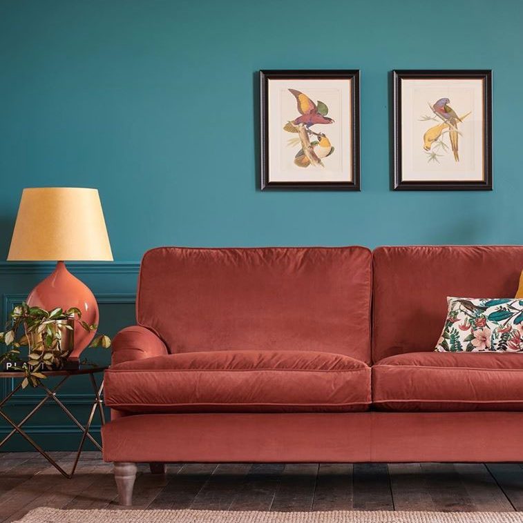
Balancing Color, Pattern, and Neutral
August 21, 2017 § Leave a comment

There is so much to love about this breakfast nook (designed by Martha Angus and Katie McCaffrey), I’m going to dive right in.
What’s to Love?
-The light gray walls. By staying with a light cool neutral on the wall color, you allow the pops of warm vibrant color to do just that: pop.
-The simple breakfast nook construction in the same wall color. What happens? The banquette disappears making the room look bigger and less chopped up.
-The wood floor. No doubt it carries throughout the public space making the whole house feel open and unified.
-The table from Paris (yeah, I know). The point is that the table is a unique piece and it’s not only functional but a conversation piece and a memory back to a really nice trip.
-The black and white print. Sure, you can add a vibrant picture there, but the neutral wall hanging allows the colors to take center stage. And they do.
-The yellow leather cushion. It’s yellow but in a fabric that’s easy to wipe up. Essential.
-And those pillows! In colors that coordinate with each other but refuse to look matchy-matchy. (And you just know that the rest of the house pulls colors from that lovely summer palette.)
Take Home Message:
If you want to show off color (or many colors), don’t overdo it. Leave spots empty and devoid of pattern for the eye to rest. And pick a palette of colors (5 is a good number) that you can carry throughout the house in various ways — wall color, furniture, art. The result will be a home that is balanced, unified, has flow from room to room, and that makes you happy every time you open the door.
Wallpaper: Timeless or Trendy?
March 18, 2016 § 1 Comment
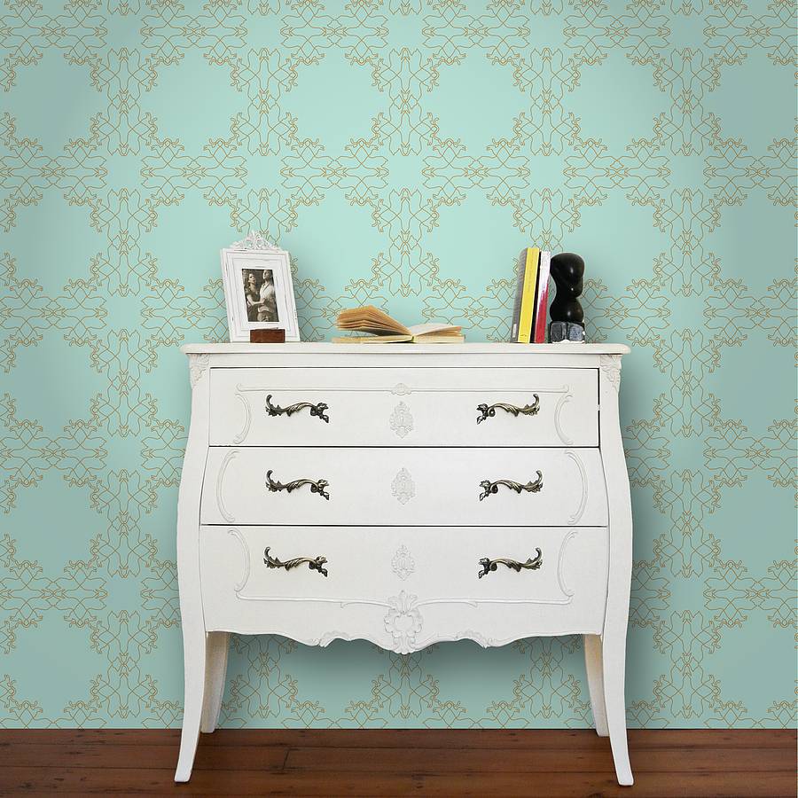 Wallpaper continues to make design headlines as it rolls back into our homes. From half baths to bedrooms and dining rooms, we’re seeing it in almost every room. If you have an older home that always had wallpaper, then this is no big deal. But for some of us who have enjoyed plain neutral walls throughout, this wallpaper trend is a bit scary.
Here are some guidelines:
- Start Small. See how you like color and pattern on a small area before committing yourself to a big project. Try papering an accent wall in your office or guest bedroom. Or even wallpaper a table top for fun. Small projects are easier to undo or live with than full-room projects. Or break the rules: Dive in and wallpaper your dining room above the chair rail. You’ll love the dramatic change.
- Scale matters. Select a large scale pattern for a large area. That will keep the wallpaper looking contemporary and not left over from a different design era. Or break the rules: If you love the look of small flowers in a guest bedroom, then who’s stopping you.
- Love it. Wallpaper is a little more permanent than a coat of paint. So you should really love the paper you select. Stay in your home’s color palette and choose something that will coordinate with adjoining rooms. Or break the rules: If you really love foil, then it’s only wallpaper. Go for it. Make your home yours.
- Give the walls their stardom. Since you’ve wallpapered the walls, we presume you want people to notice them so back off on the other patterns in your room to let the wallpaper take center stage. Using a neutral sofa in front of a patterned wall keeps the pattern from overwhelming the room. Or break the rules: The latest trend is mixing lots of patterns together to give a room personality. Try to stay in the same color family to avoid room overload. But again, if you love it and it’s you, then own it.
- Take a deep breath. Before making that decision to wallpaper your bedroom ceiling, channel your interior decorator within. Realize that unless you are restoring an historic home to its original wallpapered grandeur, wallpaper for the rest of us is yet another design trend. In 7-10 years, you may very well hate it. So be prepared to undo the trendy foil damask in your half bath. Especially if you are planning to sell your home anytime soon. Wallpaper is what we call taste-specific. Potentially you may be the only one who sees it as timeless. Just an FYI. Or break the rules: Live for TODAY!! Enjoy your wallpapered ceiling and deal with it later.
Photo: This lovely wallpaper is 44 Gatti Secret Image (available at http://www.notonthehighstreet.com).
Green Decorating: The Soothing Hue
March 17, 2016 § Leave a comment
St. Patrick’s Day brings us to thoughts of green. Whether it’s kelly green or any of the variations thereof, green is a versatile, natural hue that brings life and comfort to any room. It is particularly nice in rooms where you spend time revitalizing your mind and body.


Waking up in a green room warms a cold, white, snowy day and cools a hot, humid summer morning. It can bring the color of lush plants and trees to a city skyline view. And it can calm an agitated, overextended lifestyle at the end of another hectic day.


Green can be either warm (yellow-green) or cool (blue-green), and both pair beautifully with white. Coordinating accent colors can add energy (the complementary reds and pinks, opposites to green on the color wheel) or quiet blending (the analogous yellows and blues on either side of green on the color wheel).
I highly recommend adding green, even a mixture of greens, to your home to quiet and soothe your soul. Wherever you need a few moments of ahhhhhhh.
Paint colors above: Top left to right: Waterscape SW 6470, Topiary Tint SW 6449, Honeydew SW 6428, Breaktime SW 6463. Bottom left to right: BM Guilford Green HC-116, Palisades Park BM 439, High Park BM 467, Dartsmouth Green BM 691.
Making a House Color Splash
March 15, 2016 § Leave a comment
I have driven past this house for years and every time, I do a double take. Situated next to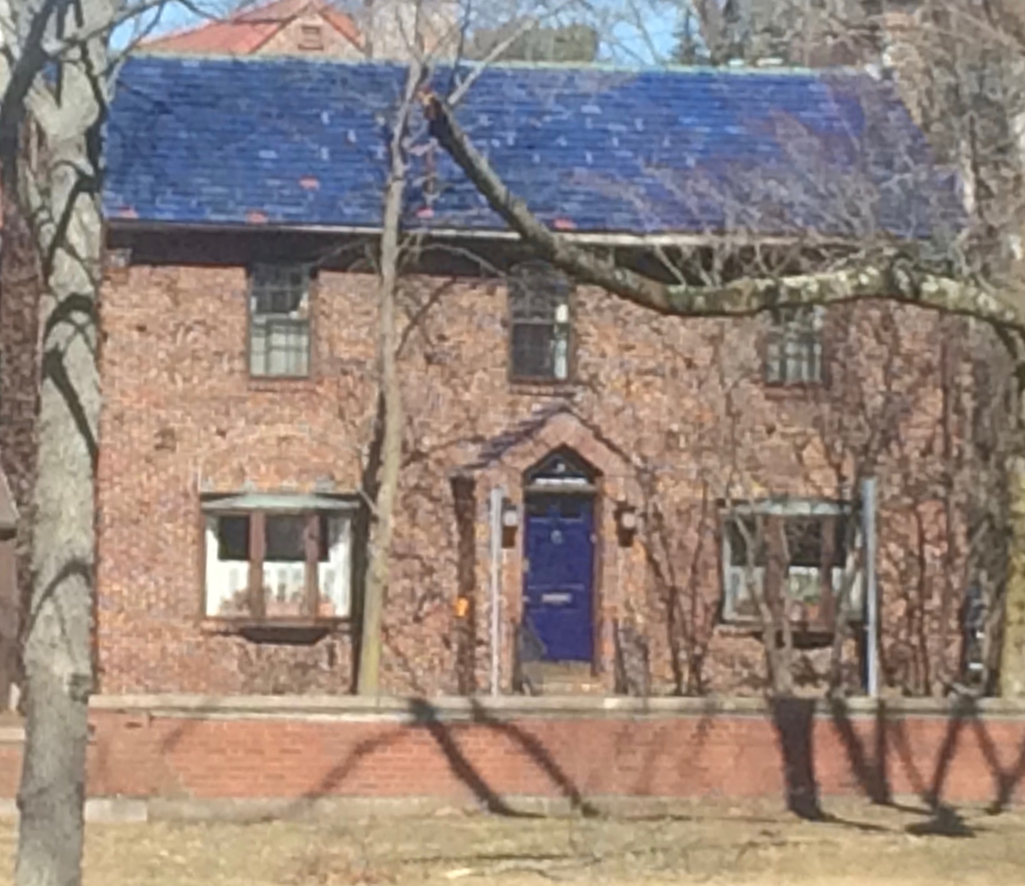 a busy roadway, there is nowhere to stop, get out of the car, and snap a decent photo. But that does not deter me.
The red brick wall is not part of the yard. And who cares about it anyway. It is the roof color and the coordinating front door in a spectacular (guessing here) Starry Night Blue (BM 2067-20) that grabs our attention. The rest of the trim is a quiet brown taken right from the brick. We don’t even notice the window trim at all, and that’s the point.

The roof looks like Vermont Mottled Purple slate, but honestly I have no idea. All I can say is that this house creates, in its traditional neighborhood, a huge House Color Splash. Kudos! And I cannot wait to drive by again.
Don’t forget about the roof color when you are planning your exterior color scheme. It is absolutely fine to keep it neutral, but if you have the personality to withstand the gawking passersby if you decide to add color to the roof, then go for it. Just remember to tie it into the rest of the house with shutters and/or front door to match. I will thank you.
Change Your Front Door Color
February 8, 2016 § 2 Comments
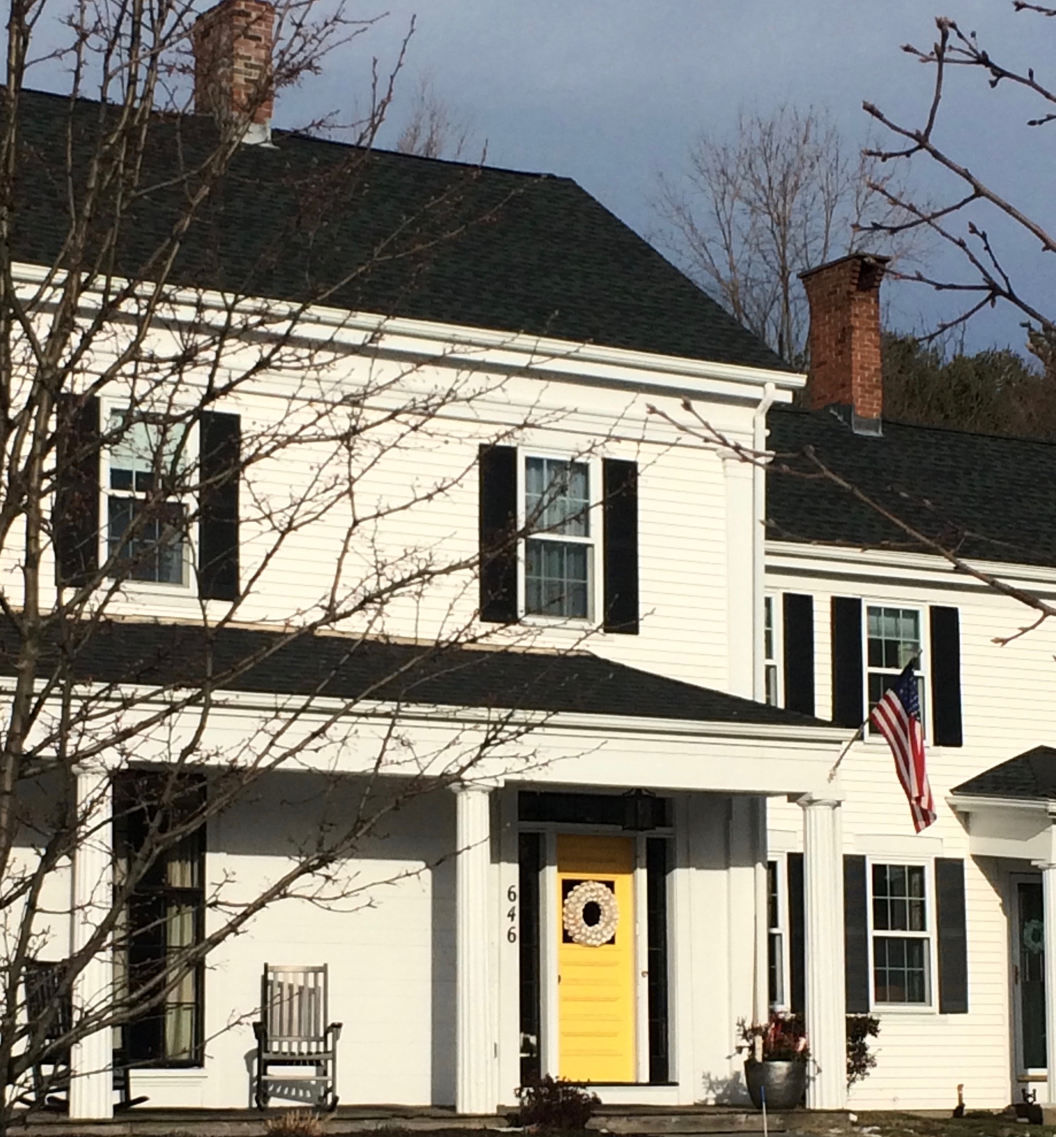 Driving through a little town recently, I glanced around as usual, admiring architecture, making a mental note about what color combinations to try and which ones really do not work, and generally looking for color and design inspiration. One house called out to me as I cruised by — quickly I made a U-turn and headed back for a closer look. Like a beacon of happiness, the bright, sunny, yellow door popped off the crisp, white house with black roof and shutters. What a stunning house to drive home to every day.
February seems to bring thoughts of Spring and those quick and easy, yet big-bang-for-the-buck house projects. And the front door color is one of them. If you’re tired of black or red for the front door, and particularly if you have a white house, there is no reason to keep the status quo. Shake it up. What is your favorite color? What color are your spring flowering shrubs? What color does your front door want to be? (Okay, that last one may be a bit weird, but you get it.)
Guidelines for choosing a new front door color:
- Make sure that new color shows up at least two other places in the front yard, for example, in the landscape plants, flower pots, patio umbrella, or other accessories.
- Consider a brighter sheen for a softer paint color. That will add life and a little pizzazz to a color that doesn’t stand out too much on its own.
- Realize that if your front door is under a porch overhang, the color of the door will darken. Go a bit brighter unless, of course, you get full afternoon sun shining on the door. In that case, go a bit darker.
- Give yourself choices. Try three different colors and look at them at different times of the day and in different weather conditions. Don’t rush the decision.
So this year, while you’re skimming through seed catalogues and planning your Spring garden colors, choose a new front door color too. You’ll love how it brightens your spirits.
From Color Inspirations to Paint
February 4, 2016 § Leave a comment
Walking into a pottery shop is like immersing yourself in a box of crayons, all pristine and unbroken with endless possibilities of combinations.
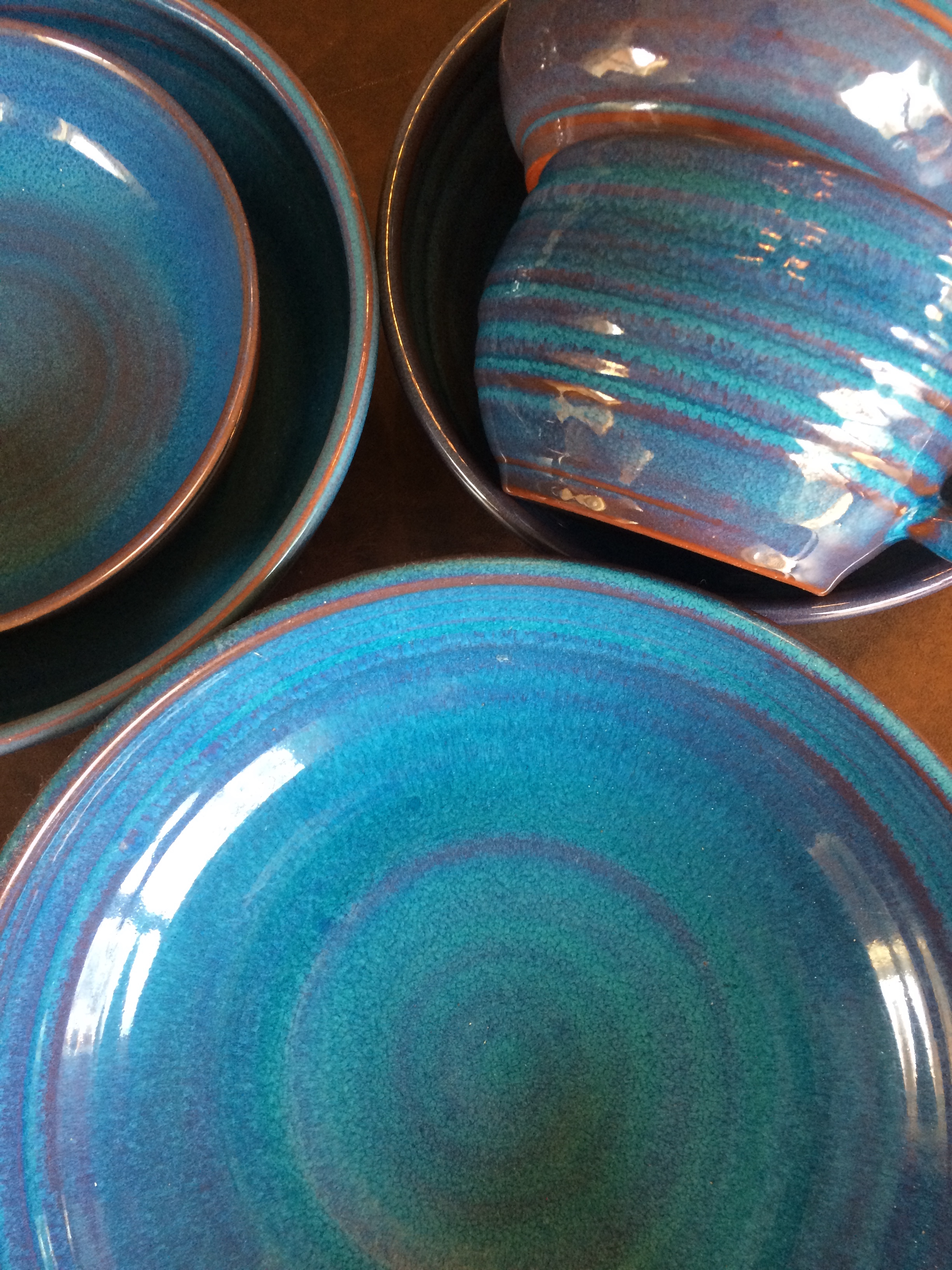 This set of dazzling bowls caught my eye. Mesmerizing is how I’d describe them with an array of blues from turquoise to cornflower. (The dishes are mine now.)
Whatever the inspiration, there is a paint project waiting. In my mind’s eye driving home, I see these dishes in a dining room painted any one of the colors with crisp white trim. Maybe even a shiny white bead board around the wainscoting to bring out the hues in the room. I can also see any one of these colors on the walls in a kitchen with white cabinets and a white subway tile backsplash. Or maybe one of these colors for the backsplash! (Head is spinning with ideas.)

Accent walls give us a way to add a small amount of color drama to the focal area of a room without painting everything. Especially nice in open-floor-plan spaces where walls may incorporate several rooms. How about one of these rich hues for your front door? Spring painting is right around the corner. (Ben Moore’s Calypso Blue, Bermuda Blue, and Deep Mulberry)
Let the color in front of you and surrounding you inspire you. Wrap yourself up in it. Do something for yourself and create a happy house. It’s just paint!
Got Personality? Show It
January 19, 2016 § Leave a comment
What does your room say about you? Designer Jeffery Bilhuber (House Beautiful, Feb 2016) infused a boatload of personality and let us know a few other things as well. What this room shouts to me: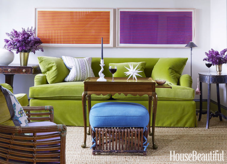
- Forget about symmetry. Mismatched end tables are way more interesting than a set.
- Go ahead and mix woods. We acquire furniture from our parents, we find treasures at a flea market, and sometimes pieces have sentimental value. Use them — even if they don’t “match” your decor.
- Add your favorite color to the room. And if you don’t have a favorite, use several. If you keep the colors at the same “hue value” (lightness or darkness of a color), they mix well together.
- Function is important. Don’t forget that you need to set your wine glass down.
- Forget matchy-matchy. This designer has taken that declaration over the top by using two different window shade colors. Bold and impetuous design choice there, but again, the room screams,”I want to be different.” And I applaud that.
- Let color speak in the room by creating a neutral backdrop from which the color can “pop.” Here, the light gray walls and the neutral woven rug give the eye a rest.
- Flowers and the little accessory details finish the room. Without them the room can look cold and staged (too many, of course, and you have a clutter zone).
- Texture matters. That sofa looks so soft. Adding warmth and texture with pillows can warm up anything, even leather.
Bottom line: You’ve heard this before, but it’s worth repeating. Don’t just follow the design trends. Let your room reflect who you are and what you love.
Make You Happy — Consignment Love
January 18, 2016 § Leave a comment
A home stager’s life can be unsettling.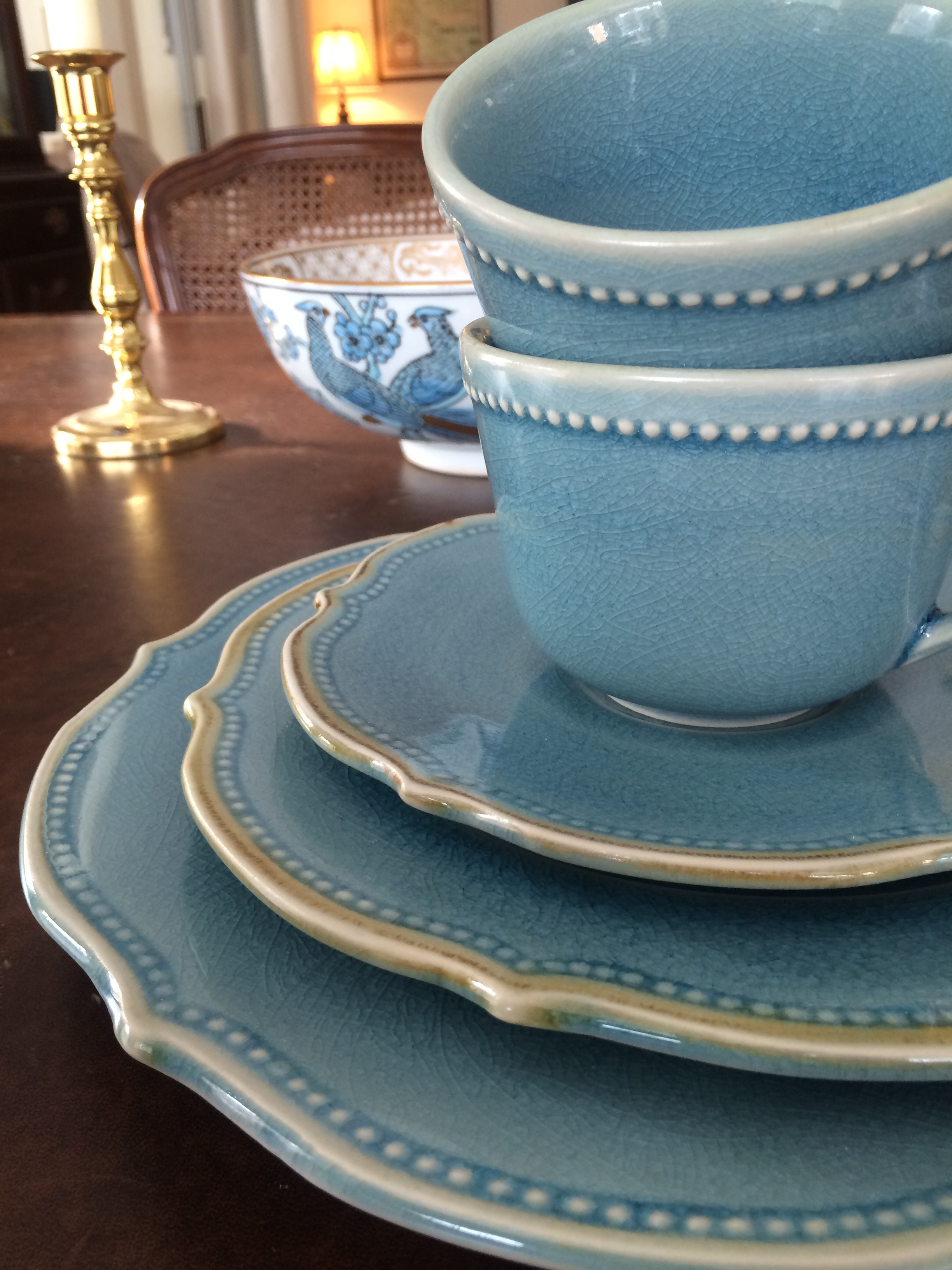 Furniture comes and goes, from storage unit to my own living room and then off to somebody’s vacant home and then back again two months later. My husband jokes that he has to turn the light on before he enters a room or he might trip over an ottoman that wasn’t there a few minutes ago.
And as a stager, I often un-decorate a home to make it more appealing (or at least not unappealing) to a wide swath of potential buyers. Family photos? Gone. Floral drapes? Too busy. Oriental rugs? Too taste-specific. So life is full of light neutral walls, white window panels, generic art, plain slipcovers, and sisal rugs. Everything looks good at the end in a Pottery Barn kind of way, but I am growing tired of meh.
Enter my favorite consignment store. And inspiration.
Finally I am going to buy something other than white plates and Parson’s chairs. And for me. These French blue dishes with gently scalloped edges and little raised dots around the rim are totally taste-specific. Mine. 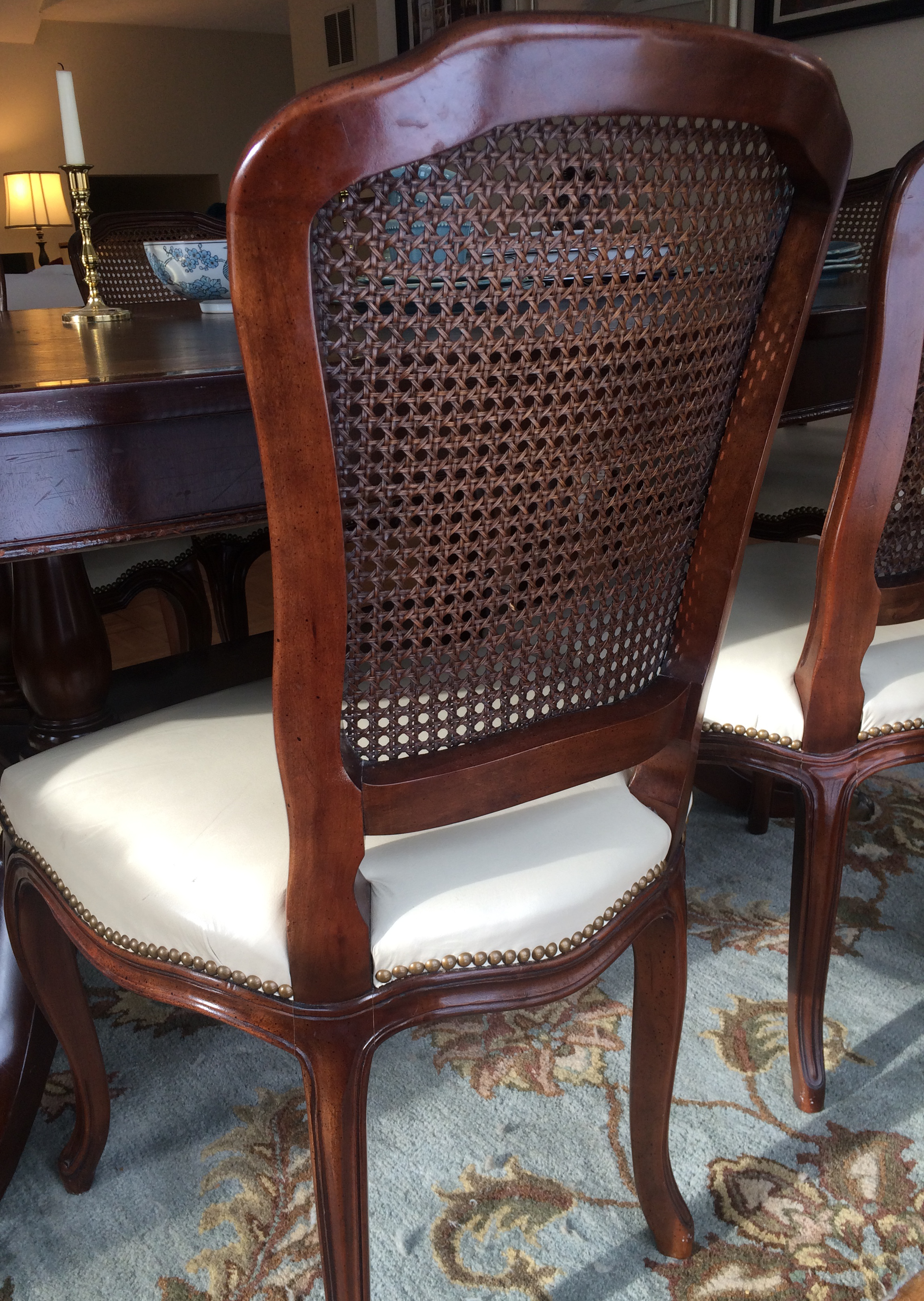 And the chairs with their cane backs, girly curves, and cream leather seats are too old-fashioned for today’s young buyers. They would spray-paint them white! Not me.
I have found love, and these items will stay in my home. I can come home every night and expect to see them there, not in somebody’s 1800s farmhouse kitchen with a For Sale sign in the front yard.
My point to all this? Surround yourself with what makes YOU happy. Don’t let your job take over your home. Have a sacred space that’s your own. Hang onto things that mean something to you and make you feel good. All that! And more this New Year.
