Curb Appeal Refresh: The Front Door
May 22, 2019 § Leave a comment
Some of you may remember when the fashion industry changed the skirt hem length every year — from maxi to mini to midi and then back to comfortably above the knee.
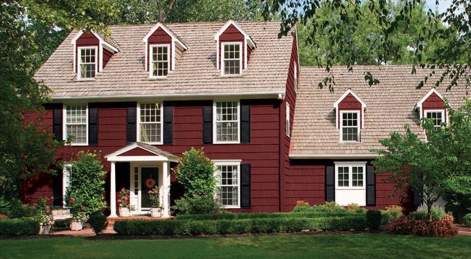
Front door color has followed a fashion trend of its own. A decade ago, red was all the rage — and for some it continues to be the most welcoming front door color. Black with a metal kick plate has always offered a sophisticated read on the front entry. But what has followed in more recent years has been a busting-out of traditional exterior curb appeal. Here’s what front door colors we were talking about just 3 years ago.
So it is time to update those door trends again. No more copycat door-painting just to be fashionable. We’re stepping out of the shade of the porch to a bold new entryway that will set each house apart from its neighbors.
But first, let’s talk about house colors. What has changed:
–More white houses. It used to be that white fell to farmhouses and antique colonials. Not anymore. There is plenty of white new construction, which opens up a fan deck of front door options.
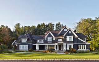
–More gray houses. Always a neutral that fits into almost any environment, the gray interior trend moved to the outside and remains. Gray also opens up a fan deck of front door options, maybe just a few fewer than white.
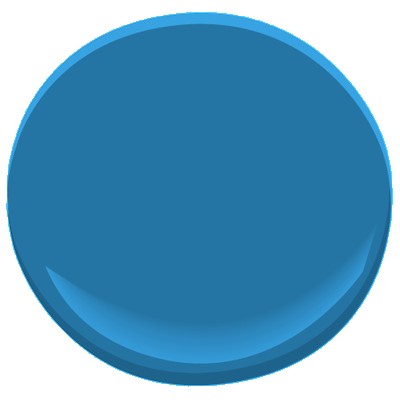
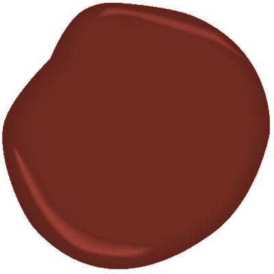
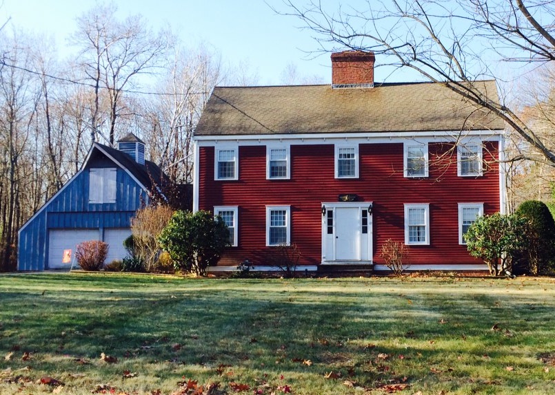
–More Crayola color and less safe beige. Dark and rich are replacing light and airy. Briarwood is moving to Hale Navy. Rich Cream is moving to Merlot Red. Even some developments are providing a rainbow of siding options instead of the light neutrals from years past. <<applause>> If you have a bold red house, you probably don’t need me to tell you what color to paint your front door (lol!), but I’ll offer suggestions anyway.
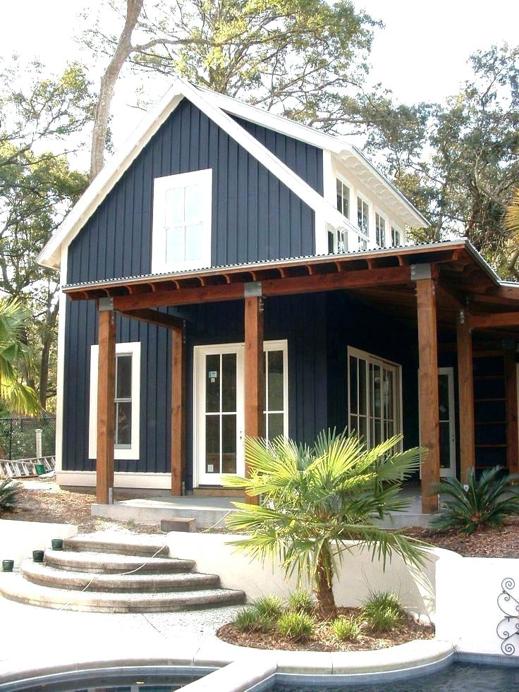
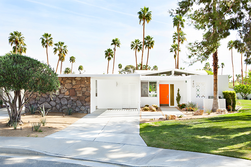
–More midcentury renos, both contemporary and ranch style. With a surge in client interest for open-concept living (uh-oh to that trend, but that’s another story), people have realized that it is easier to update an already open midcentury home with the high vaulted ceilings and the great-room flow than it is to modify a boxy colonial. Big surprise there. So we are seeing a plethora of exterior colors (even black) as a result of these one-story re-dos.
Back to the front door. Here are some ideas for redoing your front door color to refresh your home.
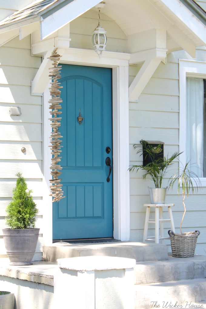
Teal and Turquoise — I cannot believe that I used to recommend turquoise only for tropical house locations or homes that at least had a pool. What used to be a quest to coordinate house colors with the local environment is now a challenge to ignore it. Where teal and turquoise work: on gray, white, black, yellow, red, okay almost every house color except blue. Where they do not work: on dirty or faded house siding (the bright color makes the house look worse) and on other blues like colonial blue.
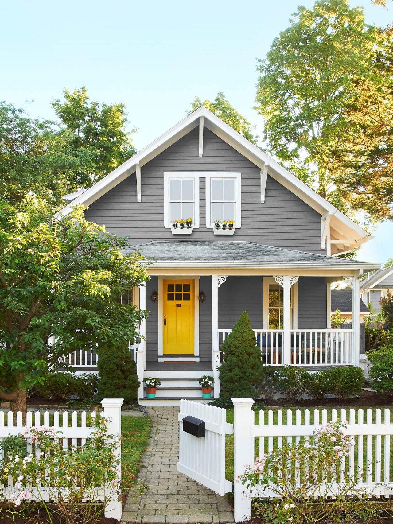
Yellow and Orange — not everybody’s favorite colors but they are so happy. I love them on a front door. Where they work: on dark house colors like navy, green-browns, dark and light grays, neutral gray brick, and white. Where they do not work: Again, on any color that looks faded, aged, or dirty.
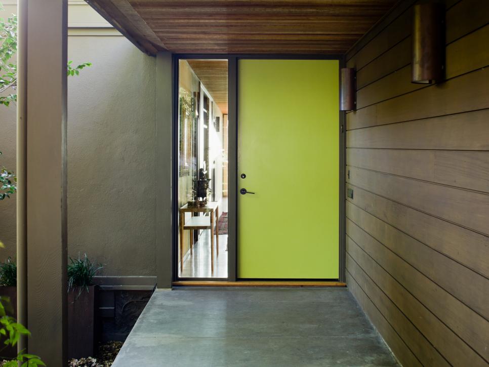
Lime Green — fresh and springy and a wonderful coordinating color for your landscape. Where it works: dark gray, navy blue, even red brick, chocolate brown, black. Where it does not work: any other green or dirty beige.
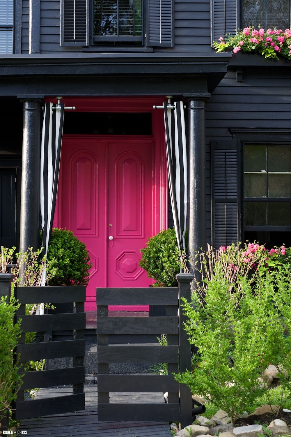
Pink and Purple – always beautiful on a white house with coordinating landscape trees but also on a dark house for a real pop of warmth in the neighborhood. Where they work: white, gray, navy. Where they do not work: on yellow beiges and orange beiges because of the undertones and on anything that has a faded or dirty appearance.

If the bright colors will not work with your house color, try natural or even white.
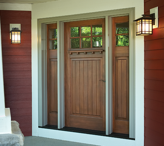
Natural Wood or wood-look – always a classic. Where it works: navy and red, for sure. And just about every other house color.
White — yes white! What white does is make the whole entry area look larger since it blends with the white trim color. It also creates a blank canvas for holiday decor — wreathes, flower pots, etc. There is nothing quite like white as a backdrop to a variety of color palettes around the entryway. Where it works: especially good on a house with a lot of color already and crisp white trim. Also works on neutrals when you want to maintain a soft neutral palette throughout — be sure to add textures though with lots of greenery and baskets or wicker furniture. White also works on aged or faded houses where the bright colors do not. Crisp white perks everything up.

I hope these ideas dazzle your thinking and inspire you to head to the paint store. Happy painting, everybody!
Pink Doors and Why They Work
February 5, 2018 § Leave a comment
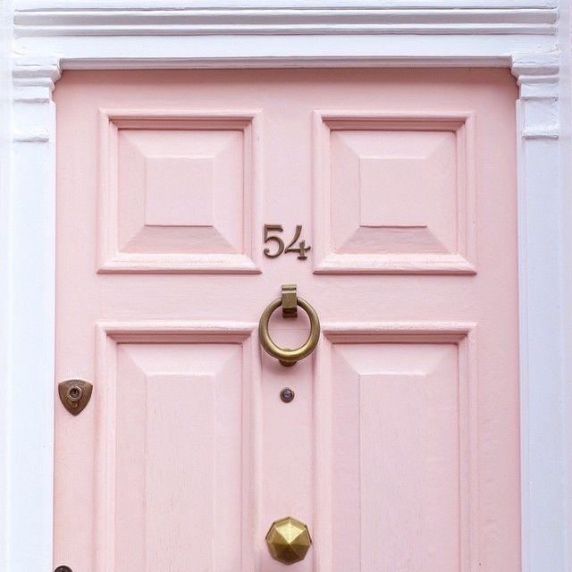
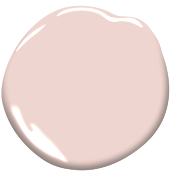
Pink — a trend we’ve been watching for the past couple of years — is no longer labeled, as my mother used to say, SS&G (sweet, simple, and “girlish”). On the contrary. The color keeps popping up with some staying power, and where it has grabbed my attention the most is at the front door.
This Pleasant Pink by Benjamin Moore is a comfortably sophisticated hue that blends rose with peach and a touch of gray undertone that keeps it from looking too bubble-gummy or baby’s room. Antique brass metal hardware (as on the London door above) will give the color an aged quality that keeps it from looking too trendy.
Why does pink work so well as a door color? Because it compliments many exterior house colors and coordinates with pinks and whites and purples in the landscape plantings. Here are a few ideas:
Behr’s Road Less Traveled from the 2018 palette is a soft mushroomy gray brown that coordinates nicely with stone walls and wooded environs and looks fabulous with white trim and a pink door. And although cherry blossoms do not last very long, for a few weeks out of the year your house will have traffic slowing down to take photos.


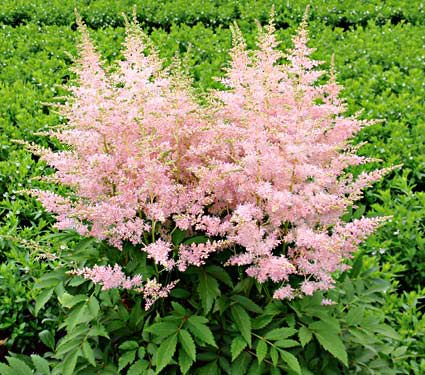
Another house color that looks great with a pink door is gray– it’s a classic combination. This gray, Benjamin Moore’s Stormy Monday, paired with pink creates a quiet traditional combo whose matched undertones make the marriage work. Pink perennials in the yard draw your eye to the coordinating front door.

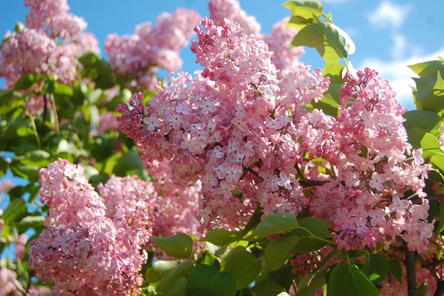
Three other colors paired with pink create quite the wow factor and a stunning bush of pink lilacs ties the whole look together.
Charcoal Blue, a Sherwin Williams color, offers the most drama. Not for everyone, but a dark navy house can be very striking, and the softness of the pink door creates a balanced look paired with silver-toned metal door accessories.
Farrow & Ball’s Slipper Satin is a gorgeous color to paint both siding and trim. Paired with a pink door and a dark brown porch deck and oil-rubbed bronze accessories, you’ve got your drama.
Finally, we have a dark charcoal, Glidden’s Flagstone Grey, that also coordinates well with stonework and contrasts beautifully with pink.

![farrow-ball-sample-pot-slipper-satin-2004-22227-p[ekm]480x480[ekm]](https://i0.wp.com/yourcolorcoach.blog/wp-content/uploads/2018/02/farrow-ball-sample-pot-slipper-satin-2004-22227-pekm480x480ekm.png?w=156&h=156&crop=1&ssl=1 "farrow-ball-sample-pot-slipper-satin-2004-22227-p[ekm]480x480[ekm]")

As you contemplate freshening up your home’s exterior this Spring, see if a glossy pink door with fresh hardware might be the answer to enhanced curb appeal. If you change out the door hardware, don’t forget to match the porch light– an inexpensive upgrade that can make a huge difference. Add a fresh door mat and pot of pink annuals on the porch step and brace yourself for compliments.
Happy Thinking-About-Spring Day, Everybody.
Trending Front Door Colors
April 25, 2016 § 1 Comment
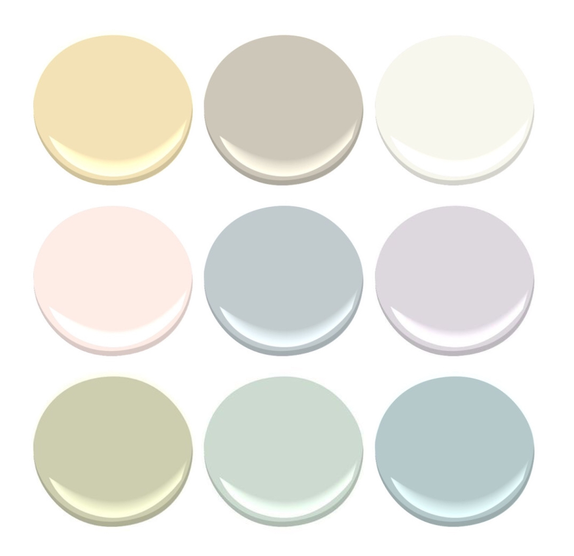
 What’s trending now in front door colors? Soft pastels. Although the traditional black and red will never go out of style on colonial homes, the palettes of many contemporary and new construction houses have been softened in recent years.
People are still loving the neutral siding colors: whites, grays, gray-blues, and sages. But instead of the dynamic contrast of a front door that shouts, we now have front doors that sing softly.
Possibilities:


Benjamin Moore’s offerings:
- Corn Silk, 198
- Revere Pewter, HC-172
- Simply White, OC-117
- Soft Pink, 2012-70
- Gentle Gray, 1626
- Touch of Gray, 2116-60
- Moon Shadow, 1516
- Colony Green, 694
- Yarmouth Blue, HC-150, a personal favorite of mine.
Spring is here! Consider painting your front door with a soft new hue. You’ll love it.
(Photo: Better Homes & Gardens)
Making a House Color Splash
March 15, 2016 § Leave a comment
I have driven past this house for years and every time, I do a double take. Situated next to a busy roadway, there is nowhere to stop, get out of the car, and snap a decent photo. But that does not deter me.
The red brick wall is not part of the yard. And who cares about it anyway. It is the roof color and the coordinating front door in a spectacular (guessing here) Starry Night Blue (BM 2067-20) that grabs our attention. The rest of the trim is a quiet brown taken right from the brick. We don’t even notice the window trim at all, and that’s the point.

The roof looks like Vermont Mottled Purple slate, but honestly I have no idea. All I can say is that this house creates, in its traditional neighborhood, a huge House Color Splash. Kudos! And I cannot wait to drive by again.
Don’t forget about the roof color when you are planning your exterior color scheme. It is absolutely fine to keep it neutral, but if you have the personality to withstand the gawking passersby if you decide to add color to the roof, then go for it. Just remember to tie it into the rest of the house with shutters and/or front door to match. I will thank you.
Change Your Front Door Color
February 8, 2016 § 2 Comments
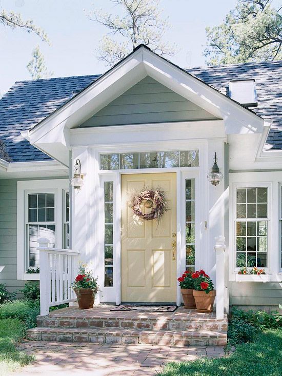
 Driving through a little town recently, I glanced around as usual, admiring architecture, making a mental note about what color combinations to try and which ones really do not work, and generally looking for color and design inspiration. One house called out to me as I cruised by — quickly I made a U-turn and headed back for a closer look. Like a beacon of happiness, the bright, sunny, yellow door popped off the crisp, white house with black roof and shutters. What a stunning house to drive home to every day.
February seems to bring thoughts of Spring and those quick and easy, yet big-bang-for-the-buck house projects. And the front door color is one of them. If you’re tired of black or red for the front door, and particularly if you have a white house, there is no reason to keep the status quo. Shake it up. What is your favorite color? What color are your spring flowering shrubs? What color does your front door want to be? (Okay, that last one may be a bit weird, but you get it.)
Guidelines for choosing a new front door color:
- Make sure that new color shows up at least two other places in the front yard, for example, in the landscape plants, flower pots, patio umbrella, or other accessories.
- Consider a brighter sheen for a softer paint color. That will add life and a little pizzazz to a color that doesn’t stand out too much on its own.
- Realize that if your front door is under a porch overhang, the color of the door will darken. Go a bit brighter unless, of course, you get full afternoon sun shining on the door. In that case, go a bit darker.
- Give yourself choices. Try three different colors and look at them at different times of the day and in different weather conditions. Don’t rush the decision.
So this year, while you’re skimming through seed catalogues and planning your Spring garden colors, choose a new front door color too. You’ll love how it brightens your spirits.
House Colors with Personality
November 20, 2014 § Leave a comment
Nothing shy about this pretty pink house. And instead of tempering it with neutral (black or gray for the shutters and door), the homeowners went Victorian bold with a rich blue like Ben Moore’s Blue Macaw 784.

When you have an old house, it’s fun to use old historic color schemes that make a statement. This one certainly does with its two-toned mustard/olive combo clarified with white trim and a traditional brick red door (Ben Moore Cottage Red).

I always love a tastefully done red-white-and-blue scheme, shown here with a blue garage attached to the red house. White (Ben Moore’s Brilliant White) as both trim and accent color pulls the look together.

This dark brown house is a classic New England Cape. Its simplicity is what captures the eye. No accent color needed on this traditional solid wood door with black hinges.

Make a statement in your neighborhood. Tastefully, of course.
What Color to Paint Your Big House
February 13, 2014 § Leave a comment
Building a new house or a large addition but beginning to worry that it might look too big in your neighborhood? Maybe a lot of people don’t worry about their neighbors, but some people do. If you think your house might appear overly large-scaled, then avoid painting it white. The contrast against the setting makes white stand out even more than other light colors.
To bring the house down to scale and accent the architecture at the same time, consider a dark color like a dark charcoal or dark green for the siding. Dark trim, of course, will camouflage the house even more, whereas white trim will highlight windows, doors, and roof trim.
Your choice — but becoming the McMansion in the modest neighborhood will not endear yourself to your neighbors. And my how they talk…
Fair warning.
Surprising House Color Trend — White
February 12, 2014 § Leave a comment
Classic but always with a modern twist, white is trending now as a house color on new construction. Whether we’re craving our grandparents’ old homestead, or we like a crisp, uncomplicated look, white is in. White siding with white trim. But the surprise element lies in the accessories. Fresh options include silver for the metal color (not the traditional black), white or pastel door colors (nolonger black or red), medium-toned metal roof colors (not just charcoal shingle anymore), mismatched out-buildings (that old classic farm look is coming back in a big way), and even (gasp!) white shutters on a white house.
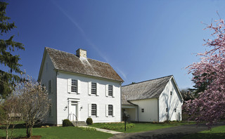
The beauty of white is that it really is timeless. Not only that, but it shows off your colorful flowers and the greenery of your landscaping, the orange patio umbrella and Adirondack chairs, and the turquoise of your backyard pool (okay maybe I’m going a little overboard).
See if a fresh pop of white brings out the character in your house.
Front Door Personality
August 28, 2013 § 6 Comments
 As much as I love eggplant, both as a vegetable and a paint color, it just didn’t work on my house. With the eave creating a shadow, the beautiful, rich purple color only lit up in the late afternoon when the sun hit it just right. For those few moments, the Caponata (Ben Moore AF-650) looked spectacular. Then it went back to black.
So… inspired by some fabric I saw awhile ago with golds and light blues, I ventured into a rarely seen color combination — hey, why not, it’s just paint! The new door and bench are Yarmouth Blue (Ben Moore HC- 150) and although the neighbors have not commented yet, I love it. The house color is Richmond Gold (HC-41) and the trim is Cameo White. I may paint the trim a less-yellow hue in the spring, but for now, it’s fine.
If your front door is in the shadow of a porch or a big tree in the front yard, consider a light front door color, something even (dare I say?) pastel. You may be really pleased with how the lighter door color can change the personality of the house from stodgy traditional to young and perky. See what you think!
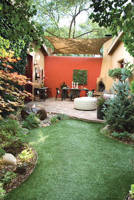
Enough about Neutral–I’m Craving Color
May 13, 2013 § Leave a comment
Who says accent walls are so last decade? Not me. I love how a carefully chosen wall or piece of architectural interest can be highlighted dramatically by color.
Here we see how bold color creates a defined outside eating area with all the drama of an interior dining room. Why not! It’s okay to use accent color on the outside of the house to warm up a patio, jazz up a porch wall, or provide a colorful backdrop to a garden. It’s spring. Get out there and do some color!