Adding Shutters? Look to Paris
November 15, 2015 § Leave a comment
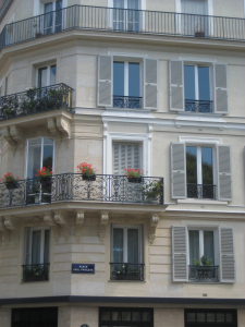 In honor of my beloved Paris, let’s talk about shutters. In my humble opinion, nobody does shutters better than the French. Classic, elegant, tasteful and actually quite functional as opposed to our (often) vinyl interpretations on our side of the pond.
That said… shutters do not have to be functional, and it’s okay if they’re vinyl. But how can we make our vinyl, nonfunctional, imitation shutters look more authentic? Size. Yes, when it comes to shutters, size matters. 
Shutters that are too narrow or too short for the window size look like an afterthought, at best. They add color and dress the bare windows, but they don’t fool anybody. Make sure 1) there is enough room on either side of the windows for properly sized shutters; 2) the width of the shutters fits the scale of the window — they could actually function; and 3) the length is appropriate — if shut, the shutters will cover the window completely and not leave a little hem showing.
Thank you, Paris, for educating me on shutters during my trip in 2010. And my sincere sympathies to you and your people.
Choosing a Paint Color for the Cottage
May 31, 2012 § 3 Comments
It’s time to repaint the cottage — it has been that shade of grassy olive green since about 1970 and I think we’re ready for a chang e especially since the cottage next door is also green, just a darker shade. You might think that choosing a color for my own place would be easy for me since I work with color all the time. But just like you struggle with paint color schemes, I have to go through that process too.
First of all, what colors are already in the neighborhood? We have dark green on one side, beige siding on the other, and brown and beige two doors away on either side. So that leaves quite a few options.
Next, what color is the roof? It’s a gray metal roof with a white fascia piece in front. The roof doesn’t show from the front, but it’s quite prominent on the sides so roof color is a consideration.
What color are the windows and other non-changing elements? The windows are all white vinyl (I know, but they’re easy maintenance for a cottage). We had the chimney removed (that had been the inspiration for the brick orange Adirondack chair).
So with fandeck in hand, I spun through the color possibilities. I eliminated yellow and white because they would take too many coats to cover the green. Red was thrown around as a possibility but I didn’t like the idea of red next to the dark green. Not summery enough. Orange is a great accent color but our cottage is not interesting enough architecturally to draw that much attention from a wild paint color. That brought me to gray and blue.
I tried some grays, both dark and light, on the Sherwin-Williams paint site and liked several with the gray roof. My reservation was that the cottage would need color added somewhere — otherwise it would look kind of blah. (Note: I LOVE the Nantucket weathered cedar look, but you need salt air to pull that off.)
 Finally, I tried blue. Hmmm… not a bad idea. I ended up with a WoodScapes opaque stain in a color called Chesapeake (SW3051) with a cool white trim (Rhinestone– it’s on the blue side of white) and my Adirondack chair color for the accent. I like a dark blue cottage color — it speaks to the lake water in the background and does not attract too much attention from passersby. I also like the contrast with the windows especially for a summer cottage. I used the Adirondack chair color (a custom red-orange) for the doors including the big garage door facing the road. Now it’s easy to find the party.
Choosing House Colors: Bark Brown?
February 28, 2012 § Leave a comment
 Talk about fitting in! Dark, rich tree-bark brown is about as close to nature as you can get for a house color that will fit unapologetically into almost any landscape.
What I love about this brown house, however, is how creative the homeowners were when it came time to choose a new roof color. Instead of opting for a light brown, gray, or dark forest green (all great options, by the way), they chose a light sage dimensional roof that looks spectacular. Then they pulled the trim color from the lightest shingle tone and used that for trim around the dark brown windows (also a nice touch), the corner trim, and the garage doors.
The result? Something different! How refreshing! Are they locked into a green roof? Yes. But who cares…
Color Your Windows
November 4, 2011 § Leave a comment
 Although it’s a commitment, there’s a growing trend in windows to replace white with color — like these beautiful blue mullioned picture windows shown as a backdrop to outdoor furniture from the Ballard Designs catalogue (www.ballarddesigns.com). Red is another great window accent color as is the ever-present forest green.
When choosing a window color, decide whether you want your windows to stand out (white windows already do) or blend into the siding color. Choosing a color that is not in your house palette already except for maybe the front door will pop your windows right off the front of the house. Picking a window color that is already in the palette of your house (taupe, for example, to match stonework) will blend the windows. Particularly nice if you have a lot of little tiny windows and prefer a less busy look for the house.
As with all color selection, contrast or the lack of it will determine the end result. But don’t pick white just to be safe. Think color!
Brick Historic House: Trim, Shutters, and Roof Made Easy
November 1, 2010 § Leave a comment
 For those of you with historic brick homes, you cannot beat crisp white trim and charcoal black for your shutter color and roof. Forget about updating your shutters and installing a new multi-colored, dimensional roof. Basic black and white may seem blah, but honestly, good taste and traditional styling are never boring.
Express your own creativity in your landscaping. Keep the plantings symmetrical around the front door to coordinate with the symmetry of your formal house design, but add color and variety of shapes and sizes. Another tip: if you do not want to match all the window treatments on the inside of the house (even though it does look spectacular on a house like this), then at least have matching white lining on the curtains, white sheers, or plantation shutters. Mixing things up with a rainbow of window colors just ruins the formal look.
Living in a historic home is not for everybody. There’s a certain expectation — I’ll talk about informal living in another post… but for now, viva la tradition!
House and Trim Colors that Make a Statement
October 14, 2010 § 3 Comments
 Every now and then I see an accent color that whacks me over the head, and this bold expression of lemon yellow really does it to me this time! Usually a color that does not translate well onto siding or other large surfaces because it’s just too intense, this clear saturated primary color on a shutter paired with black wrought iron hardware on a subdued and sophisticated dark, gray-blue siding is a knock-out! What a statement!
What makes this combination work is the sharp contrast between the gray tone in the siding color and the bright clear shutter. If the siding were another warm clear color, the combination would scream like a caution light. But the calm understated siding lets the yellow attract all the attention. There’s no competition between the colors, just sheer harmony.
Another key to this combination is the “bridge” color that pulls the look together: white. The white trim makes the colors pop — as they say — and it’s critical whenever you use bright colors, either inside or out. White also gives your eye a chance to rest from the intensity of the palette.
But just like other bold statements, be prepared to attract a lot of buzz. And keep the lawn mowed.
Sew a Simple Window Topper
August 9, 2010 § Leave a comment
 I do own a sewing machine (a hand-me-down), but I would not call myself much of a seamstress. I sew when I feel inspired or I find a fabric I cannot live without. These window toppers were so easy that I had to share. If you cannot sew a straight line, pick stripes for your fabric. Infinitely easier than everything else.
Cut rectangles of fabric and lining, allowing enough extra for your seams and your rod pocket at the top. Then with right sides together, sew along the edges of your rectangle leaving a little space at the end to turn the fabric right side out. Press the box, turn over one edge and hand-stitch a rod pocket. You’re almost done.
Once you’ve hung your new valances, then you can add a little style by cinching up the fabric in a couple of places (maybe along either edge and in the middle if your valances are wide enough). Use a needle and thread to tack in place. Voila!! Little custom valances in an afternoon!
Top Three Tips for Selling Your House Fast
August 4, 2010 § 1 Comment
 This house sold with multiple offers at the Open House. (Incredible in this picky buyer’s market.) What made this house stand out and what can we all take home from this experience? Here are three top tips:
1. When in doubt, move it out. Although this property had some big things going for it (location, location, location), the family had lived in the house for twenty-plus years and had accumulated not only their own trappings but also lots of odd furniture and artifacts from deceased relatives. This happens to many of us. What do we do with all that stuff? The answer is clear when you’re trying to sell your house: move it all out.
At the first visit, we tagged items that needed to go — things like extra side chairs and small tables, worn furniture, family photos, large area rugs, antiques and breakables — and we left each room with furniture that would identify the room’s function to buyers. The reasonable and highly motivated homeowners then made many trips to a storage facility to clear the decks and let the house “breathe.”
2. Open the door, fix your floor. Remember that old adage, something like, if you want to know if a fellow is well-dressed, look down? Well just like polished shoes, the first thing buyers notice when they open the front door is the floor, and if yours is covered by old, worn or stained carpeting, uh-oh. In general, carpeting is out. Buyers are looking for hardwood floors and tile, both of which provide easy maintenance and no safe haven for dust allergens. If you have hardwoods covered by large area rugs (like these homeowners did), congratulations! Simply roll up the rugs, buff up the floors and go “Cha-ching!” If you have wall-to-wall carpeting, don’t panic. Have it professionally cleaned, and that will help.
3. Make it sunny, welcome the money. You’ve undoubtedly heard this before, but it’s worth mentioning again. The message here is lighten and brighten. This house had dark rooms with rich wall color and heavy window treatments. We lightened the wall color and opened up the windows by removing the heavy drapes and replacing them with airy sheer panels that framed the windows but did not block the light. The result in this family room? An ahhhh feeling.
If you are overwhelmed by the prospects of preparing your house for the market, talk to your realtor. He or she will find you the help you need to get the job done quickly so you can have that “Ahhhh feeling” too!
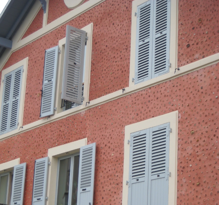
A Window to Paris
July 12, 2010 § Leave a comment
 The windows in Paris are almost as intriguing as the doors! First of all, the shutters actually work, the windows have no screens, and there are no bugs! Plus the shutters are fabulous soft colors of whites and taupes and light blues. The soft colors against the stucco and stone are simply spectacular. Not a black shutter anywhere to be found. I’m thinking that there may be room for more shutter colors in the palette — even on this side of the pond! Why limit ourselves to dark colors!


For stucco and stone homes, consider the subtle sensibilities of French architecture and the superb use of color on shutters. Tres bien!
Details Make the Difference at the Front Door
April 26, 2010 § Leave a comment
 Say nothing of the new Arts & Crafts windows, textured roof, earthy natural taupe siding color, crisp white trim, and fresh landscaping, the entryway of this renovated colonial is a knock-out.
The homeowners took their time to get all the details right. The enlarged portico with dry-stacked stone porch and columns, the tapered pillars above, the arched wood ceiling, wide chunk white contrasting trim, a period pendant light fixture, and the solid wood door with period wrought-iron hardware. There’s even a little black door-bell (with undoubtedly a charming ring on the inside).
What can I say… there goes the neighborhood…
