Fashion Colors and Your Home
October 16, 2015 § Leave a comment
What we wear affects everything: our mood, our self-confidence, our success, and even our home. It makes sense that the colors we enjoy wearing should follow us into the rooms we decorate. And they do. If you take a glance through the clothes racks in your closet, you may see a color trend that pops right out: neutrals like black, white, gray or beige? Brights like reds and purples? Nature colors like greens and blues? What you see in your closet may very well help you pick a color palette that not only looks good in your home but also coordinates with you. 
Grays are popular in fashion everywhere now (photo http://www.vince.com). And in the home, gray is still the new Linen White. It provides a neutral backdrop for any accent color and gives young home owners something different from the creams and beiges they grew up with.
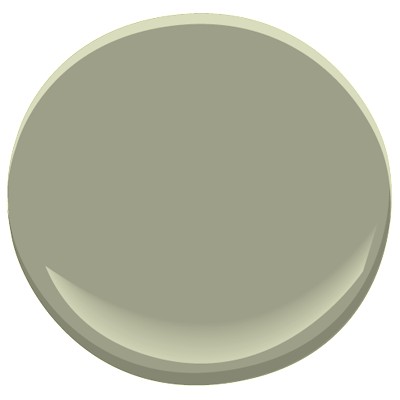
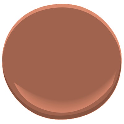
One of my favorite grays is Benjamin Moore’s Abalone 2108-60. It has a subtle warmth that looks great with stainless in a kitchen, white trim in the living room, or dark woods in a master bedroom. A touch of silver metal adds the sparkle.
Next time you’re stuck wondering what to paint a room, think about what colors you like to wear. And go from there. 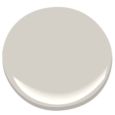
Dramatic Outside Color Creates Dazzling Interior
October 13, 2015 § Leave a comment
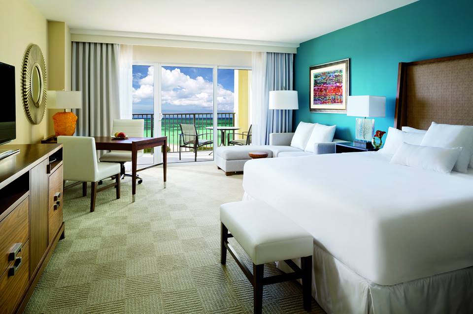 “Bring the outside in” — how many times have you heard that line before — but honestly, what a great idea! And one of the best ways to do it is with an accent wall that pulls a color right out of the view from the window. (Yes, accent walls are back.) This bedroom from a resort in Aruba has an incredible palette of blues and greens from which to choose the accent wall behind the bed. And how spectacular is it!
But you can do the same with the view from your bedroom. Choose a color that pops out at you when you stare out the window — it helps if there’s a beautiful maple in full color or a blossoming bush.
If your bedroom faces a concrete high-rise, not to worry. Your color palette is completely open to a view you might fantasize about. Create a bedroom oasis that reminds you of your trip to Bali (okay, maybe just your favorite House Hunters International on HGTV). Be bold or be subtle. Just be a force of change in your bland bedroom. And go ahead. Bring that outside in!
Ready to Immerse Your Home in Color?
November 25, 2014 § Leave a comment
 As with haute couture in the fashion world, we often look to hotels and other public spaces for trends in home color and design. Look no further than The William, a boutique hotel in New York, where each room immerses its guests in a paint bucket of saturated color punctuated by droplets of white for chroma relief. I am not sure if you can order up a particular color to match your luggage, but nevertheless, your experience there will be unforgettable.
Are we ready to move this color trend into the home? Some already have, but many of us will take a little while to move back into the rich dark hues of a decade ago. I’m just getting used to the freshness and brightness of white walls. But who knows.
 If you are contemplating a project that involves intense color, start with a small space like a guest bath or a guest room where the color will make a huge impact and the cost of painting over it will be minimal. Make sure you have adequate lighting so the color will show “true” and you will not end up in a cave. And remember to punctuate your color with white or cream to make the color “pop” and add bits of black not only to avoid the I-got-lost-in-a-box-of-crayons look but also to add an air of sophistication to the project.
Full color on!
(photos from Dwell magazine)
Color Combos that Excite the Palette
November 21, 2014 § 2 Comments
Like pairing a fine wine to its epicurean delicacy, some color combinations can stimulate an emotional response. Some of my leg-tingling favorites include:
The rich, regal Plum Royale 2070-20 with an icy accent of Colony Green 694 (colors from Ben Moore).


 (from Horchow.com)
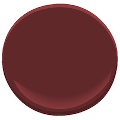
The dark luscious Dinner Party red (AF-300) with a splash of Yellowstone (202)

 (from House Beautiful)
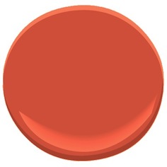
And the soft, sultry gray hue (Elephant Gray 2109-50) with a pop of orange (Soft Glow 014).

It’s almost a curse to adore color as much as I do. But they love me at the paint store!
House Colors with Personality
November 20, 2014 § Leave a comment
Nothing shy about this pretty pink house. And instead of tempering it with neutral (black or gray for the shutters and door), the homeowners went Victorian bold with a rich blue like Ben Moore’s Blue Macaw 784.

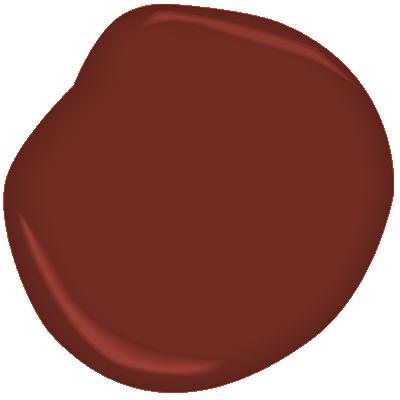
When you have an old house, it’s fun to use old historic color schemes that make a statement. This one certainly does with its two-toned mustard/olive combo clarified with white trim and a traditional brick red door (Ben Moore Cottage Red).

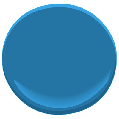
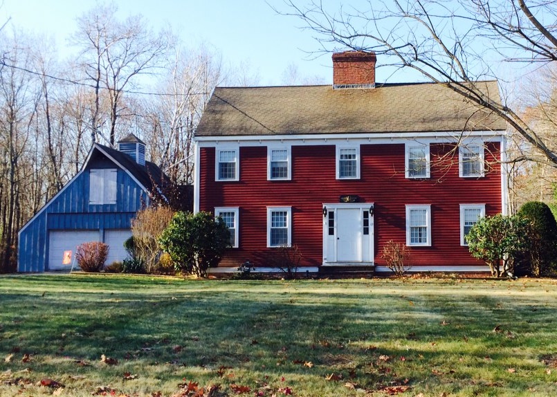
I always love a tastefully done red-white-and-blue scheme, shown here with a blue garage attached to the red house. White (Ben Moore’s Brilliant White) as both trim and accent color pulls the look together.

This dark brown house is a classic New England Cape. Its simplicity is what captures the eye. No accent color needed on this traditional solid wood door with black hinges.

Make a statement in your neighborhood. Tastefully, of course.
Accent Color Ideas for Stone and Brick Houses
November 17, 2014 § Leave a comment
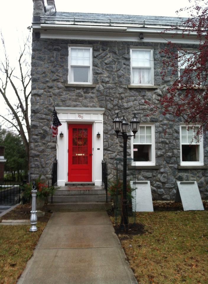
Choosing door or other accent colors for stone and brick homes is easier than you think. If the stone is uniform like this gray, then almost any accent color will work. This homeowner chose tomato red, something like Ben Moore’s Red 2000-10.

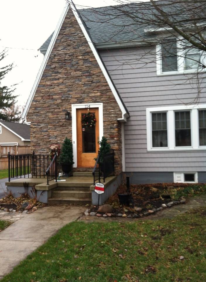
With multi-colored stonework, I like to pick a color out of the palette. In this case, the homeowners chose a gray for the siding and a warm golden color for the natural-wood-stained front door. The orange tone in the wood stain, something like Minwax’s Cherrywood, brings out the depth of color in the stonework and makes the front door warm and welcoming.

For uniformly colored red brick, you can accent with a contrasting color. And the opposite of red, of course, is green. Using a gray-green in a lighter value will prevent the house from looking like Santa’s workshop. Check out Ben Moore’s Louisburg Green HC-113.

Blonde brick is a challenging palette but consider what hues are in the brick and tease them out. Taupe is a safe bet for the siding and a warm accent like Mayflower Red (Ben Moore HC-49) will warm up the front door.

Let the stone and brick of your house speak to you. Sticking to the color palette that’s already there will make your house coordinated and happy.
Which Came First? The house color or the foundation plantings?
October 1, 2012 § 2 Comments
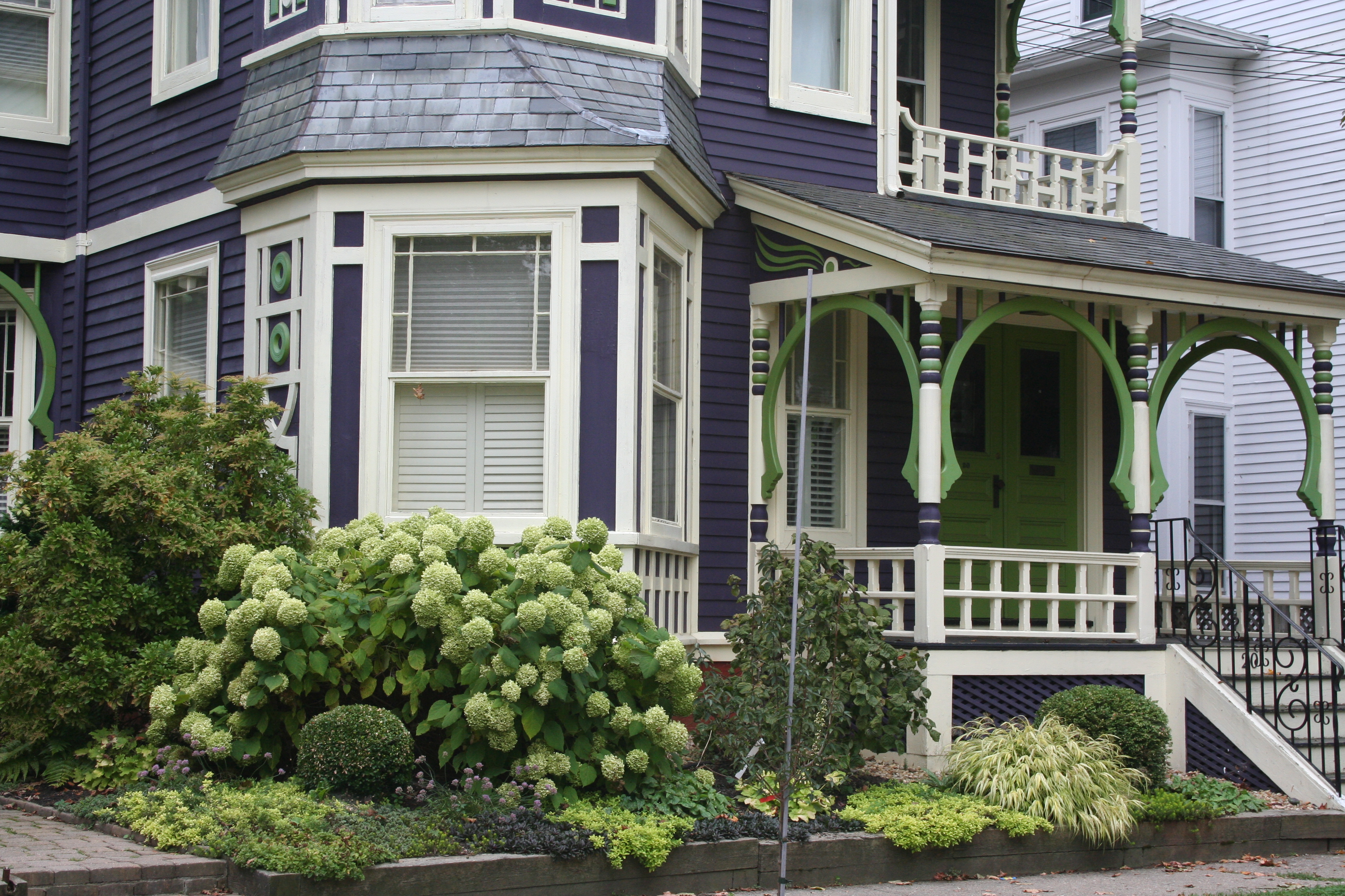 My guess? Neither. Take a close look at the roof, and the house color palette is revealed. The deep purples and greens of that slate roof present a palette the homeowners can use for their house: rich grape for the siding color tempered by a neutral cream trim and lime green for the accent color to highlight the Victorian embellishments.
But the homeowners did not stop there. To enhance the palette and spread the accent color out onto the landscape, they planted a gorgeous lime green Hydrangea coupled with other lime green plants, shrubs, and ground-cover species. Peeking out from under all that greenery is a purple flowering ground color pulling the whole look together.
Not to be matchy-matchy or anything, but this house rocks. There’s just enough contrast to keep our interest and show off the house detail without introducing new colors that might make the house too busy. Afterall, the house itself has so much detail that you wouldn’t want it to get lost in a rainbow of foundation plantings and annuals.
