Something Old Makes Something New
August 25, 2017 § Leave a comment

How do you incorporate antiques and inherited treasures into your decor without creating your grandmother’s house (with all due respect to our grandmothers)? Here are some tips:
-Add contemporary lighting like the drum shade chandelier and standing lamp in the photo (from Rejuvenation) to your traditional decor. You will be amazed what new lighting will do to your room.
-Reupholster treasured furniture pieces in classic, solid fabrics that will keep the pieces timeless from this point forward. Patterns tend to come and go over the decades, and you can date a piece instantly by upholstering it in a trendy fabric. And then you’re stuck with it after the trend is long gone.
-Layer rugs to feature one that is too small to stand on its own in a conversation area.
-Dress windows simply to avoid visual clutter from too much pattern.
-Keep the overall feeling calm in the room. Too many patterns lead to visual clutter, something our grandmothers tended to accumulate over the decades.
-Or add a crazy patterned accent piece to a neutral room. No sense in being TOO serious about our decorating.
-Show legs. Letting the furniture pieces show their legs allows for “air” around each piece and a feeling of lightness in the room. Skirts on all the pieces can weigh them down and make them look dated. (Investigate removing the skirt from an old chair or sofa. I did it and what a difference!)
-For accessories? Cluster them. Avoid scattering them all over the horizontal surfaces. Instead, feature them together on a shelf or display cabinet. That way you’ve contained the clutter while calling attention to the collection as a whole.
Cherish your heritage furniture pieces or your finds from a consignment shop. Embrace them. Love them. And show them off in a fresh new way.
My Dream Living Room
March 26, 2017 § 2 Comments

What makes a living room dreamy? Here’s what works for me.
- A fireplace mantel that can anchor a beautiful inspirational piece of art. This one, “Wild Orange Sherbet” by J.P. Prior, does it for me. Even the name makes me happy.
- A big comfy sofa. I’ve always wanted a curved sofa (this one from Arhaus) as it invites conversation. People tend to sit down and talk with each other instead of staring at the TV (which, you might note, is absent from my dream living room).

- Neutral major pieces. I chose Taft Pewter for the upholstery color because it goes beautifully with the stone around the fireplace, and the color won’t grow tiring. Even if pillows come and go with new color trends, the sofa’s soft, sophisticated neutrality will endure.
- A rug that
 will further define the conversation area
and be cozy underfoot.
This neutral coordinates with the sofa and doesn’t detract from the focal point of the room. - An ottoman is
 an absolute must as it beckons you to put your feet up and relax. With a tray on top, an ottoman serves as a hard surface for drinks and snacks.
 - A pair of perky chairs (opposite the sofa)
 to round out the conversation area and yell “Surprise!” when somebody enters the room. Everybody needs at least one chair in their favorite color.
 - Pillows
 that pull the whole color palette together and come in different sizes and textures and may be swapped out seasonally if you like.
- Finally, a pretty paint color that provides a backdrop for the room but does not compete with anything for attention. For this room, I chose Benjamin Moore’s Classic Gray, OC23.
The whole idea of my Dream Living Room is to set a happy, relaxed tone for the house in a classic and timeless style that won’t look too dated when the next big trend comes along. Keeping the bones of the room classic (hardwoods, architectural details) and the expensive pieces timeless (sofa and large furniture) allows you to play with chairs and accessories and art and have fun.
Create a dream living room in your home. Ahhhh… I like dreaming.
__________________


Sources: Art (“Wild Orange Sherbet” by J.P. Prior). Mantel (MantelCraft). Sofa (Arhaus.com for other living room inspirations). Rug (Arhaus.com). Ottoman (Arhaus.com). Armchair (Dot&Bo). Pillows: Yellow (Fine Art America), Damask (Wayfair), Lumbar Pillow (Pier 1 Imports). Paint: Benjamin Moore, Classic Gray OC23.
Got Personality? Show It
January 19, 2016 § Leave a comment
What does your room say about you? Designer Jeffery Bilhuber (House Beautiful, Feb 2016) infused a boatload of personality and let us know a few other things as well. What this room shouts to me:
- Forget about symmetry. Mismatched end tables are way more interesting than a set.
- Go ahead and mix woods. We acquire furniture from our parents, we find treasures at a flea market, and sometimes pieces have sentimental value. Use them — even if they don’t “match” your decor.
- Add your favorite color to the room. And if you don’t have a favorite, use several. If you keep the colors at the same “hue value” (lightness or darkness of a color), they mix well together.
- Function is important. Don’t forget that you need to set your wine glass down.
- Forget matchy-matchy. This designer has taken that declaration over the top by using two different window shade colors. Bold and impetuous design choice there, but again, the room screams,”I want to be different.” And I applaud that.
- Let color speak in the room by creating a neutral backdrop from which the color can “pop.” Here, the light gray walls and the neutral woven rug give the eye a rest.
- Flowers and the little accessory details finish the room. Without them the room can look cold and staged (too many, of course, and you have a clutter zone).
- Texture matters. That sofa looks so soft. Adding warmth and texture with pillows can warm up anything, even leather.
Bottom line: You’ve heard this before, but it’s worth repeating. Don’t just follow the design trends. Let your room reflect who you are and what you love.
Spring Into Unexpected Color
January 22, 2014 § Leave a comment
Designers are adding pops of color to the previous year’s light neutral color palette and in the most unexpected places. Look up for an opportunity to add color to your white kitchen. Pull some of that ceiling color down into the room with dishes, placemats, and other accessories. And create “flow” between rooms by adding a touch of your ceiling color to the adjoining room.
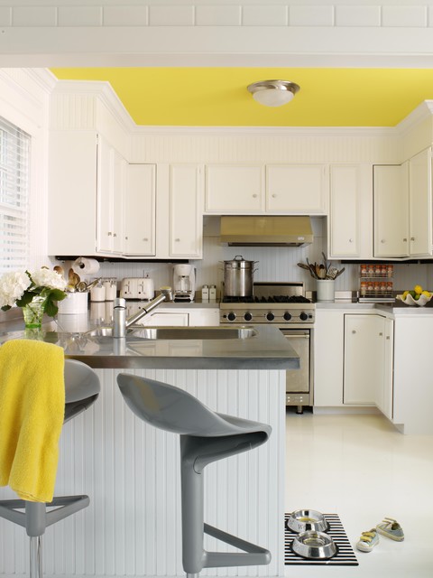
Color trends like this year’s fuschia are fun when you can add the color with inexpensive pillows or a single upholstered chair (http://www.worldmarket.com/product/fuchsia-nina-chair.do). Keeping the base of the room neutral lets you change your color palette when fresh new opportunities arise. Or with the seasons.
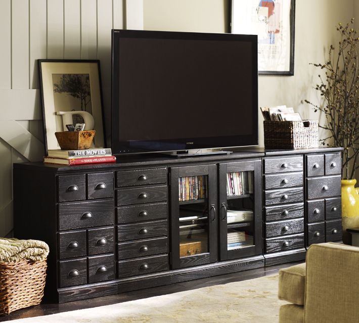
That Huge TV is so Ugly — What to do
January 21, 2014 § 2 Comments
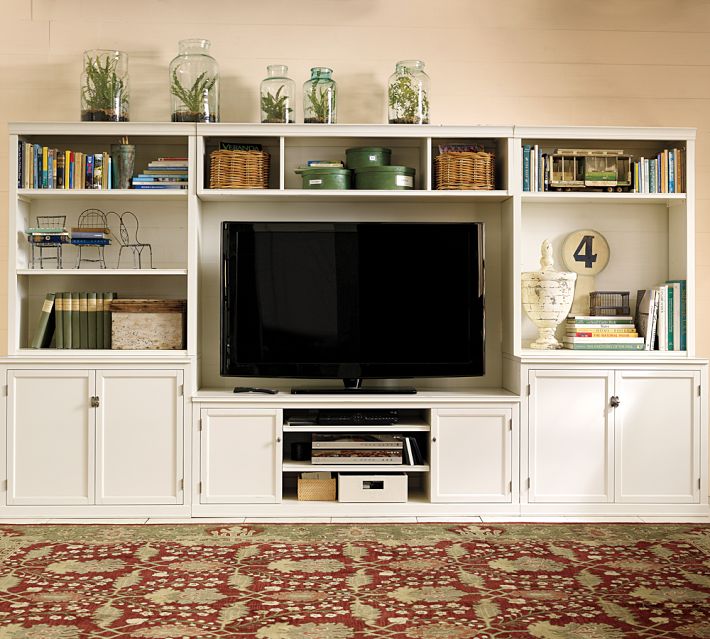 Electronics have plagued designers and esthetically driven homeowners since the demise of the TV console with doors. We’re now learning to embrace the large shiny black rectangle.
If you are trying to disguise your elephant in the living room, blend it. A black cabinet and other black accessories will help to camouflage the electronic “stuff of life” better than a white or light-colored cabinet will. See how the TV pops out of the white cabinet? And the bigger the TV, or course, the bigger the pop!
Try camouflage in your home office as well. Dark charcoal gray is another wonderful color for blending printers and monitors and other less-than-attractive devices so necessary to our everyday existence. Computers and TVs (etc.) are functional. We don’t necessarily want to see them.
Do You Know How Easy This Is??
January 18, 2014 § Leave a comment
 This update, to state the obvious, is the easiest project short of rolling paint on a wall. So easy that many of you will skip over this post or roll your eyes that I’m even mentioning it. But just in case you are still looking at stained seat covers on your kitchen chairs, you have no more excuses.
- Turn the chair upside down.

- Take your handy-dandy screwdriver (yes, you should have your own) and twist out the 4 screws.
- Next, go to your local fabric store and pick out a nice pattern and color that will look good in your room.
- Buy 1 1/2 yards (of a 50-54″-wide) fabric. If you’re at JoAnn’s Fabrics and Crafts, go to the “Home Dec” section so the fabric is sturdy enough to hold up. You don’t want quilting cotton — too flimsy.
- Lay the fabric upside down on a large table or the floor. Place your seat upside down on the fabric and cut out the new seat cover, leaving at least a 2-3″ margin after you lift the fabric up to cover the sides of the seat. Cut the fabric. (Don’t stress about the cutting — the edges are not going to show.)
- Next. If you don’t already have a staple gun (sigh), you need one. So many uses.
- Pull the fabric taut over the seat and put one staple in the center front underside of the seat.
- Turn the seat around and pull the fabric taut again putting one staple in the center back underside of the seat. Repeat with the sides, making sure the fabric pattern is straight (turn the seat over and check).
- Then pulling the fabric taut, staple the fabric onto the seat, moving toward the corners. Fold the corner pieces and staple underneath.
- Trim the fabric excess. Turn the seat over. Place it back on the chair and put the screws back in.
VOILA!
Pick Paint Colors Last — yes, Last
January 15, 2014 § Leave a comment
 So often I am called to a freshly painted room and asked to help the homeowners find a rug and window treatments to go with the new wall color. As much as I appreciate the homeowners’ enthusiasm for tackling the paint project first, it makes finishing the room much harder to start with the paint.
If you’re planning a room re-do and anticipate purchasing new furniture, window treatments, and a rug, here’s the most efficient order of purchases:
- Pick the biggest-ticket item first, perhaps the new upholstered or leather sectional sofa.
- Then pick the other furniture, like upholstered chairs and a leather ottoman.
- Then pick the rug. There are fewer options at that point, but the rug will introduce additional colors into the palette and you can bring those other colors into the room with art and accessories.
- Then if you want fabric window treatments, pick the fabric next that will complement the other elements.
- After ALL those decisions are made, THEN it’s time to pick the wall color.
There is a multitude of paint colors, shades, and tones from which to choose, but the paint decision will actually present itself more clearly once all the other major decisions are made. And the paint color will then pull the whole room together.
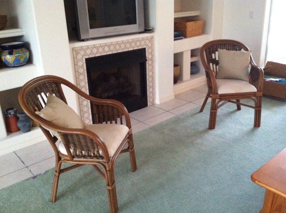
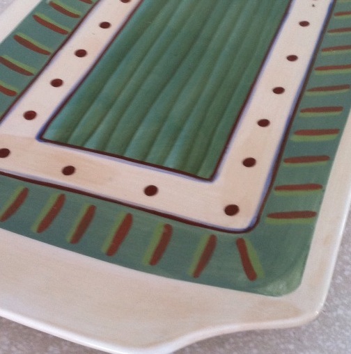
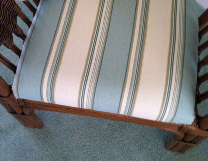 If your furniture and rugs a
 re neutral, you can find your color inspiration from almost anywhere, including in this case, a hand-painted platter. From that inspiration piece, we pulled in a striped fabric to cover some rattan chairs, and pulled the soft, gray-green paint color out at the end to complement the blues.
Furniture Arrangement Challenges May Call for Different Furniture
January 16, 2013 § Leave a comment
When it comes to furniture placement, some rooms just will not cooperate. With bay windows, bow windows, niches, dormers, and other odd architectural challenges, where on earth do you put your sofa? One solution is to forget the sofa altogether and replace it with a circular arrangement of very comfortable chairs, either all matching for a formal look or all mismatched for a casual eclectic look.
Either way, the arrangement gives you an instant, inviting seating area where you can sit down with others and have a cup of coffee or read the paper. In this photo, the designers put a round coffee table for holding popcorn, drinks, books, and just about anything else. But as you know, I’m a big fan of the big overstuffed ottoman– what I consider to be the perfect piece of versatile furniture– so that would be my choice for the center.
If you simply cannot figure out where to place your living room sofa, consider moving it to the family room or wherever the TV is. Replace the sofa/loveseat/chair concept with four comfy upholstered chairs. You’ll love the change.
Hop the Trend: Consignment Stores
December 29, 2012 § Leave a comment
Okay, I admit it. I am a consignment store junkie. And with good reason. Not only is it “green” to furnish your home with items that have been around awhile, it’s amazing what you can find for a fraction of the retail price for a new item. And the consignment bug has started to spread to my clients. During one project, we were looking for a settee of a specific length to fit in a tight spot. Tricky to find new anyway unless we went custom. My client decided to check out the local consignment store, and he found the perfect piece. Even the legs and wood color were perfect. Call it luck or call it karma.

The Cannery Exchange in Newport Beach, CA. (photo credit: Jody Tiongco)
I am convinced that these vintage pieces have a soul — they certainly have a history visible by the lovely worn patina on the arms or the scratches on the tabletop. But every scratch has a story attached to it, and that story comes with the piece to its new home.
You can always paint and recover a chair, for example, if you want a painted furniture look. Again, you’re probably starting with a chair that’s far better constructed than what you can find now so you’re already ahead. It’s like finding a piece of gently worn designer clothing or better yet a piece with the tags still hanging on it. Bonus!
Give your home some character by adding a piece or two of consignment furniture. But beware. You might catch the consignment bug too.
What’s All the Buzz about Undertones?
December 28, 2012 § 5 Comments
Determining a beige color undertone (defined by color expert Maria Killam as “a colour applied under or seen through another colour”) can be tricky. Beige can have one of several undertones: pink, yellow, or green are the basics. If you have dining room furniture with a decidedly yellow/orange hue and walls with a pink undertone like Benjamin Moore’s Georgetown Pink Beige HC-56, then yikes, you have a problem. Off to the paint store.
Bottom Line: Mixing pink-beige with yellow-beige (or yellow/orange) is a big no-no. Fix: Choose a paint with a different (non-pink) undertone like Benjamin Moore’s Monroe Bisque HC-26 that has a yellow undertone and looks great with the golden oak.


If you avoid the mistake of mixing pink and yellow undertones, you’re on your way to understanding them. The other nuances of what undertones to mix and not to mix will come much easier. Note: Mixing pink and yellow vibrant hues is perfectly okay. It’s just the dreaded undertones that can trip you up. Beware.
