Balancing Color, Pattern, and Neutral
August 21, 2017 § Leave a comment
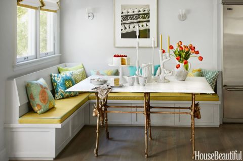
There is so much to love about this breakfast nook (designed by Martha Angus and Katie McCaffrey), I’m going to dive right in.
What’s to Love?
-The light gray walls. By staying with a light cool neutral on the wall color, you allow the pops of warm vibrant color to do just that: pop.
-The simple breakfast nook construction in the same wall color. What happens? The banquette disappears making the room look bigger and less chopped up.
-The wood floor. No doubt it carries throughout the public space making the whole house feel open and unified.
-The table from Paris (yeah, I know). The point is that the table is a unique piece and it’s not only functional but a conversation piece and a memory back to a really nice trip.
-The black and white print. Sure, you can add a vibrant picture there, but the neutral wall hanging allows the colors to take center stage. And they do.
-The yellow leather cushion. It’s yellow but in a fabric that’s easy to wipe up. Essential.
-And those pillows! In colors that coordinate with each other but refuse to look matchy-matchy. (And you just know that the rest of the house pulls colors from that lovely summer palette.)
Take Home Message:
If you want to show off color (or many colors), don’t overdo it. Leave spots empty and devoid of pattern for the eye to rest. And pick a palette of colors (5 is a good number) that you can carry throughout the house in various ways — wall color, furniture, art. The result will be a home that is balanced, unified, has flow from room to room, and that makes you happy every time you open the door.
Luscious Paint Colors: Warm Brown
April 5, 2016 § Leave a comment
 What is more welcoming in a home than rich warm color when you open the door. There are no rules that say your walls have to be a shade of white.
If you would like to add rich color like this Warm Apple Crisp (Benjamin Moore 1091) to your home, here are some guidelines:
- Make sure you have adequate light to show off the true hue. Natural light is best with big open windows that allow the depth of the color to show without making the room into a cave.
- Contrast the walls with white — trim work, furniture, accessories — so that the wall color “pops.”
- Pick an accent color from the opposite side of the color wheel to add interest. Since brown is a darker version of orange, blue is its opposite on the color wheel. There is something so fresh about that combination. Insert your accent color with art and accessories like the big, light blue egg on the shelf.
- When choosing colors for one room, consider adjoining rooms. Colors should flow from room to room so this warm brown wall color in the entryway was plucked from the adjoining kitchen cabinetry
 thereby connecting the two rooms and making the house feel bigger and more pulled together.
 - Add cute dog for cozy family feel.
Brown is a wonderful color for making a large space feel more intimate or a small space feel warmer, and it is a great way to bring out the depth of color in the woods in your room. Try it!
Green Decorating: The Soothing Hue
March 17, 2016 § Leave a comment
St. Patrick’s Day brings us to thoughts of green. Whether it’s kelly green or any of the variations thereof, green is a versatile, natural hue that brings life and comfort to any room. It is particularly nice in rooms where you spend time revitalizing your mind and body.


Waking up in a green room warms a cold, white, snowy day and cools a hot, humid summer morning. It can bring the color of lush plants and trees to a city skyline view. And it can calm an agitated, overextended lifestyle at the end of another hectic day.


Green can be either warm (yellow-green) or cool (blue-green), and both pair beautifully with white. Coordinating accent colors can add energy (the complementary reds and pinks, opposites to green on the color wheel) or quiet blending (the analogous yellows and blues on either side of green on the color wheel).
I highly recommend adding green, even a mixture of greens, to your home to quiet and soothe your soul. Wherever you need a few moments of ahhhhhhh.
Paint colors above: Top left to right: Waterscape SW 6470, Topiary Tint SW 6449, Honeydew SW 6428, Breaktime SW 6463. Bottom left to right: BM Guilford Green HC-116, Palisades Park BM 439, High Park BM 467, Dartsmouth Green BM 691.
Do You Know How Easy This Is??
January 18, 2014 § Leave a comment
 This update, to state the obvious, is the easiest project short of rolling paint on a wall. So easy that many of you will skip over this post or roll your eyes that I’m even mentioning it. But just in case you are still looking at stained seat covers on your kitchen chairs, you have no more excuses.
- Turn the chair upside down.

- Take your handy-dandy screwdriver (yes, you should have your own) and twist out the 4 screws.
- Next, go to your local fabric store and pick out a nice pattern and color that will look good in your room.
- Buy 1 1/2 yards (of a 50-54″-wide) fabric. If you’re at JoAnn’s Fabrics and Crafts, go to the “Home Dec” section so the fabric is sturdy enough to hold up. You don’t want quilting cotton — too flimsy.
- Lay the fabric upside down on a large table or the floor. Place your seat upside down on the fabric and cut out the new seat cover, leaving at least a 2-3″ margin after you lift the fabric up to cover the sides of the seat. Cut the fabric. (Don’t stress about the cutting — the edges are not going to show.)
- Next. If you don’t already have a staple gun (sigh), you need one. So many uses.
- Pull the fabric taut over the seat and put one staple in the center front underside of the seat.
- Turn the seat around and pull the fabric taut again putting one staple in the center back underside of the seat. Repeat with the sides, making sure the fabric pattern is straight (turn the seat over and check).
- Then pulling the fabric taut, staple the fabric onto the seat, moving toward the corners. Fold the corner pieces and staple underneath.
- Trim the fabric excess. Turn the seat over. Place it back on the chair and put the screws back in.
VOILA!
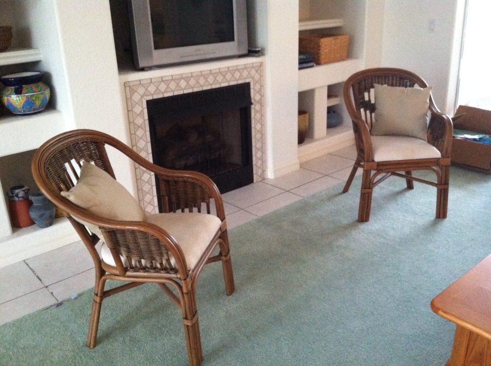
Furniture Arrangement Challenges May Call for Different Furniture
January 16, 2013 § Leave a comment
When it comes to furniture placement, some rooms just will not cooperate. With bay windows, bow windows, niches, dormers, and other odd architectural challenges, where on earth do you put your sofa? One solution is to forget the sofa altogether and replace it with a circular arrangement of very comfortable chairs, either all matching for a formal look or all mismatched for a casual eclectic look.
Either way, the arrangement gives you an instant, inviting seating area where you can sit down with others and have a cup of coffee or read the paper. In this photo, the designers put a round coffee table for holding popcorn, drinks, books, and just about anything else. But as you know, I’m a big fan of the big overstuffed ottoman– what I consider to be the perfect piece of versatile furniture– so that would be my choice for the center.
If you simply cannot figure out where to place your living room sofa, consider moving it to the family room or wherever the TV is. Replace the sofa/loveseat/chair concept with four comfy upholstered chairs. You’ll love the change.
Does Your House Welcome You Home?
December 18, 2012 § Leave a comment
Other than your golden retriever, what says “Welcome Home” better than an open, organized, well-lit, warmly decorated entryway. Isn’t it nice to swing open the door, hang up your keys, dock your cell phone, stash your purse, and find a free hanger for your coat? … That rarely happens, you say? Still tripping over sneakers and backpacks? Gotcha.
Well, how about a New Year’s Resolution to start with the entryway — whether you come in through the garage or the front door, it doesn’t matter. There are so many organizing ideas available now to help you customize an entry to fit your family and lifestyle. And although some require talent with power tools, there are many other options including stackable cubbies and DIY shelf systems that will tame the clutter.
Light woods and white are wonderful in entryways that lack natural light. But if you have large windows, any favorite wall color will look great. Consider choosing an accent color from an adjoining room to give you the “flow” you’re looking for.
Before you tackle any other in-home projects this coming year, make sure your entryway welcomes you home.
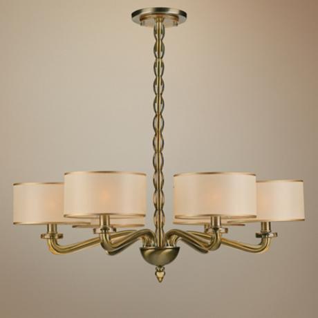
Getting Down to Brass Tacks about Brass
December 11, 2012 § Leave a comment
What a difference a decade makes. What used to be the lighting 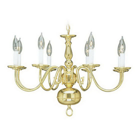 fixture of choice in upscale homes is now (still, even after several years out of favor) being tossed in a dumpster by young home owners who view the shiny yellow metal as the equivalent of how we viewed our grandmother’s dark brown paneling. Of no value.
Instead there are dozens of metal choices and finishes for lighting and other home accessories like light switch covers and doorknobs. So anti-shiny-brass are today’s home buyers that some are just shy of insisting that even all shiny brass door hinges be switched out to something else.
Note: these design trends may be regional and they don’t apply to historic homes so don’t panic if you love your brass chandelier and it fits your home’s decor perfectly. But If you are not happy with your shiny traditional yellow brass chandelier in your dining room or kitchen, you have three options:
1) Thumb your nose at metal color trends and simply wait for shiny yellow brass to come back in style. Kind of like you kept your go-go boots and bell bottoms from junior high. Yes, both trends came back around but not quite the way they looked in the late 60s. But still, doing nothing is always a design option.
2) Paint the shiny brass chandelier a different color. I once stood on a ladder, leaned over the dining table and painted my client’s brass chandelier first with a base coat of matte black to cover all the sheen and then a faux finish of browns and oranges to simulate a rustic bronze finish. It worked. The house sold.
3) Replace the old chandelier with a more current brass option like this one. The metal is toned down (antiqued) and the candelabra bulbs are covered with contemporary silk drum shades — a traditional yet updated look. Honestly, the antique brass has been around forever, and it went through a period of disfavor right around the time the shiny metal took over. But the muted finish, with updated shades, is back and looking good.
What Color Should I Paint My Ceiling?
November 29, 2012 § 266 Comments
The ceiling is the fifth wall and many decorators and designers feel that keeping the ceiling white is like “throwing a sheet over the room” (Christopher Lowell said that years ago). But there are a few conditions to consider before painting the ceiling anything other than white:
1) Is your ceiling heavily textured? In many old houses, the ceiling is patterned (and God forbid, “popcorned”) and therefore very difficult to paint well. Also, painting it anything other than white will call attention to it and maybe that’s not what you want. One solution is to have your ceilings replastered to match your walls and painted, but if that’s out of the question, I would stick with white.
2) Is your ceiling a smooth plaster? If so, you should definitely paint it. How lucky you are! See below for what color.
2A) Is your ceiling really high? If so, you can paint it virtually any color that goes with the rest of the room. If you’d like to bring the ceiling down visually, consider a color darker than your wall color or a warm color (both will advance and appear to bring the ceiling down to a level that’s more in scale with your room). Also consider adding crown moulding if it’s not already there. The moulding will also bring the ceiling down by calling your eye’s attention to it. And it really finishes the room.
|
|
|

2B) Is your ceiling low or average height? Consider painting it a tint of the wall color. If your walls are a medium blue, then your ceiling would be the very lightest blue on the color swatch or even lighter (white with a dash of blue). This will help to round out the room and make the ceiling part of the overall decor — not just that white sheet over the top.
3) Does your room have enough light? Bright white ceilings do help bounce light back into the room so if your room is already dark, pay special attention to the ceiling color. White can be used effectively, but light tints on the ceiling will also reflect light. Just avoid a ceiling color that is going to absorb all the light and leave the room dark.
4) Are you painting a guest bath? I like to paint the wall color right up over the ceiling in a guest bathroom. Doing that makes the room feel larger by blending the walls and ceiling together and avoiding sharp lines and corners. Or do something kind of exotic on the ceiling, like the Moroccan tent (see photo above).
5) Are you painting a bedroom? In what other room do we lie around and stare at the ceiling? Why not paint it something interesting. In a bedroom, the sky’s the limit (literally) — from puffy blue clouds on a backdrop of sky blue to a quilt of squares in different colors (Candice Olson did a fabulous multi-colored geometric ceiling in a master bedroom). And in kids’ rooms, the ceiling is just one more space to use your creativity.
Hope this helps the “Do I paint the ceiling?” dilemma.
houzz, Pinterest, and the Barrage of Creative Ideas
November 20, 2012 § Leave a comment
At last count, there were 867,525 spaces on houzz.com to feed your quest for inspiration. Hours — days –of poring over photos of beautiful designs. And then there’s Pinterest where, by their account, “millions of new pins are added every week.” Is anybody out there feeling overwhelmed by the sheer volume of ideas??
If you are planning a renovation, big or small, to any part of your house, here are a few tips to avoid creative overload:
-Realize that not every good idea will work in your home. Although that wall color online looks spectacular with the view of the ocean out the window, the same color may look completely different in your room with limited natural light. When you’re choosing wall color, start with your own home, the lighting you have, and the colors, furniture, and artwork in other rooms. A beautiful wall color inspiration is most likely already there.
-Stick with what you love, not something you think you should love because it’s fashionable. As we all know, trends come and go, and unless you want to re-do your home with every new trend, your home will be defined by the period in which the trend was popular. Look at metallic wallpaper from the 70s, for example. If you love it, then go for it. But try to avoid catching a wave only to find yourself tossed up on the beach in a year or two.
-And finally, unless you’re well organized at assigning ideas to a particular project or room as they come cascading into your head via web sites and social media, then focus on one project at a time. Try to avoid mission creep unless you have the budget and time to devote to starting and, most importantly, finishing all your projects. You will be bombarded with ideas and inspiration that may have you ripping up carpet in your family room when you really wanted to work on the bathroom first. Stay focused.
Enjoy the opportunity to see how millions of other creative people have transformed their homes. We are truly living in an age of enlightenment bordering on informational hysteria. Try and stay calm.
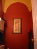
The Renaissance of Wallpaper: With a twist
September 17, 2012 § Leave a comment
 The first thing my husband did when we moved into our house many years ago was rip a long piece of wallpaper off the bathroom wall. “We won’t be keeping this,” he proclaimed. Well, I wasn’t planning to start a bathroom renovation that afternoon (I had to hide the ugly blemish with towels for months), but he certainly had the right idea. All the wallpaper came down eventually and was replaced with paint.
Many of us have visions of homes with old faded wallpaper and knick-knacks everywhere or rooms where every available inch of real estate was covered: ceiling, switch plates, wastebaskets– even the window treatments matched the wallpaper.
The rebirth of wallpaper that we’re experiencing, however, is far different from what you lived through in your grandmother’s parlor.
1) Contemporary wallpaper makes a bold statement either with color, texture, large graphic design, or all three.
2) The wallpaper is a feature of the room, like a piece of art, and not simply a wall covering upon which to layer a hodgepodge of family photos, diplomas, and other objects of interest.
And that’s the major difference. It’s more about what else is going on (or not) in the room and less about the wallpaper itself. Contemporary use of wallpaper involves a more judicious placement in areas like the focal wall in a foyer (as in the photo), the walls in a guest bath, the headboard wall in the master bedroom, and the walls above wainscoting in the dining room. The wallpaper is also selected to be the appropriate scale in the room (you won’t see so many little tiny pink flowers anymore). And the furnishings in a room with bold, contemporary wallpaper harmonize with it, both through color and fabric design and scale.
So be adventuresome. If you’re feeling like your room is just a little too blah, even after you’ve painted a fresh new color, try wallpapering an accent wall. Just for fun. Your grandmother would be proud.
