What Color Brings You Joy?
January 23, 2019 § Leave a comment
As I type the title into this blog post, I am struck by how nearly impossible that question is to answer for somebody like me who loves almost all hues. How would I ever pick a favorite? But some people have no problem.
In the latest House Beautiful (Jan/Feb 2019 issue) amidst the usual articles about paint color trends and new wallpaper patterns, a spread jumped out of the magazine when I turned the page. Designer Kristen McCory and editor Emma Bazilian lay out a color palette that I would not expect to see in a Connecticut home.
There in a high-gloss fuchsia fiesta was a fireplace surround and mantel popping out of the living room wall. And there was more! A hot pink antique secretary and a raspberry velvet settee left no doubt as to the intentions of the designer. The homeowner wanted Pink. (That’s Benjamin Moore’s Gypsy Pink on the mantel.)
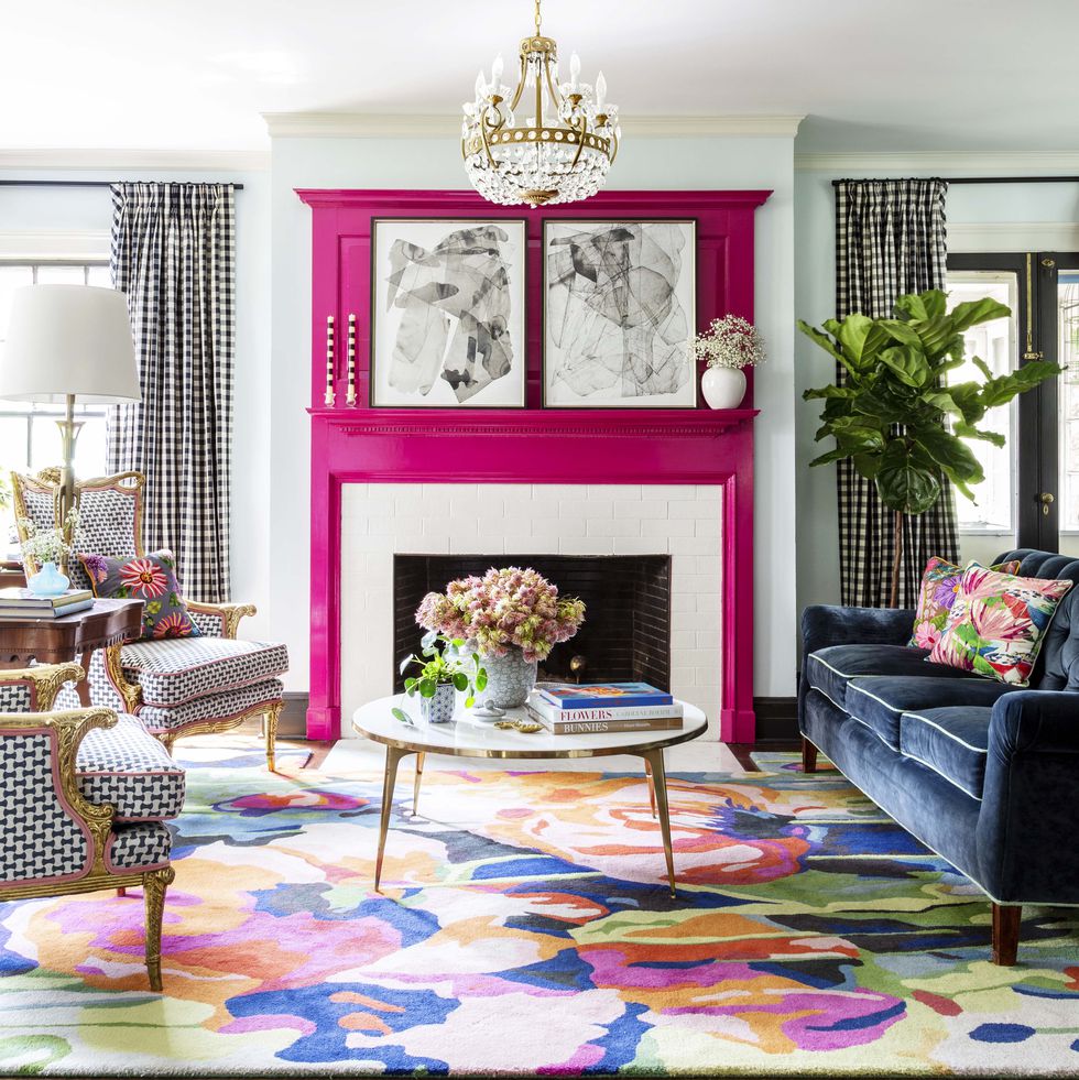
But the story gets so sweet when we discover that the pink is a tribute to the homeowner’s 99-year-old grandmother whose favorite lipstick was Revlon’s Parisian Pink. And that is what brings me to ask “What color brings YOU joy?”
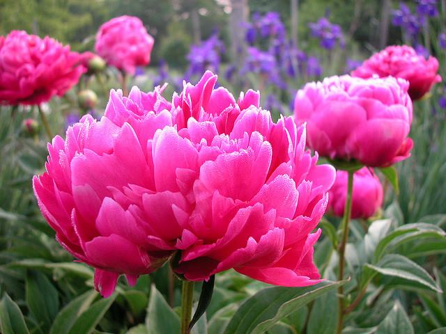
For me? I guess I’m kind of in a Pink frame of mind these days — it’s bitter cold outside and that warm pink hue brings joy to my heart when I stare at it long enough. Witness my Facebook page yesterday —>
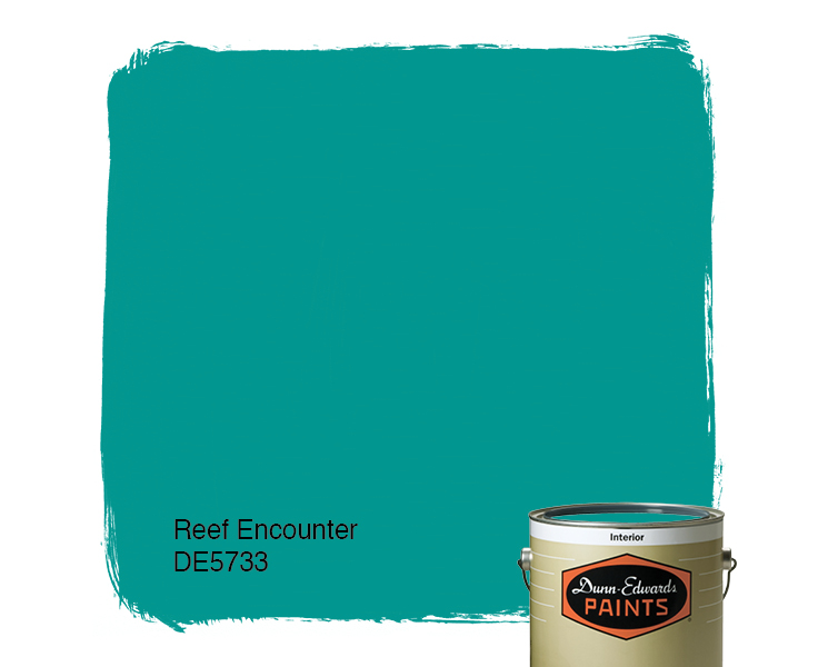
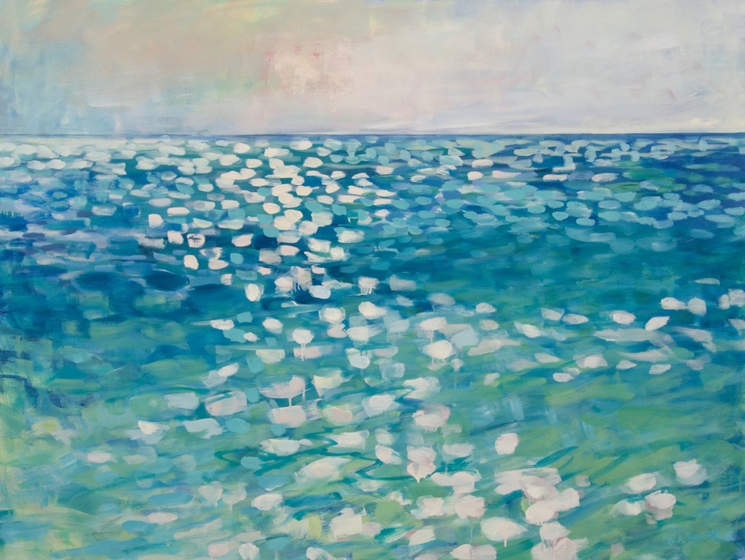
But by Spring I know I will have put all the warm colors into the closets and brought out blues to cool the house down and bring me newfound joy. I’m not sure what it is about turquoise, teal, and aqua that I love so much but maybe it’s what those colors represent to me: in this case, last year’s vacation with my precious sister! When I see ocean blues now, I think of her and it brings me joy.

Whatever color brings you joy (always or maybe just right now) … embrace it. Wear it, decorate with it, and share it with others. Don’t worry about keeping up with trends that make others happy. When clients tell me they want a color for their kitchen that is the same color as their best friend’s kitchen, I always push back a little. It never fails. What looks good in somebody else’s house is inevitably a big fail somewhere else. Don’t pick a yellow front door because your neighbor has one. As we say so often these days… You Do You.
What Color Brings YOU Joy?
The World’s Favorite Color? Where Have I Been?
February 22, 2018 § Leave a comment

Late to the party here, but better late than never. At least that’s what I said to myself yesterday when I scrolled onto THIS beautiful hue and found out that it was crowned The World’s Favourite Colour. No great surprise since it represents some of the world’s most exquisitely beautiful treasures like Bali — an island so gorgeous its name alone sounds relaxing.
Last summer there was a questionnaire sent out — ’round the globe, as it were — to find out which color appealed to the most people. (I totally missed it! Arrrgh!)

“The competition organised by Hull 2017 UK City of Culture and paper merchant GF Smith invited people to select their favourite shade online by hovering over an infinite palette of shades with their mouse until they landed on the colour they found most appealing.”
The winner was this rich teal that nature inspires and artists incorporate to capture the beauty that surrounds us.
The closest paint color approximation I could find was a Duron Paints shade, Sea Sphinx. 
But there were others:

There are plenty of other ways to introduce the color into your decor — window treatments, accessories, and more art, of course.
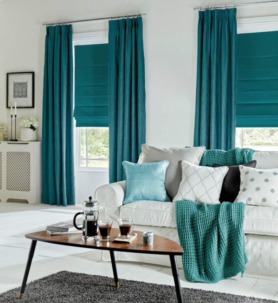
On an accent wall of Marrs Green, this art pops!

And so does this one!
Though I have blogged about “teal” before, I guess there’s a reason. It appeals to vast numbers of people worldwide. It is a little bit blue, yet a little bit green. It’s the warmest ocean color and a color that appears in natural gems and plant life. It is rejuvenating in all its forms.


")
It looks great with the full green/blue spectrum and all its values, and it forms a calm backdrop to pops of heat. Marrs Green — The World’s Favorite Color.
Pink Doors and Why They Work
February 5, 2018 § Leave a comment
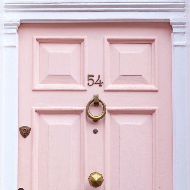
Pink — a trend we’ve been watching for the past couple of years — is no longer labeled, as my mother used to say, SS&G (sweet, simple, and “girlish”). On the contrary. The color keeps popping up with some staying power, and where it has grabbed my attention the most is at the front door.
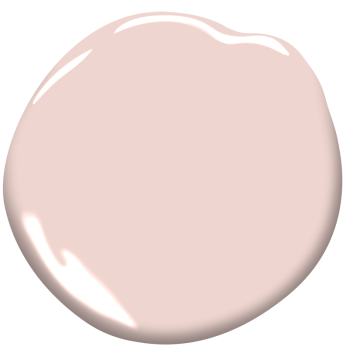
This Pleasant Pink by Benjamin Moore is a comfortably sophisticated hue that blends rose with peach and a touch of gray undertone that keeps it from looking too bubble-gummy or baby’s room. Antique brass metal hardware (as on the London door above) will give the color an aged quality that keeps it from looking too trendy.
Why does pink work so well as a door color? Because it compliments many exterior house colors and coordinates with pinks and whites and purples in the landscape plantings. Here are a few ideas:
Behr’s Road Less Traveled from the 2018 palette is a soft mushroomy gray brown that coordinates nicely with stone walls and wooded environs and looks fabulous with white trim and a pink door. And although cherry blossoms do not last very long, for a few weeks out of the year your house will have traffic slowing down to take photos.


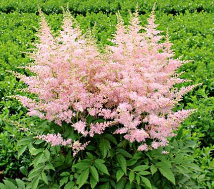
Another house color that looks great with a pink door is gray– it’s a classic combination. This gray, Benjamin Moore’s Stormy Monday, paired with pink creates a quiet traditional combo whose matched undertones make the marriage work. Pink perennials in the yard draw your eye to the coordinating front door.

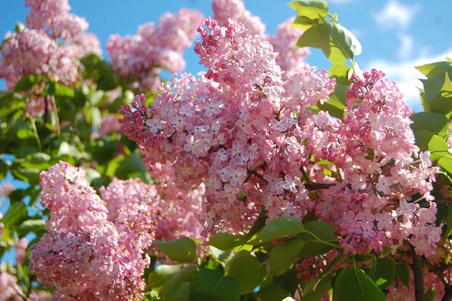
Three other colors paired with pink create quite the wow factor and a stunning bush of pink lilacs ties the whole look together.
Charcoal Blue, a Sherwin Williams color, offers the most drama. Not for everyone, but a dark navy house can be very striking, and the softness of the pink door creates a balanced look paired with silver-toned metal door accessories.
Farrow & Ball’s Slipper Satin is a gorgeous color to paint both siding and trim. Paired with a pink door and a dark brown porch deck and oil-rubbed bronze accessories, you’ve got your drama.
Finally, we have a dark charcoal, Glidden’s Flagstone Grey, that also coordinates well with stonework and contrasts beautifully with pink.

![farrow-ball-sample-pot-slipper-satin-2004-22227-p[ekm]480x480[ekm]](https://i0.wp.com/yourcolorcoach.blog/wp-content/uploads/2018/02/farrow-ball-sample-pot-slipper-satin-2004-22227-pekm480x480ekm.png?w=156&h=156&crop=1&ssl=1 "farrow-ball-sample-pot-slipper-satin-2004-22227-p[ekm]480x480[ekm]")

As you contemplate freshening up your home’s exterior this Spring, see if a glossy pink door with fresh hardware might be the answer to enhanced curb appeal. If you change out the door hardware, don’t forget to match the porch light– an inexpensive upgrade that can make a huge difference. Add a fresh door mat and pot of pink annuals on the porch step and brace yourself for compliments.
Happy Thinking-About-Spring Day, Everybody.
Change Your Front Door Color
February 8, 2016 § 2 Comments
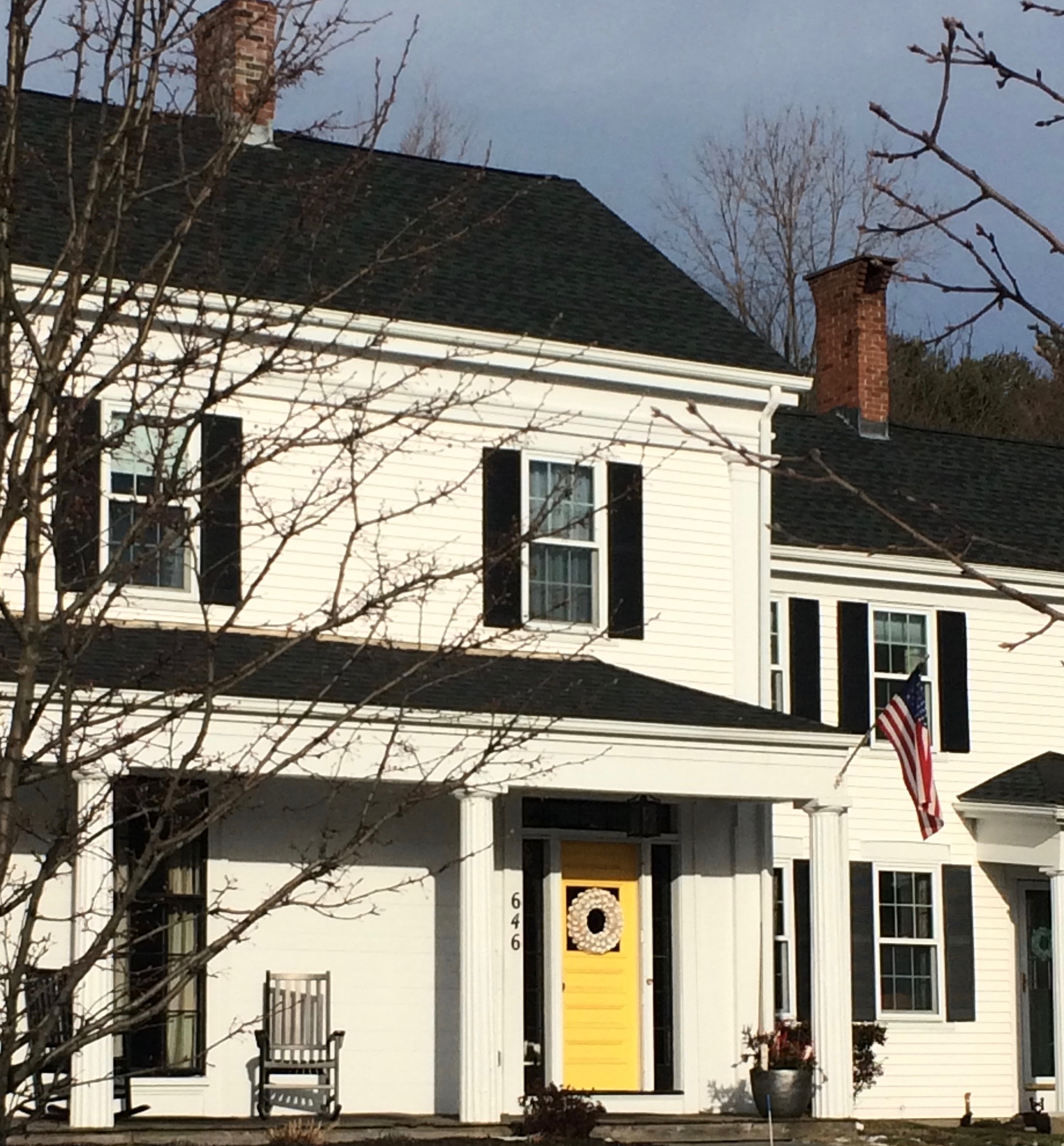 Driving through a little town recently, I glanced around as usual, admiring architecture, making a mental note about what color combinations to try and which ones really do not work, and generally looking for color and design inspiration. One house called out to me as I cruised by — quickly I made a U-turn and headed back for a closer look. Like a beacon of happiness, the bright, sunny, yellow door popped off the crisp, white house with black roof and shutters. What a stunning house to drive home to every day.
February seems to bring thoughts of Spring and those quick and easy, yet big-bang-for-the-buck house projects. And the front door color is one of them. If you’re tired of black or red for the front door, and particularly if you have a white house, there is no reason to keep the status quo. Shake it up. What is your favorite color? What color are your spring flowering shrubs? What color does your front door want to be? (Okay, that last one may be a bit weird, but you get it.)
Guidelines for choosing a new front door color:
- Make sure that new color shows up at least two other places in the front yard, for example, in the landscape plants, flower pots, patio umbrella, or other accessories.
- Consider a brighter sheen for a softer paint color. That will add life and a little pizzazz to a color that doesn’t stand out too much on its own.
- Realize that if your front door is under a porch overhang, the color of the door will darken. Go a bit brighter unless, of course, you get full afternoon sun shining on the door. In that case, go a bit darker.
- Give yourself choices. Try three different colors and look at them at different times of the day and in different weather conditions. Don’t rush the decision.
So this year, while you’re skimming through seed catalogues and planning your Spring garden colors, choose a new front door color too. You’ll love how it brightens your spirits.
Enough about Neutral–I’m Craving Color
May 13, 2013 § Leave a comment
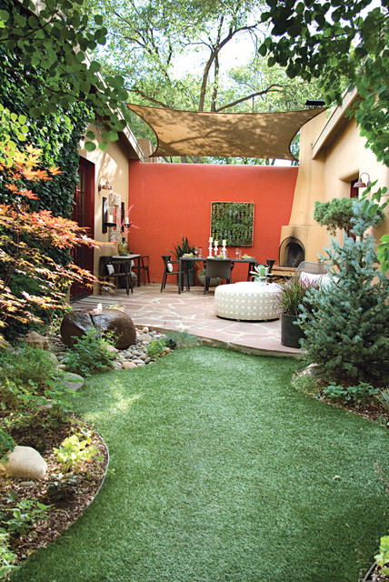
Who says accent walls are so last decade? Not me. I love how a carefully chosen wall or piece of architectural interest can be highlighted dramatically by color.
Here we see how bold color creates a defined outside eating area with all the drama of an interior dining room. Why not! It’s okay to use accent color on the outside of the house to warm up a patio, jazz up a porch wall, or provide a colorful backdrop to a garden. It’s spring. Get out there and do some color!
Which Came First? The house color or the foundation plantings?
October 1, 2012 § 2 Comments
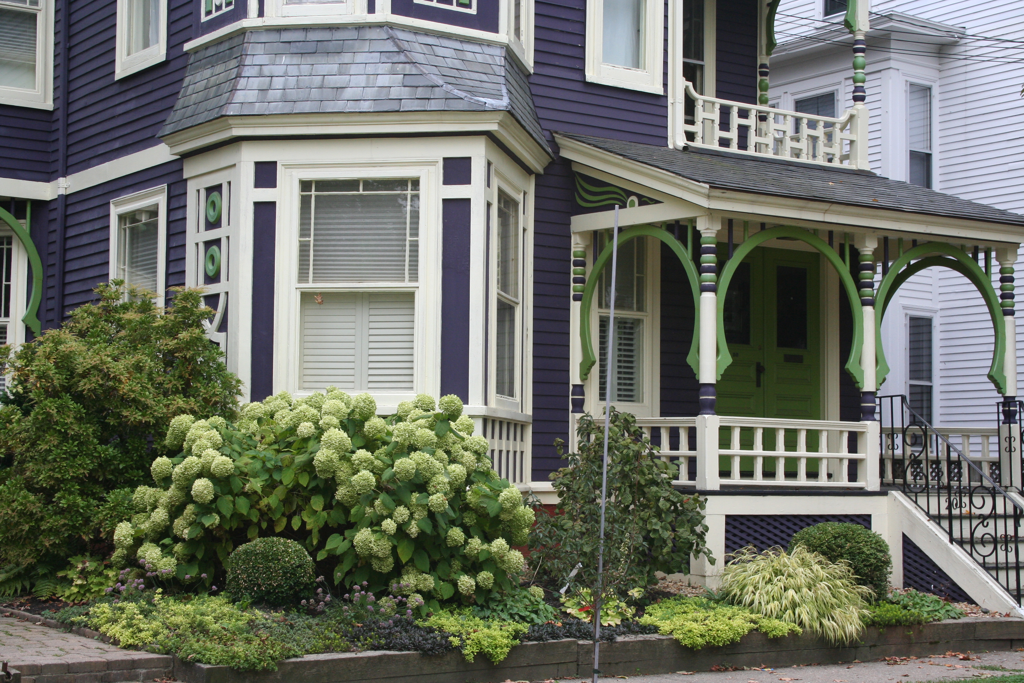 My guess? Neither. Take a close look at the roof, and the house color palette is revealed. The deep purples and greens of that slate roof present a palette the homeowners can use for their house: rich grape for the siding color tempered by a neutral cream trim and lime green for the accent color to highlight the Victorian embellishments.
But the homeowners did not stop there. To enhance the palette and spread the accent color out onto the landscape, they planted a gorgeous lime green Hydrangea coupled with other lime green plants, shrubs, and ground-cover species. Peeking out from under all that greenery is a purple flowering ground color pulling the whole look together.
Not to be matchy-matchy or anything, but this house rocks. There’s just enough contrast to keep our interest and show off the house detail without introducing new colors that might make the house too busy. Afterall, the house itself has so much detail that you wouldn’t want it to get lost in a rainbow of foundation plantings and annuals.
Choosing House Colors: Pine-Green?
February 8, 2012 § Leave a comment
 Dark blue-green pine needles and rich cedar mulch present a warm house color palette perfect for homes that want to sit quietly in a wooded environment or at least conjure up the same.
Although much of the leafy countryside in many landscapes is a mixture of greens, notice that most have a yellow undertone. But not pine green. It leans more toward blue and for that reason can really stand out in a grove of maple trees.
To warm up the cool green shade, add brown and no better place than the roof (a gray roof is fine too but it will keep the house cool). Creamy trim provides contrast between the two darker shades and serves to outline the architectural detail (dark trim will get lost but use it if you are seeking camouflage).
For the front door, why not splurge and get solid wood stained a darker version of the roof color or choose a similar paint hue like Maple Syrup (Ben Moore 1105).  Black wrought iron is the best metal for hardware, lighting and accessories.
Once again, nature’s palette does all the work.
Choosing House Colors: Gray-Blue?
January 24, 2012 § Leave a comment
 You do not have to look very far in nature to find a palette of coordinating colors from which to pluck your house paint chips. This time we’re looking at a glassy pond reflecting the blue of the sky. This blue, however, is not a primary saturated hue but rather a complex shade that has grays and greens in it as well.
 So going to the paint store, you’ll want to move toward the muddy gray part of the fan deck and find your blue there. Stay away from the clear Crayola blues or you will end up with a house color that may in fact glow in the dark.
Look carefully at the colors around the pond and you will find your accent colors. Autumn red for the door, dark woody brown for the front step treads, crisp cloud white for the trim, and pops of golden yellow for your flower pots.
With nature as your color palette, you cannot make a mistake.
Choosing House Colors: Taupe?
January 10, 2012 § 3 Comments
 When selecting the palette of colors for your exterior, use natural materials in the environment as your inspiration. This stonework has all the colors you need for your entire house, from the dark charcoal of the roof to the taupey gray siding and even the orangey brick walkway.
Tying your house color in with its surroundings “grounds” the house — it looks like it belongs there. A house that strays too far from the natural palette looks more like a spaceship that has landed on a foreign planet. Don’t do that to your neighborhood. Save your taste-specific color applications for inside the house.
Choosing House Colors: Lime Green?
January 3, 2012 § 2 Comments
 In many neighborhoods, the homeowners who chose this house color might be run out of town but not in this neighborhood where the color is prevalent in nature. The lime green (bordering on neon) fits right in! We see it here in the rainforest of El Yunque in Puerto Rico. What a happy, stimulating hue! And how appropriate to borrow it for a house color on that island paradise. It helps to pair this strong acidic color with a coffee brown or even black just to balance out the palette.
  But it works.
Use your home’s environment as inspiration when choosing a house color. But if you do not see the color in nature’s palette, then reserve the color for inside. Otherwise, your home might become a lighthouse beacon in the neighborhood. Great for identifying your house in the dark, but that’s about it!
