What Color to Paint Your Big House
February 13, 2014 § Leave a comment
Building a new house or a large addition but beginning to worry that it might look too big in your neighborhood? Maybe a lot of people don’t worry about their neighbors, but some people do. If you think your house might appear overly large-scaled, then avoid painting it white. The contrast against the setting makes white stand out even more than other light colors.
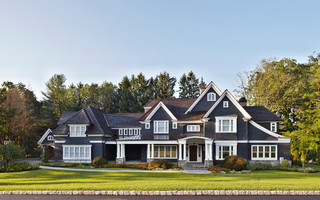
To bring the house down to scale and accent the architecture at the same time, consider a dark color like a dark charcoal or dark green for the siding. Dark trim, of course, will camouflage the house even more, whereas white trim will highlight windows, doors, and roof trim.
Your choice — but becoming the McMansion in the modest neighborhood will not endear yourself to your neighbors. And my how they talk…
Fair warning.
Surprising House Color Trend — White
February 12, 2014 § Leave a comment
Classic but always with a modern twist, white is trending now as a house color on new construction. Whether we’re craving our grandparents’ old homestead, or we like a crisp, uncomplicated look, white is in. White siding with white trim. But the surprise element lies in the accessories. Fresh options include silver for the metal color (not the traditional black), white or pastel door colors (nolonger black or red), medium-toned metal roof colors (not just charcoal shingle anymore), mismatched out-buildings (that old classic farm look is coming back in a big way), and even (gasp!) white shutters on a white house.
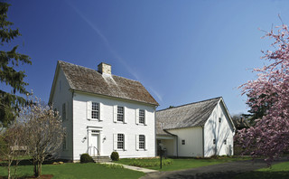
The beauty of white is that it really is timeless. Not only that, but it shows off your colorful flowers and the greenery of your landscaping, the orange patio umbrella and Adirondack chairs, and the turquoise of your backyard pool (okay maybe I’m going a little overboard).
See if a fresh pop of white brings out the character in your house.
Front Door Personality
August 28, 2013 § 6 Comments
 As much as I love eggplant, both as a vegetable and a paint color, it just didn’t work on my house. With the eave creating a shadow, the beautiful, rich purple color only lit up in the late afternoon when the sun hit it just right. For those few moments, the Caponata (Ben Moore AF-650) looked spectacular. Then it went back to black.
So… inspired by some fabric I saw awhile ago with golds and light blues, I ventured into a rarely seen color combination — hey, why not, it’s just paint! The new door and bench are Yarmouth Blue (Ben Moore HC- 150) and although the neighbors have not commented yet, I love it. The house color is Richmond Gold (HC-41) and the trim is Cameo White. I may paint the trim a less-yellow hue in the spring, but for now, it’s fine.
If your front door is in the shadow of a porch or a big tree in the front yard, consider a light front door color, something even (dare I say?) pastel. You may be really pleased with how the lighter door color can change the personality of the house from stodgy traditional to young and perky. See what you think!
Black Brings It
March 20, 2013 § Leave a comment
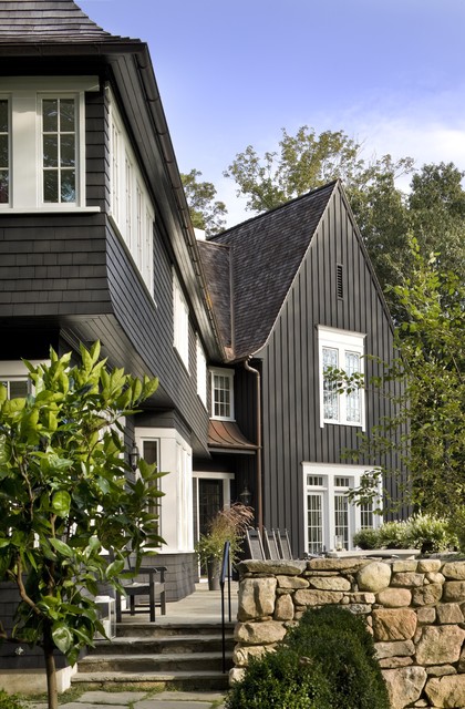
Who says black is not a house color? Certainly not me. Black is to houses what a little black dress is to a stylish woman. A great way to show your stuff.
Black is both dramatic and neutral. It attracts attention and shies away from it. Black blends with almost any environment, yet it makes all other features stand out, like the crisp white windows on this house. Since the trim on the rest of the house is also black, the white windows and window trim take center stage. The natural cedar roof creates warmth and texture. And the bronze gutters look like jewelry.
Another feature that stands out is the rock wall. The backdrop of black allows the depth of color on the rock wall to come forward — much more effectively than if the house were another more typical earth tone.
The mix of siding materials adds an additional layer of texture. The tall board and batten siding on the high gabled section makes a tower of that end of the house. The shakes on the rest bring it on home.
Yes, black maintains its reputation as the color of sophistication. Even for siding.
It’s the House Color, Not Your Dining Room Curtains
February 28, 2013 § 2 Comments
 Sometimes the best house color is one you might skip right over in the fan deck. Like this one: most likely Ben Moore’s Livingston Gold HC-16, a dark mustard-like brown with a definite green undertone. The kind of color you don’t want to see if you’re feeling queazy.
Although you probably would not choose this color for an interior room (for the reasons mentioned above), what a great house color for this old farmhouse with attached garage in natural cedar shakes. The combo is terrific — earthy, aged, and plucked from nature’s rock and wood palette of colors.
I slammed on the brakes to take a photo.
Choosing a Color Palette for Your House: It’s a Natural
January 29, 2013 § Leave a comment
 Another drive-by sighting of some curb appeal. This time, the stone wall pops out partly because of its mix of natural stones (and not just one kind) but also because the house color is drawn from the wall’s palette of natural hues. Even the front steps coordinate nicely with the wall.
Any of the wall’s creams, beiges, browns, and grays would have worked for a paint color, but the builders chose a light creamy yellow for the siding with a beige shingle on the portico. White trim pulls the house together and the black door makes the dramatic statement.
It’s so easy to choose your house color from nature. You cannot make a mistake.
Two Rules for Choosing a Roof for your House
January 28, 2013 § 2 Comments
 The roof — any roof — is a big-ticket item on the house so choosing it can be a little unsettling. There are so many colorful options available that it’s easy to get wowed by the prospect of something other than the traditional charcoal.
When choosing your roof, make sure you follow these two rules to insure a good result you can live with for, say, 40 years:
1) Get large samples of your roof options. Do not choose a roof from a photo on the computer or a little brochure. Make sure you hold the roof sample up against the side of your house to test for color coordination and to see how busy the two are when side-by-side. Stand back at the curb and take a good look. If possible, get the address of a home that has the roof already installed so you can see how the roof looks over a large area. Does it get lighter or darker? Good to know ahead of time.
2) Avoid the clash of the Maximum Definition shingles with the house. If your house is a busy colorful mixture of bricks or stones, avoid the busy “max def” roof as you will create a combination worthy of a major migraine. The photo above (from Owens Corning) is a good example of pairing a busy max def roof style (with its multiple colors) with a house siding that is neutral, painted brick and neutral siding. There is a good balance between the busy roof and the plain, calm siding materials. There’s no doubt that the roof takes center stage. Make sure it doesn’t fight with the siding “understudy.”
If you follow these two rules, you will narrow your options down to two or three reasonable choices and avoid any major, expensive roof mistakes.
Stone and Brick Reveal Your Exterior Color Palette
January 25, 2013 § Leave a comment
 Yes, it’s winter and the roof in this photo is covered with snow, but now we can focus on the rest of the house, particularly the stone. What works on this house is the color palette that is taken directly from the numerous available hues in the stonework itself.
The bricks are a monochromatic rusty red color that complements the stone without competing with it — a challenge when you have multiple materials on the house. The siding is a gray neutral, also in the stone. The trim is pulled from some of the darker taupe stones. How easy is that? Job done.
If you are building a home with different materials, use the busy one with the most colors (stone or brick) to make the rest of your color decisions. That way, the whole house will come together in a harmonious cornucopia of color.
The alternative? Choosing a color that is not in the palette at all. The result? A disjointed effect that divides the house into sections and makes it seem smaller. Can be done, but it’s tricky and needs a professional colorist to pull off. Do yourself a favor and stick with the natural palette that presents itself to you from your building materials.
The Best and Worst House Colors for Cold Snowy Winters
January 24, 2013 § 1 Comment
 As we get more and more snow this winter, I notice what house colors look good in snow and which ones look awful. I’ll start with the thumbs down. White. It either blends away completely except for any contrasting colored shutters or it looks downright dirty. It’s also cold-looking. If you have a white house and a long winter, make sure you have lots of greenery in the foundation plantings, trees in the yard, and a wreath with a big red bow on the front door.
My favorite color for long, cold, white winters is a sunny yellow. Wow, does that color look terrific against the white snow. Try Benjamin Moore’s Concord Ivory http://www.benjaminmoore.com/en-us/paint-color/concordivory. Paired with a black roof, black shutters, and white trim, you’ve got a knock-out house year round.
Color Your Home Happy
January 18, 2013 § Leave a comment
 Whether you live in a deluxe villa or a double-wide, you deserve a happy home. And the place to start is by adding color. Numerous studies have shown that color influences the way we feel and can even be used to describe our emotions (“I’m in a blue mood”).* But what may influence us the most is a lack of color.
The study found that people with depression associated their mood with the color gray. And you don’t have to paint your walls gray to have a gray aura in your home. Take a look around your house, in the corners and shadowed areas and particularly the ceiling. Do you see gray? Do you feel blah? Well then… time for color.
Start by painting your ceiling either a bright white or a tint of your wall color. That will either maximize the light reflection in the room (and bolster your mood) or make the room feel bigger and more open. Either way, you’ll feel better.
Next, if you’re timid about your color-selecting skills and afraid to make a mistake with the wall color, then start small. Add some colorful accessories to the room — pillows, artwork, other changeable items. Doing that will help you create a palette of colors you like without making a big investment or paying a painter to repaint two or three times.
When you’re ready to take the plunge and add color to your walls, try an accent wall first. Pick the wall that you see when you enter the room (the focal wall) and paint that a color you like. Add accents to the room in the same color to pull the room together. Keeping three walls neutral with pops of color on an accent wall and accessories here and there will help you step into the world of color without any Crayola catastrophes.
Note: There is nothing wrong with neutrals and whites in the home. To many people, neutral means calm. But if you are somebody who likes to wear color and you are drawn to color yet your home does not reflect that love of color, then it’s time to add color. That’s what I’m talking about.
*http://www.livescience.com/6084-colors-describe-happiness-depression.html
