Is Your Wall Color Anxious?
March 7, 2023 § 2 Comments
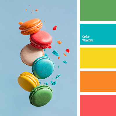
Color psychologists will tell you that colors evoke certain emotions. For example, the warm colors (red, orange, yellow) can generate happiness, stimulation, and excitement (both good and bad). And cool colors (blue, green, purple) can promote calm, relaxation and sleep. In general, we do have a psychological reaction to certain colors, and we associate them with different things. Sometimes they look tasty enough to eat.
Too much of a good thing?
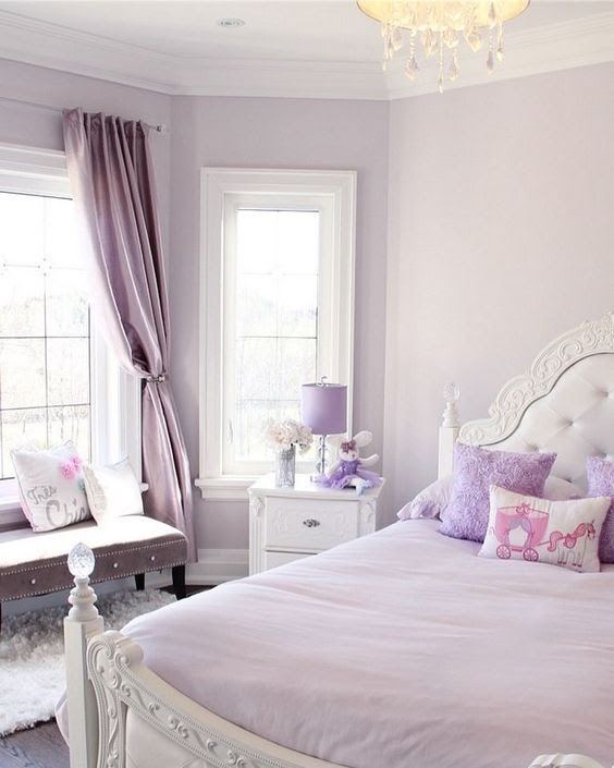
When it comes to creating an end-of-the-day sanctuary for rest and recovery, we need calm, and the cool side of the color wheel is a good place to start. Blue, green, and purple are very popular bedroom colors, for all age groups, but choosing the right version from the fan deck can be tricky. What sometimes happens is that we pick a paint color from the vast display at the store only to roll the actual paint up on the wall and suddenly feel a bit agitated. Partly at not liking the color and partly at the thought of painting it over.
What happened? I thought I was picking a calm color.
Selecting a blue, green, or purple that pops out at you in the store will not necessarily give you a serene room where your toddler can take a nap. Because it’s not the color per se. It’s the saturation that is keeping the room on edge.
So even my wall color needs a therapist?
Maybe. How saturated is it?
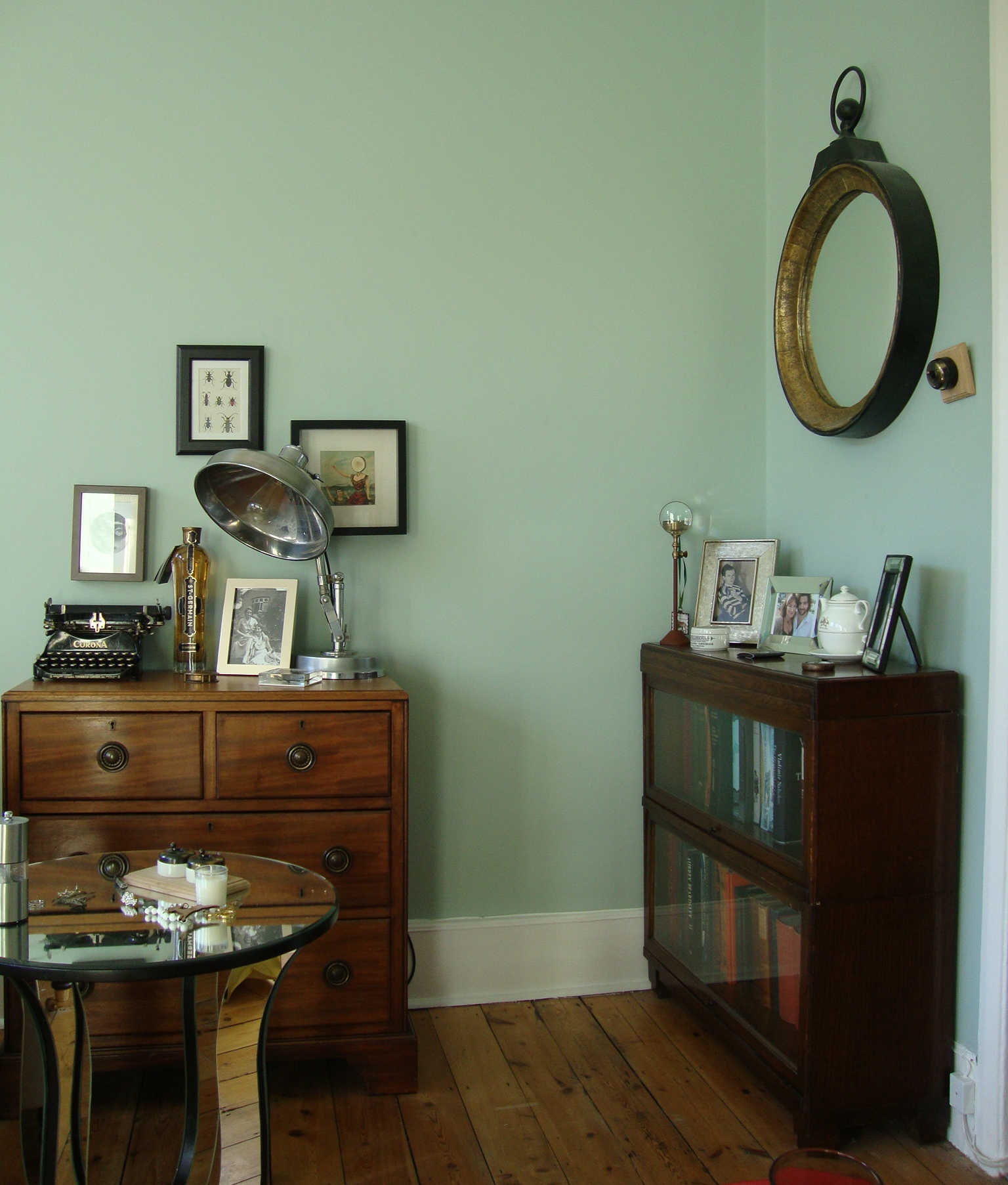
Saturation measures how clear or true a color is. It is the strength of the color often described with words, as Leatrice Eiseman writes in her book The Complete Color Harmony, like “clarity, purity, brilliance, richness, boldness, vividness, and intensity.” You get the picture. Maybe not great for a restful bedroom. For example, royal blue is more saturated than powder blue. In a bedroom, royal blue will shout for attention. The more grayed-down the color, the less saturated it is. In a bedroom painted powder blue, you might not even notice the color.


Bedroom wall color needs to chill.
Again Eiseman describes colors with lower saturation as “subdued, diffused, misty, dusted, subtle, soft, toned-down, muted, restrained, hushed, understated, and quiet.” Perfect for a bedroom. So back to the paint store to find colors with lower saturation that will be restful on the walls of the bedroom.
Can’t I paint the room lighter?
Yes, but going lighter will not make the room calmer — just a lighter value and yes, a little easier on the eyes.
Value measures how light or dark a color is. When you add white to a color you make a tint. The hue (color) gets lighter, and the perception of the intensity changes. It may appear less intense. And that’s important when you are picking a relaxing wall color. Lighter tints are more restful to the eye. To find a tint of a color you move up the fan deck color strip toward the lighter end.


If you add black to a color, you get a shade. It’s darker and perceived as more intense than its lighter version. A dark shade of a color can be very dramatic, and that will influence your color choice. To find a shade of a particular color, you move toward the darker end of the paint color strip in the fan deck.


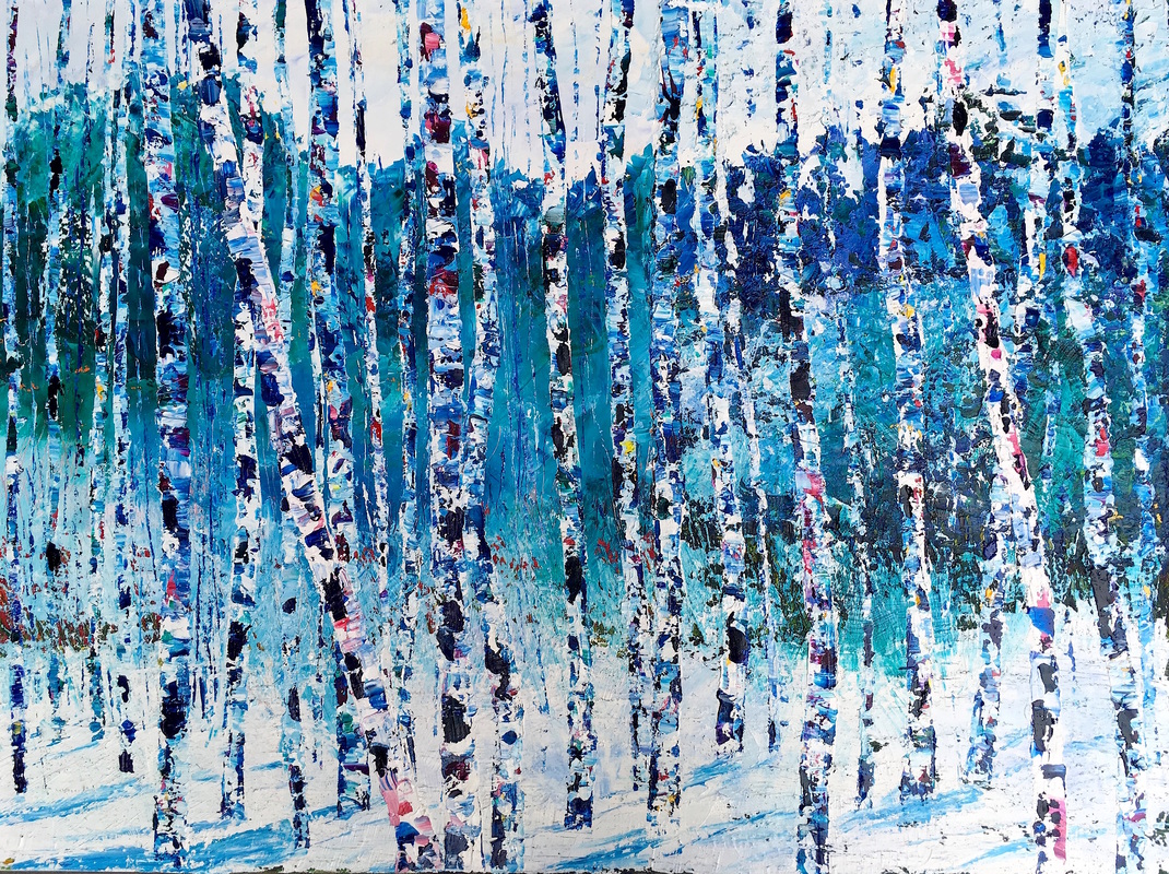
So when you’re picking a wall color for a bedroom, both the Saturation and the Value are important. If the color is too saturated, and there are other colors in the room, it can feel like the walls are vibrating. And that’s okay if you’re going for a room with lots of energy and vitality, like this one.
:max_bytes(150000):strip_icc():format(webp)/225811303_2351425294990524_4394162365566741163_n1-17bd60b7998c436d813211cbca0c5a66.jpg)
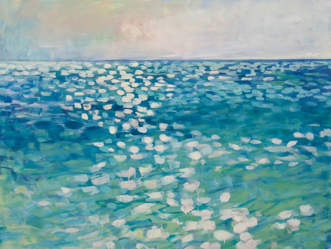
Likewise, if the color value is dark, it may feel more intense than a lighter value of the same color.
Okay, my child wants a bedroom makeover. Now what?
As a mom, I think it’s important to let children pick their own bedroom colors. But having said that… if you are concerned about having to prime over a loud or dark color in a few years when they change their mind or go off to college, you can take the hue (color) that they chose and then move a little toward the gray end of the fan deck. Muting that electric blue just a little will give the walls some longevity and allow your child to live with the color longer.
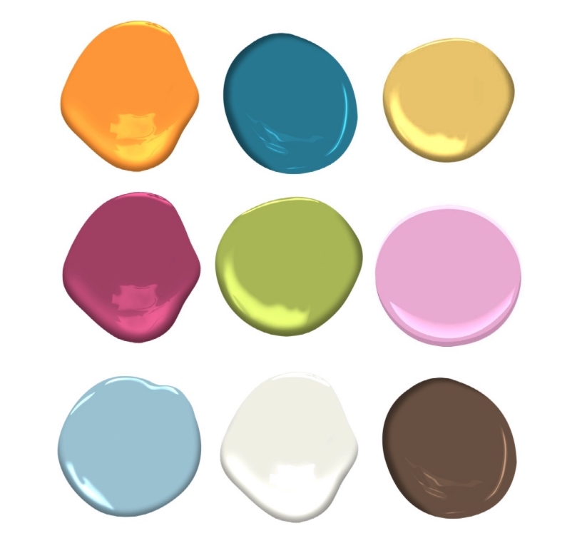
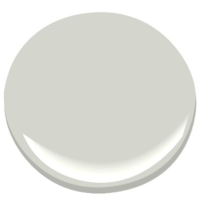
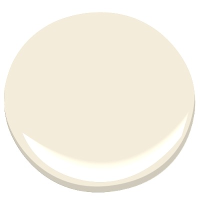
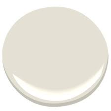
Here are some pairs of examples. The first color is a pure saturated color. The second related color is an alternative that is slightly muted (less saturated) and lighter (in value) as well. The alternative wall color will give you a calmer and perhaps a slightly more sophisticated feeling when you walk in the room. No more anxiety.


When in doubt? It’s only paint. Sleep well!
If you need help with color, feel free to comment below, hit the button for a Color Consultation, or shoot me an email at yourcolorcoach@gmail.com.
I would be happy to help you.
Hope you have a Colorful Day!
Barbara, Your Home & Color Coach
Curb Appeal Refresh: The Front Door
May 22, 2019 § Leave a comment
Some of you may remember when the fashion industry changed the skirt hem length every year — from maxi to mini to midi and then back to comfortably above the knee.
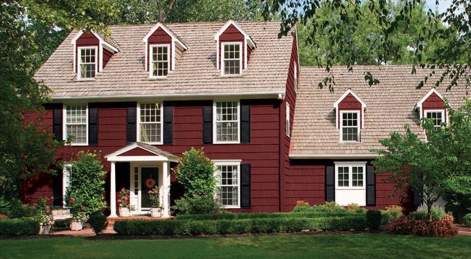
Front door color has followed a fashion trend of its own. A decade ago, red was all the rage — and for some it continues to be the most welcoming front door color. Black with a metal kick plate has always offered a sophisticated read on the front entry. But what has followed in more recent years has been a busting-out of traditional exterior curb appeal. Here’s what front door colors we were talking about just 3 years ago.
So it is time to update those door trends again. No more copycat door-painting just to be fashionable. We’re stepping out of the shade of the porch to a bold new entryway that will set each house apart from its neighbors.
But first, let’s talk about house colors. What has changed:
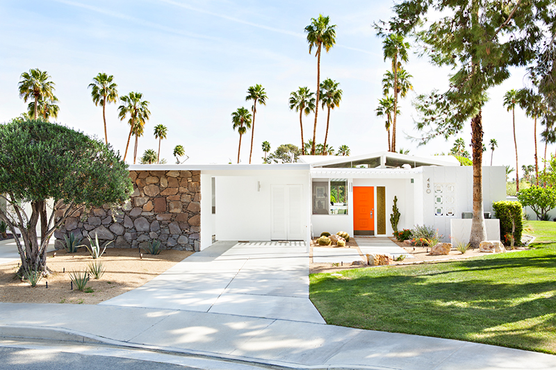
–More white houses. It used to be that white fell to farmhouses and antique colonials. Not anymore. There is plenty of white new construction, which opens up a fan deck of front door options.
–More gray houses. Always a neutral that fits into almost any environment, the gray interior trend moved to the outside and remains. Gray also opens up a fan deck of front door options, maybe just a few fewer than white.
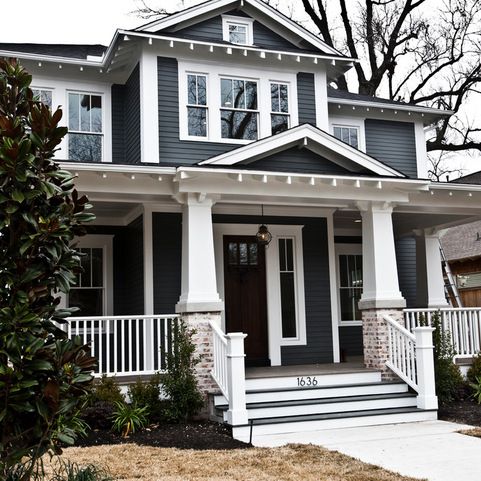
–More Crayola color and less safe beige. Dark and rich are replacing light and airy. Briarwood is moving to Hale Navy. Rich Cream is moving to Merlot Red. Even some developments are providing a rainbow of siding options instead of the light neutrals from years past. <<applause>> If you have a bold red house, you probably don’t need me to tell you what color to paint your front door (lol!), but I’ll offer suggestions anyway.
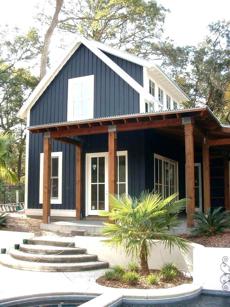
–More midcentury renos, both contemporary and ranch style. With a surge in client interest for open-concept living (uh-oh to that trend, but that’s another story), people have realized that it is easier to update an already open midcentury home with the high vaulted ceilings and the great-room flow than it is to modify a boxy colonial. Big surprise there. So we are seeing a plethora of exterior colors (even black) as a result of these one-story re-dos.
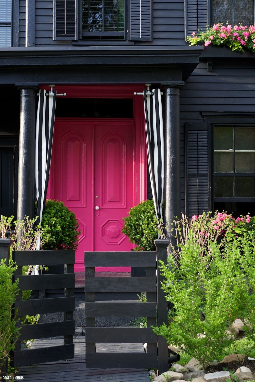
Back to the front door. Here are some ideas for redoing your front door color to refresh your home.
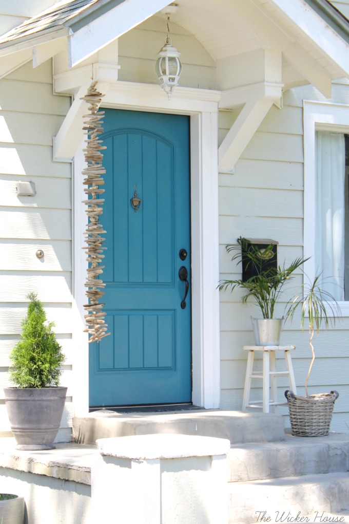
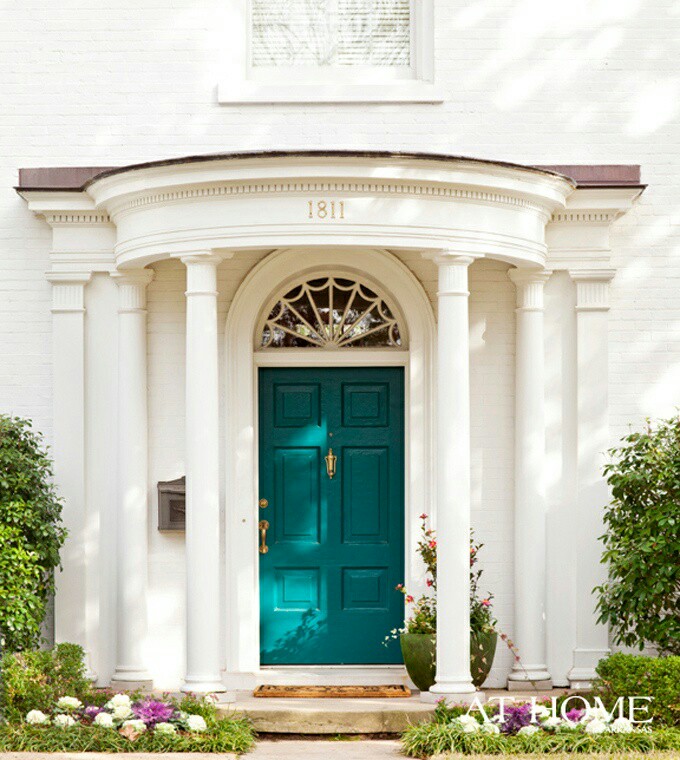
Teal and Turquoise — I cannot believe that I used to recommend turquoise only for tropical house locations or homes that at least had a pool. What used to be a quest to coordinate house colors with the local environment is now a challenge to ignore it. Where teal and turquoise work: on gray, white, black, yellow, red, okay almost every house color except blue. Where they do not work: on dirty or faded house siding (the bright color makes the house look worse) and on other blues like colonial blue.
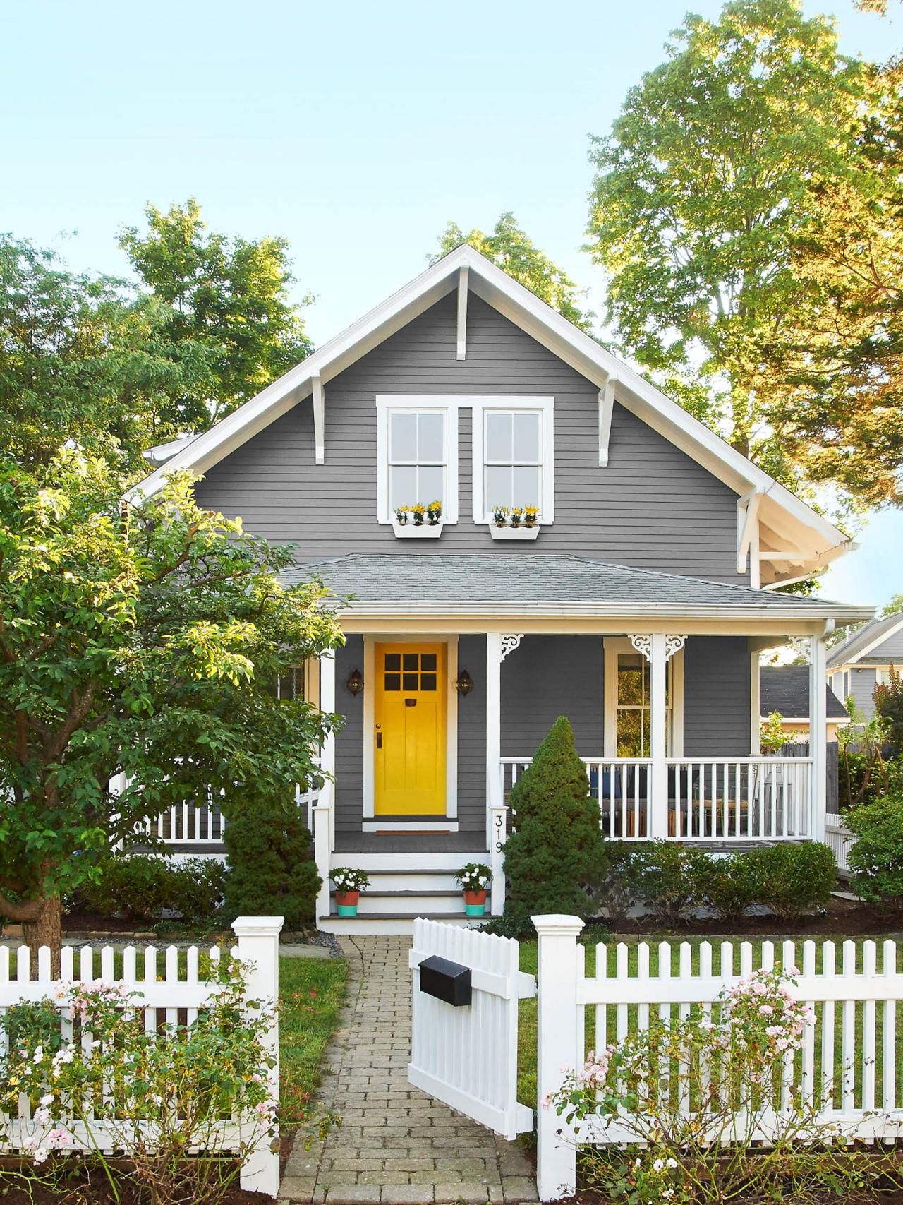
Yellow and Orange — not everybody’s favorite colors but they are so happy. I love them on a front door. Where they work: on dark house colors like navy, green-browns, dark and light grays, neutral gray brick, and white. Where they do not work: Again, on any color that looks faded, aged, or dirty.
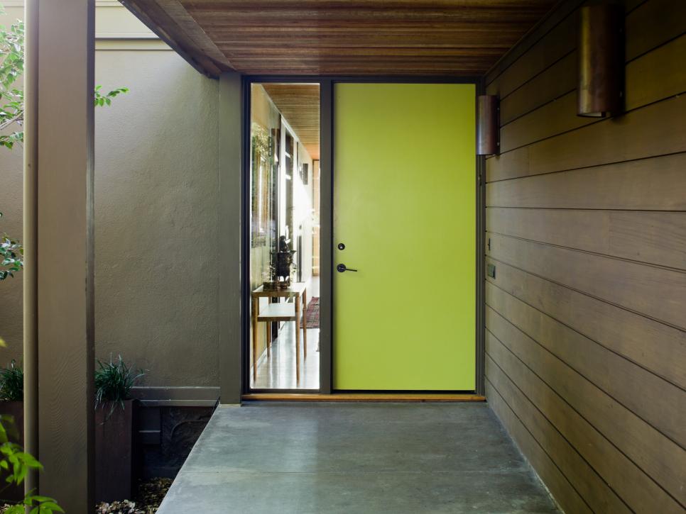
Lime Green — fresh and springy and a wonderful coordinating color for your landscape. Where it works: dark gray, navy blue, even red brick, chocolate brown, black. Where it does not work: any other green or dirty beige.
Pink and Purple – always beautiful on a white house with coordinating landscape trees but also on a dark house for a real pop of warmth in the neighborhood. Where they work: white, gray, navy. Where they do not work: on yellow beiges and orange beiges because of the undertones and on anything that has a faded or dirty appearance.

If the bright colors will not work with your house color, try natural or even white.
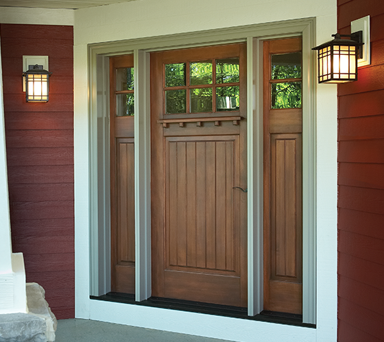
Natural Wood or wood-look – always a classic. Where it works: navy and red, for sure. And just about every other house color.
White — yes white! What white does is make the whole entry area look larger since it blends with the white trim color. It also creates a blank canvas for holiday decor — wreathes, flower pots, etc. There is nothing quite like white as a backdrop to a variety of color palettes around the entryway. Where it works: especially good on a house with a lot of color already and crisp white trim. Also works on neutrals when you want to maintain a soft neutral palette throughout — be sure to add textures though with lots of greenery and baskets or wicker furniture. White also works on aged or faded houses where the bright colors do not. Crisp white perks everything up.

I hope these ideas dazzle your thinking and inspire you to head to the paint store. Happy painting, everybody!
The World’s Favorite Color? Where Have I Been?
February 22, 2018 § Leave a comment

Late to the party here, but better late than never. At least that’s what I said to myself yesterday when I scrolled onto THIS beautiful hue and found out that it was crowned The World’s Favourite Colour. No great surprise since it represents some of the world’s most exquisitely beautiful treasures like Bali — an island so gorgeous its name alone sounds relaxing.
Last summer there was a questionnaire sent out — ’round the globe, as it were — to find out which color appealed to the most people. (I totally missed it! Arrrgh!)

“The competition organised by Hull 2017 UK City of Culture and paper merchant GF Smith invited people to select their favourite shade online by hovering over an infinite palette of shades with their mouse until they landed on the colour they found most appealing.”
The winner was this rich teal that nature inspires and artists incorporate to capture the beauty that surrounds us.
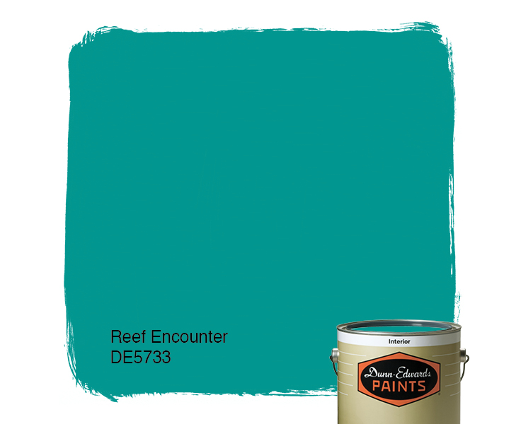
The closest paint color approximation I could find was a Duron Paints shade, Sea Sphinx. 
But there were others:

There are plenty of other ways to introduce the color into your decor — window treatments, accessories, and more art, of course.
On an accent wall of Marrs Green, this art pops!
And so does this one!
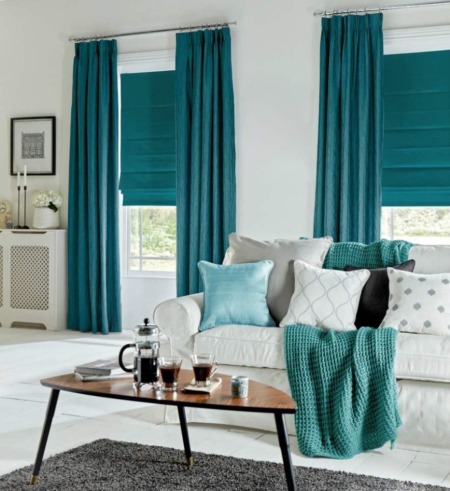
Though I have blogged about “teal” before, I guess there’s a reason. It appeals to vast numbers of people worldwide. It is a little bit blue, yet a little bit green. It’s the warmest ocean color and a color that appears in natural gems and plant life. It is rejuvenating in all its forms.


")
It looks great with the full green/blue spectrum and all its values, and it forms a calm backdrop to pops of heat. Marrs Green — The World’s Favorite Color.
Color Inspiration is Everywhere
February 19, 2018 § 2 Comments
While scrolling through the interwebs today I bumped into this tweet from Architectural Digest highlighting 20 cute items from Walmart. Okay, that I had to see. And I have to agree — there are lots of really “super cute things” that I had not noticed while shopping for cheap soap dispensers.
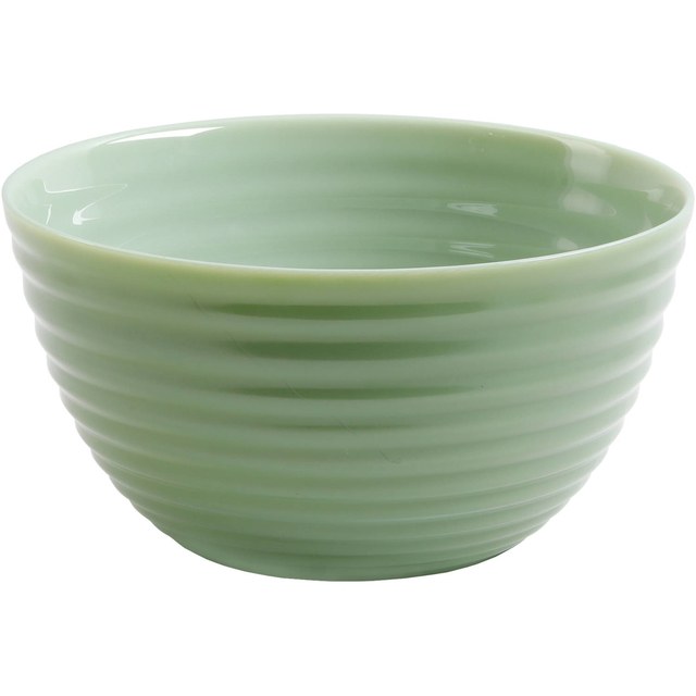
But the item that caught my eye and sent me off to color dreamland was a gorgeous ribbed glass bowl in the most deliciously subtle tones of green. It reminded me of the Farrow & Ball color palette — you know — those paint colors that look like velvet in shades and tones that no other paint company seems to match. There’s something about them (trade secrets, I suspect) that gives a room or a piece of furniture a hue that whispers sophistication. Not one of them will show up in a Crayola box.


Cooking Apple Green No. 32
There are two obvious things that distinguish Farrow & Ball from other more mainstream paint lines: the number of colors (way fewer) and the price (way more). And although many home projects and palettes of colors might not be worth the extra expense because the subtle tonal difference or undertone might not be noticed, I find that the blues and greens in Farrow & Ball are far superior for their soft, sophisticated richness.
Maybe it’s the largess of their English roots (Farrow & Ball is located in the United Kingdom). Or maybe it’s the fewer number of perfect colors (only 132) so that every color decision is a successful one. Or the fact that the company has maintained its original formulation. Or maybe it’s the mystique. But whatever it is … I love it.
What makes F&B different
Regardless of the paint line you prefer, keep your eyes open for color inspirations. They are everywhere — even Walmart.
Escape from the Blues
January 4, 2018 § Leave a comment

Horseshoe Bay, Bermuda
This is a perfect January day in New England. We are completely snowed in, and nothing is more relaxing than hunkering down in a cozy house as the wind howls outside and the snow banks pile up around us. I love winter!
But that doesn’t mean I like the wintery gray, the limited daylight, and the bitter cold that comes with it. The longer winter goes, the more I yearn for an escape to somewhere warm — even if it’s only in my imagination.
Enter the Sherwin Williams Color of the Year for 2018.

It is an opulent teal that conjures up the ocean and all the warmth of summer at the beach. If a midwinter break in Bermuda is not on your calendar, there are other ways to escape the winter cold — visually. Here are some:
Plan Your Spring Projects. It’s never too early to think about Spring projects, and painting your front door is a doable one. Remember to tie the color in with other accessories and furniture around the yard.
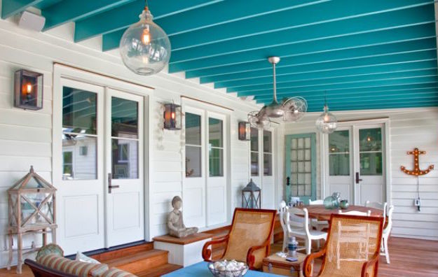
Paint the Fifth Wall. Don’t overlook the ceiling when you’re adding color. Since cool colors recede visually, painting the ceiling a medium teal blue will raise it — like rolling a Utah sky onto your porch.
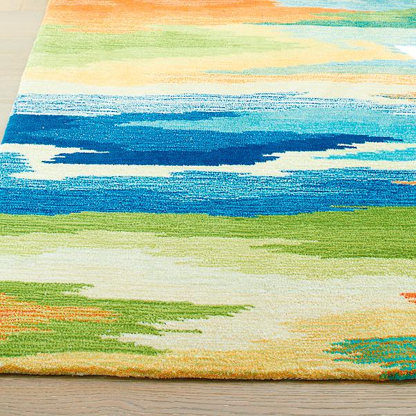
Splash Color Under Foot. Now I’m making it too easy. Add a gorgeous rug and transform your space instantly. There’s something about the combination of blues and greens that soothes and comforts us all. And a rug adds not just color but texture.

Dive into the Pool. Ceramics, art, dishes, pillows, collectibles, throws, lamps… the options for accessories are endless. Be sure when you add a color to your room that you put it in at least three locations to move the eye around the room and create flow.

Enjoy your staycation! With some daydreaming, a little shopping, and a tad bit of rearranging there at home, you can lift your spirits toward Spring and feel warm and cozy at the same time.
Thanks for stopping by!
Behold: The Gloom of Gray is Lifting
December 12, 2017 § 3 Comments

Thank goodness we’re finally moving away from gray, gray, and even more gray. (If you just repainted from Linen White to Silver Shadow, don’t panic though — it will be okay!) As we move into a new neutral trend (yes, Black), here’s some good advice. Don’t jump on it.
What sometimes happens with trends is that people go overboard with them. They think, aha Gray Trend, I must do everything gray! I have been in so many houses that are all gray on the interior. But in New England, where it’s gray much of the time anyway, those interiors are looking pretty dreary.
The goal should NOT be to create a room that looks like it was decorated in a particular period. The goal should be to create a room that is, as the color maven Maria Killam is known to say, “Classic and Timeless.” http://www.mariakillam.com/whats-next-grey-trend/
How do you achieve that? By mixing stuff up. Here are three basic rules:
- Keep the walls a light neutral. There are wonderful shades of whites out there, and most of them don’t read like spackling paste so don’t be afraid to go light. You won’t have to repaint every couple of years if that trendy color you love goes stale. Compromise? Paint only one wall, the focal wall, that trendy color.
- Keep the large, expensive furniture pieces, like the sofa, plain (remember plaid? No. Go with no pattern or just a texture so that the sofa stays timeless. Color is okay, but make sure you love it!) If you have a well-made sofa that you do not want to replace, you can opt for a slipcover (custom is best — but regardless, make sure the cushions have individual covers.)
- THEN mix things up. Add color in the rug, pillows, art, accessories, and other decorative and personal stuff of life that will make your room feel like it’s yours and not a designer’s.
And of course, let me mention the elephant in the room: inherited pieces. Don’t be afraid to mix your styles to incorporate family heirlooms. You will either have an objet d’art with a story behind it or a cozy room with treasures that remind you of home. Either way, do not be a slave to a particular decorating style just because an inherited piece “doesn’t go.” Embrace it!
Now let’s amp up the color for 2018, shall we?!
Orange Twist to the Red Revival
September 18, 2017 § 2 Comments

Apples, pumpkins, falling leaves — there’s something about Autumn in New England that, despite our recent warm temperatures, makes us cozy up to the changing seasons. Maybe that’s why some of us live here.
My newest door color obsession is a revival of the orangey red of another decade, and that may signal the end of the light, neutral, blue and even light lemon yellow door color trend I’ve focused on for the past several years. This red, Million Dollar Red (Benjamin Moore 2003-10) is as perfect on a traditional white colonial as it is on a black modern home. There is no mistaking where the door is — it screams Welcome!
What I love most about it is its “orangeyness.” Orange is a happy color no matter what. So a red on the orange side (versus pink) says this is a happy home. The color also has an updated, contemporary feel as opposed to the more traditional burgundy red (also great, of course, but more serious and refined).

Adding an orangey red as an accent color on the interior is also a great way to torque up the energy. Try it on the back of a white bookshelf, or on a pouf ottoman in the family room, or even on a focal wall in the front entry. A little bit of red warms up a room a lot. So before painting an entire room red, make sure you want to amp up the temperature in there. Using red on items that can be removed in the hot summer makes sense to me: pillows, bedding, throws, and art. Then I look forward to my seasonal exchange when I swap out the cool blue accessories for red.
Enjoy Autumn… whatever it means to you and wherever you are. And love how the color orangey red makes you feel. Warm and Happy.
From Grays to Happy
May 2, 2017 § 1 Comment

Gray has been the wall color of choice for public spaces in the home for a number of years now, and don’t get me wrong, gray is a wonderful neutral to replace the beiges of the previous trend. But you have to admit, gray is not for everybody. And if you live in a dark home with small windows and low ceilings, painting the walls gray might have been a real downer.
Never fear! Color to the rescue! Here are a few ways to make sure your gray room escapes the wrath of a couple of gallons of primer and a roller:
-Make all trim white. That is the best way to keep the gray clear and crisp.
-Make the ceiling bright ultra white. That will reflect the maximum amount of light back into the room.
-Add bright clear color. Bedding, accessories, a rug, and accent furniture (for example, as we see above in the room from Williams Sonoma Home) will help the gray perform its duty as a neutral backdrop instead of becoming the storm cloud in the room.
–Add sparkle. Whether it’s a silver lamp, a crystal chandelier, or some new gold in a brass picture frame, adding metal and glass will provide the finishing touch to the room. Reflective finishes bounce light — like jewelry!
So if your gray walls are bringing you down, don’t despair. Add Color. (You knew I’d say that.)
Torn Between Two Paint Hues
September 5, 2016 § Leave a comment
Gray Owl, Ben Moore
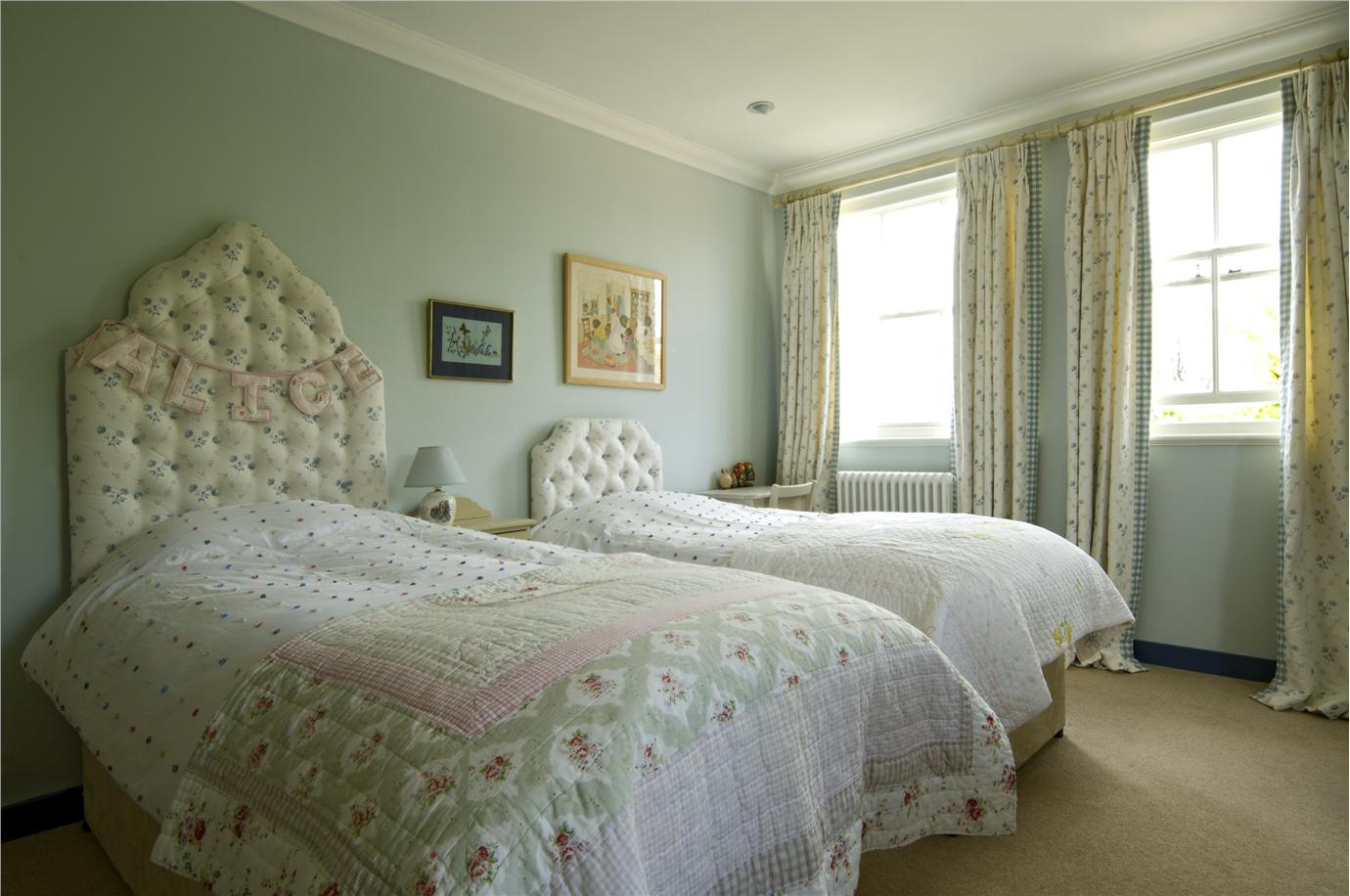
As a home stager, I suggest a lot of paint colors as I help to prepare homes for the real estate market. And by and large, grays are what sells these days. Young buyers grew up with Linen White and seem now to cringe at wall colors with a yellow base. But is gray right for your house?
If you live in an area where the weather is cloudy for much of the time or your house is nestled in the shade, then a gray interior is only going to make your visual life grayer. If you want a fresh gray interior, here’s my advice:
- Make sure you have tons of natural light — big windows with as much light as you can get streaming in the window. That will allow you to see the gray as a distinct, intentional color and not as a shadow of a different color. You know how white and other colors can appear gray in the corners of a room? That’s what I’m talking about. You’ve chosen Gray. So show it off.
- Add white for trim — that will make the gray pop and will avoid any semblance of dinginess. For Pete’s sake, you don’t want your house to look dirty.
- Add some warm color — pillows, a chair, artwork. Just for contrast and to add some warmth when needed. Yellow looks spectacular with gray.
- Pick a warm gray if you live in a cold climate or your room faces North.
- Pick a cool gray for a warmer climate or a room facing South. The color of the light and the season will influence how your room looks. If the room looks cold, chances are that it will feel cold in there too.
- Add wood texture to warm the room. A hardwood floor and other natural wood tones in the room will look sensational against a backdrop of gray.
Linen White
If gray is not for you but you want to get away from the Linen White look from decades past, try one of these halfway gray paint colors. They are warm but not too yellow and will move you in the gray direction without making your house too cool. Now let’s get painting!
Gray Mist (BM)

Maritime White (BM)
SW Color of the Year 2017
September 2, 2016 § 4 Comments
 OKay then! If you hang around long enough…(as they say…)
Taupe is back. The color we’ve spent the last decade ridding our houses of is now Sherwin Williams’ Color of the Year for 2017. Poised Taupe is the color — SW 6039 — and you have to love the description:
“Earthen brown combines with conservative grey and the result is a weathered, woodsy and complex neutral that celebrates the imperfections and authenticity of a well-lived life.” — Anytime somebody celebrates imperfections, I’m in!
But here’s what you should know about taupe. It can change radically with the light and the time of day. What looks a little brown can turn pink, purple, or green depending not only on the time of day but also on the lightbulb. Just so you know. Taupe can have a pink undertone as well that clashes horribly with the orange of a red oak hardwood floor. Another caution. But paired with white like its fan deck sibling Gauzy White SW 6035, a silver metal (not gold or brass), hardwood with a gray undertone, and fabrics in other light neutrals with a pink undertone like Cultured Pearl SW 6028, and you truly have a soft, restful combination that harkens back to those glorious. taupe-filled 50s. That’s 1950s!


Personally, I’m going to ride this one out, but I can appreciate how we’re moving from the grays into the taupes (without the yellow undertone of a previous color swing). Like I tell my clients, just because it’s the Color of the Year does not mean it’s perfect for your house. If you are considering taupe, make sure you have a lot of natural light coming in the window and (hopefully) some modern furnishings, shiny metals and glass. Try to avoid pairing with cherry wood. If you have concerns, talk to me!
Meanwhile, let’s get painting.
