Curb Appeal Refresh: The Front Door
May 22, 2019 § Leave a comment
Some of you may remember when the fashion industry changed the skirt hem length every year — from maxi to mini to midi and then back to comfortably above the knee.
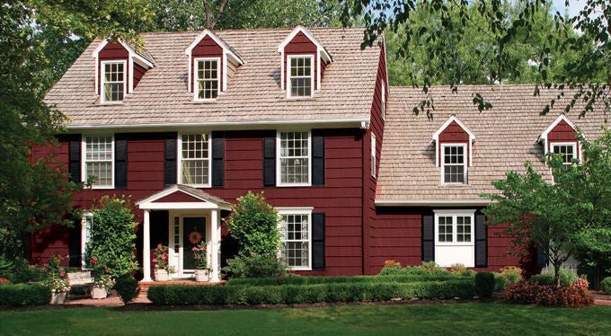
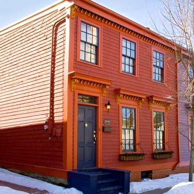
Front door color has followed a fashion trend of its own. A decade ago, red was all the rage — and for some it continues to be the most welcoming front door color. Black with a metal kick plate has always offered a sophisticated read on the front entry. But what has followed in more recent years has been a busting-out of traditional exterior curb appeal. Here’s what front door colors we were talking about just 3 years ago.
So it is time to update those door trends again. No more copycat door-painting just to be fashionable. We’re stepping out of the shade of the porch to a bold new entryway that will set each house apart from its neighbors.
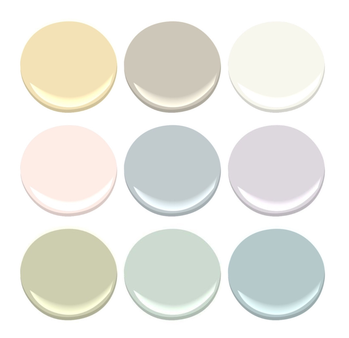
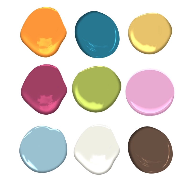
But first, let’s talk about house colors. What has changed:
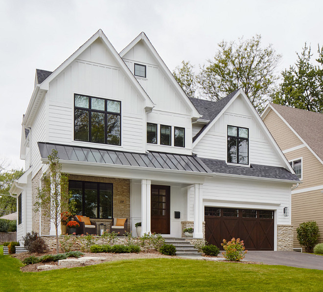
–More white houses. It used to be that white fell to farmhouses and antique colonials. Not anymore. There is plenty of white new construction, which opens up a fan deck of front door options.
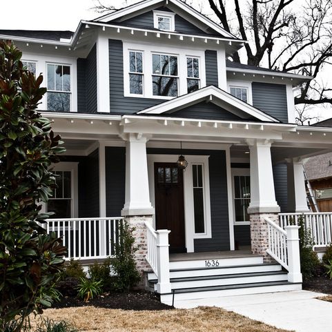
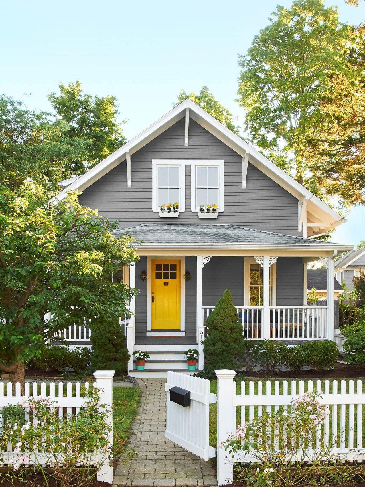
–More gray houses. Always a neutral that fits into almost any environment, the gray interior trend moved to the outside and remains. Gray also opens up a fan deck of front door options, maybe just a few fewer than white.
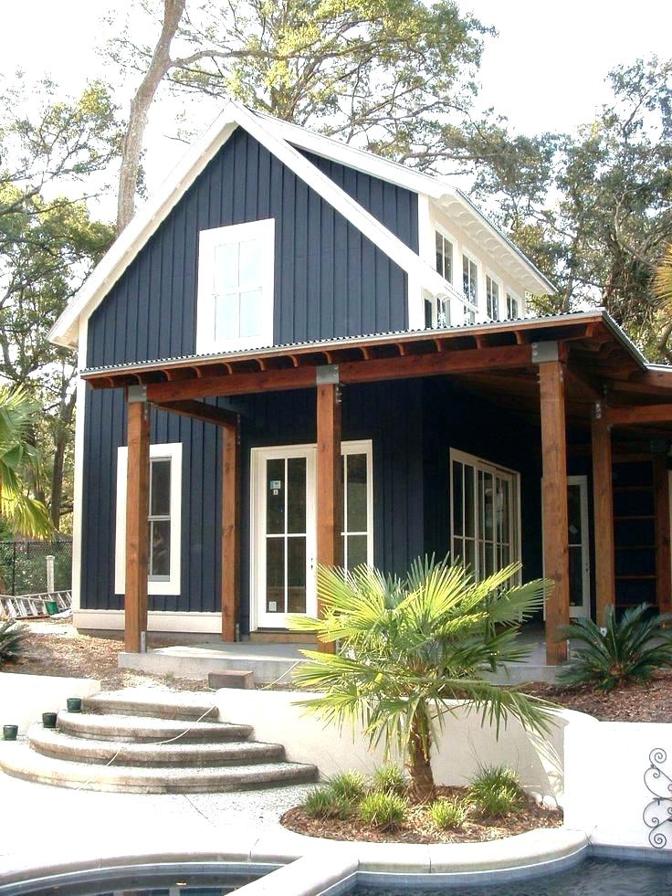
–More Crayola color and less safe beige. Dark and rich are replacing light and airy. Briarwood is moving to Hale Navy. Rich Cream is moving to Merlot Red. Even some developments are providing a rainbow of siding options instead of the light neutrals from years past. <<applause>> If you have a bold red house, you probably don’t need me to tell you what color to paint your front door (lol!), but I’ll offer suggestions anyway.
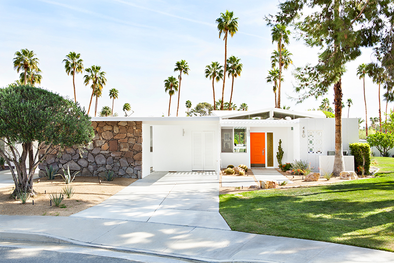
–More midcentury renos, both contemporary and ranch style. With a surge in client interest for open-concept living (uh-oh to that trend, but that’s another story), people have realized that it is easier to update an already open midcentury home with the high vaulted ceilings and the great-room flow than it is to modify a boxy colonial. Big surprise there. So we are seeing a plethora of exterior colors (even black) as a result of these one-story re-dos.
Back to the front door. Here are some ideas for redoing your front door color to refresh your home.
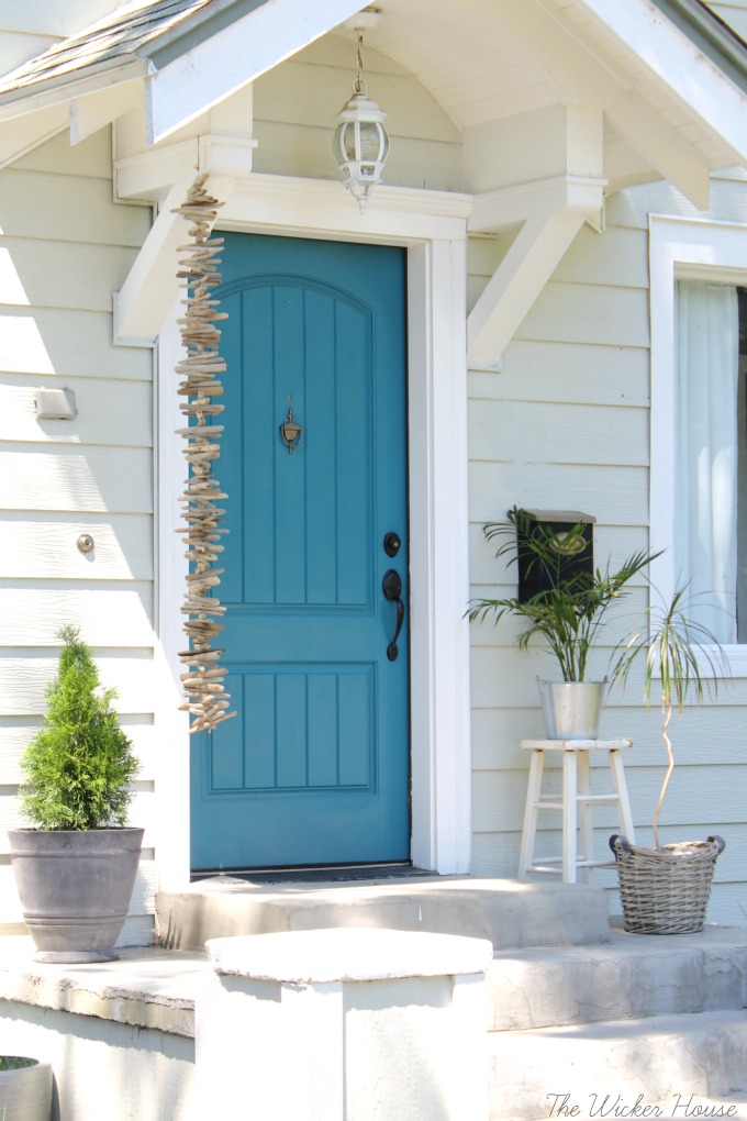
Teal and Turquoise — I cannot believe that I used to recommend turquoise only for tropical house locations or homes that at least had a pool. What used to be a quest to coordinate house colors with the local environment is now a challenge to ignore it. Where teal and turquoise work: on gray, white, black, yellow, red, okay almost every house color except blue. Where they do not work: on dirty or faded house siding (the bright color makes the house look worse) and on other blues like colonial blue.
Yellow and Orange — not everybody’s favorite colors but they are so happy. I love them on a front door. Where they work: on dark house colors like navy, green-browns, dark and light grays, neutral gray brick, and white. Where they do not work: Again, on any color that looks faded, aged, or dirty.
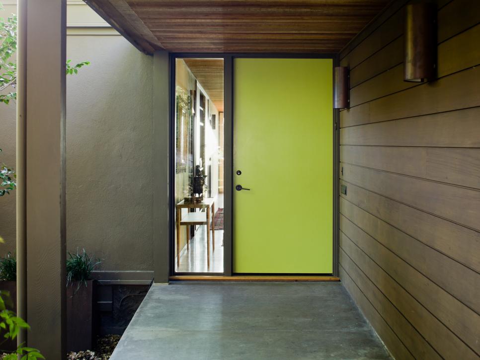
Lime Green — fresh and springy and a wonderful coordinating color for your landscape. Where it works: dark gray, navy blue, even red brick, chocolate brown, black. Where it does not work: any other green or dirty beige.
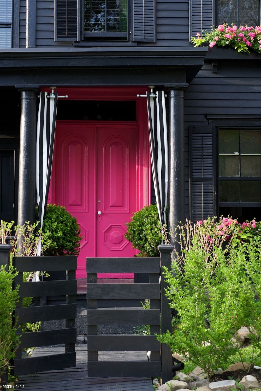
Pink and Purple – always beautiful on a white house with coordinating landscape trees but also on a dark house for a real pop of warmth in the neighborhood. Where they work: white, gray, navy. Where they do not work: on yellow beiges and orange beiges because of the undertones and on anything that has a faded or dirty appearance.

If the bright colors will not work with your house color, try natural or even white.
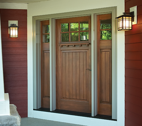
Natural Wood or wood-look – always a classic. Where it works: navy and red, for sure. And just about every other house color.
White — yes white! What white does is make the whole entry area look larger since it blends with the white trim color. It also creates a blank canvas for holiday decor — wreathes, flower pots, etc. There is nothing quite like white as a backdrop to a variety of color palettes around the entryway. Where it works: especially good on a house with a lot of color already and crisp white trim. Also works on neutrals when you want to maintain a soft neutral palette throughout — be sure to add textures though with lots of greenery and baskets or wicker furniture. White also works on aged or faded houses where the bright colors do not. Crisp white perks everything up.

I hope these ideas dazzle your thinking and inspire you to head to the paint store. Happy painting, everybody!
Is Your House an EXtrovert? Paint It
February 15, 2018 § Leave a comment
In the next town over, there’s a purple house. And when I say purple, I mean PURple, but not just the front door as we see in the row house above, but also the siding, the trim, the doors, the shutters, and even the concrete foundation. The whole house is purple. (I would show you a photo of the house, but I don’t want to embarrass it.) The result is a house that draws everyone’s attention and not in a good way.
On the other hand, if your house is already an extrovert — one that has character and interesting features you want to show off in all their glory, then go ahead and use paint. This article from This Old House presents ideas for how to bring out the personality in your older home and shows not only colors that grab attention but also where to put them and which ones go beautifully together.
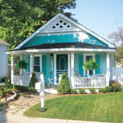
There are lots of ways to use color. This beachy turquoise, perfect for a cottage style home in a coastal community, uses one hue — a medium tone for the siding and a darker value for the shutters and door. White trim completes the cottagey look. The result is a house that displays its positive features without overdoing the palette. This strategy is especially good for a small house.
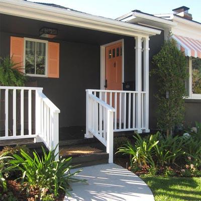
Dark colors are trending now, and this gray-brown ranch is a good example. But instead of keeping the whole house a quiet, conventional wallflower, the homeowner displays its cheerful personality with tangerine shutters, front door and striped awning. The white trim makes the colors “pop,” as we say, and you have a real looker!
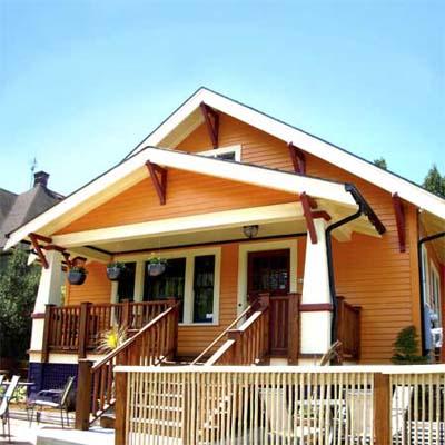
Speaking of citrus, look how this bungalow shows off its architectural features with Juicy Fruit colors and — wait a minute — a lovely deep grape purple foundation. Now that works!
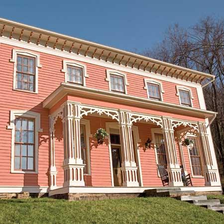
My favorite color combination, though, and perfect for this restored Italianate house, is terra cotta siding; a darker value for the window muntins, eave corbels, and column accents; a rich natural wood front door (and rocking chairs — nice touch); and cream gingerbread trim.
These are only a few ideas for how to embellish your older home with color. Spring outdoor projects are coming for many of us, and one of us at least has house color on her mind. Ha!
Think color, my Color Friends! And stay cozy.
Creating Colorful Curb Appeal
January 23, 2018 § 2 Comments
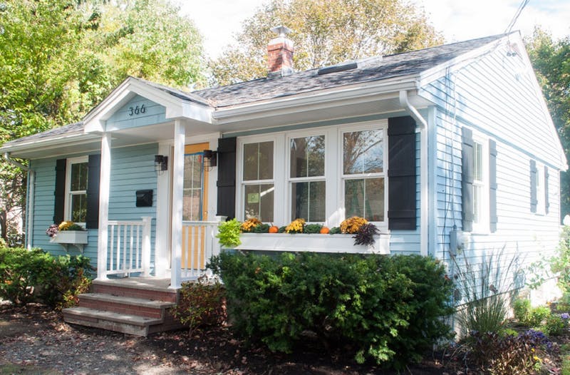
Need curb appeal?? Well, this remarkable ranch re-do will show you how some strategic changes to the front of a rather ho-hum house can make a huge impact, and if you’re planning on selling anytime soon, pay attention. There are some quick easy fixes that may apply to you.
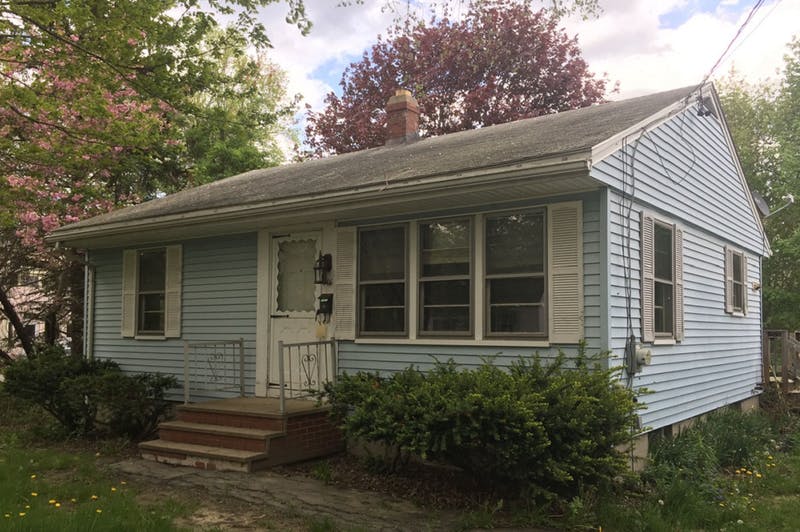
Here is the Before shot: faded vinyl siding, old aluminum windows, dated storm door, dirty white shutters, old iron stair railing, and tree overgrowth. Have you seen a million houses like this one? Yup. Me too. Not exactly a head-turner.
Laurel LaBauve at SoPo Cottage addressed the front facade with a new porch portico. Adding dimension to the front face of the ranch made a huge difference and created a cottage style instantly. She could have stopped there, but onward to new windows (fresh, white, two-over-two) that brought more light into the house and gave it a cute, vintage, styled look. Excellent choice!
Next up? The vinyl siding. Why does the after vinyl look so terrific? Laurel revealed her secret: something called Vinyl Renu, a product that, Laurel reports, brings new life to the color and sheen and is supposed to last 10 years! I’m in! What a difference. If your house has vinyl siding and it needs a refresh, here’s the stuff.
Switching the shutters to black board-and-batten was another great cottagey move. If they’re vinyl, you fooled me. Note: Leaving the brand new windows bare with no shutters would not have been a bad thing. A little more contemporary. But the contrast of the black with the light blue siding and white trim is sharp, and the house looks finished.
Then there’s the front door color. Yellow. One of my faves as it sings Happy House as you walk up the front steps. And the coordinating flowers in the new window boxes (also a cottage style fun-to-have) pull the whole look together. (If you need color help, let me know!)
Even if there is no budget for major changes, here are a few easy fixes that will still make a big difference in your home’s curb appeal. Take-aways for home sellers:
- Trim the trees back so that the house is free of branches and there’s a clear view of the house from the approach. Pay attention to the landscaping, weeding, and overgrown bushes. It’s amazing what a little green thumb elbow grease will do.
- Rev up the vinyl siding with Vinyl Renu to give the color a fresh look.
- Add shutters if there’s room and particularly if the house is a light color. Black will give the house a dressed-up and polished curb appeal.
- Add coordinating accessories like porch lighting and a mailbox.
- Paint the front door a warm contrasting color and tie in the landscape (annuals, flowering shrubs) and any outdoor accessories like Adirondack chairs or deck furniture.
Click here to see how the INside was transformed. Bravo! Laurel, you are quite an inspiration.
But I Love Grandma’s Furniture
January 20, 2018 § Leave a comment

Furniture that has been in the family for generations (or as long as you can remember, at least) carries memories of sitting around Grandma’s dining room table during holiday dinners and enjoying family and food and all that goes with that. So of course you accept Grandma’s dining room set when presented. Okay, now what.
Designer Stephanie Lees shows us how to marry traditional (whether inherited or acquired some other way) and modern styling. Yes, the two can co-exist nicely together.
Color is the most obvious creative solution. The navy grasscloth walls in that dining room contrast elegantly with the traditional white wainscoting beneath the chair rail. Camouflaged there is a white lacquer cabinet that showcases more family treasures that frame out the modern artwork above.
The green curtain panels in an unfussy simple treatment dress the windows with a pop of color that is carried over to the back of the traditional wingback chair. Wingbacks –whether old or new — are classic. But the modern fabric placement takes what might have been a studious, grownup, wingback chair and made it playful. Those bamboo side chairs — if not your grandmother’s then just like them — can be recovered very DIY with new coordinating fabric by unscrewing the seats, stapling fabric onto the seat bottoms, and screwing the seats back onto the chair. Instant update.
Another key update that sets a modern tone to the room is the contemporary rug, again keeping with the blue & white palette but staying clear of any traditional rug design. Random color placement in the rug keeps the room from looking too formal, and it is key to pulling off this style marriage.
But just short of replacing whatever shiny, old, yellow-brass light fixture might have hung from the ceiling before with a new contemporary brushed nickel version (gasp!), the designer opted for a vintage Italian chandelier in crystal. Dramatic, classic, and oh so stylish.
You’ve given us lots to think about, Stephanie, as we incorporate inherited pieces into our own homes. Thanks for the inspiration!
@StyleatHome, @YourColorCoach, stephanieleesdesign
Something Old Makes Something New
August 25, 2017 § Leave a comment
How do you incorporate antiques and inherited treasures into your decor without creating your grandmother’s house (with all due respect to our grandmothers)? Here are some tips:
-Add contemporary lighting like the drum shade chandelier and standing lamp in the photo (from Rejuvenation) to your traditional decor. You will be amazed what new lighting will do to your room.
-Reupholster treasured furniture pieces in classic, solid fabrics that will keep the pieces timeless from this point forward. Patterns tend to come and go over the decades, and you can date a piece instantly by upholstering it in a trendy fabric. And then you’re stuck with it after the trend is long gone.
-Layer rugs to feature one that is too small to stand on its own in a conversation area.
-Dress windows simply to avoid visual clutter from too much pattern.
-Keep the overall feeling calm in the room. Too many patterns lead to visual clutter, something our grandmothers tended to accumulate over the decades.
-Or add a crazy patterned accent piece to a neutral room. No sense in being TOO serious about our decorating.
-Show legs. Letting the furniture pieces show their legs allows for “air” around each piece and a feeling of lightness in the room. Skirts on all the pieces can weigh them down and make them look dated. (Investigate removing the skirt from an old chair or sofa. I did it and what a difference!)
-For accessories? Cluster them. Avoid scattering them all over the horizontal surfaces. Instead, feature them together on a shelf or display cabinet. That way you’ve contained the clutter while calling attention to the collection as a whole.
Cherish your heritage furniture pieces or your finds from a consignment shop. Embrace them. Love them. And show them off in a fresh new way.
Making a House Color Splash
March 15, 2016 § Leave a comment
I have driven past this house for years and every time, I do a double take. Situated next to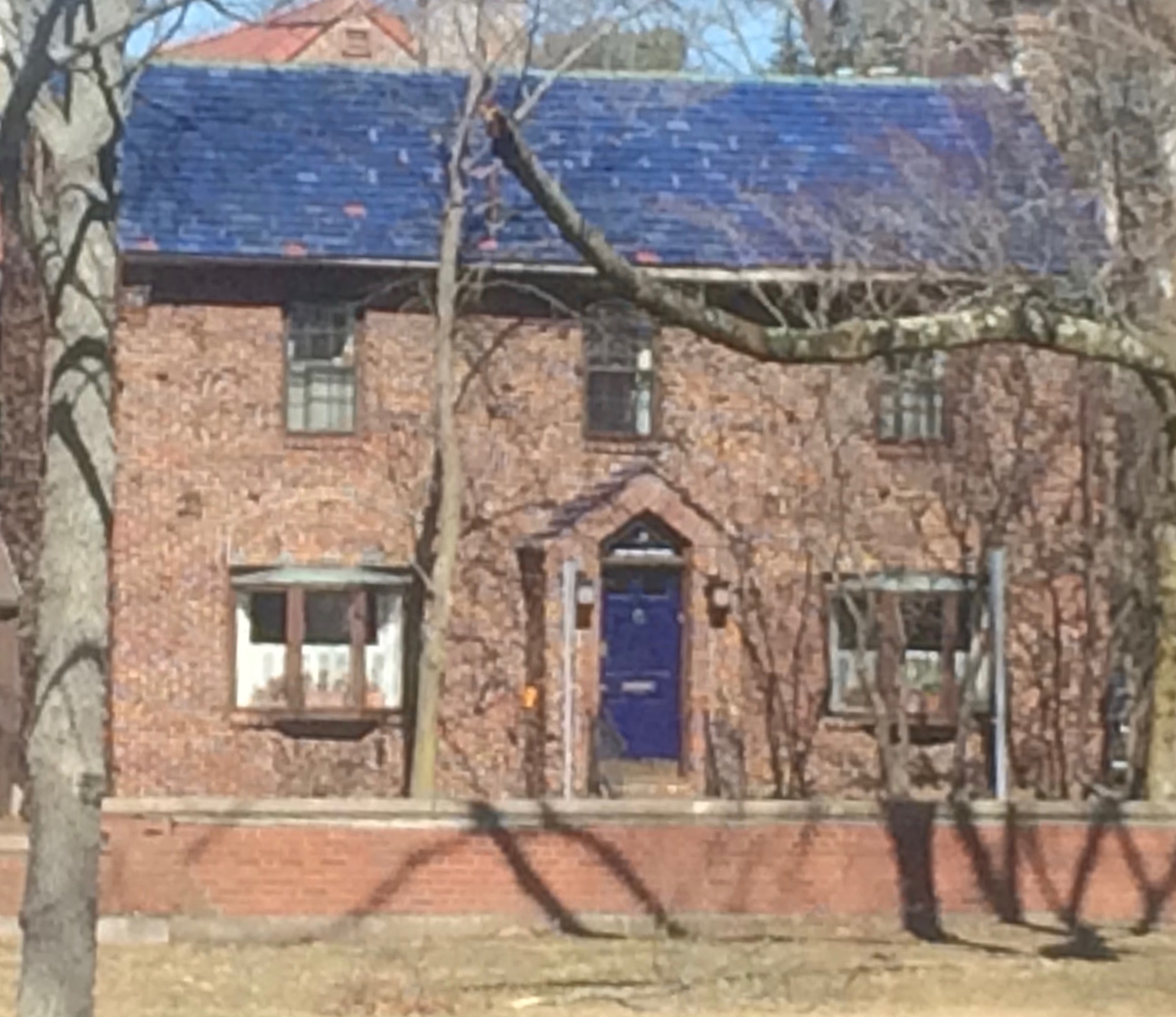 a busy roadway, there is nowhere to stop, get out of the car, and snap a decent photo. But that does not deter me.
The red brick wall is not part of the yard. And who cares about it anyway. It is the roof color and the coordinating front door in a spectacular (guessing here) Starry Night Blue (BM 2067-20) that grabs our attention. The rest of the trim is a quiet brown taken right from the brick. We don’t even notice the window trim at all, and that’s the point.

The roof looks like Vermont Mottled Purple slate, but honestly I have no idea. All I can say is that this house creates, in its traditional neighborhood, a huge House Color Splash. Kudos! And I cannot wait to drive by again.
Don’t forget about the roof color when you are planning your exterior color scheme. It is absolutely fine to keep it neutral, but if you have the personality to withstand the gawking passersby if you decide to add color to the roof, then go for it. Just remember to tie it into the rest of the house with shutters and/or front door to match. I will thank you.
Make You Happy — Consignment Love
January 18, 2016 § Leave a comment
A home stager’s life can be unsettling.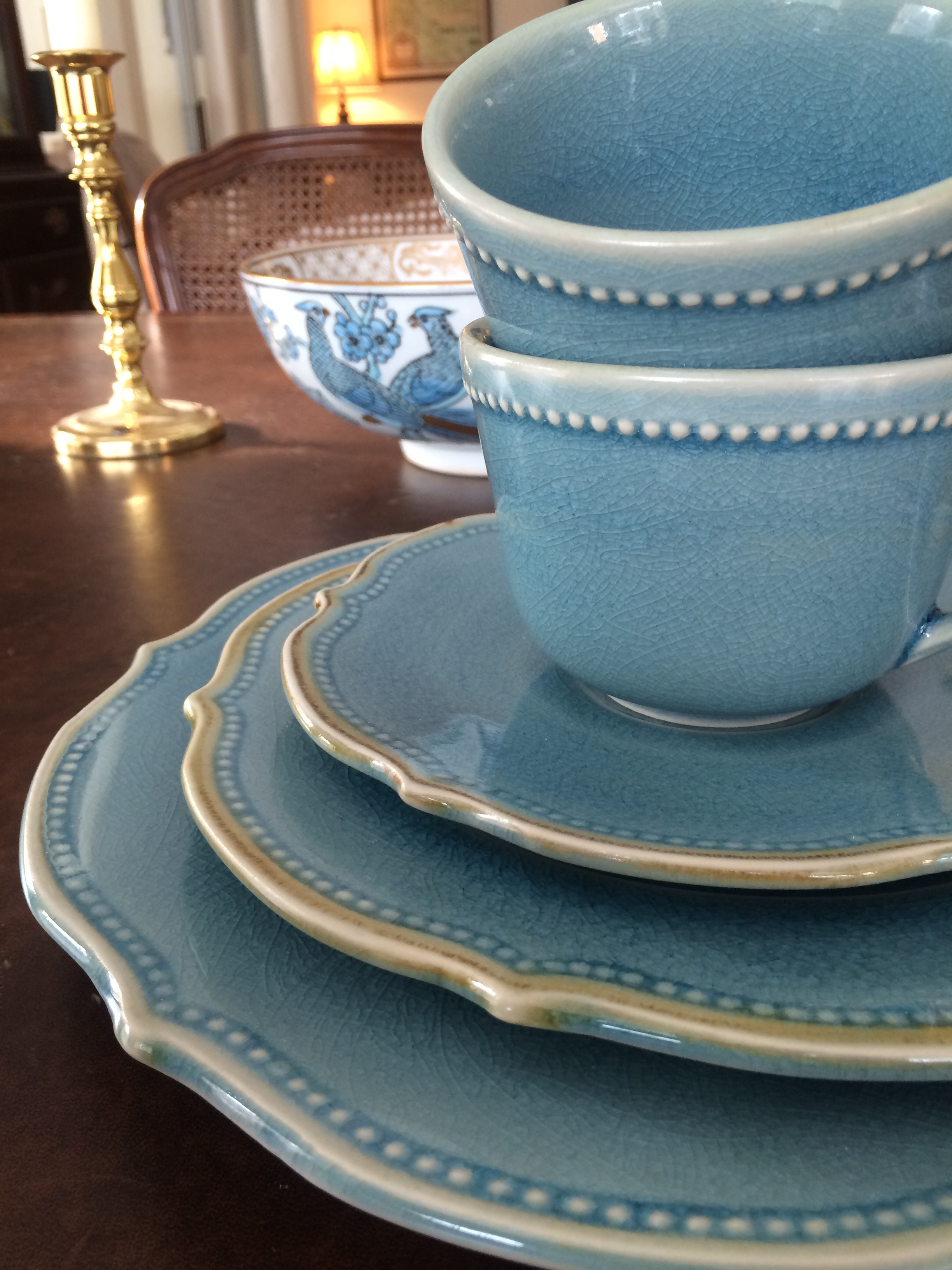 Furniture comes and goes, from storage unit to my own living room and then off to somebody’s vacant home and then back again two months later. My husband jokes that he has to turn the light on before he enters a room or he might trip over an ottoman that wasn’t there a few minutes ago.
And as a stager, I often un-decorate a home to make it more appealing (or at least not unappealing) to a wide swath of potential buyers. Family photos? Gone. Floral drapes? Too busy. Oriental rugs? Too taste-specific. So life is full of light neutral walls, white window panels, generic art, plain slipcovers, and sisal rugs. Everything looks good at the end in a Pottery Barn kind of way, but I am growing tired of meh.
Enter my favorite consignment store. And inspiration.
Finally I am going to buy something other than white plates and Parson’s chairs. And for me. These French blue dishes with gently scalloped edges and little raised dots around the rim are totally taste-specific. Mine. 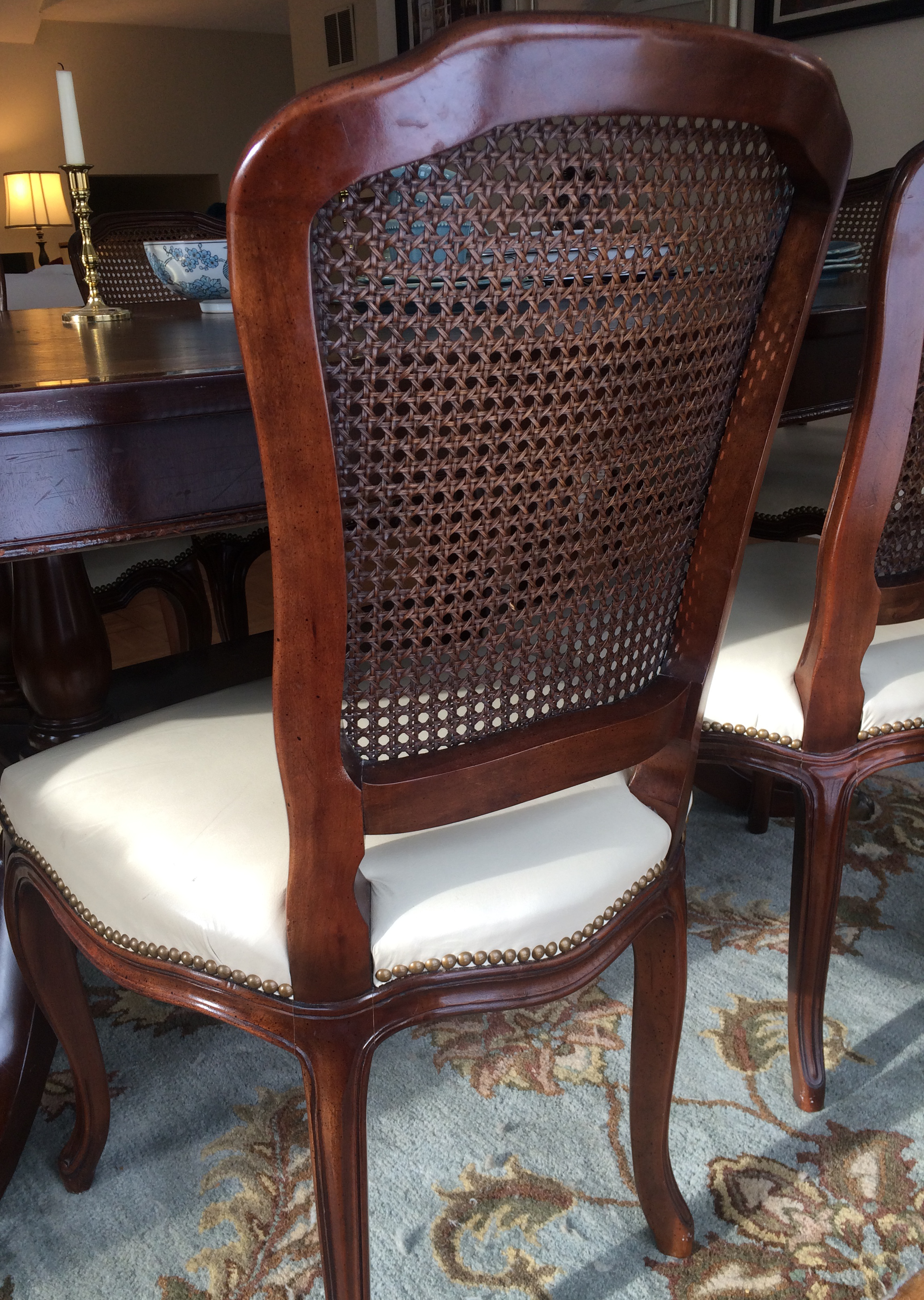 And the chairs with their cane backs, girly curves, and cream leather seats are too old-fashioned for today’s young buyers. They would spray-paint them white! Not me.
I have found love, and these items will stay in my home. I can come home every night and expect to see them there, not in somebody’s 1800s farmhouse kitchen with a For Sale sign in the front yard.
My point to all this? Surround yourself with what makes YOU happy. Don’t let your job take over your home. Have a sacred space that’s your own. Hang onto things that mean something to you and make you feel good. All that! And more this New Year.
Not-So-New Kitchen Flooring Ideas
June 2, 2014 § 2 Comments
 Kitchen floors always pose a challenge. Do we continue the not-always-practical hardwoods throughout or do we interrupt the flow with a more indestructible surface alternative? In this kitchen by Designer Sarah Richardson, she used a linoleum tile to create a colorful and durable floor to complement the light pastel blue and white palette. What we do not see is the adjoining room and how the two areas are connected.
Here is my rule of thumb:
If you have a small house, continue the hardwood floors throughout the downstairs public areas (living room, dining room, family room if there is one, and kitchen). That way, the house will appear larger and less chopped up into individual rooms.
If you have an old house (or a large one) with distinct room divisions, go ahead and select an alternative flooring that offers color or durability (although carrying the hardwood throughout is okay too). I recommend using the color palette to pull the public areas together so in Sarah’s case, the adjoining room would have some light blue in it. Mixing and matching within the color palette will create the feeling of a larger, more pulled-together house — even if the rooms are boxy and divided by walls and small doors.
Just like there are more options than granite and Formica for your kitchen counter top, there are now numerous exciting alternatives to wood and tile on your kitchen floor.
Mixed Metals Get My Rave Review
January 24, 2014 § Leave a comment
 Gold and brass are finally officially back. The cheerful, dressed-up metal color has been scorned and ostracized for years, it seems, with homeowners rushing to change out everything from drawer knobs to door hinges. Well, hold up.
Over the past couple of years, we have watched brass trickle back into design (you knew it would) but have been waiting for the main stream to catch on. Now we’re seeing a mix-and-match approach that seems to fit everybody’s home style.
In this kitchen by architect William Hefner (http://www.williamhefner.com/) we see dramatic gold accents along with the other metals (chrome sink and wrought iron light fixtures). What I’m sensing, as with fashion, is that you can pick your accent metal like you pick your hem length. If it works for you, then go for it. We love that approach as it allows you to update your home without having to replace everything in it all at once. Casual acceptance of materials seems way more sensible than dictating that “Metal X” (whatever that turns out to be) is totally OUT.
Hurray for sensible design.
Do You Know How Easy This Is??
January 18, 2014 § Leave a comment
 This update, to state the obvious, is the easiest project short of rolling paint on a wall. So easy that many of you will skip over this post or roll your eyes that I’m even mentioning it. But just in case you are still looking at stained seat covers on your kitchen chairs, you have no more excuses.
- Turn the chair upside down.

- Take your handy-dandy screwdriver (yes, you should have your own) and twist out the 4 screws.
- Next, go to your local fabric store and pick out a nice pattern and color that will look good in your room.
- Buy 1 1/2 yards (of a 50-54″-wide) fabric. If you’re at JoAnn’s Fabrics and Crafts, go to the “Home Dec” section so the fabric is sturdy enough to hold up. You don’t want quilting cotton — too flimsy.
- Lay the fabric upside down on a large table or the floor. Place your seat upside down on the fabric and cut out the new seat cover, leaving at least a 2-3″ margin after you lift the fabric up to cover the sides of the seat. Cut the fabric. (Don’t stress about the cutting — the edges are not going to show.)
- Next. If you don’t already have a staple gun (sigh), you need one. So many uses.
- Pull the fabric taut over the seat and put one staple in the center front underside of the seat.
- Turn the seat around and pull the fabric taut again putting one staple in the center back underside of the seat. Repeat with the sides, making sure the fabric pattern is straight (turn the seat over and check).
- Then pulling the fabric taut, staple the fabric onto the seat, moving toward the corners. Fold the corner pieces and staple underneath.
- Trim the fabric excess. Turn the seat over. Place it back on the chair and put the screws back in.
VOILA!
