Front Door Color –Refresh for Brick Homes
May 20, 2019 § 6 Comments
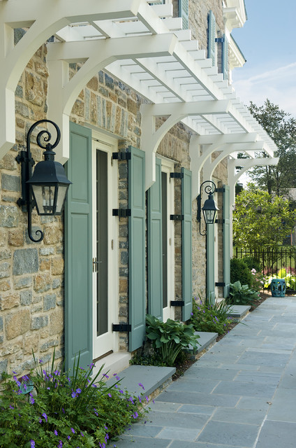
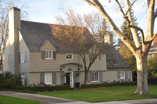
I wrote my first blog post about front door color back in 2012 when it seemed like red and black were the most common options for traditional homes. And shutters? Well black and then black again.

But today I stumbled upon a couple of photos from Beacon Hill in Boston that blew my traditional color palette out of the fan deck, so to speak. It was love at first sight of that rich gorgeous blue — yet to be identified by name and brand.

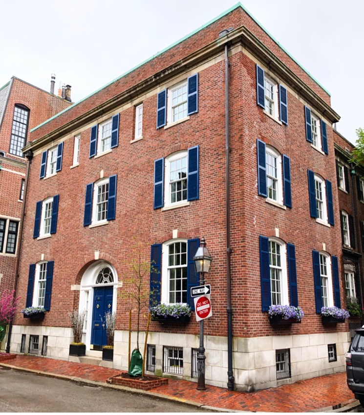
Photo: @buildingsofnewengland
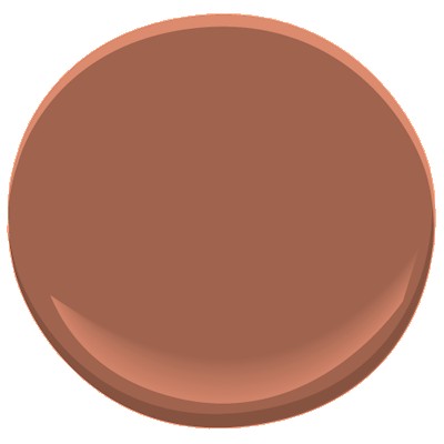
Just guessing here (I didn’t find anything in the Sherwin Williams paint line), but Benjamin Moore has Dark Royal Blue 2065-20 that comes pretty close for now until I can track this color down.

Benjamin Moore 2065-20
What I love about this color for the front door (and shutters for that matter) is that it’s dark enough be traditionally tasteful and even replace black on many houses like the 1912 Colonial above, but it has hue enough to excite the senses and certainly stand out from the crowd of traditional black and Charleston Green doors and shutters (not that there’s anything wrong with traditional!).

And I’m just talking about brick homes — because door colors on painted houses and more contemporary homes have gone right through the color palette. More updates on that later.
In the meantime I’m going to appreciate that stunning blue on the brick Rhoades House and open my fan deck to more brick home door color ideas.
Making a House Color Splash
March 15, 2016 § Leave a comment
I have driven past this house for years and every time, I do a double take. Situated next to a busy roadway, there is nowhere to stop, get out of the car, and snap a decent photo. But that does not deter me.
The red brick wall is not part of the yard. And who cares about it anyway. It is the roof color and the coordinating front door in a spectacular (guessing here) Starry Night Blue (BM 2067-20) that grabs our attention. The rest of the trim is a quiet brown taken right from the brick. We don’t even notice the window trim at all, and that’s the point.

The roof looks like Vermont Mottled Purple slate, but honestly I have no idea. All I can say is that this house creates, in its traditional neighborhood, a huge House Color Splash. Kudos! And I cannot wait to drive by again.
Don’t forget about the roof color when you are planning your exterior color scheme. It is absolutely fine to keep it neutral, but if you have the personality to withstand the gawking passersby if you decide to add color to the roof, then go for it. Just remember to tie it into the rest of the house with shutters and/or front door to match. I will thank you.
Accent Color Ideas for Stone and Brick Houses
November 17, 2014 § Leave a comment
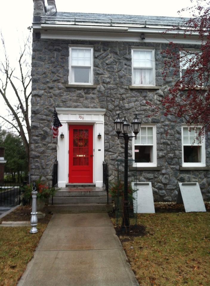
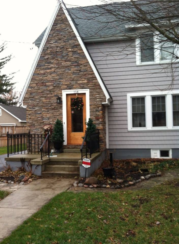
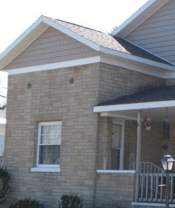
Choosing door or other accent colors for stone and brick homes is easier than you think. If the stone is uniform like this gray, then almost any accent color will work. This homeowner chose tomato red, something like Ben Moore’s Red 2000-10.

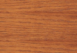
With multi-colored stonework, I like to pick a color out of the palette. In this case, the homeowners chose a gray for the siding and a warm golden color for the natural-wood-stained front door. The orange tone in the wood stain, something like Minwax’s Cherrywood, brings out the depth of color in the stonework and makes the front door warm and welcoming.
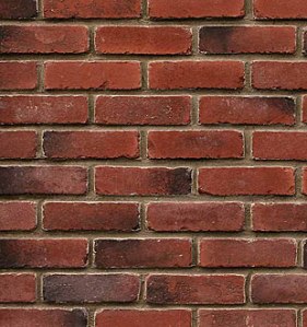
For uniformly colored red brick, you can accent with a contrasting color. And the opposite of red, of course, is green. Using a gray-green in a lighter value will prevent the house from looking like Santa’s workshop. Check out Ben Moore’s Louisburg Green HC-113.

Blonde brick is a challenging palette but consider what hues are in the brick and tease them out. Taupe is a safe bet for the siding and a warm accent like Mayflower Red (Ben Moore HC-49) will warm up the front door.
Let the stone and brick of your house speak to you. Sticking to the color palette that’s already there will make your house coordinated and happy.
Choosing a Siding Color to Coordinate with Brick
March 5, 2013 § Leave a comment
 Where a particular hue sits on the color wheel can make a world of difference when it comes to choosing house colors. Especially if you’re trying to coordinate the color with another material, like brick.
In this example, one yellow leans toward orange. The other one leans toward green.

I don’t think I need to say any more.
Two Rules for Choosing a Roof for your House
January 28, 2013 § 2 Comments
 The roof — any roof — is a big-ticket item on the house so choosing it can be a little unsettling. There are so many colorful options available that it’s easy to get wowed by the prospect of something other than the traditional charcoal.
When choosing your roof, make sure you follow these two rules to insure a good result you can live with for, say, 40 years:
1) Get large samples of your roof options. Do not choose a roof from a photo on the computer or a little brochure. Make sure you hold the roof sample up against the side of your house to test for color coordination and to see how busy the two are when side-by-side. Stand back at the curb and take a good look. If possible, get the address of a home that has the roof already installed so you can see how the roof looks over a large area. Does it get lighter or darker? Good to know ahead of time.
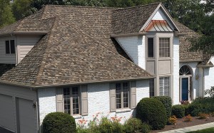
2) Avoid the clash of the Maximum Definition shingles with the house. If your house is a busy colorful mixture of bricks or stones, avoid the busy “max def” roof as you will create a combination worthy of a major migraine. The photo above (from Owens Corning) is a good example of pairing a busy max def roof style (with its multiple colors) with a house siding that is neutral, painted brick and neutral siding. There is a good balance between the busy roof and the plain, calm siding materials. There’s no doubt that the roof takes center stage. Make sure it doesn’t fight with the siding “understudy.”
If you follow these two rules, you will narrow your options down to two or three reasonable choices and avoid any major, expensive roof mistakes.
Stone and Brick Reveal Your Exterior Color Palette
January 25, 2013 § Leave a comment
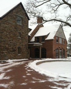 Yes, it’s winter and the roof in this photo is covered with snow, but now we can focus on the rest of the house, particularly the stone. What works on this house is the color palette that is taken directly from the numerous available hues in the stonework itself.
The bricks are a monochromatic rusty red color that complements the stone without competing with it — a challenge when you have multiple materials on the house. The siding is a gray neutral, also in the stone. The trim is pulled from some of the darker taupe stones. How easy is that? Job done.
If you are building a home with different materials, use the busy one with the most colors (stone or brick) to make the rest of your color decisions. That way, the whole house will come together in a harmonious cornucopia of color.
The alternative? Choosing a color that is not in the palette at all. The result? A disjointed effect that divides the house into sections and makes it seem smaller. Can be done, but it’s tricky and needs a professional colorist to pull off. Do yourself a favor and stick with the natural palette that presents itself to you from your building materials.
Shutter Color Inspiration for Stone and Brick Houses
January 10, 2013 § 6 Comments
One approach to choosing an accent color for your stone or brick home is to let the stone or brickwork dictate the color. How easy is that. The stonework on this house and walkway revealed a whole palette of dusty blue-gray greens from which the shutter paint was then custom-mixed to a perfectly coordinated color.
In the brick example, this Old Town red brick contains a lot more colors than just red. Purple is what pops out and that gorgeous shade was the inspiration for a dark purple shutter color: Ben Moore’s Caponata AF-650. Dark purple shutters are a wonderful option for other homes as well, not just red brick.

Natural wood tones always work for shutters, especially on stone or brick and especially if the shutters are actually wood and not vinyl. Old World wonderful.
When selecting a shutter color, take your color cues from your house. Chances are pretty good that if you have a stone or brick house, you have quite a palette of colors to choose from already.
Coordinating Brick House, Siding, and Roof Colors
January 9, 2013 § 652 Comments
In this brick house example, the dark sandy grout color was used as a siding color, and it coordinates beautifully with the earthy shades in the brick. Even the roof is tied in although black would have worked just as well. Contrast that with the pink brick and lemon yellow siding example below right. Yikes.

Sometimes there’s just no way around ugly brick except to paint it. And the results can be stunning. Not only have you made your house bigger visually by blending in the brick with the siding color, but also you have added texture to the house without the busy look that highly variegated brickwork can create. A great compromise and an updated house.
Tired Brick Fireplace Takes Cover
January 9, 2013 § 4 Comments
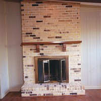 Sometimes the “bones” of an old house fall under the category of “What were they thinking?” You could say that about this brick fireplace with its random placement of dark bricks and the outdated brass enclosure. But not to worry. Your family room is not doomed to the styles of 1972 — you have options. One of the best ones is to paint the brick as shown in the after photo (from Southern Living Magazine’s Makeovers).
The homeowners covered the offensive brick with a flat, textured paint in the green wall color. They painted the hearth in a natural stone color. Then they added two bookshelves for a built-in look and painted them the same green. The new fireplace insert in a bronze color blends nicely. A narrower mantel and corbels painted cream pop off the green — art finishes the focal point.
The overall result is a fireplace wall with emphasis on everything but the original dated fireplace. When faced with old brick or other outdated hardscape in your home, consider painting it for an almost instant update without the expense of covering it or replacing it. This makeover was a huge success. No more ugly brick.
Choosing a Metal Roof Color
January 7, 2013 § 4 Comments
Just a pet peeve of mine, but I really do not care for a bright red metal roof on an old historic stone house. I know that some of my bias is regional–I’m sorry if I’ve offended anybody’s taste. But what I much prefer is a color that comes from the stone itself. What that does is blend the roof with the house and not call it out like a big old stop sign on a dirt road.
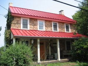
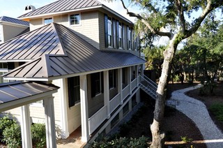
This photo shows a neutral option for a metal roof color. Perfect actually for the little stone house above.
If you are choosing a metal roof color for your home and you do NOT want to feature the roof as the focal point of the neighborhood, choose a color that blends or approximates a traditional roof color (grays, bronze, brown, charcoal, black). On the other hand, if you need people to find your house in a snowstorm, then choose a bright Crayola color and love it. Fair warning.
