Mirrors Mirrors on the Walls
March 15, 2019 § 2 Comments
I’ve been reflecting a lot lately on mirrors. (Sorry, had to to that.) I love mirrors in decorating. Not only do they bring much needed natural light into a dark room, but they create an illusion of space and even act as art if hung in groupings on a focal wall or along a stairwell.
But sometimes a mirror just doesn’t work. Here are a few tips for placing mirrors that might help you better appreciate them in your home.
- Avoid reflecting light back out the front door.
This is feng shui (it is not good to reflect the chi back out the front door), but it does make decorating sense. Putting a mirror at the front entry so you see yourself entering the home misses the opportunity to see and greet your guests with a beautiful piece of art instead. Just move the mirror to another wall in the entry and you will still add light to the space.
- Make sure the mirror reflects something positive.
Nobody wants to see your kitchen sink full of dishes reflected in the living room mirror. Make sure you place the mirror where it reflects a window or art on another wall in the room.
- Hang mirror over the fireplace instead of tilting it on the mantel.
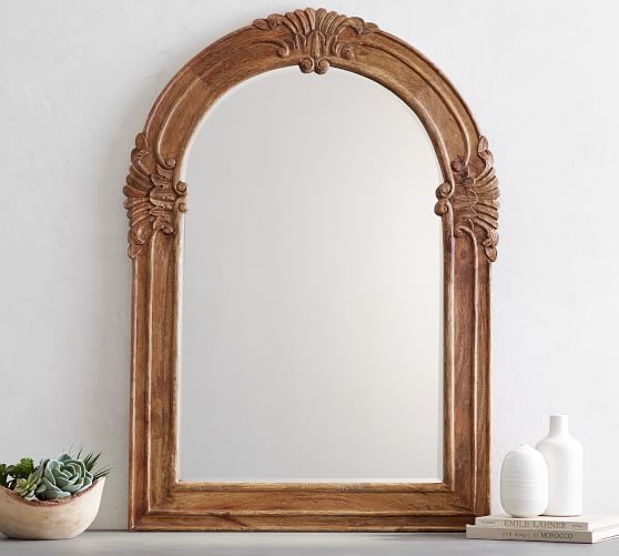
What happens when you tilt a mirror on the mantel is that it most likely will reflect your ceiling and that’s it. If you hang the mirror, it will reflect the rest of the room and will double the space. Also, just an aside… if you are staging your home to sell, a mirror in the living room is good luck because potential home buyers who see themselves in the home tend to buy it (not a scientific fact, but it has worked so far!).
- Hang bathroom mirror so you can see into it.

It’s okay to let the mirror overhang the bead board (or backsplash tile) as long as you and others can see into the mirror while standing in front of the sink. Although visually, you might be tempted to hang the mirror clearly on the drywall (above the trim work in this photo), in a bathroom, form follows function.
- Make art with groupings of mirrors.
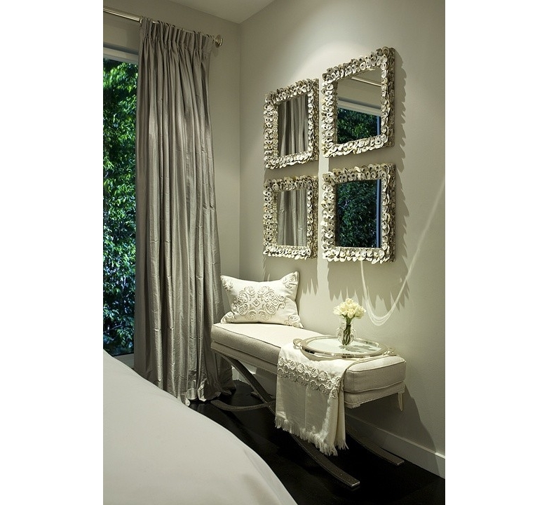
Organizing and hanging your mirrors either by matching shapes or frames (or both as above) or creating a random display of your mirror collection creates a unique focal point on the wall. Especially fun in a bedroom, stairwell or hallway that needs additional light but where the function of each mirror is secondary to its artistic arrangement.
Place your mirrors strategically to maximize their impact on the room. And for hanging really heavy mirrors, make sure you find at least one wall stud to secure the mirror onto the wall.
Mirror mirror on the wall. Be the smartest mirror-hanger of all!
What Color Brings You Joy?
January 23, 2019 § Leave a comment
As I type the title into this blog post, I am struck by how nearly impossible that question is to answer for somebody like me who loves almost all hues. How would I ever pick a favorite? But some people have no problem.
In the latest House Beautiful (Jan/Feb 2019 issue) amidst the usual articles about paint color trends and new wallpaper patterns, a spread jumped out of the magazine when I turned the page. Designer Kristen McCory and editor Emma Bazilian lay out a color palette that I would not expect to see in a Connecticut home.
There in a high-gloss fuchsia fiesta was a fireplace surround and mantel popping out of the living room wall. And there was more! A hot pink antique secretary and a raspberry velvet settee left no doubt as to the intentions of the designer. The homeowner wanted Pink. (That’s Benjamin Moore’s Gypsy Pink on the mantel.)
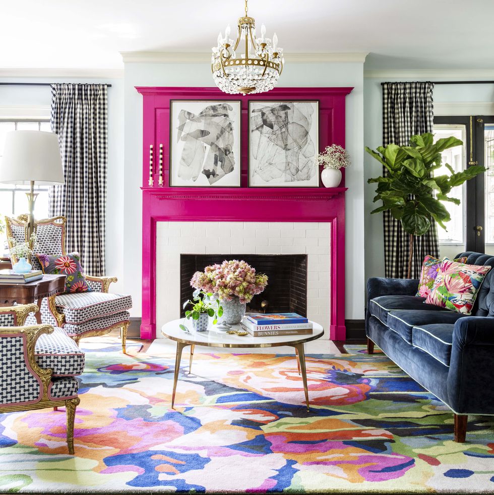
But the story gets so sweet when we discover that the pink is a tribute to the homeowner’s 99-year-old grandmother whose favorite lipstick was Revlon’s Parisian Pink. And that is what brings me to ask “What color brings YOU joy?”
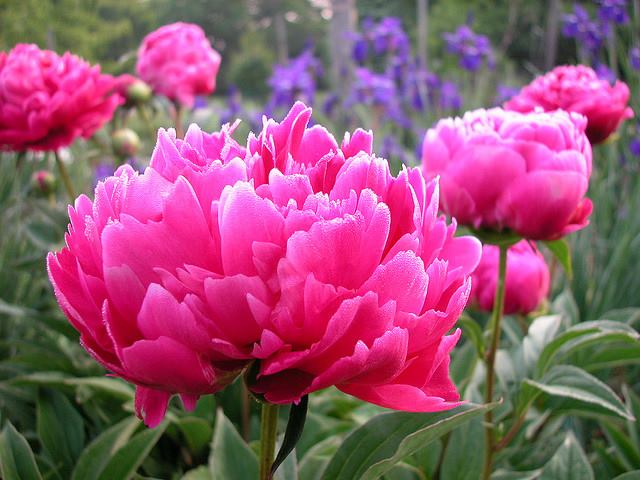
For me? I guess I’m kind of in a Pink frame of mind these days — it’s bitter cold outside and that warm pink hue brings joy to my heart when I stare at it long enough. Witness my Facebook page yesterday —>
But by Spring I know I will have put all the warm colors into the closets and brought out blues to cool the house down and bring me newfound joy. I’m not sure what it is about turquoise, teal, and aqua that I love so much but maybe it’s what those colors represent to me: in this case, last year’s vacation with my precious sister! When I see ocean blues now, I think of her and it brings me joy.

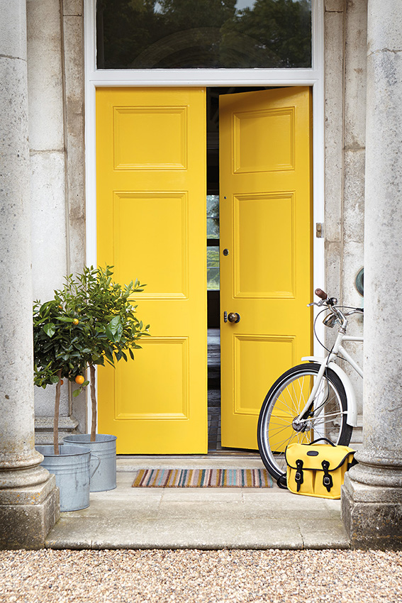
Whatever color brings you joy (always or maybe just right now) … embrace it. Wear it, decorate with it, and share it with others. Don’t worry about keeping up with trends that make others happy. When clients tell me they want a color for their kitchen that is the same color as their best friend’s kitchen, I always push back a little. It never fails. What looks good in somebody else’s house is inevitably a big fail somewhere else. Don’t pick a yellow front door because your neighbor has one. As we say so often these days… You Do You.
What Color Brings YOU Joy?
Going Big-Art Big
January 10, 2019 § Leave a comment
“Little stuff reads Clutter — big stuff reads Drama.”
That is the mantra of a home stager, but the staging principle (what shows up best on camera) translates nicely into home decorating. That is not to say that you can’t have collections of treasures and portraits of the family scattered around your home, but going big successfully draws the eye and establishes the personality for the room.

Of course color does help! I’m enjoying the oranges and reds this cold winter morning, but contrast is all you need for major dramatic impact.

Go ahead. Make a statement!

Or create a serene backdrop for pared-down furnishings.

Or go for a wall mural — yes, big is back!

One caveat. Keep the furnishings in front of the art relatively simple for maximum effect. I’m about to install a piece of art that’s 60″ tall — can’t wait to show you the end result in my client’s family room.
Happy 2019 Everybody! I’ll be back with more color talk soon!
My Favorite Color? Blue&Green
May 13, 2016 § 2 Comments
 When I was in college, back in the style-challenged ’70s, my response to “What’s your favorite color?” was always “blueANDgreen.” They came as a set for me, and even the vintage floral fabrics of that decade
 still have a nostalgic, times-were-great-back-then appeal.
So I am thrilled to see the combination back around, especially for the summer. Talk about bringing the outside in… is there anything more appealing than the yellow-green shades of Hosta together with the cool watery turquoise blues? The combo works for me.
 So as I do every year at this time, I put away all my hot-looking accessories including my red and cream striped window treatments, art with spicey oranges and reds, and all the red pillows on the sofa, and I replace them with the cool-palette colors that remind me of summers at the lake and carefree times. Summer is here!
(Living room photo: Bassett Furniture)
From Color Inspirations to Paint
February 4, 2016 § Leave a comment
Walking into a pottery shop is like immersing yourself in a box of crayons, all pristine and unbroken with endless possibilities of combinations.
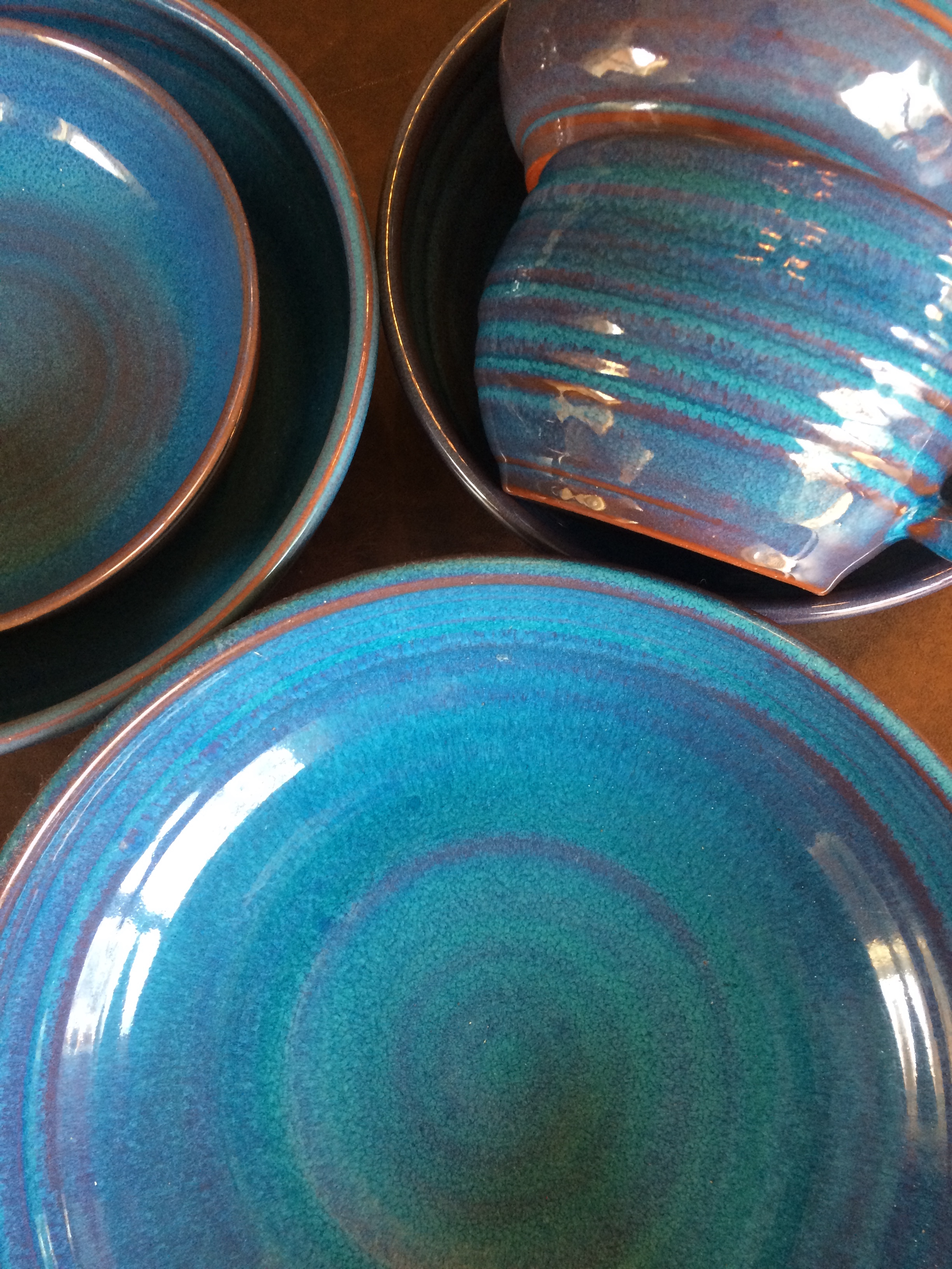 This set of dazzling bowls caught my eye. Mesmerizing is how I’d describe them with an array of blues from turquoise to cornflower. (The dishes are mine now.)
Whatever the inspiration, there is a paint project waiting. In my mind’s eye driving home, I see these dishes in a dining room painted any one of the colors with crisp white trim. Maybe even a shiny white bead board around the wainscoting to bring out the hues in the room. I can also see any one of these colors on the walls in a kitchen with white cabinets and a white subway tile backsplash. Or maybe one of these colors for the backsplash! (Head is spinning with ideas.)
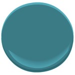
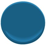
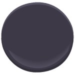
Accent walls give us a way to add a small amount of color drama to the focal area of a room without painting everything. Especially nice in open-floor-plan spaces where walls may incorporate several rooms. How about one of these rich hues for your front door? Spring painting is right around the corner. (Ben Moore’s Calypso Blue, Bermuda Blue, and Deep Mulberry)
Let the color in front of you and surrounding you inspire you. Wrap yourself up in it. Do something for yourself and create a happy house. It’s just paint!
Got Personality? Show It
January 19, 2016 § Leave a comment
What does your room say about you? Designer Jeffery Bilhuber (House Beautiful, Feb 2016) infused a boatload of personality and let us know a few other things as well. What this room shouts to me: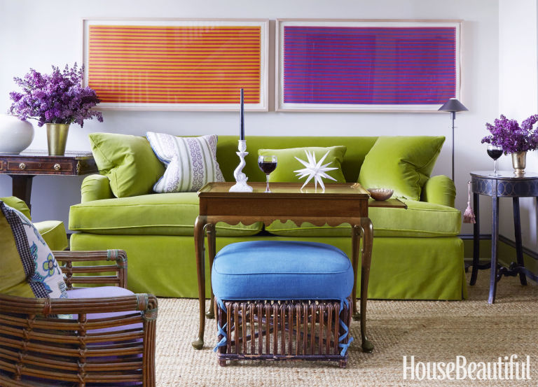
- Forget about symmetry. Mismatched end tables are way more interesting than a set.
- Go ahead and mix woods. We acquire furniture from our parents, we find treasures at a flea market, and sometimes pieces have sentimental value. Use them — even if they don’t “match” your decor.
- Add your favorite color to the room. And if you don’t have a favorite, use several. If you keep the colors at the same “hue value” (lightness or darkness of a color), they mix well together.
- Function is important. Don’t forget that you need to set your wine glass down.
- Forget matchy-matchy. This designer has taken that declaration over the top by using two different window shade colors. Bold and impetuous design choice there, but again, the room screams,”I want to be different.” And I applaud that.
- Let color speak in the room by creating a neutral backdrop from which the color can “pop.” Here, the light gray walls and the neutral woven rug give the eye a rest.
- Flowers and the little accessory details finish the room. Without them the room can look cold and staged (too many, of course, and you have a clutter zone).
- Texture matters. That sofa looks so soft. Adding warmth and texture with pillows can warm up anything, even leather.
Bottom line: You’ve heard this before, but it’s worth repeating. Don’t just follow the design trends. Let your room reflect who you are and what you love.
It’s Time for Faux to Gaux
June 22, 2015 § 2 Comments
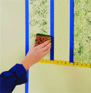 Drop the sponges, folks. Honestly, without trying to offend anyone or stomp on creativity, I have never seen such awful faux finishes in my life! It’s high time we roll over those ugly paint jobs and simplify our visual lives a bit. And if you plan to sell your house anytime soon, please listen up.
Faux is out. It was hard to perfect from the beginning but as of now, it has been totally overdone. From walls to kitchen cabinets to dressers and dining room ceilings, enough!
What’s in? Paint. Just plain paint. And in some applications, wallpaper. But not too much! No need to match the curtains to the wallpaper to the bed linens. As one who tends to find a  good thing and overdo it, I can certainly sympathize. But the next time you have the urge to spend hours dabbing wet sponges on the wall or cabinet door, take a deep breath and stop.
Don’t Let Your Art Fade Away
February 17, 2014 § Leave a comment
 Old faded jeans and old faded glory aside, old faded artwork in your house is a No-Go. If you have art prints that have hung on the wall in your bright cheery living room for several years, take a close look at them. Do they have a blue-green aura to them? Are flowers that used to be red sort of a strange blue? Is there any red or pink left in the piece at all? No?? Then haul it down. It’s done. Off to the recycle bin. Use the frame for something new that will add life to your room. Just this next time, opt for glass that will prevent color-fading. It’s more expensive but worth every penny if you love your art and prints.
Don’t be stubborn. Love your faded jeans, but get rid of your faded art.
Let There Be (New) Light
February 15, 2014 § 3 Comments
 Take a look at your lamps. Have they been on the same side tables for more than 20 years? 30 even? (okay that’s scary) Listen up. One of the easiest and cheapest updates you can do for your house is to exchange the old lighting for something fresh, colorful, and uplifting.
New lamps come in a variety of shapes and sizes, some with colored glass, some with clear. Some have updated metals, some are made to look old. But all have crisp shades with a nice clean barrel shape. (Traditional lamps are still, well, traditional. They will never go out of style. But you know what kind of outdated lamps I mean. Check out your grandmother’s family room, decorated circa 1968. Now you get it.)
You do not have to spend a lot of money. You can shop at a fancy lighting store or Target and get an updated look.
And while you’re looking at lighting, check out your ceiling fixtures. For a few bills at a home improvement store, you can switch out the old brass candelabra flush-mount fixture for something MUCH more current. The change will transform the house — you will see it in a whole new … (wait for it) … LIGHT.
(Lamp from Bellacor: Number 541835)
Mixed Metals Get My Rave Review
January 24, 2014 § Leave a comment
 Gold and brass are finally officially back. The cheerful, dressed-up metal color has been scorned and ostracized for years, it seems, with homeowners rushing to change out everything from drawer knobs to door hinges. Well, hold up.
Over the past couple of years, we have watched brass trickle back into design (you knew it would) but have been waiting for the main stream to catch on. Now we’re seeing a mix-and-match approach that seems to fit everybody’s home style.
In this kitchen by architect William Hefner (http://www.williamhefner.com/) we see dramatic gold accents along with the other metals (chrome sink and wrought iron light fixtures). What I’m sensing, as with fashion, is that you can pick your accent metal like you pick your hem length. If it works for you, then go for it. We love that approach as it allows you to update your home without having to replace everything in it all at once. Casual acceptance of materials seems way more sensible than dictating that “Metal X” (whatever that turns out to be) is totally OUT.
Hurray for sensible design.
