My Favorite Color? Blue&Green
May 13, 2016 § 2 Comments
 When I was in college, back in the style-challenged ’70s, my response to “What’s your favorite color?” was always “blueANDgreen.” They came as a set for me, and even the vintage floral fabrics of that decade
 still have a nostalgic, times-were-great-back-then appeal.
So I am thrilled to see the combination back around, especially for the summer. Talk about bringing the outside in… is there anything more appealing than the yellow-green shades of Hosta together with the cool watery turquoise blues? The combo works for me.
 So as I do every year at this time, I put away all my hot-looking accessories including my red and cream striped window treatments, art with spicey oranges and reds, and all the red pillows on the sofa, and I replace them with the cool-palette colors that remind me of summers at the lake and carefree times. Summer is here!
(Living room photo: Bassett Furniture)
Green Decorating: The Soothing Hue
March 17, 2016 § Leave a comment
St. Patrick’s Day brings us to thoughts of green. Whether it’s kelly green or any of the variations thereof, green is a versatile, natural hue that brings life and comfort to any room. It is particularly nice in rooms where you spend time revitalizing your mind and body.


Waking up in a green room warms a cold, white, snowy day and cools a hot, humid summer morning. It can bring the color of lush plants and trees to a city skyline view. And it can calm an agitated, overextended lifestyle at the end of another hectic day.


Green can be either warm (yellow-green) or cool (blue-green), and both pair beautifully with white. Coordinating accent colors can add energy (the complementary reds and pinks, opposites to green on the color wheel) or quiet blending (the analogous yellows and blues on either side of green on the color wheel).
I highly recommend adding green, even a mixture of greens, to your home to quiet and soothe your soul. Wherever you need a few moments of ahhhhhhh.
Paint colors above: Top left to right: Waterscape SW 6470, Topiary Tint SW 6449, Honeydew SW 6428, Breaktime SW 6463. Bottom left to right: BM Guilford Green HC-116, Palisades Park BM 439, High Park BM 467, Dartsmouth Green BM 691.
Great Color Combos: Pink & Orange
February 18, 2016 § Leave a comment
 One glance at Taylor Swift’s Grammy red carpet ensemble and I was inspired. What a great color combo! Reminiscent of gorgeous summer sunsets and gardens of spring tulips, hot pink and vibrant coral scream happiness and passion. No shyness there. That’s for sure.
You can bring those colors into your home. Here’s how:
–Add plenty of white. Nothing brings out the true color of anything better than white. That’s why adding white flowers to a garden landscape makes the color in the garden “pop” (as we say).
–Mix colors of the same Hue (color) Value (relative lightness or darkness). They will blend better together without one overtaking the other.
 –Add plenty of neutral texture. Sisal rugs, nubby neutral chenille pillows, and natural (neutral) linen-like window panels will balance the powerful color statement in the room and cool the temperature down a bit.
–Go part-way in. To make a major color statement without a huge commitment, stay completely neutral in the paint, furniture, rugs, and windows and add color with your accessories: art, pillows, lamp bases, and other accessories.
Look for other great color combos in fashion and nature. Find what you love!
Photo: Jordan Strauss/Invision/AP./ Published: 02/16/2016 9:24:16. Pillow: Pottery Barn.
Got Personality? Show It
January 19, 2016 § Leave a comment
What does your room say about you? Designer Jeffery Bilhuber (House Beautiful, Feb 2016) infused a boatload of personality and let us know a few other things as well. What this room shouts to me:
- Forget about symmetry. Mismatched end tables are way more interesting than a set.
- Go ahead and mix woods. We acquire furniture from our parents, we find treasures at a flea market, and sometimes pieces have sentimental value. Use them — even if they don’t “match” your decor.
- Add your favorite color to the room. And if you don’t have a favorite, use several. If you keep the colors at the same “hue value” (lightness or darkness of a color), they mix well together.
- Function is important. Don’t forget that you need to set your wine glass down.
- Forget matchy-matchy. This designer has taken that declaration over the top by using two different window shade colors. Bold and impetuous design choice there, but again, the room screams,”I want to be different.” And I applaud that.
- Let color speak in the room by creating a neutral backdrop from which the color can “pop.” Here, the light gray walls and the neutral woven rug give the eye a rest.
- Flowers and the little accessory details finish the room. Without them the room can look cold and staged (too many, of course, and you have a clutter zone).
- Texture matters. That sofa looks so soft. Adding warmth and texture with pillows can warm up anything, even leather.
Bottom line: You’ve heard this before, but it’s worth repeating. Don’t just follow the design trends. Let your room reflect who you are and what you love.
Mixed Metals Get My Rave Review
January 24, 2014 § Leave a comment
 Gold and brass are finally officially back. The cheerful, dressed-up metal color has been scorned and ostracized for years, it seems, with homeowners rushing to change out everything from drawer knobs to door hinges. Well, hold up.
Over the past couple of years, we have watched brass trickle back into design (you knew it would) but have been waiting for the main stream to catch on. Now we’re seeing a mix-and-match approach that seems to fit everybody’s home style.
In this kitchen by architect William Hefner (http://www.williamhefner.com/) we see dramatic gold accents along with the other metals (chrome sink and wrought iron light fixtures). What I’m sensing, as with fashion, is that you can pick your accent metal like you pick your hem length. If it works for you, then go for it. We love that approach as it allows you to update your home without having to replace everything in it all at once. Casual acceptance of materials seems way more sensible than dictating that “Metal X” (whatever that turns out to be) is totally OUT.
Hurray for sensible design.
What Makes a Great Master Bedroom?
February 5, 2013 § 2 Comments
Ahhhh… the master bedroom — a retreat, a haven, a place to get away from it all. Of course, in practical terms, the master bedroom often houses exercise equipment, an office space, baskets of laundry, and piles of unread newspapers. But what makes a great master bedroom? Here’s my take:
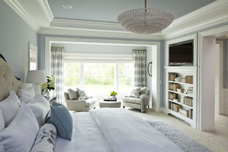
1. A large enough bed to house two people comfortably. Queen size is great because it’s usually big enough but not too big. To me, a king invites the whole family to sleep there including multiple pets. (‘nuf said)
2. A padded headboard. Not only is a padded headboard attractive, but also it’s functional. It sure beats wood when you’re reading in bed.
3. No footboard. Leaving off the footboard allows for more visual space in the room, and it makes the bed look like you can run and jump onto it. Inviting, welcoming, all those things.
4. Good lighting on both sides of the bed. I don’t always call for symmetry in design, but both parties need good lighting so two of the same kind seems fair to me.
5. Really comfy bedding with a cozy throw on top. You’ll be amazed at how handy a throw can be when you’re hanging out on the bed watching TV.
6. A “wallflower” TV. If you must have one in the master bedroom, at least put it over in a corner where it is not the focal point of the room.
7. Two comfortable chairs. If you have a TV and enough space, put at least one or preferably two comfortable chairs in front of it. That way you’re not always lying in bed watching TV. (You’ll sleep better. Trust me on that one.)
8. A wall color that pleases both parties. Something soothing that does not promote controversy. You might avoid red, bright acidic yellow, and girlie pink. Just an observation.
9. Privacy. Locks on doors, shades on windows, and anything else that will shield you from the outside world. This is your haven — a place to regroup and refresh.
10. And what NOT to have. (optimally, of course) A desk, treadmill, laundry folding station, newspaper repository, and holiday decoration storage. It should not be a graveyard of unmatched socks, moldy towels, and unsorted paperwork. How practical is that? Well? These are guidelines…
Spend some time on your master bedroom. You’ll feel better in the morning.
Kitchen Cabinet Color: Move over Back Splash
January 30, 2013 § Leave a comment
Kitchen cabinet color is in. From yellow to navy to this refreshing mint, cabinets and kitchen islands are getting a paint job. And it’s not just old cabinets that are being refreshed. New kitchen designs are showing painted cabinets in colors that were once reserved for bathrooms and laundry areas. And it’s a bold move because, unlike wall color, you are unlikely to re-do cabinet paint color anytime soon. Call it confidence or general optimism (or a craving for it) but cabinet color will be here to stay for some time.
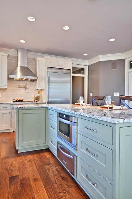
If you’re a little unsure of painting all your cabinets a particular color, try painting the back of an open cabinet or the center island first. That’s what I did. And I was hooked from that point on. (My cabinets have had two color transformations since discovering color in the kitchen.)
One suggstion for choosing a paint color for your cabinets: take a look at the colors in adjoining rooms and pick a color that will pull the public areas together. A pillow color in the adjoining family room might make a terrific cabinet color in the kitchen. You are limited only by…hmmmm… nothing really. Enjoy!
Color Your Home Happy
January 18, 2013 § Leave a comment
 Whether you live in a deluxe villa or a double-wide, you deserve a happy home. And the place to start is by adding color. Numerous studies have shown that color influences the way we feel and can even be used to describe our emotions (“I’m in a blue mood”).* But what may influence us the most is a lack of color.
The study found that people with depression associated their mood with the color gray. And you don’t have to paint your walls gray to have a gray aura in your home. Take a look around your house, in the corners and shadowed areas and particularly the ceiling. Do you see gray? Do you feel blah? Well then… time for color.
Start by painting your ceiling either a bright white or a tint of your wall color. That will either maximize the light reflection in the room (and bolster your mood) or make the room feel bigger and more open. Either way, you’ll feel better.
Next, if you’re timid about your color-selecting skills and afraid to make a mistake with the wall color, then start small. Add some colorful accessories to the room — pillows, artwork, other changeable items. Doing that will help you create a palette of colors you like without making a big investment or paying a painter to repaint two or three times.
When you’re ready to take the plunge and add color to your walls, try an accent wall first. Pick the wall that you see when you enter the room (the focal wall) and paint that a color you like. Add accents to the room in the same color to pull the room together. Keeping three walls neutral with pops of color on an accent wall and accessories here and there will help you step into the world of color without any Crayola catastrophes.
Note: There is nothing wrong with neutrals and whites in the home. To many people, neutral means calm. But if you are somebody who likes to wear color and you are drawn to color yet your home does not reflect that love of color, then it’s time to add color. That’s what I’m talking about.
*http://www.livescience.com/6084-colors-describe-happiness-depression.html
Furniture Arrangement Challenges May Call for Different Furniture
January 16, 2013 § Leave a comment
When it comes to furniture placement, some rooms just will not cooperate. With bay windows, bow windows, niches, dormers, and other odd architectural challenges, where on earth do you put your sofa? One solution is to forget the sofa altogether and replace it with a circular arrangement of very comfortable chairs, either all matching for a formal look or all mismatched for a casual eclectic look.
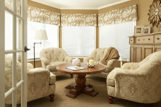
Either way, the arrangement gives you an instant, inviting seating area where you can sit down with others and have a cup of coffee or read the paper. In this photo, the designers put a round coffee table for holding popcorn, drinks, books, and just about anything else. But as you know, I’m a big fan of the big overstuffed ottoman– what I consider to be the perfect piece of versatile furniture– so that would be my choice for the center.
If you simply cannot figure out where to place your living room sofa, consider moving it to the family room or wherever the TV is. Replace the sofa/loveseat/chair concept with four comfy upholstered chairs. You’ll love the change.
Choosing Paint Colors From Room to Room
January 14, 2013 § 1 Comment
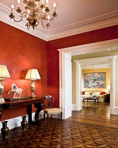 Create flow throughout your home by sharing colors between rooms. In this luscious red Venetian plaster dining room, the red is shared with the living room pillows across the hall. Just enough to draw your eye over there and pull the two spaces together.
Paint colors in nearby rooms “speak” to each other because they are adjacent on the color wheel. Red and yellow are separated by a neutral with a slight green undertone, adding a punch of contrast to the hallway.
Layering colors between rooms that you can see from one location and “cross-pollinating” the colors with pillows, accessories, and artwork will create a flow that will make your home appear bigger, less chopped-up, and more thoughtfully planned for optimal warmth.
(Interior design: Marcy Masterson)
