Something Old Makes Something New
August 25, 2017 § Leave a comment

How do you incorporate antiques and inherited treasures into your decor without creating your grandmother’s house (with all due respect to our grandmothers)? Here are some tips:
-Add contemporary lighting like the drum shade chandelier and standing lamp in the photo (from Rejuvenation) to your traditional decor. You will be amazed what new lighting will do to your room.
-Reupholster treasured furniture pieces in classic, solid fabrics that will keep the pieces timeless from this point forward. Patterns tend to come and go over the decades, and you can date a piece instantly by upholstering it in a trendy fabric. And then you’re stuck with it after the trend is long gone.
-Layer rugs to feature one that is too small to stand on its own in a conversation area.
-Dress windows simply to avoid visual clutter from too much pattern.
-Keep the overall feeling calm in the room. Too many patterns lead to visual clutter, something our grandmothers tended to accumulate over the decades.
-Or add a crazy patterned accent piece to a neutral room. No sense in being TOO serious about our decorating.
-Show legs. Letting the furniture pieces show their legs allows for “air” around each piece and a feeling of lightness in the room. Skirts on all the pieces can weigh them down and make them look dated. (Investigate removing the skirt from an old chair or sofa. I did it and what a difference!)
-For accessories? Cluster them. Avoid scattering them all over the horizontal surfaces. Instead, feature them together on a shelf or display cabinet. That way you’ve contained the clutter while calling attention to the collection as a whole.
Cherish your heritage furniture pieces or your finds from a consignment shop. Embrace them. Love them. And show them off in a fresh new way.
Quick Old-Kitchen Updates
April 27, 2016 § Leave a comment
 You inherited your kitchen. We get it. No money for a costly re-do. We hear ya. But there are a few things you can do to lighten and brighten your dark, dated kitchen while you pour money into other fun things.
- Replace the door handles and drawer pulls. There are so many new metal options out there, and many of them are quite inexpensive. Some even come by the bagful. So there’s no excuse for keeping these.

- Paint the old golden oak cabinets. It may sound hard, but anything is better than the dated, dry and grainy orange beauties many of us were stuck with for awhile. Painting takes patience: in a nutshell, remove the doors, take off all the hardware, sand the cabinets and doors to give the surface “tooth,” prime everything with a really good primer and then paint the doors outside on a horizontal surface to prevent drips. I like to use a cabinet-grade enamel that holds up pretty well. Stay neutral for longevity although painted cabinets are all the rage. So pick a color you’ll love for a long time. Here’s what the Pros recommend for a really nice finish. http://www.thisoldhouse.com/toh/how-to/intro/0,,20315665,00.html
- Switch out the overhead lighting. This is a really cheap, DIY project (remember to turn off the power first!!). There are so many options way more creative than the central overhead ceiling light or the yellowy brass candleabra over the kitchen table.
- Add under-cabinet lighting. This is a great way to add both task lighting to an old kitchen counter space and ambiance. If you don’t have a tile backsplash, make sure that area is freshly painted as it will show up now. Here’s a link for the many options and how-to’s. http://www.lowes.com/projects/kitchen-and-dining/under-cabinet-lighting-buying-guide/project
- And don’t forget to paint the walls. The easiest, cheapest, and quickest update to any room is a fresh paint job. If you need help with color, let’s work together.
Now, isn’t that easy? You will love pouring your morning coffee in your face-lifted new kitchen. Yes, you still have the old layout and probably none of the new gadgets currently available, but your kitchen will feel brand new. And think of the fun you can have with all your saved money! Enjoy.
(Photo: Brian Wilder for This Old House Magazine)
Don’t Let Your Art Fade Away
February 17, 2014 § Leave a comment
 Old faded jeans and old faded glory aside, old faded artwork in your house is a No-Go. If you have art prints that have hung on the wall in your bright cheery living room for several years, take a close look at them. Do they have a blue-green aura to them? Are flowers that used to be red sort of a strange blue? Is there any red or pink left in the piece at all? No?? Then haul it down. It’s done. Off to the recycle bin. Use the frame for something new that will add life to your room. Just this next time, opt for glass that will prevent color-fading. It’s more expensive but worth every penny if you love your art and prints.
Don’t be stubborn. Love your faded jeans, but get rid of your faded art.
Let There Be (New) Light
February 15, 2014 § 3 Comments
 Take a look at your lamps. Have they been on the same side tables for more than 20 years? 30 even? (okay that’s scary) Listen up. One of the easiest and cheapest updates you can do for your house is to exchange the old lighting for something fresh, colorful, and uplifting.
New lamps come in a variety of shapes and sizes, some with colored glass, some with clear. Some have updated metals, some are made to look old. But all have crisp shades with a nice clean barrel shape. (Traditional lamps are still, well, traditional. They will never go out of style. But you know what kind of outdated lamps I mean. Check out your grandmother’s family room, decorated circa 1968. Now you get it.)
You do not have to spend a lot of money. You can shop at a fancy lighting store or Target and get an updated look.
And while you’re looking at lighting, check out your ceiling fixtures. For a few bills at a home improvement store, you can switch out the old brass candelabra flush-mount fixture for something MUCH more current. The change will transform the house — you will see it in a whole new … (wait for it) … LIGHT.
(Lamp from Bellacor: Number 541835)
Mixed Metals Get My Rave Review
January 24, 2014 § Leave a comment
 Gold and brass are finally officially back. The cheerful, dressed-up metal color has been scorned and ostracized for years, it seems, with homeowners rushing to change out everything from drawer knobs to door hinges. Well, hold up.
Over the past couple of years, we have watched brass trickle back into design (you knew it would) but have been waiting for the main stream to catch on. Now we’re seeing a mix-and-match approach that seems to fit everybody’s home style.
In this kitchen by architect William Hefner (http://www.williamhefner.com/) we see dramatic gold accents along with the other metals (chrome sink and wrought iron light fixtures). What I’m sensing, as with fashion, is that you can pick your accent metal like you pick your hem length. If it works for you, then go for it. We love that approach as it allows you to update your home without having to replace everything in it all at once. Casual acceptance of materials seems way more sensible than dictating that “Metal X” (whatever that turns out to be) is totally OUT.
Hurray for sensible design.
Light Up Your Front Door
December 12, 2012 § Leave a comment
Why wait for the holidays to light up your front door? You spent enough time choosing the color — show it off all year with a boost in your exterior lighting.
Choose properly spaced recessed fixtures that will wash light down on the door color and other parts of the porch as in this photo (lighting by Illumination s, Inc.). Or add a large pendant over the door and sconces on either side. Make sure the lighting fixtures are big enough that they don’t look skimpy from the street. Bigger is usually better when it comes to lighting.
While you’re choosing your new light fixtures, take advantage of all the different metal color options you have now. Don’t settle for wrought iron if another color would update your house and make it look fabulous.
So when the holidays are over and you take down the hanging twinkle lights and box up the spot light from the front door, take a close look at what lighting is left. Maybe it’s time for an upgrade.
Let there be light!
Getting Down to Brass Tacks about Brass
December 11, 2012 § Leave a comment
What a difference a decade makes. What used to be the lighting 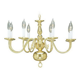 fixture of choice in upscale homes is now (still, even after several years out of favor) being tossed in a dumpster by young home owners who view the shiny yellow metal as the equivalent of how we viewed our grandmother’s dark brown paneling. Of no value.
Instead there are dozens of metal choices and finishes for lighting and other home accessories like light switch covers and doorknobs. So anti-shiny-brass are today’s home buyers that some are just shy of insisting that even all shiny brass door hinges be switched out to something else.
Note: these design trends may be regional and they don’t apply to historic homes so don’t panic if you love your brass chandelier and it fits your home’s decor perfectly. But If you are not happy with your shiny traditional yellow brass chandelier in your dining room or kitchen, you have three options:
1) Thumb your nose at metal color trends and simply wait for shiny yellow brass to come back in style. Kind of like you kept your go-go boots and bell bottoms from junior high. Yes, both trends came back around but not quite the way they looked in the late 60s. But still, doing nothing is always a design option.
2) Paint the shiny brass chandelier a different color. I once stood on a ladder, leaned over the dining table and painted my client’s brass chandelier first with a base coat of matte black to cover all the sheen and then a faux finish of browns and oranges to simulate a rustic bronze finish. It worked. The house sold.
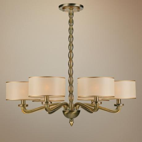
3) Replace the old chandelier with a more current brass option like this one. The metal is toned down (antiqued) and the candelabra bulbs are covered with contemporary silk drum shades — a traditional yet updated look. Honestly, the antique brass has been around forever, and it went through a period of disfavor right around the time the shiny metal took over. But the muted finish, with updated shades, is back and looking good.
Christmas in NYC
December 10, 2011 § Leave a comment
 New York takes on a special character during the holidays: strolling down Madison Avenue, walking by Macy’s window, and being part of the busy crowds of shoppers. All of that says Christmas like nothing else. The big, the bright, and the beautiful!
One challenge to decorating NYC for the holidays is how to make what is already glitzy even more noticeable and memorable. The answer? Big oversized displays and lights — lots of them — as we see in these photos.


Another challenge to decorating NYC is the scale. One example of a large venue that usually needs little embellishment is Radio City Music Hall. With its gilded walls, it’s already dressed for the holidays. But designer Thom Filicia and his team found a way to add drama to an already-dramatic lobby. They hung a white crystal Christmas tree from the ceiling — an imposing focal element as you enter the building. He documented the project on Christmas at Radio City Music Hall (an HGTV special: http://www.hgtv.com/radio-city-holiday/show/index.html) and after seeing the program, I checked it out. Even with all the crowds milling around the lobby, the decorations make a huge statement.


The take-away from this study in light and scale is something you can use at home. Go big with your wreath and other Christmas ornamentation or if it’s small (like lights), have a lot of them. If it seems too big from the house, it’s probably perfect from the street. Here’s a tip for decorating deciduous trees: wrap the lights around each of the branches and then the trunk. You will get a much more dramatic effect than simply winding the string of lights around the outside as if it’s a typical Christmas tree.

Enjoy your holidays!
Shutters Shatter Traditional Color Combinations
September 6, 2011 § 4 Comments
 This house has a color combination I wanted to share with you. The taupe siding has the most interesting pink, almost purple, undertone that changes the way we see the house color depending on the light. The color can go from brown to mauve to gray over the course of the day. The trim is a combination of painted creams and vinyl off-whites (I wish they had picked one color or the other, honestly). But the real surprise (we’ll ignore the green front door) is the majestic blue shutter color. I would never think to pair the mauvey taupe with a royal blue but somehow it works. Black shutters would have been the easy choice, but someone had the bold idea to step out of the ordinary and into a new color combo. New to me anyway…
Shutters provide another opportunity, along with the front door, of course, to express some individuality for your home’s exterior. Although it is customary to work within the neighborhood in terms of palette, if you feel like breaking the mold, go for it. Just be sure that your home’s personality does not overpower your own. It’s no fun to make excuses for a paint job that went haywire. In other words, if you don’t like it, paint it over!
In the meantime, have another spin of the fandeck and see what paint color combinations work for you.
Kitchen Decisions
June 15, 2011 § Leave a comment
 And you thought picking a paint color was hard? Try a kitchen renovation. The number of decisions that have to be made seemingly all at the same time is daunting to even a seasoned renovator. What kind of cabinets? What color? What style? How many? Where to put them? What stain? What knobs? And that’s just the cabinets! Okay… before I get carried away, here’s an example of how the homeowners and I managed the decisions on their renovated kitchen.
The first decision was to pick the cabinets: white painted wood with a shaker-style door. They knew they wanted white because it was classic and would brighten up their small kitchen. Pewter knobs would be the jewelry. They also picked out their appliances: stainless steel. Next came the counter top and that’s when they called me into the project. We discussed concrete, honed granite, and soapstone and settled on soapstone as it had a nice finish and seemed appropriate to the age and style of the home. Shiny granite was out!
The next decision was what to do with the floor. They had hardwood in the adjoining living room but considered tile for the kitchen area because they had heard that it was easier to clean and was okay in wet areas. All true. But I convinced them that carrying the wood all the way through from living room to kitchen would widen the entire space and give the area a more continuous feel.
The backsplash was the next item and both homeowners wanted color. They just could not agree on what color and which material to use. I warned them that glass might be a little trendy for their brick-fireplaced kitchen and suggested they look at slate. The colors are natural and earthy and very appropriate for a slightly more rustic look in the kitchen. At the same time, the white cabinets really make the wonderful palette of earthy colors pop off the counter! The slate also looks terrific with both counter top and stainless!
Lighting was next with some recessed cans with LED fixtures around the perimeter and under-cabinet strips for task lighting, a couple of pendants over the eating areas, and a creative track system of lighting above the island. Track lighting is back! In a big way! And its flexibility makes it appealing — you can maneuver the spots anywhere you’d like them and you can change them too!
 Wall color was last on the list of decisions. We went with a rich red-orange accent wall on the other end of the kitchen by the dining area — to create a warm dining space and give the homeowner the red she craved. The rest of the walls are a gray blue that picks up on the tile and coordinates well with stainless and white.
Kitchen done. Just in time for a relaxing summer!
