Is Your Wall Color Anxious?
March 7, 2023 § 2 Comments
Color psychologists will tell you that colors evoke certain emotions. For example, the warm colors (red, orange, yellow) can generate happiness, stimulation, and excitement (both good and bad). And cool colors (blue, green, purple) can promote calm, relaxation and sleep. In general, we do have a psychological reaction to certain colors, and we associate them with different things. Sometimes they look tasty enough to eat.
Too much of a good thing?
When it comes to creating an end-of-the-day sanctuary for rest and recovery, we need calm, and the cool side of the color wheel is a good place to start. Blue, green, and purple are very popular bedroom colors, for all age groups, but choosing the right version from the fan deck can be tricky. What sometimes happens is that we pick a paint color from the vast display at the store only to roll the actual paint up on the wall and suddenly feel a bit agitated. Partly at not liking the color and partly at the thought of painting it over.
What happened? I thought I was picking a calm color.
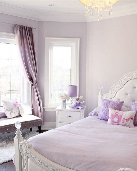
Selecting a blue, green, or purple that pops out at you in the store will not necessarily give you a serene room where your toddler can take a nap. Because it’s not the color per se. It’s the saturation that is keeping the room on edge.
So even my wall color needs a therapist?
Maybe. How saturated is it?
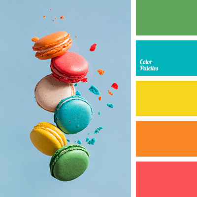
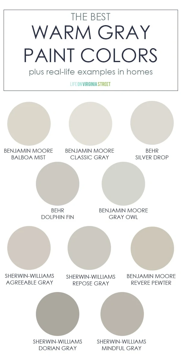
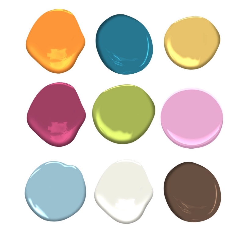
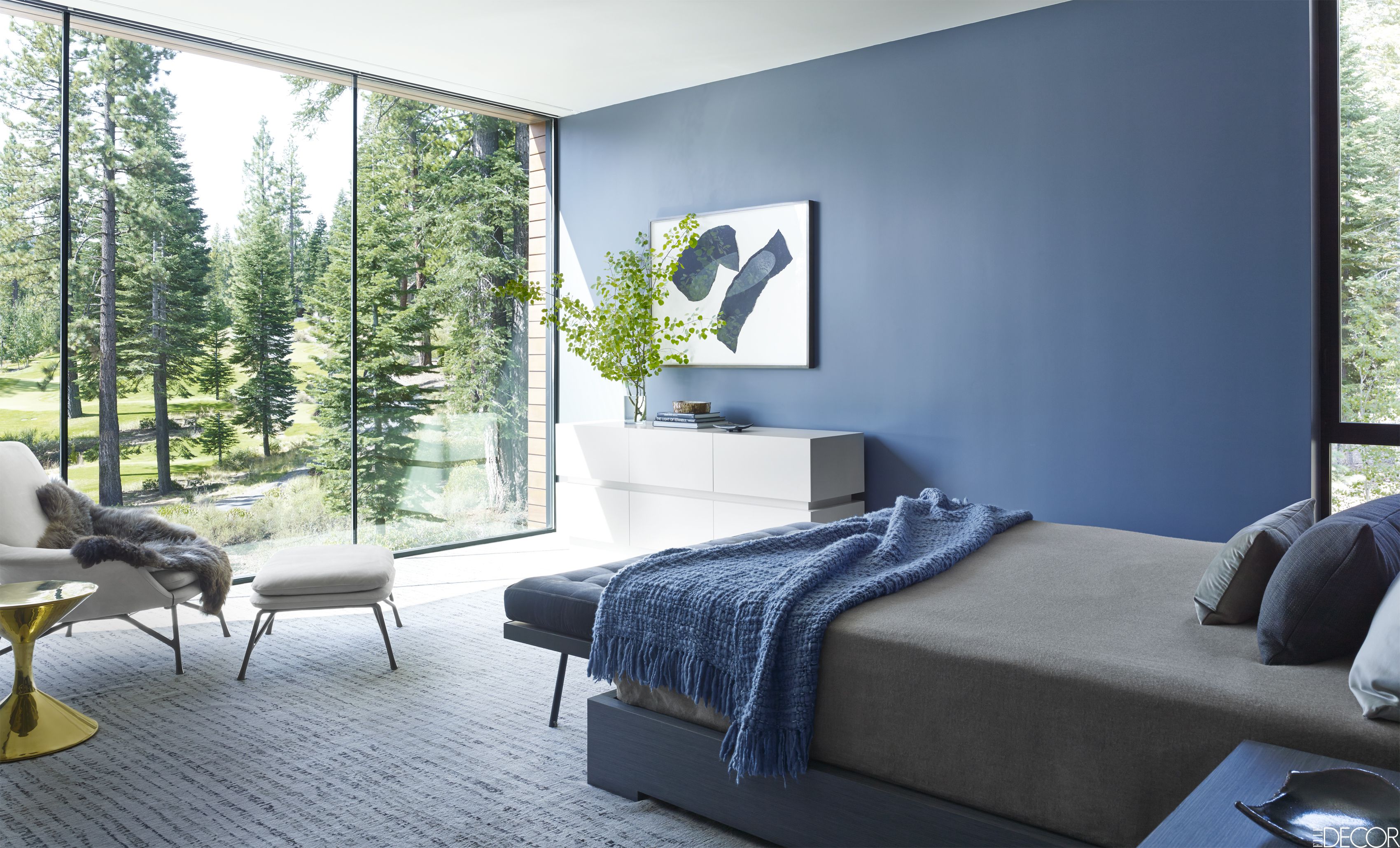
Saturation measures how clear or true a color is. It is the strength of the color often described with words, as Leatrice Eiseman writes in her book The Complete Color Harmony, like “clarity, purity, brilliance, richness, boldness, vividness, and intensity.” You get the picture. Maybe not great for a restful bedroom. For example, royal blue is more saturated than powder blue. In a bedroom, royal blue will shout for attention. The more grayed-down the color, the less saturated it is. In a bedroom painted powder blue, you might not even notice the color.


Bedroom wall color needs to chill.
Again Eiseman describes colors with lower saturation as “subdued, diffused, misty, dusted, subtle, soft, toned-down, muted, restrained, hushed, understated, and quiet.” Perfect for a bedroom. So back to the paint store to find colors with lower saturation that will be restful on the walls of the bedroom.
Can’t I paint the room lighter?
Yes, but going lighter will not make the room calmer — just a lighter value and yes, a little easier on the eyes.
Value measures how light or dark a color is. When you add white to a color you make a tint. The hue (color) gets lighter, and the perception of the intensity changes. It may appear less intense. And that’s important when you are picking a relaxing wall color. Lighter tints are more restful to the eye. To find a tint of a color you move up the fan deck color strip toward the lighter end.


If you add black to a color, you get a shade. It’s darker and perceived as more intense than its lighter version. A dark shade of a color can be very dramatic, and that will influence your color choice. To find a shade of a particular color, you move toward the darker end of the paint color strip in the fan deck.


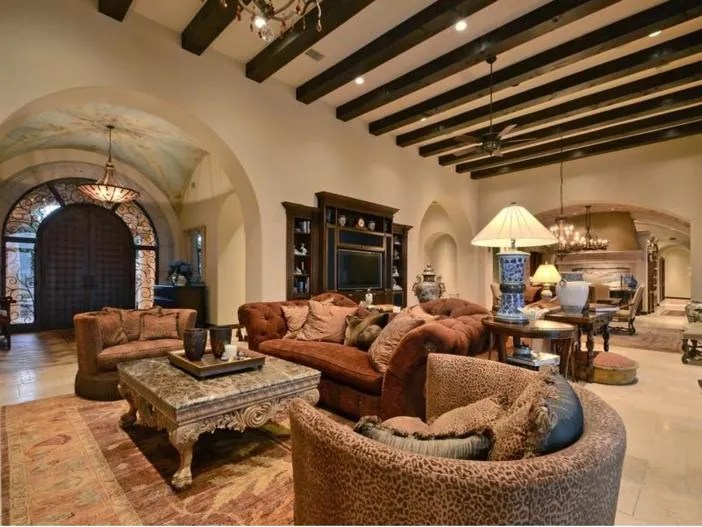
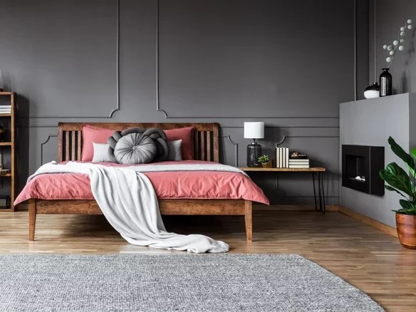
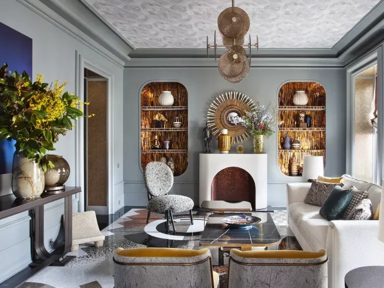
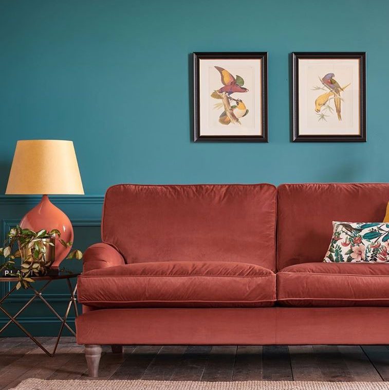
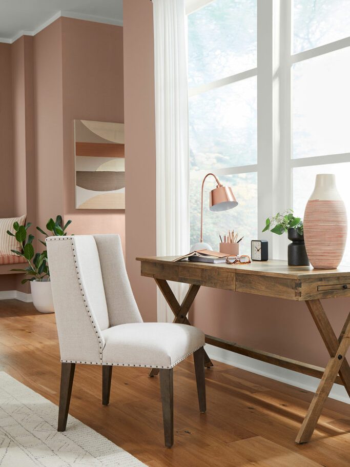
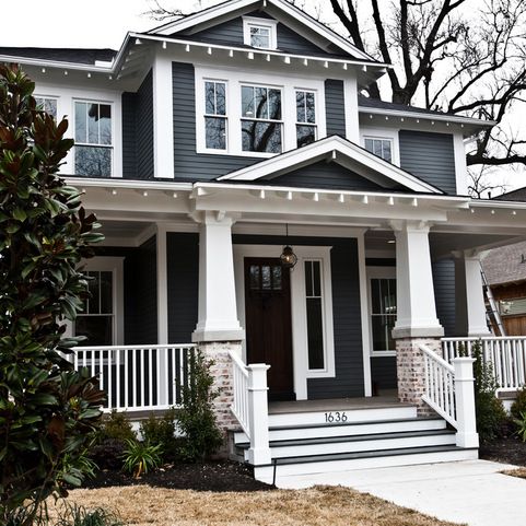
So when you’re picking a wall color for a bedroom, both the Saturation and the Value are important. If the color is too saturated, and there are other colors in the room, it can feel like the walls are vibrating. And that’s okay if you’re going for a room with lots of energy and vitality, like this one.
:max_bytes(150000):strip_icc():format(webp)/225811303_2351425294990524_4394162365566741163_n1-17bd60b7998c436d813211cbca0c5a66.jpg)
Likewise, if the color value is dark, it may feel more intense than a lighter value of the same color.
Okay, my child wants a bedroom makeover. Now what?
As a mom, I think it’s important to let children pick their own bedroom colors. But having said that… if you are concerned about having to prime over a loud or dark color in a few years when they change their mind or go off to college, you can take the hue (color) that they chose and then move a little toward the gray end of the fan deck. Muting that electric blue just a little will give the walls some longevity and allow your child to live with the color longer.
Here are some pairs of examples. The first color is a pure saturated color. The second related color is an alternative that is slightly muted (less saturated) and lighter (in value) as well. The alternative wall color will give you a calmer and perhaps a slightly more sophisticated feeling when you walk in the room. No more anxiety.


When in doubt? It’s only paint. Sleep well!
If you need help with color, feel free to comment below, hit the button for a Color Consultation, or shoot me an email at yourcolorcoach@gmail.com.
I would be happy to help you.
Hope you have a Colorful Day!
Barbara, Your Home & Color Coach
Hanging Art: Tips from a Home Stager
March 4, 2023 § 1 Comment
As a home stager, the one thing that stands out to me when I enter someone’s home is their artwork on the walls. Sometimes it makes a smashing impact. Other times it seems a bit random. Where is the art located? How high is it hung? And how have they grouped the pieces together?
Hanging art in the right places and at the right level to view optimally makes a huge difference in the overall effect of having art at all. Here are a few tips that might help you get the most impact from the art you select for your home.
WHERE SHOULD I HANG ART?
Hang art on the focal wall.
That’s generally the wall you see from the doorway. It’s what grabs the eye as you enter the room. It may be different from an accent wall that you painted behind the bed on a non-focal wall. The focal wall is visible from the door and it’s where your art will have the biggest impact. You can hang art elsewhere, but there should be something fabulous on that focal wall.

____________________________
HOW HIGH DO I HANG IT?
Rule of Thumb — 57″ on center
The biggest mistake I see is hanging art too high. On a plain wall, hang the art so the center of the piece is 57″ off the floor. That gives most people a direct eye-level look at the art when they are standing up. Like in a gallery. If you have to look up to see a single piece of art, it’s too high.

____________________________
HOW HIGH DO I HANG IT OVER FURNITURE?
6-8″ from the top of the furniture
Another mistake I see often is art hanging midway in the space between the top of the furniture and the ceiling. It may be tempting to split the distance and hang the art there. But chances are good that the art will be too high. There should be some breathing room above the art or it will feel too big for that space. If it feels too big, move it to another location.
When hanging art over furniture, the 57″ Rule does not apply. In that situation, the bottom of the art should be 6-8″ from the top of the furniture, in this case the headboard.
____________________________
WHAT ABOUT IN A DINING ROOM?
Since people are seated in the dining room, the art is often hung a bit lower so that it is viewable by people sitting down at the table. If the art is hung too high in this room, it’s really noticeable.
____________________________
HOW FAR APART DO I SPACE THE ART?
3-6″ at most
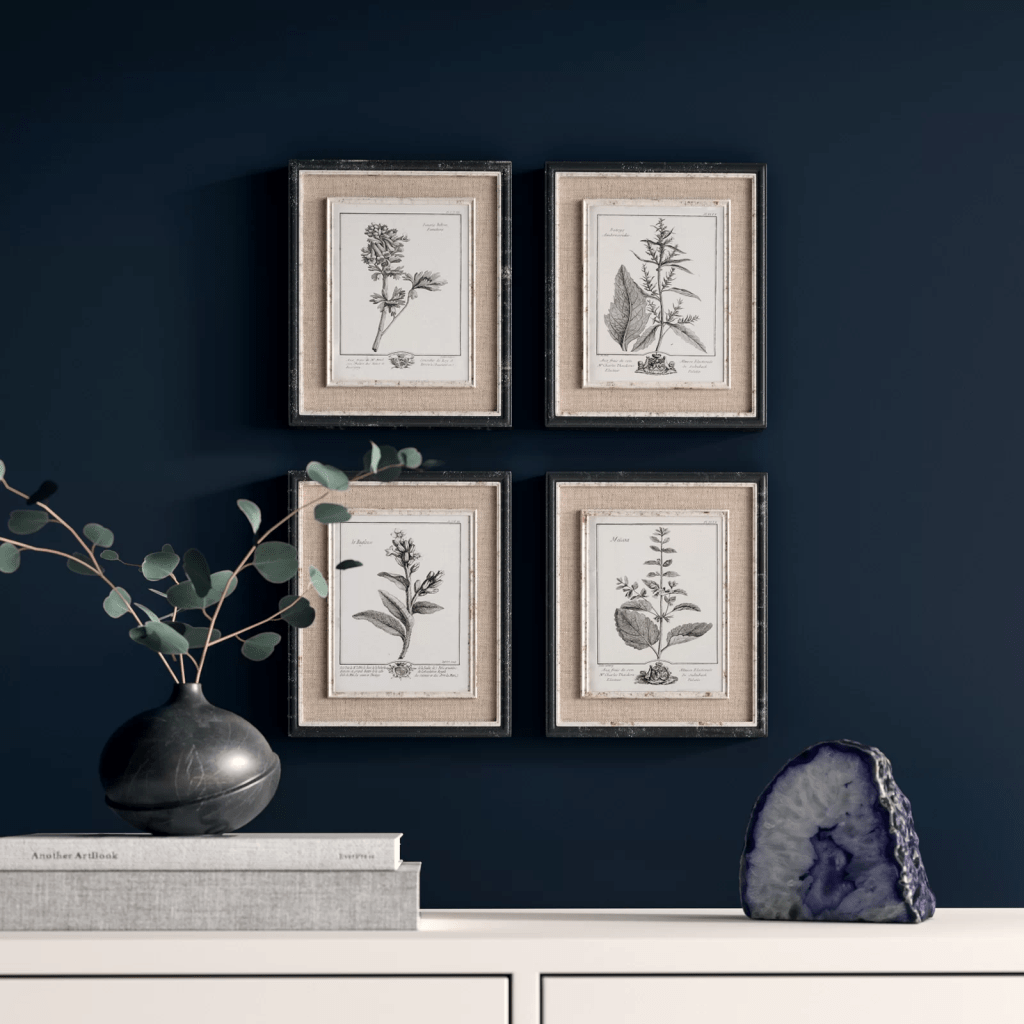
In a geometric grouping, when all the frames are the same size, it is important to keep the art close together so they are seen as a grouping and not as individual pieces. In terms of location on the wall, make sure the center of the grouping is 57″ off the floor. Doing a practice arrangement of the art on the floor will save putting too many holes in the wall. Measure twice, as they say…
____________________________
HOW DO I ARRANGE A RANDOM GROUPING?
On the floor first
Arranging and rearranging a grouping on the floor will help with later placement on the wall. I play around with the arrangement until I get one that pleases me. A couple of guidelines:
- Keep the same distance between pieces of art. This creates cohesion and makes the arrangement look like a grouping. It is not always possible, but to my eye it looks nicer.
- Avoid “rivers.” The long lines of space running horizontally or vertically without interruption between the pictures are called “rivers.” Avoiding them is an old high school yearbook rule for laying out photos. It stuck with me, and I do follow it. (The exception is when the grouping is geometric as above — all the frames are the same and are displayed in a grid.)
The center of the grouping should be 57″ off the floor.


____________________________
WHAT ABOUT DIFFERENT FRAMES AND SIZES?
Start with the biggest piece
For a large arrangement, spreading out on the floor will help a lot. Start with the biggest piece and work out and around from there. Remember that if there is a sofa below, leave 6-8″ between the top of the sofa and the bottom of the first piece of art. Notice how the two pieces on the far left line up on their right side. It is important to keep the distance between pieces the same throughout for an intentionally collected arrangement.

If you need help with color, feel free to comment below, hit the button for a Color Consultation, or shoot me an email at yourcolorcoach@gmail.com.
I would be happy to help you.
Hope you have a Colorful Day!
Barbara, Your Home & Color Coach
Speaking of Red, What’s the Best Front Door Color?
February 26, 2023 § Leave a comment
Quick answer? Not red. Necessarily.
Red is a traditional door color that is steeped in history and folklore as it symbolizes a welcoming home, a safe haven for travelers, a harbinger of good luck, and protection from ghosts and evil spirits. And it certainly is striking, particularly on a white house.

But before you run out to the paint store, a study done by Zillow in 2022 found that buyers would pay $6500 more for a house with a door color they found desirable and conversely would pay $6500 less for a house with a front door they didn’t like. The door color that brought the highest offer? Black.

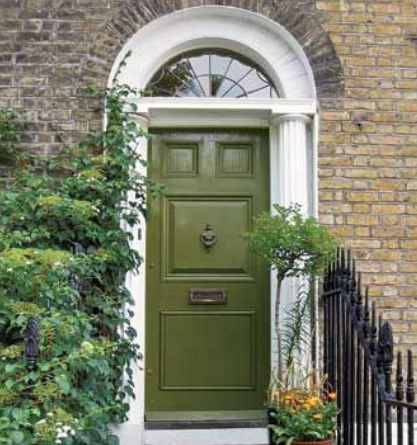
Now black isn’t for everybody, but red obviously isn’t either. The same study found that Slate Blue and an earthy Olive Green came in second and third. (Note the stone and brick on these two houses — we’ll come back to that.)

Colors to be avoided? Pale Pink and Cement Gray as they were described by respondents as “shabby and dated.”
Not to be contrary, but only a year later another trend study found Soft Rose (aka pink) and Dark Charcoal (aka gray) to be two of the recommended front door options for 2023.


Okay, let’s unpack this because you cannot pick your front door color based on folklore or some conflicting color trends. It just doesn’t work.
A front door color should be chosen based on your
- House color. Do you have a neutral house color or is it already making a color statement? Obviously you don’t have to have a red door for luck or a black door to sell your house, but there are some color combinations that are better than others.
- House style. Is your house from a particular style era? Colonial? Mid-century? Modern houses can support bright crayola colors. Traditional homes sometimes match shutters to the door color and might even keep them light for a blended, softer look.
- Landscape colors. Do you have flowering shrubs next to the entry? A big rhododendron or lilac bush? There may be a color opportunity just steps away.
- Materials. Is your house brick or stone? Natural materials on the front of a house often present challenges to picking a door color because there may be multiple colors already in that brick or stone, and the house may appear busy. Choosing a door color to complement that stonework is tricky.
- Roof color. Sometimes it plays a pretty big role in the overall house palette. (I’ll talk about roof color another day.)
HOUSE COLOR
If you have a white house…
You have a rainbow of choices before you. But tie that front door color in somehow so it doesn’t look like a random walk through the crayon box.
What if my house already makes a statement — it’s red?
If the front door is under a porch overhang, I suggest keeping the door light. With all that house color, a creamy white works, and you can still find the door without the porch light on.

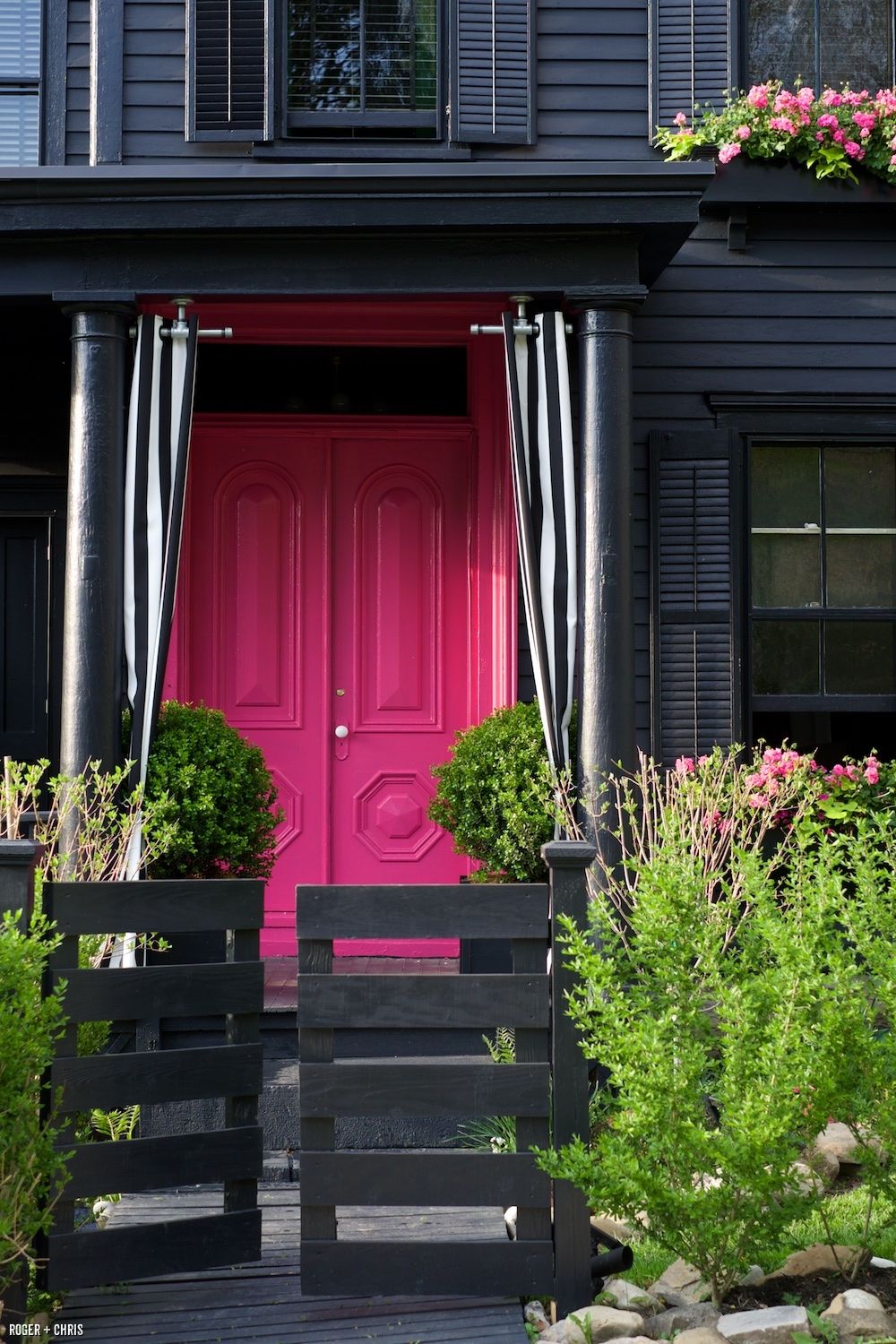
What if my house is black?
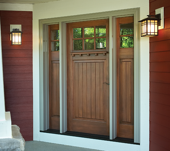
All door color options are open to you — even black. And keeping the whole house black lets the greenery take top billing. But the door color I like best for a black house is a natural wood door — it totally warms up the house and is very inviting.

What if my house is not black but it’s still dark — like navy blue?
There is nothing fresher than a splashy sunny yellow door on a navy blue house.

What if my house is charcoal gray?
You really cannot beat the warmth of wood. Or the color of wood — a rich gold paint color.

What if my house is light — like this gray-blue?
This house picks up some of the warm peach tones from the front porch and gives this more traditional house color a fresh look.

What if my house is green?
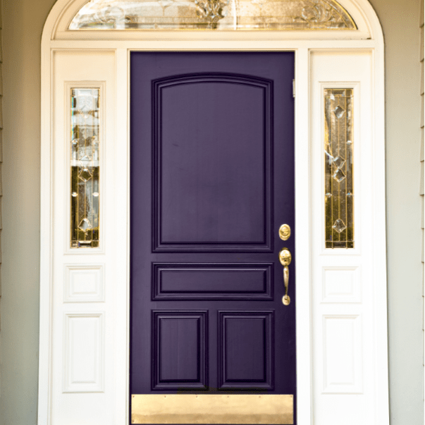
Omgosh… try a regal shade of purple. And plant some irises. It’s a stunning combination.
HOUSE STYLE
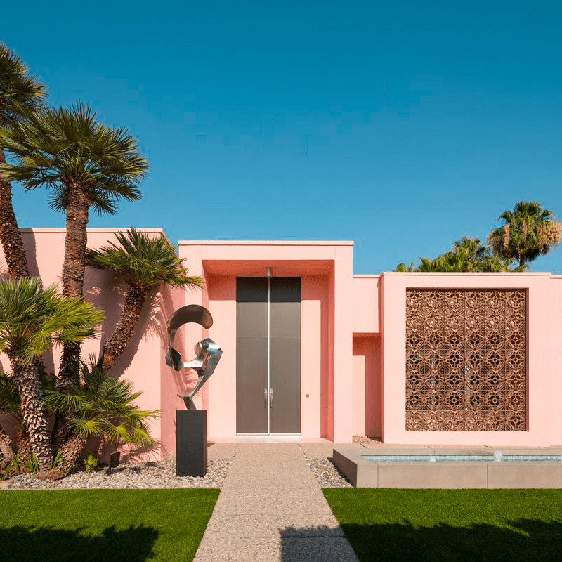
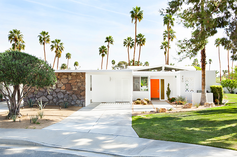
Here’s where a nod to regional trends and a tip-of-the-hat to history play a part in color choices. I’ll just pick two examples. The soft blend of tones on this neo-European style traditional home speaks to the part of the world where shutters actually function. The pink house waves from Palm Springs. Note the choice of door color — to calm the perky exterior. House styles have some parameters. After that, it’s all about your taste.

Now back to reality…
LANDSCAPE COLORS
Notice how the landscaping dictates the door color? It is such a great trick, and it really pulls the curb appeal to a higher level. Will it bring in the highest offer on your home? Maybe not, but if you’re not moving, then it’s not an issue.


HOUSE MATERIALS
What if my house is brick?
Solid dark colors like navy are classic door colors with brick. As is black, of course. One color to avoid? Red because bricks are not actually red and trying to match them for a door color is a challenge.
What if my house has multiple colors or stone textures?
My absolute go-to color for coordinating front door and stonework without introducing another accent color is Sherwin Williams Urbane Bronze! It is a miracle front door color!

If you need help with color, feel free to comment below, hit the button for a Color Consultation, or shoot me an email at yourcolorcoach@gmail.com.
I would be happy to help you.
Hope you have a Colorful Day!
Barbara, Your Home & Color Coach
Add Color Here but Please Not There
February 23, 2023 § Leave a comment
Color is back in season as we watch the light neutrals fade off into the distance. Here are 5 areas of your home where you can add color with a paint roller or a brush. But scroll to the bottom for a gasp of OMGosh please do not do this!
ADD COLOR TO STAIRS
I am a huge fan of painting the stairs — pretty much anything but white. The ombre effect on the stair risers creates a fresh relaxed look and is a great way to bring in an accent color. Or you can paint the whole stairway. The stained wood treads look spectacular popping off the dark gray woodwork.


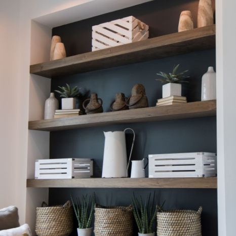
ADD COLOR TO SHELVING
This color application has been around awhile, but I am still a fan! Painting the back of your display shelving is such an eye-catcher. And it can highlight your collections. What an opportunity to add color — and so easy! Or you can paint the whole inside of each display cube a different color for a playful focal wall.
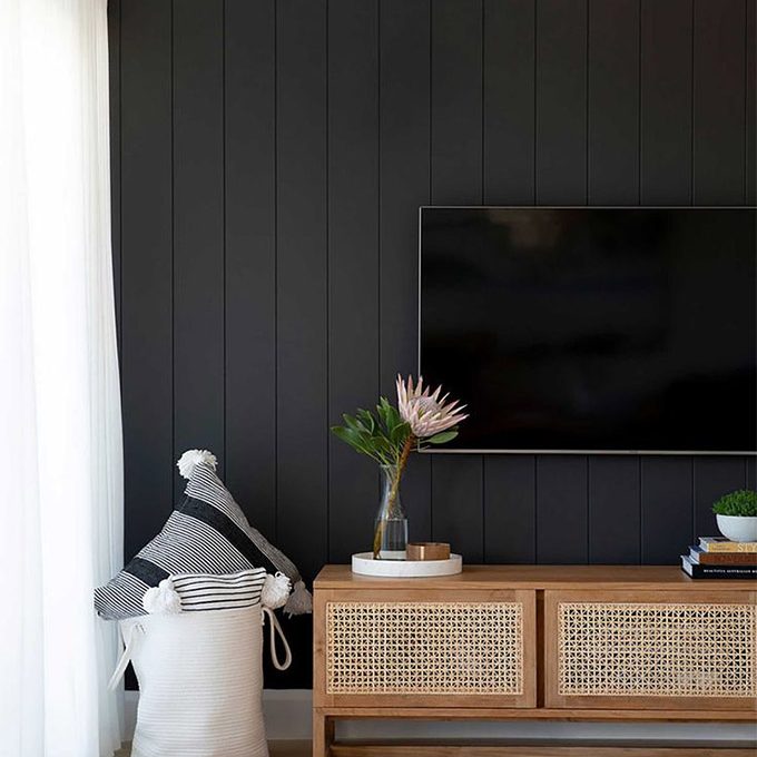
ADD COLOR BEHIND THE TV
It doesn’t have to be black, but camouflaging the TV is a great idea. Any dark color will help. Or if you rather like a large touch of black, make the TV wall a colorful focal point.

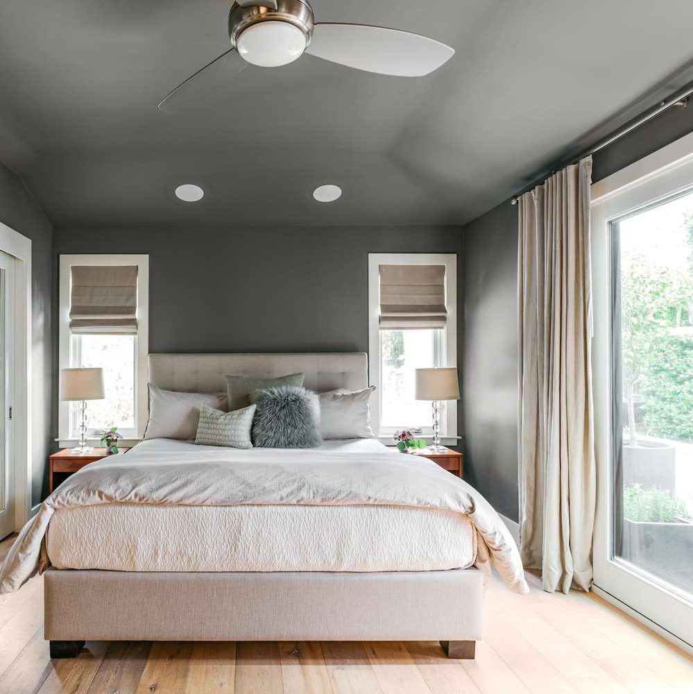
ADD COLOR TO THE CEILING
Whether you want to paint just the ceiling and molding around it as an accent or go up over the ceiling with the wall color to enlarge the room, painting the ceiling will add drama. But white in the room offers a fresh contrast and keeps the room from feeling like a cave.

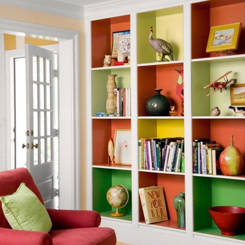
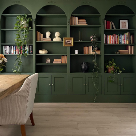
ADD COLOR TO A WALL OF BOOKSHELVES
Your painter will love you (oh, that’s you?) if you decide to paint the entire wall of bookshelves the same accent color. For one thing, the sheen on the paint will stay the same. And there is no cutting-in or taping-off required. In a light-filled room or a library, this color application will set the mood for sure.

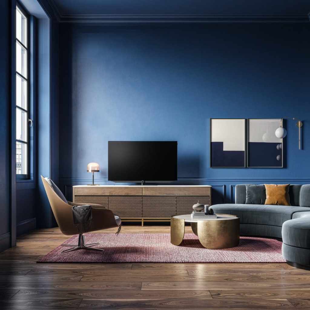
WARNING! DON’T DO IT!
OMGosh… please do not try this last one at home UNLESS you are a designer, your ceilings are high already, and you have enormous windows. Yes, it’s dramatic, cool, and trending to paint walls, trim, and ceiling all one dark, dramatic color. And yes it’s quicker and easier when it’s all the same. But here’s what happens:
- You lose all architectural detail (moldings, fireplace, wainscoting — if you don’t have any, you might not care).
- You lose all contrast that helps you see color (because say it with me, “white makes colors pop”).
- You add reliance on light — either from windows or lamps — to see anything in the room.
- You risk the wall/ceiling color influencing the colors of everything else in the room.
- You risk making your furniture look drab.
- You risk triggering your seasonal depression on a daily basis.
- And the elephant in the room: If you want to sell your home anytime soon, dark-and-moody just doesn’t sell. It will cost a fortune in primer to paint over all that surface area.

But as they say in the biz… it’s just paint!
If you need help with color, feel free to comment below, hit the button for a Color Consultation, or shoot me an email at yourcolorcoach@gmail.com.
I would be happy to help you.
Hope you have a Colorful Day!
Barbara, Your Home & Color Coach
COLOR: Where We’ve Been –Where We’re Going
February 17, 2023 § 2 Comments
Should you care about color trends? When it comes to predicting what paint colors will be popular in the year ahead, are you in one of these groups?
- Ds & Ds (Decorators and DIYers. We love color trends, whether we follow them or not.)
- Non-Ds (Non-Decorators. These people are not watching HGTV or Nick on YouTube. But maybe they should.)
- HS & HBs (Home Sellers and Home Buyers. Both groups are aware of color trends because realtors talk about them a lot.)
- RPs (Regular People trying to furnish or update their homes.)
Regardless of which group you’re in, if at some point you want to refresh your home for yourself or you want to sell it for top dollar, you will bump into the latest color trends.
One Caveat: History is the boss of me

Historic homes often celebrated color, florals, and large patterns all at the same time. If you own an historic home, you are exempt from color trends of all kinds except those associated with the original style of your home. You know who you are. But if you want to see the angst that other people experience when it comes to color in their homes, read on.
Jumping ahead a few decades …
Here’s Where We’ve Been
The Tuscan Trend
This Mediterranean-inspired period started in full swing in the 2000s, particularly in new construction. There was lots of beige and taupe with wrought iron, ornate carvings, faux finishes, and cabinet door glazes. Many people who were building or renovating at the time seemed to want to live in Tuscany.
The Gray Trend
Then in 2010 when stainless appliances were well-ensconced in new construction and renovated kitchens, Sherwin Williams coined the phrase, the “Graying of America,” and introduced a palette of gray wall colors that replaced beige in a major design shift. Builders and renovators jumped on board.
But people turned to gray in kind of a big way. Over a short amount of time everything turned gray: bedding, walls, furniture, and even flooring. Colors from previous color trends were gone from the shelves. Finding peach towels, for example, was all but impossible in this decade.

Re-Enter Brass Metal
In some parts of the country where sunshine is infrequent, homes that were entirely gray began to feel a bit chilly inside. A resurgence of brass (but in a more modern finish) entered the scene and started to warm up the grays.
Enter Farmhouse Wood and White
Then with the popularity of the architectural Farmhouse Style, people were drawn to reclaimed wood, which again warmed up the grays, and white kitchen cabinets that lightened and brightened the previous all-gray scheme.
Before long, everyone wanted white walls. Regardless of house style. Light, airy and open was the mantra with minimal window treatments.

But the thing about white walls is that they can look chalky or just overly bright if there is too much natural light.
Enter Greige (and how DO you pronounce it?)
Greige (a gray-beige pronounced, big surprise, GRAYge) parachuted into real estate as stagers tried to hit the middle between gray, beige, and white to satisfy the largest swath of buyers. And greige became the go-to bank of paint colors. Greige is warmer than white but it does not darken the room or look drab. Benjamin Moore’s Classic Gray was a favorite.
Time to Move On
Yet right on cue, the design community and countless influencers, including companies that want to sell paint, moved to creamy off-whites and back to beige. For those of us in the business awhile, it was like coming full circle. But alas this is not a new Tuscan Trend.
OKAY, pause here.
If you have a recently painted gray interior and you love it, keep it. You do not have to repaint. In some cases gray is the perfect neutral and regardless, we can work with it. You are in a prime position to hop on the color trend and ride into the future.
Here’s Where We’re Going
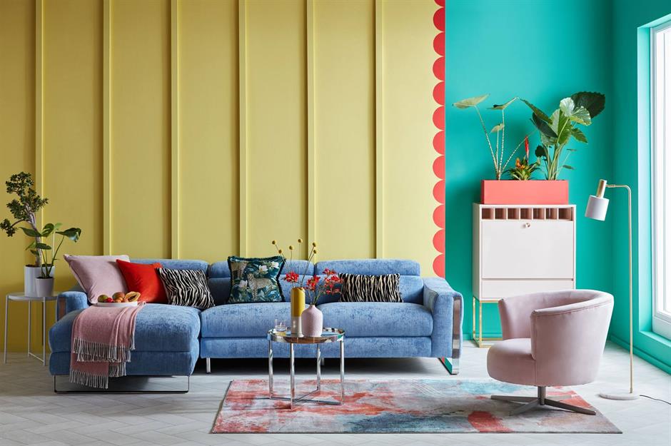
COLOR! Big art, colorful accessories. Regardless of your wall color, adding art and accessories will refresh your space.


If you need help with color, feel free to comment below, hit the button for a Color Consultation, or shoot me an email at yourcolorcoach@gmail.com.
I would be happy to help you.
Hope you have a Colorful Day!
Barbara, Your Home & Color Coach
Where Color Trends Dare You to Go
February 12, 2023 § Leave a comment
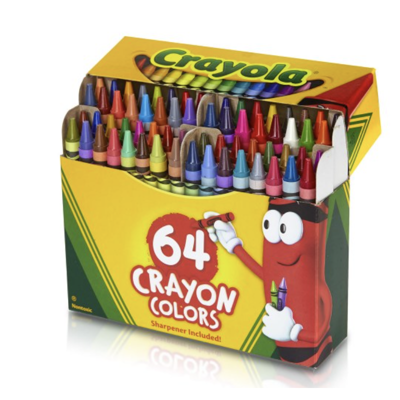
Were you the kind of kid who rearranged your crayon box? Maybe lining up all the cool blue-greens with the cobalt blues? Then putting the grass-greens and sunny yellows together? Or did you make a rainbow or go from light to dark? Just curious.
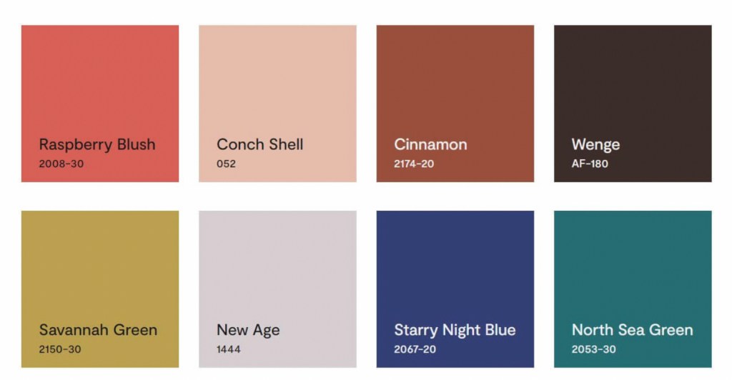
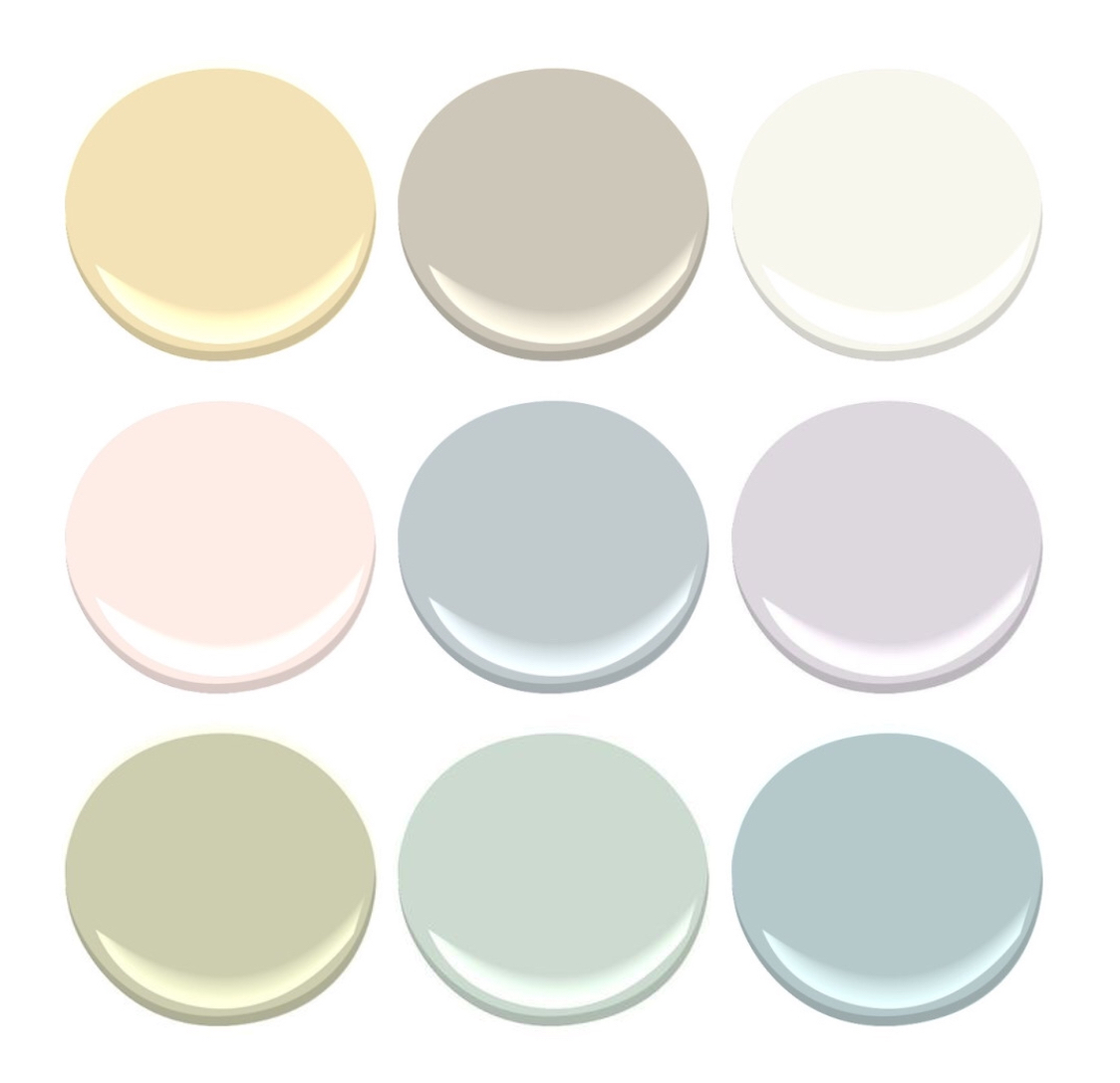
If you like a color organizing challenge, here’s one — the Color Trend Palette for 2023 from Benjamin Moore.
Okay let’s unpack this crayon box
Benjamin Moore calls this paint color grouping a “palette.” Personally, I think of a palette as a combination of hues and hue values that coordinate together and tell a story or express a mood. Something that signifies a color direction or coming design trend. But I looked it up anyway.
Googled “color palette”
“A color palette refers to the actual colors that you’ve chosen, based on your color scheme. A color scheme is based on color theory, like a monochromatic scheme. ” Diana Hathaway Timmons
So if you decide to paint your living room blue and you have all different shades of blue (navy blue sofa, light blue chair), then you have chosen a monochromatic color scheme for your living room. The actual color palette might include the paint color Starry Night Blue, but it would not include all those other paint hues because your color scheme is monochromatic — just one color.
Painting on canvas versus decorating a room
If you paint on canvas, not walls, your palette may look like this!

Artists can mix paint colors and create art. But decorating a room is different from painting a picture. Colors in a room are not blended — they are placed next to each other, in front of each other, and over, behind, and on top of each other. And depending on the light in the room, one color can influence the color next to it. And sometimes, they just don’t work (see discussion of clean and dirty colors in What Color Trends Don’t Tell You).
Back to the Color Trend Palette for 2023
In case there is some confusion, the hues in the Benjamin Moore Color Trend Palette for 2023 (above) were not chosen because they all go together. The paint company is not expressing a particular mood or design style we can expect to see or even create in our own homes in 2023.
They have simply compiled eight separate hues (ideas, if you will) that their designers have determined, from global trends and design tea leaves at home, will hit the paint stores and home goods stores this year.
But to soothe my Kindergarten color-arranging sensibilities, I will rearrange their paint color palette anyway.
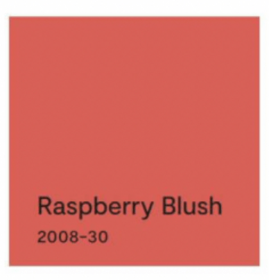
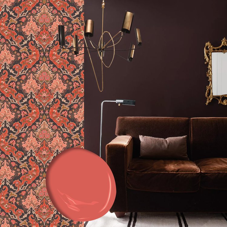
First up? Raspberry Blush
The first color, Raspberry Blush, is the Benjamin Moore Color of the Year for 2023. What a lovely stand-alone color for a dining room wall or an accent wall behind a white fireplace.

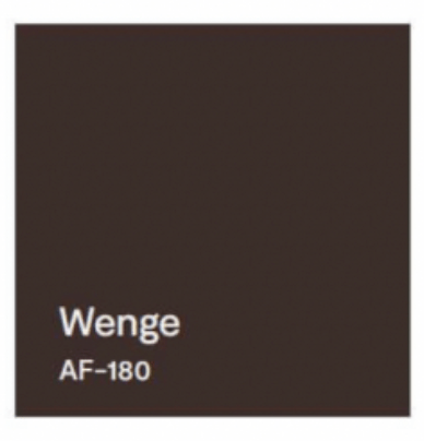
It can be paired with Wenge from this Color Palette.

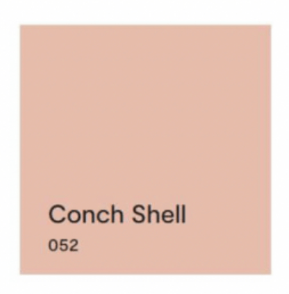
Next up? Conch Shell.
If you saw the previous post, we talked about clean and dirty colors. Conch Shell is clearly a “dirty” color that does not pair well with any “clean” colors. So in this palette, other than pairing with a neutral, I would line it up with New Age, and that’s it. These two “dirty” hues look great together. And Conch Shell would be a pleasant hue to add to the palette of a gray paint color scheme in your home if you’re trying to add some warmth for 2023.


Next up? Cinnamon.
Cinnamon is a rich warm color that conjures up a timeless Southwest palette so it is fitting to pair it with a teal like North Sea Green that reminds us of turquoise.


Flash Back and Flash Ahead
Lastly, I would flash back to the blue & green decades from the past to pair the last two sultry hues. And I’m not talking about the ’70s. Art Deco (from the 1920s and early ’30s) with its rich jewel tones and luscious velvet textures is on trend at the moment, and these two colors will fit right in.


But if you dare to go there…
If you are not afraid of color and have an eye for modern, eclectic, live-what-you-love design, then throw out all those color-matchy-matchy Crayola crayon pairings and toss the whole batch of 2023’s trending paint colors into the room.
Because when it comes to loving YOUR home, there simply are no rules.
If you need help with color, do not hesitate to comment below, hit the button for a quick color consult, or shoot me an email. I would be happy to help you.
Hope you have a Colorful Day!
-Barbara, Your Home & Color Coach
What Color Trends Don’t Tell You
February 10, 2023 § Leave a comment

It’s that time of year when people toss out the old and refresh their place with something that will breathe some Spring into the Winter blahs. Some people pore over seed catalogues for inspiration. Others turn to paint companies for the hot new color trends. So off we go to scour the internet for how the color experts see us living in this year’s creative new palettes.
All the major trend-makers and influencers weigh in. Everywhere, it seems, you see the new colors pop up in linens and bath towels, art and accessories, and furniture. Experts offer an array of options for incorporating new color ideas into your home.
And THAT’s where we hit the design wall.
For example:
Sherwin Williams chose the paint color Redend Point for their 2023 Color of the Year.
They show beautiful rooms with the color applied in all kinds of spaces. And they even give you trim colors and other hues that will complement Redend Point.
But what each of these trend-setters tells you is how to use the new color in a complete room makeover. Unless you have a room that is essentially a blank slate, like this one,

you end up trying to incorporate this color into your existing space. I am here to tell you when incorporating this dusty paint color will work and actually more importantly, when it will not.
First a note about colors and mixing. Quite simply, there are two kinds of colors: Clean and Dirty. Clean colors can be described as clear and identifiable as a particular hue. Right out of the crayon box, you might say. Dirty colors can be described as muted, mixed with other hues to make the color appear grayed down and kind of dirty next to its clean sibling.
 “CLEAN” “CLEAN”Benjamin Moore’s Shades of Green 537 |  “DIRTY” “DIRTY”Benjamin Moore’s Mesquite 501 |
And Redend Point, with all due respect, is a dirty color.

It goes great with neutrals like off-whites and grays, and other muted “dirty” colors like worn terra cotta, dusty grape, and cool rustic wood brown.


But wait a minute!
Butted up against clean colors, though, Redend Point looks worse than dirty — it doesn’t belong, whether it’s the wall color or a pillow on the sofa. So let’s look at what does NOT work with this color.
Your existing room decor matters.
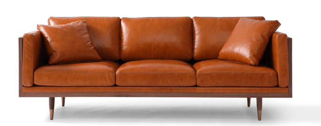
If you bought a new cognac leather sofa when it was all the rage, then that orangey brown leather will make your newly painted Redend Point walls look dirty. So nope.

Your hardwood floor matters.
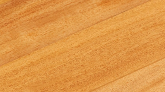
If your existing hardwood floors have yellowed over the years, then do not consider Redend Point for your room. (Tip though: if everything else in the room works, then a large rug will definitely help.)
Clean color matters.
Yellows, vibrant blues, and other clean colors are coming back too (I’ll talk about them later), but they do not go with Redend Point, please! Again, that paint color (or pillow or side chair or rug) is going to look old, faded, and ready to toss next to any clean, clear colors and especially yellow. No to these!


Questions? Just ask.
If you have questions about color, do not hesitate to leave a comment, click on the link for a quick color consult, or shoot me an email. And thanks for the chat.
Hope you have a Colorful Day!
-Barbara, Your Home & Color Coach
Curb Appeal Refresh: The Front Door
May 22, 2019 § Leave a comment
Some of you may remember when the fashion industry changed the skirt hem length every year — from maxi to mini to midi and then back to comfortably above the knee.
Front door color has followed a fashion trend of its own. A decade ago, red was all the rage — and for some it continues to be the most welcoming front door color. Black with a metal kick plate has always offered a sophisticated read on the front entry. But what has followed in more recent years has been a busting-out of traditional exterior curb appeal. Here’s what front door colors we were talking about just 3 years ago.
So it is time to update those door trends again. No more copycat door-painting just to be fashionable. We’re stepping out of the shade of the porch to a bold new entryway that will set each house apart from its neighbors.
But first, let’s talk about house colors. What has changed:
–More white houses. It used to be that white fell to farmhouses and antique colonials. Not anymore. There is plenty of white new construction, which opens up a fan deck of front door options.
–More gray houses. Always a neutral that fits into almost any environment, the gray interior trend moved to the outside and remains. Gray also opens up a fan deck of front door options, maybe just a few fewer than white.
–More Crayola color and less safe beige. Dark and rich are replacing light and airy. Briarwood is moving to Hale Navy. Rich Cream is moving to Merlot Red. Even some developments are providing a rainbow of siding options instead of the light neutrals from years past. <<applause>> If you have a bold red house, you probably don’t need me to tell you what color to paint your front door (lol!), but I’ll offer suggestions anyway.
–More midcentury renos, both contemporary and ranch style. With a surge in client interest for open-concept living (uh-oh to that trend, but that’s another story), people have realized that it is easier to update an already open midcentury home with the high vaulted ceilings and the great-room flow than it is to modify a boxy colonial. Big surprise there. So we are seeing a plethora of exterior colors (even black) as a result of these one-story re-dos.
Back to the front door. Here are some ideas for redoing your front door color to refresh your home.
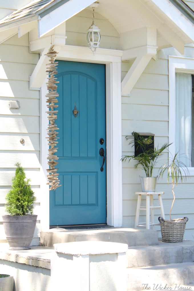
Teal and Turquoise — I cannot believe that I used to recommend turquoise only for tropical house locations or homes that at least had a pool. What used to be a quest to coordinate house colors with the local environment is now a challenge to ignore it. Where teal and turquoise work: on gray, white, black, yellow, red, okay almost every house color except blue. Where they do not work: on dirty or faded house siding (the bright color makes the house look worse) and on other blues like colonial blue.
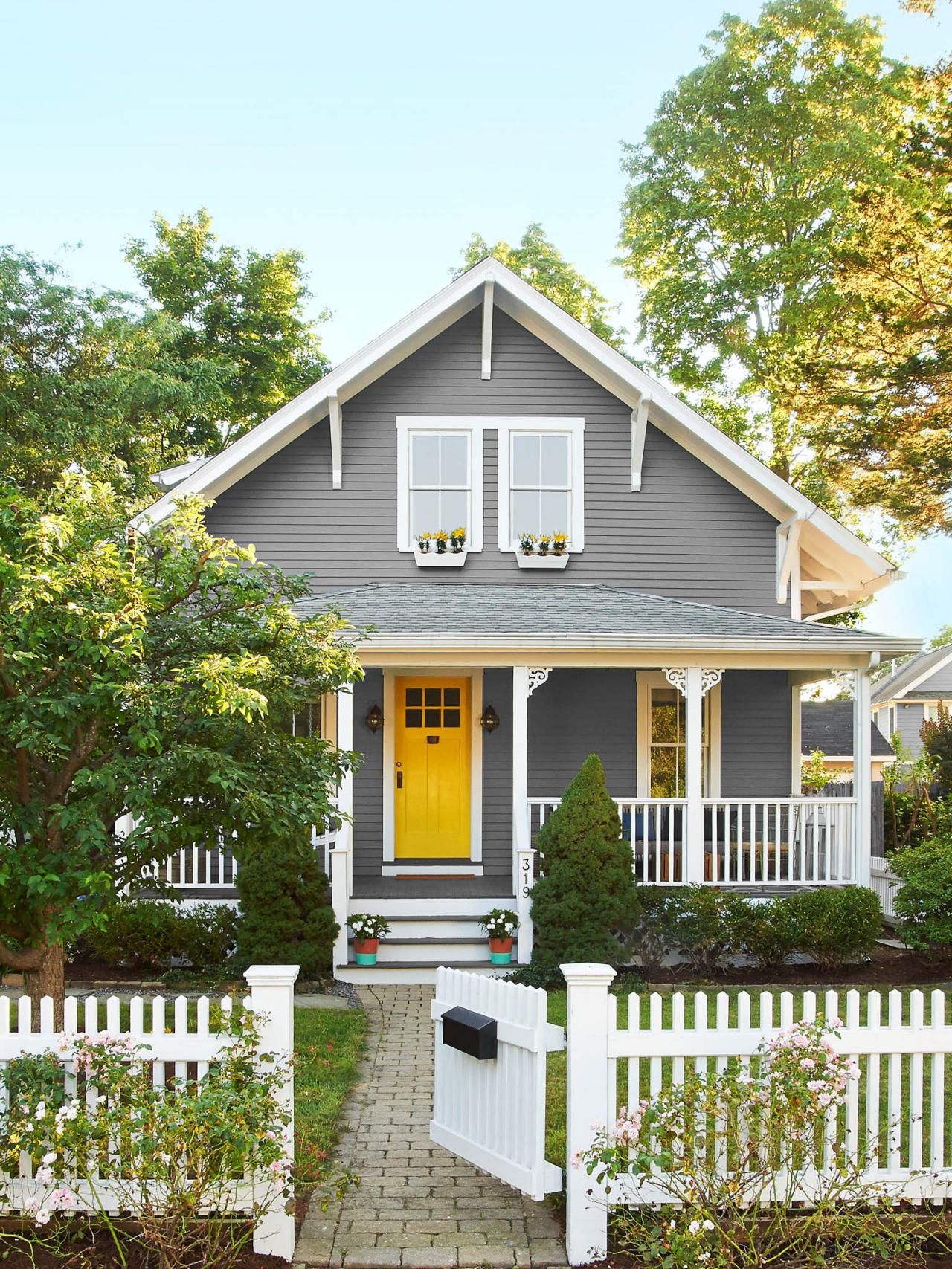
Yellow and Orange — not everybody’s favorite colors but they are so happy. I love them on a front door. Where they work: on dark house colors like navy, green-browns, dark and light grays, neutral gray brick, and white. Where they do not work: Again, on any color that looks faded, aged, or dirty.
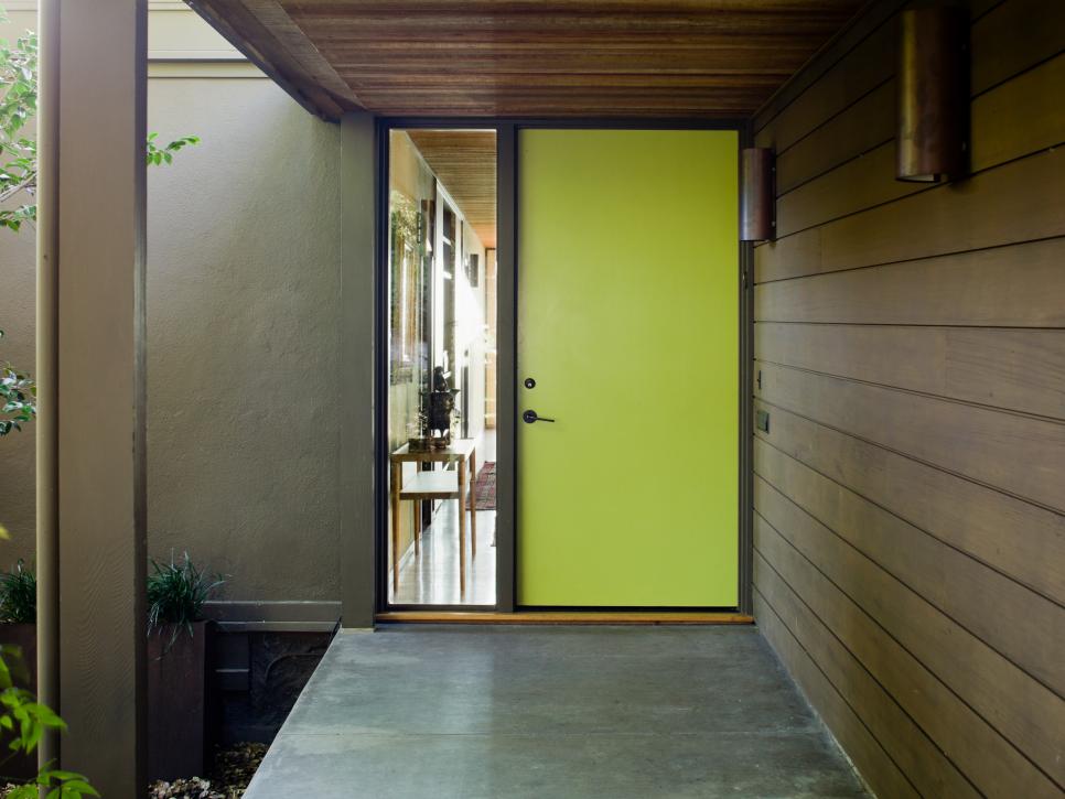
Lime Green — fresh and springy and a wonderful coordinating color for your landscape. Where it works: dark gray, navy blue, even red brick, chocolate brown, black. Where it does not work: any other green or dirty beige.
Pink and Purple – always beautiful on a white house with coordinating landscape trees but also on a dark house for a real pop of warmth in the neighborhood. Where they work: white, gray, navy. Where they do not work: on yellow beiges and orange beiges because of the undertones and on anything that has a faded or dirty appearance.

If the bright colors will not work with your house color, try natural or even white.
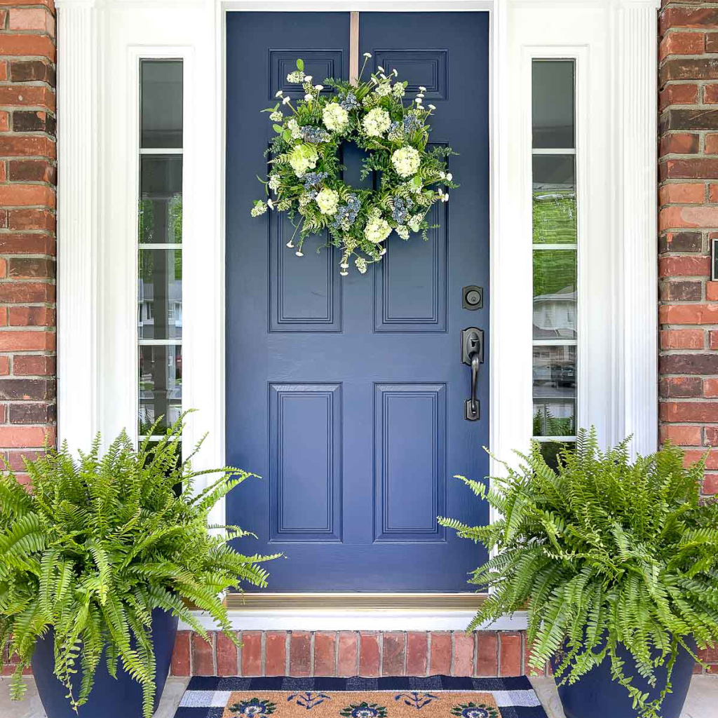
Natural Wood or wood-look – always a classic. Where it works: navy and red, for sure. And just about every other house color.
White — yes white! What white does is make the whole entry area look larger since it blends with the white trim color. It also creates a blank canvas for holiday decor — wreathes, flower pots, etc. There is nothing quite like white as a backdrop to a variety of color palettes around the entryway. Where it works: especially good on a house with a lot of color already and crisp white trim. Also works on neutrals when you want to maintain a soft neutral palette throughout — be sure to add textures though with lots of greenery and baskets or wicker furniture. White also works on aged or faded houses where the bright colors do not. Crisp white perks everything up.

I hope these ideas dazzle your thinking and inspire you to head to the paint store. Happy painting, everybody!
Front Door Color –Refresh for Brick Homes
May 20, 2019 § 6 Comments
I wrote my first blog post about front door color back in 2012 when it seemed like red and black were the most common options for traditional homes. And shutters? Well black and then black again.

But today I stumbled upon a couple of photos from Beacon Hill in Boston that blew my traditional color palette out of the fan deck, so to speak. It was love at first sight of that rich gorgeous blue — yet to be identified by name and brand.

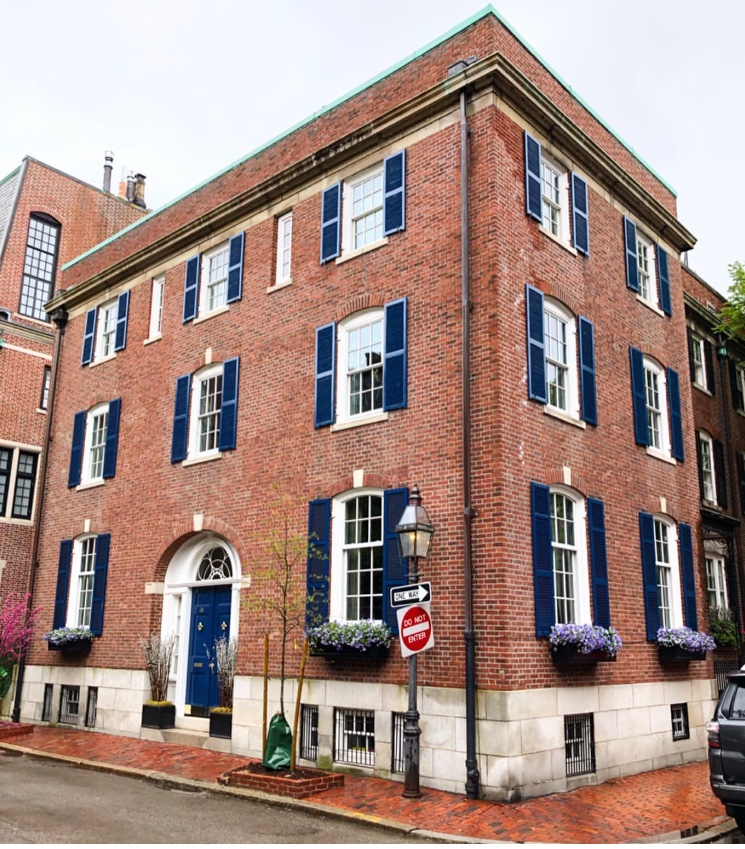
Photo: @buildingsofnewengland
Just guessing here (I didn’t find anything in the Sherwin Williams paint line), but Benjamin Moore has Dark Royal Blue 2065-20 that comes pretty close for now until I can track this color down.

Benjamin Moore 2065-20
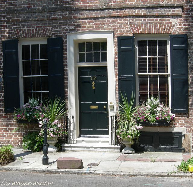
What I love about this color for the front door (and shutters for that matter) is that it’s dark enough be traditionally tasteful and even replace black on many houses like the 1912 Colonial above, but it has hue enough to excite the senses and certainly stand out from the crowd of traditional black and Charleston Green doors and shutters (not that there’s anything wrong with traditional!).

And I’m just talking about brick homes — because door colors on painted houses and more contemporary homes have gone right through the color palette. More updates on that later.
In the meantime I’m going to appreciate that stunning blue on the brick Rhoades House and open my fan deck to more brick home door color ideas.
Calming the Visual Chaos
March 28, 2019 § 2 Comments

It’s all around us. Chaos. From the constant stream of visual information we scroll through daily and the mountain of snail mail we sort and toss to the stuff of life — equipment, cords, mismatched socks, you get it.
On the other side of chaos, we have the wisdom and direction of Marie Kondo who delicately advises us on how to live a happy and ordered life. It’s no wonder she has sold over 10 million copies worldwide of her “The Life- Changing Magic of Tidying Up” Series.
But what if you’re somewhere between surrendering to utter dysfunction and summoning up the energy to fight the entropy bombardment to disrupt your home? What else can you do to add some calmness to your home without ordering a dumpster for the driveway?
- Rid Yourself of Red (unless it’s your favorite color)
Whatever tends to agitate you emotionally, get rid of it. I’m talking about colors, not your family members. Whether it’s your limey yellow kitchen walls, red curtains in the master bedroom, or the dated and kind of ugly wallpaper left by the previous owner, take the time to change it. Personally, I took all the red pillows and artwork out of my living room and replaced them with blues and calm neutrals. I noticed a remarkable change in my spirit.
- Create One Beautiful Vista Per Room
If the thought of clearing out 27 years of living from your house is overwhelming, then focus only on the view of each room from the doorway. If you can free up and make beautiful only one wall of each room, you will enter the room each time with a feeling of orderly calmness. The rest will come with time. It’s a start.

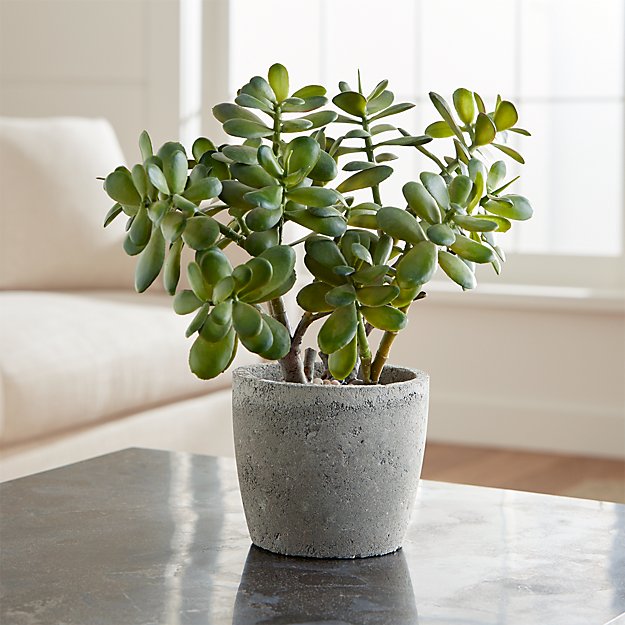
- Keep the Plants Living
It may seem ridiculous to say this, but “Water your plants.” If you have them, nurture them. Otherwise, give them away or toss. There is nothing calming about a dead plant occupying a coveted corner of your living room. You might better replace that pot with a decorative one with nothing in it.
Now that you’ve started to create a calmer environment, you might have the energy to rummage through closets and drawers — maybe on a nice day with the windows open. I’m not suggesting you throw anything out. Just put like things with other like things. It will make a big difference.
- Invest in Containers
In the laundry area, bathroom closet, under the sink, in the kitchen drawers — everywhere there is a bunch of related stuff cluttering up an area, put that stuff in a container: basket, plastic bin, or a box even. What that does is take all that visual clutter and replace it with one thing to look at on a daily basis. Then when you need to get an item, focus and locate it in the container. But until then, you’ve managed to calm that visual chaos.

- Combine Cluttery Stuff
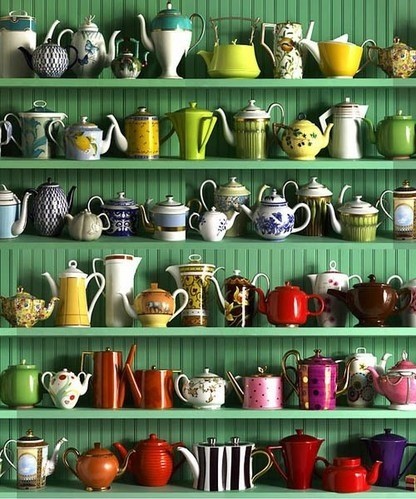
Books, collections, trophies, photos of the family — everything that tends to creep all over the house and look busy. Combine them into groupings: a collage of family photos on the stairwell wall, a curio cabinet with all your collectibles, dedicated bookcases for your library of favorite books. Once your collections are contained in a dedicated area for display, you will appreciate them more for all the stories you can tell about them. Plus, you can find them. You’ve contained your chaos of stuff by highlighting and honoring the reason you’re keeping it all.
- Keep a White Flag Handy
Okay, that’s it. I don’t want to stress you out with another to-do list. There will be days, weeks, months when you need to take care of yourself and let the house go. Acknowledge that. Wave your white flag. Order a pizza delivered, close the door to the clutter, and put your feet up. Or take a bath. It will all be there tomorrow, but you may feel better about it.

