Hanging Art: Tips from a Home Stager
March 4, 2023 § 1 Comment
As a home stager, the one thing that stands out to me when I enter someone’s home is their artwork on the walls. Sometimes it makes a smashing impact. Other times it seems a bit random. Where is the art located? How high is it hung? And how have they grouped the pieces together?
Hanging art in the right places and at the right level to view optimally makes a huge difference in the overall effect of having art at all. Here are a few tips that might help you get the most impact from the art you select for your home.
WHERE SHOULD I HANG ART?
Hang art on the focal wall.
That’s generally the wall you see from the doorway. It’s what grabs the eye as you enter the room. It may be different from an accent wall that you painted behind the bed on a non-focal wall. The focal wall is visible from the door and it’s where your art will have the biggest impact. You can hang art elsewhere, but there should be something fabulous on that focal wall.

____________________________
HOW HIGH DO I HANG IT?
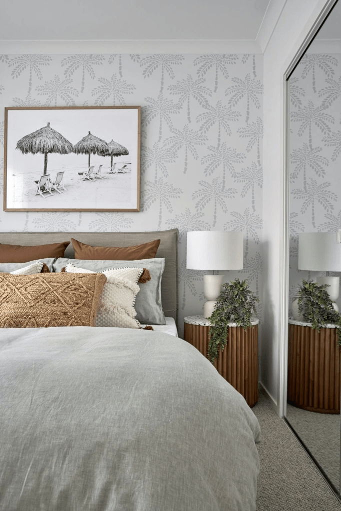
Rule of Thumb — 57″ on center
The biggest mistake I see is hanging art too high. On a plain wall, hang the art so the center of the piece is 57″ off the floor. That gives most people a direct eye-level look at the art when they are standing up. Like in a gallery. If you have to look up to see a single piece of art, it’s too high.

____________________________
HOW HIGH DO I HANG IT OVER FURNITURE?
6-8″ from the top of the furniture
Another mistake I see often is art hanging midway in the space between the top of the furniture and the ceiling. It may be tempting to split the distance and hang the art there. But chances are good that the art will be too high. There should be some breathing room above the art or it will feel too big for that space. If it feels too big, move it to another location.
When hanging art over furniture, the 57″ Rule does not apply. In that situation, the bottom of the art should be 6-8″ from the top of the furniture, in this case the headboard.
____________________________
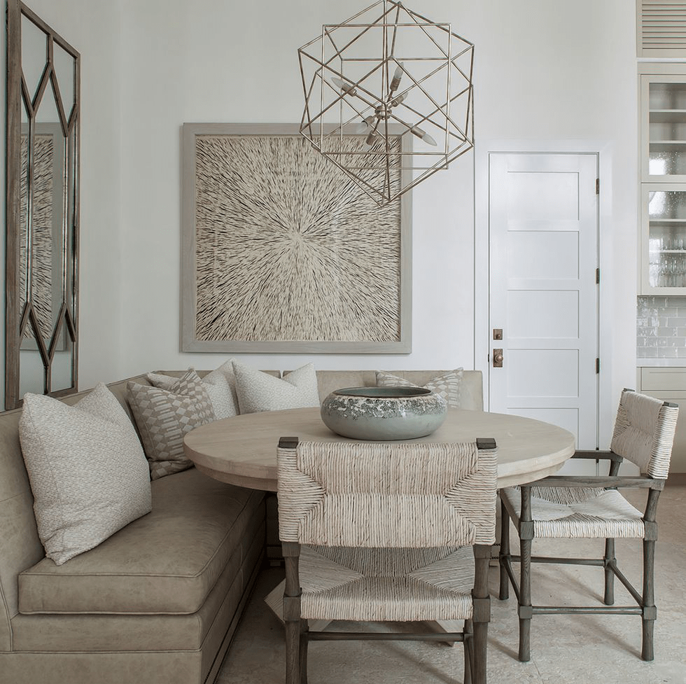
WHAT ABOUT IN A DINING ROOM?
Since people are seated in the dining room, the art is often hung a bit lower so that it is viewable by people sitting down at the table. If the art is hung too high in this room, it’s really noticeable.
____________________________
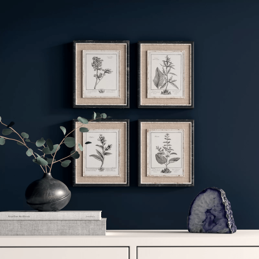
HOW FAR APART DO I SPACE THE ART?
3-6″ at most
In a geometric grouping, when all the frames are the same size, it is important to keep the art close together so they are seen as a grouping and not as individual pieces. In terms of location on the wall, make sure the center of the grouping is 57″ off the floor. Doing a practice arrangement of the art on the floor will save putting too many holes in the wall. Measure twice, as they say…
____________________________
HOW DO I ARRANGE A RANDOM GROUPING?
On the floor first
Arranging and rearranging a grouping on the floor will help with later placement on the wall. I play around with the arrangement until I get one that pleases me. A couple of guidelines:
- Keep the same distance between pieces of art. This creates cohesion and makes the arrangement look like a grouping. It is not always possible, but to my eye it looks nicer.
- Avoid “rivers.” The long lines of space running horizontally or vertically without interruption between the pictures are called “rivers.” Avoiding them is an old high school yearbook rule for laying out photos. It stuck with me, and I do follow it. (The exception is when the grouping is geometric as above — all the frames are the same and are displayed in a grid.)
The center of the grouping should be 57″ off the floor.


____________________________
WHAT ABOUT DIFFERENT FRAMES AND SIZES?
Start with the biggest piece
For a large arrangement, spreading out on the floor will help a lot. Start with the biggest piece and work out and around from there. Remember that if there is a sofa below, leave 6-8″ between the top of the sofa and the bottom of the first piece of art. Notice how the two pieces on the far left line up on their right side. It is important to keep the distance between pieces the same throughout for an intentionally collected arrangement.

If you need help with color, feel free to comment below, hit the button for a Color Consultation, or shoot me an email at yourcolorcoach@gmail.com.
I would be happy to help you.
Hope you have a Colorful Day!
Barbara, Your Home & Color Coach
SW Color of the Year 2017
September 2, 2016 § 4 Comments
 OKay then! If you hang around long enough…(as they say…)
Taupe is back. The color we’ve spent the last decade ridding our houses of is now Sherwin Williams’ Color of the Year for 2017. Poised Taupe is the color — SW 6039 — and you have to love the description:
“Earthen brown combines with conservative grey and the result is a weathered, woodsy and complex neutral that celebrates the imperfections and authenticity of a well-lived life.” — Anytime somebody celebrates imperfections, I’m in!
But here’s what you should know about taupe. It can change radically with the light and the time of day. What looks a little brown can turn pink, purple, or green depending not only on the time of day but also on the lightbulb. Just so you know. Taupe can have a pink undertone as well that clashes horribly with the orange of a red oak hardwood floor. Another caution. But paired with white like its fan deck sibling Gauzy White SW 6035, a silver metal (not gold or brass), hardwood with a gray undertone, and fabrics in other light neutrals with a pink undertone like Cultured Pearl SW 6028, and you truly have a soft, restful combination that harkens back to those glorious. taupe-filled 50s. That’s 1950s!


Personally, I’m going to ride this one out, but I can appreciate how we’re moving from the grays into the taupes (without the yellow undertone of a previous color swing). Like I tell my clients, just because it’s the Color of the Year does not mean it’s perfect for your house. If you are considering taupe, make sure you have a lot of natural light coming in the window and (hopefully) some modern furnishings, shiny metals and glass. Try to avoid pairing with cherry wood. If you have concerns, talk to me!
Meanwhile, let’s get painting.
Green Decorating: The Soothing Hue
March 17, 2016 § Leave a comment
St. Patrick’s Day brings us to thoughts of green. Whether it’s kelly green or any of the variations thereof, green is a versatile, natural hue that brings life and comfort to any room. It is particularly nice in rooms where you spend time revitalizing your mind and body.


Waking up in a green room warms a cold, white, snowy day and cools a hot, humid summer morning. It can bring the color of lush plants and trees to a city skyline view. And it can calm an agitated, overextended lifestyle at the end of another hectic day.


Green can be either warm (yellow-green) or cool (blue-green), and both pair beautifully with white. Coordinating accent colors can add energy (the complementary reds and pinks, opposites to green on the color wheel) or quiet blending (the analogous yellows and blues on either side of green on the color wheel).
I highly recommend adding green, even a mixture of greens, to your home to quiet and soothe your soul. Wherever you need a few moments of ahhhhhhh.
Paint colors above: Top left to right: Waterscape SW 6470, Topiary Tint SW 6449, Honeydew SW 6428, Breaktime SW 6463. Bottom left to right: BM Guilford Green HC-116, Palisades Park BM 439, High Park BM 467, Dartsmouth Green BM 691.
Making a House Color Splash
March 15, 2016 § Leave a comment
I have driven past this house for years and every time, I do a double take. Situated next to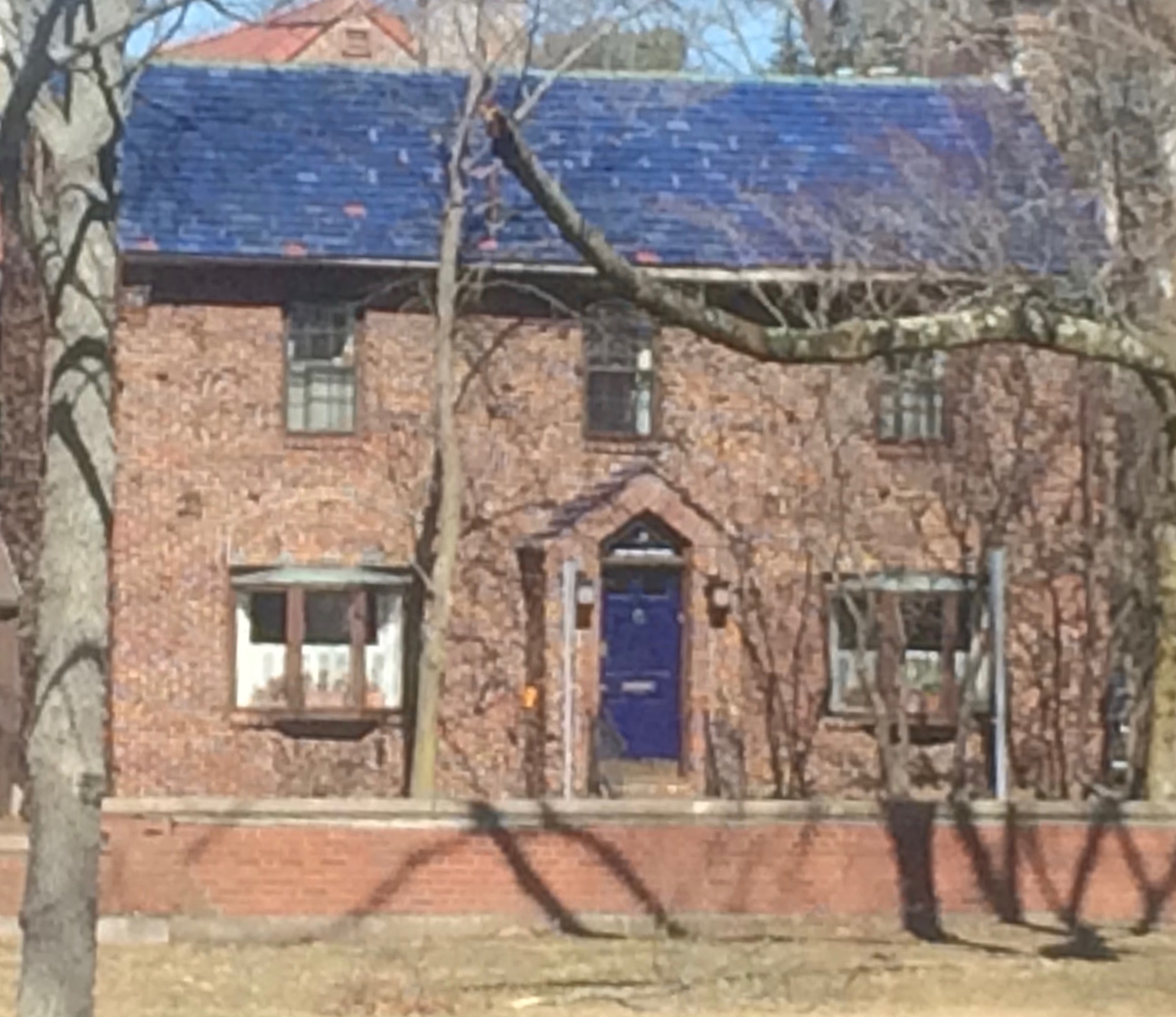 a busy roadway, there is nowhere to stop, get out of the car, and snap a decent photo. But that does not deter me.
The red brick wall is not part of the yard. And who cares about it anyway. It is the roof color and the coordinating front door in a spectacular (guessing here) Starry Night Blue (BM 2067-20) that grabs our attention. The rest of the trim is a quiet brown taken right from the brick. We don’t even notice the window trim at all, and that’s the point.

The roof looks like Vermont Mottled Purple slate, but honestly I have no idea. All I can say is that this house creates, in its traditional neighborhood, a huge House Color Splash. Kudos! And I cannot wait to drive by again.
Don’t forget about the roof color when you are planning your exterior color scheme. It is absolutely fine to keep it neutral, but if you have the personality to withstand the gawking passersby if you decide to add color to the roof, then go for it. Just remember to tie it into the rest of the house with shutters and/or front door to match. I will thank you.
From Color Inspirations to Paint
February 4, 2016 § Leave a comment
Walking into a pottery shop is like immersing yourself in a box of crayons, all pristine and unbroken with endless possibilities of combinations.
 This set of dazzling bowls caught my eye. Mesmerizing is how I’d describe them with an array of blues from turquoise to cornflower. (The dishes are mine now.)
Whatever the inspiration, there is a paint project waiting. In my mind’s eye driving home, I see these dishes in a dining room painted any one of the colors with crisp white trim. Maybe even a shiny white bead board around the wainscoting to bring out the hues in the room. I can also see any one of these colors on the walls in a kitchen with white cabinets and a white subway tile backsplash. Or maybe one of these colors for the backsplash! (Head is spinning with ideas.)


Accent walls give us a way to add a small amount of color drama to the focal area of a room without painting everything. Especially nice in open-floor-plan spaces where walls may incorporate several rooms. How about one of these rich hues for your front door? Spring painting is right around the corner. (Ben Moore’s Calypso Blue, Bermuda Blue, and Deep Mulberry)
Let the color in front of you and surrounding you inspire you. Wrap yourself up in it. Do something for yourself and create a happy house. It’s just paint!
Got Personality? Show It
January 19, 2016 § Leave a comment
What does your room say about you? Designer Jeffery Bilhuber (House Beautiful, Feb 2016) infused a boatload of personality and let us know a few other things as well. What this room shouts to me: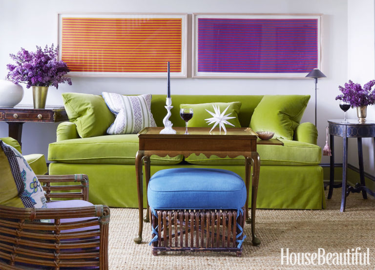
- Forget about symmetry. Mismatched end tables are way more interesting than a set.
- Go ahead and mix woods. We acquire furniture from our parents, we find treasures at a flea market, and sometimes pieces have sentimental value. Use them — even if they don’t “match” your decor.
- Add your favorite color to the room. And if you don’t have a favorite, use several. If you keep the colors at the same “hue value” (lightness or darkness of a color), they mix well together.
- Function is important. Don’t forget that you need to set your wine glass down.
- Forget matchy-matchy. This designer has taken that declaration over the top by using two different window shade colors. Bold and impetuous design choice there, but again, the room screams,”I want to be different.” And I applaud that.
- Let color speak in the room by creating a neutral backdrop from which the color can “pop.” Here, the light gray walls and the neutral woven rug give the eye a rest.
- Flowers and the little accessory details finish the room. Without them the room can look cold and staged (too many, of course, and you have a clutter zone).
- Texture matters. That sofa looks so soft. Adding warmth and texture with pillows can warm up anything, even leather.
Bottom line: You’ve heard this before, but it’s worth repeating. Don’t just follow the design trends. Let your room reflect who you are and what you love.
Adding Shutters? Look to Paris
November 15, 2015 § Leave a comment
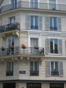 In honor of my beloved Paris, let’s talk about shutters. In my humble opinion, nobody does shutters better than the French. Classic, elegant, tasteful and actually quite functional as opposed to our (often) vinyl interpretations on our side of the pond.
That said… shutters do not have to be functional, and it’s okay if they’re vinyl. But how can we make our vinyl, nonfunctional, imitation shutters look more authentic? Size. Yes, when it comes to shutters, size matters. 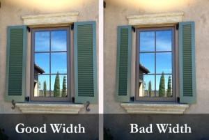
Shutters that are too narrow or too short for the window size look like an afterthought, at best. They add color and dress the bare windows, but they don’t fool anybody. Make sure 1) there is enough room on either side of the windows for properly sized shutters; 2) the width of the shutters fits the scale of the window — they could actually function; and 3) the length is appropriate — if shut, the shutters will cover the window completely and not leave a little hem showing.
Thank you, Paris, for educating me on shutters during my trip in 2010. And my sincere sympathies to you and your people.
Let There Be (New) Light
February 15, 2014 § 3 Comments
 Take a look at your lamps. Have they been on the same side tables for more than 20 years? 30 even? (okay that’s scary) Listen up. One of the easiest and cheapest updates you can do for your house is to exchange the old lighting for something fresh, colorful, and uplifting.
New lamps come in a variety of shapes and sizes, some with colored glass, some with clear. Some have updated metals, some are made to look old. But all have crisp shades with a nice clean barrel shape. (Traditional lamps are still, well, traditional. They will never go out of style. But you know what kind of outdated lamps I mean. Check out your grandmother’s family room, decorated circa 1968. Now you get it.)
You do not have to spend a lot of money. You can shop at a fancy lighting store or Target and get an updated look.
And while you’re looking at lighting, check out your ceiling fixtures. For a few bills at a home improvement store, you can switch out the old brass candelabra flush-mount fixture for something MUCH more current. The change will transform the house — you will see it in a whole new … (wait for it) … LIGHT.
(Lamp from Bellacor: Number 541835)
Surprising House Color Trend — White
February 12, 2014 § Leave a comment
Classic but always with a modern twist, white is trending now as a house color on new construction. Whether we’re craving our grandparents’ old homestead, or we like a crisp, uncomplicated look, white is in. White siding with white trim. But the surprise element lies in the accessories. Fresh options include silver for the metal color (not the traditional black), white or pastel door colors (nolonger black or red), medium-toned metal roof colors (not just charcoal shingle anymore), mismatched out-buildings (that old classic farm look is coming back in a big way), and even (gasp!) white shutters on a white house.

The beauty of white is that it really is timeless. Not only that, but it shows off your colorful flowers and the greenery of your landscaping, the orange patio umbrella and Adirondack chairs, and the turquoise of your backyard pool (okay maybe I’m going a little overboard).
See if a fresh pop of white brings out the character in your house.
Mixed Metals Get My Rave Review
January 24, 2014 § Leave a comment
 Gold and brass are finally officially back. The cheerful, dressed-up metal color has been scorned and ostracized for years, it seems, with homeowners rushing to change out everything from drawer knobs to door hinges. Well, hold up.
Over the past couple of years, we have watched brass trickle back into design (you knew it would) but have been waiting for the main stream to catch on. Now we’re seeing a mix-and-match approach that seems to fit everybody’s home style.
In this kitchen by architect William Hefner (http://www.williamhefner.com/) we see dramatic gold accents along with the other metals (chrome sink and wrought iron light fixtures). What I’m sensing, as with fashion, is that you can pick your accent metal like you pick your hem length. If it works for you, then go for it. We love that approach as it allows you to update your home without having to replace everything in it all at once. Casual acceptance of materials seems way more sensible than dictating that “Metal X” (whatever that turns out to be) is totally OUT.
Hurray for sensible design.
