Is Your House an EXtrovert? Paint It
February 15, 2018 § Leave a comment

In the next town over, there’s a purple house. And when I say purple, I mean PURple, but not just the front door as we see in the row house above, but also the siding, the trim, the doors, the shutters, and even the concrete foundation. The whole house is purple. (I would show you a photo of the house, but I don’t want to embarrass it.) The result is a house that draws everyone’s attention and not in a good way.
On the other hand, if your house is already an extrovert — one that has character and interesting features you want to show off in all their glory, then go ahead and use paint. This article from This Old House presents ideas for how to bring out the personality in your older home and shows not only colors that grab attention but also where to put them and which ones go beautifully together.
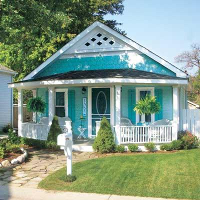
There are lots of ways to use color. This beachy turquoise, perfect for a cottage style home in a coastal community, uses one hue — a medium tone for the siding and a darker value for the shutters and door. White trim completes the cottagey look. The result is a house that displays its positive features without overdoing the palette. This strategy is especially good for a small house.
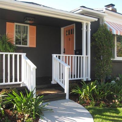
Dark colors are trending now, and this gray-brown ranch is a good example. But instead of keeping the whole house a quiet, conventional wallflower, the homeowner displays its cheerful personality with tangerine shutters, front door and striped awning. The white trim makes the colors “pop,” as we say, and you have a real looker!
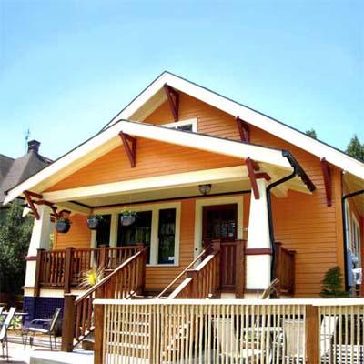
Speaking of citrus, look how this bungalow shows off its architectural features with Juicy Fruit colors and — wait a minute — a lovely deep grape purple foundation. Now that works!

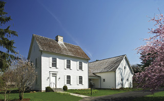
My favorite color combination, though, and perfect for this restored Italianate house, is terra cotta siding; a darker value for the window muntins, eave corbels, and column accents; a rich natural wood front door (and rocking chairs — nice touch); and cream gingerbread trim.
These are only a few ideas for how to embellish your older home with color. Spring outdoor projects are coming for many of us, and one of us at least has house color on her mind. Ha!
Think color, my Color Friends! And stay cozy.
What Color to Paint Your Big House
February 13, 2014 § Leave a comment
Building a new house or a large addition but beginning to worry that it might look too big in your neighborhood? Maybe a lot of people don’t worry about their neighbors, but some people do. If you think your house might appear overly large-scaled, then avoid painting it white. The contrast against the setting makes white stand out even more than other light colors.
To bring the house down to scale and accent the architecture at the same time, consider a dark color like a dark charcoal or dark green for the siding. Dark trim, of course, will camouflage the house even more, whereas white trim will highlight windows, doors, and roof trim.
Your choice — but becoming the McMansion in the modest neighborhood will not endear yourself to your neighbors. And my how they talk…
Fair warning.
Surprising House Color Trend — White
February 12, 2014 § Leave a comment
Classic but always with a modern twist, white is trending now as a house color on new construction. Whether we’re craving our grandparents’ old homestead, or we like a crisp, uncomplicated look, white is in. White siding with white trim. But the surprise element lies in the accessories. Fresh options include silver for the metal color (not the traditional black), white or pastel door colors (nolonger black or red), medium-toned metal roof colors (not just charcoal shingle anymore), mismatched out-buildings (that old classic farm look is coming back in a big way), and even (gasp!) white shutters on a white house.
The beauty of white is that it really is timeless. Not only that, but it shows off your colorful flowers and the greenery of your landscaping, the orange patio umbrella and Adirondack chairs, and the turquoise of your backyard pool (okay maybe I’m going a little overboard).
See if a fresh pop of white brings out the character in your house.
Is Your House Comfortable in its Color?
March 18, 2013 § 4 Comments
 Wherever I go I study house color, trim color, front doors, and overall curb appeal (it’s kind of an obsession). And this house (even with its imperfections) struck me today as a good example of a house that is comfortable in its skin.
The siding color is yellow but not too lemony and not too orange. Kind of pale but not too cream. Buttery but not too saturated. It’s just, in a word, perfect for this little house.
The trim is not white-white but an off-white without being too beige. A whiter white would look too crisp and a little too Cape Cod for this antique. Off-white gives the house an aged, relaxed, comfortable look. No face-lift needed here.
And the accent color, a soft weathered green with just a touch of blue is really not an accent color at all. Instead of interrupting the house color, like black shutters would, the green simply finishes the house like curtain panels finish a room.
The point is, these homeowners let their house speak to them when it was time to pick a house color palette and didn’t try to make the house into something it isn’t.
Choosing a Color Palette for Your House: It’s a Natural
January 29, 2013 § Leave a comment
 Another drive-by sighting of some curb appeal. This time, the stone wall pops out partly because of its mix of natural stones (and not just one kind) but also because the house color is drawn from the wall’s palette of natural hues. Even the front steps coordinate nicely with the wall.
Any of the wall’s creams, beiges, browns, and grays would have worked for a paint color, but the builders chose a light creamy yellow for the siding with a beige shingle on the portico. White trim pulls the house together and the black door makes the dramatic statement.
It’s so easy to choose your house color from nature. You cannot make a mistake.
Stone and Brick Reveal Your Exterior Color Palette
January 25, 2013 § Leave a comment
 Yes, it’s winter and the roof in this photo is covered with snow, but now we can focus on the rest of the house, particularly the stone. What works on this house is the color palette that is taken directly from the numerous available hues in the stonework itself.
The bricks are a monochromatic rusty red color that complements the stone without competing with it — a challenge when you have multiple materials on the house. The siding is a gray neutral, also in the stone. The trim is pulled from some of the darker taupe stones. How easy is that? Job done.
If you are building a home with different materials, use the busy one with the most colors (stone or brick) to make the rest of your color decisions. That way, the whole house will come together in a harmonious cornucopia of color.
The alternative? Choosing a color that is not in the palette at all. The result? A disjointed effect that divides the house into sections and makes it seem smaller. Can be done, but it’s tricky and needs a professional colorist to pull off. Do yourself a favor and stick with the natural palette that presents itself to you from your building materials.
The Best and Worst House Colors for Cold Snowy Winters
January 24, 2013 § 1 Comment
 As we get more and more snow this winter, I notice what house colors look good in snow and which ones look awful. I’ll start with the thumbs down. White. It either blends away completely except for any contrasting colored shutters or it looks downright dirty. It’s also cold-looking. If you have a white house and a long winter, make sure you have lots of greenery in the foundation plantings, trees in the yard, and a wreath with a big red bow on the front door.
My favorite color for long, cold, white winters is a sunny yellow. Wow, does that color look terrific against the white snow. Try Benjamin Moore’s Concord Ivory http://www.benjaminmoore.com/en-us/paint-color/concordivory. Paired with a black roof, black shutters, and white trim, you’ve got a knock-out house year round.
Painting Your House Red
December 3, 2012 § Leave a comment
Which Came First? The house color or the foundation plantings?
October 1, 2012 § 2 Comments
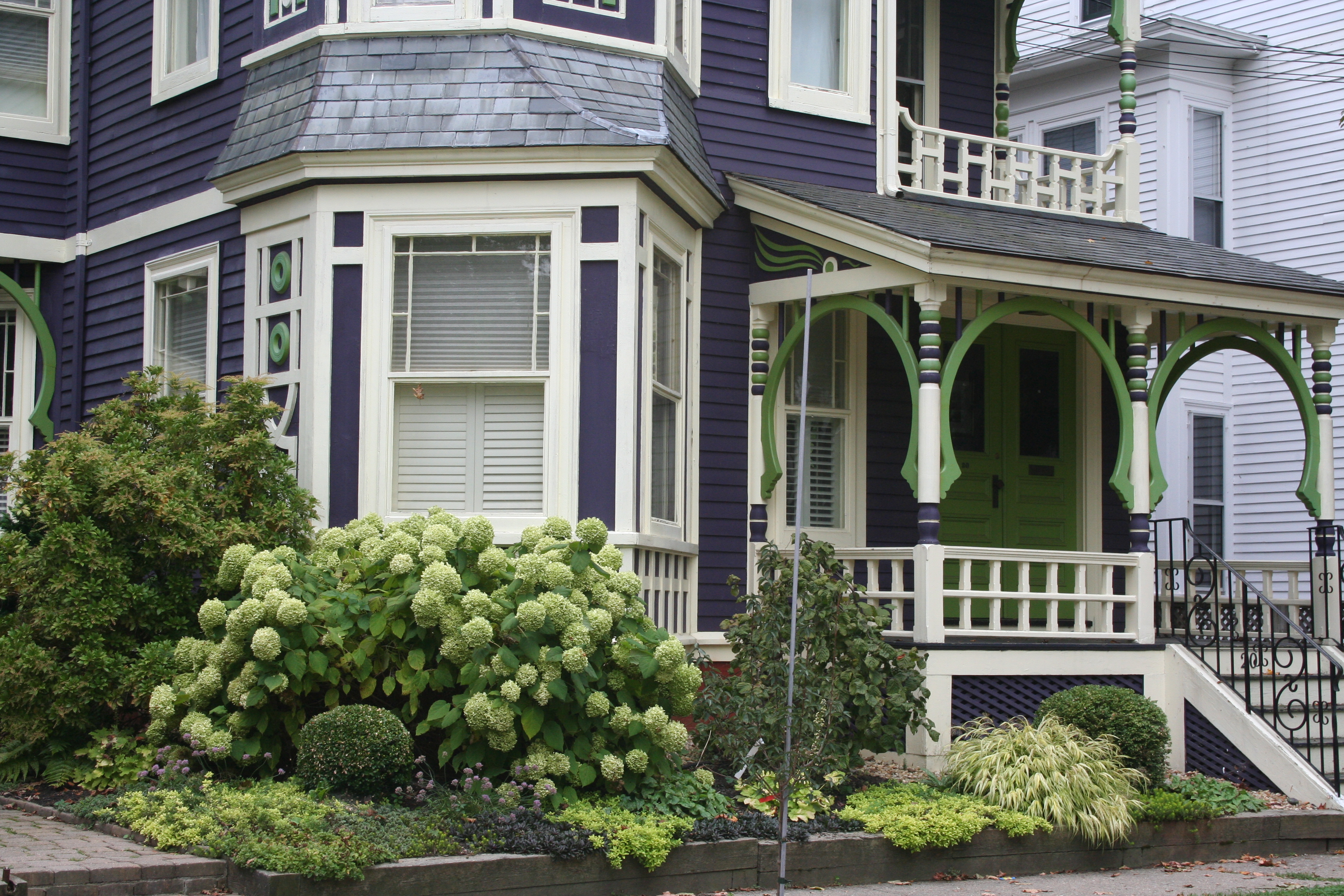 My guess? Neither. Take a close look at the roof, and the house color palette is revealed. The deep purples and greens of that slate roof present a palette the homeowners can use for their house: rich grape for the siding color tempered by a neutral cream trim and lime green for the accent color to highlight the Victorian embellishments.
But the homeowners did not stop there. To enhance the palette and spread the accent color out onto the landscape, they planted a gorgeous lime green Hydrangea coupled with other lime green plants, shrubs, and ground-cover species. Peeking out from under all that greenery is a purple flowering ground color pulling the whole look together.
Not to be matchy-matchy or anything, but this house rocks. There’s just enough contrast to keep our interest and show off the house detail without introducing new colors that might make the house too busy. Afterall, the house itself has so much detail that you wouldn’t want it to get lost in a rainbow of foundation plantings and annuals.
Choosing a Paint Color for the Cottage
May 31, 2012 § 3 Comments
It’s time to repaint the cottage — it has been that shade of grassy olive green since about 1970 and I think we’re ready for a chang e especially since the cottage next door is also green, just a darker shade. You might think that choosing a color for my own place would be easy for me since I work with color all the time. But just like you struggle with paint color schemes, I have to go through that process too.
First of all, what colors are already in the neighborhood? We have dark green on one side, beige siding on the other, and brown and beige two doors away on either side. So that leaves quite a few options.
Next, what color is the roof? It’s a gray metal roof with a white fascia piece in front. The roof doesn’t show from the front, but it’s quite prominent on the sides so roof color is a consideration.
What color are the windows and other non-changing elements? The windows are all white vinyl (I know, but they’re easy maintenance for a cottage). We had the chimney removed (that had been the inspiration for the brick orange Adirondack chair).
So with fandeck in hand, I spun through the color possibilities. I eliminated yellow and white because they would take too many coats to cover the green. Red was thrown around as a possibility but I didn’t like the idea of red next to the dark green. Not summery enough. Orange is a great accent color but our cottage is not interesting enough architecturally to draw that much attention from a wild paint color. That brought me to gray and blue.
I tried some grays, both dark and light, on the Sherwin-Williams paint site and liked several with the gray roof. My reservation was that the cottage would need color added somewhere — otherwise it would look kind of blah. (Note: I LOVE the Nantucket weathered cedar look, but you need salt air to pull that off.)
 Finally, I tried blue. Hmmm… not a bad idea. I ended up with a WoodScapes opaque stain in a color called Chesapeake (SW3051) with a cool white trim (Rhinestone– it’s on the blue side of white) and my Adirondack chair color for the accent. I like a dark blue cottage color — it speaks to the lake water in the background and does not attract too much attention from passersby. I also like the contrast with the windows especially for a summer cottage. I used the Adirondack chair color (a custom red-orange) for the doors including the big garage door facing the road. Now it’s easy to find the party.
