Why “Fixer Upper Style” is a Thing
March 28, 2017 § Leave a comment
 What is it about the latest home decorating craze that has us all rushing out to buy accessories that look like they belong in a barn? Well lots of things, it turns out. But first of all, in case your TV is not permanently fixed on HGTV, here’s what I’m talking about.
“Fixer Upper,” the smash HGTV show featuring the lovely designer Joanna Gaines and her cute, goofy, muscled, builder husband Chip, has transformed the design aesthetic in much of the country from Pottery Barn chic to We-All-Want-to-Move-to-Waco fabulous. What Chip and Joanna do with ugly fixer-uppers is remarkable. Here’s a Before & After example of the French Country episode exterior:


The interior style is relaxed with a simple black, white, gray, and cream color palette, reclaimed wood pieces, including “ship lap” (horizontal wide-plank panelling) on the walls, and lots of textures and accessories that Joanna acquires from the “antiques and junk” shops of rural Texas and her own Silos full of treasures at Magnolia Market. She is a master at accessorizing a room to give what others have described as that Modern Farmhouse aesthetic — lived-in yet chic, folksy yet uncluttered. What she does is truly an art — really!

HGTV, Joanna Gaines
Why is this style so popular now??
- We love Chip and Joanna. They radiate love for each other and their four cute children. It’s fun to watch them at home and, like a soap opera, the show is such a refreshing antidote to the routines of our own daily lives.
- The style reminds us of Grandma. Many of the items Joanna finds and uses in her designs are old antiques and treasures we might remember from visiting our grandparents out on the farm. It’s refreshing to travel back to those simpler days.
- The color palette is relaxing. With the over-stimulation of our lives, it’s calming to see whites and woods and neutrals that don’t generate an emotional response. We need downtime in our lives and this style seems to create it.

HGTV, Joanna Gaines
- The style starts from scratch. The show guts houses and creates new spaces. There’s something cathartic about the idea of tearing down walls, donating all the old furniture, and starting with a clean slate. It says something about our group needs as a culture.
- What’s old is new again. Even though the bones of the rooms are new and updated, the look appears old and recycled. Scratches and dents don’t matter in this style. They add character. And how relaxing is it to think that your kids can sit at a table without coasters under the glasses.
- Things have a reason for being there. Joanna’s design uses lots of accessories but the rooms don’t appear cluttered. That is the work of a skilled artist. It’s hard to accessorize mindfully without overdoing.
Tips: If you want to incorporate the Fixer Upper style into your decor,
- Start with the kitchen as it can accommodate extra accessories without appearing overdone.
- Stay authentic. The reason Joanna’s style works is she uses actual old pieces she finds.
- Shop antique and consignment stores to find accessories that fit the style, and don’t forget to look in Grandpa’s old barn. Lots of stuff in there, I bet.
- Do what you love. Make your space a happy one to come home to. That means way more than following a particular trend.
Thanks for stopping by!
Celebrating Authentically
November 30, 2016 § Leave a comment
 After years of using fake greenery around and on my front door in a futile attempt to make holiday decorating easy and inexpensive (true confessions — you’ve heard of the cobbler’s children having no shoes?), well my big, beautifully-adorned-with-more-fakery wreath fell apart onto the closet floor.
That single event made quite an impact, literally and figuratively, of course. I am SO fed up with fake everything: plastic wreaths, plastic lights, plastic balls, plastic blow-up Santas, plastic reindeer in the yard. For me this year, after quite a year, I am settling down to a visually simple, quiet, authentic holiday season.
I don’t mind others’ decorations at all — the lights, the colors, the flashing sleigh on the roof, and everything else that makes children’s jaws drop in sheer delight — don’t get me wrong. But I guess with the kids all out of the house, I don’t feel the need to create a spectacle. And it’s okay.
For those of you who share my desire for a simpler holiday, I’m here to say that it’s okay. A few special ornaments or treasures from past years displayed among some fresh greens on the dining room table or mantle can provide the essence of the season without the hassle and the clean-up on January 2. For those who adore the season of color and lights, go for it. The rest of us will appreciate all you do to make our neighborhoods sparkly and special.
 So today I am going out to buy a big plain evergreen bough wreath. Then, I’ll tie a big light blue floral ribbon on it and hang it on the front door. Then I’ll snip some pine from the backyard and stick the branches in my big blue pot on the front porch. Maybe even put a spotlight on the door so the house looks welcoming at night. And with that done, I can focus on making the holiday special and memorable for my family and … for me.
(wreath: LLBean)
Green Decorating: The Soothing Hue
March 17, 2016 § Leave a comment
St. Patrick’s Day brings us to thoughts of green. Whether it’s kelly green or any of the variations thereof, green is a versatile, natural hue that brings life and comfort to any room. It is particularly nice in rooms where you spend time revitalizing your mind and body.


Waking up in a green room warms a cold, white, snowy day and cools a hot, humid summer morning. It can bring the color of lush plants and trees to a city skyline view. And it can calm an agitated, overextended lifestyle at the end of another hectic day.


Green can be either warm (yellow-green) or cool (blue-green), and both pair beautifully with white. Coordinating accent colors can add energy (the complementary reds and pinks, opposites to green on the color wheel) or quiet blending (the analogous yellows and blues on either side of green on the color wheel).
I highly recommend adding green, even a mixture of greens, to your home to quiet and soothe your soul. Wherever you need a few moments of ahhhhhhh.
Paint colors above: Top left to right: Waterscape SW 6470, Topiary Tint SW 6449, Honeydew SW 6428, Breaktime SW 6463. Bottom left to right: BM Guilford Green HC-116, Palisades Park BM 439, High Park BM 467, Dartsmouth Green BM 691.
Make You Happy — Consignment Love
January 18, 2016 § Leave a comment
A home stager’s life can be unsettling. Furniture comes and goes, from storage unit to my own living room and then off to somebody’s vacant home and then back again two months later. My husband jokes that he has to turn the light on before he enters a room or he might trip over an ottoman that wasn’t there a few minutes ago.
And as a stager, I often un-decorate a home to make it more appealing (or at least not unappealing) to a wide swath of potential buyers. Family photos? Gone. Floral drapes? Too busy. Oriental rugs? Too taste-specific. So life is full of light neutral walls, white window panels, generic art, plain slipcovers, and sisal rugs. Everything looks good at the end in a Pottery Barn kind of way, but I am growing tired of meh.
Enter my favorite consignment store. And inspiration.
Finally I am going to buy something other than white plates and Parson’s chairs. And for me. These French blue dishes with gently scalloped edges and little raised dots around the rim are totally taste-specific. Mine.  And the chairs with their cane backs, girly curves, and cream leather seats are too old-fashioned for today’s young buyers. They would spray-paint them white! Not me.
I have found love, and these items will stay in my home. I can come home every night and expect to see them there, not in somebody’s 1800s farmhouse kitchen with a For Sale sign in the front yard.
My point to all this? Surround yourself with what makes YOU happy. Don’t let your job take over your home. Have a sacred space that’s your own. Hang onto things that mean something to you and make you feel good. All that! And more this New Year.
Don’t Let Your Art Fade Away
February 17, 2014 § Leave a comment
 Old faded jeans and old faded glory aside, old faded artwork in your house is a No-Go. If you have art prints that have hung on the wall in your bright cheery living room for several years, take a close look at them. Do they have a blue-green aura to them? Are flowers that used to be red sort of a strange blue? Is there any red or pink left in the piece at all? No?? Then haul it down. It’s done. Off to the recycle bin. Use the frame for something new that will add life to your room. Just this next time, opt for glass that will prevent color-fading. It’s more expensive but worth every penny if you love your art and prints.
Don’t be stubborn. Love your faded jeans, but get rid of your faded art.
Do You Know How Easy This Is??
January 18, 2014 § Leave a comment
 This update, to state the obvious, is the easiest project short of rolling paint on a wall. So easy that many of you will skip over this post or roll your eyes that I’m even mentioning it. But just in case you are still looking at stained seat covers on your kitchen chairs, you have no more excuses.
- Turn the chair upside down.

- Take your handy-dandy screwdriver (yes, you should have your own) and twist out the 4 screws.
- Next, go to your local fabric store and pick out a nice pattern and color that will look good in your room.
- Buy 1 1/2 yards (of a 50-54″-wide) fabric. If you’re at JoAnn’s Fabrics and Crafts, go to the “Home Dec” section so the fabric is sturdy enough to hold up. You don’t want quilting cotton — too flimsy.
- Lay the fabric upside down on a large table or the floor. Place your seat upside down on the fabric and cut out the new seat cover, leaving at least a 2-3″ margin after you lift the fabric up to cover the sides of the seat. Cut the fabric. (Don’t stress about the cutting — the edges are not going to show.)
- Next. If you don’t already have a staple gun (sigh), you need one. So many uses.
- Pull the fabric taut over the seat and put one staple in the center front underside of the seat.
- Turn the seat around and pull the fabric taut again putting one staple in the center back underside of the seat. Repeat with the sides, making sure the fabric pattern is straight (turn the seat over and check).
- Then pulling the fabric taut, staple the fabric onto the seat, moving toward the corners. Fold the corner pieces and staple underneath.
- Trim the fabric excess. Turn the seat over. Place it back on the chair and put the screws back in.
VOILA!
Pick Paint Colors Last — yes, Last
January 15, 2014 § Leave a comment
 So often I am called to a freshly painted room and asked to help the homeowners find a rug and window treatments to go with the new wall color. As much as I appreciate the homeowners’ enthusiasm for tackling the paint project first, it makes finishing the room much harder to start with the paint.
If you’re planning a room re-do and anticipate purchasing new furniture, window treatments, and a rug, here’s the most efficient order of purchases:
- Pick the biggest-ticket item first, perhaps the new upholstered or leather sectional sofa.
- Then pick the other furniture, like upholstered chairs and a leather ottoman.
- Then pick the rug. There are fewer options at that point, but the rug will introduce additional colors into the palette and you can bring those other colors into the room with art and accessories.
- Then if you want fabric window treatments, pick the fabric next that will complement the other elements.
- After ALL those decisions are made, THEN it’s time to pick the wall color.
There is a multitude of paint colors, shades, and tones from which to choose, but the paint decision will actually present itself more clearly once all the other major decisions are made. And the paint color will then pull the whole room together.
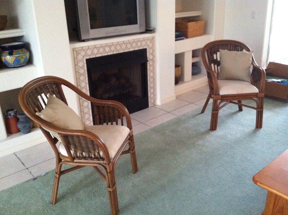
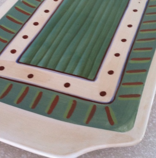
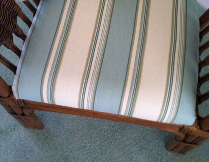 If your furniture and rugs a
 re neutral, you can find your color inspiration from almost anywhere, including in this case, a hand-painted platter. From that inspiration piece, we pulled in a striped fabric to cover some rattan chairs, and pulled the soft, gray-green paint color out at the end to complement the blues.
Kitchen Cabinet Color: Move over Back Splash
January 30, 2013 § Leave a comment
Kitchen cabinet color is in. From yellow to navy to this refreshing mint, cabinets and kitchen islands are getting a paint job. And it’s not just old cabinets that are being refreshed. New kitchen designs are showing painted cabinets in colors that were once reserved for bathrooms and laundry areas. And it’s a bold move because, unlike wall color, you are unlikely to re-do cabinet paint color anytime soon. Call it confidence or general optimism (or a craving for it) but cabinet color will be here to stay for some time.
If you’re a little unsure of painting all your cabinets a particular color, try painting the back of an open cabinet or the center island first. That’s what I did. And I was hooked from that point on. (My cabinets have had two color transformations since discovering color in the kitchen.)
One suggstion for choosing a paint color for your cabinets: take a look at the colors in adjoining rooms and pick a color that will pull the public areas together. A pillow color in the adjoining family room might make a terrific cabinet color in the kitchen. You are limited only by…hmmmm… nothing really. Enjoy!
Tired Brick Fireplace Takes Cover
January 9, 2013 § 4 Comments
 Sometimes the “bones” of an old house fall under the category of “What were they thinking?” You could say that about this brick fireplace with its random placement of dark bricks and the outdated brass enclosure. But not to worry. Your family room is not doomed to the styles of 1972 — you have options. One of the best ones is to paint the brick as shown in the after photo (from Southern Living Magazine’s Makeovers).
The homeowners covered the offensive brick with a flat, textured paint in the green wall color. They painted the hearth in a natural stone color. Then they added two bookshelves for a built-in look and painted them the same green. The new fireplace insert in a bronze color blends nicely. A narrower mantel and corbels painted cream pop off the green — art finishes the focal point.
The overall result is a fireplace wall with emphasis on everything but the original dated fireplace. When faced with old brick or other outdated hardscape in your home, consider painting it for an almost instant update without the expense of covering it or replacing it. This makeover was a huge success. No more ugly brick.
Hop the Trend: Consignment Stores
December 29, 2012 § Leave a comment
Okay, I admit it. I am a consignment store junkie. And with good reason. Not only is it “green” to furnish your home with items that have been around awhile, it’s amazing what you can find for a fraction of the retail price for a new item. And the consignment bug has started to spread to my clients. During one project, we were looking for a settee of a specific length to fit in a tight spot. Tricky to find new anyway unless we went custom. My client decided to check out the local consignment store, and he found the perfect piece. Even the legs and wood color were perfect. Call it luck or call it karma.

The Cannery Exchange in Newport Beach, CA. (photo credit: Jody Tiongco)
I am convinced that these vintage pieces have a soul — they certainly have a history visible by the lovely worn patina on the arms or the scratches on the tabletop. But every scratch has a story attached to it, and that story comes with the piece to its new home.
You can always paint and recover a chair, for example, if you want a painted furniture look. Again, you’re probably starting with a chair that’s far better constructed than what you can find now so you’re already ahead. It’s like finding a piece of gently worn designer clothing or better yet a piece with the tags still hanging on it. Bonus!
Give your home some character by adding a piece or two of consignment furniture. But beware. You might catch the consignment bug too.
