Is Your Wall Color Anxious?
March 7, 2023 § 2 Comments
Color psychologists will tell you that colors evoke certain emotions. For example, the warm colors (red, orange, yellow) can generate happiness, stimulation, and excitement (both good and bad). And cool colors (blue, green, purple) can promote calm, relaxation and sleep. In general, we do have a psychological reaction to certain colors, and we associate them with different things. Sometimes they look tasty enough to eat.
Too much of a good thing?
When it comes to creating an end-of-the-day sanctuary for rest and recovery, we need calm, and the cool side of the color wheel is a good place to start. Blue, green, and purple are very popular bedroom colors, for all age groups, but choosing the right version from the fan deck can be tricky. What sometimes happens is that we pick a paint color from the vast display at the store only to roll the actual paint up on the wall and suddenly feel a bit agitated. Partly at not liking the color and partly at the thought of painting it over.
What happened? I thought I was picking a calm color.
Selecting a blue, green, or purple that pops out at you in the store will not necessarily give you a serene room where your toddler can take a nap. Because it’s not the color per se. It’s the saturation that is keeping the room on edge.
So even my wall color needs a therapist?
Maybe. How saturated is it?
Saturation measures how clear or true a color is. It is the strength of the color often described with words, as Leatrice Eiseman writes in her book The Complete Color Harmony, like “clarity, purity, brilliance, richness, boldness, vividness, and intensity.” You get the picture. Maybe not great for a restful bedroom. For example, royal blue is more saturated than powder blue. In a bedroom, royal blue will shout for attention. The more grayed-down the color, the less saturated it is. In a bedroom painted powder blue, you might not even notice the color.


Bedroom wall color needs to chill.
Again Eiseman describes colors with lower saturation as “subdued, diffused, misty, dusted, subtle, soft, toned-down, muted, restrained, hushed, understated, and quiet.” Perfect for a bedroom. So back to the paint store to find colors with lower saturation that will be restful on the walls of the bedroom.
Can’t I paint the room lighter?
Yes, but going lighter will not make the room calmer — just a lighter value and yes, a little easier on the eyes.
Value measures how light or dark a color is. When you add white to a color you make a tint. The hue (color) gets lighter, and the perception of the intensity changes. It may appear less intense. And that’s important when you are picking a relaxing wall color. Lighter tints are more restful to the eye. To find a tint of a color you move up the fan deck color strip toward the lighter end.


If you add black to a color, you get a shade. It’s darker and perceived as more intense than its lighter version. A dark shade of a color can be very dramatic, and that will influence your color choice. To find a shade of a particular color, you move toward the darker end of the paint color strip in the fan deck.


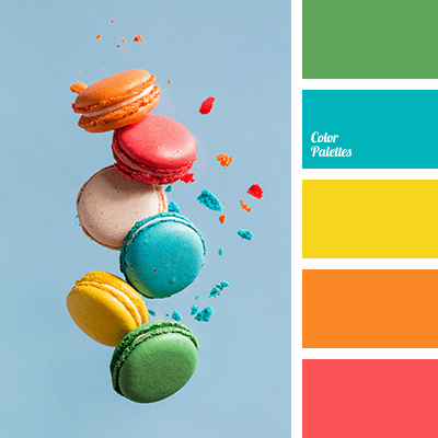
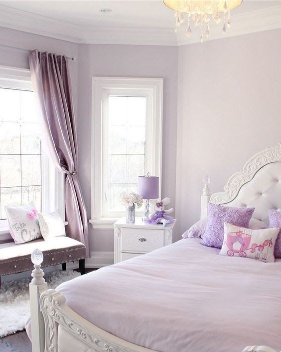
So when you’re picking a wall color for a bedroom, both the Saturation and the Value are important. If the color is too saturated, and there are other colors in the room, it can feel like the walls are vibrating. And that’s okay if you’re going for a room with lots of energy and vitality, like this one.
:max_bytes(150000):strip_icc():format(webp)/225811303_2351425294990524_4394162365566741163_n1-17bd60b7998c436d813211cbca0c5a66.jpg)
Likewise, if the color value is dark, it may feel more intense than a lighter value of the same color.
Okay, my child wants a bedroom makeover. Now what?
As a mom, I think it’s important to let children pick their own bedroom colors. But having said that… if you are concerned about having to prime over a loud or dark color in a few years when they change their mind or go off to college, you can take the hue (color) that they chose and then move a little toward the gray end of the fan deck. Muting that electric blue just a little will give the walls some longevity and allow your child to live with the color longer.
Here are some pairs of examples. The first color is a pure saturated color. The second related color is an alternative that is slightly muted (less saturated) and lighter (in value) as well. The alternative wall color will give you a calmer and perhaps a slightly more sophisticated feeling when you walk in the room. No more anxiety.


When in doubt? It’s only paint. Sleep well!
If you need help with color, feel free to comment below, hit the button for a Color Consultation, or shoot me an email at yourcolorcoach@gmail.com.
I would be happy to help you.
Hope you have a Colorful Day!
Barbara, Your Home & Color Coach

I love your explanation of saturation and value. I’m having a lot of trouble with color right now. I just bought a house in New Orleans where the houses can be very colorful. Being from Texas and living in an HOA I am afraid of color. The house as it stands have nice colors on their own but they just don’t work together. The siding is a dark Khaki, shutters are deep blue, and door is a muted red. I’ve settled on BM Linen white for the siding, BM santorini blue for the shutters but I am having difficulty on deciding what color for the door. The house is a literal box with very few architectural details. I’m feel if I paint the door the same color as the shutters it may look a little boring. I’d like a pop of color but not sure if I should stay monochromatic or go with a different color altogether. What color do you think would look pretty with BM Santorini blue shutters?
Hi Carrie! So sorry for this long delay. If you haven’t chosen a door color yet and want to make it pop but stay in the palette, try going down the paint chip to a darker shade, something like Providence Blue 1636. OR you could warm up the door with a nice antique gold like Chestertown Buff HC-9. Good luck and thanks for asking!