Front Door Color –Refresh for Brick Homes
May 20, 2019 § 6 Comments
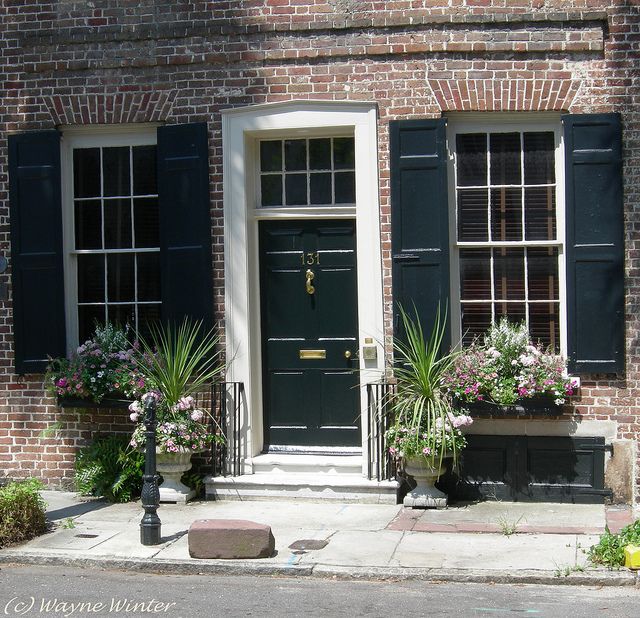
I wrote my first blog post about front door color back in 2012 when it seemed like red and black were the most common options for traditional homes. And shutters? Well black and then black again.

But today I stumbled upon a couple of photos from Beacon Hill in Boston that blew my traditional color palette out of the fan deck, so to speak. It was love at first sight of that rich gorgeous blue — yet to be identified by name and brand.

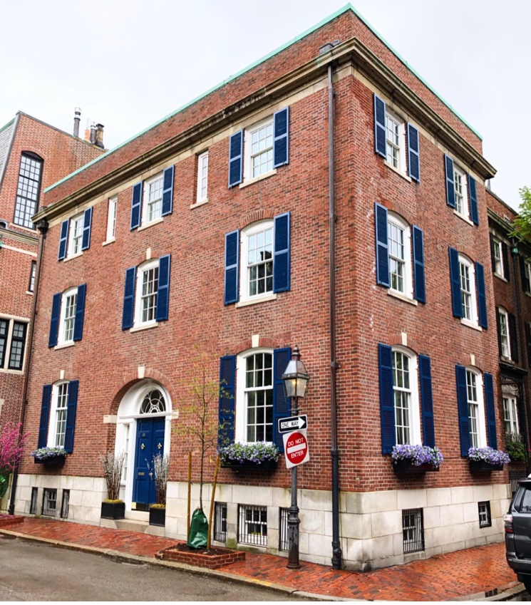
Photo: @buildingsofnewengland
Just guessing here (I didn’t find anything in the Sherwin Williams paint line), but Benjamin Moore has Dark Royal Blue 2065-20 that comes pretty close for now until I can track this color down.

Benjamin Moore 2065-20
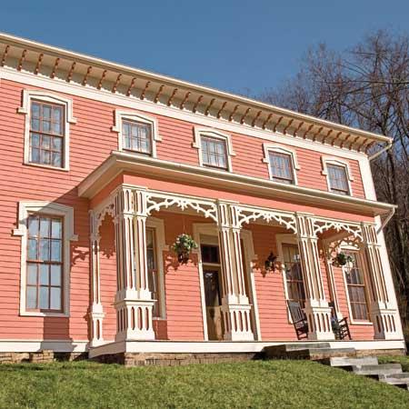
What I love about this color for the front door (and shutters for that matter) is that it’s dark enough be traditionally tasteful and even replace black on many houses like the 1912 Colonial above, but it has hue enough to excite the senses and certainly stand out from the crowd of traditional black and Charleston Green doors and shutters (not that there’s anything wrong with traditional!).

And I’m just talking about brick homes — because door colors on painted houses and more contemporary homes have gone right through the color palette. More updates on that later.
In the meantime I’m going to appreciate that stunning blue on the brick Rhoades House and open my fan deck to more brick home door color ideas.
Is Your House an EXtrovert? Paint It
February 15, 2018 § Leave a comment
In the next town over, there’s a purple house. And when I say purple, I mean PURple, but not just the front door as we see in the row house above, but also the siding, the trim, the doors, the shutters, and even the concrete foundation. The whole house is purple. (I would show you a photo of the house, but I don’t want to embarrass it.) The result is a house that draws everyone’s attention and not in a good way.
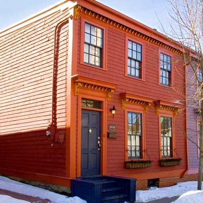
On the other hand, if your house is already an extrovert — one that has character and interesting features you want to show off in all their glory, then go ahead and use paint. This article from This Old House presents ideas for how to bring out the personality in your older home and shows not only colors that grab attention but also where to put them and which ones go beautifully together.
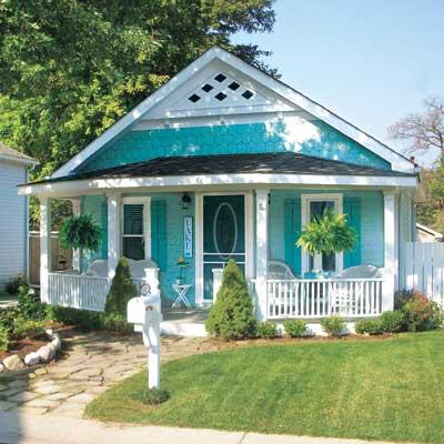
There are lots of ways to use color. This beachy turquoise, perfect for a cottage style home in a coastal community, uses one hue — a medium tone for the siding and a darker value for the shutters and door. White trim completes the cottagey look. The result is a house that displays its positive features without overdoing the palette. This strategy is especially good for a small house.

Dark colors are trending now, and this gray-brown ranch is a good example. But instead of keeping the whole house a quiet, conventional wallflower, the homeowner displays its cheerful personality with tangerine shutters, front door and striped awning. The white trim makes the colors “pop,” as we say, and you have a real looker!

Speaking of citrus, look how this bungalow shows off its architectural features with Juicy Fruit colors and — wait a minute — a lovely deep grape purple foundation. Now that works!
My favorite color combination, though, and perfect for this restored Italianate house, is terra cotta siding; a darker value for the window muntins, eave corbels, and column accents; a rich natural wood front door (and rocking chairs — nice touch); and cream gingerbread trim.
These are only a few ideas for how to embellish your older home with color. Spring outdoor projects are coming for many of us, and one of us at least has house color on her mind. Ha!
Think color, my Color Friends! And stay cozy.
But I Love Grandma’s Furniture
January 20, 2018 § Leave a comment

Furniture that has been in the family for generations (or as long as you can remember, at least) carries memories of sitting around Grandma’s dining room table during holiday dinners and enjoying family and food and all that goes with that. So of course you accept Grandma’s dining room set when presented. Okay, now what.
Designer Stephanie Lees shows us how to marry traditional (whether inherited or acquired some other way) and modern styling. Yes, the two can co-exist nicely together.
Color is the most obvious creative solution. The navy grasscloth walls in that dining room contrast elegantly with the traditional white wainscoting beneath the chair rail. Camouflaged there is a white lacquer cabinet that showcases more family treasures that frame out the modern artwork above.
The green curtain panels in an unfussy simple treatment dress the windows with a pop of color that is carried over to the back of the traditional wingback chair. Wingbacks –whether old or new — are classic. But the modern fabric placement takes what might have been a studious, grownup, wingback chair and made it playful. Those bamboo side chairs — if not your grandmother’s then just like them — can be recovered very DIY with new coordinating fabric by unscrewing the seats, stapling fabric onto the seat bottoms, and screwing the seats back onto the chair. Instant update.
Another key update that sets a modern tone to the room is the contemporary rug, again keeping with the blue & white palette but staying clear of any traditional rug design. Random color placement in the rug keeps the room from looking too formal, and it is key to pulling off this style marriage.
But just short of replacing whatever shiny, old, yellow-brass light fixture might have hung from the ceiling before with a new contemporary brushed nickel version (gasp!), the designer opted for a vintage Italian chandelier in crystal. Dramatic, classic, and oh so stylish.
You’ve given us lots to think about, Stephanie, as we incorporate inherited pieces into our own homes. Thanks for the inspiration!
@StyleatHome, @YourColorCoach, stephanieleesdesign
Something Old Makes Something New
August 25, 2017 § Leave a comment
How do you incorporate antiques and inherited treasures into your decor without creating your grandmother’s house (with all due respect to our grandmothers)? Here are some tips:
-Add contemporary lighting like the drum shade chandelier and standing lamp in the photo (from Rejuvenation) to your traditional decor. You will be amazed what new lighting will do to your room.
-Reupholster treasured furniture pieces in classic, solid fabrics that will keep the pieces timeless from this point forward. Patterns tend to come and go over the decades, and you can date a piece instantly by upholstering it in a trendy fabric. And then you’re stuck with it after the trend is long gone.
-Layer rugs to feature one that is too small to stand on its own in a conversation area.
-Dress windows simply to avoid visual clutter from too much pattern.
-Keep the overall feeling calm in the room. Too many patterns lead to visual clutter, something our grandmothers tended to accumulate over the decades.
-Or add a crazy patterned accent piece to a neutral room. No sense in being TOO serious about our decorating.
-Show legs. Letting the furniture pieces show their legs allows for “air” around each piece and a feeling of lightness in the room. Skirts on all the pieces can weigh them down and make them look dated. (Investigate removing the skirt from an old chair or sofa. I did it and what a difference!)
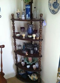
-For accessories? Cluster them. Avoid scattering them all over the horizontal surfaces. Instead, feature them together on a shelf or display cabinet. That way you’ve contained the clutter while calling attention to the collection as a whole.
Cherish your heritage furniture pieces or your finds from a consignment shop. Embrace them. Love them. And show them off in a fresh new way.
Celebrating Authentically
November 30, 2016 § Leave a comment
 After years of using fake greenery around and on my front door in a futile attempt to make holiday decorating easy and inexpensive (true confessions — you’ve heard of the cobbler’s children having no shoes?), well my big, beautifully-adorned-with-more-fakery wreath fell apart onto the closet floor.
That single event made quite an impact, literally and figuratively, of course. I am SO fed up with fake everything: plastic wreaths, plastic lights, plastic balls, plastic blow-up Santas, plastic reindeer in the yard. For me this year, after quite a year, I am settling down to a visually simple, quiet, authentic holiday season.
I don’t mind others’ decorations at all — the lights, the colors, the flashing sleigh on the roof, and everything else that makes children’s jaws drop in sheer delight — don’t get me wrong. But I guess with the kids all out of the house, I don’t feel the need to create a spectacle. And it’s okay.
For those of you who share my desire for a simpler holiday, I’m here to say that it’s okay. A few special ornaments or treasures from past years displayed among some fresh greens on the dining room table or mantle can provide the essence of the season without the hassle and the clean-up on January 2. For those who adore the season of color and lights, go for it. The rest of us will appreciate all you do to make our neighborhoods sparkly and special.
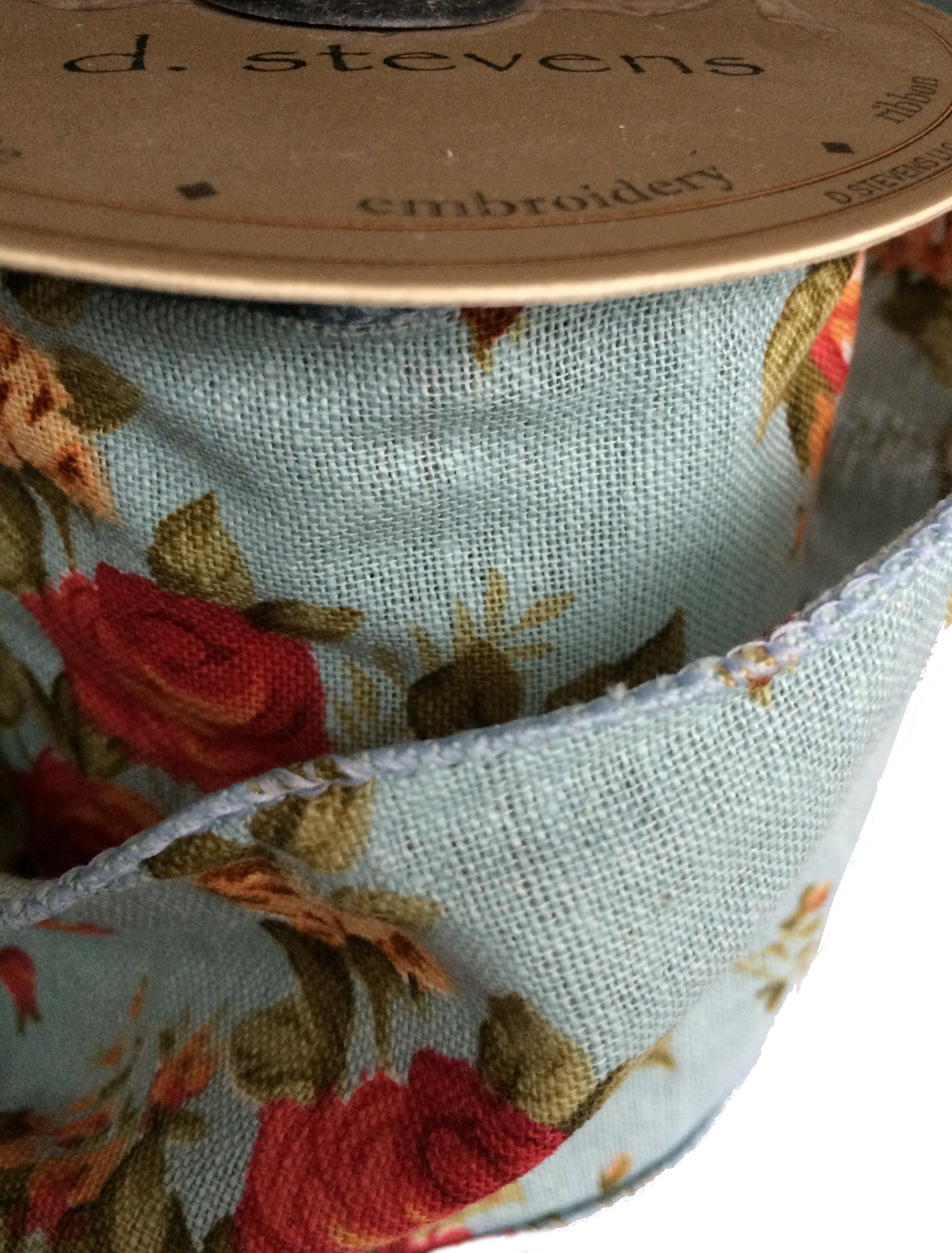 So today I am going out to buy a big plain evergreen bough wreath. Then, I’ll tie a big light blue floral ribbon on it and hang it on the front door. Then I’ll snip some pine from the backyard and stick the branches in my big blue pot on the front porch. Maybe even put a spotlight on the door so the house looks welcoming at night. And with that done, I can focus on making the holiday special and memorable for my family and … for me.
(wreath: LLBean)
Making a House Color Splash
March 15, 2016 § Leave a comment
I have driven past this house for years and every time, I do a double take. Situated next to a busy roadway, there is nowhere to stop, get out of the car, and snap a decent photo. But that does not deter me.
The red brick wall is not part of the yard. And who cares about it anyway. It is the roof color and the coordinating front door in a spectacular (guessing here) Starry Night Blue (BM 2067-20) that grabs our attention. The rest of the trim is a quiet brown taken right from the brick. We don’t even notice the window trim at all, and that’s the point.

The roof looks like Vermont Mottled Purple slate, but honestly I have no idea. All I can say is that this house creates, in its traditional neighborhood, a huge House Color Splash. Kudos! And I cannot wait to drive by again.
Don’t forget about the roof color when you are planning your exterior color scheme. It is absolutely fine to keep it neutral, but if you have the personality to withstand the gawking passersby if you decide to add color to the roof, then go for it. Just remember to tie it into the rest of the house with shutters and/or front door to match. I will thank you.
Change Your Front Door Color
February 8, 2016 § 2 Comments
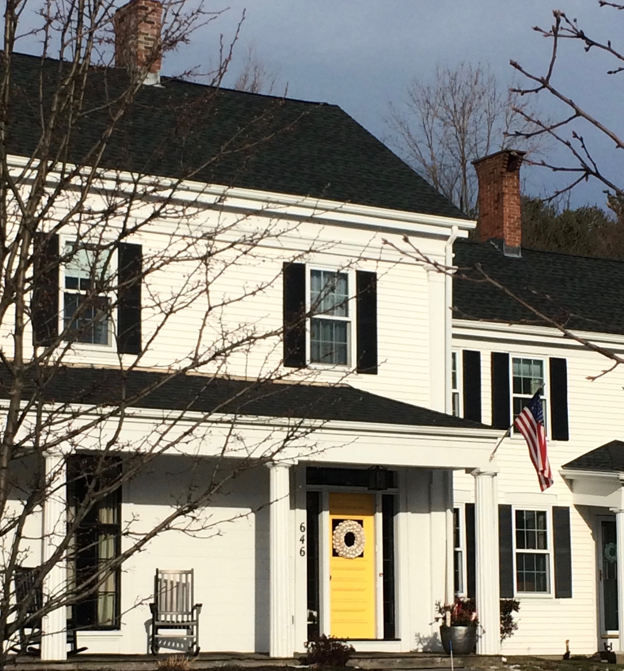 Driving through a little town recently, I glanced around as usual, admiring architecture, making a mental note about what color combinations to try and which ones really do not work, and generally looking for color and design inspiration. One house called out to me as I cruised by — quickly I made a U-turn and headed back for a closer look. Like a beacon of happiness, the bright, sunny, yellow door popped off the crisp, white house with black roof and shutters. What a stunning house to drive home to every day.
February seems to bring thoughts of Spring and those quick and easy, yet big-bang-for-the-buck house projects. And the front door color is one of them. If you’re tired of black or red for the front door, and particularly if you have a white house, there is no reason to keep the status quo. Shake it up. What is your favorite color? What color are your spring flowering shrubs? What color does your front door want to be? (Okay, that last one may be a bit weird, but you get it.)
Guidelines for choosing a new front door color:
- Make sure that new color shows up at least two other places in the front yard, for example, in the landscape plants, flower pots, patio umbrella, or other accessories.
- Consider a brighter sheen for a softer paint color. That will add life and a little pizzazz to a color that doesn’t stand out too much on its own.
- Realize that if your front door is under a porch overhang, the color of the door will darken. Go a bit brighter unless, of course, you get full afternoon sun shining on the door. In that case, go a bit darker.
- Give yourself choices. Try three different colors and look at them at different times of the day and in different weather conditions. Don’t rush the decision.
So this year, while you’re skimming through seed catalogues and planning your Spring garden colors, choose a new front door color too. You’ll love how it brightens your spirits.
Clear Knick-Knacks Before Buyers Knock-Knock
January 16, 2014 § Leave a comment
 Attention Homeowners:
1) Are you planning to put your house on the market anytime soon?
2) Are you a collector?
If you answered YES to both questions, then I’m here to help.
Whether it’s a massive book collection in the living room, a rock collection in the study, or a porcelain collection in the corner curio cabinet, the very first step in preparing your home for the market is to
- Box up your collections.
You may think your treasures are carefully tucked away on high shelves away from onlookers, but collections, plain and simple, represent clutter and add to the perceived age of the house. Collections also draw the eye of the potential buyers away from the architectural features of the house (what you want them to see) and focus the buyer’s attention on your hobbies. What they most likely will remember about your house will be the collections and not the house.
Another even more practical reason to box up your collections is so that nothing will get broken. Potential buyers and their children wander through your house unaccompanied during an Open House, and a toy car collection will stimulate lots of interest, but not the good kind.
You do not have to strip the shelves completely bare. Empty shelves do not sell houses any better than over-stuffed ones. You can keep some books and larger accessories. As a rule of thumb, shelves should be about 2/5ths full. In other words, if you have a bookshelf with 5 shelves, 3 of them should be emptied and the remainder of the items redistributed. If you empty the entire bookshelf, then remove it from the room completely.
Hope that gets you started. Happy Selling!
It’s the House Color, Not Your Dining Room Curtains
February 28, 2013 § 2 Comments
 Sometimes the best house color is one you might skip right over in the fan deck. Like this one: most likely Ben Moore’s Livingston Gold HC-16, a dark mustard-like brown with a definite green undertone. The kind of color you don’t want to see if you’re feeling queazy.
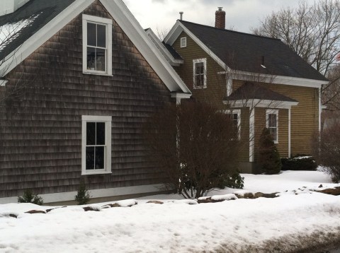
Although you probably would not choose this color for an interior room (for the reasons mentioned above), what a great house color for this old farmhouse with attached garage in natural cedar shakes. The combo is terrific — earthy, aged, and plucked from nature’s rock and wood palette of colors.
I slammed on the brakes to take a photo.
Choosing a Color Palette for Your House: It’s a Natural
January 29, 2013 § Leave a comment
 Another drive-by sighting of some curb appeal. This time, the stone wall pops out partly because of its mix of natural stones (and not just one kind) but also because the house color is drawn from the wall’s palette of natural hues. Even the front steps coordinate nicely with the wall.
Any of the wall’s creams, beiges, browns, and grays would have worked for a paint color, but the builders chose a light creamy yellow for the siding with a beige shingle on the portico. White trim pulls the house together and the black door makes the dramatic statement.
It’s so easy to choose your house color from nature. You cannot make a mistake.
