Where Color Trends Dare You to Go
February 12, 2023 § Leave a comment
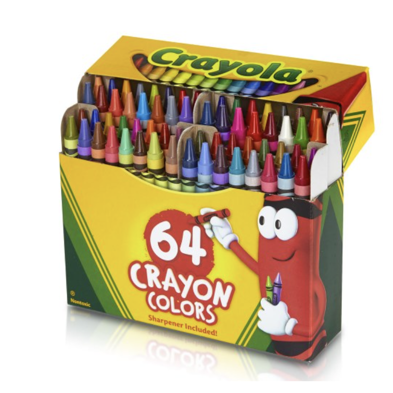
Were you the kind of kid who rearranged your crayon box? Maybe lining up all the cool blue-greens with the cobalt blues? Then putting the grass-greens and sunny yellows together? Or did you make a rainbow or go from light to dark? Just curious.
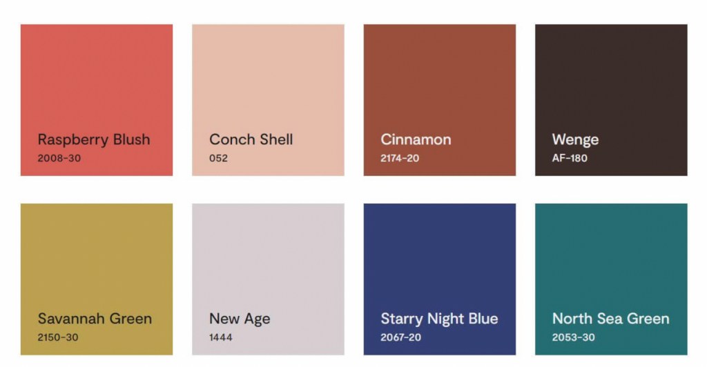
If you like a color organizing challenge, here’s one — the Color Trend Palette for 2023 from Benjamin Moore.
Okay let’s unpack this crayon box
Benjamin Moore calls this paint color grouping a “palette.” Personally, I think of a palette as a combination of hues and hue values that coordinate together and tell a story or express a mood. Something that signifies a color direction or coming design trend. But I looked it up anyway.
Googled “color palette”
“A color palette refers to the actual colors that you’ve chosen, based on your color scheme. A color scheme is based on color theory, like a monochromatic scheme. ” Diana Hathaway Timmons
So if you decide to paint your living room blue and you have all different shades of blue (navy blue sofa, light blue chair), then you have chosen a monochromatic color scheme for your living room. The actual color palette might include the paint color Starry Night Blue, but it would not include all those other paint hues because your color scheme is monochromatic — just one color.
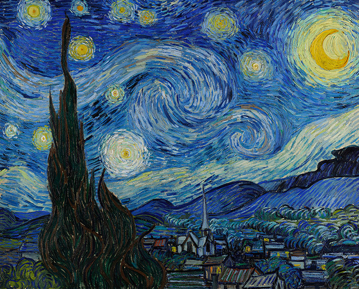
Painting on canvas versus decorating a room
If you paint on canvas, not walls, your palette may look like this!

Artists can mix paint colors and create art. But decorating a room is different from painting a picture. Colors in a room are not blended — they are placed next to each other, in front of each other, and over, behind, and on top of each other. And depending on the light in the room, one color can influence the color next to it. And sometimes, they just don’t work (see discussion of clean and dirty colors in What Color Trends Don’t Tell You).
Back to the Color Trend Palette for 2023
In case there is some confusion, the hues in the Benjamin Moore Color Trend Palette for 2023 (above) were not chosen because they all go together. The paint company is not expressing a particular mood or design style we can expect to see or even create in our own homes in 2023.
They have simply compiled eight separate hues (ideas, if you will) that their designers have determined, from global trends and design tea leaves at home, will hit the paint stores and home goods stores this year.
But to soothe my Kindergarten color-arranging sensibilities, I will rearrange their paint color palette anyway.
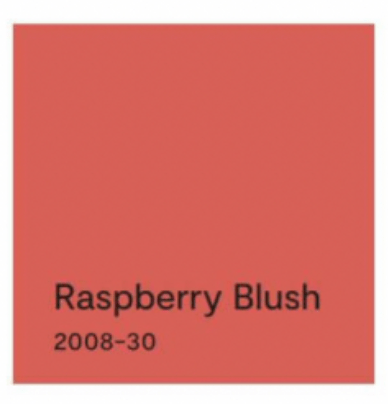
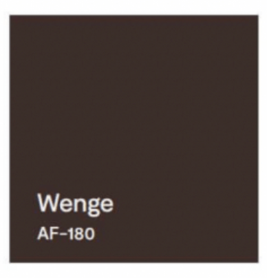
First up? Raspberry Blush
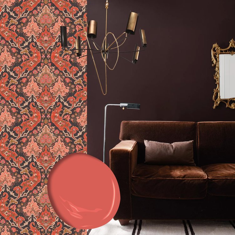
The first color, Raspberry Blush, is the Benjamin Moore Color of the Year for 2023. What a lovely stand-alone color for a dining room wall or an accent wall behind a white fireplace.

It can be paired with Wenge from this Color Palette.

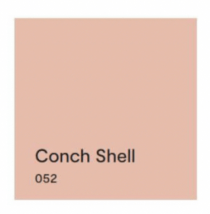
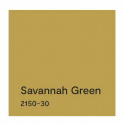
Next up? Conch Shell.
If you saw the previous post, we talked about clean and dirty colors. Conch Shell is clearly a “dirty” color that does not pair well with any “clean” colors. So in this palette, other than pairing with a neutral, I would line it up with New Age, and that’s it. These two “dirty” hues look great together. And Conch Shell would be a pleasant hue to add to the palette of a gray paint color scheme in your home if you’re trying to add some warmth for 2023.


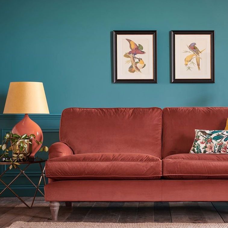
Next up? Cinnamon.
Cinnamon is a rich warm color that conjures up a timeless Southwest palette so it is fitting to pair it with a teal like North Sea Green that reminds us of turquoise.


Flash Back and Flash Ahead
Lastly, I would flash back to the blue & green decades from the past to pair the last two sultry hues. And I’m not talking about the ’70s. Art Deco (from the 1920s and early ’30s) with its rich jewel tones and luscious velvet textures is on trend at the moment, and these two colors will fit right in.


But if you dare to go there…
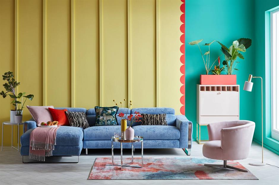
If you are not afraid of color and have an eye for modern, eclectic, live-what-you-love design, then throw out all those color-matchy-matchy Crayola crayon pairings and toss the whole batch of 2023’s trending paint colors into the room.
Because when it comes to loving YOUR home, there simply are no rules.
If you need help with color, do not hesitate to comment below, hit the button for a quick color consult, or shoot me an email. I would be happy to help you.
Hope you have a Colorful Day!
-Barbara, Your Home & Color Coach

Leave a comment