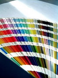
SW Color of the Year 2017
September 2, 2016 § 4 Comments
 OKay then! If you hang around long enough…(as they say…)
Taupe is back. The color we’ve spent the last decade ridding our houses of is now Sherwin Williams’ Color of the Year for 2017. Poised Taupe is the color — SW 6039 — and you have to love the description:
“Earthen brown combines with conservative grey and the result is a weathered, woodsy and complex neutral that celebrates the imperfections and authenticity of a well-lived life.” — Anytime somebody celebrates imperfections, I’m in!
But here’s what you should know about taupe. It can change radically with the light and the time of day. What looks a little brown can turn pink, purple, or green depending not only on the time of day but also on the lightbulb. Just so you know. Taupe can have a pink undertone as well that clashes horribly with the orange of a red oak hardwood floor. Another caution. But paired with white like its fan deck sibling Gauzy White SW 6035, a silver metal (not gold or brass), hardwood with a gray undertone, and fabrics in other light neutrals with a pink undertone like Cultured Pearl SW 6028, and you truly have a soft, restful combination that harkens back to those glorious. taupe-filled 50s. That’s 1950s!


Personally, I’m going to ride this one out, but I can appreciate how we’re moving from the grays into the taupes (without the yellow undertone of a previous color swing). Like I tell my clients, just because it’s the Color of the Year does not mean it’s perfect for your house. If you are considering taupe, make sure you have a lot of natural light coming in the window and (hopefully) some modern furnishings, shiny metals and glass. Try to avoid pairing with cherry wood. If you have concerns, talk to me!
Meanwhile, let’s get painting.
Green Decorating: The Soothing Hue
March 17, 2016 § Leave a comment
St. Patrick’s Day brings us to thoughts of green. Whether it’s kelly green or any of the variations thereof, green is a versatile, natural hue that brings life and comfort to any room. It is particularly nice in rooms where you spend time revitalizing your mind and body.


Waking up in a green room warms a cold, white, snowy day and cools a hot, humid summer morning. It can bring the color of lush plants and trees to a city skyline view. And it can calm an agitated, overextended lifestyle at the end of another hectic day.


Green can be either warm (yellow-green) or cool (blue-green), and both pair beautifully with white. Coordinating accent colors can add energy (the complementary reds and pinks, opposites to green on the color wheel) or quiet blending (the analogous yellows and blues on either side of green on the color wheel).
I highly recommend adding green, even a mixture of greens, to your home to quiet and soothe your soul. Wherever you need a few moments of ahhhhhhh.
Paint colors above: Top left to right: Waterscape SW 6470, Topiary Tint SW 6449, Honeydew SW 6428, Breaktime SW 6463. Bottom left to right: BM Guilford Green HC-116, Palisades Park BM 439, High Park BM 467, Dartsmouth Green BM 691.
Spring Into Unexpected Color
January 22, 2014 § Leave a comment
Designers are adding pops of color to the previous year’s light neutral color palette and in the most unexpected places. Look up for an opportunity to add color to your white kitchen. Pull some of that ceiling color down into the room with dishes, placemats, and other accessories. And create “flow” between rooms by adding a touch of your ceiling color to the adjoining room.
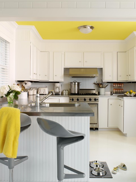
Color trends like this year’s fuschia are fun when you can add the color with inexpensive pillows or a single upholstered chair (http://www.worldmarket.com/product/fuchsia-nina-chair.do). Keeping the base of the room neutral lets you change your color palette when fresh new opportunities arise. Or with the seasons.
Pick Paint Colors Last — yes, Last
January 15, 2014 § Leave a comment
 So often I am called to a freshly painted room and asked to help the homeowners find a rug and window treatments to go with the new wall color. As much as I appreciate the homeowners’ enthusiasm for tackling the paint project first, it makes finishing the room much harder to start with the paint.
If you’re planning a room re-do and anticipate purchasing new furniture, window treatments, and a rug, here’s the most efficient order of purchases:
- Pick the biggest-ticket item first, perhaps the new upholstered or leather sectional sofa.
- Then pick the other furniture, like upholstered chairs and a leather ottoman.
- Then pick the rug. There are fewer options at that point, but the rug will introduce additional colors into the palette and you can bring those other colors into the room with art and accessories.
- Then if you want fabric window treatments, pick the fabric next that will complement the other elements.
- After ALL those decisions are made, THEN it’s time to pick the wall color.
There is a multitude of paint colors, shades, and tones from which to choose, but the paint decision will actually present itself more clearly once all the other major decisions are made. And the paint color will then pull the whole room together.
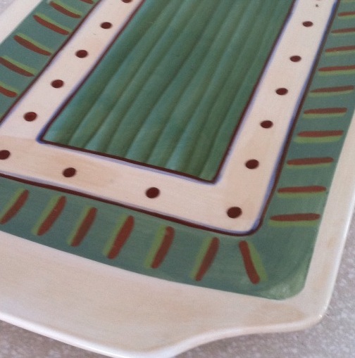
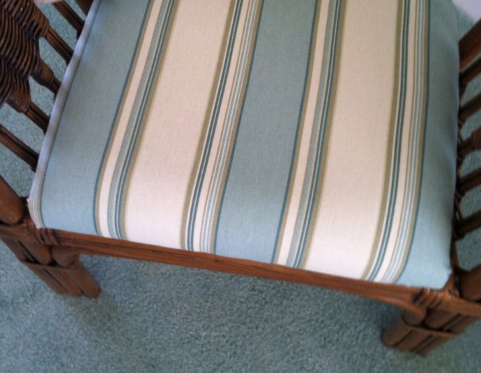 If your furniture and rugs a
 re neutral, you can find your color inspiration from almost anywhere, including in this case, a hand-painted platter. From that inspiration piece, we pulled in a striped fabric to cover some rattan chairs, and pulled the soft, gray-green paint color out at the end to complement the blues.
Kitchen Cabinet Color: Move over Back Splash
January 30, 2013 § Leave a comment
Kitchen cabinet color is in. From yellow to navy to this refreshing mint, cabinets and kitchen islands are getting a paint job. And it’s not just old cabinets that are being refreshed. New kitchen designs are showing painted cabinets in colors that were once reserved for bathrooms and laundry areas. And it’s a bold move because, unlike wall color, you are unlikely to re-do cabinet paint color anytime soon. Call it confidence or general optimism (or a craving for it) but cabinet color will be here to stay for some time.
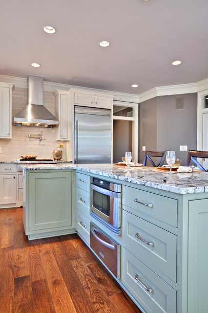
If you’re a little unsure of painting all your cabinets a particular color, try painting the back of an open cabinet or the center island first. That’s what I did. And I was hooked from that point on. (My cabinets have had two color transformations since discovering color in the kitchen.)
One suggstion for choosing a paint color for your cabinets: take a look at the colors in adjoining rooms and pick a color that will pull the public areas together. A pillow color in the adjoining family room might make a terrific cabinet color in the kitchen. You are limited only by…hmmmm… nothing really. Enjoy!
Choosing a Color Palette for Your House: It’s a Natural
January 29, 2013 § Leave a comment
 Another drive-by sighting of some curb appeal. This time, the stone wall pops out partly because of its mix of natural stones (and not just one kind) but also because the house color is drawn from the wall’s palette of natural hues. Even the front steps coordinate nicely with the wall.
Any of the wall’s creams, beiges, browns, and grays would have worked for a paint color, but the builders chose a light creamy yellow for the siding with a beige shingle on the portico. White trim pulls the house together and the black door makes the dramatic statement.
It’s so easy to choose your house color from nature. You cannot make a mistake.
Stone and Brick Reveal Your Exterior Color Palette
January 25, 2013 § Leave a comment
 Yes, it’s winter and the roof in this photo is covered with snow, but now we can focus on the rest of the house, particularly the stone. What works on this house is the color palette that is taken directly from the numerous available hues in the stonework itself.
The bricks are a monochromatic rusty red color that complements the stone without competing with it — a challenge when you have multiple materials on the house. The siding is a gray neutral, also in the stone. The trim is pulled from some of the darker taupe stones. How easy is that? Job done.
If you are building a home with different materials, use the busy one with the most colors (stone or brick) to make the rest of your color decisions. That way, the whole house will come together in a harmonious cornucopia of color.
The alternative? Choosing a color that is not in the palette at all. The result? A disjointed effect that divides the house into sections and makes it seem smaller. Can be done, but it’s tricky and needs a professional colorist to pull off. Do yourself a favor and stick with the natural palette that presents itself to you from your building materials.
Color Your Home Happy
January 18, 2013 § Leave a comment
 Whether you live in a deluxe villa or a double-wide, you deserve a happy home. And the place to start is by adding color. Numerous studies have shown that color influences the way we feel and can even be used to describe our emotions (“I’m in a blue mood”).* But what may influence us the most is a lack of color.
The study found that people with depression associated their mood with the color gray. And you don’t have to paint your walls gray to have a gray aura in your home. Take a look around your house, in the corners and shadowed areas and particularly the ceiling. Do you see gray? Do you feel blah? Well then… time for color.
Start by painting your ceiling either a bright white or a tint of your wall color. That will either maximize the light reflection in the room (and bolster your mood) or make the room feel bigger and more open. Either way, you’ll feel better.
Next, if you’re timid about your color-selecting skills and afraid to make a mistake with the wall color, then start small. Add some colorful accessories to the room — pillows, artwork, other changeable items. Doing that will help you create a palette of colors you like without making a big investment or paying a painter to repaint two or three times.
When you’re ready to take the plunge and add color to your walls, try an accent wall first. Pick the wall that you see when you enter the room (the focal wall) and paint that a color you like. Add accents to the room in the same color to pull the room together. Keeping three walls neutral with pops of color on an accent wall and accessories here and there will help you step into the world of color without any Crayola catastrophes.
Note: There is nothing wrong with neutrals and whites in the home. To many people, neutral means calm. But if you are somebody who likes to wear color and you are drawn to color yet your home does not reflect that love of color, then it’s time to add color. That’s what I’m talking about.
*http://www.livescience.com/6084-colors-describe-happiness-depression.html
Choosing Paint Colors From Room to Room
January 14, 2013 § 1 Comment
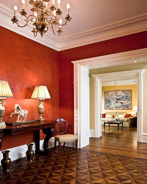 Create flow throughout your home by sharing colors between rooms. In this luscious red Venetian plaster dining room, the red is shared with the living room pillows across the hall. Just enough to draw your eye over there and pull the two spaces together.
Paint colors in nearby rooms “speak” to each other because they are adjacent on the color wheel. Red and yellow are separated by a neutral with a slight green undertone, adding a punch of contrast to the hallway.
Layering colors between rooms that you can see from one location and “cross-pollinating” the colors with pillows, accessories, and artwork will create a flow that will make your home appear bigger, less chopped-up, and more thoughtfully planned for optimal warmth.
(Interior design: Marcy Masterson)
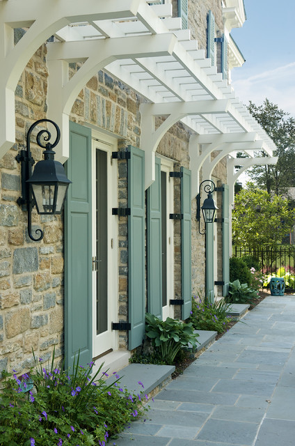
Shutter Color Inspiration for Stone and Brick Houses
January 10, 2013 § 6 Comments
One approach to choosing an accent color for your stone or brick home is to let the stone or brickwork dictate the color. How easy is that. The stonework on this house and walkway revealed a whole palette of dusty blue-gray greens from which the shutter paint was then custom-mixed to a perfectly coordinated color.
In the brick example, this Old Town red brick contains a lot more colors than just red. Purple is what pops out and that gorgeous shade was the inspiration for a dark purple shutter color: Ben Moore’s Caponata AF-650. Dark purple shutters are a wonderful option for other homes as well, not just red brick.


Natural wood tones always work for shutters, especially on stone or brick and especially if the shutters are actually wood and not vinyl. Old World wonderful.
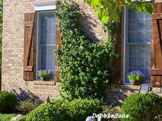
When selecting a shutter color, take your color cues from your house. Chances are pretty good that if you have a stone or brick house, you have quite a palette of colors to choose from already.
