Mirrors Mirrors on the Walls
March 15, 2019 § 2 Comments
I’ve been reflecting a lot lately on mirrors. (Sorry, had to to that.) I love mirrors in decorating. Not only do they bring much needed natural light into a dark room, but they create an illusion of space and even act as art if hung in groupings on a focal wall or along a stairwell.
But sometimes a mirror just doesn’t work. Here are a few tips for placing mirrors that might help you better appreciate them in your home.
- Avoid reflecting light back out the front door.
This is feng shui (it is not good to reflect the chi back out the front door), but it does make decorating sense. Putting a mirror at the front entry so you see yourself entering the home misses the opportunity to see and greet your guests with a beautiful piece of art instead. Just move the mirror to another wall in the entry and you will still add light to the space.
- Make sure the mirror reflects something positive.
Nobody wants to see your kitchen sink full of dishes reflected in the living room mirror. Make sure you place the mirror where it reflects a window or art on another wall in the room.
- Hang mirror over the fireplace instead of tilting it on the mantel.
What happens when you tilt a mirror on the mantel is that it most likely will reflect your ceiling and that’s it. If you hang the mirror, it will reflect the rest of the room and will double the space. Also, just an aside… if you are staging your home to sell, a mirror in the living room is good luck because potential home buyers who see themselves in the home tend to buy it (not a scientific fact, but it has worked so far!).
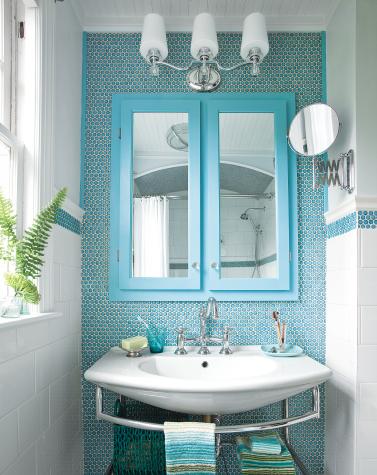
- Hang bathroom mirror so you can see into it.

It’s okay to let the mirror overhang the bead board (or backsplash tile) as long as you and others can see into the mirror while standing in front of the sink. Although visually, you might be tempted to hang the mirror clearly on the drywall (above the trim work in this photo), in a bathroom, form follows function.
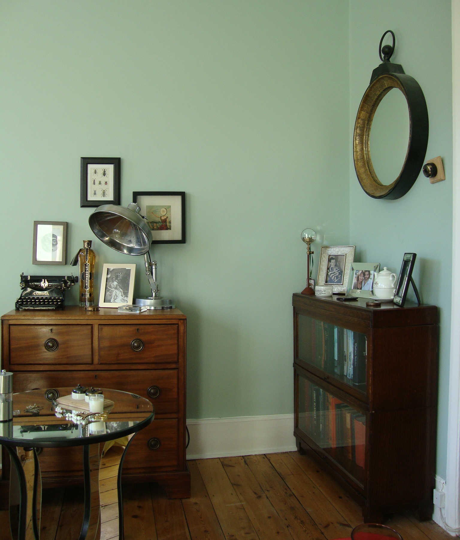
- Make art with groupings of mirrors.
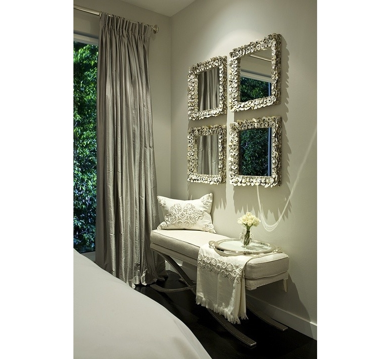
Organizing and hanging your mirrors either by matching shapes or frames (or both as above) or creating a random display of your mirror collection creates a unique focal point on the wall. Especially fun in a bedroom, stairwell or hallway that needs additional light but where the function of each mirror is secondary to its artistic arrangement.
Place your mirrors strategically to maximize their impact on the room. And for hanging really heavy mirrors, make sure you find at least one wall stud to secure the mirror onto the wall.
Mirror mirror on the wall. Be the smartest mirror-hanger of all!
What Color Brings You Joy?
January 23, 2019 § Leave a comment
As I type the title into this blog post, I am struck by how nearly impossible that question is to answer for somebody like me who loves almost all hues. How would I ever pick a favorite? But some people have no problem.
In the latest House Beautiful (Jan/Feb 2019 issue) amidst the usual articles about paint color trends and new wallpaper patterns, a spread jumped out of the magazine when I turned the page. Designer Kristen McCory and editor Emma Bazilian lay out a color palette that I would not expect to see in a Connecticut home.
There in a high-gloss fuchsia fiesta was a fireplace surround and mantel popping out of the living room wall. And there was more! A hot pink antique secretary and a raspberry velvet settee left no doubt as to the intentions of the designer. The homeowner wanted Pink. (That’s Benjamin Moore’s Gypsy Pink on the mantel.)
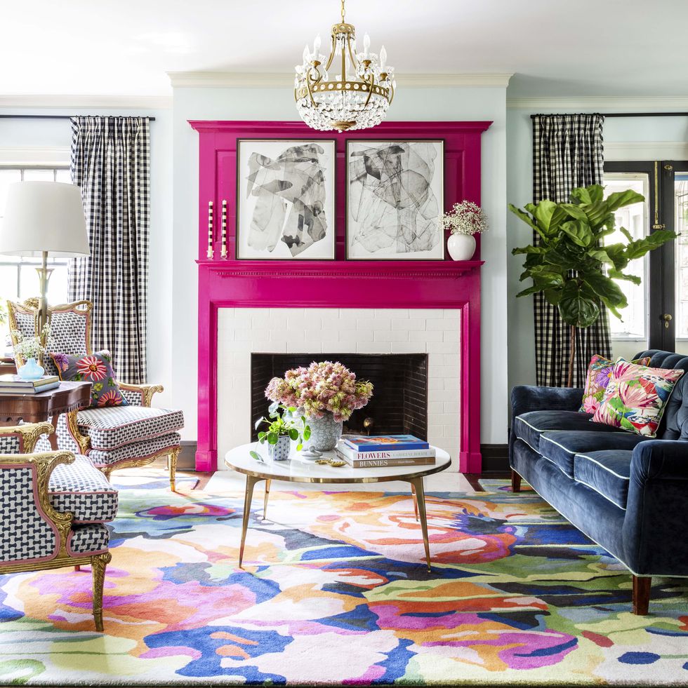
But the story gets so sweet when we discover that the pink is a tribute to the homeowner’s 99-year-old grandmother whose favorite lipstick was Revlon’s Parisian Pink. And that is what brings me to ask “What color brings YOU joy?”
For me? I guess I’m kind of in a Pink frame of mind these days — it’s bitter cold outside and that warm pink hue brings joy to my heart when I stare at it long enough. Witness my Facebook page yesterday —>
But by Spring I know I will have put all the warm colors into the closets and brought out blues to cool the house down and bring me newfound joy. I’m not sure what it is about turquoise, teal, and aqua that I love so much but maybe it’s what those colors represent to me: in this case, last year’s vacation with my precious sister! When I see ocean blues now, I think of her and it brings me joy.

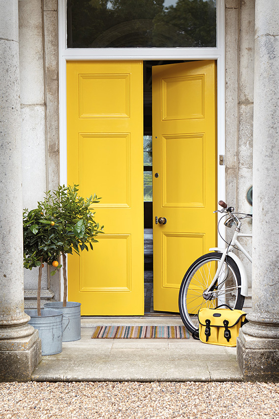
Whatever color brings you joy (always or maybe just right now) … embrace it. Wear it, decorate with it, and share it with others. Don’t worry about keeping up with trends that make others happy. When clients tell me they want a color for their kitchen that is the same color as their best friend’s kitchen, I always push back a little. It never fails. What looks good in somebody else’s house is inevitably a big fail somewhere else. Don’t pick a yellow front door because your neighbor has one. As we say so often these days… You Do You.
What Color Brings YOU Joy?
Going Big-Art Big
January 10, 2019 § Leave a comment
“Little stuff reads Clutter — big stuff reads Drama.”
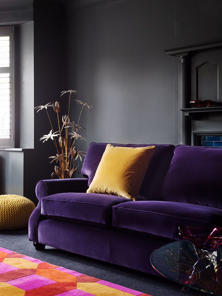
That is the mantra of a home stager, but the staging principle (what shows up best on camera) translates nicely into home decorating. That is not to say that you can’t have collections of treasures and portraits of the family scattered around your home, but going big successfully draws the eye and establishes the personality for the room.

Of course color does help! I’m enjoying the oranges and reds this cold winter morning, but contrast is all you need for major dramatic impact.

Go ahead. Make a statement!

Or create a serene backdrop for pared-down furnishings.

Or go for a wall mural — yes, big is back!

One caveat. Keep the furnishings in front of the art relatively simple for maximum effect. I’m about to install a piece of art that’s 60″ tall — can’t wait to show you the end result in my client’s family room.
Happy 2019 Everybody! I’ll be back with more color talk soon!
How Do We Pick Colors?
May 23, 2018 § 1 Comment
We are attracted to colors that are pleasing to us, and nature provides the best inspiration. Color palettes are everywhere, but not everything we see is pleasing to the eye. Why do some colors whisper sweetly at us whereas others, when combined, seem to claw at each other for dominance?
As color enthusiasts, we are all familiar with the color wheel as the foundation of basic color theory and the resource for learning the characteristics of various colors (or “hues”) and which colors work together.
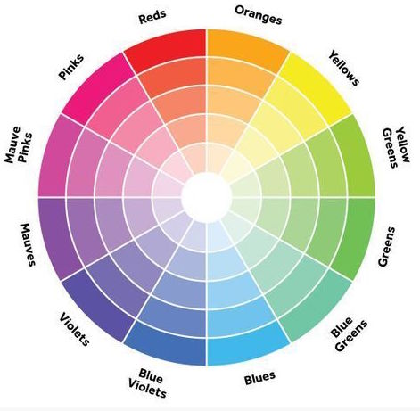
Hue Value: Besides the obvious differences between the colors in this rainbow wheel, one of the easiest characteristics to see is the value (whether one color is lighter or darker than another). Color professionals and other color lovers know this, but just in case… if we look at the second ring in from the outside, we can see that moving toward the outside of the wheel (adding black) makes the hue darker (a shade of the original). Moving toward the center of the wheel (adding white) makes the hue lighter (a tone of the original color).
Color Clarity: The clarity, whether a color is Crayola-crayon clear or kind of muddy looking, is another color characteristic that contributes to our particular color taste and definitely influences which colors go together and which ones fight.
Clear colors are vibrant and are used not only in packaging and advertising because they attract so much attention but also in some modern decorating and architectural color schemes.


On the other hand, the same color (green) when altered by mixing its opposite color with it becomes quieter and more subdued and can blend easily into a landscape. That’s why “grayed-down” colors work well on an exterior – at least for the siding (doors are a different story!).
TIP Mixing clear colors with grayed-down colors (especially if they’re in the same color family – say green) does not work. The clear color suddenly looks garish, and the grayed-down color suddenly looks dirty. It is probably one of the biggest decorating mistakes I see.
Undertone: One of the hardest color characteristics to identify is a color’s undertone, but every neutral has one. And what may on its own look like a simple beige or gray may actually reveal another color (for example, pink, green, yellow) when placed next to another color (or white).


In large quantity (like a floor), either tile above might read “beige.” But the tile on the left has a pink undertone, and the one on the right has a green undertone. It is important to decipher the undertones particularly in carpet, counter, tile, and other materials and avoid mixing undertones when you add fabrics, paint, and furniture, and other surfaces. The kitchen below is an expensive mistake.
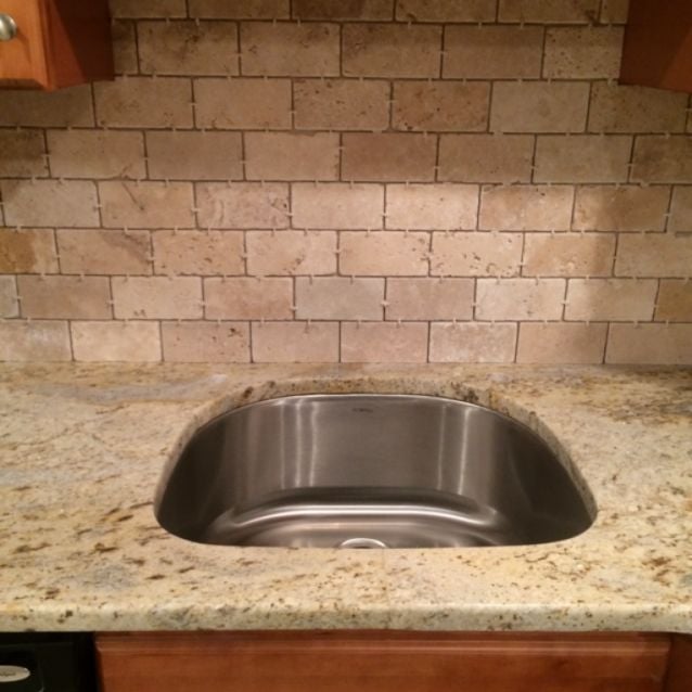
There are whole books and courses on undertones alone. I refer you to Maria Killam who literally wrote the book on Undertones. Professional designers, decorators and color experts need to be very familiar with undertones before specifying color.
TIP Don’t Mix Undertones!
So How Do Colors Work Together Successfully?
Almost any color will look good by itself or mixed with white. But we don’t pick colors to stand alone most of the time. We choose color combinations. And that’s where the fun is – figuring out which color combinations work together and how to use each color effectively, whether you’re designing a magazine cover or a living room.
Using the color wheel again, here are some combinations:
A monochromatic color scheme is an easy way to decorate a room as it uses many different shades and tones of one color (hue) like you would find up and down a particular color strip in the fan deck.

TIP If you use a monochromatic color scheme, make sure that the clarity of the color is the same throughout. In the words of Maria Killam, “don’t mix clean with dirty.”
Complementary colors are opposites on the color wheel and they tend to have energy when they’re together. So using them in an application makes a big splash like on a magazine cover when you want it to leap off the shelf at you while you’re standing at the checkout counter.
Complementary Colors

More Complementary Colors
Analogous colors are side-by-side on the color wheel and tend to be either cool (blues and greens) or warm (red/orange/yellow).
Cool colors all used together actually create a calm feeling, and they are often used in high-stress settings like hospitals.

And what better color scheme when you want to generate warmth and draw customers into a hot coffee shop than to use analogous warm colors like pink and orange.
TIP When you are using an analogous color scheme, show those subtle color differences off by pairing with plenty of white! White makes colors pop!
Sharply contrasting colors like black and white provide the starkest contrast, but white with gray and a pop of vibrant neon can really look striking, both in packaging and in a room.

Neutrals are not always beiges and grays as you can see from this neutral living room, but they don’t always show up on a typical color wheel. Many of you may be in what we might refer to as the Gray Period of recent years (gray replaced beige of decades past as the neutral of choice).
TIP Add texture (nubby pillows, shiny metals, soft fabrics) if you decorate with a neutral color scheme to add visual interest in a room without a lot of color and contrast.
Whites — who knew — are so numerous that if you Google “shades of white” you get 982,000,000 results. So there are whites, and then there are WHITES. Unless you are painting an art museum interior, I suggest avoiding a chalky white for your wall color. That particular white is so vivid it practically glows in the dark.

TIP Choosing an off-white (a “white” that leans more toward a color like beige, gray, yellow, or blue) gets you more mileage and will age more gracefully than a pure toothpaste white.
Color trends may come and go, but it’s helpful to know why certain color schemes work and how to make adjustments in ones that don’t.
The World’s Favorite Color? Where Have I Been?
February 22, 2018 § Leave a comment

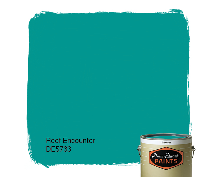
Late to the party here, but better late than never. At least that’s what I said to myself yesterday when I scrolled onto THIS beautiful hue and found out that it was crowned The World’s Favourite Colour. No great surprise since it represents some of the world’s most exquisitely beautiful treasures like Bali — an island so gorgeous its name alone sounds relaxing.
Last summer there was a questionnaire sent out — ’round the globe, as it were — to find out which color appealed to the most people. (I totally missed it! Arrrgh!)

“The competition organised by Hull 2017 UK City of Culture and paper merchant GF Smith invited people to select their favourite shade online by hovering over an infinite palette of shades with their mouse until they landed on the colour they found most appealing.”
The winner was this rich teal that nature inspires and artists incorporate to capture the beauty that surrounds us.
The closest paint color approximation I could find was a Duron Paints shade, Sea Sphinx. 
But there were others:

There are plenty of other ways to introduce the color into your decor — window treatments, accessories, and more art, of course.
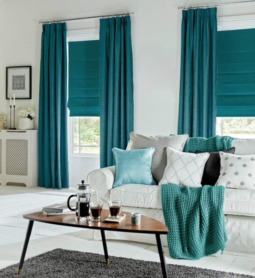
On an accent wall of Marrs Green, this art pops!
And so does this one!
Though I have blogged about “teal” before, I guess there’s a reason. It appeals to vast numbers of people worldwide. It is a little bit blue, yet a little bit green. It’s the warmest ocean color and a color that appears in natural gems and plant life. It is rejuvenating in all its forms.


")
It looks great with the full green/blue spectrum and all its values, and it forms a calm backdrop to pops of heat. Marrs Green — The World’s Favorite Color.
Color Inspiration is Everywhere
February 19, 2018 § 2 Comments
While scrolling through the interwebs today I bumped into this tweet from Architectural Digest highlighting 20 cute items from Walmart. Okay, that I had to see. And I have to agree — there are lots of really “super cute things” that I had not noticed while shopping for cheap soap dispensers.
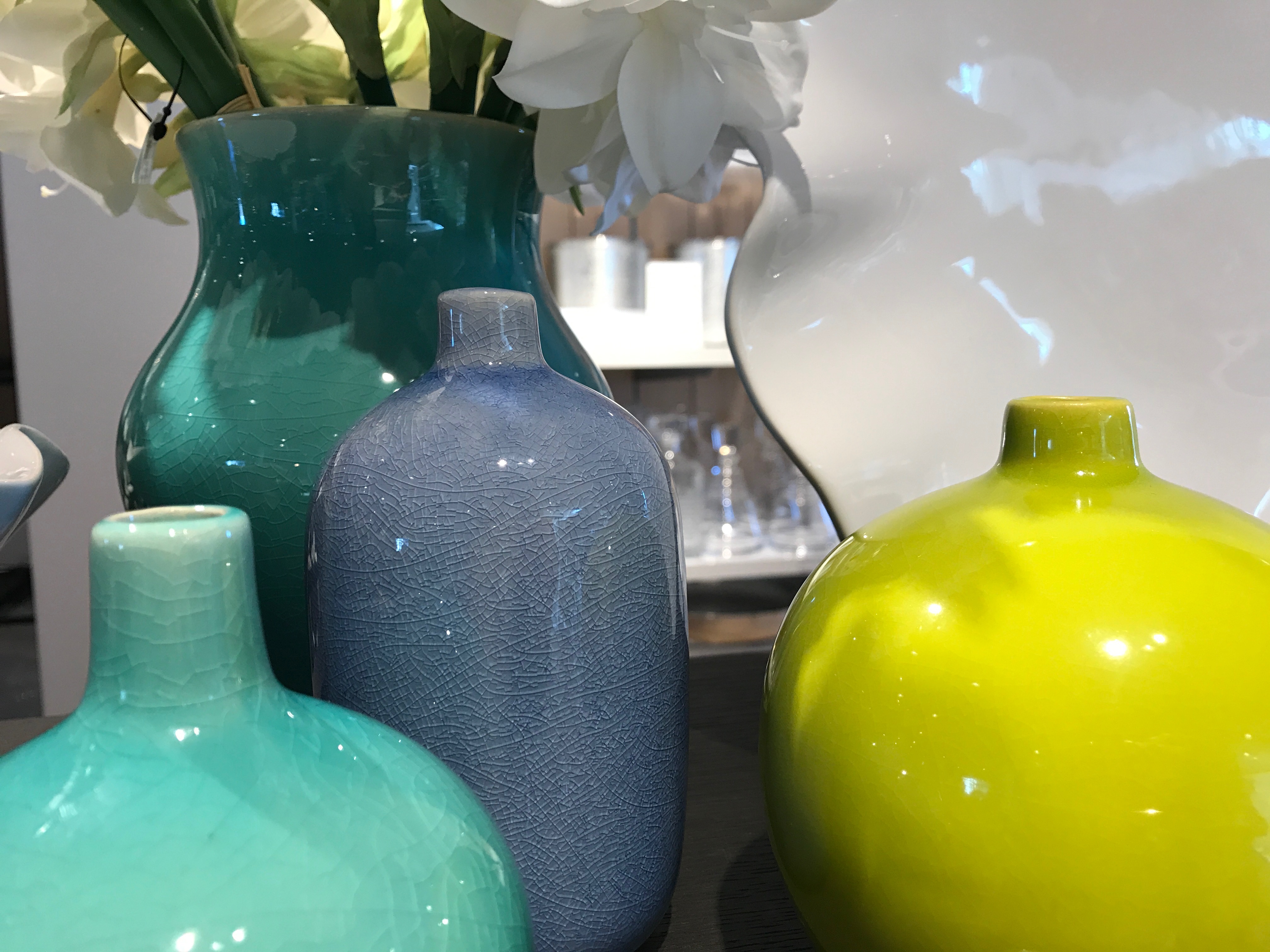
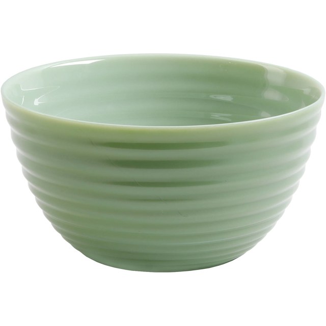
But the item that caught my eye and sent me off to color dreamland was a gorgeous ribbed glass bowl in the most deliciously subtle tones of green. It reminded me of the Farrow & Ball color palette — you know — those paint colors that look like velvet in shades and tones that no other paint company seems to match. There’s something about them (trade secrets, I suspect) that gives a room or a piece of furniture a hue that whispers sophistication. Not one of them will show up in a Crayola box.


Cooking Apple Green No. 32
There are two obvious things that distinguish Farrow & Ball from other more mainstream paint lines: the number of colors (way fewer) and the price (way more). And although many home projects and palettes of colors might not be worth the extra expense because the subtle tonal difference or undertone might not be noticed, I find that the blues and greens in Farrow & Ball are far superior for their soft, sophisticated richness.
Maybe it’s the largess of their English roots (Farrow & Ball is located in the United Kingdom). Or maybe it’s the fewer number of perfect colors (only 132) so that every color decision is a successful one. Or the fact that the company has maintained its original formulation. Or maybe it’s the mystique. But whatever it is … I love it.
What makes F&B different
Regardless of the paint line you prefer, keep your eyes open for color inspirations. They are everywhere — even Walmart.
Is Your House an EXtrovert? Paint It
February 15, 2018 § Leave a comment
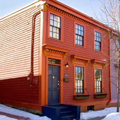
In the next town over, there’s a purple house. And when I say purple, I mean PURple, but not just the front door as we see in the row house above, but also the siding, the trim, the doors, the shutters, and even the concrete foundation. The whole house is purple. (I would show you a photo of the house, but I don’t want to embarrass it.) The result is a house that draws everyone’s attention and not in a good way.
On the other hand, if your house is already an extrovert — one that has character and interesting features you want to show off in all their glory, then go ahead and use paint. This article from This Old House presents ideas for how to bring out the personality in your older home and shows not only colors that grab attention but also where to put them and which ones go beautifully together.
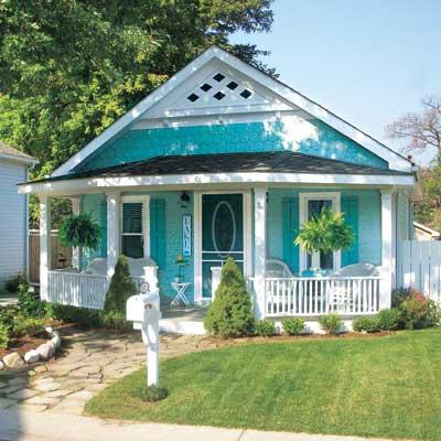
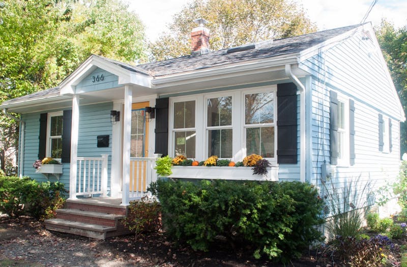
There are lots of ways to use color. This beachy turquoise, perfect for a cottage style home in a coastal community, uses one hue — a medium tone for the siding and a darker value for the shutters and door. White trim completes the cottagey look. The result is a house that displays its positive features without overdoing the palette. This strategy is especially good for a small house.
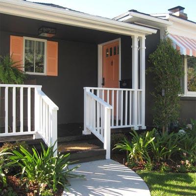
Dark colors are trending now, and this gray-brown ranch is a good example. But instead of keeping the whole house a quiet, conventional wallflower, the homeowner displays its cheerful personality with tangerine shutters, front door and striped awning. The white trim makes the colors “pop,” as we say, and you have a real looker!
Speaking of citrus, look how this bungalow shows off its architectural features with Juicy Fruit colors and — wait a minute — a lovely deep grape purple foundation. Now that works!
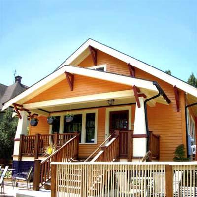
My favorite color combination, though, and perfect for this restored Italianate house, is terra cotta siding; a darker value for the window muntins, eave corbels, and column accents; a rich natural wood front door (and rocking chairs — nice touch); and cream gingerbread trim.
These are only a few ideas for how to embellish your older home with color. Spring outdoor projects are coming for many of us, and one of us at least has house color on her mind. Ha!
Think color, my Color Friends! And stay cozy.
Pink Doors and Why They Work
February 5, 2018 § Leave a comment
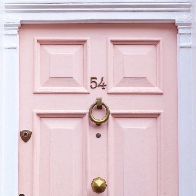
Pink — a trend we’ve been watching for the past couple of years — is no longer labeled, as my mother used to say, SS&G (sweet, simple, and “girlish”). On the contrary. The color keeps popping up with some staying power, and where it has grabbed my attention the most is at the front door.
This Pleasant Pink by Benjamin Moore is a comfortably sophisticated hue that blends rose with peach and a touch of gray undertone that keeps it from looking too bubble-gummy or baby’s room. Antique brass metal hardware (as on the London door above) will give the color an aged quality that keeps it from looking too trendy.
Why does pink work so well as a door color? Because it compliments many exterior house colors and coordinates with pinks and whites and purples in the landscape plantings. Here are a few ideas:
Behr’s Road Less Traveled from the 2018 palette is a soft mushroomy gray brown that coordinates nicely with stone walls and wooded environs and looks fabulous with white trim and a pink door. And although cherry blossoms do not last very long, for a few weeks out of the year your house will have traffic slowing down to take photos.


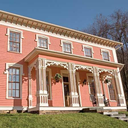
Another house color that looks great with a pink door is gray– it’s a classic combination. This gray, Benjamin Moore’s Stormy Monday, paired with pink creates a quiet traditional combo whose matched undertones make the marriage work. Pink perennials in the yard draw your eye to the coordinating front door.

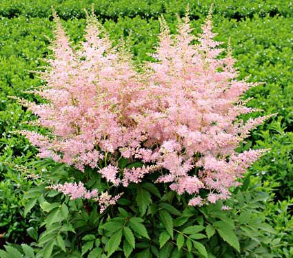
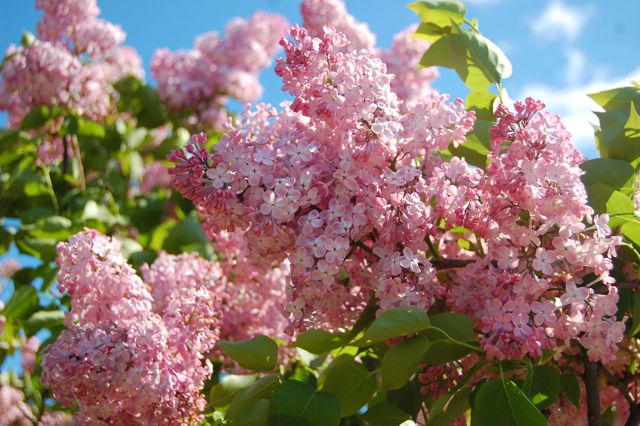
Three other colors paired with pink create quite the wow factor and a stunning bush of pink lilacs ties the whole look together.
Charcoal Blue, a Sherwin Williams color, offers the most drama. Not for everyone, but a dark navy house can be very striking, and the softness of the pink door creates a balanced look paired with silver-toned metal door accessories.
Farrow & Ball’s Slipper Satin is a gorgeous color to paint both siding and trim. Paired with a pink door and a dark brown porch deck and oil-rubbed bronze accessories, you’ve got your drama.
Finally, we have a dark charcoal, Glidden’s Flagstone Grey, that also coordinates well with stonework and contrasts beautifully with pink.

![farrow-ball-sample-pot-slipper-satin-2004-22227-p[ekm]480x480[ekm]](https://i0.wp.com/yourcolorcoach.blog/wp-content/uploads/2018/02/farrow-ball-sample-pot-slipper-satin-2004-22227-pekm480x480ekm.png?w=156&h=156&crop=1&ssl=1 "farrow-ball-sample-pot-slipper-satin-2004-22227-p[ekm]480x480[ekm]")

As you contemplate freshening up your home’s exterior this Spring, see if a glossy pink door with fresh hardware might be the answer to enhanced curb appeal. If you change out the door hardware, don’t forget to match the porch light– an inexpensive upgrade that can make a huge difference. Add a fresh door mat and pot of pink annuals on the porch step and brace yourself for compliments.
Happy Thinking-About-Spring Day, Everybody.
Beat the Blues with a Beach Bathroom
January 30, 2018 § Leave a comment

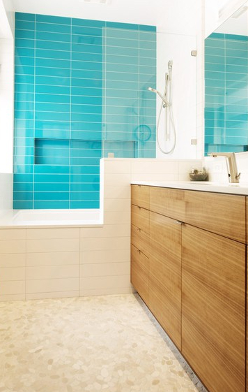
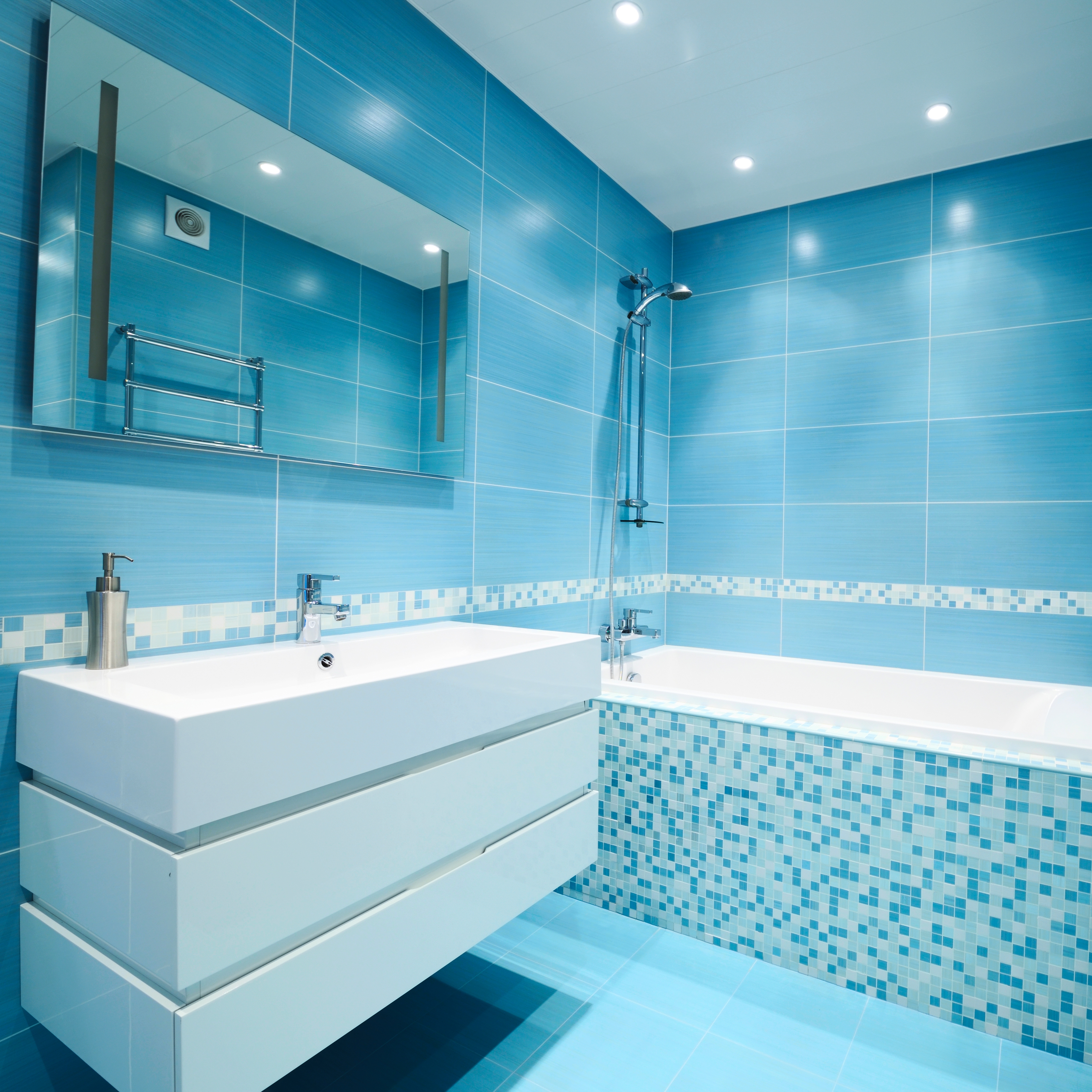
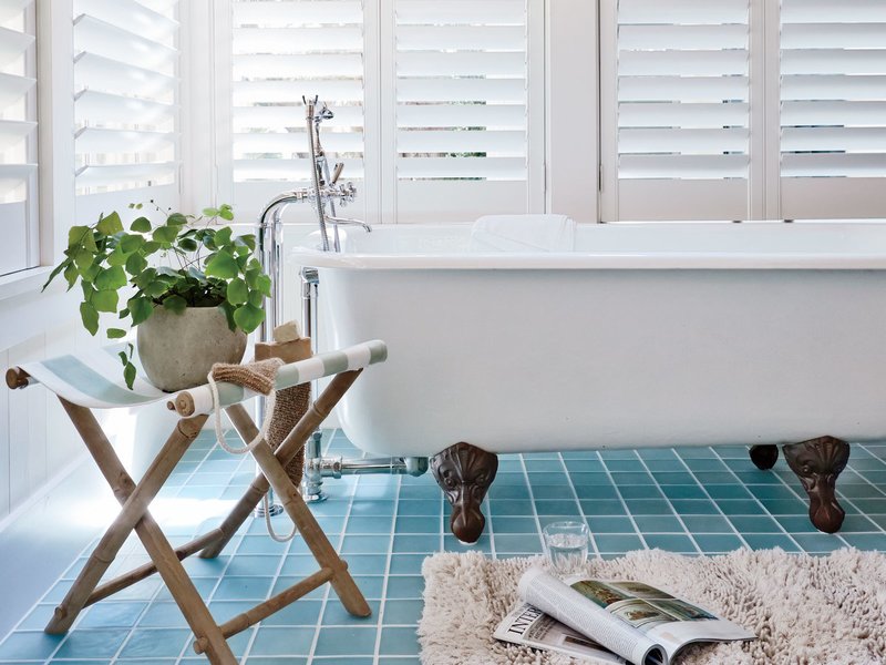
Nothing quite like a beach scene to distract from the snowflakes drifting by my office window. So here I am scrolling through photos of the most beautiful beaches in the world and dreaming of what it would feel like to be barefoot in the sand. Arguably one of the most beautiful of all of nature’s color combinations, there is something healing about blues and greens together. Not a big surprise.

But the funny thing (to me) is that I find myself thumbing through the part of the fan deck that I rarely use — occasionally for kids rooms — the bright clear Crayola colors. Maybe it’s a reaction to years of neutrals and grays upon grays, but my eye and my spirit are drawn to the crystal clear hues that one encounters about three feet in as you wade into the water. That color.
The rest of the palette is just as lovely especially all together. Whether you pick one as the floor tile color and another, maybe in a lighter value, for the walls, the combinations for color placement are endless.


Add in the the sandy white for bathroom fixtures, and the other colors for art and accessories, and voila.


A little splash of paradise in the privacy of your own home.
Houzz

Creating Colorful Curb Appeal
January 23, 2018 § 2 Comments
Need curb appeal?? Well, this remarkable ranch re-do will show you how some strategic changes to the front of a rather ho-hum house can make a huge impact, and if you’re planning on selling anytime soon, pay attention. There are some quick easy fixes that may apply to you.
Here is the Before shot: faded vinyl siding, old aluminum windows, dated storm door, dirty white shutters, old iron stair railing, and tree overgrowth. Have you seen a million houses like this one? Yup. Me too. Not exactly a head-turner.
Laurel LaBauve at SoPo Cottage addressed the front facade with a new porch portico. Adding dimension to the front face of the ranch made a huge difference and created a cottage style instantly. She could have stopped there, but onward to new windows (fresh, white, two-over-two) that brought more light into the house and gave it a cute, vintage, styled look. Excellent choice!
Next up? The vinyl siding. Why does the after vinyl look so terrific? Laurel revealed her secret: something called Vinyl Renu, a product that, Laurel reports, brings new life to the color and sheen and is supposed to last 10 years! I’m in! What a difference. If your house has vinyl siding and it needs a refresh, here’s the stuff.
Switching the shutters to black board-and-batten was another great cottagey move. If they’re vinyl, you fooled me. Note: Leaving the brand new windows bare with no shutters would not have been a bad thing. A little more contemporary. But the contrast of the black with the light blue siding and white trim is sharp, and the house looks finished.
Then there’s the front door color. Yellow. One of my faves as it sings Happy House as you walk up the front steps. And the coordinating flowers in the new window boxes (also a cottage style fun-to-have) pull the whole look together. (If you need color help, let me know!)
Even if there is no budget for major changes, here are a few easy fixes that will still make a big difference in your home’s curb appeal. Take-aways for home sellers:
- Trim the trees back so that the house is free of branches and there’s a clear view of the house from the approach. Pay attention to the landscaping, weeding, and overgrown bushes. It’s amazing what a little green thumb elbow grease will do.
- Rev up the vinyl siding with Vinyl Renu to give the color a fresh look.
- Add shutters if there’s room and particularly if the house is a light color. Black will give the house a dressed-up and polished curb appeal.
- Add coordinating accessories like porch lighting and a mailbox.
- Paint the front door a warm contrasting color and tie in the landscape (annuals, flowering shrubs) and any outdoor accessories like Adirondack chairs or deck furniture.
Click here to see how the INside was transformed. Bravo! Laurel, you are quite an inspiration.
