Surprising House Color Trend — White
February 12, 2014 § Leave a comment
Classic but always with a modern twist, white is trending now as a house color on new construction. Whether we’re craving our grandparents’ old homestead, or we like a crisp, uncomplicated look, white is in. White siding with white trim. But the surprise element lies in the accessories. Fresh options include silver for the metal color (not the traditional black), white or pastel door colors (nolonger black or red), medium-toned metal roof colors (not just charcoal shingle anymore), mismatched out-buildings (that old classic farm look is coming back in a big way), and even (gasp!) white shutters on a white house.

The beauty of white is that it really is timeless. Not only that, but it shows off your colorful flowers and the greenery of your landscaping, the orange patio umbrella and Adirondack chairs, and the turquoise of your backyard pool (okay maybe I’m going a little overboard).
See if a fresh pop of white brings out the character in your house.
Warm Your Soul with Color
January 29, 2014 § Leave a comment
 Those of us with light airy neutral homes are feeling the chill this winter. Whether it’s the frigid temperatures outside or the cabin fever inside, the light, low-contrasting palette we enjoy so much of the year for its calm and cool comfort just isn’t cutting it.
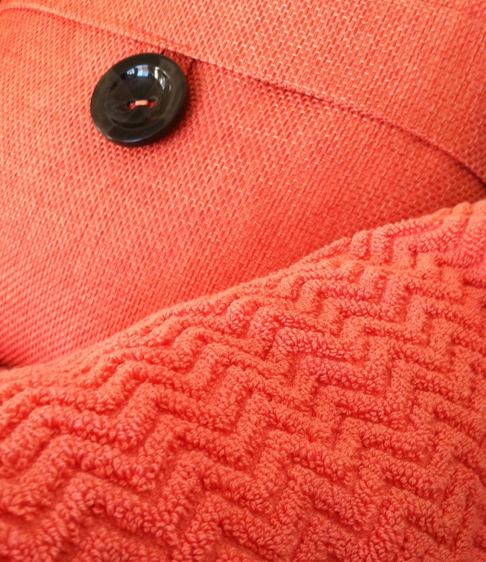
A recent trip to a home goods store had me craving color. On two separate occasions, my eye scoured the store’s palette of spring selections and landed on the same warm vibrant coral. I had to have it. First the pillow. And next time, two towels (for me only, I might add).
Color makes us feel good. Color cheers us up and calms us down. And the right color can make our homes feel cozy and welcoming any time of year. Welcome home, my new coral accents. And if the temps don’t rise soon, I’ll be off to the paint store for a gallon of, you guessed it, coral.
Stay warm, my friends!
Mixed Metals Get My Rave Review
January 24, 2014 § Leave a comment
 Gold and brass are finally officially back. The cheerful, dressed-up metal color has been scorned and ostracized for years, it seems, with homeowners rushing to change out everything from drawer knobs to door hinges. Well, hold up.
Over the past couple of years, we have watched brass trickle back into design (you knew it would) but have been waiting for the main stream to catch on. Now we’re seeing a mix-and-match approach that seems to fit everybody’s home style.
In this kitchen by architect William Hefner (http://www.williamhefner.com/) we see dramatic gold accents along with the other metals (chrome sink and wrought iron light fixtures). What I’m sensing, as with fashion, is that you can pick your accent metal like you pick your hem length. If it works for you, then go for it. We love that approach as it allows you to update your home without having to replace everything in it all at once. Casual acceptance of materials seems way more sensible than dictating that “Metal X” (whatever that turns out to be) is totally OUT.
Hurray for sensible design.
Spring Into Unexpected Color
January 22, 2014 § Leave a comment
Designers are adding pops of color to the previous year’s light neutral color palette and in the most unexpected places. Look up for an opportunity to add color to your white kitchen. Pull some of that ceiling color down into the room with dishes, placemats, and other accessories. And create “flow” between rooms by adding a touch of your ceiling color to the adjoining room.
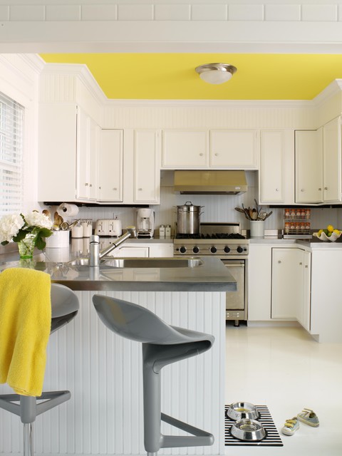
Color trends like this year’s fuschia are fun when you can add the color with inexpensive pillows or a single upholstered chair (http://www.worldmarket.com/product/fuchsia-nina-chair.do). Keeping the base of the room neutral lets you change your color palette when fresh new opportunities arise. Or with the seasons.
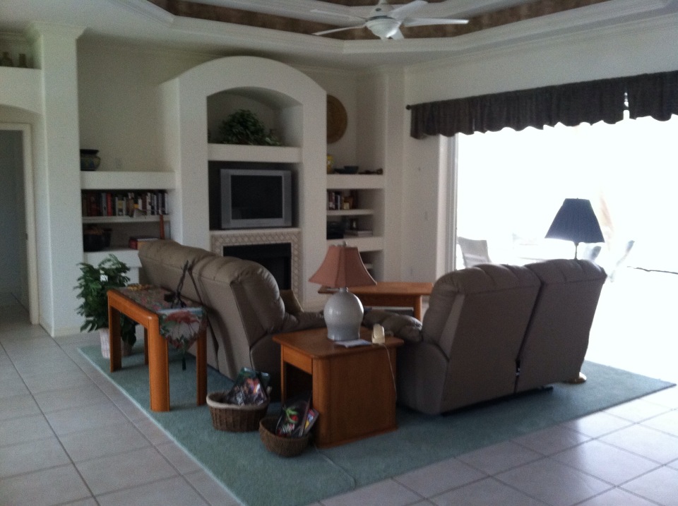
That Huge TV is so Ugly — What to do
January 21, 2014 § 2 Comments
 Electronics have plagued designers and esthetically driven homeowners since the demise of the TV console with doors. We’re now learning to embrace the large shiny black rectangle.
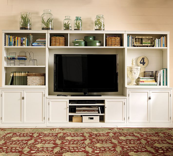
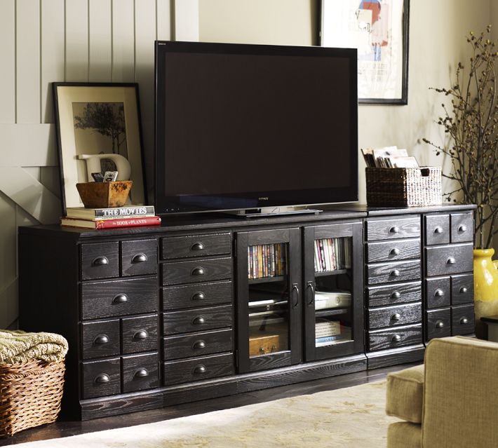
If you are trying to disguise your elephant in the living room, blend it. A black cabinet and other black accessories will help to camouflage the electronic “stuff of life” better than a white or light-colored cabinet will. See how the TV pops out of the white cabinet? And the bigger the TV, or course, the bigger the pop!
Try camouflage in your home office as well. Dark charcoal gray is another wonderful color for blending printers and monitors and other less-than-attractive devices so necessary to our everyday existence. Computers and TVs (etc.) are functional. We don’t necessarily want to see them.
Do You Know How Easy This Is??
January 18, 2014 § Leave a comment
 This update, to state the obvious, is the easiest project short of rolling paint on a wall. So easy that many of you will skip over this post or roll your eyes that I’m even mentioning it. But just in case you are still looking at stained seat covers on your kitchen chairs, you have no more excuses.
- Turn the chair upside down.

- Take your handy-dandy screwdriver (yes, you should have your own) and twist out the 4 screws.
- Next, go to your local fabric store and pick out a nice pattern and color that will look good in your room.
- Buy 1 1/2 yards (of a 50-54″-wide) fabric. If you’re at JoAnn’s Fabrics and Crafts, go to the “Home Dec” section so the fabric is sturdy enough to hold up. You don’t want quilting cotton — too flimsy.
- Lay the fabric upside down on a large table or the floor. Place your seat upside down on the fabric and cut out the new seat cover, leaving at least a 2-3″ margin after you lift the fabric up to cover the sides of the seat. Cut the fabric. (Don’t stress about the cutting — the edges are not going to show.)
- Next. If you don’t already have a staple gun (sigh), you need one. So many uses.
- Pull the fabric taut over the seat and put one staple in the center front underside of the seat.
- Turn the seat around and pull the fabric taut again putting one staple in the center back underside of the seat. Repeat with the sides, making sure the fabric pattern is straight (turn the seat over and check).
- Then pulling the fabric taut, staple the fabric onto the seat, moving toward the corners. Fold the corner pieces and staple underneath.
- Trim the fabric excess. Turn the seat over. Place it back on the chair and put the screws back in.
VOILA!
Home-Staging Tips That Help You Sell
January 17, 2014 § Leave a comment
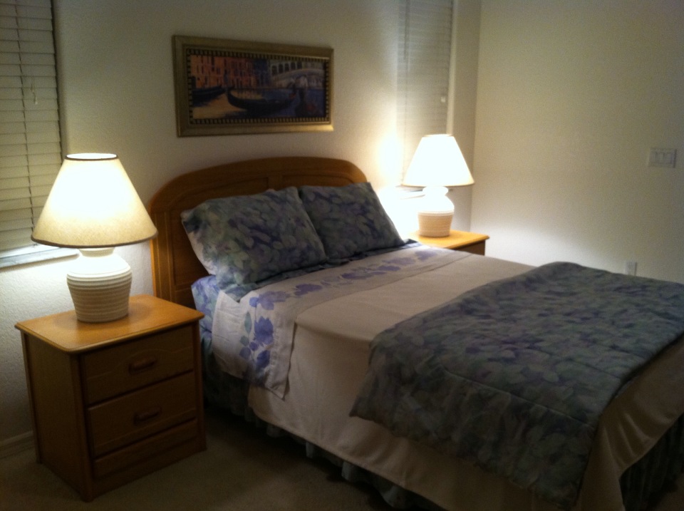
Tip 1: Make the Master Bedroom a cozy nest.
Remove outdated window treatments.
Dress the bed to look welcoming.
Add art above the headboard.
Make sure there is adequate lighting.
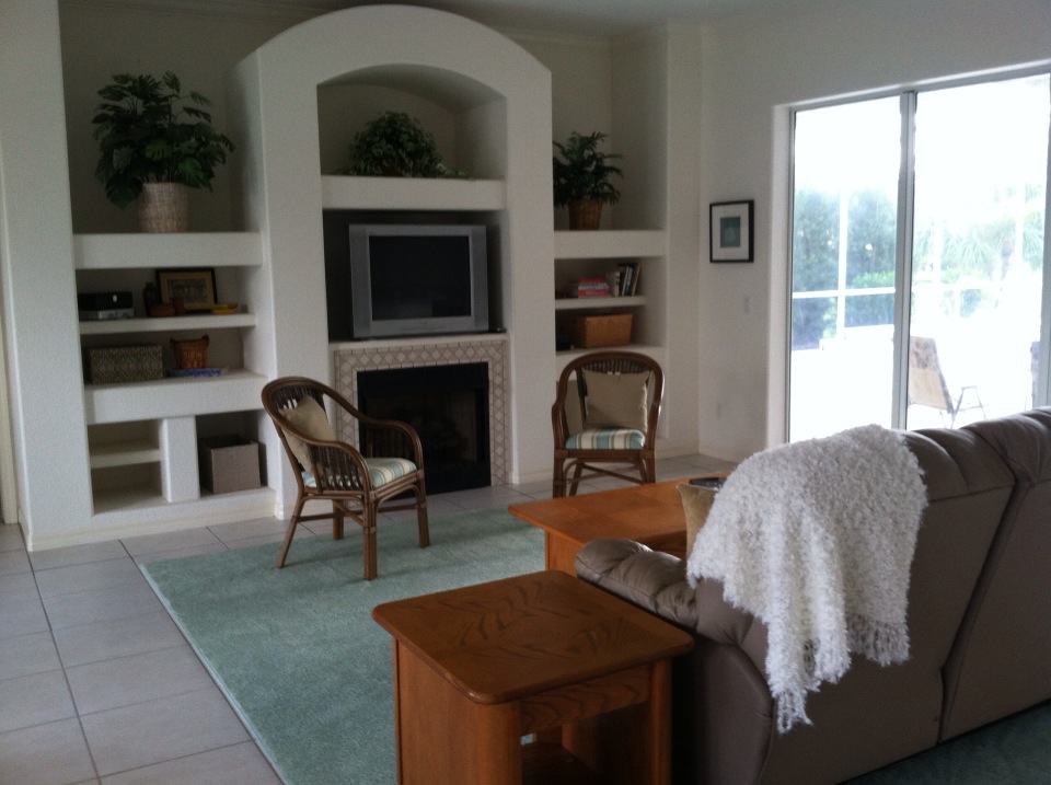
Tip 2: Clear the path to the room’s focal point.
Take away unnecessary furniture.
Remove dark window valances.
Rearrange furniture to feature focal area.

Tip 3: Remove styling that dates the house.
Less is more when you’re trying to attract young buyers.
Remove rugs to show off tile or hardwood floors.
Reorient furniture to add space.
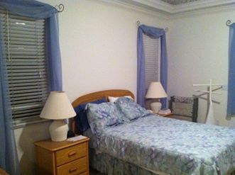
Before shots:

Clear Knick-Knacks Before Buyers Knock-Knock
January 16, 2014 § Leave a comment
 Attention Homeowners:
1) Are you planning to put your house on the market anytime soon?
2) Are you a collector?
If you answered YES to both questions, then I’m here to help.
Whether it’s a massive book collection in the living room, a rock collection in the study, or a porcelain collection in the corner curio cabinet, the very first step in preparing your home for the market is to
- Box up your collections.
You may think your treasures are carefully tucked away on high shelves away from onlookers, but collections, plain and simple, represent clutter and add to the perceived age of the house. Collections also draw the eye of the potential buyers away from the architectural features of the house (what you want them to see) and focus the buyer’s attention on your hobbies. What they most likely will remember about your house will be the collections and not the house.
Another even more practical reason to box up your collections is so that nothing will get broken. Potential buyers and their children wander through your house unaccompanied during an Open House, and a toy car collection will stimulate lots of interest, but not the good kind.
You do not have to strip the shelves completely bare. Empty shelves do not sell houses any better than over-stuffed ones. You can keep some books and larger accessories. As a rule of thumb, shelves should be about 2/5ths full. In other words, if you have a bookshelf with 5 shelves, 3 of them should be emptied and the remainder of the items redistributed. If you empty the entire bookshelf, then remove it from the room completely.
Hope that gets you started. Happy Selling!
Pick Paint Colors Last — yes, Last
January 15, 2014 § Leave a comment
 So often I am called to a freshly painted room and asked to help the homeowners find a rug and window treatments to go with the new wall color. As much as I appreciate the homeowners’ enthusiasm for tackling the paint project first, it makes finishing the room much harder to start with the paint.
If you’re planning a room re-do and anticipate purchasing new furniture, window treatments, and a rug, here’s the most efficient order of purchases:
- Pick the biggest-ticket item first, perhaps the new upholstered or leather sectional sofa.
- Then pick the other furniture, like upholstered chairs and a leather ottoman.
- Then pick the rug. There are fewer options at that point, but the rug will introduce additional colors into the palette and you can bring those other colors into the room with art and accessories.
- Then if you want fabric window treatments, pick the fabric next that will complement the other elements.
- After ALL those decisions are made, THEN it’s time to pick the wall color.
There is a multitude of paint colors, shades, and tones from which to choose, but the paint decision will actually present itself more clearly once all the other major decisions are made. And the paint color will then pull the whole room together.
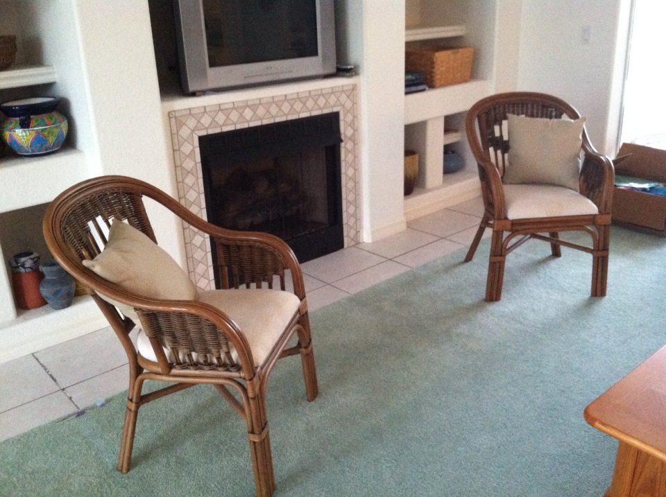
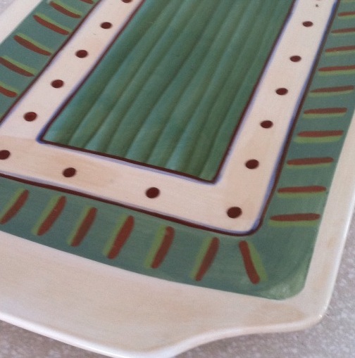
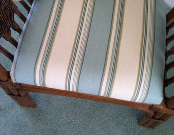 If your furniture and rugs a
 re neutral, you can find your color inspiration from almost anywhere, including in this case, a hand-painted platter. From that inspiration piece, we pulled in a striped fabric to cover some rattan chairs, and pulled the soft, gray-green paint color out at the end to complement the blues.
Front Door Personality
August 28, 2013 § 6 Comments
 As much as I love eggplant, both as a vegetable and a paint color, it just didn’t work on my house. With the eave creating a shadow, the beautiful, rich purple color only lit up in the late afternoon when the sun hit it just right. For those few moments, the Caponata (Ben Moore AF-650) looked spectacular. Then it went back to black.
So… inspired by some fabric I saw awhile ago with golds and light blues, I ventured into a rarely seen color combination — hey, why not, it’s just paint! The new door and bench are Yarmouth Blue (Ben Moore HC- 150) and although the neighbors have not commented yet, I love it. The house color is Richmond Gold (HC-41) and the trim is Cameo White. I may paint the trim a less-yellow hue in the spring, but for now, it’s fine.
If your front door is in the shadow of a porch or a big tree in the front yard, consider a light front door color, something even (dare I say?) pastel. You may be really pleased with how the lighter door color can change the personality of the house from stodgy traditional to young and perky. See what you think!
