Hanging Art: Tips from a Home Stager
March 4, 2023 § 1 Comment
As a home stager, the one thing that stands out to me when I enter someone’s home is their artwork on the walls. Sometimes it makes a smashing impact. Other times it seems a bit random. Where is the art located? How high is it hung? And how have they grouped the pieces together?
Hanging art in the right places and at the right level to view optimally makes a huge difference in the overall effect of having art at all. Here are a few tips that might help you get the most impact from the art you select for your home.
WHERE SHOULD I HANG ART?
Hang art on the focal wall.
That’s generally the wall you see from the doorway. It’s what grabs the eye as you enter the room. It may be different from an accent wall that you painted behind the bed on a non-focal wall. The focal wall is visible from the door and it’s where your art will have the biggest impact. You can hang art elsewhere, but there should be something fabulous on that focal wall.

____________________________
HOW HIGH DO I HANG IT?
Rule of Thumb — 57″ on center
The biggest mistake I see is hanging art too high. On a plain wall, hang the art so the center of the piece is 57″ off the floor. That gives most people a direct eye-level look at the art when they are standing up. Like in a gallery. If you have to look up to see a single piece of art, it’s too high.
____________________________
HOW HIGH DO I HANG IT OVER FURNITURE?
6-8″ from the top of the furniture
Another mistake I see often is art hanging midway in the space between the top of the furniture and the ceiling. It may be tempting to split the distance and hang the art there. But chances are good that the art will be too high. There should be some breathing room above the art or it will feel too big for that space. If it feels too big, move it to another location.
When hanging art over furniture, the 57″ Rule does not apply. In that situation, the bottom of the art should be 6-8″ from the top of the furniture, in this case the headboard.
____________________________
WHAT ABOUT IN A DINING ROOM?
Since people are seated in the dining room, the art is often hung a bit lower so that it is viewable by people sitting down at the table. If the art is hung too high in this room, it’s really noticeable.
____________________________
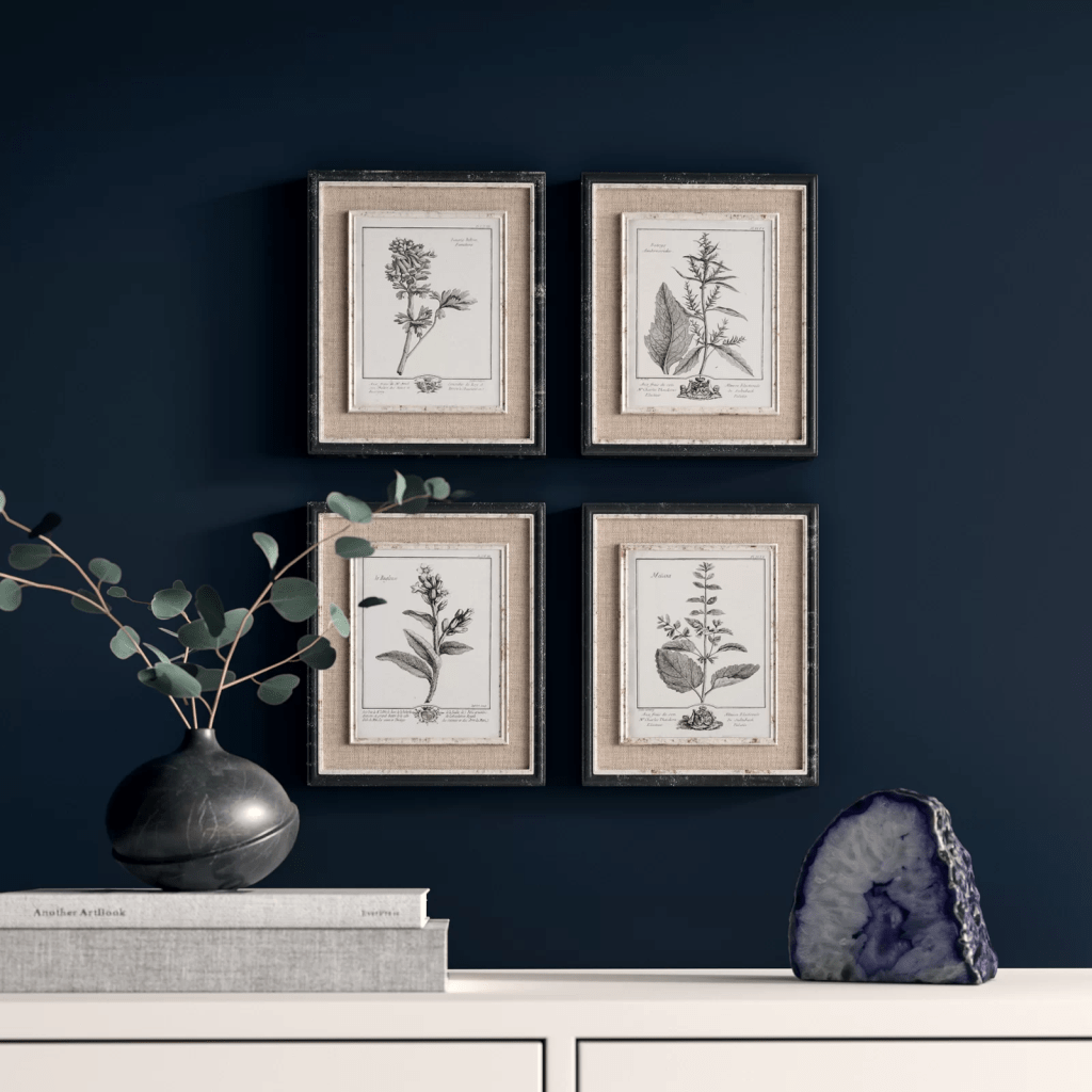
HOW FAR APART DO I SPACE THE ART?
3-6″ at most
In a geometric grouping, when all the frames are the same size, it is important to keep the art close together so they are seen as a grouping and not as individual pieces. In terms of location on the wall, make sure the center of the grouping is 57″ off the floor. Doing a practice arrangement of the art on the floor will save putting too many holes in the wall. Measure twice, as they say…
____________________________
HOW DO I ARRANGE A RANDOM GROUPING?
On the floor first
Arranging and rearranging a grouping on the floor will help with later placement on the wall. I play around with the arrangement until I get one that pleases me. A couple of guidelines:
- Keep the same distance between pieces of art. This creates cohesion and makes the arrangement look like a grouping. It is not always possible, but to my eye it looks nicer.
- Avoid “rivers.” The long lines of space running horizontally or vertically without interruption between the pictures are called “rivers.” Avoiding them is an old high school yearbook rule for laying out photos. It stuck with me, and I do follow it. (The exception is when the grouping is geometric as above — all the frames are the same and are displayed in a grid.)
The center of the grouping should be 57″ off the floor.


____________________________
WHAT ABOUT DIFFERENT FRAMES AND SIZES?
Start with the biggest piece
For a large arrangement, spreading out on the floor will help a lot. Start with the biggest piece and work out and around from there. Remember that if there is a sofa below, leave 6-8″ between the top of the sofa and the bottom of the first piece of art. Notice how the two pieces on the far left line up on their right side. It is important to keep the distance between pieces the same throughout for an intentionally collected arrangement.

If you need help with color, feel free to comment below, hit the button for a Color Consultation, or shoot me an email at yourcolorcoach@gmail.com.
I would be happy to help you.
Hope you have a Colorful Day!
Barbara, Your Home & Color Coach
Balancing Color, Pattern, and Neutral
August 21, 2017 § Leave a comment

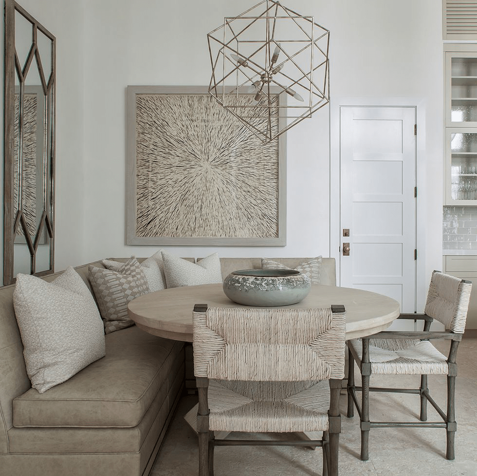
There is so much to love about this breakfast nook (designed by Martha Angus and Katie McCaffrey), I’m going to dive right in.
What’s to Love?
-The light gray walls. By staying with a light cool neutral on the wall color, you allow the pops of warm vibrant color to do just that: pop.
-The simple breakfast nook construction in the same wall color. What happens? The banquette disappears making the room look bigger and less chopped up.
-The wood floor. No doubt it carries throughout the public space making the whole house feel open and unified.
-The table from Paris (yeah, I know). The point is that the table is a unique piece and it’s not only functional but a conversation piece and a memory back to a really nice trip.
-The black and white print. Sure, you can add a vibrant picture there, but the neutral wall hanging allows the colors to take center stage. And they do.
-The yellow leather cushion. It’s yellow but in a fabric that’s easy to wipe up. Essential.
-And those pillows! In colors that coordinate with each other but refuse to look matchy-matchy. (And you just know that the rest of the house pulls colors from that lovely summer palette.)
Take Home Message:
If you want to show off color (or many colors), don’t overdo it. Leave spots empty and devoid of pattern for the eye to rest. And pick a palette of colors (5 is a good number) that you can carry throughout the house in various ways — wall color, furniture, art. The result will be a home that is balanced, unified, has flow from room to room, and that makes you happy every time you open the door.
Luscious Paint Colors: Warm Brown
April 5, 2016 § Leave a comment
 What is more welcoming in a home than rich warm color when you open the door. There are no rules that say your walls have to be a shade of white.
If you would like to add rich color like this Warm Apple Crisp (Benjamin Moore 1091) to your home, here are some guidelines:
- Make sure you have adequate light to show off the true hue. Natural light is best with big open windows that allow the depth of the color to show without making the room into a cave.
- Contrast the walls with white — trim work, furniture, accessories — so that the wall color “pops.”
- Pick an accent color from the opposite side of the color wheel to add interest. Since brown is a darker version of orange, blue is its opposite on the color wheel. There is something so fresh about that combination. Insert your accent color with art and accessories like the big, light blue egg on the shelf.
- When choosing colors for one room, consider adjoining rooms. Colors should flow from room to room so this warm brown wall color in the entryway was plucked from the adjoining kitchen cabinetry
 thereby connecting the two rooms and making the house feel bigger and more pulled together.
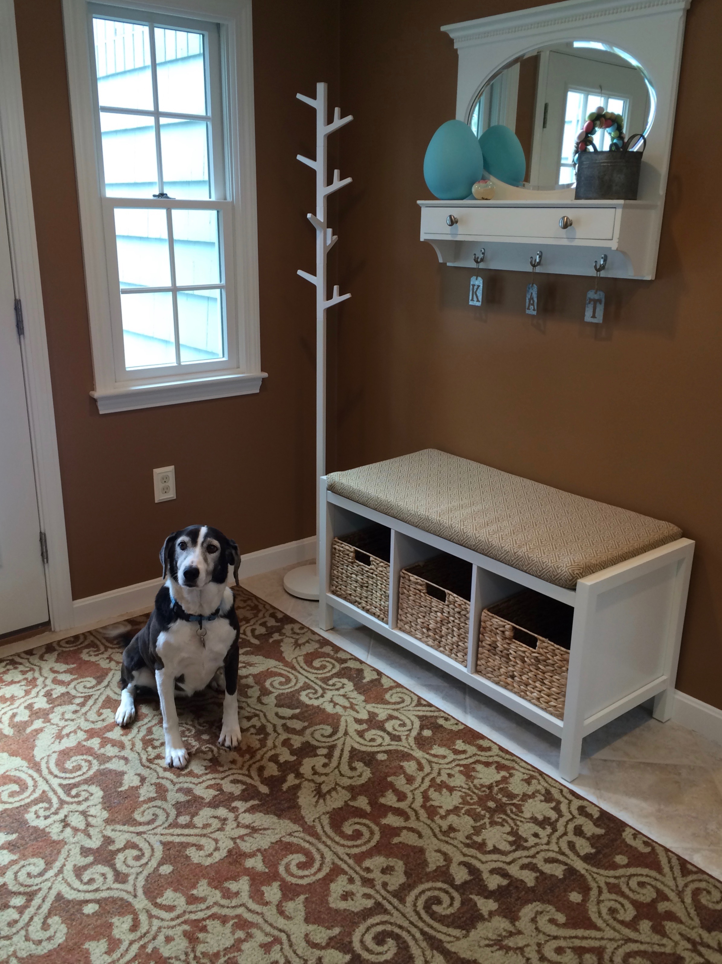
 - Add cute dog for cozy family feel.
Brown is a wonderful color for making a large space feel more intimate or a small space feel warmer, and it is a great way to bring out the depth of color in the woods in your room. Try it!
Green Decorating: The Soothing Hue
March 17, 2016 § Leave a comment
St. Patrick’s Day brings us to thoughts of green. Whether it’s kelly green or any of the variations thereof, green is a versatile, natural hue that brings life and comfort to any room. It is particularly nice in rooms where you spend time revitalizing your mind and body.


Waking up in a green room warms a cold, white, snowy day and cools a hot, humid summer morning. It can bring the color of lush plants and trees to a city skyline view. And it can calm an agitated, overextended lifestyle at the end of another hectic day.


Green can be either warm (yellow-green) or cool (blue-green), and both pair beautifully with white. Coordinating accent colors can add energy (the complementary reds and pinks, opposites to green on the color wheel) or quiet blending (the analogous yellows and blues on either side of green on the color wheel).
I highly recommend adding green, even a mixture of greens, to your home to quiet and soothe your soul. Wherever you need a few moments of ahhhhhhh.
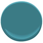
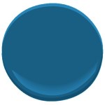
Paint colors above: Top left to right: Waterscape SW 6470, Topiary Tint SW 6449, Honeydew SW 6428, Breaktime SW 6463. Bottom left to right: BM Guilford Green HC-116, Palisades Park BM 439, High Park BM 467, Dartsmouth Green BM 691.
From Color Inspirations to Paint
February 4, 2016 § Leave a comment
Walking into a pottery shop is like immersing yourself in a box of crayons, all pristine and unbroken with endless possibilities of combinations.
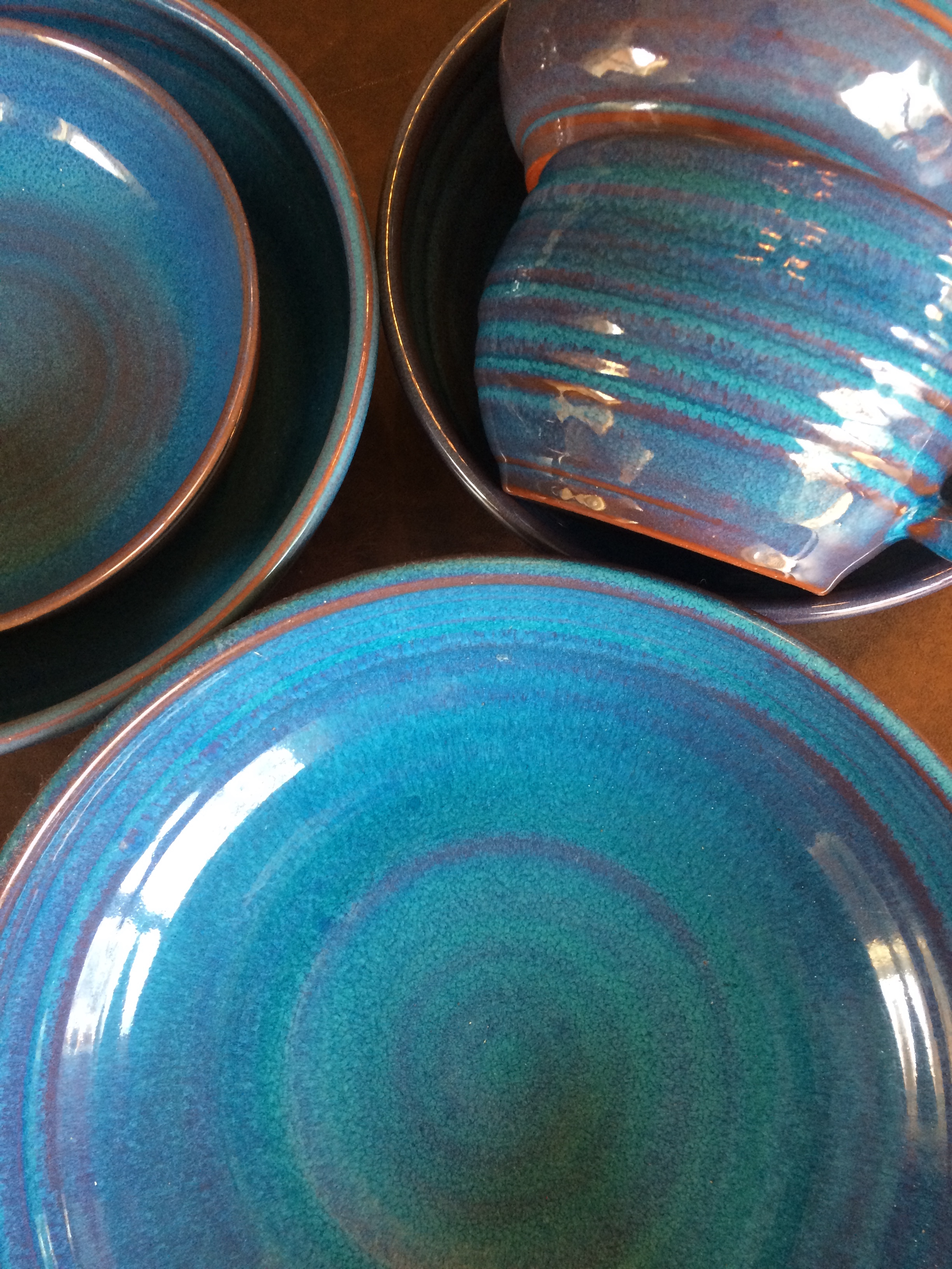 This set of dazzling bowls caught my eye. Mesmerizing is how I’d describe them with an array of blues from turquoise to cornflower. (The dishes are mine now.)
Whatever the inspiration, there is a paint project waiting. In my mind’s eye driving home, I see these dishes in a dining room painted any one of the colors with crisp white trim. Maybe even a shiny white bead board around the wainscoting to bring out the hues in the room. I can also see any one of these colors on the walls in a kitchen with white cabinets and a white subway tile backsplash. Or maybe one of these colors for the backsplash! (Head is spinning with ideas.)

Accent walls give us a way to add a small amount of color drama to the focal area of a room without painting everything. Especially nice in open-floor-plan spaces where walls may incorporate several rooms. How about one of these rich hues for your front door? Spring painting is right around the corner. (Ben Moore’s Calypso Blue, Bermuda Blue, and Deep Mulberry)
Let the color in front of you and surrounding you inspire you. Wrap yourself up in it. Do something for yourself and create a happy house. It’s just paint!
Got Personality? Show It
January 19, 2016 § Leave a comment
What does your room say about you? Designer Jeffery Bilhuber (House Beautiful, Feb 2016) infused a boatload of personality and let us know a few other things as well. What this room shouts to me: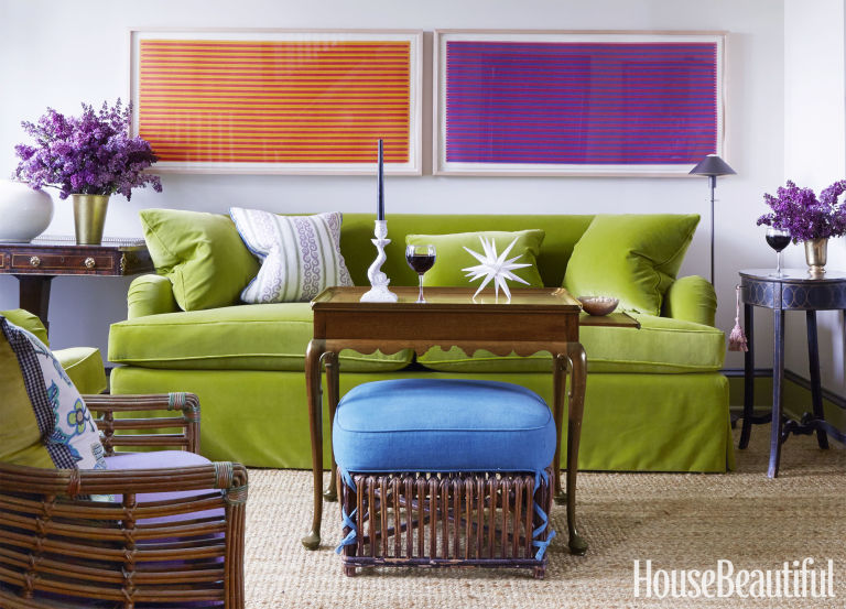
- Forget about symmetry. Mismatched end tables are way more interesting than a set.
- Go ahead and mix woods. We acquire furniture from our parents, we find treasures at a flea market, and sometimes pieces have sentimental value. Use them — even if they don’t “match” your decor.
- Add your favorite color to the room. And if you don’t have a favorite, use several. If you keep the colors at the same “hue value” (lightness or darkness of a color), they mix well together.
- Function is important. Don’t forget that you need to set your wine glass down.
- Forget matchy-matchy. This designer has taken that declaration over the top by using two different window shade colors. Bold and impetuous design choice there, but again, the room screams,”I want to be different.” And I applaud that.
- Let color speak in the room by creating a neutral backdrop from which the color can “pop.” Here, the light gray walls and the neutral woven rug give the eye a rest.
- Flowers and the little accessory details finish the room. Without them the room can look cold and staged (too many, of course, and you have a clutter zone).
- Texture matters. That sofa looks so soft. Adding warmth and texture with pillows can warm up anything, even leather.
Bottom line: You’ve heard this before, but it’s worth repeating. Don’t just follow the design trends. Let your room reflect who you are and what you love.
Make You Happy — Consignment Love
January 18, 2016 § Leave a comment
A home stager’s life can be unsettling.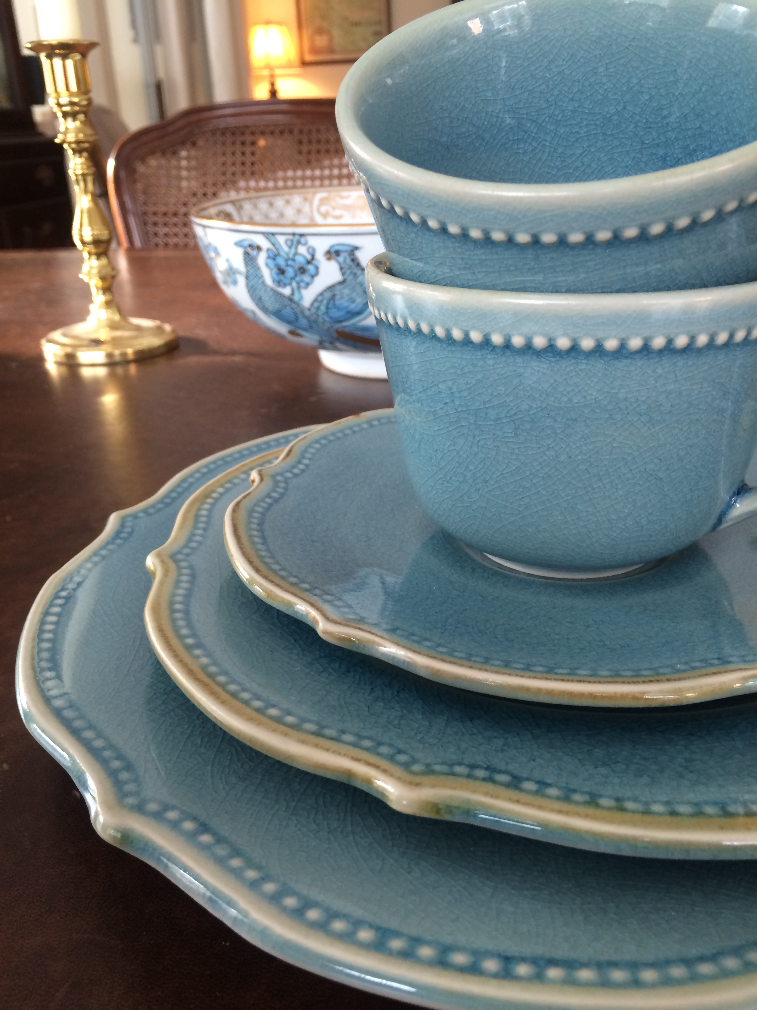 Furniture comes and goes, from storage unit to my own living room and then off to somebody’s vacant home and then back again two months later. My husband jokes that he has to turn the light on before he enters a room or he might trip over an ottoman that wasn’t there a few minutes ago.
And as a stager, I often un-decorate a home to make it more appealing (or at least not unappealing) to a wide swath of potential buyers. Family photos? Gone. Floral drapes? Too busy. Oriental rugs? Too taste-specific. So life is full of light neutral walls, white window panels, generic art, plain slipcovers, and sisal rugs. Everything looks good at the end in a Pottery Barn kind of way, but I am growing tired of meh.
Enter my favorite consignment store. And inspiration.
Finally I am going to buy something other than white plates and Parson’s chairs. And for me. These French blue dishes with gently scalloped edges and little raised dots around the rim are totally taste-specific. Mine. 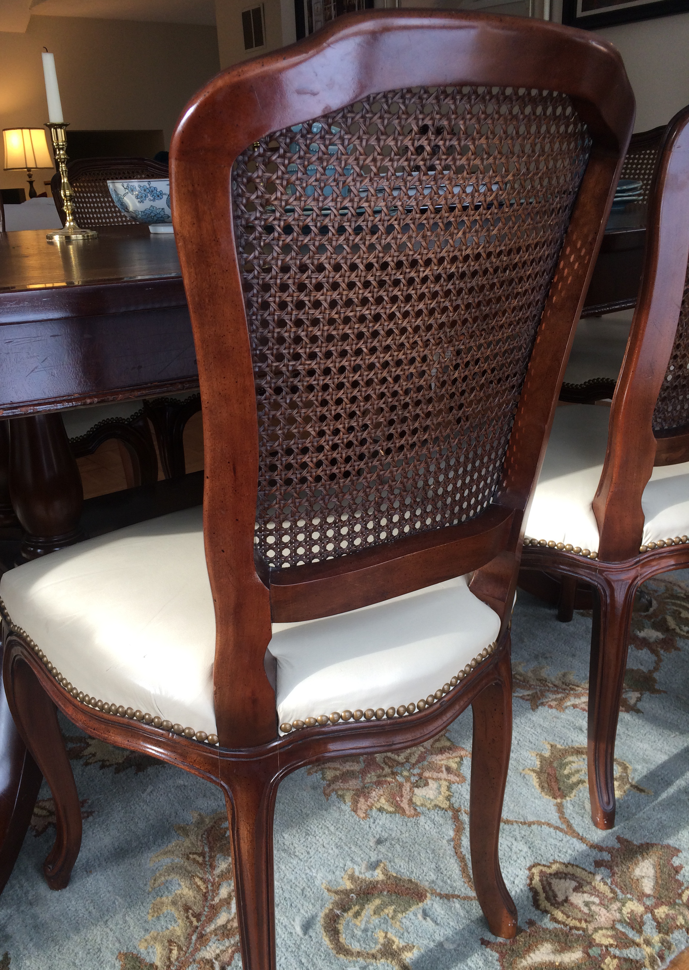 And the chairs with their cane backs, girly curves, and cream leather seats are too old-fashioned for today’s young buyers. They would spray-paint them white! Not me.
I have found love, and these items will stay in my home. I can come home every night and expect to see them there, not in somebody’s 1800s farmhouse kitchen with a For Sale sign in the front yard.
My point to all this? Surround yourself with what makes YOU happy. Don’t let your job take over your home. Have a sacred space that’s your own. Hang onto things that mean something to you and make you feel good. All that! And more this New Year.
In a Teen’s Bedroom, It’s Just Paint
February 24, 2014 § 2 Comments
 Letting your child express herself in her bedroom is a wonderful way to uncork inner creativity. You may bristle at the color scheme and opt to keep the door closed most of the time, but allowing your child to have a room of his or her own design is so important to creative development.
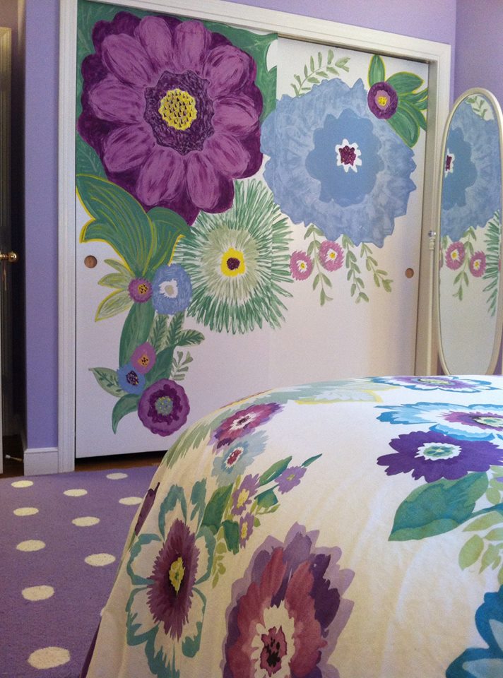
In this room, the young client chose a Pottery Barn Teen bed cover as her inspiration piece. After we selected a new wall color together (a soft purple — and a departure from the previous bubblegum pink), we brought in white accessories and a purple polka dot rug.
I mentioned that sometimes it’s fun to get a little crazy with the closet doors in the bedroom because they present a blank white canvas just begging for color. So guess what … hey, it’s just paint!
Warm Your Soul with Color
January 29, 2014 § Leave a comment
 Those of us with light airy neutral homes are feeling the chill this winter. Whether it’s the frigid temperatures outside or the cabin fever inside, the light, low-contrasting palette we enjoy so much of the year for its calm and cool comfort just isn’t cutting it.
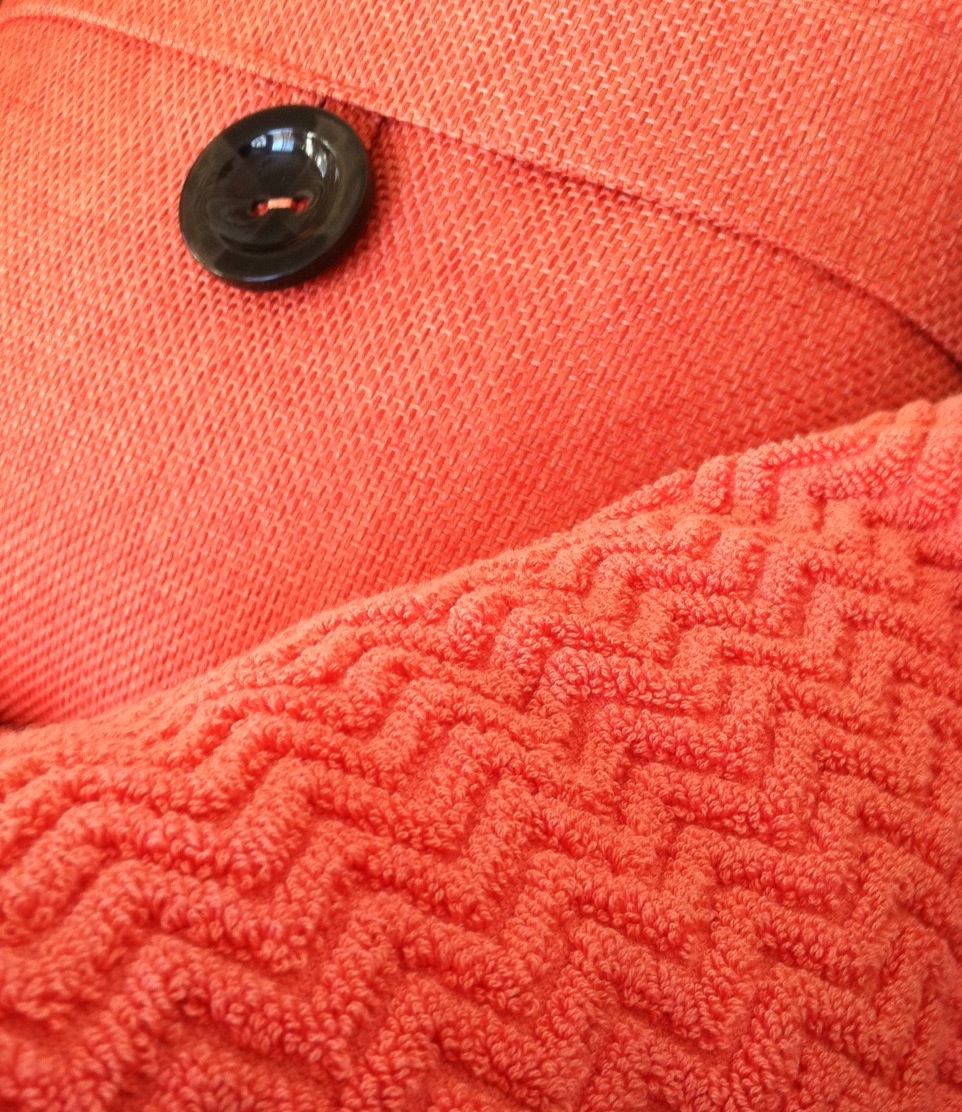
A recent trip to a home goods store had me craving color. On two separate occasions, my eye scoured the store’s palette of spring selections and landed on the same warm vibrant coral. I had to have it. First the pillow. And next time, two towels (for me only, I might add).
Color makes us feel good. Color cheers us up and calms us down. And the right color can make our homes feel cozy and welcoming any time of year. Welcome home, my new coral accents. And if the temps don’t rise soon, I’ll be off to the paint store for a gallon of, you guessed it, coral.
Stay warm, my friends!
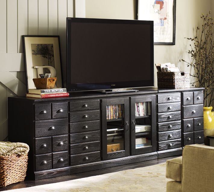
That Huge TV is so Ugly — What to do
January 21, 2014 § 2 Comments
 Electronics have plagued designers and esthetically driven homeowners since the demise of the TV console with doors. We’re now learning to embrace the large shiny black rectangle.
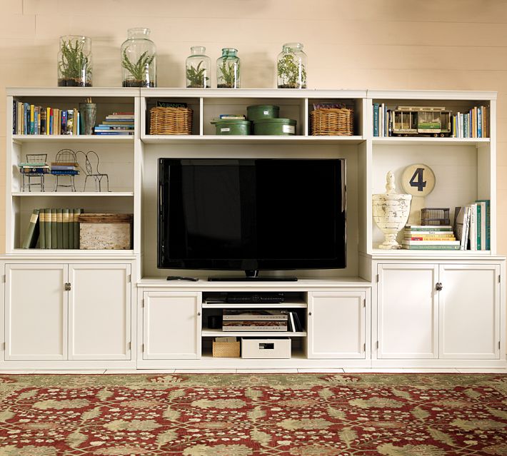
If you are trying to disguise your elephant in the living room, blend it. A black cabinet and other black accessories will help to camouflage the electronic “stuff of life” better than a white or light-colored cabinet will. See how the TV pops out of the white cabinet? And the bigger the TV, or course, the bigger the pop!
Try camouflage in your home office as well. Dark charcoal gray is another wonderful color for blending printers and monitors and other less-than-attractive devices so necessary to our everyday existence. Computers and TVs (etc.) are functional. We don’t necessarily want to see them.