Front Door Color –Refresh for Brick Homes
May 20, 2019 § 6 Comments
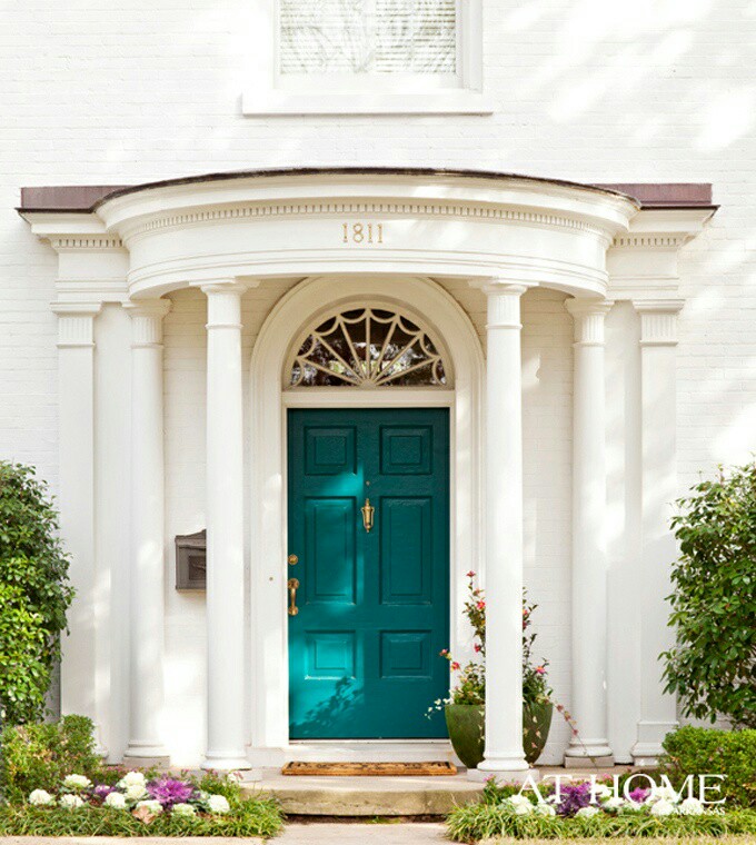
I wrote my first blog post about front door color back in 2012 when it seemed like red and black were the most common options for traditional homes. And shutters? Well black and then black again.

But today I stumbled upon a couple of photos from Beacon Hill in Boston that blew my traditional color palette out of the fan deck, so to speak. It was love at first sight of that rich gorgeous blue — yet to be identified by name and brand.

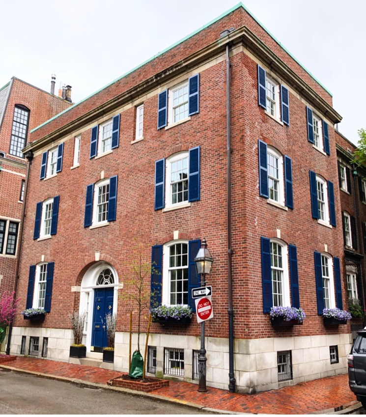
Photo: @buildingsofnewengland
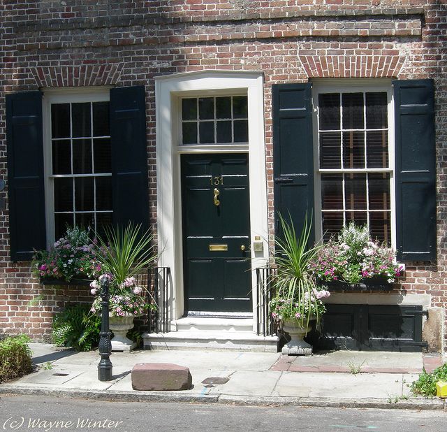
Just guessing here (I didn’t find anything in the Sherwin Williams paint line), but Benjamin Moore has Dark Royal Blue 2065-20 that comes pretty close for now until I can track this color down.

Benjamin Moore 2065-20
What I love about this color for the front door (and shutters for that matter) is that it’s dark enough be traditionally tasteful and even replace black on many houses like the 1912 Colonial above, but it has hue enough to excite the senses and certainly stand out from the crowd of traditional black and Charleston Green doors and shutters (not that there’s anything wrong with traditional!).

And I’m just talking about brick homes — because door colors on painted houses and more contemporary homes have gone right through the color palette. More updates on that later.
In the meantime I’m going to appreciate that stunning blue on the brick Rhoades House and open my fan deck to more brick home door color ideas.
The World’s Favorite Color? Where Have I Been?
February 22, 2018 § Leave a comment

Late to the party here, but better late than never. At least that’s what I said to myself yesterday when I scrolled onto THIS beautiful hue and found out that it was crowned The World’s Favourite Colour. No great surprise since it represents some of the world’s most exquisitely beautiful treasures like Bali — an island so gorgeous its name alone sounds relaxing.
Last summer there was a questionnaire sent out — ’round the globe, as it were — to find out which color appealed to the most people. (I totally missed it! Arrrgh!)

“The competition organised by Hull 2017 UK City of Culture and paper merchant GF Smith invited people to select their favourite shade online by hovering over an infinite palette of shades with their mouse until they landed on the colour they found most appealing.”
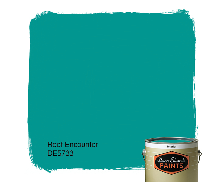
The winner was this rich teal that nature inspires and artists incorporate to capture the beauty that surrounds us.
The closest paint color approximation I could find was a Duron Paints shade, Sea Sphinx. 
But there were others:

There are plenty of other ways to introduce the color into your decor — window treatments, accessories, and more art, of course.
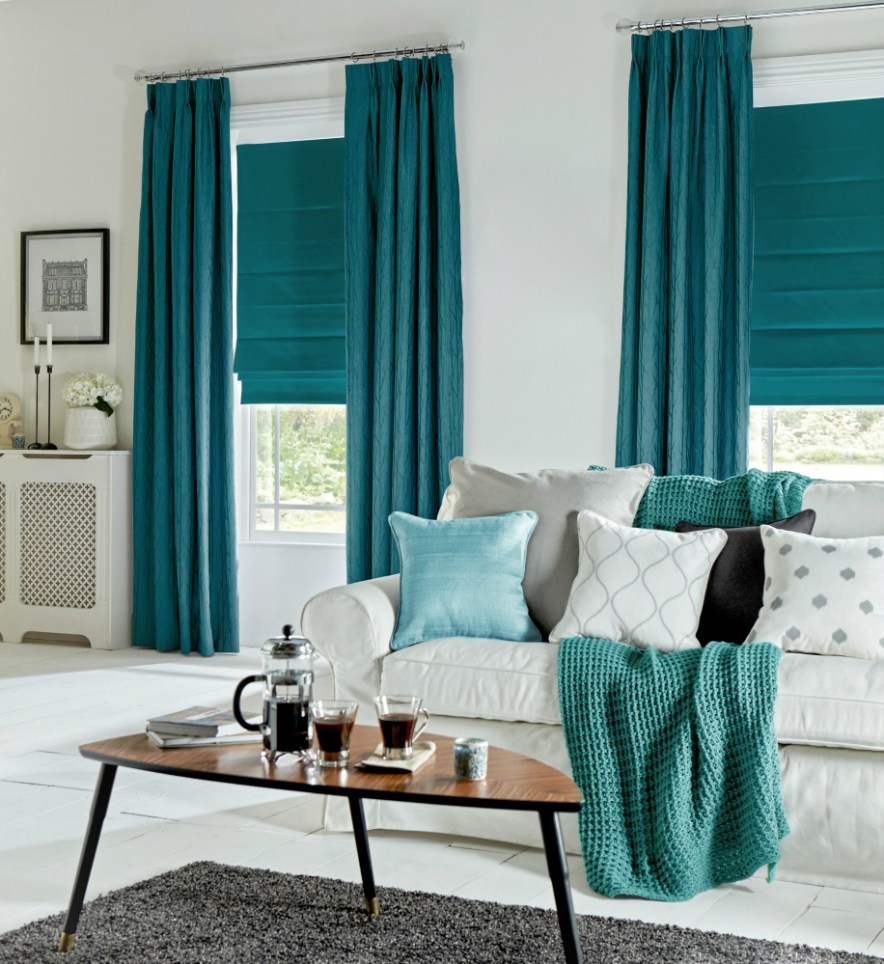
On an accent wall of Marrs Green, this art pops!
And so does this one!
Though I have blogged about “teal” before, I guess there’s a reason. It appeals to vast numbers of people worldwide. It is a little bit blue, yet a little bit green. It’s the warmest ocean color and a color that appears in natural gems and plant life. It is rejuvenating in all its forms.


")
It looks great with the full green/blue spectrum and all its values, and it forms a calm backdrop to pops of heat. Marrs Green — The World’s Favorite Color.
Creating Colorful Curb Appeal
January 23, 2018 § 2 Comments
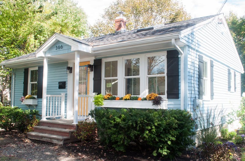
Need curb appeal?? Well, this remarkable ranch re-do will show you how some strategic changes to the front of a rather ho-hum house can make a huge impact, and if you’re planning on selling anytime soon, pay attention. There are some quick easy fixes that may apply to you.
Here is the Before shot: faded vinyl siding, old aluminum windows, dated storm door, dirty white shutters, old iron stair railing, and tree overgrowth. Have you seen a million houses like this one? Yup. Me too. Not exactly a head-turner.
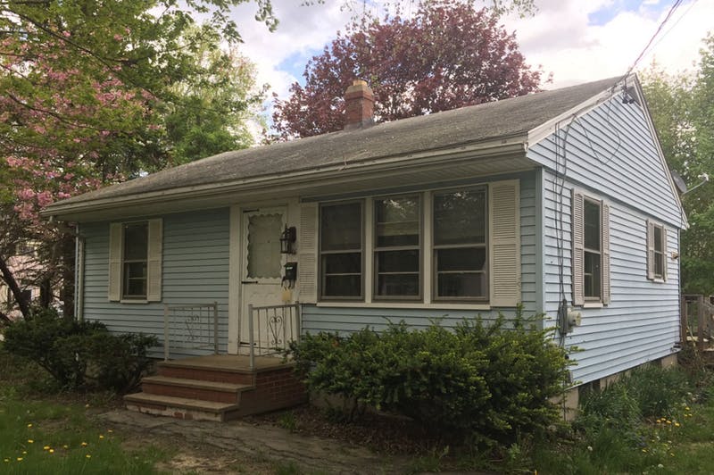
Laurel LaBauve at SoPo Cottage addressed the front facade with a new porch portico. Adding dimension to the front face of the ranch made a huge difference and created a cottage style instantly. She could have stopped there, but onward to new windows (fresh, white, two-over-two) that brought more light into the house and gave it a cute, vintage, styled look. Excellent choice!
Next up? The vinyl siding. Why does the after vinyl look so terrific? Laurel revealed her secret: something called Vinyl Renu, a product that, Laurel reports, brings new life to the color and sheen and is supposed to last 10 years! I’m in! What a difference. If your house has vinyl siding and it needs a refresh, here’s the stuff.
Switching the shutters to black board-and-batten was another great cottagey move. If they’re vinyl, you fooled me. Note: Leaving the brand new windows bare with no shutters would not have been a bad thing. A little more contemporary. But the contrast of the black with the light blue siding and white trim is sharp, and the house looks finished.
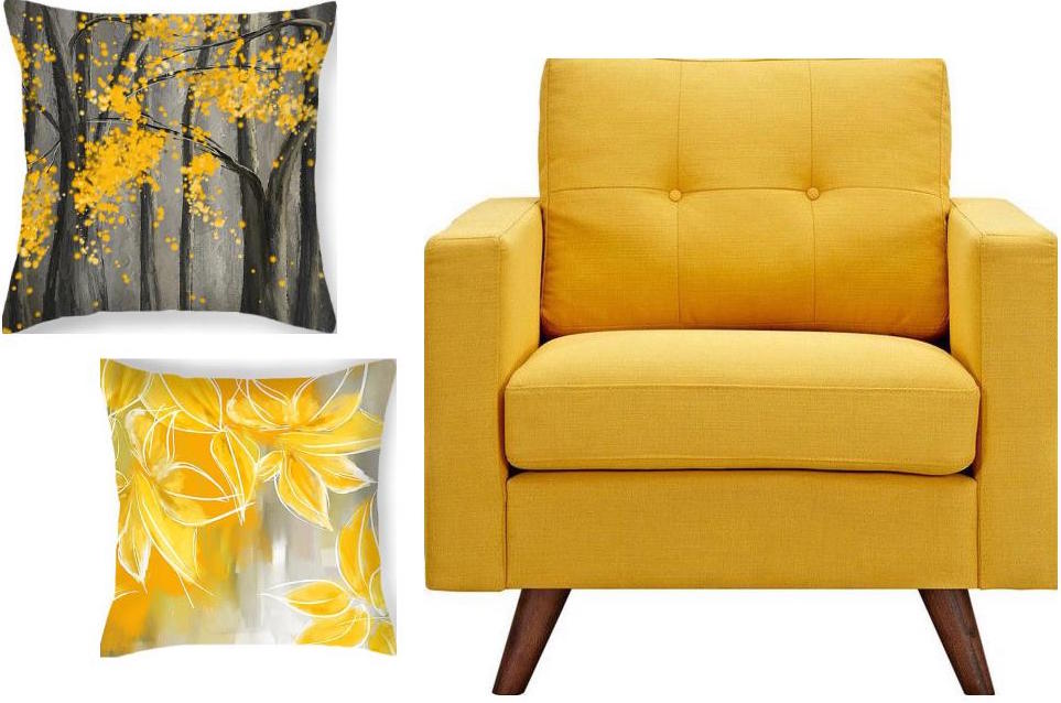
Then there’s the front door color. Yellow. One of my faves as it sings Happy House as you walk up the front steps. And the coordinating flowers in the new window boxes (also a cottage style fun-to-have) pull the whole look together. (If you need color help, let me know!)
Even if there is no budget for major changes, here are a few easy fixes that will still make a big difference in your home’s curb appeal. Take-aways for home sellers:
- Trim the trees back so that the house is free of branches and there’s a clear view of the house from the approach. Pay attention to the landscaping, weeding, and overgrown bushes. It’s amazing what a little green thumb elbow grease will do.
- Rev up the vinyl siding with Vinyl Renu to give the color a fresh look.
- Add shutters if there’s room and particularly if the house is a light color. Black will give the house a dressed-up and polished curb appeal.
- Add coordinating accessories like porch lighting and a mailbox.
- Paint the front door a warm contrasting color and tie in the landscape (annuals, flowering shrubs) and any outdoor accessories like Adirondack chairs or deck furniture.
Click here to see how the INside was transformed. Bravo! Laurel, you are quite an inspiration.
But I Love Grandma’s Furniture
January 20, 2018 § Leave a comment

Furniture that has been in the family for generations (or as long as you can remember, at least) carries memories of sitting around Grandma’s dining room table during holiday dinners and enjoying family and food and all that goes with that. So of course you accept Grandma’s dining room set when presented. Okay, now what.
Designer Stephanie Lees shows us how to marry traditional (whether inherited or acquired some other way) and modern styling. Yes, the two can co-exist nicely together.
Color is the most obvious creative solution. The navy grasscloth walls in that dining room contrast elegantly with the traditional white wainscoting beneath the chair rail. Camouflaged there is a white lacquer cabinet that showcases more family treasures that frame out the modern artwork above.
The green curtain panels in an unfussy simple treatment dress the windows with a pop of color that is carried over to the back of the traditional wingback chair. Wingbacks –whether old or new — are classic. But the modern fabric placement takes what might have been a studious, grownup, wingback chair and made it playful. Those bamboo side chairs — if not your grandmother’s then just like them — can be recovered very DIY with new coordinating fabric by unscrewing the seats, stapling fabric onto the seat bottoms, and screwing the seats back onto the chair. Instant update.
Another key update that sets a modern tone to the room is the contemporary rug, again keeping with the blue & white palette but staying clear of any traditional rug design. Random color placement in the rug keeps the room from looking too formal, and it is key to pulling off this style marriage.
But just short of replacing whatever shiny, old, yellow-brass light fixture might have hung from the ceiling before with a new contemporary brushed nickel version (gasp!), the designer opted for a vintage Italian chandelier in crystal. Dramatic, classic, and oh so stylish.
You’ve given us lots to think about, Stephanie, as we incorporate inherited pieces into our own homes. Thanks for the inspiration!
@StyleatHome, @YourColorCoach, stephanieleesdesign
Escape from the Blues
January 4, 2018 § Leave a comment

Horseshoe Bay, Bermuda
This is a perfect January day in New England. We are completely snowed in, and nothing is more relaxing than hunkering down in a cozy house as the wind howls outside and the snow banks pile up around us. I love winter!
But that doesn’t mean I like the wintery gray, the limited daylight, and the bitter cold that comes with it. The longer winter goes, the more I yearn for an escape to somewhere warm — even if it’s only in my imagination.
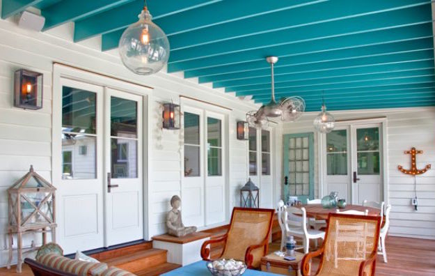
Enter the Sherwin Williams Color of the Year for 2018.

It is an opulent teal that conjures up the ocean and all the warmth of summer at the beach. If a midwinter break in Bermuda is not on your calendar, there are other ways to escape the winter cold — visually. Here are some:
Plan Your Spring Projects. It’s never too early to think about Spring projects, and painting your front door is a doable one. Remember to tie the color in with other accessories and furniture around the yard.
Paint the Fifth Wall. Don’t overlook the ceiling when you’re adding color. Since cool colors recede visually, painting the ceiling a medium teal blue will raise it — like rolling a Utah sky onto your porch.
Splash Color Under Foot. Now I’m making it too easy. Add a gorgeous rug and transform your space instantly. There’s something about the combination of blues and greens that soothes and comforts us all. And a rug adds not just color but texture.

Dive into the Pool. Ceramics, art, dishes, pillows, collectibles, throws, lamps… the options for accessories are endless. Be sure when you add a color to your room that you put it in at least three locations to move the eye around the room and create flow.

Enjoy your staycation! With some daydreaming, a little shopping, and a tad bit of rearranging there at home, you can lift your spirits toward Spring and feel warm and cozy at the same time.
Thanks for stopping by!
My Dream Living Room
March 26, 2017 § 2 Comments
What makes a living room dreamy? Here’s what works for me.
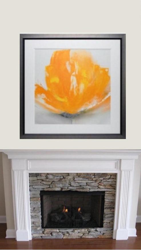
- A fireplace mantel that can anchor a beautiful inspirational piece of art. This one, “Wild Orange Sherbet” by J.P. Prior, does it for me. Even the name makes me happy.
- A big comfy sofa. I’ve always wanted a curved sofa (this one from Arhaus) as it invites conversation. People tend to sit down and talk with each other instead of staring at the TV (which, you might note, is absent from my dream living room).

- Neutral major pieces. I chose Taft Pewter for the upholstery color because it goes beautifully with the stone around the fireplace, and the color won’t grow tiring. Even if pillows come and go with new color trends, the sofa’s soft, sophisticated neutrality will endure.
- A rug that
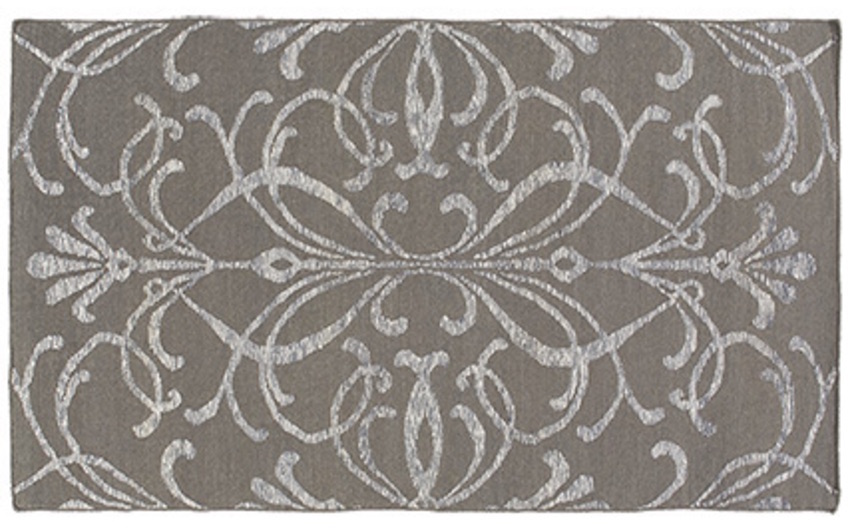 will further define the conversation area
and be cozy underfoot.
This neutral coordinates with the sofa and doesn’t detract from the focal point of the room. - An ottoman is
 an absolute must as it beckons you to put your feet up and relax. With a tray on top, an ottoman serves as a hard surface for drinks and snacks.
 - A pair of perky chairs (opposite the sofa)
 to round out the conversation area and yell “Surprise!” when somebody enters the room. Everybody needs at least one chair in their favorite color.
 - Pillows
 that pull the whole color palette together and come in different sizes and textures and may be swapped out seasonally if you like.
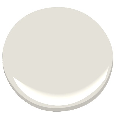
- Finally, a pretty paint color that provides a backdrop for the room but does not compete with anything for attention. For this room, I chose Benjamin Moore’s Classic Gray, OC23.
The whole idea of my Dream Living Room is to set a happy, relaxed tone for the house in a classic and timeless style that won’t look too dated when the next big trend comes along. Keeping the bones of the room classic (hardwoods, architectural details) and the expensive pieces timeless (sofa and large furniture) allows you to play with chairs and accessories and art and have fun.
Create a dream living room in your home. Ahhhh… I like dreaming.
__________________


Sources: Art (“Wild Orange Sherbet” by J.P. Prior). Mantel (MantelCraft). Sofa (Arhaus.com for other living room inspirations). Rug (Arhaus.com). Ottoman (Arhaus.com). Armchair (Dot&Bo). Pillows: Yellow (Fine Art America), Damask (Wayfair), Lumbar Pillow (Pier 1 Imports). Paint: Benjamin Moore, Classic Gray OC23.
Torn Between Two Paint Hues
September 5, 2016 § Leave a comment
Gray Owl, Ben Moore
As a home stager, I suggest a lot of paint colors as I help to prepare homes for the real estate market. And by and large, grays are what sells these days. Young buyers grew up with Linen White and seem now to cringe at wall colors with a yellow base. But is gray right for your house?
If you live in an area where the weather is cloudy for much of the time or your house is nestled in the shade, then a gray interior is only going to make your visual life grayer. If you want a fresh gray interior, here’s my advice:
- Make sure you have tons of natural light — big windows with as much light as you can get streaming in the window. That will allow you to see the gray as a distinct, intentional color and not as a shadow of a different color. You know how white and other colors can appear gray in the corners of a room? That’s what I’m talking about. You’ve chosen Gray. So show it off.
- Add white for trim — that will make the gray pop and will avoid any semblance of dinginess. For Pete’s sake, you don’t want your house to look dirty.
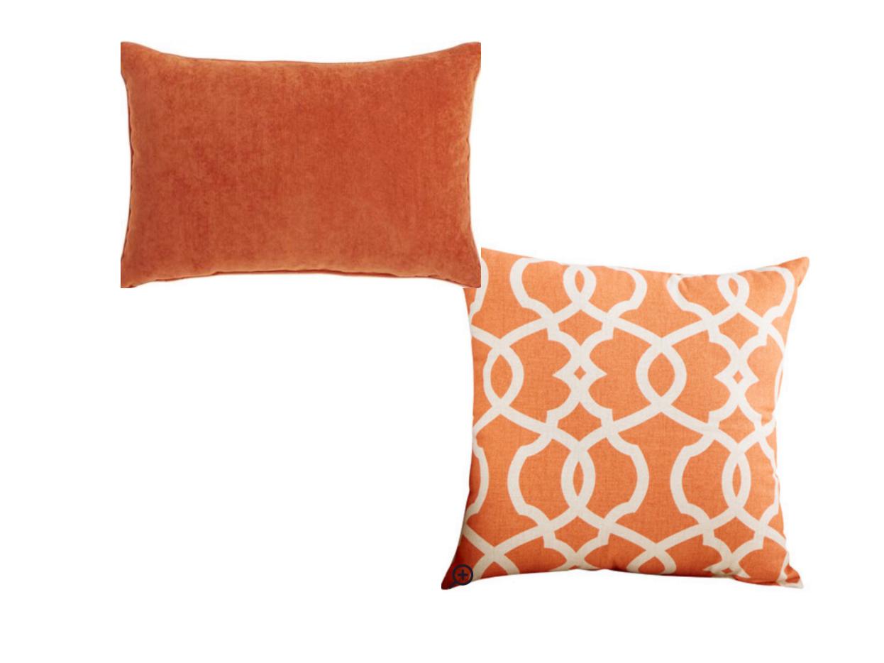
- Add some warm color — pillows, a chair, artwork. Just for contrast and to add some warmth when needed. Yellow looks spectacular with gray.
- Pick a warm gray if you live in a cold climate or your room faces North.
- Pick a cool gray for a warmer climate or a room facing South. The color of the light and the season will influence how your room looks. If the room looks cold, chances are that it will feel cold in there too.
- Add wood texture to warm the room. A hardwood floor and other natural wood tones in the room will look sensational against a backdrop of gray.
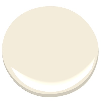
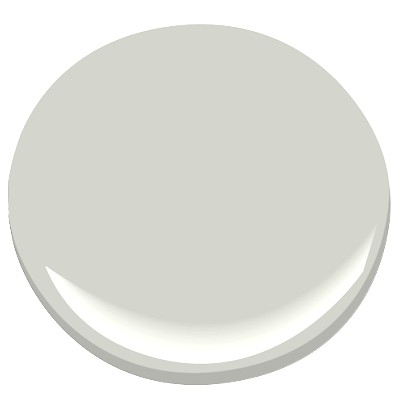
Linen White
If gray is not for you but you want to get away from the Linen White look from decades past, try one of these halfway gray paint colors. They are warm but not too yellow and will move you in the gray direction without making your house too cool. Now let’s get painting!
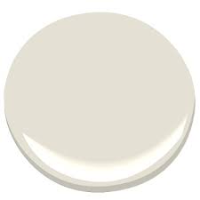
Gray Mist (BM)

Maritime White (BM)
Quick Old-Kitchen Updates
April 27, 2016 § Leave a comment
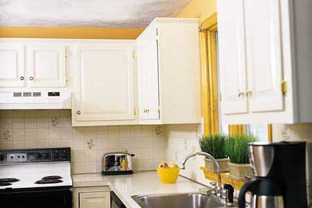 You inherited your kitchen. We get it. No money for a costly re-do. We hear ya. But there are a few things you can do to lighten and brighten your dark, dated kitchen while you pour money into other fun things.
- Replace the door handles and drawer pulls. There are so many new metal options out there, and many of them are quite inexpensive. Some even come by the bagful. So there’s no excuse for keeping these.

- Paint the old golden oak cabinets. It may sound hard, but anything is better than the dated, dry and grainy orange beauties many of us were stuck with for awhile. Painting takes patience: in a nutshell, remove the doors, take off all the hardware, sand the cabinets and doors to give the surface “tooth,” prime everything with a really good primer and then paint the doors outside on a horizontal surface to prevent drips. I like to use a cabinet-grade enamel that holds up pretty well. Stay neutral for longevity although painted cabinets are all the rage. So pick a color you’ll love for a long time. Here’s what the Pros recommend for a really nice finish. http://www.thisoldhouse.com/toh/how-to/intro/0,,20315665,00.html
- Switch out the overhead lighting. This is a really cheap, DIY project (remember to turn off the power first!!). There are so many options way more creative than the central overhead ceiling light or the yellowy brass candleabra over the kitchen table.
- Add under-cabinet lighting. This is a great way to add both task lighting to an old kitchen counter space and ambiance. If you don’t have a tile backsplash, make sure that area is freshly painted as it will show up now. Here’s a link for the many options and how-to’s. http://www.lowes.com/projects/kitchen-and-dining/under-cabinet-lighting-buying-guide/project
- And don’t forget to paint the walls. The easiest, cheapest, and quickest update to any room is a fresh paint job. If you need help with color, let’s work together.
Now, isn’t that easy? You will love pouring your morning coffee in your face-lifted new kitchen. Yes, you still have the old layout and probably none of the new gadgets currently available, but your kitchen will feel brand new. And think of the fun you can have with all your saved money! Enjoy.
(Photo: Brian Wilder for This Old House Magazine)
Not-So-New Kitchen Flooring Ideas
June 2, 2014 § 2 Comments
 Kitchen floors always pose a challenge. Do we continue the not-always-practical hardwoods throughout or do we interrupt the flow with a more indestructible surface alternative? In this kitchen by Designer Sarah Richardson, she used a linoleum tile to create a colorful and durable floor to complement the light pastel blue and white palette. What we do not see is the adjoining room and how the two areas are connected.
Here is my rule of thumb:
If you have a small house, continue the hardwood floors throughout the downstairs public areas (living room, dining room, family room if there is one, and kitchen). That way, the house will appear larger and less chopped up into individual rooms.
If you have an old house (or a large one) with distinct room divisions, go ahead and select an alternative flooring that offers color or durability (although carrying the hardwood throughout is okay too). I recommend using the color palette to pull the public areas together so in Sarah’s case, the adjoining room would have some light blue in it. Mixing and matching within the color palette will create the feeling of a larger, more pulled-together house — even if the rooms are boxy and divided by walls and small doors.
Just like there are more options than granite and Formica for your kitchen counter top, there are now numerous exciting alternatives to wood and tile on your kitchen floor.
Don’t Let Your Art Fade Away
February 17, 2014 § Leave a comment
 Old faded jeans and old faded glory aside, old faded artwork in your house is a No-Go. If you have art prints that have hung on the wall in your bright cheery living room for several years, take a close look at them. Do they have a blue-green aura to them? Are flowers that used to be red sort of a strange blue? Is there any red or pink left in the piece at all? No?? Then haul it down. It’s done. Off to the recycle bin. Use the frame for something new that will add life to your room. Just this next time, opt for glass that will prevent color-fading. It’s more expensive but worth every penny if you love your art and prints.
Don’t be stubborn. Love your faded jeans, but get rid of your faded art.
