Calming the Visual Chaos
March 28, 2019 § 2 Comments

It’s all around us. Chaos. From the constant stream of visual information we scroll through daily and the mountain of snail mail we sort and toss to the stuff of life — equipment, cords, mismatched socks, you get it.
On the other side of chaos, we have the wisdom and direction of Marie Kondo who delicately advises us on how to live a happy and ordered life. It’s no wonder she has sold over 10 million copies worldwide of her “The Life- Changing Magic of Tidying Up” Series.
But what if you’re somewhere between surrendering to utter dysfunction and summoning up the energy to fight the entropy bombardment to disrupt your home? What else can you do to add some calmness to your home without ordering a dumpster for the driveway?
- Rid Yourself of Red (unless it’s your favorite color)
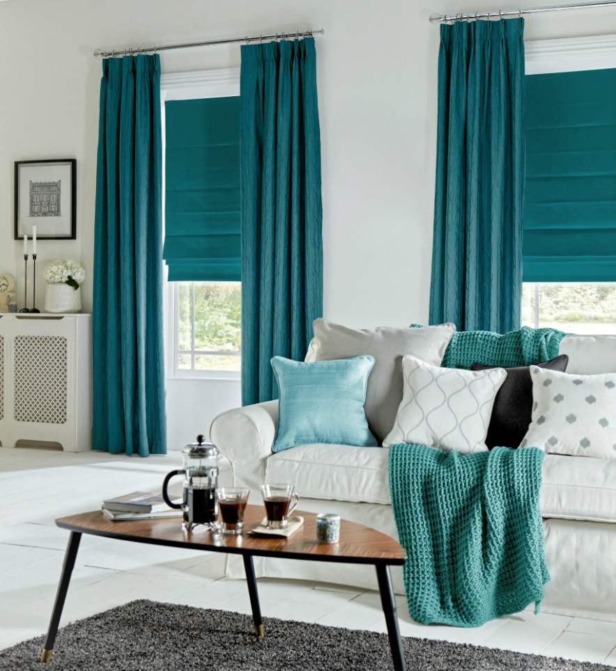
Whatever tends to agitate you emotionally, get rid of it. I’m talking about colors, not your family members. Whether it’s your limey yellow kitchen walls, red curtains in the master bedroom, or the dated and kind of ugly wallpaper left by the previous owner, take the time to change it. Personally, I took all the red pillows and artwork out of my living room and replaced them with blues and calm neutrals. I noticed a remarkable change in my spirit.
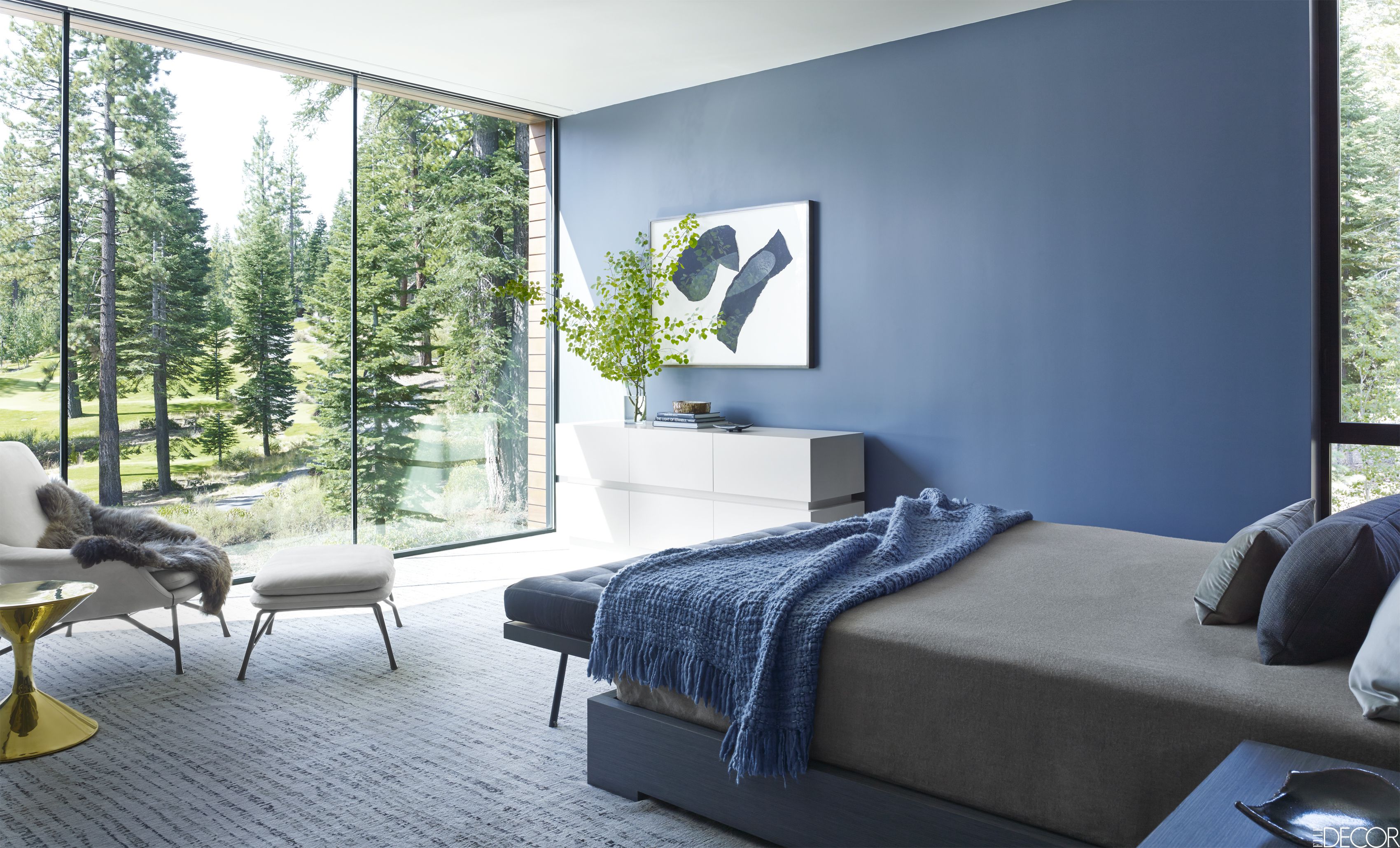
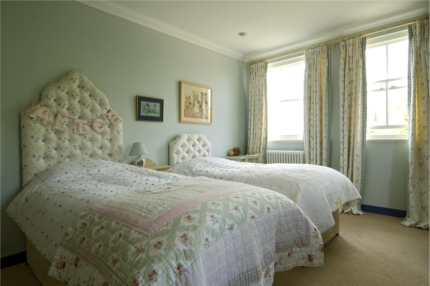
- Create One Beautiful Vista Per Room
If the thought of clearing out 27 years of living from your house is overwhelming, then focus only on the view of each room from the doorway. If you can free up and make beautiful only one wall of each room, you will enter the room each time with a feeling of orderly calmness. The rest will come with time. It’s a start.

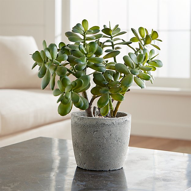
- Keep the Plants Living
It may seem ridiculous to say this, but “Water your plants.” If you have them, nurture them. Otherwise, give them away or toss. There is nothing calming about a dead plant occupying a coveted corner of your living room. You might better replace that pot with a decorative one with nothing in it.
Now that you’ve started to create a calmer environment, you might have the energy to rummage through closets and drawers — maybe on a nice day with the windows open. I’m not suggesting you throw anything out. Just put like things with other like things. It will make a big difference.
- Invest in Containers
In the laundry area, bathroom closet, under the sink, in the kitchen drawers — everywhere there is a bunch of related stuff cluttering up an area, put that stuff in a container: basket, plastic bin, or a box even. What that does is take all that visual clutter and replace it with one thing to look at on a daily basis. Then when you need to get an item, focus and locate it in the container. But until then, you’ve managed to calm that visual chaos.

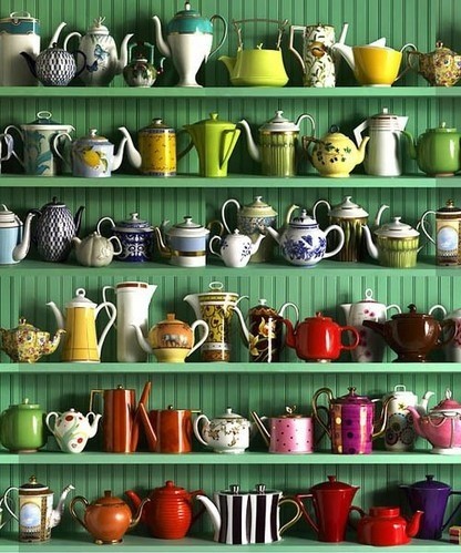
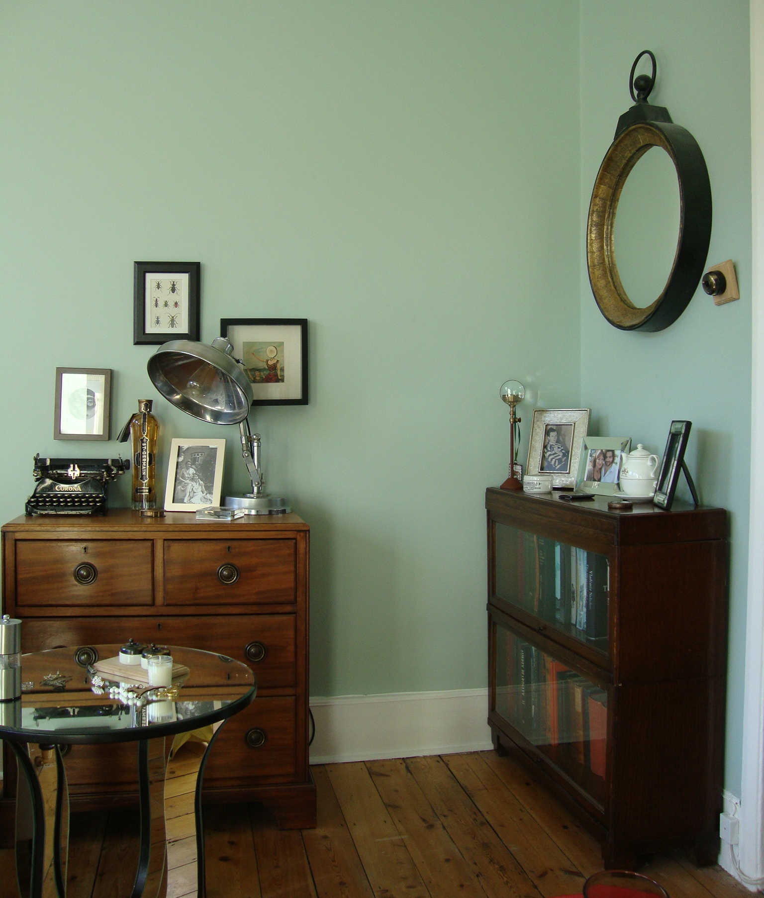
- Combine Cluttery Stuff
Books, collections, trophies, photos of the family — everything that tends to creep all over the house and look busy. Combine them into groupings: a collage of family photos on the stairwell wall, a curio cabinet with all your collectibles, dedicated bookcases for your library of favorite books. Once your collections are contained in a dedicated area for display, you will appreciate them more for all the stories you can tell about them. Plus, you can find them. You’ve contained your chaos of stuff by highlighting and honoring the reason you’re keeping it all.
- Keep a White Flag Handy
Okay, that’s it. I don’t want to stress you out with another to-do list. There will be days, weeks, months when you need to take care of yourself and let the house go. Acknowledge that. Wave your white flag. Order a pizza delivered, close the door to the clutter, and put your feet up. Or take a bath. It will all be there tomorrow, but you may feel better about it.

The World’s Favorite Color? Where Have I Been?
February 22, 2018 § Leave a comment

Late to the party here, but better late than never. At least that’s what I said to myself yesterday when I scrolled onto THIS beautiful hue and found out that it was crowned The World’s Favourite Colour. No great surprise since it represents some of the world’s most exquisitely beautiful treasures like Bali — an island so gorgeous its name alone sounds relaxing.
Last summer there was a questionnaire sent out — ’round the globe, as it were — to find out which color appealed to the most people. (I totally missed it! Arrrgh!)

“The competition organised by Hull 2017 UK City of Culture and paper merchant GF Smith invited people to select their favourite shade online by hovering over an infinite palette of shades with their mouse until they landed on the colour they found most appealing.”
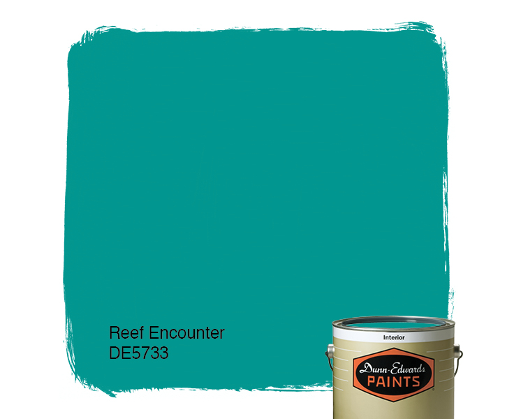
The winner was this rich teal that nature inspires and artists incorporate to capture the beauty that surrounds us.
The closest paint color approximation I could find was a Duron Paints shade, Sea Sphinx. 
But there were others:

There are plenty of other ways to introduce the color into your decor — window treatments, accessories, and more art, of course.
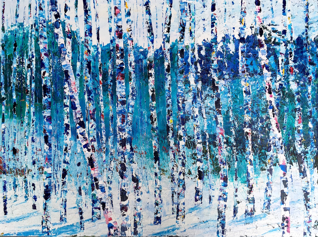
On an accent wall of Marrs Green, this art pops!
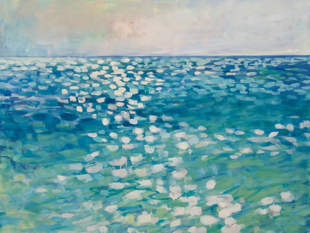
And so does this one!
Though I have blogged about “teal” before, I guess there’s a reason. It appeals to vast numbers of people worldwide. It is a little bit blue, yet a little bit green. It’s the warmest ocean color and a color that appears in natural gems and plant life. It is rejuvenating in all its forms.


")
It looks great with the full green/blue spectrum and all its values, and it forms a calm backdrop to pops of heat. Marrs Green — The World’s Favorite Color.
Color Inspiration is Everywhere
February 19, 2018 § 2 Comments
While scrolling through the interwebs today I bumped into this tweet from Architectural Digest highlighting 20 cute items from Walmart. Okay, that I had to see. And I have to agree — there are lots of really “super cute things” that I had not noticed while shopping for cheap soap dispensers.
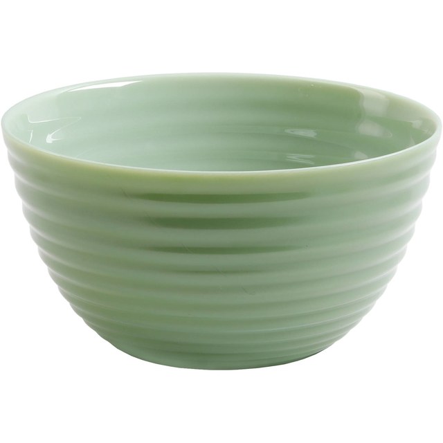
But the item that caught my eye and sent me off to color dreamland was a gorgeous ribbed glass bowl in the most deliciously subtle tones of green. It reminded me of the Farrow & Ball color palette — you know — those paint colors that look like velvet in shades and tones that no other paint company seems to match. There’s something about them (trade secrets, I suspect) that gives a room or a piece of furniture a hue that whispers sophistication. Not one of them will show up in a Crayola box.


Cooking Apple Green No. 32
There are two obvious things that distinguish Farrow & Ball from other more mainstream paint lines: the number of colors (way fewer) and the price (way more). And although many home projects and palettes of colors might not be worth the extra expense because the subtle tonal difference or undertone might not be noticed, I find that the blues and greens in Farrow & Ball are far superior for their soft, sophisticated richness.
Maybe it’s the largess of their English roots (Farrow & Ball is located in the United Kingdom). Or maybe it’s the fewer number of perfect colors (only 132) so that every color decision is a successful one. Or the fact that the company has maintained its original formulation. Or maybe it’s the mystique. But whatever it is … I love it.
What makes F&B different
Regardless of the paint line you prefer, keep your eyes open for color inspirations. They are everywhere — even Walmart.
Why “Fixer Upper Style” is a Thing
March 28, 2017 § Leave a comment
 What is it about the latest home decorating craze that has us all rushing out to buy accessories that look like they belong in a barn? Well lots of things, it turns out. But first of all, in case your TV is not permanently fixed on HGTV, here’s what I’m talking about.
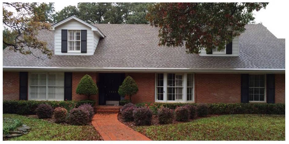
“Fixer Upper,” the smash HGTV show featuring the lovely designer Joanna Gaines and her cute, goofy, muscled, builder husband Chip, has transformed the design aesthetic in much of the country from Pottery Barn chic to We-All-Want-to-Move-to-Waco fabulous. What Chip and Joanna do with ugly fixer-uppers is remarkable. Here’s a Before & After example of the French Country episode exterior:
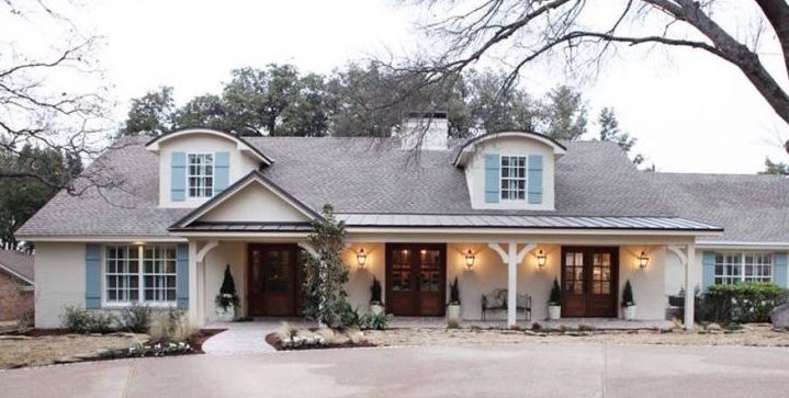
The interior style is relaxed with a simple black, white, gray, and cream color palette, reclaimed wood pieces, including “ship lap” (horizontal wide-plank panelling) on the walls, and lots of textures and accessories that Joanna acquires from the “antiques and junk” shops of rural Texas and her own Silos full of treasures at Magnolia Market. She is a master at accessorizing a room to give what others have described as that Modern Farmhouse aesthetic — lived-in yet chic, folksy yet uncluttered. What she does is truly an art — really!
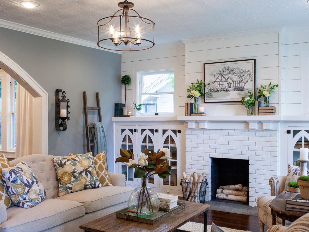
HGTV, Joanna Gaines
Why is this style so popular now??
- We love Chip and Joanna. They radiate love for each other and their four cute children. It’s fun to watch them at home and, like a soap opera, the show is such a refreshing antidote to the routines of our own daily lives.
- The style reminds us of Grandma. Many of the items Joanna finds and uses in her designs are old antiques and treasures we might remember from visiting our grandparents out on the farm. It’s refreshing to travel back to those simpler days.
- The color palette is relaxing. With the over-stimulation of our lives, it’s calming to see whites and woods and neutrals that don’t generate an emotional response. We need downtime in our lives and this style seems to create it.
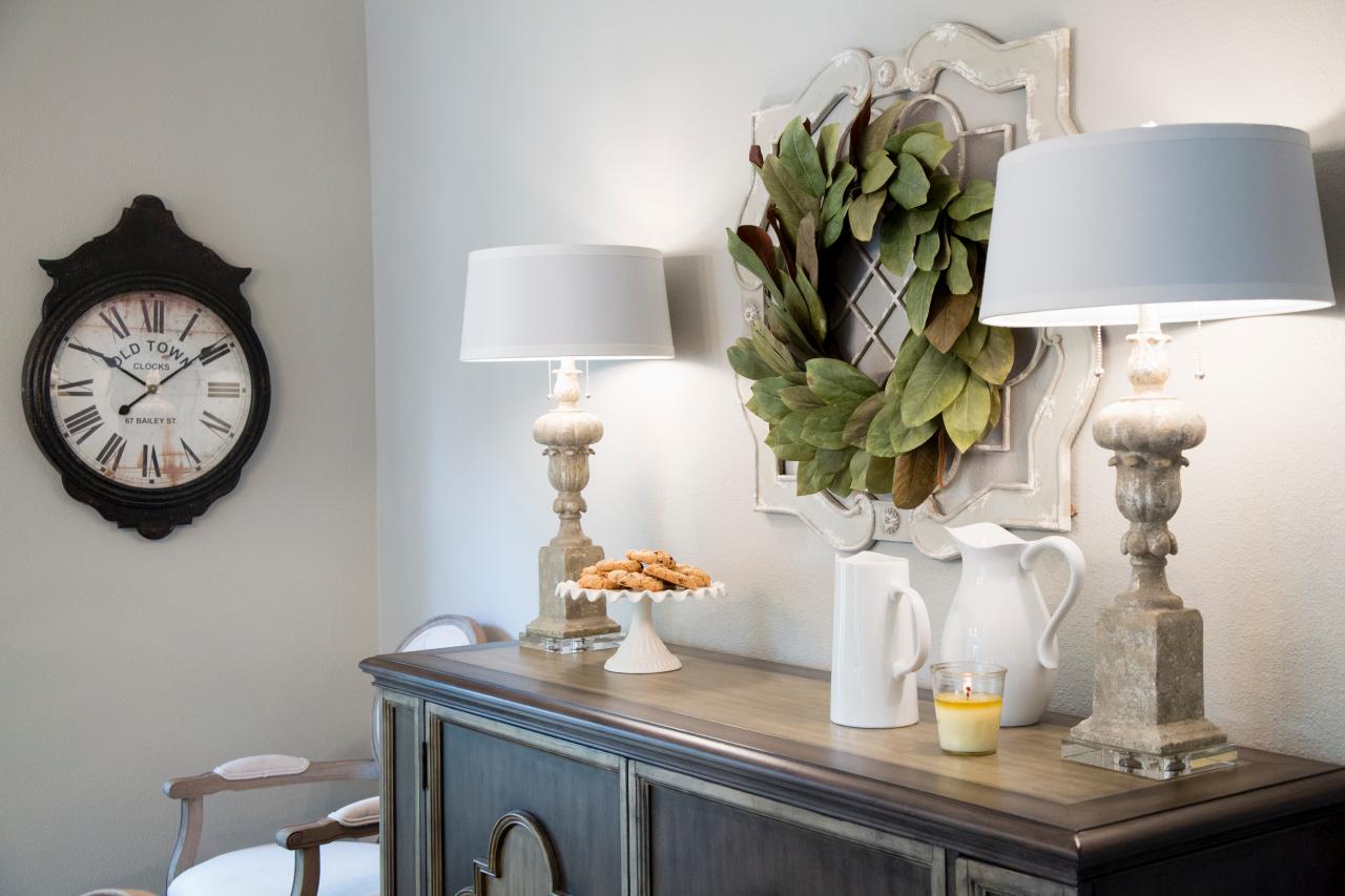
HGTV, Joanna Gaines
- The style starts from scratch. The show guts houses and creates new spaces. There’s something cathartic about the idea of tearing down walls, donating all the old furniture, and starting with a clean slate. It says something about our group needs as a culture.
- What’s old is new again. Even though the bones of the rooms are new and updated, the look appears old and recycled. Scratches and dents don’t matter in this style. They add character. And how relaxing is it to think that your kids can sit at a table without coasters under the glasses.
- Things have a reason for being there. Joanna’s design uses lots of accessories but the rooms don’t appear cluttered. That is the work of a skilled artist. It’s hard to accessorize mindfully without overdoing.
Tips: If you want to incorporate the Fixer Upper style into your decor,
- Start with the kitchen as it can accommodate extra accessories without appearing overdone.
- Stay authentic. The reason Joanna’s style works is she uses actual old pieces she finds.
- Shop antique and consignment stores to find accessories that fit the style, and don’t forget to look in Grandpa’s old barn. Lots of stuff in there, I bet.
- Do what you love. Make your space a happy one to come home to. That means way more than following a particular trend.
Thanks for stopping by!
My Dream Living Room
March 26, 2017 § 2 Comments
What makes a living room dreamy? Here’s what works for me.
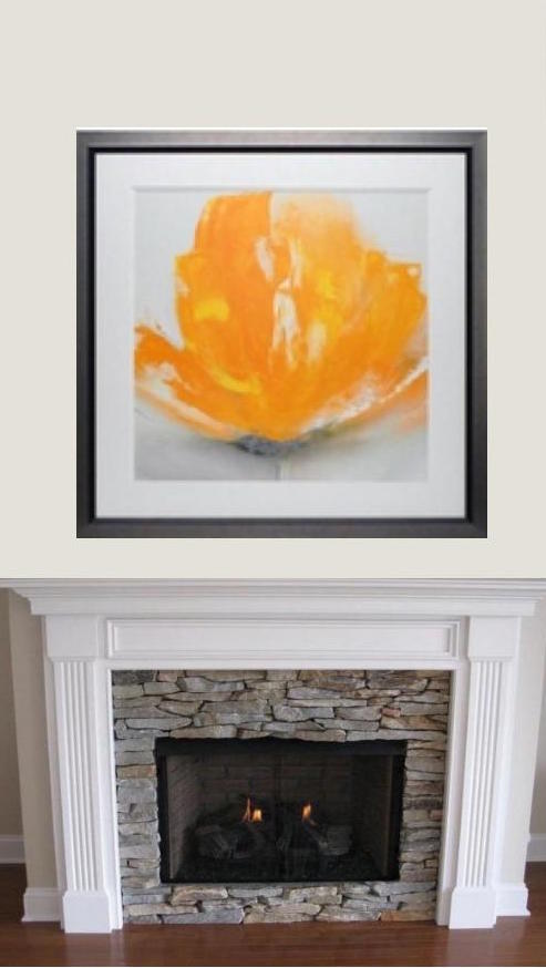
- A fireplace mantel that can anchor a beautiful inspirational piece of art. This one, “Wild Orange Sherbet” by J.P. Prior, does it for me. Even the name makes me happy.
- A big comfy sofa. I’ve always wanted a curved sofa (this one from Arhaus) as it invites conversation. People tend to sit down and talk with each other instead of staring at the TV (which, you might note, is absent from my dream living room).
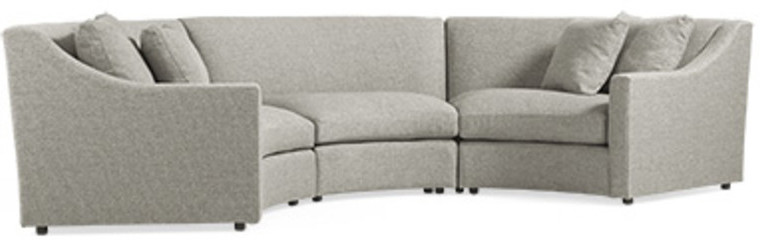
- Neutral major pieces. I chose Taft Pewter for the upholstery color because it goes beautifully with the stone around the fireplace, and the color won’t grow tiring. Even if pillows come and go with new color trends, the sofa’s soft, sophisticated neutrality will endure.
- A rug that
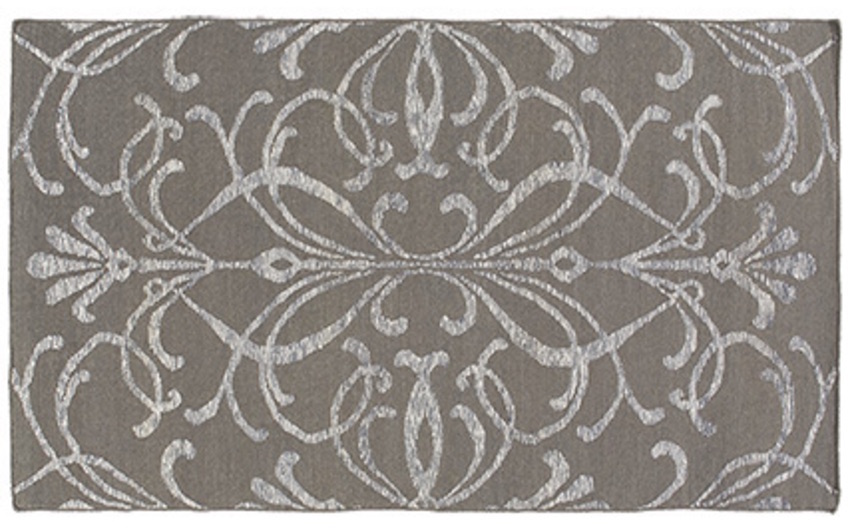 will further define the conversation area
and be cozy underfoot.
This neutral coordinates with the sofa and doesn’t detract from the focal point of the room. - An ottoman is
 an absolute must as it beckons you to put your feet up and relax. With a tray on top, an ottoman serves as a hard surface for drinks and snacks.
 - A pair of perky chairs (opposite the sofa)
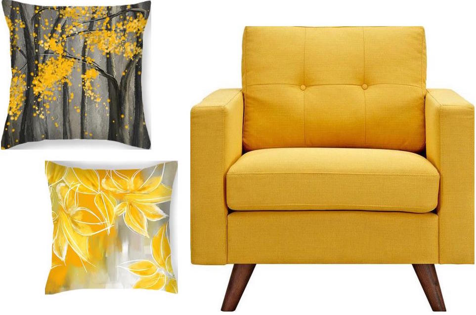 to round out the conversation area and yell “Surprise!” when somebody enters the room. Everybody needs at least one chair in their favorite color.
 - Pillows
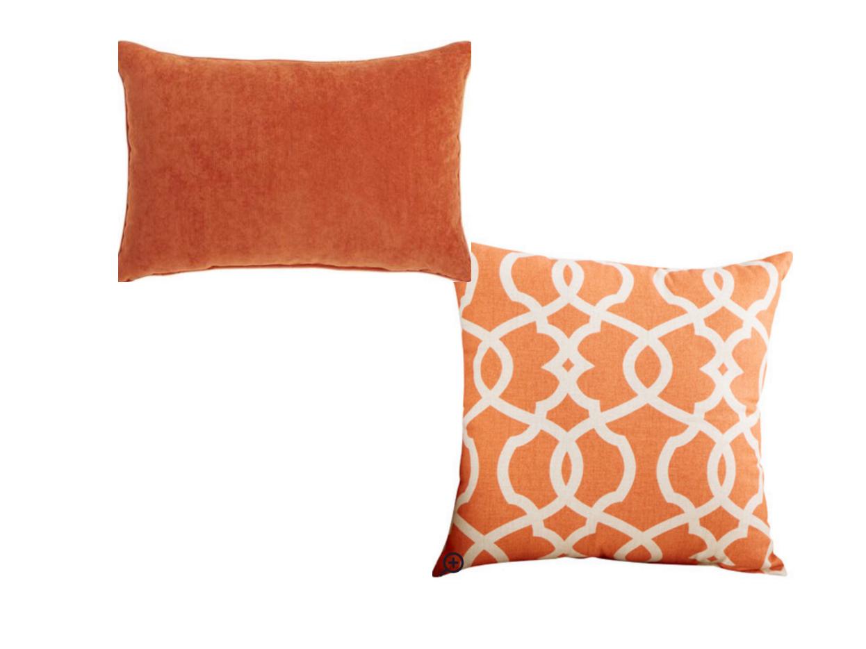 that pull the whole color palette together and come in different sizes and textures and may be swapped out seasonally if you like.
- Finally, a pretty paint color that provides a backdrop for the room but does not compete with anything for attention. For this room, I chose Benjamin Moore’s Classic Gray, OC23.
The whole idea of my Dream Living Room is to set a happy, relaxed tone for the house in a classic and timeless style that won’t look too dated when the next big trend comes along. Keeping the bones of the room classic (hardwoods, architectural details) and the expensive pieces timeless (sofa and large furniture) allows you to play with chairs and accessories and art and have fun.
Create a dream living room in your home. Ahhhh… I like dreaming.
__________________


Sources: Art (“Wild Orange Sherbet” by J.P. Prior). Mantel (MantelCraft). Sofa (Arhaus.com for other living room inspirations). Rug (Arhaus.com). Ottoman (Arhaus.com). Armchair (Dot&Bo). Pillows: Yellow (Fine Art America), Damask (Wayfair), Lumbar Pillow (Pier 1 Imports). Paint: Benjamin Moore, Classic Gray OC23.
Happy Color for 2017
January 5, 2017 § Leave a comment
The New Year creates an opportunity for change. Whether it’s a p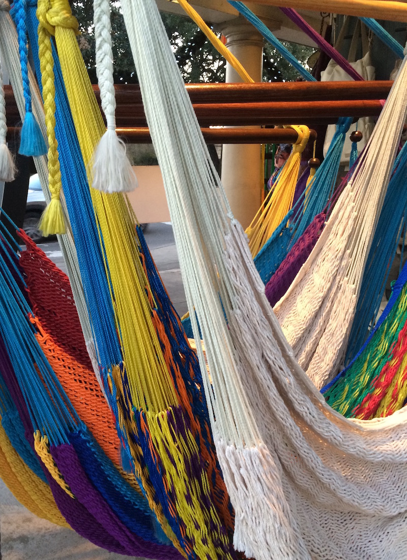 ledge to drop a few pounds, move the body more, or clear out the clutter, January is Change Month. And around here, I am ready to change color.
Not that I wasn’t crazy for color before, but fresh, clear color screams enthusiasm, optimism, and hope for great things. My nuanced, subtle, neutral palette looks dreary and tired. It is ready for a color boost to the happy side.
What does that mean for my decorating aesthetic? Not repainting my entire house and dragging all the furniture to Goodwill. Rather, a move to throw in a few color “punches” by switching out pillows on the sofa and adding some art and accessories. The hammocks are such an inspiration (from our fami ly trek to New Orleans over the holidays). And check out this orange Moroccan pouf my sister gave me for my birthday. I adore the color orange because it’s always a happy color — she knows that.
So if you are looking for a jolt of positivity in your life this January of 2017, try adding color and see if it helps your outlook on life. (Good coffee will help too!) Have a Colorful New Year, my friends!
Adding POPS of Color — Orange
October 10, 2016 § Leave a comment
 Is there any color happier than orange? Okay, full disclosure. Orange — that special red-orange that you see on maple trees in the Fall in New England — is my favorite color. I don’t wear it, but I love looking at it.
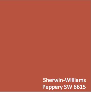
Fall is a wonderful time to add a touch of orange to your home. Go all in with a peppery accent wall in a guest bedroom. Or go easy with a few orange candles on the mantle. I like to switch out my light blue throw pillows on the sofa for orange this time of year. Keeping my sofa neutral lets me do that, and on that first chilly October day, orange pillows warm the room instantly.
What goes with orange? If you want energy, blue (like SW Indigo). Just look at the sky in the photo and how those two complementary colors work off each other. If you want a bit more calm in the room, use a warm gray as a back drop, like the fence in the photo (and SW Dorian Gray).
 Another way to add orange without switching out your furniture and paint color is to introduce a large framed photo of Fall colors. I like to stick with the season we’re in so the photo would come down in the winter and be replaced by a cozy winter scene. Seasonal changes keep the room looking vibrant and fresh.
If all those ideas and colors are still over the top, there’s always squash soup and pumpkin-spice muffins. Sometimes a little color on the dinner table is all you need to enjoy the autumn season.
Stay cozy, my friends.
Dramatic Outside Color Creates Dazzling Interior
October 13, 2015 § Leave a comment
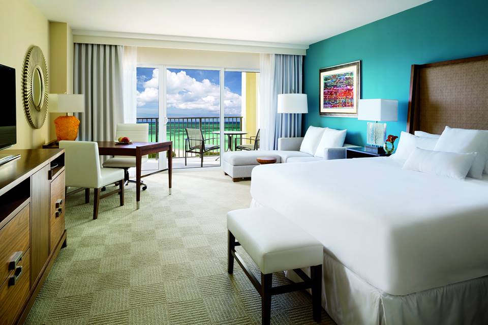 “Bring the outside in” — how many times have you heard that line before — but honestly, what a great idea! And one of the best ways to do it is with an accent wall that pulls a color right out of the view from the window. (Yes, accent walls are back.) This bedroom from a resort in Aruba has an incredible palette of blues and greens from which to choose the accent wall behind the bed. And how spectacular is it!
But you can do the same with the view from your bedroom. Choose a color that pops out at you when you stare out the window — it helps if there’s a beautiful maple in full color or a blossoming bush.
If your bedroom faces a concrete high-rise, not to worry. Your color palette is completely open to a view you might fantasize about. Create a bedroom oasis that reminds you of your trip to Bali (okay, maybe just your favorite House Hunters International on HGTV). Be bold or be subtle. Just be a force of change in your bland bedroom. And go ahead. Bring that outside in!
Adding Pattern Personality to Your Home
October 7, 2015 § Leave a comment
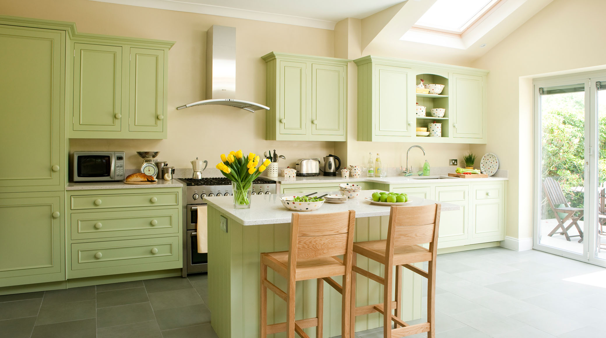
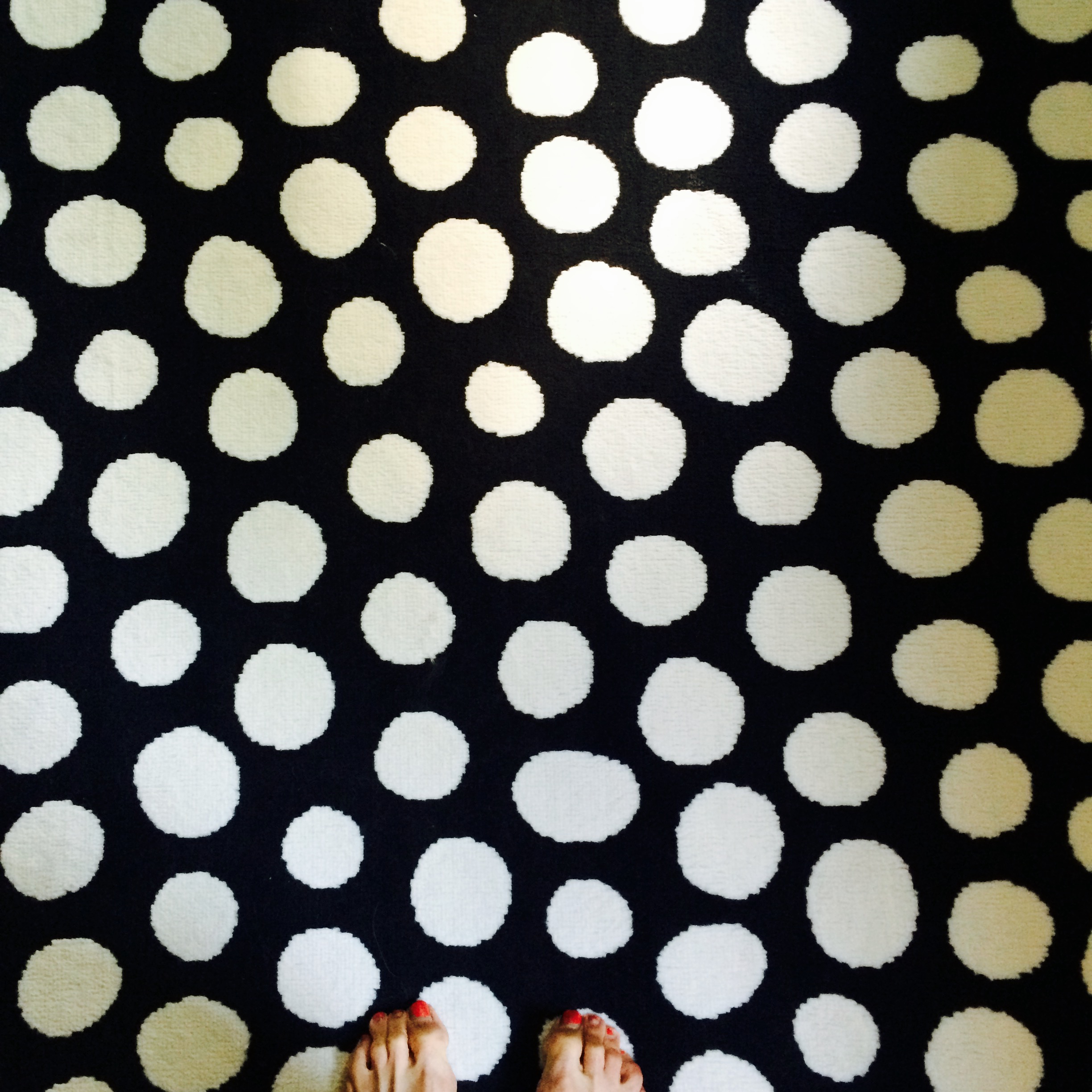 What is your pattern passion? Mine is polka dots. I can’t seem to get enough–dresses, bags, note cards, rugs, whatever I see in polka dots, large and small. But when is it enough?
I’ve seen complete rooms done in small-flowered Waverly prints: bedding, curtains, and even wallpaper going up over the ceiling. If you love the idea of waking up in (and I mean IN) a field of wildflowers, then that’s just great. But what happens when you get tired of the pattern and it’s literally everywhere in your room? You’re stuck.
Healthy alternative to bingeing on your pattern passion? Small portions. Instead of wallpapering the entire room in your favorite plaid, just do one accent wall or a reading nook, like we see in this HGTV design idea. That way you are less likely to tire of the pattern and want to rip it down. 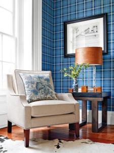
If animal prints are your print of choice, consider limiting it to the upholstery on a fun favorite chair or a pillow (Pottery Barn). There is no reason to feel limited by any fashion trends if you have a passion for a particular print. But using it in limited applications will allow you to switch it out when the next pattern passion comes along. 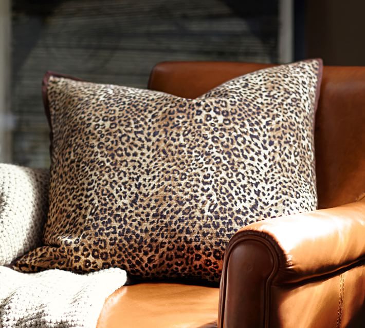
In a Teen’s Bedroom, It’s Just Paint
February 24, 2014 § 2 Comments
 Letting your child express herself in her bedroom is a wonderful way to uncork inner creativity. You may bristle at the color scheme and opt to keep the door closed most of the time, but allowing your child to have a room of his or her own design is so important to creative development.
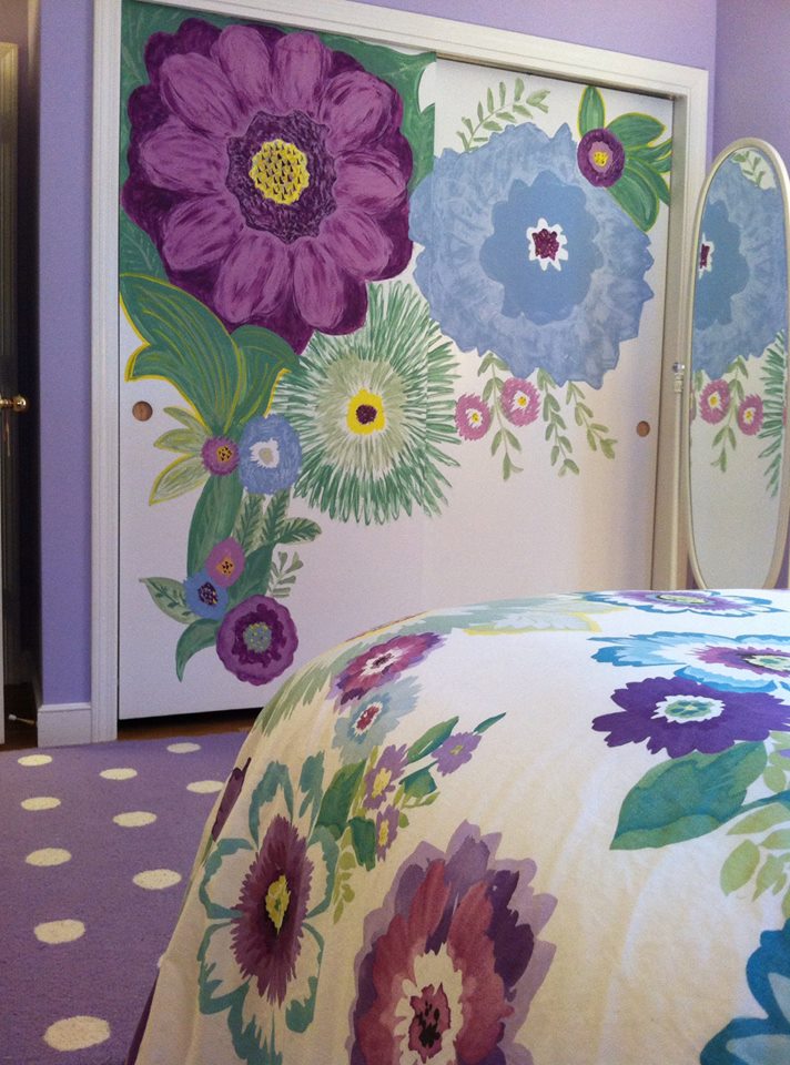
In this room, the young client chose a Pottery Barn Teen bed cover as her inspiration piece. After we selected a new wall color together (a soft purple — and a departure from the previous bubblegum pink), we brought in white accessories and a purple polka dot rug.
I mentioned that sometimes it’s fun to get a little crazy with the closet doors in the bedroom because they present a blank white canvas just begging for color. So guess what … hey, it’s just paint!
