Color Combos that Excite the Palette
November 21, 2014 § 2 Comments
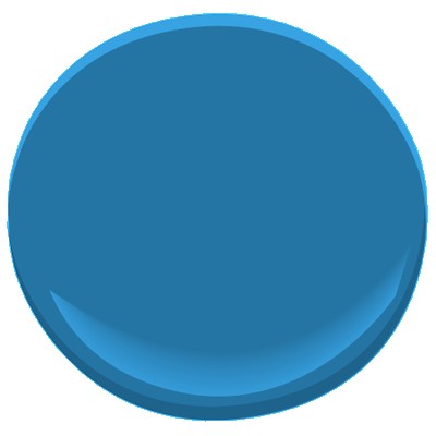
Like pairing a fine wine to its epicurean delicacy, some color combinations can stimulate an emotional response. Some of my leg-tingling favorites include:
The rich, regal Plum Royale 2070-20 with an icy accent of Colony Green 694 (colors from Ben Moore).


 (from Horchow.com)
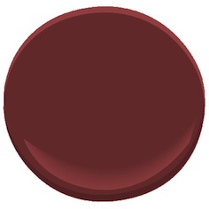
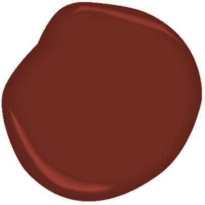
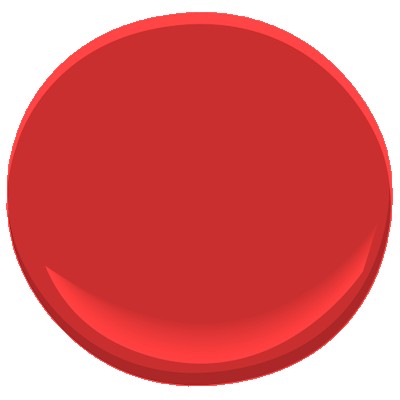
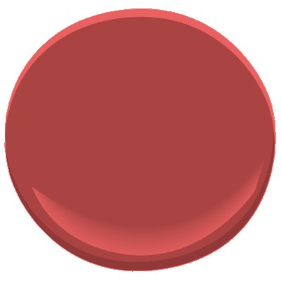
The dark luscious Dinner Party red (AF-300) with a splash of Yellowstone (202)

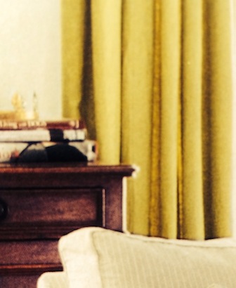 (from House Beautiful)
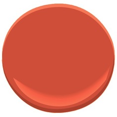
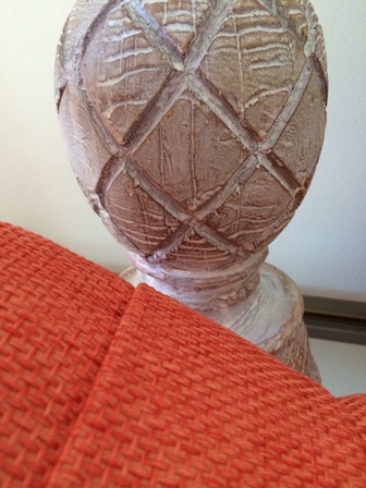
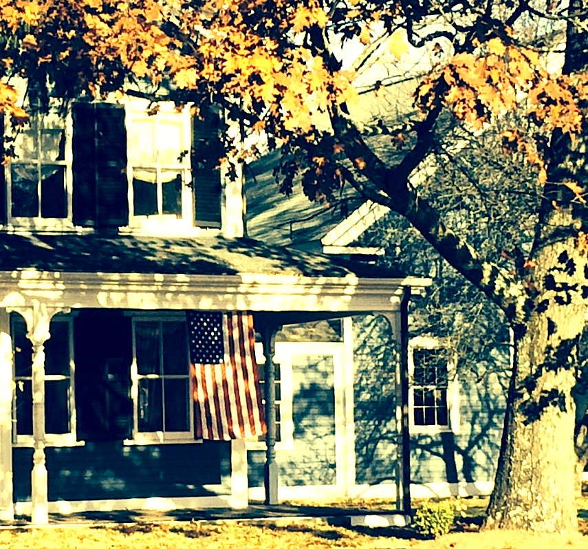
And the soft, sultry gray hue (Elephant Gray 2109-50) with a pop of orange (Soft Glow 014).

It’s almost a curse to adore color as much as I do. But they love me at the paint store!
House Colors with Personality
November 20, 2014 § Leave a comment
Nothing shy about this pretty pink house. And instead of tempering it with neutral (black or gray for the shutters and door), the homeowners went Victorian bold with a rich blue like Ben Moore’s Blue Macaw 784.

When you have an old house, it’s fun to use old historic color schemes that make a statement. This one certainly does with its two-toned mustard/olive combo clarified with white trim and a traditional brick red door (Ben Moore Cottage Red).

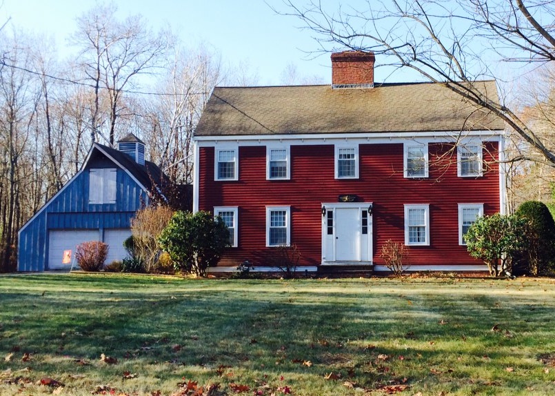
I always love a tastefully done red-white-and-blue scheme, shown here with a blue garage attached to the red house. White (Ben Moore’s Brilliant White) as both trim and accent color pulls the look together.

This dark brown house is a classic New England Cape. Its simplicity is what captures the eye. No accent color needed on this traditional solid wood door with black hinges.

Make a statement in your neighborhood. Tastefully, of course.
Accent Color Ideas for Stone and Brick Houses
November 17, 2014 § Leave a comment
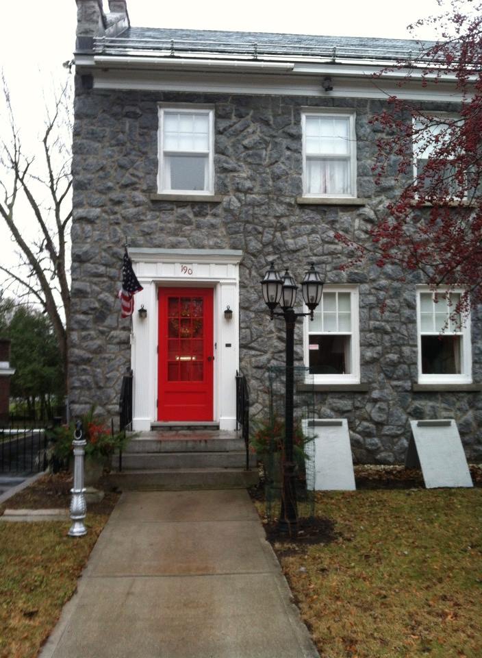
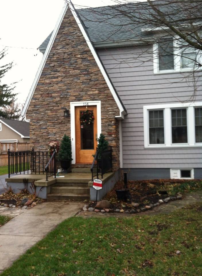
Choosing door or other accent colors for stone and brick homes is easier than you think. If the stone is uniform like this gray, then almost any accent color will work. This homeowner chose tomato red, something like Ben Moore’s Red 2000-10.
With multi-colored stonework, I like to pick a color out of the palette. In this case, the homeowners chose a gray for the siding and a warm golden color for the natural-wood-stained front door. The orange tone in the wood stain, something like Minwax’s Cherrywood, brings out the depth of color in the stonework and makes the front door warm and welcoming.

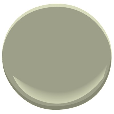
For uniformly colored red brick, you can accent with a contrasting color. And the opposite of red, of course, is green. Using a gray-green in a lighter value will prevent the house from looking like Santa’s workshop. Check out Ben Moore’s Louisburg Green HC-113.

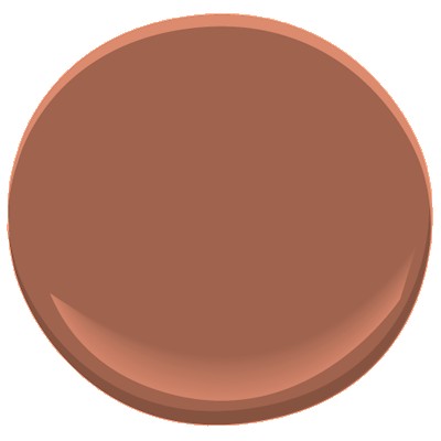
Blonde brick is a challenging palette but consider what hues are in the brick and tease them out. Taupe is a safe bet for the siding and a warm accent like Mayflower Red (Ben Moore HC-49) will warm up the front door.

Let the stone and brick of your house speak to you. Sticking to the color palette that’s already there will make your house coordinated and happy.
Fab Front Door Color Ideas
November 14, 2014 § 3 Comments
Your front door does not have to be red. Or black. Or green. Or any other traditional color (although there’s nothing wrong with that). Have some fun with your front door color by looking around your yard for inspiration. Or step outside the box by choosing a contrasting color in an unexpected lighter tone. Once you decide on the color, spread it around a bit more by painting a bench or a pot the same color and planting annuals and other flowering shrubbery around the yard to pull the whole look together.
For a BLUE or GRAY house: Consider warm sunny yellow (Ben Moore Concord Ivory HC-12).

For a golden BROWN house, surprise your neighbors with a light shade of contrasting blue (Ben Moore Yarmouth Blue HC-150).
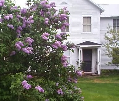
For a white house, consider using a color from your plantings around the yard. Here, the purple lilacs provide the inspiration (Ben Moore Cabernet 2116-30).

For a red house, I still love creamy white trim and a navy door (Ben Moore Hale Navy HC-154).
For a green house, use a natural wood toned door or paint it an earthy rusty brown (Ben Moore Ten Gallon Hat 1210).

And of course a yellow house still looks absolutely smashing with a traditional red door (Ben Moore Moroccan Red 1309).
Your front door should reflect a little bit of you and the home you’ve created on the other side of it.
Choosing House Colors in a Colorful World
November 10, 2014 § 1 Comment
 “Anyone who claims to be an expert on color is a liar,” assert Joann and Arielle Eckstut in their book The Secret Language of Color. I (hesitantly, of course) agree. Asking someone to pick a color for you is like asking a stranger to describe your personality, your favorite sweater when you were five, and your family tree. But hey, with a series of clues, we color “experts” do it all the time.
The colors you end up with for your home, your clothes, your car and everything else should be a reflection of you. But how we make those choices is dependent upon our associations between colors and objects or feelings (yellow can conjure up sunshine and happiness or anger and agitation), our culture (Americans tend to prefer blue, Asians red) and even our ability to distinguish certain colors at all (some red/green color-blind individuals see only a gray scale).
When choosing a house color, there are even more considerations: neighborhood, age of house, natural environment, and frankly whether or not you want your house to blend in or stand out. For the most part, we tend to use colors in the palette of nature: beiges, taupes, grays, greens, and occasionally reds, yellows and blues. Nature colors can blend a house into the tree-lined landscape in the backyard or the row of stone walls in the cul-de-sac. Red can echo the autumn colors lining the street or the late afternoon sunset. Yellow can fit just as well in a quaint New England town as it does along the coast of Malibu. And blue in all its various shades looks fabulous on a house between the dunes at the beach.
But what if you want your house to stand out in a world full of color? Don’t overlook white. It can be warmed up or cooled down with the seasons and it will never go out of style. Splashing in a no-color “color” like white into a palette (whether it’s your neighborhood or the front garden) not only makes the surrounding hues more vivid but also serves as a beacon of relief in a multi-colored landscape. When choosing a floral display that I knew would be surrounded by other beautiful, multi-hued arrangements, I chose white. And sure enough, what showed up the most? White. (What color is the bride? White.) You get the picture…
Be your own color expert. Choose what you like. Fit in. Stand out. Or ask one of us to help.
Not-So-New Kitchen Flooring Ideas
June 2, 2014 § 2 Comments
 Kitchen floors always pose a challenge. Do we continue the not-always-practical hardwoods throughout or do we interrupt the flow with a more indestructible surface alternative? In this kitchen by Designer Sarah Richardson, she used a linoleum tile to create a colorful and durable floor to complement the light pastel blue and white palette. What we do not see is the adjoining room and how the two areas are connected.
Here is my rule of thumb:
If you have a small house, continue the hardwood floors throughout the downstairs public areas (living room, dining room, family room if there is one, and kitchen). That way, the house will appear larger and less chopped up into individual rooms.
If you have an old house (or a large one) with distinct room divisions, go ahead and select an alternative flooring that offers color or durability (although carrying the hardwood throughout is okay too). I recommend using the color palette to pull the public areas together so in Sarah’s case, the adjoining room would have some light blue in it. Mixing and matching within the color palette will create the feeling of a larger, more pulled-together house — even if the rooms are boxy and divided by walls and small doors.
Just like there are more options than granite and Formica for your kitchen counter top, there are now numerous exciting alternatives to wood and tile on your kitchen floor.
In a Teen’s Bedroom, It’s Just Paint
February 24, 2014 § 2 Comments
 Letting your child express herself in her bedroom is a wonderful way to uncork inner creativity. You may bristle at the color scheme and opt to keep the door closed most of the time, but allowing your child to have a room of his or her own design is so important to creative development.
In this room, the young client chose a Pottery Barn Teen bed cover as her inspiration piece. After we selected a new wall color together (a soft purple — and a departure from the previous bubblegum pink), we brought in white accessories and a purple polka dot rug.
I mentioned that sometimes it’s fun to get a little crazy with the closet doors in the bedroom because they present a blank white canvas just begging for color. So guess what … hey, it’s just paint!
Don’t Let Your Art Fade Away
February 17, 2014 § Leave a comment
 Old faded jeans and old faded glory aside, old faded artwork in your house is a No-Go. If you have art prints that have hung on the wall in your bright cheery living room for several years, take a close look at them. Do they have a blue-green aura to them? Are flowers that used to be red sort of a strange blue? Is there any red or pink left in the piece at all? No?? Then haul it down. It’s done. Off to the recycle bin. Use the frame for something new that will add life to your room. Just this next time, opt for glass that will prevent color-fading. It’s more expensive but worth every penny if you love your art and prints.
Don’t be stubborn. Love your faded jeans, but get rid of your faded art.
Let There Be (New) Light
February 15, 2014 § 3 Comments
 Take a look at your lamps. Have they been on the same side tables for more than 20 years? 30 even? (okay that’s scary) Listen up. One of the easiest and cheapest updates you can do for your house is to exchange the old lighting for something fresh, colorful, and uplifting.
New lamps come in a variety of shapes and sizes, some with colored glass, some with clear. Some have updated metals, some are made to look old. But all have crisp shades with a nice clean barrel shape. (Traditional lamps are still, well, traditional. They will never go out of style. But you know what kind of outdated lamps I mean. Check out your grandmother’s family room, decorated circa 1968. Now you get it.)
You do not have to spend a lot of money. You can shop at a fancy lighting store or Target and get an updated look.
And while you’re looking at lighting, check out your ceiling fixtures. For a few bills at a home improvement store, you can switch out the old brass candelabra flush-mount fixture for something MUCH more current. The change will transform the house — you will see it in a whole new … (wait for it) … LIGHT.
(Lamp from Bellacor: Number 541835)
What Color to Paint Your Big House
February 13, 2014 § Leave a comment
Building a new house or a large addition but beginning to worry that it might look too big in your neighborhood? Maybe a lot of people don’t worry about their neighbors, but some people do. If you think your house might appear overly large-scaled, then avoid painting it white. The contrast against the setting makes white stand out even more than other light colors.
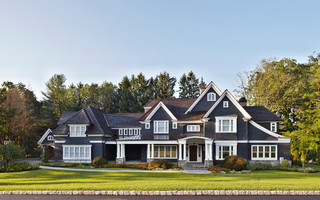
To bring the house down to scale and accent the architecture at the same time, consider a dark color like a dark charcoal or dark green for the siding. Dark trim, of course, will camouflage the house even more, whereas white trim will highlight windows, doors, and roof trim.
Your choice — but becoming the McMansion in the modest neighborhood will not endear yourself to your neighbors. And my how they talk…
Fair warning.
