From Color Inspirations to Paint
February 4, 2016 § Leave a comment
Walking into a pottery shop is like immersing yourself in a box of crayons, all pristine and unbroken with endless possibilities of combinations.
 This set of dazzling bowls caught my eye. Mesmerizing is how I’d describe them with an array of blues from turquoise to cornflower. (The dishes are mine now.)
Whatever the inspiration, there is a paint project waiting. In my mind’s eye driving home, I see these dishes in a dining room painted any one of the colors with crisp white trim. Maybe even a shiny white bead board around the wainscoting to bring out the hues in the room. I can also see any one of these colors on the walls in a kitchen with white cabinets and a white subway tile backsplash. Or maybe one of these colors for the backsplash! (Head is spinning with ideas.)
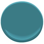


Accent walls give us a way to add a small amount of color drama to the focal area of a room without painting everything. Especially nice in open-floor-plan spaces where walls may incorporate several rooms. How about one of these rich hues for your front door? Spring painting is right around the corner. (Ben Moore’s Calypso Blue, Bermuda Blue, and Deep Mulberry)
Let the color in front of you and surrounding you inspire you. Wrap yourself up in it. Do something for yourself and create a happy house. It’s just paint!
Got Personality? Show It
January 19, 2016 § Leave a comment
What does your room say about you? Designer Jeffery Bilhuber (House Beautiful, Feb 2016) infused a boatload of personality and let us know a few other things as well. What this room shouts to me:
- Forget about symmetry. Mismatched end tables are way more interesting than a set.
- Go ahead and mix woods. We acquire furniture from our parents, we find treasures at a flea market, and sometimes pieces have sentimental value. Use them — even if they don’t “match” your decor.
- Add your favorite color to the room. And if you don’t have a favorite, use several. If you keep the colors at the same “hue value” (lightness or darkness of a color), they mix well together.
- Function is important. Don’t forget that you need to set your wine glass down.
- Forget matchy-matchy. This designer has taken that declaration over the top by using two different window shade colors. Bold and impetuous design choice there, but again, the room screams,”I want to be different.” And I applaud that.
- Let color speak in the room by creating a neutral backdrop from which the color can “pop.” Here, the light gray walls and the neutral woven rug give the eye a rest.
- Flowers and the little accessory details finish the room. Without them the room can look cold and staged (too many, of course, and you have a clutter zone).
- Texture matters. That sofa looks so soft. Adding warmth and texture with pillows can warm up anything, even leather.
Bottom line: You’ve heard this before, but it’s worth repeating. Don’t just follow the design trends. Let your room reflect who you are and what you love.
Make You Happy — Consignment Love
January 18, 2016 § Leave a comment
A home stager’s life can be unsettling. Furniture comes and goes, from storage unit to my own living room and then off to somebody’s vacant home and then back again two months later. My husband jokes that he has to turn the light on before he enters a room or he might trip over an ottoman that wasn’t there a few minutes ago.
And as a stager, I often un-decorate a home to make it more appealing (or at least not unappealing) to a wide swath of potential buyers. Family photos? Gone. Floral drapes? Too busy. Oriental rugs? Too taste-specific. So life is full of light neutral walls, white window panels, generic art, plain slipcovers, and sisal rugs. Everything looks good at the end in a Pottery Barn kind of way, but I am growing tired of meh.
Enter my favorite consignment store. And inspiration.
Finally I am going to buy something other than white plates and Parson’s chairs. And for me. These French blue dishes with gently scalloped edges and little raised dots around the rim are totally taste-specific. Mine.  And the chairs with their cane backs, girly curves, and cream leather seats are too old-fashioned for today’s young buyers. They would spray-paint them white! Not me.
I have found love, and these items will stay in my home. I can come home every night and expect to see them there, not in somebody’s 1800s farmhouse kitchen with a For Sale sign in the front yard.
My point to all this? Surround yourself with what makes YOU happy. Don’t let your job take over your home. Have a sacred space that’s your own. Hang onto things that mean something to you and make you feel good. All that! And more this New Year.
Adding Shutters? Look to Paris
November 15, 2015 § Leave a comment
 In honor of my beloved Paris, let’s talk about shutters. In my humble opinion, nobody does shutters better than the French. Classic, elegant, tasteful and actually quite functional as opposed to our (often) vinyl interpretations on our side of the pond.
That said… shutters do not have to be functional, and it’s okay if they’re vinyl. But how can we make our vinyl, nonfunctional, imitation shutters look more authentic? Size. Yes, when it comes to shutters, size matters. 
Shutters that are too narrow or too short for the window size look like an afterthought, at best. They add color and dress the bare windows, but they don’t fool anybody. Make sure 1) there is enough room on either side of the windows for properly sized shutters; 2) the width of the shutters fits the scale of the window — they could actually function; and 3) the length is appropriate — if shut, the shutters will cover the window completely and not leave a little hem showing.
Thank you, Paris, for educating me on shutters during my trip in 2010. And my sincere sympathies to you and your people.
Fashion Colors and Your Home
October 16, 2015 § Leave a comment
What we wear affects everything: our mood, our self-confidence, our success, and even our home. It makes sense that the colors we enjoy wearing should follow us into the rooms we decorate. And they do. If you take a glance through the clothes racks in your closet, you may see a color trend that pops right out: neutrals like black, white, gray or beige? Brights like reds and purples? Nature colors like greens and blues? What you see in your closet may very well help you pick a color palette that not only looks good in your home but also coordinates with you. 
Grays are popular in fashion everywhere now (photo http://www.vince.com). And in the home, gray is still the new Linen White. It provides a neutral backdrop for any accent color and gives young home owners something different from the creams and beiges they grew up with.
One of my favorite grays is Benjamin Moore’s Abalone 2108-60. It has a subtle warmth that looks great with stainless in a kitchen, white trim in the living room, or dark woods in a master bedroom. A touch of silver metal adds the sparkle.
Next time you’re stuck wondering what to paint a room, think about what colors you like to wear. And go from there. 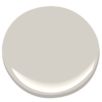
Dramatic Outside Color Creates Dazzling Interior
October 13, 2015 § Leave a comment
 “Bring the outside in” — how many times have you heard that line before — but honestly, what a great idea! And one of the best ways to do it is with an accent wall that pulls a color right out of the view from the window. (Yes, accent walls are back.) This bedroom from a resort in Aruba has an incredible palette of blues and greens from which to choose the accent wall behind the bed. And how spectacular is it!
But you can do the same with the view from your bedroom. Choose a color that pops out at you when you stare out the window — it helps if there’s a beautiful maple in full color or a blossoming bush.
If your bedroom faces a concrete high-rise, not to worry. Your color palette is completely open to a view you might fantasize about. Create a bedroom oasis that reminds you of your trip to Bali (okay, maybe just your favorite House Hunters International on HGTV). Be bold or be subtle. Just be a force of change in your bland bedroom. And go ahead. Bring that outside in!
Adding Pattern Personality to Your Home
October 7, 2015 § Leave a comment
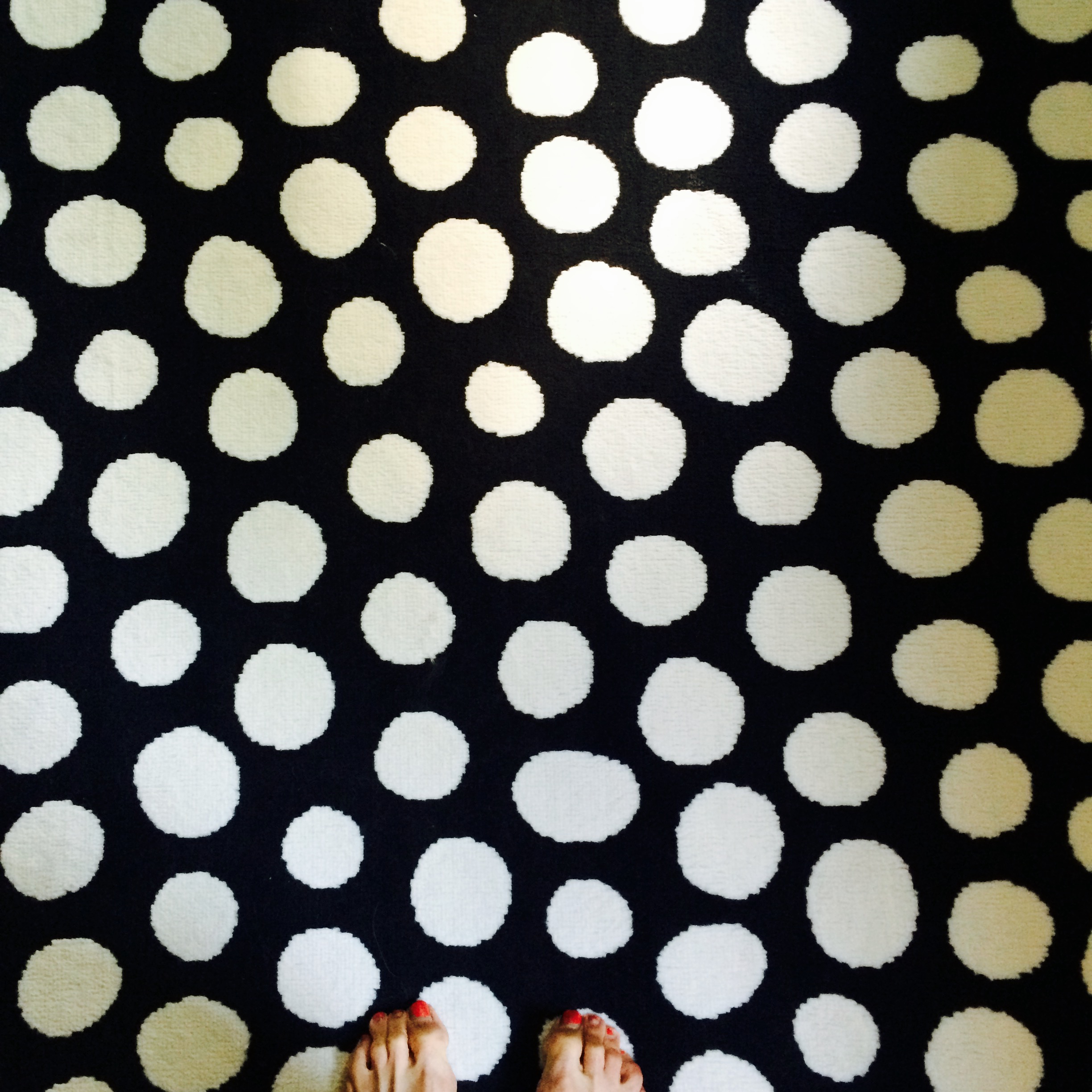 What is your pattern passion? Mine is polka dots. I can’t seem to get enough–dresses, bags, note cards, rugs, whatever I see in polka dots, large and small. But when is it enough?
I’ve seen complete rooms done in small-flowered Waverly prints: bedding, curtains, and even wallpaper going up over the ceiling. If you love the idea of waking up in (and I mean IN) a field of wildflowers, then that’s just great. But what happens when you get tired of the pattern and it’s literally everywhere in your room? You’re stuck.
Healthy alternative to bingeing on your pattern passion? Small portions. Instead of wallpapering the entire room in your favorite plaid, just do one accent wall or a reading nook, like we see in this HGTV design idea. That way you are less likely to tire of the pattern and want to rip it down. 
If animal prints are your print of choice, consider limiting it to the upholstery on a fun favorite chair or a pillow (Pottery Barn). There is no reason to feel limited by any fashion trends if you have a passion for a particular print. But using it in limited applications will allow you to switch it out when the next pattern passion comes along. 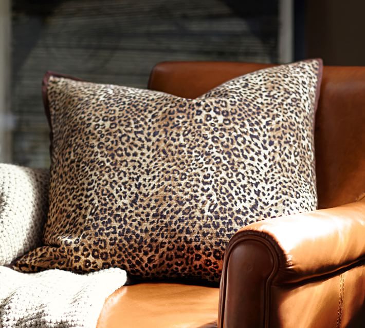
It’s Time for Faux to Gaux
June 22, 2015 § 2 Comments
 Drop the sponges, folks. Honestly, without trying to offend anyone or stomp on creativity, I have never seen such awful faux finishes in my life! It’s high time we roll over those ugly paint jobs and simplify our visual lives a bit. And if you plan to sell your house anytime soon, please listen up.
Faux is out. It was hard to perfect from the beginning but as of now, it has been totally overdone. From walls to kitchen cabinets to dressers and dining room ceilings, enough!
What’s in? Paint. Just plain paint. And in some applications, wallpaper. But not too much! No need to match the curtains to the wallpaper to the bed linens. As one who tends to find a  good thing and overdo it, I can certainly sympathize. But the next time you have the urge to spend hours dabbing wet sponges on the wall or cabinet door, take a deep breath and stop.
Marital (Decorating) Mismatches
December 10, 2014 § Leave a comment
 Are you and your significant other on the same page when it comes to the “stuff” of life around the house? The newspapers, magazines, mail, books, TV clickers, recycling cords and the like? Are you one to snatch the Sports Page right out of his or her hands as you make your daily pilgrimage to the recycling bin? Or are you content to let paper pile up on the coffee table until you get around to reading it? If you both treat life’s eternal clutter the same way… then congratulations. At least you don’t fight about it. But what if you are mismatched? Here are some ideas:
1. Make a deal to keep the main public space (maybe the living room) clear and ready for guests who pop in. At the end of each day, spend 5 minutes picking stuff up and putting it away. If you can only manage one room of the house, then that’s okay.
2. Contain clutter with baskets and bins. Little stuff on counters and tables may drive you crazy, but your partner needs to know where to find that restaurant receipt from last weekend. Make an agreement that things left on the kitchen counter can be found in a certain basket or bin by the recharging station.
3. Which brings me to the Recharging Station. Have one. That way you can find your phone when you are ready to leave for the day and more importantly, you can contain cords and loose devices to one particular spot instead of draping them out of every outlet. Rescue the TV clickers from under the cushions and keep them in a dedicated clicker basket.
4. And speaking of baskets and bins (see #2 above), invest in them. Closets, garages, spare bedrooms, offices, and every other clutter-prone area will benefit visually from containing the loose items in baskets rather than letting loose items and papers pile up. Both partners win. One gets to keep the stuff. The other sees some semblance of organization and unity.
5. If you are the neat one of the pair, give your partner space to mess up. For people who need everything out in full view instead of behind cupboard doors, your neatnik nagging is undoubtedly really annoying. Not everybody can be as organized as you. Give your spouse a space that he or she can call home and not be under constant pressure to pick stuff up.
6. If you are the messy one, appreciate how clutter can affect your partner’s mood and even creativity. Make an occasional attempt to go through piles and purge — even if you just move piles from one area to another. Any free space will encourage marital bliss.
7. Most importantly, take a chill pill. Fighting over “stuff” is pretty silly in the grand scheme of things.
Hope this helps.
Ready to Immerse Your Home in Color?
November 25, 2014 § Leave a comment
 As with haute couture in the fashion world, we often look to hotels and other public spaces for trends in home color and design. Look no further than The William, a boutique hotel in New York, where each room immerses its guests in a paint bucket of saturated color punctuated by droplets of white for chroma relief. I am not sure if you can order up a particular color to match your luggage, but nevertheless, your experience there will be unforgettable.
Are we ready to move this color trend into the home? Some already have, but many of us will take a little while to move back into the rich dark hues of a decade ago. I’m just getting used to the freshness and brightness of white walls. But who knows.
 If you are contemplating a project that involves intense color, start with a small space like a guest bath or a guest room where the color will make a huge impact and the cost of painting over it will be minimal. Make sure you have adequate lighting so the color will show “true” and you will not end up in a cave. And remember to punctuate your color with white or cream to make the color “pop” and add bits of black not only to avoid the I-got-lost-in-a-box-of-crayons look but also to add an air of sophistication to the project.
Full color on!
(photos from Dwell magazine)
