Sew a Simple Window Topper
August 9, 2010 § Leave a comment
 I do own a sewing machine (a hand-me-down), but I would not call myself much of a seamstress. I sew when I feel inspired or I find a fabric I cannot live without. These window toppers were so easy that I had to share. If you cannot sew a straight line, pick stripes for your fabric. Infinitely easier than everything else.
Cut rectangles of fabric and lining, allowing enough extra for your seams and your rod pocket at the top. Then with right sides together, sew along the edges of your rectangle leaving a little space at the end to turn the fabric right side out. Press the box, turn over one edge and hand-stitch a rod pocket. You’re almost done.
Once you’ve hung your new valances, then you can add a little style by cinching up the fabric in a couple of places (maybe along either edge and in the middle if your valances are wide enough). Use a needle and thread to tack in place. Voila!! Little custom valances in an afternoon!
Banish Old Brass with Paint
August 5, 2010 § 6 Comments
 Brass will be back at some point, but there are lots of alternative metals on the market these days that make shiny, brassy… well… brass seem really dated and ordinary. I see these brass candelabra chandeliers everywhere. I even had one in my own home until I decided I couldn’t stand it anymore.
 I suppose I could have replaced it at relatively low cost, but then I would have to take it down, etc, etc. I decided that the quickest fix was to paint it. So I got my tallest ladder, moved the table out of the way, and primed the brass. All of it. Then I gave it a coat of matte black acrylic paint. (I was liking it better already.) I then drew on the inner artist somewhere in me to apply several different colors: dark brown, burnt umber, lighter brown, in kind of a faux finish of sorts to make the finished product look more like oil-rubbed bronze (my version).
I even painted the little candlesticks a creamy yellow, found leather-like chandelier shades at my local home improvement store, and used a scrap of fabric for a chain cover. There. All set — I love it. Time to put the ladder away.
If you have old lighting in your home, you can either replace it or paint it! Just remember when working with lighting of any kind, turn off the power first!
Top Three Tips for Selling Your House Fast
August 4, 2010 § 1 Comment
 This house sold with multiple offers at the Open House. (Incredible in this picky buyer’s market.) What made this house stand out and what can we all take home from this experience? Here are three top tips:
1. When in doubt, move it out. Although this property had some big things going for it (location, location, location), the family had lived in the house for twenty-plus years and had accumulated not only their own trappings but also lots of odd furniture and artifacts from deceased relatives. This happens to many of us. What do we do with all that stuff? The answer is clear when you’re trying to sell your house: move it all out.
At the first visit, we tagged items that needed to go — things like extra side chairs and small tables, worn furniture, family photos, large area rugs, antiques and breakables — and we left each room with furniture that would identify the room’s function to buyers. The reasonable and highly motivated homeowners then made many trips to a storage facility to clear the decks and let the house “breathe.”
2. Open the door, fix your floor. Remember that old adage, something like, if you want to know if a fellow is well-dressed, look down? Well just like polished shoes, the first thing buyers notice when they open the front door is the floor, and if yours is covered by old, worn or stained carpeting, uh-oh. In general, carpeting is out. Buyers are looking for hardwood floors and tile, both of which provide easy maintenance and no safe haven for dust allergens. If you have hardwoods covered by large area rugs (like these homeowners did), congratulations! Simply roll up the rugs, buff up the floors and go “Cha-ching!” If you have wall-to-wall carpeting, don’t panic. Have it professionally cleaned, and that will help.
3. Make it sunny, welcome the money. You’ve undoubtedly heard this before, but it’s worth mentioning again. The message here is lighten and brighten. This house had dark rooms with rich wall color and heavy window treatments. We lightened the wall color and opened up the windows by removing the heavy drapes and replacing them with airy sheer panels that framed the windows but did not block the light. The result in this family room? An ahhhh feeling.
If you are overwhelmed by the prospects of preparing your house for the market, talk to your realtor. He or she will find you the help you need to get the job done quickly so you can have that “Ahhhh feeling” too!
Farmhouse Kitchen Renovation
August 3, 2010 § Leave a comment
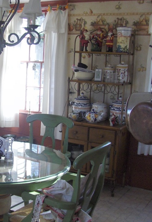
 This historic New England farmhouse kitchen posed a challenge to the homeowner when it came time for a remodel. How do you update your kitchen while keeping with the age and style of your home? You cannot simply drop a slick granite countertop into a kitchen whose bones date back to the mid-18th century.
With its layers upon layers of early architecture and more recent updates, the de-construction was bound to expose some surprises, but plans for the new kitchen proceeded. Since the homeowners are gourmet cooks, the appliances were purchased first. Form follows function in a busy kitchen where every weekend welcomes a different group of dinner guests.
The design team, which also included a local kitchen designer and the homeowner who is an artist, went through the wish list and created a floorplan that incorporated everything. The gas range took center stage followed by a bake station, double ovens and a large farmhouse sink. The round table and chairs were replaced by a sizeable peninsula with food prep station and leather-seated bar stools for guests. We chose soapstone for the countertops in keeping with the period and kept the woods and tile in natural tones with minimal contrast to make the rather small kitchen appear larger.
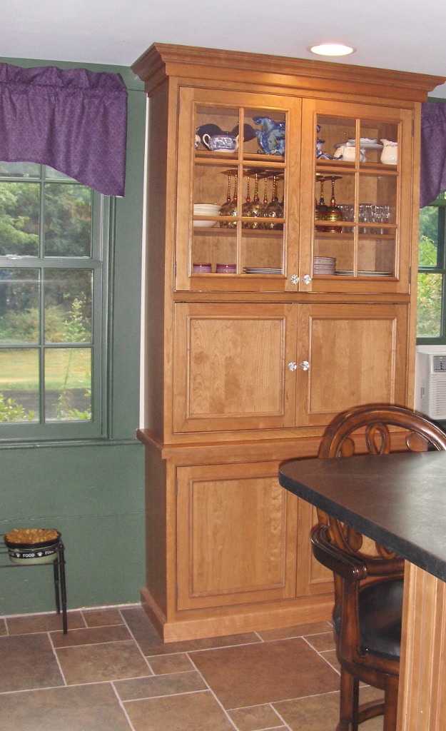
 We brought the forest green and grape accent colors in from the wallpaper in the adjoining family room to create flow between the back-to-back rooms, and we added a built-in cabinet to replace the free-standing piece that housed collections and other kitchen clutter. The clean lines of the new cabinet also helped to enlarge the space.

 The updated kitchen, even with all its bells and whistles, manages to maintain the old early American character found in the rest of the house and provide its homeowners with a much more efficient and workable space for cooking and entertaining.
Three Tips for Staging your Empty Condo
August 2, 2010 § 1 Comment
 Selling a condo is hard enough, but in a buyer’s market, it’s a challenge to distinguish yours from all the others out there, some even in the same building. And if you’ve already moved out? Oh, forget it! There’s nothing worse than a vacant unit where the fingerprints on the walls and the spots on the carpet become the selling features that buyers remember.
If you are trying to sell your condo, here are three basic tips to get you started. This is not an exhaustive list of “to-do’s” for your space but if you do nothing else, do these.
1) Play up the saleable features. This condo has a fireplace and it happens to be the focal point of the room. But without drawing the buyer’s eye to it with art and chairs, the eye wanders from window to window and aimlessly around the vacuous space. With a couple of chairs, an ottoman, a piece of art hung on the wall (with no nails), and some accessories to warm up the area, potential buyers can picture themselves sitting there reading a book and enjoying their home. And that’s what we want.
 2) Pay attention to the kitchen. The sellers were unwilling to upgrade cabinets or countertops so we picked a warm wall color that would blend the old-style cabinets and formica countertop. Doing that took the focus off the dated features highlighted by the white walls and made the kitchen look bigger — a selling bonus. The sellers had also painted a burnt orange accent wall that would not appeal to all buyers so we toned that down to a warm cognac brown that coordinated with the woven shade in the window and the wood trim on the cabinets. With a table and two chairs, the kitchen turned into a move-in ready space, despite its vintage.
 3) Define your living spaces. The only way to tell where the dining area was in this condo was the lonely light fixture hanging in the middle of the room. So we added a table and chairs and set the table with a contemporary color scheme that tied in with the art and furniture in the adjoining living room. The dining area was defined and set up for guests — again, allowing buyers to picture themselves entertaining in their new condo.

Don’t leave your condo vacant and expect it to sell unless you live in a penthouse in Manhattan. Most cookie-cutter condos need some personality injected into them to attract serious buyers, but a little paint, a few pieces of furniture, and some well-placed accessories will help you create the atmosphere you’re trying to sell.
Light and Color and Your House Paint
July 31, 2010 § 3 Comments
Sometimes color appears out of nowhere and dazzles you — even for only a few moments — like it did the day I snapped this photo in the late afternoon sun. The yellow of this barn grabbed my attention and said, “Stop where you are and look at me — I am gorgeous!” A few moments later, the barn was in shadow and the intense color was gone for another day.
When you’re choosing a house color, be sure to paint some sample colors on the house and look at them in various lights — early morning, late afternoon — and on cloudy days as well. You may see the color change. That might be a good thing or maybe not. I once watched my living room color change from tan to gray to green to pink all in the course of a 12-hour period. To a color person like myself, that experience was horrendous. I had the primer out within the week. (The color I painted my living room was taupe — the mysterious color that accepts other hues around it and changes like a chameleon. Some people actually like that — I have clients who do — but not so much for me at least on the interior.)
Color depends on light. And light or the lack of it can change your perception of the color itself. What you thought was one color in the paint store or even when you opened up the can turns out to be quite something else once it’s applied to your wall, whether it’s inside or out. Use your sampling time to see how light affects not only the color you’ve chosen but also the “value” of the color (how intense it is). If the color attracts too much attention for your taste, move more toward the gray side of that particular hue. Dull it down a touch and you’ll get it right. Color will be more intense on a large area anyway, like the side of your house. Check it out first before the painters arrive.
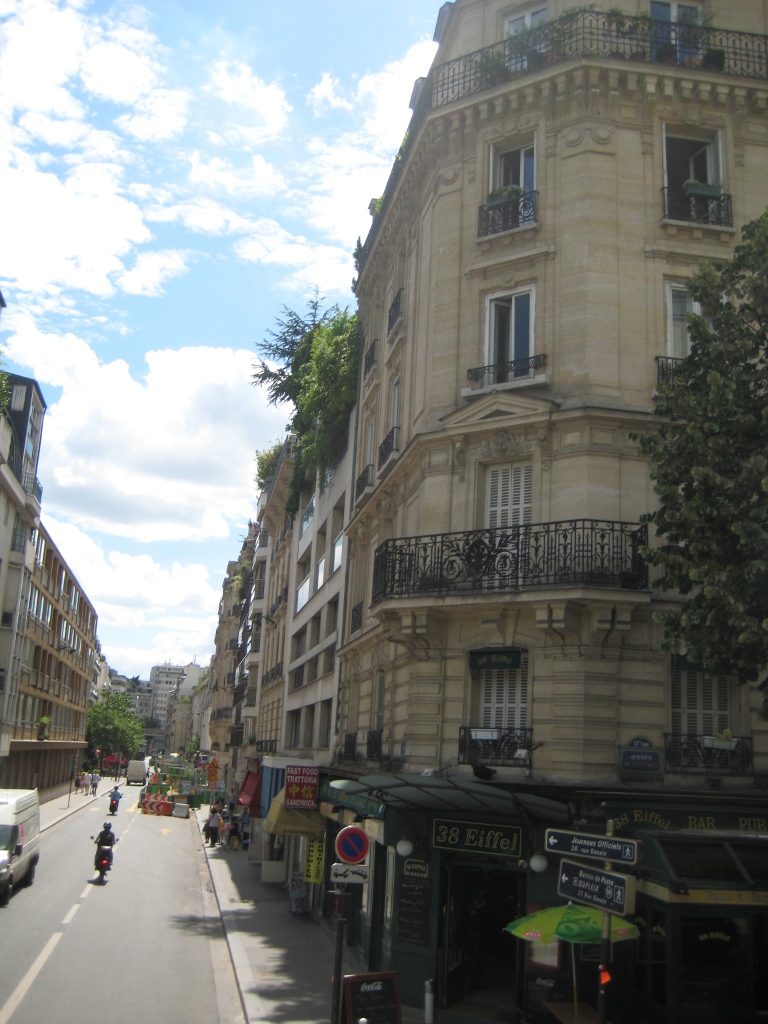
Inspirations from the Top of a Paris Bus
July 28, 2010 § 2 Comments
Cruising down the Avenue des Champs-Élysées and under the Arc de Triomphe in a double-decker bus is quite a thrill. Especially the day before Bastille Day in Paris. Tons of people everywhere (and I was glad someone else was doing the driving). Taking a bus tour was a great way to see the city especially on a short timeframe. From the grassy-roofed sports stadium to views down the River Seine, the bus gave us average American tourists a snapshot of Paris highlights without the lines.


Brick Tudor Siding, Trim, and Roof Color
July 27, 2010 § 6 Comments
 Brick is one of those design elements that people either love or hate. Well over half of the questions that come to me have to do with brick: How do we work with the brick? How do we pick a siding that goes with the brick? What about roof color and brick? Can I paint my brick? How can I possibly live with this brick?
Here is a photo of an early-last-century, Tudor-style home with the signature brick gabled entry and chimney. The brick is monochromatic (not a lot of contrast between individual bricks), and it is a very pleasant dark muted red color.
The new homeowners chose an olive green siding color which complements the brick and makes it stand out as a feature on the house. (That works great if you like the brick! I’ll address what to do if you hate your brick in another post.) The muted olive siding color balances the muted red of the brick so that the house elements are in harmony (a fancy way of saying “They just work!”). Even though the windows themselves are white, the homeowner chose cream for the trim color. Cream is much softer than white and is preferable to white on older homes or with earthy palettes. And see? You can use cream trim with white windows and not ruin the house.
As for the roof, obviously this is a new roof and the homeowners took advantage of the myriad choices available to them. The muted brown tones pick up on some of the browns in the brick and again pull a very visible element of this house — the roof — successfully into the palette.
Traditional wrought iron sconces and mailbox as well as period hardware on a solid wood door provide the perfect jewelry topped off by a real, not plastic, concrete urn on the front steps for summer flowers.
These homeowners took an old home and modernized it in a tasteful way that pays homage to the home’s original Tudor styling. The result is both fresh and historic. Perfect house synergy.
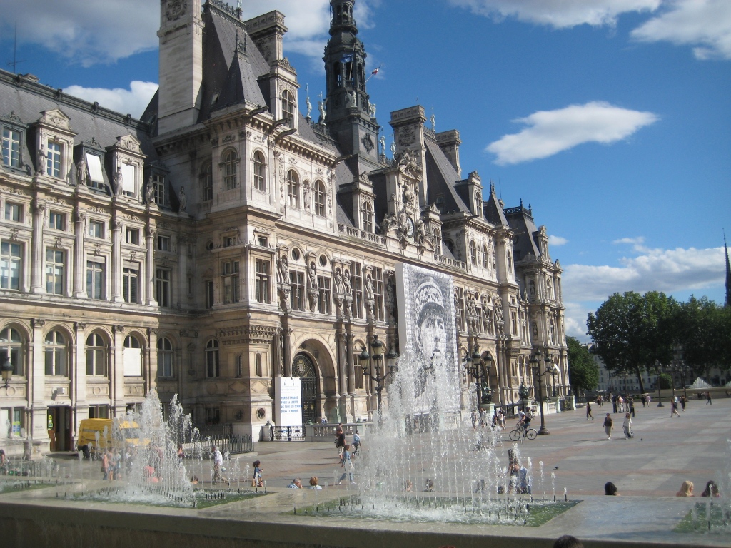
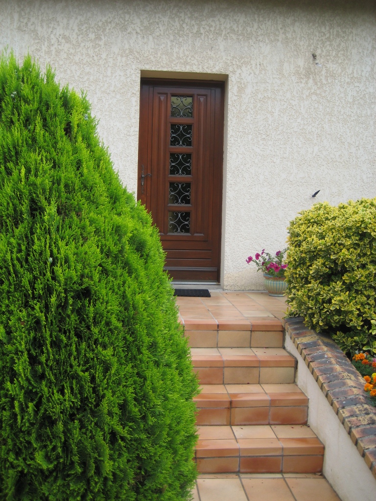
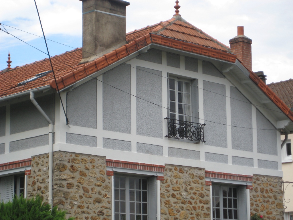
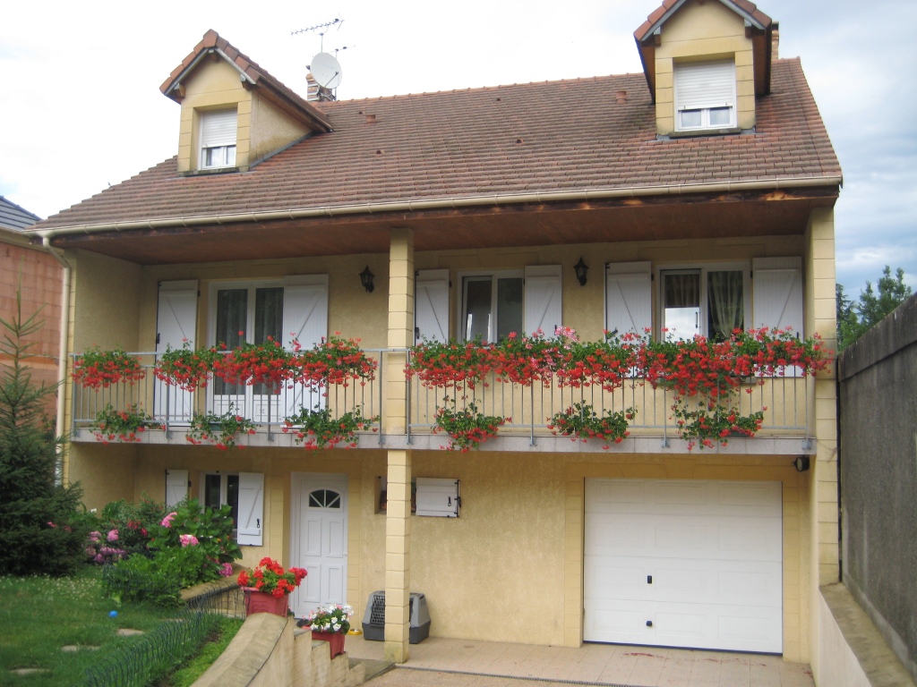
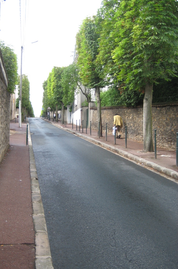
Inspirations from the French Countryside
July 26, 2010 § 1 Comment
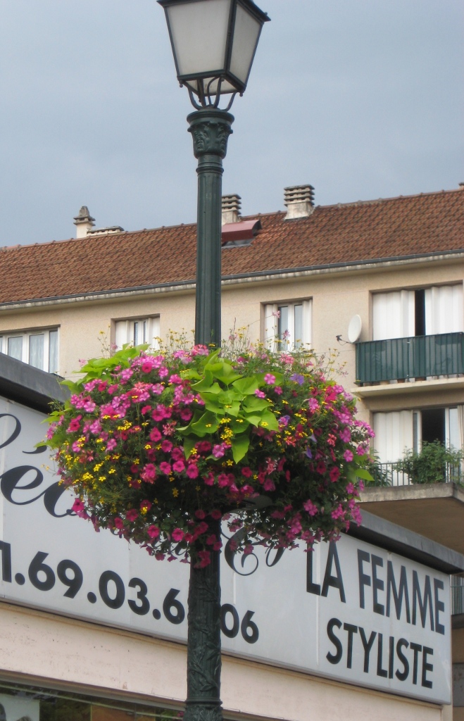
Traveling south of Paris into the French countryside really gives you a feel for how the French live. The quiet little town of Montgeron with its hilly one-way streets, gated driveways, and modest stucco and stone homes, is nestled far enough away from the city to give the town an identity of its own. Gone are the wrought iron railings and the bustling sidewalk cafes of the city. We’re in the quiet part of France where people still buy their daily breads, meats, and vegetables, but tend to live simpler lives tucked safely behind walls.
The public gardens are beautifully tended, kind of a smaller version of the Paris jardins, and the French details like the flowers on the light post are evident. Walking through the neighborhoods conjures up a lifestyle that many of us busy Americans (at least those of us just outside major cities) left all too long ago. It’s no wonder the French live so long!


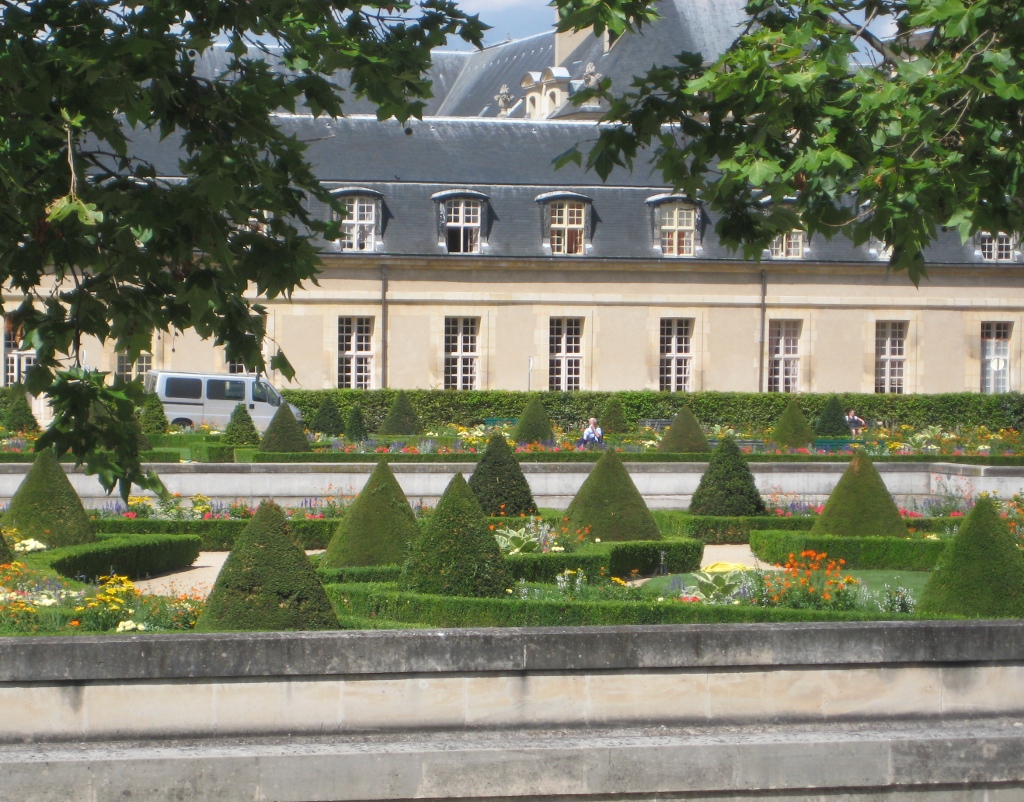
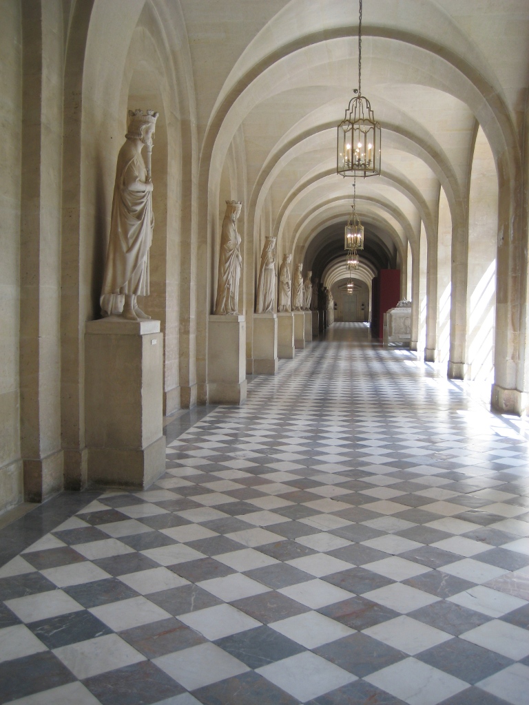
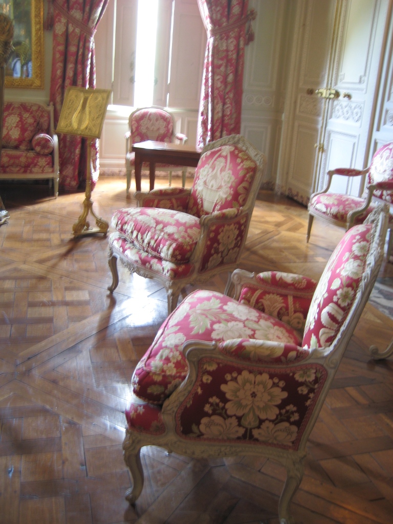
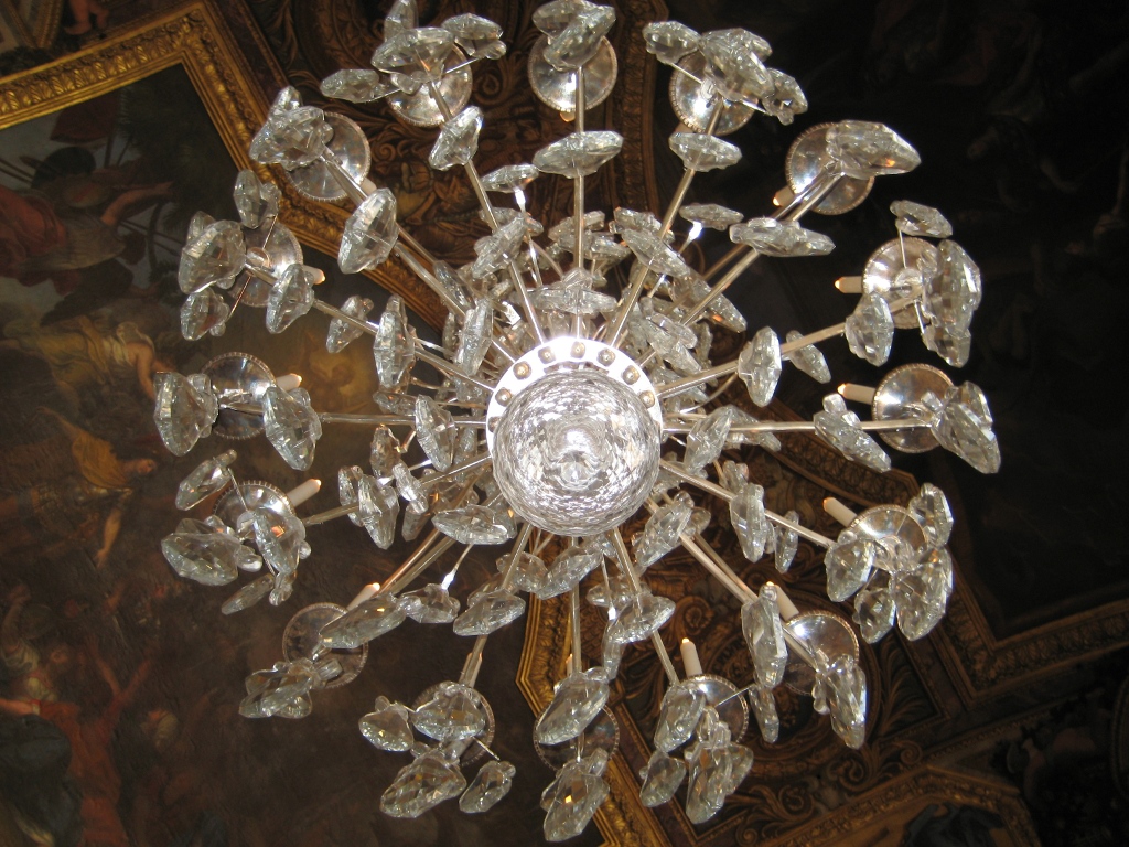
Inspirations from Versailles
July 24, 2010 § Leave a comment
Honestly, I didn’t think I would be that impressed by Versailles. To those of us who are not accustomed to living in such opulence, Versailles is, to coin a much-used phrase, over the top –the gilding, the marble, the flourishes. We all know that. But the French always seem to do things in a tasteful way. So even though everything is on a grand scale, the overall feel seems somehow appropriate for living and entertaining (18th century style).
Truly, everywhere you look, it’s a postcard, from the oddly sculpted trees in the gardens to the massive crystal chandeliers overhead to the rowboats ready for afternoon visitors. The trip to Versailles was worth it, and it was a great way to learn some French history — all about Kings Louis, Louis, and … Louis. Vive la France!


