It’s the House Color, Not Your Dining Room Curtains
February 28, 2013 § 2 Comments
 Sometimes the best house color is one you might skip right over in the fan deck. Like this one: most likely Ben Moore’s Livingston Gold HC-16, a dark mustard-like brown with a definite green undertone. The kind of color you don’t want to see if you’re feeling queazy.
Although you probably would not choose this color for an interior room (for the reasons mentioned above), what a great house color for this old farmhouse with attached garage in natural cedar shakes. The combo is terrific — earthy, aged, and plucked from nature’s rock and wood palette of colors.
I slammed on the brakes to take a photo.
What Makes a Great Master Bedroom?
February 5, 2013 § 2 Comments
Ahhhh… the master bedroom — a retreat, a haven, a place to get away from it all. Of course, in practical terms, the master bedroom often houses exercise equipment, an office space, baskets of laundry, and piles of unread newspapers. But what makes a great master bedroom? Here’s my take:
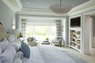
1. A large enough bed to house two people comfortably. Queen size is great because it’s usually big enough but not too big. To me, a king invites the whole family to sleep there including multiple pets. (‘nuf said)
2. A padded headboard. Not only is a padded headboard attractive, but also it’s functional. It sure beats wood when you’re reading in bed.
3. No footboard. Leaving off the footboard allows for more visual space in the room, and it makes the bed look like you can run and jump onto it. Inviting, welcoming, all those things.
4. Good lighting on both sides of the bed. I don’t always call for symmetry in design, but both parties need good lighting so two of the same kind seems fair to me.
5. Really comfy bedding with a cozy throw on top. You’ll be amazed at how handy a throw can be when you’re hanging out on the bed watching TV.
6. A “wallflower” TV. If you must have one in the master bedroom, at least put it over in a corner where it is not the focal point of the room.
7. Two comfortable chairs. If you have a TV and enough space, put at least one or preferably two comfortable chairs in front of it. That way you’re not always lying in bed watching TV. (You’ll sleep better. Trust me on that one.)
8. A wall color that pleases both parties. Something soothing that does not promote controversy. You might avoid red, bright acidic yellow, and girlie pink. Just an observation.
9. Privacy. Locks on doors, shades on windows, and anything else that will shield you from the outside world. This is your haven — a place to regroup and refresh.
10. And what NOT to have. (optimally, of course) A desk, treadmill, laundry folding station, newspaper repository, and holiday decoration storage. It should not be a graveyard of unmatched socks, moldy towels, and unsorted paperwork. How practical is that? Well? These are guidelines…
Spend some time on your master bedroom. You’ll feel better in the morning.
Kitchen Cabinet Color: Move over Back Splash
January 30, 2013 § Leave a comment
Kitchen cabinet color is in. From yellow to navy to this refreshing mint, cabinets and kitchen islands are getting a paint job. And it’s not just old cabinets that are being refreshed. New kitchen designs are showing painted cabinets in colors that were once reserved for bathrooms and laundry areas. And it’s a bold move because, unlike wall color, you are unlikely to re-do cabinet paint color anytime soon. Call it confidence or general optimism (or a craving for it) but cabinet color will be here to stay for some time.
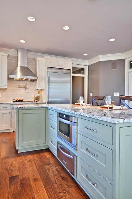
If you’re a little unsure of painting all your cabinets a particular color, try painting the back of an open cabinet or the center island first. That’s what I did. And I was hooked from that point on. (My cabinets have had two color transformations since discovering color in the kitchen.)
One suggstion for choosing a paint color for your cabinets: take a look at the colors in adjoining rooms and pick a color that will pull the public areas together. A pillow color in the adjoining family room might make a terrific cabinet color in the kitchen. You are limited only by…hmmmm… nothing really. Enjoy!
Choosing a Color Palette for Your House: It’s a Natural
January 29, 2013 § Leave a comment
 Another drive-by sighting of some curb appeal. This time, the stone wall pops out partly because of its mix of natural stones (and not just one kind) but also because the house color is drawn from the wall’s palette of natural hues. Even the front steps coordinate nicely with the wall.
Any of the wall’s creams, beiges, browns, and grays would have worked for a paint color, but the builders chose a light creamy yellow for the siding with a beige shingle on the portico. White trim pulls the house together and the black door makes the dramatic statement.
It’s so easy to choose your house color from nature. You cannot make a mistake.
Two Rules for Choosing a Roof for your House
January 28, 2013 § 2 Comments
 The roof — any roof — is a big-ticket item on the house so choosing it can be a little unsettling. There are so many colorful options available that it’s easy to get wowed by the prospect of something other than the traditional charcoal.
When choosing your roof, make sure you follow these two rules to insure a good result you can live with for, say, 40 years:
1) Get large samples of your roof options. Do not choose a roof from a photo on the computer or a little brochure. Make sure you hold the roof sample up against the side of your house to test for color coordination and to see how busy the two are when side-by-side. Stand back at the curb and take a good look. If possible, get the address of a home that has the roof already installed so you can see how the roof looks over a large area. Does it get lighter or darker? Good to know ahead of time.
2) Avoid the clash of the Maximum Definition shingles with the house. If your house is a busy colorful mixture of bricks or stones, avoid the busy “max def” roof as you will create a combination worthy of a major migraine. The photo above (from Owens Corning) is a good example of pairing a busy max def roof style (with its multiple colors) with a house siding that is neutral, painted brick and neutral siding. There is a good balance between the busy roof and the plain, calm siding materials. There’s no doubt that the roof takes center stage. Make sure it doesn’t fight with the siding “understudy.”
If you follow these two rules, you will narrow your options down to two or three reasonable choices and avoid any major, expensive roof mistakes.
Stone and Brick Reveal Your Exterior Color Palette
January 25, 2013 § Leave a comment
 Yes, it’s winter and the roof in this photo is covered with snow, but now we can focus on the rest of the house, particularly the stone. What works on this house is the color palette that is taken directly from the numerous available hues in the stonework itself.
The bricks are a monochromatic rusty red color that complements the stone without competing with it — a challenge when you have multiple materials on the house. The siding is a gray neutral, also in the stone. The trim is pulled from some of the darker taupe stones. How easy is that? Job done.
If you are building a home with different materials, use the busy one with the most colors (stone or brick) to make the rest of your color decisions. That way, the whole house will come together in a harmonious cornucopia of color.
The alternative? Choosing a color that is not in the palette at all. The result? A disjointed effect that divides the house into sections and makes it seem smaller. Can be done, but it’s tricky and needs a professional colorist to pull off. Do yourself a favor and stick with the natural palette that presents itself to you from your building materials.
The Best and Worst House Colors for Cold Snowy Winters
January 24, 2013 § 1 Comment
 As we get more and more snow this winter, I notice what house colors look good in snow and which ones look awful. I’ll start with the thumbs down. White. It either blends away completely except for any contrasting colored shutters or it looks downright dirty. It’s also cold-looking. If you have a white house and a long winter, make sure you have lots of greenery in the foundation plantings, trees in the yard, and a wreath with a big red bow on the front door.
My favorite color for long, cold, white winters is a sunny yellow. Wow, does that color look terrific against the white snow. Try Benjamin Moore’s Concord Ivory http://www.benjaminmoore.com/en-us/paint-color/concordivory. Paired with a black roof, black shutters, and white trim, you’ve got a knock-out house year round.
Color Your Home Happy
January 18, 2013 § Leave a comment
 Whether you live in a deluxe villa or a double-wide, you deserve a happy home. And the place to start is by adding color. Numerous studies have shown that color influences the way we feel and can even be used to describe our emotions (“I’m in a blue mood”).* But what may influence us the most is a lack of color.
The study found that people with depression associated their mood with the color gray. And you don’t have to paint your walls gray to have a gray aura in your home. Take a look around your house, in the corners and shadowed areas and particularly the ceiling. Do you see gray? Do you feel blah? Well then… time for color.
Start by painting your ceiling either a bright white or a tint of your wall color. That will either maximize the light reflection in the room (and bolster your mood) or make the room feel bigger and more open. Either way, you’ll feel better.
Next, if you’re timid about your color-selecting skills and afraid to make a mistake with the wall color, then start small. Add some colorful accessories to the room — pillows, artwork, other changeable items. Doing that will help you create a palette of colors you like without making a big investment or paying a painter to repaint two or three times.
When you’re ready to take the plunge and add color to your walls, try an accent wall first. Pick the wall that you see when you enter the room (the focal wall) and paint that a color you like. Add accents to the room in the same color to pull the room together. Keeping three walls neutral with pops of color on an accent wall and accessories here and there will help you step into the world of color without any Crayola catastrophes.
Note: There is nothing wrong with neutrals and whites in the home. To many people, neutral means calm. But if you are somebody who likes to wear color and you are drawn to color yet your home does not reflect that love of color, then it’s time to add color. That’s what I’m talking about.
*http://www.livescience.com/6084-colors-describe-happiness-depression.html
Furniture Arrangement Challenges May Call for Different Furniture
January 16, 2013 § Leave a comment
When it comes to furniture placement, some rooms just will not cooperate. With bay windows, bow windows, niches, dormers, and other odd architectural challenges, where on earth do you put your sofa? One solution is to forget the sofa altogether and replace it with a circular arrangement of very comfortable chairs, either all matching for a formal look or all mismatched for a casual eclectic look.
Either way, the arrangement gives you an instant, inviting seating area where you can sit down with others and have a cup of coffee or read the paper. In this photo, the designers put a round coffee table for holding popcorn, drinks, books, and just about anything else. But as you know, I’m a big fan of the big overstuffed ottoman– what I consider to be the perfect piece of versatile furniture– so that would be my choice for the center.
If you simply cannot figure out where to place your living room sofa, consider moving it to the family room or wherever the TV is. Replace the sofa/loveseat/chair concept with four comfy upholstered chairs. You’ll love the change.
Choosing Paint Colors From Room to Room
January 14, 2013 § 1 Comment
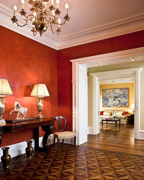 Create flow throughout your home by sharing colors between rooms. In this luscious red Venetian plaster dining room, the red is shared with the living room pillows across the hall. Just enough to draw your eye over there and pull the two spaces together.
Paint colors in nearby rooms “speak” to each other because they are adjacent on the color wheel. Red and yellow are separated by a neutral with a slight green undertone, adding a punch of contrast to the hallway.
Layering colors between rooms that you can see from one location and “cross-pollinating” the colors with pillows, accessories, and artwork will create a flow that will make your home appear bigger, less chopped-up, and more thoughtfully planned for optimal warmth.
(Interior design: Marcy Masterson)
