Everybody’s Favorite Neutral: Revere Pewter
January 4, 2013 § 2 Comments
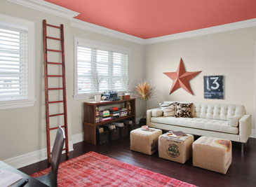
As our design aesthetic moved steadily from beige to gray over the past several years, one warm gray popped up as the perfect transitional color. Benjamin Moore’s Revere Pewter HC-172 is currently the number one all-around neutral as it is not too light, not too dark, not too yellow, not too green, not an ounce of pink, and even not too gray. Perfect with all kinds of complementary colors including this luscious Persimmon 2088-40 on the ceiling.
I like Revere Pewter in public areas like the dining room as it looks spectacular with warm golds and crystal. In the kitchen, it highlights the stainless steel appliances. In the hallway, it even makes a golden oak bannister look terrific.
As one fan describes it, the color “calms and restores, like driftwood found on the beach.” Yup. Kind of makes me want to dunk the whole house in it.

I was just about to paint my daughter’s nursery ceiling ‘Persimmon’ by Martha Stewart when I found out I was expecting my third child, our second son. My husband questioned my sanity, but seeing the above photograph, I know it would have looked great!
Congratulations! Maybe the ceiling in your daughter’s new big-girl room? I’m with you. I love color on the ceiling!