Is Your Wall Color Anxious?
March 7, 2023 § 2 Comments
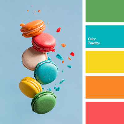
Color psychologists will tell you that colors evoke certain emotions. For example, the warm colors (red, orange, yellow) can generate happiness, stimulation, and excitement (both good and bad). And cool colors (blue, green, purple) can promote calm, relaxation and sleep. In general, we do have a psychological reaction to certain colors, and we associate them with different things. Sometimes they look tasty enough to eat.
Too much of a good thing?
When it comes to creating an end-of-the-day sanctuary for rest and recovery, we need calm, and the cool side of the color wheel is a good place to start. Blue, green, and purple are very popular bedroom colors, for all age groups, but choosing the right version from the fan deck can be tricky. What sometimes happens is that we pick a paint color from the vast display at the store only to roll the actual paint up on the wall and suddenly feel a bit agitated. Partly at not liking the color and partly at the thought of painting it over.
What happened? I thought I was picking a calm color.
Selecting a blue, green, or purple that pops out at you in the store will not necessarily give you a serene room where your toddler can take a nap. Because it’s not the color per se. It’s the saturation that is keeping the room on edge.
So even my wall color needs a therapist?
Maybe. How saturated is it?
Saturation measures how clear or true a color is. It is the strength of the color often described with words, as Leatrice Eiseman writes in her book The Complete Color Harmony, like “clarity, purity, brilliance, richness, boldness, vividness, and intensity.” You get the picture. Maybe not great for a restful bedroom. For example, royal blue is more saturated than powder blue. In a bedroom, royal blue will shout for attention. The more grayed-down the color, the less saturated it is. In a bedroom painted powder blue, you might not even notice the color.


Bedroom wall color needs to chill.
Again Eiseman describes colors with lower saturation as “subdued, diffused, misty, dusted, subtle, soft, toned-down, muted, restrained, hushed, understated, and quiet.” Perfect for a bedroom. So back to the paint store to find colors with lower saturation that will be restful on the walls of the bedroom.
Can’t I paint the room lighter?
Yes, but going lighter will not make the room calmer — just a lighter value and yes, a little easier on the eyes.
Value measures how light or dark a color is. When you add white to a color you make a tint. The hue (color) gets lighter, and the perception of the intensity changes. It may appear less intense. And that’s important when you are picking a relaxing wall color. Lighter tints are more restful to the eye. To find a tint of a color you move up the fan deck color strip toward the lighter end.


If you add black to a color, you get a shade. It’s darker and perceived as more intense than its lighter version. A dark shade of a color can be very dramatic, and that will influence your color choice. To find a shade of a particular color, you move toward the darker end of the paint color strip in the fan deck.


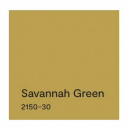
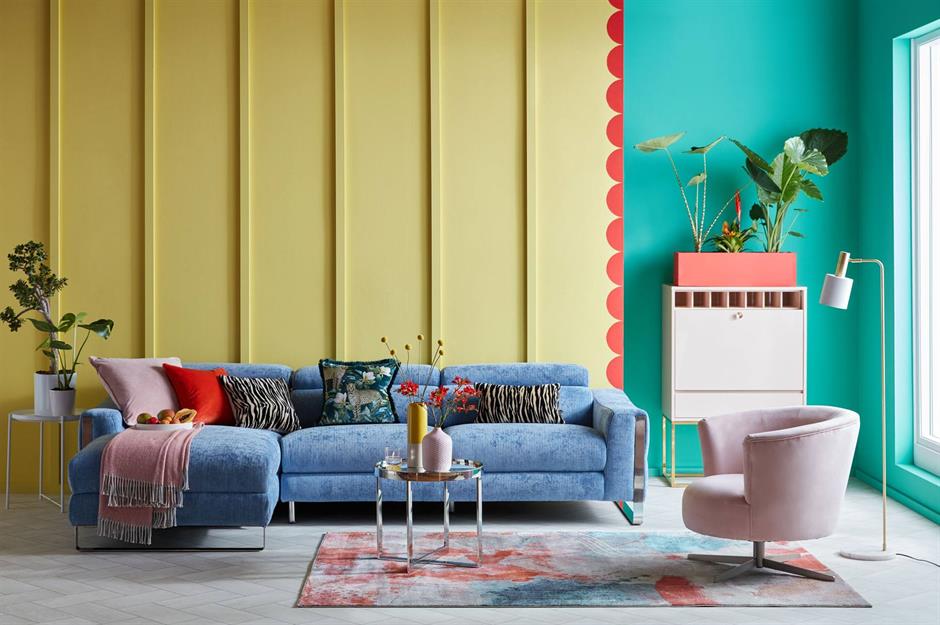
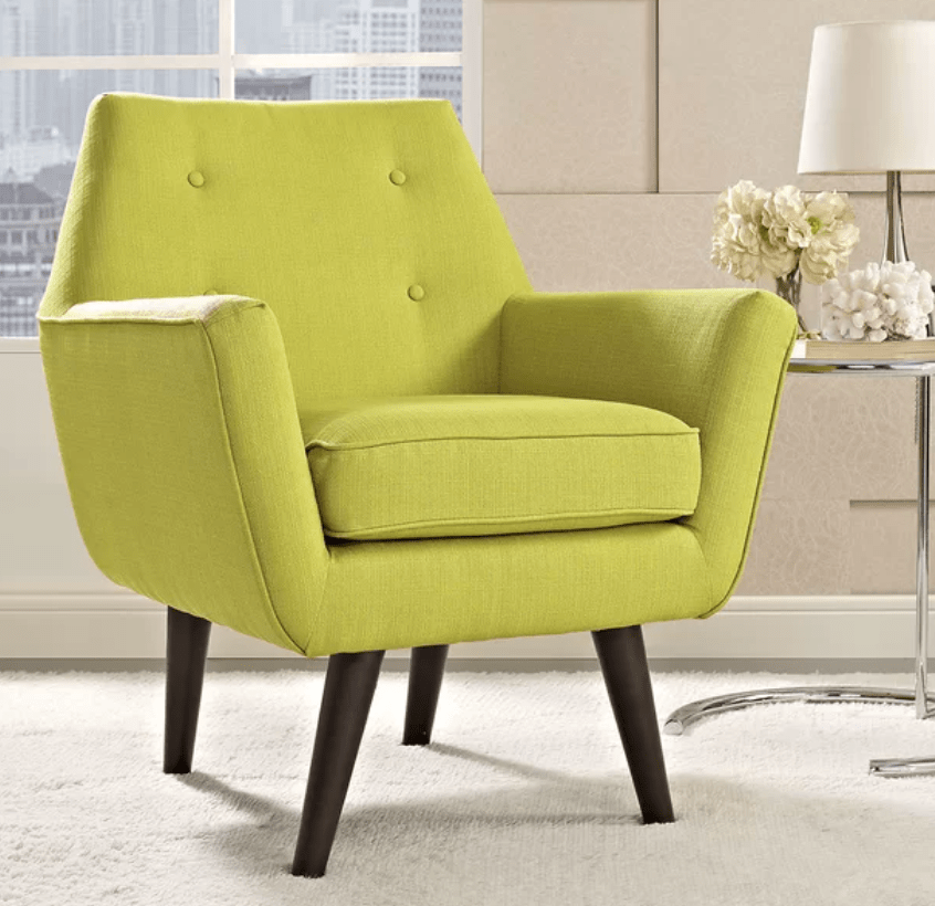
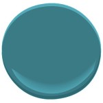
So when you’re picking a wall color for a bedroom, both the Saturation and the Value are important. If the color is too saturated, and there are other colors in the room, it can feel like the walls are vibrating. And that’s okay if you’re going for a room with lots of energy and vitality, like this one.
:max_bytes(150000):strip_icc():format(webp)/225811303_2351425294990524_4394162365566741163_n1-17bd60b7998c436d813211cbca0c5a66.jpg)
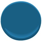
Likewise, if the color value is dark, it may feel more intense than a lighter value of the same color.
Okay, my child wants a bedroom makeover. Now what?
As a mom, I think it’s important to let children pick their own bedroom colors. But having said that… if you are concerned about having to prime over a loud or dark color in a few years when they change their mind or go off to college, you can take the hue (color) that they chose and then move a little toward the gray end of the fan deck. Muting that electric blue just a little will give the walls some longevity and allow your child to live with the color longer.
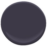
Here are some pairs of examples. The first color is a pure saturated color. The second related color is an alternative that is slightly muted (less saturated) and lighter (in value) as well. The alternative wall color will give you a calmer and perhaps a slightly more sophisticated feeling when you walk in the room. No more anxiety.


When in doubt? It’s only paint. Sleep well!
If you need help with color, feel free to comment below, hit the button for a Color Consultation, or shoot me an email at yourcolorcoach@gmail.com.
I would be happy to help you.
Hope you have a Colorful Day!
Barbara, Your Home & Color Coach
Where Color Trends Dare You to Go
February 12, 2023 § Leave a comment
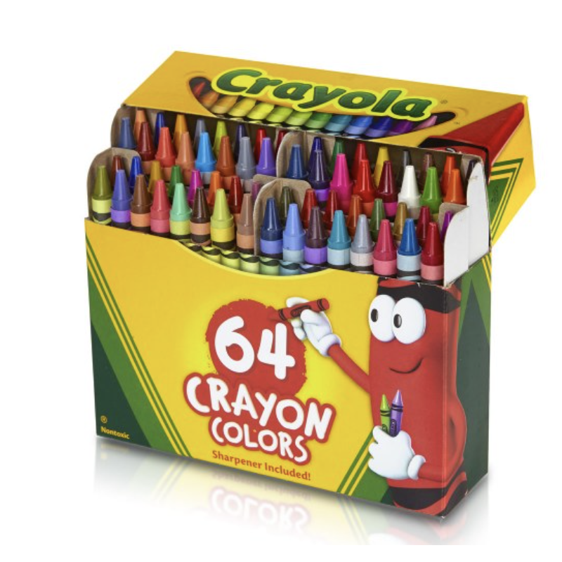
Were you the kind of kid who rearranged your crayon box? Maybe lining up all the cool blue-greens with the cobalt blues? Then putting the grass-greens and sunny yellows together? Or did you make a rainbow or go from light to dark? Just curious.
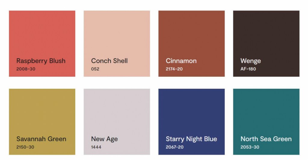
If you like a color organizing challenge, here’s one — the Color Trend Palette for 2023 from Benjamin Moore.
Okay let’s unpack this crayon box
Benjamin Moore calls this paint color grouping a “palette.” Personally, I think of a palette as a combination of hues and hue values that coordinate together and tell a story or express a mood. Something that signifies a color direction or coming design trend. But I looked it up anyway.
Googled “color palette”
“A color palette refers to the actual colors that you’ve chosen, based on your color scheme. A color scheme is based on color theory, like a monochromatic scheme. ” Diana Hathaway Timmons
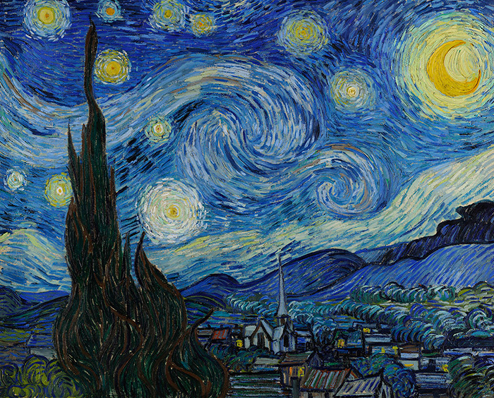
So if you decide to paint your living room blue and you have all different shades of blue (navy blue sofa, light blue chair), then you have chosen a monochromatic color scheme for your living room. The actual color palette might include the paint color Starry Night Blue, but it would not include all those other paint hues because your color scheme is monochromatic — just one color.
Painting on canvas versus decorating a room
If you paint on canvas, not walls, your palette may look like this!

Artists can mix paint colors and create art. But decorating a room is different from painting a picture. Colors in a room are not blended — they are placed next to each other, in front of each other, and over, behind, and on top of each other. And depending on the light in the room, one color can influence the color next to it. And sometimes, they just don’t work (see discussion of clean and dirty colors in What Color Trends Don’t Tell You).
Back to the Color Trend Palette for 2023
In case there is some confusion, the hues in the Benjamin Moore Color Trend Palette for 2023 (above) were not chosen because they all go together. The paint company is not expressing a particular mood or design style we can expect to see or even create in our own homes in 2023.
They have simply compiled eight separate hues (ideas, if you will) that their designers have determined, from global trends and design tea leaves at home, will hit the paint stores and home goods stores this year.
But to soothe my Kindergarten color-arranging sensibilities, I will rearrange their paint color palette anyway.
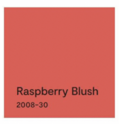
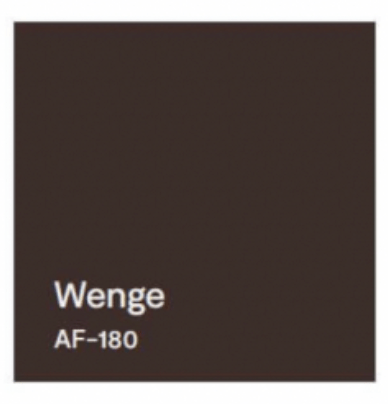
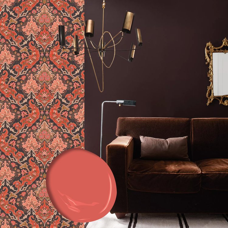
First up? Raspberry Blush
The first color, Raspberry Blush, is the Benjamin Moore Color of the Year for 2023. What a lovely stand-alone color for a dining room wall or an accent wall behind a white fireplace.

It can be paired with Wenge from this Color Palette.

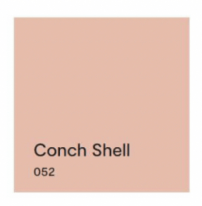
Next up? Conch Shell.
If you saw the previous post, we talked about clean and dirty colors. Conch Shell is clearly a “dirty” color that does not pair well with any “clean” colors. So in this palette, other than pairing with a neutral, I would line it up with New Age, and that’s it. These two “dirty” hues look great together. And Conch Shell would be a pleasant hue to add to the palette of a gray paint color scheme in your home if you’re trying to add some warmth for 2023.


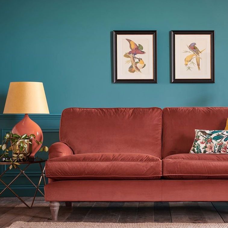
Next up? Cinnamon.
Cinnamon is a rich warm color that conjures up a timeless Southwest palette so it is fitting to pair it with a teal like North Sea Green that reminds us of turquoise.


Flash Back and Flash Ahead
Lastly, I would flash back to the blue & green decades from the past to pair the last two sultry hues. And I’m not talking about the ’70s. Art Deco (from the 1920s and early ’30s) with its rich jewel tones and luscious velvet textures is on trend at the moment, and these two colors will fit right in.


But if you dare to go there…
If you are not afraid of color and have an eye for modern, eclectic, live-what-you-love design, then throw out all those color-matchy-matchy Crayola crayon pairings and toss the whole batch of 2023’s trending paint colors into the room.
Because when it comes to loving YOUR home, there simply are no rules.
If you need help with color, do not hesitate to comment below, hit the button for a quick color consult, or shoot me an email. I would be happy to help you.
Hope you have a Colorful Day!
-Barbara, Your Home & Color Coach
What Color Trends Don’t Tell You
February 10, 2023 § Leave a comment

It’s that time of year when people toss out the old and refresh their place with something that will breathe some Spring into the Winter blahs. Some people pore over seed catalogues for inspiration. Others turn to paint companies for the hot new color trends. So off we go to scour the internet for how the color experts see us living in this year’s creative new palettes.
All the major trend-makers and influencers weigh in. Everywhere, it seems, you see the new colors pop up in linens and bath towels, art and accessories, and furniture. Experts offer an array of options for incorporating new color ideas into your home.
And THAT’s where we hit the design wall.
For example:
Sherwin Williams chose the paint color Redend Point for their 2023 Color of the Year.
They show beautiful rooms with the color applied in all kinds of spaces. And they even give you trim colors and other hues that will complement Redend Point.
But what each of these trend-setters tells you is how to use the new color in a complete room makeover. Unless you have a room that is essentially a blank slate, like this one,

you end up trying to incorporate this color into your existing space. I am here to tell you when incorporating this dusty paint color will work and actually more importantly, when it will not.
First a note about colors and mixing. Quite simply, there are two kinds of colors: Clean and Dirty. Clean colors can be described as clear and identifiable as a particular hue. Right out of the crayon box, you might say. Dirty colors can be described as muted, mixed with other hues to make the color appear grayed down and kind of dirty next to its clean sibling.
 “CLEAN” “CLEAN”Benjamin Moore’s Shades of Green 537 |  “DIRTY” “DIRTY”Benjamin Moore’s Mesquite 501 |
And Redend Point, with all due respect, is a dirty color.

It goes great with neutrals like off-whites and grays, and other muted “dirty” colors like worn terra cotta, dusty grape, and cool rustic wood brown.


But wait a minute!
Butted up against clean colors, though, Redend Point looks worse than dirty — it doesn’t belong, whether it’s the wall color or a pillow on the sofa. So let’s look at what does NOT work with this color.
Your existing room decor matters.
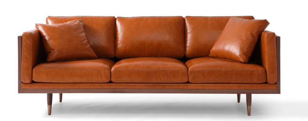
If you bought a new cognac leather sofa when it was all the rage, then that orangey brown leather will make your newly painted Redend Point walls look dirty. So nope.

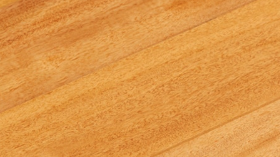
Your hardwood floor matters.
If your existing hardwood floors have yellowed over the years, then do not consider Redend Point for your room. (Tip though: if everything else in the room works, then a large rug will definitely help.)
Clean color matters.
Yellows, vibrant blues, and other clean colors are coming back too (I’ll talk about them later), but they do not go with Redend Point, please! Again, that paint color (or pillow or side chair or rug) is going to look old, faded, and ready to toss next to any clean, clear colors and especially yellow. No to these!


Questions? Just ask.
If you have questions about color, do not hesitate to leave a comment, click on the link for a quick color consult, or shoot me an email. And thanks for the chat.
Hope you have a Colorful Day!
-Barbara, Your Home & Color Coach
SW Color of the Year 2017
September 2, 2016 § 4 Comments
 OKay then! If you hang around long enough…(as they say…)
Taupe is back. The color we’ve spent the last decade ridding our houses of is now Sherwin Williams’ Color of the Year for 2017. Poised Taupe is the color — SW 6039 — and you have to love the description:
“Earthen brown combines with conservative grey and the result is a weathered, woodsy and complex neutral that celebrates the imperfections and authenticity of a well-lived life.” — Anytime somebody celebrates imperfections, I’m in!
But here’s what you should know about taupe. It can change radically with the light and the time of day. What looks a little brown can turn pink, purple, or green depending not only on the time of day but also on the lightbulb. Just so you know. Taupe can have a pink undertone as well that clashes horribly with the orange of a red oak hardwood floor. Another caution. But paired with white like its fan deck sibling Gauzy White SW 6035, a silver metal (not gold or brass), hardwood with a gray undertone, and fabrics in other light neutrals with a pink undertone like Cultured Pearl SW 6028, and you truly have a soft, restful combination that harkens back to those glorious. taupe-filled 50s. That’s 1950s!


Personally, I’m going to ride this one out, but I can appreciate how we’re moving from the grays into the taupes (without the yellow undertone of a previous color swing). Like I tell my clients, just because it’s the Color of the Year does not mean it’s perfect for your house. If you are considering taupe, make sure you have a lot of natural light coming in the window and (hopefully) some modern furnishings, shiny metals and glass. Try to avoid pairing with cherry wood. If you have concerns, talk to me!
Meanwhile, let’s get painting.
Luscious Paint Colors: Warm Brown
April 5, 2016 § Leave a comment
 What is more welcoming in a home than rich warm color when you open the door. There are no rules that say your walls have to be a shade of white.
If you would like to add rich color like this Warm Apple Crisp (Benjamin Moore 1091) to your home, here are some guidelines:
- Make sure you have adequate light to show off the true hue. Natural light is best with big open windows that allow the depth of the color to show without making the room into a cave.
- Contrast the walls with white — trim work, furniture, accessories — so that the wall color “pops.”
- Pick an accent color from the opposite side of the color wheel to add interest. Since brown is a darker version of orange, blue is its opposite on the color wheel. There is something so fresh about that combination. Insert your accent color with art and accessories like the big, light blue egg on the shelf.
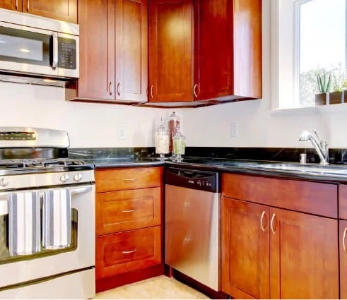
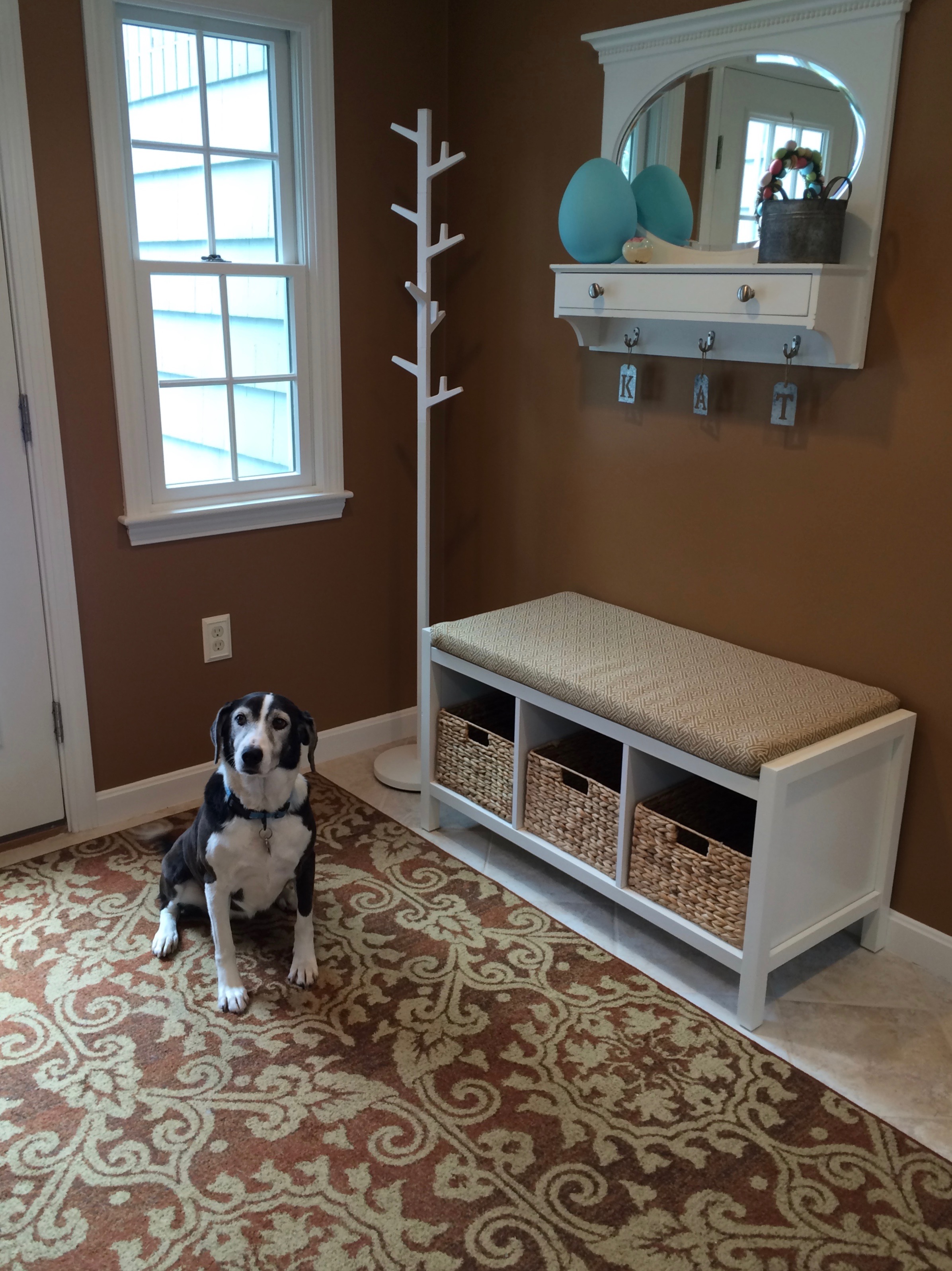
- When choosing colors for one room, consider adjoining rooms. Colors should flow from room to room so this warm brown wall color in the entryway was plucked from the adjoining kitchen cabinetry
 thereby connecting the two rooms and making the house feel bigger and more pulled together.
 - Add cute dog for cozy family feel.
Brown is a wonderful color for making a large space feel more intimate or a small space feel warmer, and it is a great way to bring out the depth of color in the woods in your room. Try it!
Green Decorating: The Soothing Hue
March 17, 2016 § Leave a comment
St. Patrick’s Day brings us to thoughts of green. Whether it’s kelly green or any of the variations thereof, green is a versatile, natural hue that brings life and comfort to any room. It is particularly nice in rooms where you spend time revitalizing your mind and body.


Waking up in a green room warms a cold, white, snowy day and cools a hot, humid summer morning. It can bring the color of lush plants and trees to a city skyline view. And it can calm an agitated, overextended lifestyle at the end of another hectic day.


Green can be either warm (yellow-green) or cool (blue-green), and both pair beautifully with white. Coordinating accent colors can add energy (the complementary reds and pinks, opposites to green on the color wheel) or quiet blending (the analogous yellows and blues on either side of green on the color wheel).
I highly recommend adding green, even a mixture of greens, to your home to quiet and soothe your soul. Wherever you need a few moments of ahhhhhhh.
Paint colors above: Top left to right: Waterscape SW 6470, Topiary Tint SW 6449, Honeydew SW 6428, Breaktime SW 6463. Bottom left to right: BM Guilford Green HC-116, Palisades Park BM 439, High Park BM 467, Dartsmouth Green BM 691.
From Color Inspirations to Paint
February 4, 2016 § Leave a comment
Walking into a pottery shop is like immersing yourself in a box of crayons, all pristine and unbroken with endless possibilities of combinations.
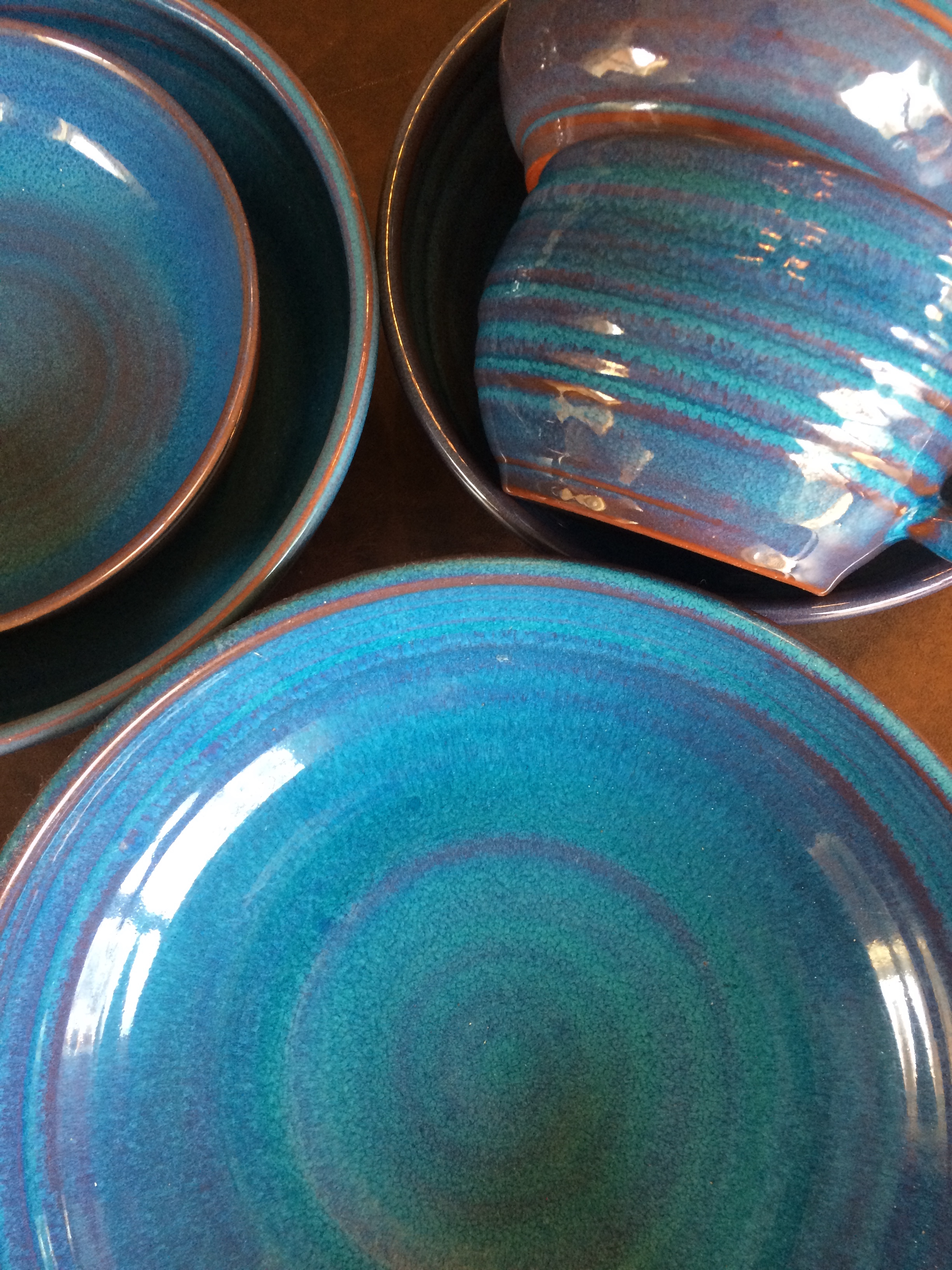 This set of dazzling bowls caught my eye. Mesmerizing is how I’d describe them with an array of blues from turquoise to cornflower. (The dishes are mine now.)
Whatever the inspiration, there is a paint project waiting. In my mind’s eye driving home, I see these dishes in a dining room painted any one of the colors with crisp white trim. Maybe even a shiny white bead board around the wainscoting to bring out the hues in the room. I can also see any one of these colors on the walls in a kitchen with white cabinets and a white subway tile backsplash. Or maybe one of these colors for the backsplash! (Head is spinning with ideas.)
Accent walls give us a way to add a small amount of color drama to the focal area of a room without painting everything. Especially nice in open-floor-plan spaces where walls may incorporate several rooms. How about one of these rich hues for your front door? Spring painting is right around the corner. (Ben Moore’s Calypso Blue, Bermuda Blue, and Deep Mulberry)
Let the color in front of you and surrounding you inspire you. Wrap yourself up in it. Do something for yourself and create a happy house. It’s just paint!
It’s Time for Faux to Gaux
June 22, 2015 § 2 Comments
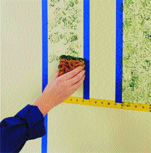 Drop the sponges, folks. Honestly, without trying to offend anyone or stomp on creativity, I have never seen such awful faux finishes in my life! It’s high time we roll over those ugly paint jobs and simplify our visual lives a bit. And if you plan to sell your house anytime soon, please listen up.
Faux is out. It was hard to perfect from the beginning but as of now, it has been totally overdone. From walls to kitchen cabinets to dressers and dining room ceilings, enough!
What’s in? Paint. Just plain paint. And in some applications, wallpaper. But not too much! No need to match the curtains to the wallpaper to the bed linens. As one who tends to find a  good thing and overdo it, I can certainly sympathize. But the next time you have the urge to spend hours dabbing wet sponges on the wall or cabinet door, take a deep breath and stop.
Choosing House Colors in a Colorful World
November 10, 2014 § 1 Comment
 “Anyone who claims to be an expert on color is a liar,” assert Joann and Arielle Eckstut in their book The Secret Language of Color. I (hesitantly, of course) agree. Asking someone to pick a color for you is like asking a stranger to describe your personality, your favorite sweater when you were five, and your family tree. But hey, with a series of clues, we color “experts” do it all the time.
The colors you end up with for your home, your clothes, your car and everything else should be a reflection of you. But how we make those choices is dependent upon our associations between colors and objects or feelings (yellow can conjure up sunshine and happiness or anger and agitation), our culture (Americans tend to prefer blue, Asians red) and even our ability to distinguish certain colors at all (some red/green color-blind individuals see only a gray scale).
When choosing a house color, there are even more considerations: neighborhood, age of house, natural environment, and frankly whether or not you want your house to blend in or stand out. For the most part, we tend to use colors in the palette of nature: beiges, taupes, grays, greens, and occasionally reds, yellows and blues. Nature colors can blend a house into the tree-lined landscape in the backyard or the row of stone walls in the cul-de-sac. Red can echo the autumn colors lining the street or the late afternoon sunset. Yellow can fit just as well in a quaint New England town as it does along the coast of Malibu. And blue in all its various shades looks fabulous on a house between the dunes at the beach.
But what if you want your house to stand out in a world full of color? Don’t overlook white. It can be warmed up or cooled down with the seasons and it will never go out of style. Splashing in a no-color “color” like white into a palette (whether it’s your neighborhood or the front garden) not only makes the surrounding hues more vivid but also serves as a beacon of relief in a multi-colored landscape. When choosing a floral display that I knew would be surrounded by other beautiful, multi-hued arrangements, I chose white. And sure enough, what showed up the most? White. (What color is the bride? White.) You get the picture…
Be your own color expert. Choose what you like. Fit in. Stand out. Or ask one of us to help.
In a Teen’s Bedroom, It’s Just Paint
February 24, 2014 § 2 Comments
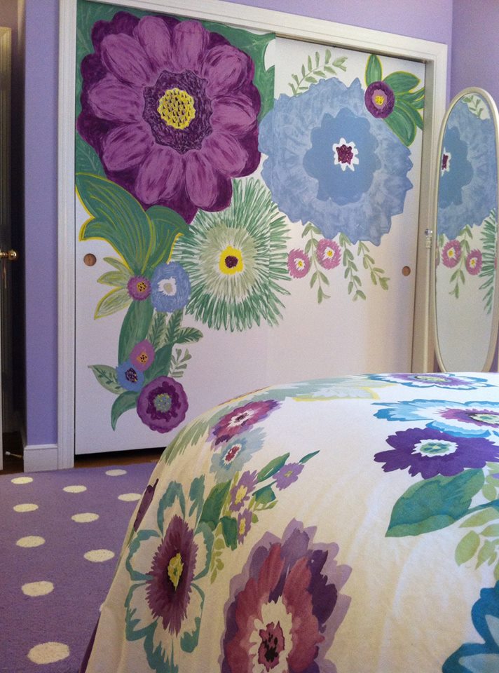 Letting your child express herself in her bedroom is a wonderful way to uncork inner creativity. You may bristle at the color scheme and opt to keep the door closed most of the time, but allowing your child to have a room of his or her own design is so important to creative development.
In this room, the young client chose a Pottery Barn Teen bed cover as her inspiration piece. After we selected a new wall color together (a soft purple — and a departure from the previous bubblegum pink), we brought in white accessories and a purple polka dot rug.
I mentioned that sometimes it’s fun to get a little crazy with the closet doors in the bedroom because they present a blank white canvas just begging for color. So guess what … hey, it’s just paint!
