Make You Happy — Consignment Love
January 18, 2016 § Leave a comment
A home stager’s life can be unsettling. Furniture comes and goes, from storage unit to my own living room and then off to somebody’s vacant home and then back again two months later. My husband jokes that he has to turn the light on before he enters a room or he might trip over an ottoman that wasn’t there a few minutes ago.
And as a stager, I often un-decorate a home to make it more appealing (or at least not unappealing) to a wide swath of potential buyers. Family photos? Gone. Floral drapes? Too busy. Oriental rugs? Too taste-specific. So life is full of light neutral walls, white window panels, generic art, plain slipcovers, and sisal rugs. Everything looks good at the end in a Pottery Barn kind of way, but I am growing tired of meh.
Enter my favorite consignment store. And inspiration.
Finally I am going to buy something other than white plates and Parson’s chairs. And for me. These French blue dishes with gently scalloped edges and little raised dots around the rim are totally taste-specific. Mine.  And the chairs with their cane backs, girly curves, and cream leather seats are too old-fashioned for today’s young buyers. They would spray-paint them white! Not me.
I have found love, and these items will stay in my home. I can come home every night and expect to see them there, not in somebody’s 1800s farmhouse kitchen with a For Sale sign in the front yard.
My point to all this? Surround yourself with what makes YOU happy. Don’t let your job take over your home. Have a sacred space that’s your own. Hang onto things that mean something to you and make you feel good. All that! And more this New Year.
House Colors with Personality
November 20, 2014 § Leave a comment
Nothing shy about this pretty pink house. And instead of tempering it with neutral (black or gray for the shutters and door), the homeowners went Victorian bold with a rich blue like Ben Moore’s Blue Macaw 784.

When you have an old house, it’s fun to use old historic color schemes that make a statement. This one certainly does with its two-toned mustard/olive combo clarified with white trim and a traditional brick red door (Ben Moore Cottage Red).


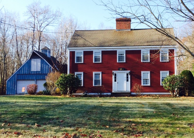
I always love a tastefully done red-white-and-blue scheme, shown here with a blue garage attached to the red house. White (Ben Moore’s Brilliant White) as both trim and accent color pulls the look together.

This dark brown house is a classic New England Cape. Its simplicity is what captures the eye. No accent color needed on this traditional solid wood door with black hinges.

Make a statement in your neighborhood. Tastefully, of course.
Painting Over Tradition But Maintaining the Soul
August 26, 2013 § Leave a comment
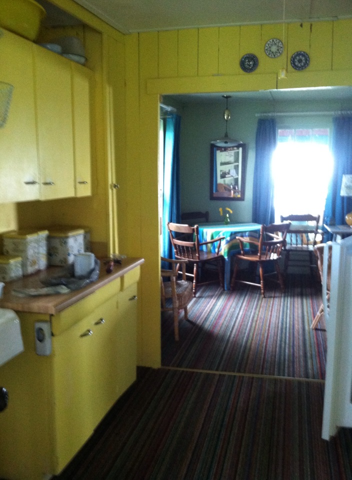 Make no mistake. This is my mother’s kitchen. She painted it this bright yellow probably 60 years ago, and up until this past summer, it stayed that way.
With my mother’s passing and the rebirth of the cottage as a rental property, I decided to tone down the walls in the kitchen a bit. I considered sea foam greens, light ocean blues, and beach sand beiges, but I ended up with a light peachy cream-yellow (Windham Cream HC-6, Ben Moore) as it kept the cheerful sunny aura of the space but took some of the harshness away.
I brought the blue in with the window treatment, kept all the old furnishings like the metal paper towel dispenser and bottle opener, and the yellow tub that we all took baths in as kids. I think Mother would be pleased. And that’s important to me.

Tired Brick Fireplace Takes Cover
January 9, 2013 § 4 Comments
 Sometimes the “bones” of an old house fall under the category of “What were they thinking?” You could say that about this brick fireplace with its random placement of dark bricks and the outdated brass enclosure. But not to worry. Your family room is not doomed to the styles of 1972 — you have options. One of the best ones is to paint the brick as shown in the after photo (from Southern Living Magazine’s Makeovers).
The homeowners covered the offensive brick with a flat, textured paint in the green wall color. They painted the hearth in a natural stone color. Then they added two bookshelves for a built-in look and painted them the same green. The new fireplace insert in a bronze color blends nicely. A narrower mantel and corbels painted cream pop off the green — art finishes the focal point.
The overall result is a fireplace wall with emphasis on everything but the original dated fireplace. When faced with old brick or other outdated hardscape in your home, consider painting it for an almost instant update without the expense of covering it or replacing it. This makeover was a huge success. No more ugly brick.
Everybody’s Favorite Neutral: Revere Pewter
January 4, 2013 § 2 Comments
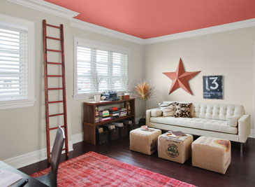
As our design aesthetic moved steadily from beige to gray over the past several years, one warm gray popped up as the perfect transitional color. Benjamin Moore’s Revere Pewter HC-172 is currently the number one all-around neutral as it is not too light, not too dark, not too yellow, not too green, not an ounce of pink, and even not too gray. Perfect with all kinds of complementary colors including this luscious Persimmon 2088-40 on the ceiling.
I like Revere Pewter in public areas like the dining room as it looks spectacular with warm golds and crystal. In the kitchen, it highlights the stainless steel appliances. In the hallway, it even makes a golden oak bannister look terrific.
As one fan describes it, the color “calms and restores, like driftwood found on the beach.” Yup. Kind of makes me want to dunk the whole house in it.
Hop the Trend: Consignment Stores
December 29, 2012 § Leave a comment
Okay, I admit it. I am a consignment store junkie. And with good reason. Not only is it “green” to furnish your home with items that have been around awhile, it’s amazing what you can find for a fraction of the retail price for a new item. And the consignment bug has started to spread to my clients. During one project, we were looking for a settee of a specific length to fit in a tight spot. Tricky to find new anyway unless we went custom. My client decided to check out the local consignment store, and he found the perfect piece. Even the legs and wood color were perfect. Call it luck or call it karma.

The Cannery Exchange in Newport Beach, CA. (photo credit: Jody Tiongco)
I am convinced that these vintage pieces have a soul — they certainly have a history visible by the lovely worn patina on the arms or the scratches on the tabletop. But every scratch has a story attached to it, and that story comes with the piece to its new home.
You can always paint and recover a chair, for example, if you want a painted furniture look. Again, you’re probably starting with a chair that’s far better constructed than what you can find now so you’re already ahead. It’s like finding a piece of gently worn designer clothing or better yet a piece with the tags still hanging on it. Bonus!
Give your home some character by adding a piece or two of consignment furniture. But beware. You might catch the consignment bug too.
What Color Should I Paint My Ceiling?
November 29, 2012 § 266 Comments
The ceiling is the fifth wall and many decorators and designers feel that keeping the ceiling white is like “throwing a sheet over the room” (Christopher Lowell said that years ago). But there are a few conditions to consider before painting the ceiling anything other than white:
1) Is your ceiling heavily textured? In many old houses, the ceiling is patterned (and God forbid, “popcorned”) and therefore very difficult to paint well. Also, painting it anything other than white will call attention to it and maybe that’s not what you want. One solution is to have your ceilings replastered to match your walls and painted, but if that’s out of the question, I would stick with white.
2) Is your ceiling a smooth plaster? If so, you should definitely paint it. How lucky you are! See below for what color.
2A) Is your ceiling really high? If so, you can paint it virtually any color that goes with the rest of the room. If you’d like to bring the ceiling down visually, consider a color darker than your wall color or a warm color (both will advance and appear to bring the ceiling down to a level that’s more in scale with your room). Also consider adding crown moulding if it’s not already there. The moulding will also bring the ceiling down by calling your eye’s attention to it. And it really finishes the room.
|
|
|


2B) Is your ceiling low or average height? Consider painting it a tint of the wall color. If your walls are a medium blue, then your ceiling would be the very lightest blue on the color swatch or even lighter (white with a dash of blue). This will help to round out the room and make the ceiling part of the overall decor — not just that white sheet over the top.
3) Does your room have enough light? Bright white ceilings do help bounce light back into the room so if your room is already dark, pay special attention to the ceiling color. White can be used effectively, but light tints on the ceiling will also reflect light. Just avoid a ceiling color that is going to absorb all the light and leave the room dark.
4) Are you painting a guest bath? I like to paint the wall color right up over the ceiling in a guest bathroom. Doing that makes the room feel larger by blending the walls and ceiling together and avoiding sharp lines and corners. Or do something kind of exotic on the ceiling, like the Moroccan tent (see photo above).
5) Are you painting a bedroom? In what other room do we lie around and stare at the ceiling? Why not paint it something interesting. In a bedroom, the sky’s the limit (literally) — from puffy blue clouds on a backdrop of sky blue to a quilt of squares in different colors (Candice Olson did a fabulous multi-colored geometric ceiling in a master bedroom). And in kids’ rooms, the ceiling is just one more space to use your creativity.
Hope this helps the “Do I paint the ceiling?” dilemma.
Ceiling Drama
January 17, 2012 § 2 Comments
 If your room has a high ceiling or an interesting shape or slope, paint it for maximum drama! This restaurant has creamy woodwork (molding, columns, and wainscoting) everywhere except the ceiling and the stairwell walls. There, the paint color is a soft gray-blue. The effect is summery, warm, cottagey, and welcoming especially with the dark hardwood floors and accents.
Lighting is bronze, industrial on the ceiling and sconces for warmth along the wood walls. Mirrors double the width of the long and narrow space.
The food? (oh yah, that was excellent too!)

Bring Your Summer Vacation Home: How to Achieve the Cottage Style
August 18, 2008 § Leave a comment
If you own a cottage or rent one somewhere, you know what the cottage style is all about: old painted furniture, vintage fabrics, mixes of woods and different styles of furniture. It’s all about care-free and comfortable living because that’s what vacations are for.

To bring that feeling and more importantly the lifestyle home with you, all you need is a relaxed attitude about your furnishings. Instead of upholstered furniture that warrants surveillance when your children and their friends are around (say nothing of the pets), just invest in some washable custom slipcovers. White is actually best since you can always bleach out the jelly stains if necessary. Cover the expensive sofa and chairs and just feel your blood pressure lowering. You’re relaxing already. And who says wicker is just for porches. A good coat of spray paint will freshen up even the most weather-beaten wicker and make it presentable for your living room.
If you haven’t inherited a cellar full of old furniture that would be perfect for your new relaxed cottage look, then let the furniture hunt begin. Plan what you need, of course, to avoid coming home with impulse purchases, but start the search for the perfect old coffee table, end table, console, buffet, china hutch, whatever you need to create your cottage lifestyle. Visit consignment stores, yard sales, thrift shops, and flea markets. The point is: If you like the piece and it fits, then buy it. If it fits and you don’t like the look, buy it anyway and paint it.
Cottages are typically dumping grounds for old furniture that’s replaced in the permanent home. And to make the furniture look better, it’s often painted. Time and wear rough up the edges on these cottage relics, but you can recreate the look with paint and some sandpaper. You don’t want things to match. Furniture and other items are acquired over time, sometimes decades, so if the piece has a function, it works.
The best part about the cottage style is how comfortable your guests will be when they visit you. No pretense. No uncomfortable questions about where to sit. Your home will feel warm and inviting to everyone.
