Escape from the Blues
January 4, 2018 § Leave a comment

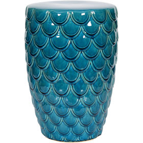
Horseshoe Bay, Bermuda
This is a perfect January day in New England. We are completely snowed in, and nothing is more relaxing than hunkering down in a cozy house as the wind howls outside and the snow banks pile up around us. I love winter!
But that doesn’t mean I like the wintery gray, the limited daylight, and the bitter cold that comes with it. The longer winter goes, the more I yearn for an escape to somewhere warm — even if it’s only in my imagination.
Enter the Sherwin Williams Color of the Year for 2018.

It is an opulent teal that conjures up the ocean and all the warmth of summer at the beach. If a midwinter break in Bermuda is not on your calendar, there are other ways to escape the winter cold — visually. Here are some:
Plan Your Spring Projects. It’s never too early to think about Spring projects, and painting your front door is a doable one. Remember to tie the color in with other accessories and furniture around the yard.

Paint the Fifth Wall. Don’t overlook the ceiling when you’re adding color. Since cool colors recede visually, painting the ceiling a medium teal blue will raise it — like rolling a Utah sky onto your porch.

Splash Color Under Foot. Now I’m making it too easy. Add a gorgeous rug and transform your space instantly. There’s something about the combination of blues and greens that soothes and comforts us all. And a rug adds not just color but texture.

Dive into the Pool. Ceramics, art, dishes, pillows, collectibles, throws, lamps… the options for accessories are endless. Be sure when you add a color to your room that you put it in at least three locations to move the eye around the room and create flow.
Enjoy your staycation! With some daydreaming, a little shopping, and a tad bit of rearranging there at home, you can lift your spirits toward Spring and feel warm and cozy at the same time.
Thanks for stopping by!
Spring Into Unexpected Color
January 22, 2014 § Leave a comment
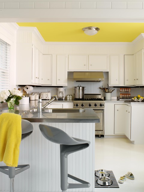
Designers are adding pops of color to the previous year’s light neutral color palette and in the most unexpected places. Look up for an opportunity to add color to your white kitchen. Pull some of that ceiling color down into the room with dishes, placemats, and other accessories. And create “flow” between rooms by adding a touch of your ceiling color to the adjoining room.
Color trends like this year’s fuschia are fun when you can add the color with inexpensive pillows or a single upholstered chair (http://www.worldmarket.com/product/fuchsia-nina-chair.do). Keeping the base of the room neutral lets you change your color palette when fresh new opportunities arise. Or with the seasons.
Color Your Home Happy
January 18, 2013 § Leave a comment
 Whether you live in a deluxe villa or a double-wide, you deserve a happy home. And the place to start is by adding color. Numerous studies have shown that color influences the way we feel and can even be used to describe our emotions (“I’m in a blue mood”).* But what may influence us the most is a lack of color.
The study found that people with depression associated their mood with the color gray. And you don’t have to paint your walls gray to have a gray aura in your home. Take a look around your house, in the corners and shadowed areas and particularly the ceiling. Do you see gray? Do you feel blah? Well then… time for color.
Start by painting your ceiling either a bright white or a tint of your wall color. That will either maximize the light reflection in the room (and bolster your mood) or make the room feel bigger and more open. Either way, you’ll feel better.
Next, if you’re timid about your color-selecting skills and afraid to make a mistake with the wall color, then start small. Add some colorful accessories to the room — pillows, artwork, other changeable items. Doing that will help you create a palette of colors you like without making a big investment or paying a painter to repaint two or three times.
When you’re ready to take the plunge and add color to your walls, try an accent wall first. Pick the wall that you see when you enter the room (the focal wall) and paint that a color you like. Add accents to the room in the same color to pull the room together. Keeping three walls neutral with pops of color on an accent wall and accessories here and there will help you step into the world of color without any Crayola catastrophes.
Note: There is nothing wrong with neutrals and whites in the home. To many people, neutral means calm. But if you are somebody who likes to wear color and you are drawn to color yet your home does not reflect that love of color, then it’s time to add color. That’s what I’m talking about.
*http://www.livescience.com/6084-colors-describe-happiness-depression.html
Everybody’s Favorite Neutral: Revere Pewter
January 4, 2013 § 2 Comments
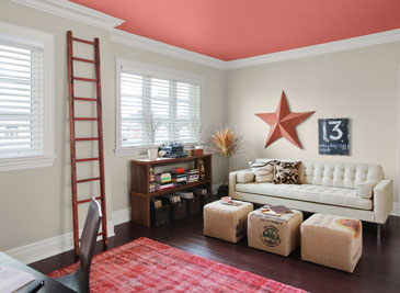
As our design aesthetic moved steadily from beige to gray over the past several years, one warm gray popped up as the perfect transitional color. Benjamin Moore’s Revere Pewter HC-172 is currently the number one all-around neutral as it is not too light, not too dark, not too yellow, not too green, not an ounce of pink, and even not too gray. Perfect with all kinds of complementary colors including this luscious Persimmon 2088-40 on the ceiling.
I like Revere Pewter in public areas like the dining room as it looks spectacular with warm golds and crystal. In the kitchen, it highlights the stainless steel appliances. In the hallway, it even makes a golden oak bannister look terrific.
As one fan describes it, the color “calms and restores, like driftwood found on the beach.” Yup. Kind of makes me want to dunk the whole house in it.
Return of the Gilded Age, Well Not Exactly
January 3, 2013 § 1 Comment

We have Downton Abbey, Princess Kate, and the popularity of all things English to thank for the resurgence of gold in interior design right now. At least that’s my opinion… And what a welcome sight it is.
After too many years degilding homes of anything that even hinted of gold, brass or yellow, the hue of royalty has returned.
The new interpretation, however, is decidedly fresh as we see in this living room from Traditional Home magazine. The wall color is so subtle that it accentuates even the creamy tan stripe on the window panel and the moldings on the ceiling. The gold demilune table and classic gold-framed art above it pop. As does the Chinese porcelain, as if pulled directly from the painting. Even the floor color is perfect, establishing a solid grounding upon which to layer all those beautiful blues and wheat tones.
The look is not your grandmother’s living room, with all due respect to your grandmother. Gold is nolonger shunned from updated decor.
Welcome back, gold.
Interior designer: Joseph Minton, with Paula Lowes and Michelle M. Wade
What Color Should I Paint My Ceiling?
November 29, 2012 § 266 Comments
The ceiling is the fifth wall and many decorators and designers feel that keeping the ceiling white is like “throwing a sheet over the room” (Christopher Lowell said that years ago). But there are a few conditions to consider before painting the ceiling anything other than white:
1) Is your ceiling heavily textured? In many old houses, the ceiling is patterned (and God forbid, “popcorned”) and therefore very difficult to paint well. Also, painting it anything other than white will call attention to it and maybe that’s not what you want. One solution is to have your ceilings replastered to match your walls and painted, but if that’s out of the question, I would stick with white.
2) Is your ceiling a smooth plaster? If so, you should definitely paint it. How lucky you are! See below for what color.
2A) Is your ceiling really high? If so, you can paint it virtually any color that goes with the rest of the room. If you’d like to bring the ceiling down visually, consider a color darker than your wall color or a warm color (both will advance and appear to bring the ceiling down to a level that’s more in scale with your room). Also consider adding crown moulding if it’s not already there. The moulding will also bring the ceiling down by calling your eye’s attention to it. And it really finishes the room.
|
|
|


2B) Is your ceiling low or average height? Consider painting it a tint of the wall color. If your walls are a medium blue, then your ceiling would be the very lightest blue on the color swatch or even lighter (white with a dash of blue). This will help to round out the room and make the ceiling part of the overall decor — not just that white sheet over the top.
3) Does your room have enough light? Bright white ceilings do help bounce light back into the room so if your room is already dark, pay special attention to the ceiling color. White can be used effectively, but light tints on the ceiling will also reflect light. Just avoid a ceiling color that is going to absorb all the light and leave the room dark.
4) Are you painting a guest bath? I like to paint the wall color right up over the ceiling in a guest bathroom. Doing that makes the room feel larger by blending the walls and ceiling together and avoiding sharp lines and corners. Or do something kind of exotic on the ceiling, like the Moroccan tent (see photo above).
5) Are you painting a bedroom? In what other room do we lie around and stare at the ceiling? Why not paint it something interesting. In a bedroom, the sky’s the limit (literally) — from puffy blue clouds on a backdrop of sky blue to a quilt of squares in different colors (Candice Olson did a fabulous multi-colored geometric ceiling in a master bedroom). And in kids’ rooms, the ceiling is just one more space to use your creativity.
Hope this helps the “Do I paint the ceiling?” dilemma.
Ceiling Drama
January 17, 2012 § 2 Comments
 If your room has a high ceiling or an interesting shape or slope, paint it for maximum drama! This restaurant has creamy woodwork (molding, columns, and wainscoting) everywhere except the ceiling and the stairwell walls. There, the paint color is a soft gray-blue. The effect is summery, warm, cottagey, and welcoming especially with the dark hardwood floors and accents.
Lighting is bronze, industrial on the ceiling and sconces for warmth along the wood walls. Mirrors double the width of the long and narrow space.
The food? (oh yah, that was excellent too!)

