Add Color Here but Please Not There
February 23, 2023 § Leave a comment
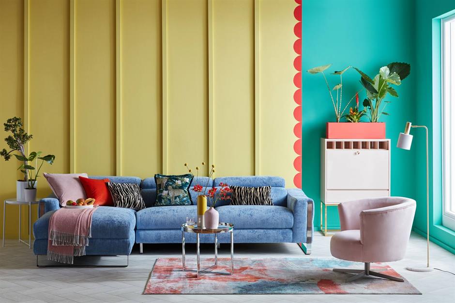
Color is back in season as we watch the light neutrals fade off into the distance. Here are 5 areas of your home where you can add color with a paint roller or a brush. But scroll to the bottom for a gasp of OMGosh please do not do this!
ADD COLOR TO STAIRS
I am a huge fan of painting the stairs — pretty much anything but white. The ombre effect on the stair risers creates a fresh relaxed look and is a great way to bring in an accent color. Or you can paint the whole stairway. The stained wood treads look spectacular popping off the dark gray woodwork.


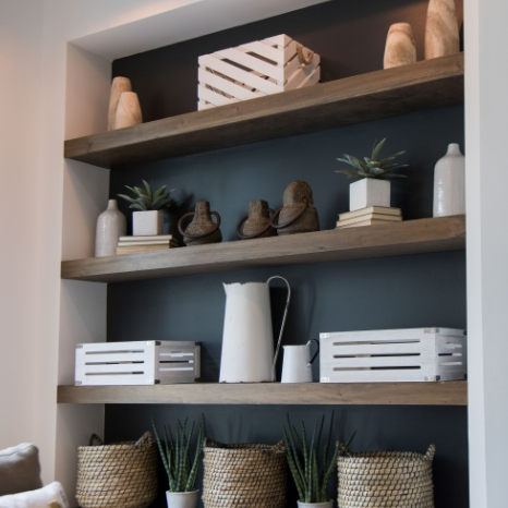
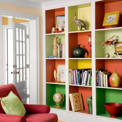
ADD COLOR TO SHELVING
This color application has been around awhile, but I am still a fan! Painting the back of your display shelving is such an eye-catcher. And it can highlight your collections. What an opportunity to add color — and so easy! Or you can paint the whole inside of each display cube a different color for a playful focal wall.
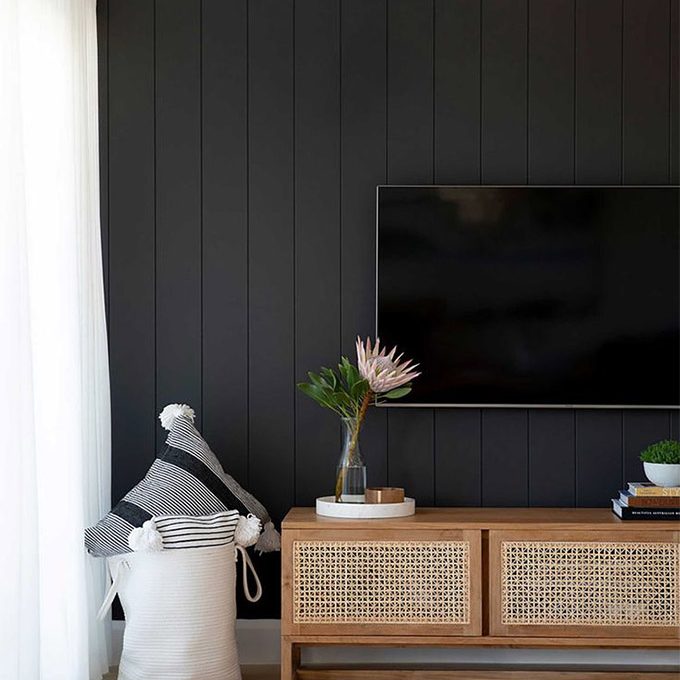
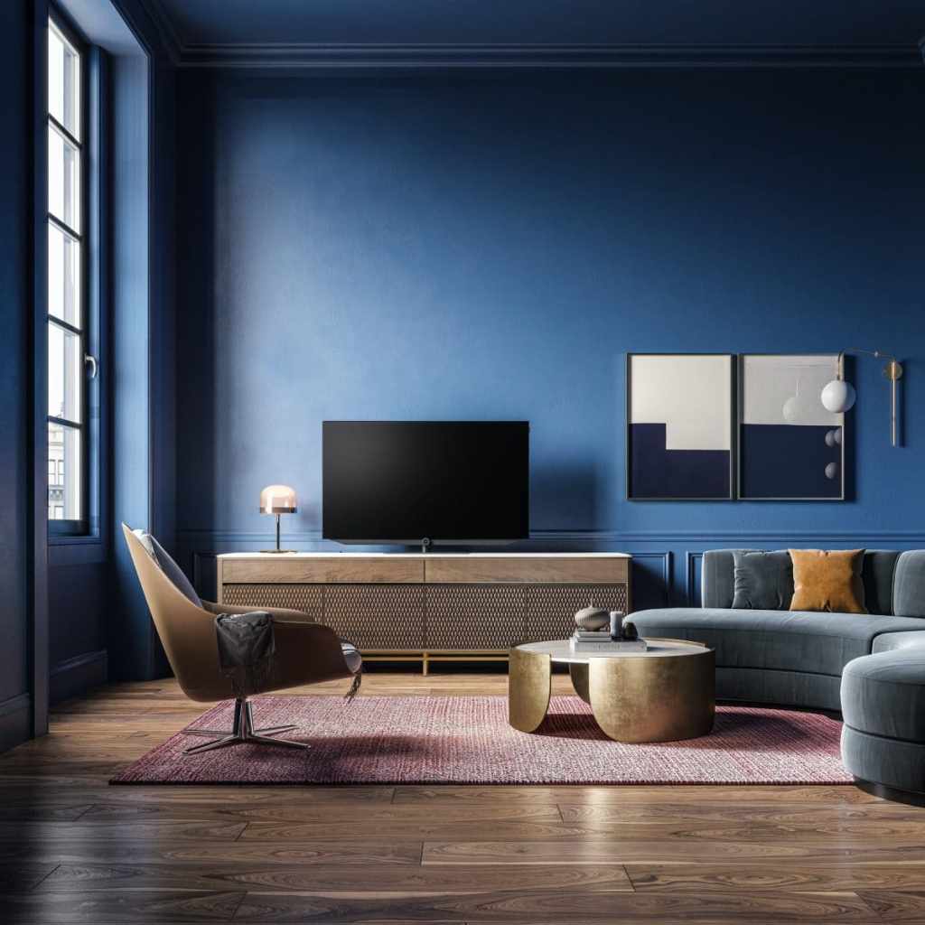
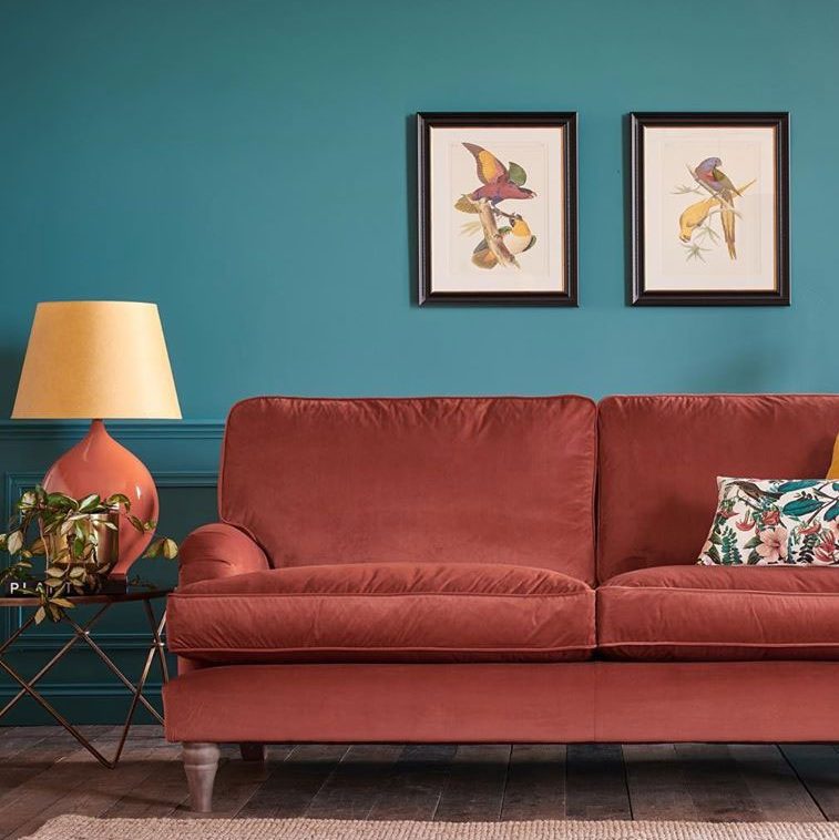
ADD COLOR BEHIND THE TV
It doesn’t have to be black, but camouflaging the TV is a great idea. Any dark color will help. Or if you rather like a large touch of black, make the TV wall a colorful focal point.

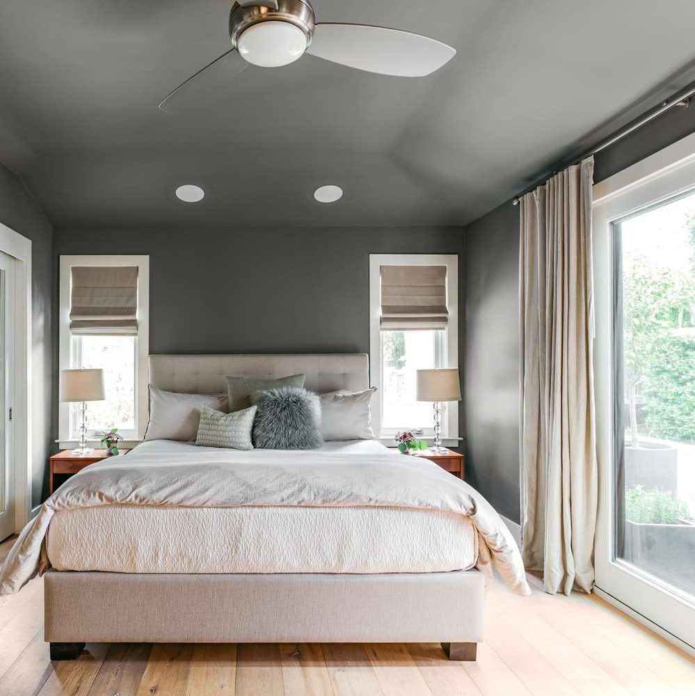
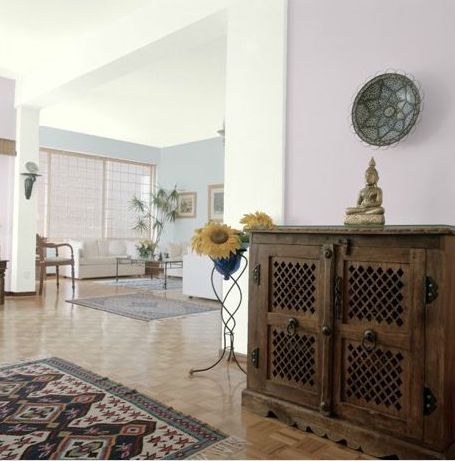
ADD COLOR TO THE CEILING
Whether you want to paint just the ceiling and molding around it as an accent or go up over the ceiling with the wall color to enlarge the room, painting the ceiling will add drama. But white in the room offers a fresh contrast and keeps the room from feeling like a cave.

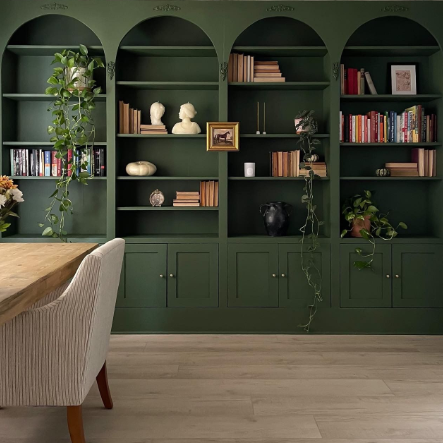
ADD COLOR TO A WALL OF BOOKSHELVES
Your painter will love you (oh, that’s you?) if you decide to paint the entire wall of bookshelves the same accent color. For one thing, the sheen on the paint will stay the same. And there is no cutting-in or taping-off required. In a light-filled room or a library, this color application will set the mood for sure.

WARNING! DON’T DO IT!
OMGosh… please do not try this last one at home UNLESS you are a designer, your ceilings are high already, and you have enormous windows. Yes, it’s dramatic, cool, and trending to paint walls, trim, and ceiling all one dark, dramatic color. And yes it’s quicker and easier when it’s all the same. But here’s what happens:
- You lose all architectural detail (moldings, fireplace, wainscoting — if you don’t have any, you might not care).
- You lose all contrast that helps you see color (because say it with me, “white makes colors pop”).
- You add reliance on light — either from windows or lamps — to see anything in the room.
- You risk the wall/ceiling color influencing the colors of everything else in the room.
- You risk making your furniture look drab.
- You risk triggering your seasonal depression on a daily basis.
- And the elephant in the room: If you want to sell your home anytime soon, dark-and-moody just doesn’t sell. It will cost a fortune in primer to paint over all that surface area.

But as they say in the biz… it’s just paint!
If you need help with color, feel free to comment below, hit the button for a Color Consultation, or shoot me an email at yourcolorcoach@gmail.com.
I would be happy to help you.
Hope you have a Colorful Day!
Barbara, Your Home & Color Coach
Where Color Trends Dare You to Go
February 12, 2023 § Leave a comment
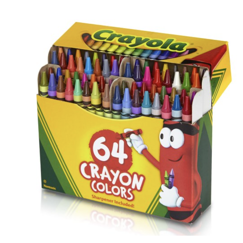
Were you the kind of kid who rearranged your crayon box? Maybe lining up all the cool blue-greens with the cobalt blues? Then putting the grass-greens and sunny yellows together? Or did you make a rainbow or go from light to dark? Just curious.
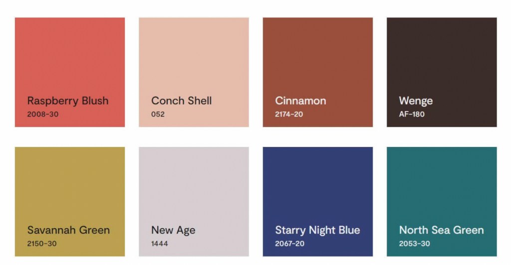
If you like a color organizing challenge, here’s one — the Color Trend Palette for 2023 from Benjamin Moore.
Okay let’s unpack this crayon box
Benjamin Moore calls this paint color grouping a “palette.” Personally, I think of a palette as a combination of hues and hue values that coordinate together and tell a story or express a mood. Something that signifies a color direction or coming design trend. But I looked it up anyway.
Googled “color palette”
“A color palette refers to the actual colors that you’ve chosen, based on your color scheme. A color scheme is based on color theory, like a monochromatic scheme. ” Diana Hathaway Timmons
So if you decide to paint your living room blue and you have all different shades of blue (navy blue sofa, light blue chair), then you have chosen a monochromatic color scheme for your living room. The actual color palette might include the paint color Starry Night Blue, but it would not include all those other paint hues because your color scheme is monochromatic — just one color.
Painting on canvas versus decorating a room
If you paint on canvas, not walls, your palette may look like this!

Artists can mix paint colors and create art. But decorating a room is different from painting a picture. Colors in a room are not blended — they are placed next to each other, in front of each other, and over, behind, and on top of each other. And depending on the light in the room, one color can influence the color next to it. And sometimes, they just don’t work (see discussion of clean and dirty colors in What Color Trends Don’t Tell You).
Back to the Color Trend Palette for 2023
In case there is some confusion, the hues in the Benjamin Moore Color Trend Palette for 2023 (above) were not chosen because they all go together. The paint company is not expressing a particular mood or design style we can expect to see or even create in our own homes in 2023.
They have simply compiled eight separate hues (ideas, if you will) that their designers have determined, from global trends and design tea leaves at home, will hit the paint stores and home goods stores this year.
But to soothe my Kindergarten color-arranging sensibilities, I will rearrange their paint color palette anyway.
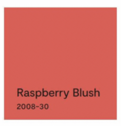
First up? Raspberry Blush
The first color, Raspberry Blush, is the Benjamin Moore Color of the Year for 2023. What a lovely stand-alone color for a dining room wall or an accent wall behind a white fireplace.

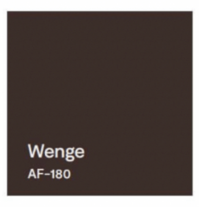
It can be paired with Wenge from this Color Palette.

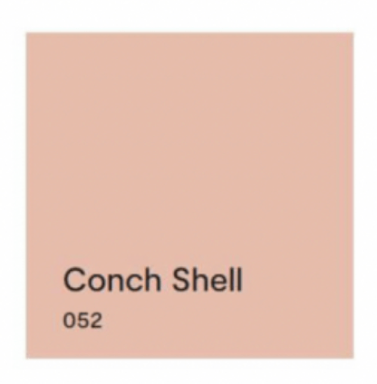
Next up? Conch Shell.
If you saw the previous post, we talked about clean and dirty colors. Conch Shell is clearly a “dirty” color that does not pair well with any “clean” colors. So in this palette, other than pairing with a neutral, I would line it up with New Age, and that’s it. These two “dirty” hues look great together. And Conch Shell would be a pleasant hue to add to the palette of a gray paint color scheme in your home if you’re trying to add some warmth for 2023.


Next up? Cinnamon.
Cinnamon is a rich warm color that conjures up a timeless Southwest palette so it is fitting to pair it with a teal like North Sea Green that reminds us of turquoise.


Flash Back and Flash Ahead
Lastly, I would flash back to the blue & green decades from the past to pair the last two sultry hues. And I’m not talking about the ’70s. Art Deco (from the 1920s and early ’30s) with its rich jewel tones and luscious velvet textures is on trend at the moment, and these two colors will fit right in.


But if you dare to go there…
If you are not afraid of color and have an eye for modern, eclectic, live-what-you-love design, then throw out all those color-matchy-matchy Crayola crayon pairings and toss the whole batch of 2023’s trending paint colors into the room.
Because when it comes to loving YOUR home, there simply are no rules.
If you need help with color, do not hesitate to comment below, hit the button for a quick color consult, or shoot me an email. I would be happy to help you.
Hope you have a Colorful Day!
-Barbara, Your Home & Color Coach
What Color Trends Don’t Tell You
February 10, 2023 § Leave a comment

It’s that time of year when people toss out the old and refresh their place with something that will breathe some Spring into the Winter blahs. Some people pore over seed catalogues for inspiration. Others turn to paint companies for the hot new color trends. So off we go to scour the internet for how the color experts see us living in this year’s creative new palettes.
All the major trend-makers and influencers weigh in. Everywhere, it seems, you see the new colors pop up in linens and bath towels, art and accessories, and furniture. Experts offer an array of options for incorporating new color ideas into your home.
And THAT’s where we hit the design wall.
For example:
Sherwin Williams chose the paint color Redend Point for their 2023 Color of the Year.
They show beautiful rooms with the color applied in all kinds of spaces. And they even give you trim colors and other hues that will complement Redend Point.
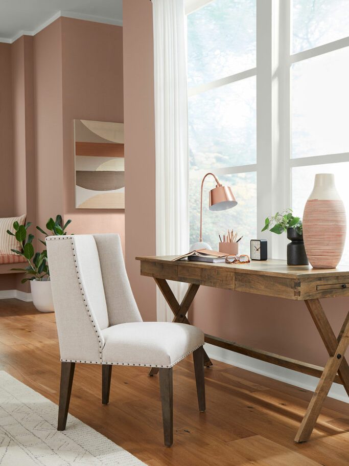
But what each of these trend-setters tells you is how to use the new color in a complete room makeover. Unless you have a room that is essentially a blank slate, like this one,

you end up trying to incorporate this color into your existing space. I am here to tell you when incorporating this dusty paint color will work and actually more importantly, when it will not.
First a note about colors and mixing. Quite simply, there are two kinds of colors: Clean and Dirty. Clean colors can be described as clear and identifiable as a particular hue. Right out of the crayon box, you might say. Dirty colors can be described as muted, mixed with other hues to make the color appear grayed down and kind of dirty next to its clean sibling.
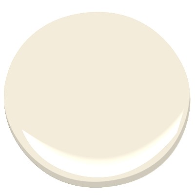
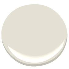
 “CLEAN” “CLEAN”Benjamin Moore’s Shades of Green 537 |  “DIRTY” “DIRTY”Benjamin Moore’s Mesquite 501 |
And Redend Point, with all due respect, is a dirty color.

It goes great with neutrals like off-whites and grays, and other muted “dirty” colors like worn terra cotta, dusty grape, and cool rustic wood brown.


But wait a minute!
Butted up against clean colors, though, Redend Point looks worse than dirty — it doesn’t belong, whether it’s the wall color or a pillow on the sofa. So let’s look at what does NOT work with this color.
Your existing room decor matters.
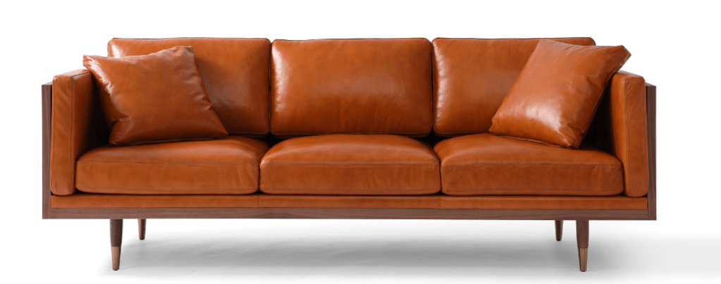
If you bought a new cognac leather sofa when it was all the rage, then that orangey brown leather will make your newly painted Redend Point walls look dirty. So nope.

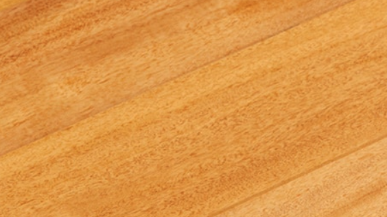
Your hardwood floor matters.
If your existing hardwood floors have yellowed over the years, then do not consider Redend Point for your room. (Tip though: if everything else in the room works, then a large rug will definitely help.)
Clean color matters.
Yellows, vibrant blues, and other clean colors are coming back too (I’ll talk about them later), but they do not go with Redend Point, please! Again, that paint color (or pillow or side chair or rug) is going to look old, faded, and ready to toss next to any clean, clear colors and especially yellow. No to these!


Questions? Just ask.
If you have questions about color, do not hesitate to leave a comment, click on the link for a quick color consult, or shoot me an email. And thanks for the chat.
Hope you have a Colorful Day!
-Barbara, Your Home & Color Coach
Peach Makes a Splashy Comeback
January 16, 2018 § Leave a comment
Don’t we all love HGTV! It’s such a wonderful antidote from mind-numbing news shows. So it’s not a big surprise that again this year we wander through the fantasy of winning the HGTV Dream Home — this one on the coast of Washington State. Here’s the gallery.
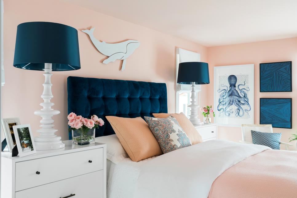
What strikes me most is the wall color in the Guest Bedroom. Peach! It’s been so long since we have seen this color on the cutting edge, and I have to say, Welcome Back! Although many will call this color pink, and you know who you are, it’s on the orange side of the “pink” hue giving it a warmer feel than the bluer-pink, which can be quite chilly.

Peach, this one by Sherwin Williams, is not your clear tropical hue. Its calm sophisticated undertone makes it perfect for an adult bedroom as long as it’s paired with contrast that will give the room some weight, and pardon the expression, masculine vibe.
In this case the designer, Brian Patrick Flynn, chose navy blue to anchor the room not only with a beautiful upholstered headboard but also with art and accessories. He pulls in nautical elements to remind the homeowner, as if they need a reminder, that they can probably see that gorgeous color palette out their bedroom window as the sun sets over Puget Sound.
If you’re not into as much white as the designer has infused into this bedroom, you might add more wood tones in the furniture, much as he did with a dresser on the opposite side of the room. Adding wood elements will balance the light and airy peach, but truly the navy gives the room its updated palette.
Peach can also be introduced into a gray palette in your own home without harkening back to the 1980s. Like yellow, peach is a warm balance to a lot of heavy gray, a trend we are exiting. See this other post for what to do if you feel a bit stuck with too much gray.
In the mean time, welcome back to Peach. We’ll see how long you stick around this time!
Escape from the Blues
January 4, 2018 § Leave a comment

Horseshoe Bay, Bermuda
This is a perfect January day in New England. We are completely snowed in, and nothing is more relaxing than hunkering down in a cozy house as the wind howls outside and the snow banks pile up around us. I love winter!
But that doesn’t mean I like the wintery gray, the limited daylight, and the bitter cold that comes with it. The longer winter goes, the more I yearn for an escape to somewhere warm — even if it’s only in my imagination.
Enter the Sherwin Williams Color of the Year for 2018.

It is an opulent teal that conjures up the ocean and all the warmth of summer at the beach. If a midwinter break in Bermuda is not on your calendar, there are other ways to escape the winter cold — visually. Here are some:
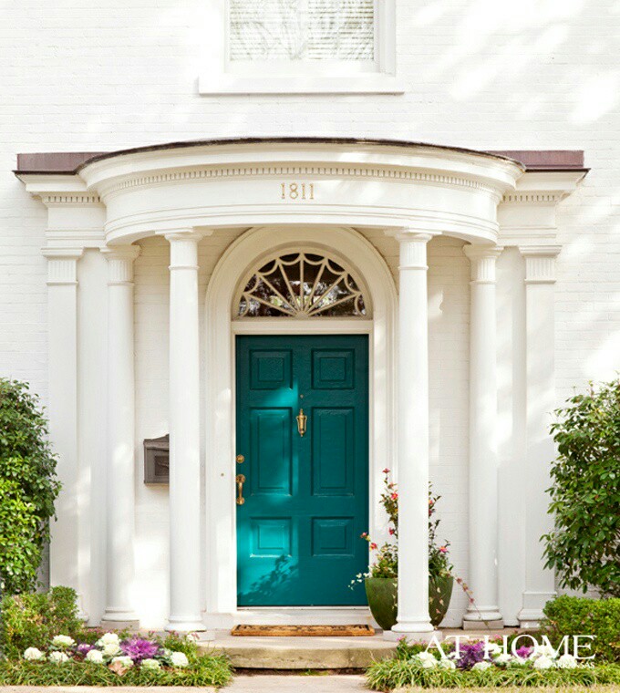
Plan Your Spring Projects. It’s never too early to think about Spring projects, and painting your front door is a doable one. Remember to tie the color in with other accessories and furniture around the yard.
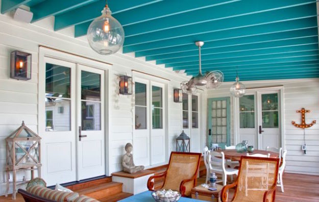
Paint the Fifth Wall. Don’t overlook the ceiling when you’re adding color. Since cool colors recede visually, painting the ceiling a medium teal blue will raise it — like rolling a Utah sky onto your porch.
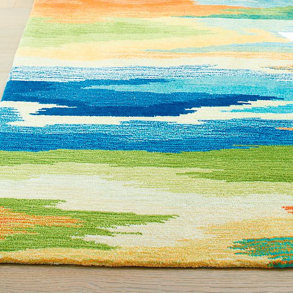
Splash Color Under Foot. Now I’m making it too easy. Add a gorgeous rug and transform your space instantly. There’s something about the combination of blues and greens that soothes and comforts us all. And a rug adds not just color but texture.

Dive into the Pool. Ceramics, art, dishes, pillows, collectibles, throws, lamps… the options for accessories are endless. Be sure when you add a color to your room that you put it in at least three locations to move the eye around the room and create flow.

Enjoy your staycation! With some daydreaming, a little shopping, and a tad bit of rearranging there at home, you can lift your spirits toward Spring and feel warm and cozy at the same time.
Thanks for stopping by!
Behold: The Gloom of Gray is Lifting
December 12, 2017 § 3 Comments

Thank goodness we’re finally moving away from gray, gray, and even more gray. (If you just repainted from Linen White to Silver Shadow, don’t panic though — it will be okay!) As we move into a new neutral trend (yes, Black), here’s some good advice. Don’t jump on it.
What sometimes happens with trends is that people go overboard with them. They think, aha Gray Trend, I must do everything gray! I have been in so many houses that are all gray on the interior. But in New England, where it’s gray much of the time anyway, those interiors are looking pretty dreary.
The goal should NOT be to create a room that looks like it was decorated in a particular period. The goal should be to create a room that is, as the color maven Maria Killam is known to say, “Classic and Timeless.” http://www.mariakillam.com/whats-next-grey-trend/
How do you achieve that? By mixing stuff up. Here are three basic rules:
- Keep the walls a light neutral. There are wonderful shades of whites out there, and most of them don’t read like spackling paste so don’t be afraid to go light. You won’t have to repaint every couple of years if that trendy color you love goes stale. Compromise? Paint only one wall, the focal wall, that trendy color.
- Keep the large, expensive furniture pieces, like the sofa, plain (remember plaid? No. Go with no pattern or just a texture so that the sofa stays timeless. Color is okay, but make sure you love it!) If you have a well-made sofa that you do not want to replace, you can opt for a slipcover (custom is best — but regardless, make sure the cushions have individual covers.)
- THEN mix things up. Add color in the rug, pillows, art, accessories, and other decorative and personal stuff of life that will make your room feel like it’s yours and not a designer’s.
And of course, let me mention the elephant in the room: inherited pieces. Don’t be afraid to mix your styles to incorporate family heirlooms. You will either have an objet d’art with a story behind it or a cozy room with treasures that remind you of home. Either way, do not be a slave to a particular decorating style just because an inherited piece “doesn’t go.” Embrace it!
Now let’s amp up the color for 2018, shall we?!
Happy Color for 2017
January 5, 2017 § Leave a comment
The New Year creates an opportunity for change. Whether it’s a p ledge to drop a few pounds, move the body more, or clear out the clutter, January is Change Month. And around here, I am ready to change color.
Not that I wasn’t crazy for color before, but fresh, clear color screams enthusiasm, optimism, and hope for great things. My nuanced, subtle, neutral palette looks dreary and tired. It is ready for a color boost to the happy side.
What does that mean for my decorating aesthetic? Not repainting my entire house and dragging all the furniture to Goodwill. Rather, a move to throw in a few color “punches” by switching out pillows on the sofa and adding some art and accessories. The hammocks are such an inspiration (from our fami ly trek to New Orleans over the holidays). And check out this orange Moroccan pouf my sister gave me for my birthday. I adore the color orange because it’s always a happy color — she knows that.
So if you are looking for a jolt of positivity in your life this January of 2017, try adding color and see if it helps your outlook on life. (Good coffee will help too!) Have a Colorful New Year, my friends!
Torn Between Two Paint Hues
September 5, 2016 § Leave a comment
Gray Owl, Ben Moore
As a home stager, I suggest a lot of paint colors as I help to prepare homes for the real estate market. And by and large, grays are what sells these days. Young buyers grew up with Linen White and seem now to cringe at wall colors with a yellow base. But is gray right for your house?
If you live in an area where the weather is cloudy for much of the time or your house is nestled in the shade, then a gray interior is only going to make your visual life grayer. If you want a fresh gray interior, here’s my advice:
- Make sure you have tons of natural light — big windows with as much light as you can get streaming in the window. That will allow you to see the gray as a distinct, intentional color and not as a shadow of a different color. You know how white and other colors can appear gray in the corners of a room? That’s what I’m talking about. You’ve chosen Gray. So show it off.
- Add white for trim — that will make the gray pop and will avoid any semblance of dinginess. For Pete’s sake, you don’t want your house to look dirty.
- Add some warm color — pillows, a chair, artwork. Just for contrast and to add some warmth when needed. Yellow looks spectacular with gray.
- Pick a warm gray if you live in a cold climate or your room faces North.
- Pick a cool gray for a warmer climate or a room facing South. The color of the light and the season will influence how your room looks. If the room looks cold, chances are that it will feel cold in there too.
- Add wood texture to warm the room. A hardwood floor and other natural wood tones in the room will look sensational against a backdrop of gray.
Linen White
If gray is not for you but you want to get away from the Linen White look from decades past, try one of these halfway gray paint colors. They are warm but not too yellow and will move you in the gray direction without making your house too cool. Now let’s get painting!
Gray Mist (BM)

Maritime White (BM)
SW Color of the Year 2017
September 2, 2016 § 4 Comments
 OKay then! If you hang around long enough…(as they say…)
Taupe is back. The color we’ve spent the last decade ridding our houses of is now Sherwin Williams’ Color of the Year for 2017. Poised Taupe is the color — SW 6039 — and you have to love the description:
“Earthen brown combines with conservative grey and the result is a weathered, woodsy and complex neutral that celebrates the imperfections and authenticity of a well-lived life.” — Anytime somebody celebrates imperfections, I’m in!
But here’s what you should know about taupe. It can change radically with the light and the time of day. What looks a little brown can turn pink, purple, or green depending not only on the time of day but also on the lightbulb. Just so you know. Taupe can have a pink undertone as well that clashes horribly with the orange of a red oak hardwood floor. Another caution. But paired with white like its fan deck sibling Gauzy White SW 6035, a silver metal (not gold or brass), hardwood with a gray undertone, and fabrics in other light neutrals with a pink undertone like Cultured Pearl SW 6028, and you truly have a soft, restful combination that harkens back to those glorious. taupe-filled 50s. That’s 1950s!


Personally, I’m going to ride this one out, but I can appreciate how we’re moving from the grays into the taupes (without the yellow undertone of a previous color swing). Like I tell my clients, just because it’s the Color of the Year does not mean it’s perfect for your house. If you are considering taupe, make sure you have a lot of natural light coming in the window and (hopefully) some modern furnishings, shiny metals and glass. Try to avoid pairing with cherry wood. If you have concerns, talk to me!
Meanwhile, let’s get painting.
Where to Splash Your Kitchen Color
June 9, 2016 § Leave a comment
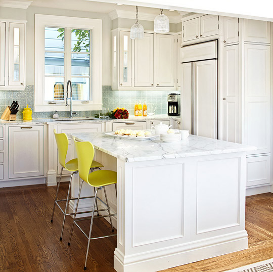 White kitchens are, again, all the rage, but what keeps a white kitchen from becoming too cold and uninteresting? You guessed it. Color.
What I love about this white kitchen from Traditional Home is the strategic placement of color where it will 1) have the biggest impact; and 2) be inexpensive to change over time.
Where to put the color?
Backsplash. Since the cabinetry and counter tops are white, the backsplash is a logical place for applying a splash of color. Plus, since it’s a relatively small area in the kitchen, you can be bold with your tile choices knowing that replacing the backsplash when styles change down the road will not break the bank.
Furniture. Splashy citron breakfast bar chairs give the neutral kitchen a modern vitality that pairs very well with the traditional cabinetry. The chairs keep the traditional cabinet design and the timeless marble counter top from being too stuffy. And because there are just two chairs, theoretically you could switch them out seasonally if you wanted to and change the look of the kitchen completely.
Accessories. Always a place to introduce color, the accessories like dishes and canisters and placemats and other easily switched-out items add splashes of color all over the kitchen and are temporary. Again, you’re not locked into a color scheme that will go out of favor in a year or two. Bringing in new accessories in a new color palette will freshen up the kitchen at practically no expense.
No wonder white is such a popular color for the kitchen. It is timeless, and it goes with every decor and season. Plus by adding color in places where new color can be infused without redoing the entire kitchen, you’ve added longevity to your original white kitchen design. Smart thinking!
Here’s the link: http://www.traditionalhome.com/kitchens/design-ideas-white-kitchens?page=0
