Balancing Color, Pattern, and Neutral
August 21, 2017 § Leave a comment
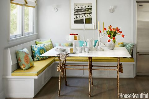
There is so much to love about this breakfast nook (designed by Martha Angus and Katie McCaffrey), I’m going to dive right in.
What’s to Love?
-The light gray walls. By staying with a light cool neutral on the wall color, you allow the pops of warm vibrant color to do just that: pop.
-The simple breakfast nook construction in the same wall color. What happens? The banquette disappears making the room look bigger and less chopped up.
-The wood floor. No doubt it carries throughout the public space making the whole house feel open and unified.
-The table from Paris (yeah, I know). The point is that the table is a unique piece and it’s not only functional but a conversation piece and a memory back to a really nice trip.
-The black and white print. Sure, you can add a vibrant picture there, but the neutral wall hanging allows the colors to take center stage. And they do.
-The yellow leather cushion. It’s yellow but in a fabric that’s easy to wipe up. Essential.
-And those pillows! In colors that coordinate with each other but refuse to look matchy-matchy. (And you just know that the rest of the house pulls colors from that lovely summer palette.)
Take Home Message:
If you want to show off color (or many colors), don’t overdo it. Leave spots empty and devoid of pattern for the eye to rest. And pick a palette of colors (5 is a good number) that you can carry throughout the house in various ways — wall color, furniture, art. The result will be a home that is balanced, unified, has flow from room to room, and that makes you happy every time you open the door.

Leave a comment