Something Old Makes Something New
August 25, 2017 § Leave a comment

How do you incorporate antiques and inherited treasures into your decor without creating your grandmother’s house (with all due respect to our grandmothers)? Here are some tips:
-Add contemporary lighting like the drum shade chandelier and standing lamp in the photo (from Rejuvenation) to your traditional decor. You will be amazed what new lighting will do to your room.
-Reupholster treasured furniture pieces in classic, solid fabrics that will keep the pieces timeless from this point forward. Patterns tend to come and go over the decades, and you can date a piece instantly by upholstering it in a trendy fabric. And then you’re stuck with it after the trend is long gone.
-Layer rugs to feature one that is too small to stand on its own in a conversation area.
-Dress windows simply to avoid visual clutter from too much pattern.
-Keep the overall feeling calm in the room. Too many patterns lead to visual clutter, something our grandmothers tended to accumulate over the decades.
-Or add a crazy patterned accent piece to a neutral room. No sense in being TOO serious about our decorating.
-Show legs. Letting the furniture pieces show their legs allows for “air” around each piece and a feeling of lightness in the room. Skirts on all the pieces can weigh them down and make them look dated. (Investigate removing the skirt from an old chair or sofa. I did it and what a difference!)
-For accessories? Cluster them. Avoid scattering them all over the horizontal surfaces. Instead, feature them together on a shelf or display cabinet. That way you’ve contained the clutter while calling attention to the collection as a whole.
Cherish your heritage furniture pieces or your finds from a consignment shop. Embrace them. Love them. And show them off in a fresh new way.
Balancing Color, Pattern, and Neutral
August 21, 2017 § Leave a comment
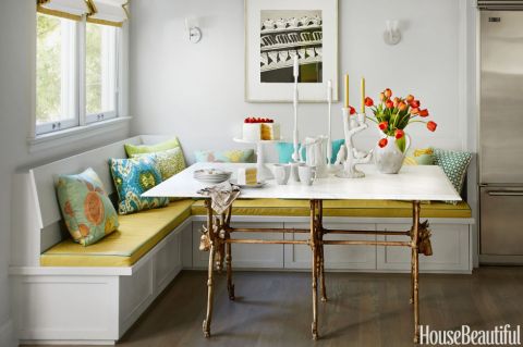
There is so much to love about this breakfast nook (designed by Martha Angus and Katie McCaffrey), I’m going to dive right in.
What’s to Love?
-The light gray walls. By staying with a light cool neutral on the wall color, you allow the pops of warm vibrant color to do just that: pop.
-The simple breakfast nook construction in the same wall color. What happens? The banquette disappears making the room look bigger and less chopped up.
-The wood floor. No doubt it carries throughout the public space making the whole house feel open and unified.
-The table from Paris (yeah, I know). The point is that the table is a unique piece and it’s not only functional but a conversation piece and a memory back to a really nice trip.
-The black and white print. Sure, you can add a vibrant picture there, but the neutral wall hanging allows the colors to take center stage. And they do.
-The yellow leather cushion. It’s yellow but in a fabric that’s easy to wipe up. Essential.
-And those pillows! In colors that coordinate with each other but refuse to look matchy-matchy. (And you just know that the rest of the house pulls colors from that lovely summer palette.)
Take Home Message:
If you want to show off color (or many colors), don’t overdo it. Leave spots empty and devoid of pattern for the eye to rest. And pick a palette of colors (5 is a good number) that you can carry throughout the house in various ways — wall color, furniture, art. The result will be a home that is balanced, unified, has flow from room to room, and that makes you happy every time you open the door.
Adding Pattern Personality to Your Home
October 7, 2015 § Leave a comment
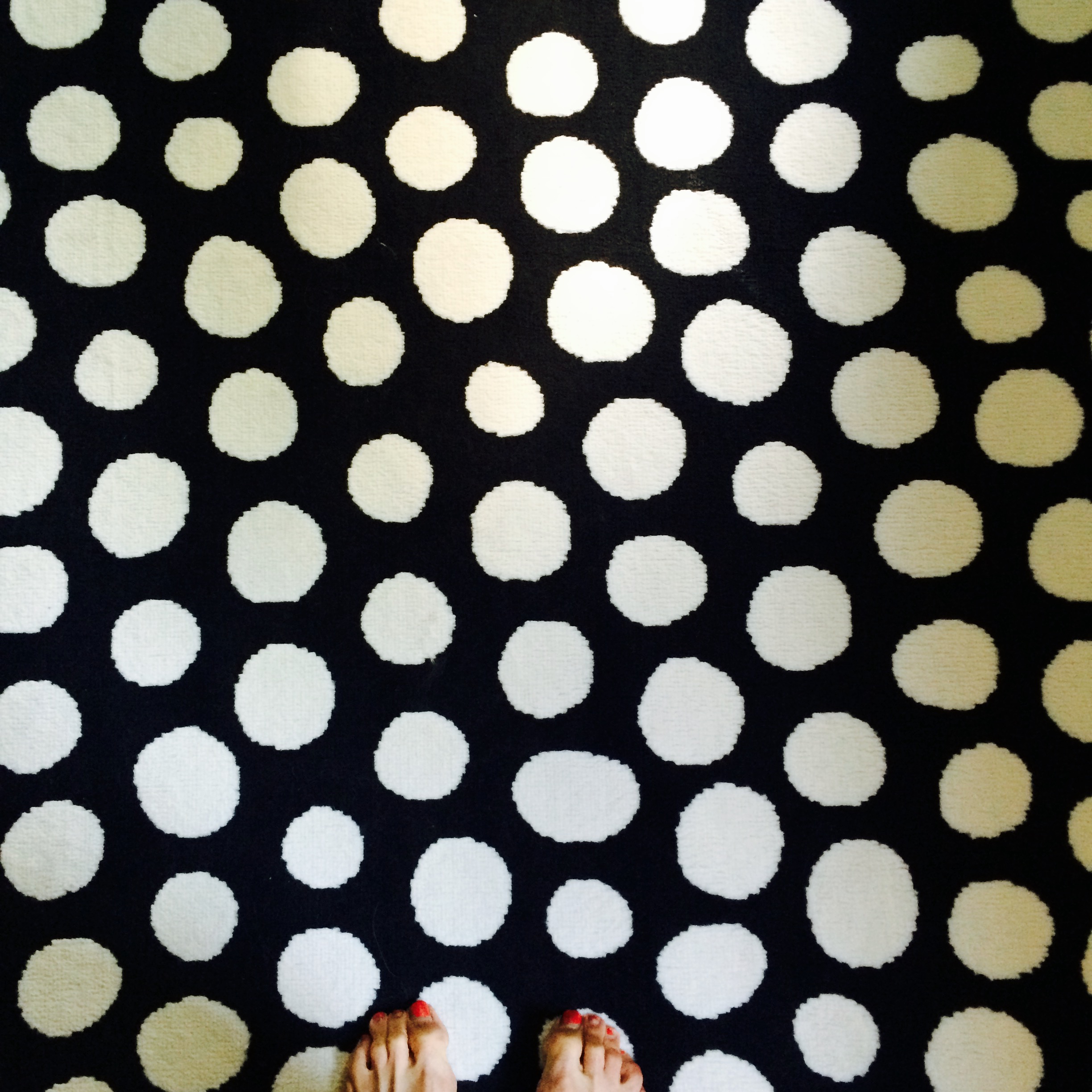 What is your pattern passion? Mine is polka dots. I can’t seem to get enough–dresses, bags, note cards, rugs, whatever I see in polka dots, large and small. But when is it enough?
I’ve seen complete rooms done in small-flowered Waverly prints: bedding, curtains, and even wallpaper going up over the ceiling. If you love the idea of waking up in (and I mean IN) a field of wildflowers, then that’s just great. But what happens when you get tired of the pattern and it’s literally everywhere in your room? You’re stuck.
Healthy alternative to bingeing on your pattern passion? Small portions. Instead of wallpapering the entire room in your favorite plaid, just do one accent wall or a reading nook, like we see in this HGTV design idea. That way you are less likely to tire of the pattern and want to rip it down. 
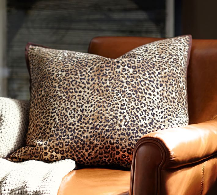
If animal prints are your print of choice, consider limiting it to the upholstery on a fun favorite chair or a pillow (Pottery Barn). There is no reason to feel limited by any fashion trends if you have a passion for a particular print. But using it in limited applications will allow you to switch it out when the next pattern passion comes along.