The World’s Favorite Color? Where Have I Been?
February 22, 2018 § Leave a comment

Late to the party here, but better late than never. At least that’s what I said to myself yesterday when I scrolled onto THIS beautiful hue and found out that it was crowned The World’s Favourite Colour. No great surprise since it represents some of the world’s most exquisitely beautiful treasures like Bali — an island so gorgeous its name alone sounds relaxing.
Last summer there was a questionnaire sent out — ’round the globe, as it were — to find out which color appealed to the most people. (I totally missed it! Arrrgh!)

“The competition organised by Hull 2017 UK City of Culture and paper merchant GF Smith invited people to select their favourite shade online by hovering over an infinite palette of shades with their mouse until they landed on the colour they found most appealing.”
The winner was this rich teal that nature inspires and artists incorporate to capture the beauty that surrounds us.
The closest paint color approximation I could find was a Duron Paints shade, Sea Sphinx. 
But there were others:


There are plenty of other ways to introduce the color into your decor — window treatments, accessories, and more art, of course.

On an accent wall of Marrs Green, this art pops!

And so does this one!

Though I have blogged about “teal” before, I guess there’s a reason. It appeals to vast numbers of people worldwide. It is a little bit blue, yet a little bit green. It’s the warmest ocean color and a color that appears in natural gems and plant life. It is rejuvenating in all its forms.


")
It looks great with the full green/blue spectrum and all its values, and it forms a calm backdrop to pops of heat. Marrs Green — The World’s Favorite Color.
Creating Colorful Curb Appeal
January 23, 2018 § 2 Comments
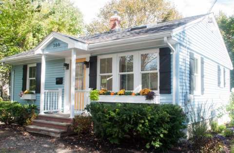
Need curb appeal?? Well, this remarkable ranch re-do will show you how some strategic changes to the front of a rather ho-hum house can make a huge impact, and if you’re planning on selling anytime soon, pay attention. There are some quick easy fixes that may apply to you.
Here is the Before shot: faded vinyl siding, old aluminum windows, dated storm door, dirty white shutters, old iron stair railing, and tree overgrowth. Have you seen a million houses like this one? Yup. Me too. Not exactly a head-turner.

Laurel LaBauve at SoPo Cottage addressed the front facade with a new porch portico. Adding dimension to the front face of the ranch made a huge difference and created a cottage style instantly. She could have stopped there, but onward to new windows (fresh, white, two-over-two) that brought more light into the house and gave it a cute, vintage, styled look. Excellent choice!
Next up? The vinyl siding. Why does the after vinyl look so terrific? Laurel revealed her secret: something called Vinyl Renu, a product that, Laurel reports, brings new life to the color and sheen and is supposed to last 10 years! I’m in! What a difference. If your house has vinyl siding and it needs a refresh, here’s the stuff.
Switching the shutters to black board-and-batten was another great cottagey move. If they’re vinyl, you fooled me. Note: Leaving the brand new windows bare with no shutters would not have been a bad thing. A little more contemporary. But the contrast of the black with the light blue siding and white trim is sharp, and the house looks finished.
Then there’s the front door color. Yellow. One of my faves as it sings Happy House as you walk up the front steps. And the coordinating flowers in the new window boxes (also a cottage style fun-to-have) pull the whole look together. (If you need color help, let me know!)
Even if there is no budget for major changes, here are a few easy fixes that will still make a big difference in your home’s curb appeal. Take-aways for home sellers:
- Trim the trees back so that the house is free of branches and there’s a clear view of the house from the approach. Pay attention to the landscaping, weeding, and overgrown bushes. It’s amazing what a little green thumb elbow grease will do.
- Rev up the vinyl siding with Vinyl Renu to give the color a fresh look.
- Add shutters if there’s room and particularly if the house is a light color. Black will give the house a dressed-up and polished curb appeal.
- Add coordinating accessories like porch lighting and a mailbox.
- Paint the front door a warm contrasting color and tie in the landscape (annuals, flowering shrubs) and any outdoor accessories like Adirondack chairs or deck furniture.
Click here to see how the INside was transformed. Bravo! Laurel, you are quite an inspiration.
Escape from the Blues
January 4, 2018 § Leave a comment

Horseshoe Bay, Bermuda
This is a perfect January day in New England. We are completely snowed in, and nothing is more relaxing than hunkering down in a cozy house as the wind howls outside and the snow banks pile up around us. I love winter!
But that doesn’t mean I like the wintery gray, the limited daylight, and the bitter cold that comes with it. The longer winter goes, the more I yearn for an escape to somewhere warm — even if it’s only in my imagination.
Enter the Sherwin Williams Color of the Year for 2018.

It is an opulent teal that conjures up the ocean and all the warmth of summer at the beach. If a midwinter break in Bermuda is not on your calendar, there are other ways to escape the winter cold — visually. Here are some:
Plan Your Spring Projects. It’s never too early to think about Spring projects, and painting your front door is a doable one. Remember to tie the color in with other accessories and furniture around the yard.

Paint the Fifth Wall. Don’t overlook the ceiling when you’re adding color. Since cool colors recede visually, painting the ceiling a medium teal blue will raise it — like rolling a Utah sky onto your porch.

Splash Color Under Foot. Now I’m making it too easy. Add a gorgeous rug and transform your space instantly. There’s something about the combination of blues and greens that soothes and comforts us all. And a rug adds not just color but texture.

Dive into the Pool. Ceramics, art, dishes, pillows, collectibles, throws, lamps… the options for accessories are endless. Be sure when you add a color to your room that you put it in at least three locations to move the eye around the room and create flow.
Enjoy your staycation! With some daydreaming, a little shopping, and a tad bit of rearranging there at home, you can lift your spirits toward Spring and feel warm and cozy at the same time.
Thanks for stopping by!
Behold: The Gloom of Gray is Lifting
December 12, 2017 § 3 Comments

Thank goodness we’re finally moving away from gray, gray, and even more gray. (If you just repainted from Linen White to Silver Shadow, don’t panic though — it will be okay!) As we move into a new neutral trend (yes, Black), here’s some good advice. Don’t jump on it.
What sometimes happens with trends is that people go overboard with them. They think, aha Gray Trend, I must do everything gray! I have been in so many houses that are all gray on the interior. But in New England, where it’s gray much of the time anyway, those interiors are looking pretty dreary.
The goal should NOT be to create a room that looks like it was decorated in a particular period. The goal should be to create a room that is, as the color maven Maria Killam is known to say, “Classic and Timeless.” http://www.mariakillam.com/whats-next-grey-trend/
How do you achieve that? By mixing stuff up. Here are three basic rules:
- Keep the walls a light neutral. There are wonderful shades of whites out there, and most of them don’t read like spackling paste so don’t be afraid to go light. You won’t have to repaint every couple of years if that trendy color you love goes stale. Compromise? Paint only one wall, the focal wall, that trendy color.
- Keep the large, expensive furniture pieces, like the sofa, plain (remember plaid? No. Go with no pattern or just a texture so that the sofa stays timeless. Color is okay, but make sure you love it!) If you have a well-made sofa that you do not want to replace, you can opt for a slipcover (custom is best — but regardless, make sure the cushions have individual covers.)
- THEN mix things up. Add color in the rug, pillows, art, accessories, and other decorative and personal stuff of life that will make your room feel like it’s yours and not a designer’s.
And of course, let me mention the elephant in the room: inherited pieces. Don’t be afraid to mix your styles to incorporate family heirlooms. You will either have an objet d’art with a story behind it or a cozy room with treasures that remind you of home. Either way, do not be a slave to a particular decorating style just because an inherited piece “doesn’t go.” Embrace it!
Now let’s amp up the color for 2018, shall we?!

Orange Twist to the Red Revival
September 18, 2017 § 2 Comments

Apples, pumpkins, falling leaves — there’s something about Autumn in New England that, despite our recent warm temperatures, makes us cozy up to the changing seasons. Maybe that’s why some of us live here.
My newest door color obsession is a revival of the orangey red of another decade, and that may signal the end of the light, neutral, blue and even light lemon yellow door color trend I’ve focused on for the past several years. This red, Million Dollar Red (Benjamin Moore 2003-10) is as perfect on a traditional white colonial as it is on a black modern home. There is no mistaking where the door is — it screams Welcome!
What I love most about it is its “orangeyness.” Orange is a happy color no matter what. So a red on the orange side (versus pink) says this is a happy home. The color also has an updated, contemporary feel as opposed to the more traditional burgundy red (also great, of course, but more serious and refined).

Adding an orangey red as an accent color on the interior is also a great way to torque up the energy. Try it on the back of a white bookshelf, or on a pouf ottoman in the family room, or even on a focal wall in the front entry. A little bit of red warms up a room a lot. So before painting an entire room red, make sure you want to amp up the temperature in there. Using red on items that can be removed in the hot summer makes sense to me: pillows, bedding, throws, and art. Then I look forward to my seasonal exchange when I swap out the cool blue accessories for red.
Enjoy Autumn… whatever it means to you and wherever you are. And love how the color orangey red makes you feel. Warm and Happy.
Balancing Color, Pattern, and Neutral
August 21, 2017 § Leave a comment
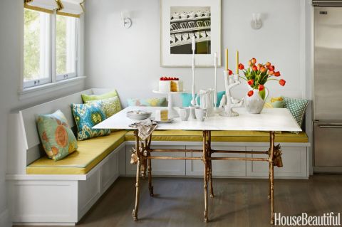
There is so much to love about this breakfast nook (designed by Martha Angus and Katie McCaffrey), I’m going to dive right in.
What’s to Love?
-The light gray walls. By staying with a light cool neutral on the wall color, you allow the pops of warm vibrant color to do just that: pop.
-The simple breakfast nook construction in the same wall color. What happens? The banquette disappears making the room look bigger and less chopped up.
-The wood floor. No doubt it carries throughout the public space making the whole house feel open and unified.
-The table from Paris (yeah, I know). The point is that the table is a unique piece and it’s not only functional but a conversation piece and a memory back to a really nice trip.
-The black and white print. Sure, you can add a vibrant picture there, but the neutral wall hanging allows the colors to take center stage. And they do.
-The yellow leather cushion. It’s yellow but in a fabric that’s easy to wipe up. Essential.
-And those pillows! In colors that coordinate with each other but refuse to look matchy-matchy. (And you just know that the rest of the house pulls colors from that lovely summer palette.)
Take Home Message:
If you want to show off color (or many colors), don’t overdo it. Leave spots empty and devoid of pattern for the eye to rest. And pick a palette of colors (5 is a good number) that you can carry throughout the house in various ways — wall color, furniture, art. The result will be a home that is balanced, unified, has flow from room to room, and that makes you happy every time you open the door.
From Grays to Happy
May 2, 2017 § 1 Comment

Gray has been the wall color of choice for public spaces in the home for a number of years now, and don’t get me wrong, gray is a wonderful neutral to replace the beiges of the previous trend. But you have to admit, gray is not for everybody. And if you live in a dark home with small windows and low ceilings, painting the walls gray might have been a real downer.
Never fear! Color to the rescue! Here are a few ways to make sure your gray room escapes the wrath of a couple of gallons of primer and a roller:
-Make all trim white. That is the best way to keep the gray clear and crisp.
-Make the ceiling bright ultra white. That will reflect the maximum amount of light back into the room.
-Add bright clear color. Bedding, accessories, a rug, and accent furniture (for example, as we see above in the room from Williams Sonoma Home) will help the gray perform its duty as a neutral backdrop instead of becoming the storm cloud in the room.
–Add sparkle. Whether it’s a silver lamp, a crystal chandelier, or some new gold in a brass picture frame, adding metal and glass will provide the finishing touch to the room. Reflective finishes bounce light — like jewelry!
So if your gray walls are bringing you down, don’t despair. Add Color. (You knew I’d say that.)
Happy Color for 2017
January 5, 2017 § Leave a comment
The New Year creates an opportunity for change. Whether it’s a p ledge to drop a few pounds, move the body more, or clear out the clutter, January is Change Month. And around here, I am ready to change color.
Not that I wasn’t crazy for color before, but fresh, clear color screams enthusiasm, optimism, and hope for great things. My nuanced, subtle, neutral palette looks dreary and tired. It is ready for a color boost to the happy side.
What does that mean for my decorating aesthetic? Not repainting my entire house and dragging all the furniture to Goodwill. Rather, a move to throw in a few color “punches” by switching out pillows on the sofa and adding some art and accessories. The hammocks are such an inspiration (from our fami ly trek to New Orleans over the holidays). And check out this orange Moroccan pouf my sister gave me for my birthday. I adore the color orange because it’s always a happy color — she knows that.
So if you are looking for a jolt of positivity in your life this January of 2017, try adding color and see if it helps your outlook on life. (Good coffee will help too!) Have a Colorful New Year, my friends!
Color Your Spirits Bright
March 19, 2009 § 17 Comments

For years decorators have ignored an entire section of the paint color fandeck, labeling these colors as garish, for children only, or just simply in bad taste. Not anymore. Now colors like Mellow Yellow (Ben Moore’s 2020-50 that’s hardly mellow) and Bermuda Teal (2044-50) are making a fresh new statement of uplifting optimism in the design world. A splash of Marmalade (2016-40) or just a smattering of Sherwin Williams’ Gladiola (SW6875) cannot help but lift your spirits. Behr’s wonderful yellow green called Carolina Parakeet (410B-4) is such a happy color that even the name makes me smile.
I wrote about this topic months ago when we started to watch our savings go down the tubes, etc, etc, (no need to drag us through a rehash of events), and today’s Boston Globe has a great article entitled “What is the Color of Hope.” Here’s the link:
http://www.boston.com/lifestyle/house/articles/2009/03/19/what_is_the_color_of_hope/
Even if you’re not planning any massive redecorating projects this spring, adding clear happy color as an accent either on a wall, backsplash, or pillows on the sofa may actually improve your mood, enhance the good feelings in your home, and help you cope. A note of caution: If you decide to paint with these bright colors, be sure to mix in lots of white in trim, furniture and accessories not only to bring out the color but give the eye a little rest if needed.
Happy Spring!
