Adding Unexpected Color to Your Home
January 9, 2008 § 16 Comments

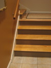
Next time you feel inspired to add color to your home, consider painting the stair risers on your front staircase. Usually they are painted white, a nice contrast against the wooden stair treads, but how practical is that. It doesn’t take long before the riser is all scuffed up with black shoe marks going up the stairs. Why not solve that problem by painting the risers a different color, something darker that will hide the shoe marks but will coordinate with your decor.
You can take a color out of the tile in the entryway or borrow the color from an adjoining room. Either way, the stairs will become a more important feature in your decorating scheme and yet another place to add some unexpected color to your home.

This is such a simple yet wonderful idea, I can’t believe I never thought of it! We’ve been considering painting the old stair risers in our 1930s cape cod, but we knew the white would just show dirt. We have a chocolate brown wall right across from the stairs and lighter caramel colored walls on both sides of the stairs. Would painting the risers brown just be too much?
Hi Staz,
Well, I like brown risers. They’re very practical, and they really show off the wooden tread nicely. You can do the brown, which will blend with your other walls, or if you really want to accent the stairs, you can pick a third color. Either way, it beats white!
Good luck.
-Barbara.
Your Home & Color Coach
What a fantastic idea. Our stair case is the first thing you see when you open the door of the house. This would be so pleasing to the eye:-)
I love the phrase ‘unexpected colour’ my house is full of exactly this, my kitchen is orange and purple, my lounge yellow and red and the playroom, lime green, turquoise nad a touch of pink, all in their brightest forms. you have to brave with colour and if it doesn’t work you can just paint over it, this makes life so much more exciting and colourful, i get endless comments about my house…who knows what people say behnid my back and quite frankyl who cares, i have to live in it and i love it. If you would like to see a little of it have a peek at my website, there are pictures at the top of each page and most of these are taken in my house, you will see ht ecolour for yourself…go on be brave and just try adding a splash of colour…it makes you feel great!!
Marla
http://www.shappsandcoutts.com
Hi Marla,
I went back to your site to see your room colors and you’ve masterfully balanced wonderful saturated color with white for an outstanding result. Very cheerful and uplifting.
I go through various color phases and the rooms in my house change quite regularly — they are my laboratory for experimentation. But you share my passion for color!
Thanks again for introducing us to Shapps & Coutts!
Barbara
Your Home & Color Coach
I’m looking for advice about painting the floors in my 1840’s home. The floor boards are not finished (never were) and even mismatched. I think they were put in as the underlayment but finished boards were never added. They’ve been painted several times. I was thinking of painting them black on the first floor and white on the second floor. Any thoughts?
Hi Merilynn (#6),
Call me practical or in need of a full-time housekeeper perhaps, but I think a floor should either be dark or resemble dirt. I know it sounds ugly, but white floors are next to impossible to keep clean if you have anyone in the house besides yourself in a pair of soft slippers.
I suggest a dark brown for both sets of wood floors. Black absorbs tons of light (but is preferable to white), and white is, as I mentioned above, impossible.
A color that resembles natural wood will make the floor less of an issue so you can focus on color in the rest of the house.
See what you think.
-Barbara
Your Home & Color Coach
Hi – We are looking to paint our foyer. We have a cape cod style home and the foyer is open to the second floor. At the top of the landing there is a railing for the 2nd floor hallway. You can see the doors for the master bedroom and the 2nd bathroom. The 2 kids rooms are around the corner. There is also a gabled window – so there is a good amount of light that comes in the 2nd part of the day. The floor is light hardwood. Upon entering, there is a normal size entrance to the living room on the right (colors are pale green/beige walls) – with country style furniture (green/beige/navy tight woven plaid couch and loveseat)…the curtains are sage green. Upon entering, the unfinished dining room is to the left where the stairs go to the 2nd floor. We are thinking of a farm table and rusty paint colors when we are able to afford it. It is a playroom for the kids now. Upon entering, straight ahead is the hardwood floors and the entrance to the large country kitchen (13×19) – the colors are sage green walls, oak cabinets, white countertops. I don’t know we need to tie in those colors…but I know we will be using black and white photos of the kids, family to accentuate the foyer. What are some good colors to make the b/w photos pop out, but also tie into the type of home we have…very traditional/country type of home we have and want to have. We just bought the home 10 months ago…so we are changing things up a little. There was water damage to the drywall above the front door – so we need to redo the foyer…and that is our next project…we already did the siding (beige) with navy blue shutter and front door, and roof in the spring. Please advise…THANKS!!
Hi Alicia (#8),
Have a look at Ben Moore’s Powell Buff. It’s a warm neutral that has enough color to make a wonderful backdrop for photos and it will tie in nicely with both your sage greens and your wood tones and floor.
See what you think.
-Barbara
Your Home & Color Coach
Hi there
I have a Q for you about wall color. The colors i’m going for in my new place are Beige,light Blue(on furniture)earth tones,and gold. I would like to know if Beige mocha would go as wall color or not? what do you recommend.
if you look at this picture, this is what i’m going for, but i want to add blue coloured furniture. Would that work? and by blue i mean very light, that are here and there.
http://www.horchow.com/store/catalog/templates/Silo.jhtml?itemId=cat000001&parentId=cat000000&siloId=cat000001&icid=topNavcat000001
thank you for the help. 🙂
Sara
Hi Sara,
I love your color scheme. Rich and soothing at the same time. You might want to add some dark mahogany brown (tables) to add some contrast. Warm white trim and gold accents will create an elegant room.
Enjoy!
-Barbara
Your Home & Color Coach
Great idea, wouldn’t be too costly and actually adds a lot to the home. Thanks for the tip!
On Dec. 21, 2008 my family and I awoke to a house full of smoke, and flames the size of New Hampshire. We all made it out safely, but our home was badly damaged. They’ve now begun to rebuild, and we are suddenly presented with so many decisions at once–with no time to prepare.

Our next order of business is to choose a stucco and roofing color. We wanted the house to have a timless look to it, but we are really only able to alter a few things. The stone work stays. We would be so thankful for any input. Any ideas?
Here is a link to the house before the fire. The roof and most of the top floor are gone, with the exception of the room over the garage.
Hi Jodi,
Sorry to read about your fire! What an awful time for your family. I’m glad rebuilding has begun and I hope I can help.
I love the old roof color and the stonework. But I would switch the stucco color to something a little less predictable. Check out the Ben Moore colors: Gettysburg gray HC-107, Alexandria beige HC-77, and even Ashley gray HC-87. Each of these is a complex historical color that I see in your stone work. It all depends on which colors you want to highlight. Any of them would look good. I just would avoid browns with your particular stone. Stick with taupes/greens/warm grays.
Hope that helps.
-Barbara
Your Home & Color Coach
Thank you Barbara :))
Glad that you liked the color scheme.
About the dark mahogany brown , we are having dark teak parquet (floor) and dark wood furnitures. But i’m still undecided about the wall color.
🙂
Hi Sara,
Something with contrast would be nice. If you are looking for a neutral (and don’t have a fabric from which to choose a wall color), have a look at Ben Moore’s papaya (957). It goes with everything.
-Barbara
Your Home & Color Coach