Before You Color Your Walls, Check the Lighting
October 19, 2007 § 12 Comments
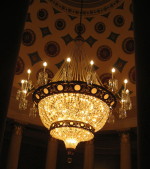 You may not have a chandelier quite as grand as this one for your dining room or entryway, but take a look at your current lighting situation. Although it may seem obvious, good lighting is critical. You need light to see color so before you paint your walls chocolate brown, check to see whether you have enough light in the room to see that gorgeous color. Otherwise it will fade out to gray or black.
You also need adequate task lighting like lamps for reading and pendant lights for cooking. You need some overhead lighting, like recessed cans for highlighting artwork, or chandeliers for mood lighting. But there are other kinds of lighting as well.
Wall sconces are ideal in the bathroom if hung at face level for optimal shaving and makeup application. Sconces are also wonderful for hallways and beside the fireplace to enhance the warm glow in the room. An uplight under a plant in the corner is a quick way to add drama to a room. The light shining up through the plant sends all kinds of interesting shapes onto the ceiling. “Fantasy lighting” creates a mood in a room but is inadequate for actually seeing anything. Soffit lights around the edge of the room give a soft, almost night-light feel to a room. If you’re redesigning a room, look at the lighting first.
Here are a few tips:
- Unless it’s a table lamp, install dimmers on everything from the chandelier in the dining room to the recessed cans in the kitchen. There’s nothing that kills the mood quicker than somebody coming into a room and throwing on the overhead light switch.
- Set up a triangle of lamps. Don’t have all your lighting on one side of the room. Balance it around the room so there aren’t any really dark areas.
- Replace that single bulb in the middle of the ceiling with either a semi-flush-mount light fixture in an up-to-date metal finish or some recessed cans around the perimeter of the room. All on a dimmer.
- Make sure your table lamps are the right scale for your tables. Small lamps are great for the bedroom, but larger lamps really go better in the living room. And tall skinny lamps look good on sofa tables and buffets.
- Don’t forget a floor lamp, excellent for a reading nook.
- And torchieres, like other uplights, throw light up onto the ceiling where it is reflected. Torchieres are a good balance to all the other light that is pointing down into the room.
Have fun with the lighting in your home. You can save money by using energy-efficient bulbs wherever possible, especially in lamps that you leave on a lot. But just remember that those energy-efficient fluorescent bulbs cast a cooler light than either halogens or incandescent bulbs and may change the color of your walls at night. Keep that in mind when you choose your wall color.

Hi again, I already received wonderful advice from you and this is the other dilema I have. As we wade through the house building process, we are also picking out lighting. For the most part it has been simple to find lighting we both like that we feel will compliment the various spaces…….
I found I do not lean towards the traditional style of lighting that is used in the south (probably because I am originally from California), but I do like the look of the darker metals (oil rubbed bronze, venetian coppers and the darker wrought irons finishes) but it’s been hard to find those finishes that do not have a ton of crystals, the curly cues or all the little “do-dahs” sticking out everwhere. It’s almost a contemporary look is what I gravitate towards but in the darker finishes….that has been difficult to find fixtures that I like without the finishes being brushed nickel or stainless steel……or the style is too “retro”. Meanwhile back at the homefront, my very traditional southern husband likes all the foo foo crystals and curly cues. I have to work hard keep a straight face when he suggests “what about this?”
But we have managed to agree on some fixtures by Forte and Minka Lighting and to appeas my “southern” husband, I agreed to go with the larger more traditional chandelier in the dining room (versus the big bowl pendant), it has the numerous glass bowls he likes but cleaner lines and no foo foo crystals/limited curly cues and darker finish …….and this was with the compromise I would get to put the matching/ smaller hanging bowl pendant in the foyer. We are using recessed lights in the kitchen so it’s only the breakfast nook that has me stumped. They have a smaller version of the dining room chandelier, which of course he likes. They also carry a similar fixture with “down turned” glass which I like. I tend to think the nook is more casual in nature and the down turned glass lends to that, but we are also putting in a tall breakfast bar that will be situated between the kitchen and great room, so unsure if we should then go with something more formal like the smaller chandelier that he likes…that only seems to be a smaller copy cat of the fixture to go in the dining room.
We are putting in recessed lights in the 4 corners of the great room with a ceiling fan in the center that will have an upturned light on the top end of the fan with a light dome on the other end, it has nice scrollwork on the fan motor cover….. with of course oil rubbed bronze finish and so of course I am worried on the flow of these fixtures and not exactly sure what I really want. In reality, we probably will only use the formal dining room during the holidays, the breakfast bar (which will also have 3 pendant or mini pendant lights over that, which my husband nixed my thought of using colorful blown glass for those) is where we primarly will dine…..the nook table will be used as the proud display of all things dusty more than likely.
I never paid attention to light fixtures before until recently and we are now obsessed wherever we go…restraunts, friends homes, model homes, TV shows…..you name it….we are noticing everything.
What would you recommend for the breakfast nook light that would stand the test of time and not be too trendy?
Also……in the master bathroom……do the vanity light glass face up or down? I seem to see them displayed both ways and I not sure which way it is supposed to go or what determines that…or is that just personal preference? We do not have any recessed lights in the master bath as we have a nice glass block window that is going to bring in lots of light during the day though at night that wouldn’t help much. I have heard vanity lights makes one skin color look unnatural, but at my age, nothing looks natural any more!!
And last but not least……we are going to put a sconce in the stairwell and right now it is wired for just one that is about half way up the stairwell. There will be a flush mount light at the top of the landing. On average, what wattage bulb should I expect to use for that sconce fixture to ensure the stairwell is well lit?
I am sure the lighting folks should probably tell me this but I found out that my lighting person is on vacation this week and sure enough, we are supposed to “order” lights by weeks end!
Thanks again and sorry for yet again another “novel”
Hi Sandy,
I think I’ll work backwards up through your questions. As far as the wattage goes, I put in the maximum or next wattage down from what the fixture states on the little label attached to it. You just don’t want to go over the wattage specified, that’s all. Usually 100 watts will give a lot of light. (You can get the energy saving fluorescents. I’m sure we’ll all get used to the light they cast as we all turn “green.”)
As for the lighting in the bathroom, the best light for shaving and makeup application is at the same level as your face. In other words it’s halfway down the wall, not above the mirror.
But if you’ve already got the wiring above the mirror, then it is really personal preference. The light will be a little less harsh if the shades are pointing up and you don’t see the bulbs. But the whole idea in the bathroom is to have enough light to put your makeup on without stabbing yourself in the eye.
Now on to the breakfast nook, you’ve chosen the same metal, but the fixture doesn’t have to match the one in the dining room. If it’s easier to choose the smaller version, then go right ahead, but I like the idea of selecting a style that’s not quite so formal. Also, people tend to do work, whether it’s homework or studying maps or whatever, at the kitchen table so nice downward-directed lighting is a plus. (Versus the more formal indirect mood lighting in the dining room.)
I think that’s it. You’re doing great. Only a few decisions left!!
-Barbara
Your Home & Color Coach
Barbara
Your advice has been invaluable and has helped me tremendously. I was able to make most of my lighting selections but I am struggling with a few minor details. The chandelier I picked for our formal dining room is from Forte (2322-09-27) that is 34WX39H and 9 bulbs but I am really thinking that is going to be too big….the dining room is 12′ wide and 14’4″ long with a 9′ ceiling height. One wall (the longer end) opens into the foyer. The current dining room table that is to go into this dining room is a 42″ round table with a 12″-14″ leaf that can convert this into an oval table (the leaf is packed away but will be used when we move)…and while the current table will more than likely be replaced down the road, I am still unsure if this fixture is too large for this room.
An alternative fixture I was looking at was another Forte fixture (2200-09-32) which also has 9 bulbs but is smaller, 27WX24H and I am I really grappling with which is the more appropriate size fixture for this room. Any advice?
I also have been looking at ceiling medallions. If I were to put a ceiling medallion in the dining room, what diameter ceiling medallion (outside diameter) would compliment the dining room fixture and the overall look of the room?
I am also considering a ceiling fan medallions in the great room and master bedroom and both are going to be 52″ ceiling fans, with the only difference is that the master bedroom has a sloped tray ceiling so the actual dimensions of the ceiling in the tray portion is obviously smaller. I am debating whether to have a ceiling medallion in the breakfast nook…..or not and for the two pendant lights in the powder room. I read that in small rooms or bathrooms to use small ceiling medallions (4″ OD?) to not overpower the fixture and ceiling.
And last but not least, what color should the ceiling medallions be? In the dining room, the portion of the ceiling fan will be painted an accent color. Do I pay it the same as the trim color in a semi gloss latex? In the great room the ceiling color is lighter than the walls (candelescent) with an even lighter trim color (lily of the valley) and unsure if I match to the trim or ceiling or what. And the master bedroom ceiling will be the wall color with the sloped tray portin the candelscent. I am going to use your earlier suggestion of a metalic chocolate paint on the powder room ceiling so unsure if I want the medallion to pop out or blend in or something in between.
Thanks as always…..
Sandy
Hi Sandy,
You can go either way. For your size room, the ideal chandelier is between 28-32 inches. The medallion should be either larger or smaller than the diameter of the light fixture. In your case, the medallion should be about 24 inches based on the room dimensions.
For ceiling fans, the medallion should be smaller than the diameter of the fan.
As for the color, medallions are treated like trim. At least in the public spaces. For your guest bath, you are free to bust out of convention and try something new for color.
Hope that helps.
-Barbara
Your Home & Color Coach
Well this chandelier is amazing in beautifull construction.Rgds
Barbara
Just an update and to thank you again. Our house is within a month of completion and the paint choices we made look rich, warm and flow so incredibly well from room to room. The lighting fixtures are amazing and as if they were made for their respective rooms…..and believe me I am so design retarded and had many a sleepless night worrying if I made the right choices. But your advice was so helpful when I was second guessing myself on every little thing…..thanks again
Hi.
My apartment complex is offering an accent wall program and I want to paint a wall in the living room. The apartment gets a lot of sunlight during the afternoon because all the windows face west and the objective for me is to create a cooler environment when I get home from work. I have the URL to the colors they offer below for reference.
I was thinking of going with a dark brown but, I plan on having dark furniture with white accents (will that look dull?). However, if dark brown looks nice with a lot of sunlight I will easily change my furniture theme to white. I am also considering a greyish-blue because it might cool down the room because of the blue tint (this is my assumption). Before I begin to ramble on, I’m going to end it here and patiently wait for a response.
Thank you!!
Colors:
http://www.villageinthepark.com/about_accent.htm
-Daniel
Hi Daniel,
The greyish-blue might be the way to go if you plan to have dark furniture in front of it. The blue is definitely a cool color and it looks terrific with brown and white. You can always add a little bit of orange to jazz it up.
The dark brown will work as well as long as you have some white or cream in front of it and lots of light. But with only one wall painted brown, you wouldn’t have to worry about the cave effect.
Either will work. But the brown is more dramatic, of course.
Ultimately, it all depends on what furniture you want to end up with.
Glad you have the opportunity to personalize your space!
-Barbara
Your Home & Color Coach
Barbara,
I just wanted to THANK YOU for your help. I’ve been searching for advice all over the internet and could not find a better answer than the one you provided me. You couldn’t have laid out my options any better. After reading your post on brown, it is quite tempting to go that route but, I love the orange idea with the blue.
Thanks again!!
-Daniel
You’re welcome, Daniel. Glad I could help out.
-Barbara
Your Home & Color Coach
Barbara,
I’ve really enjoyed reading your posts and hope you may be able to help me with a bit of color correction. My husband and I recently bought our first home. It’s a small cape that has a country feel to it, especially with the oak trim that was installed throughout by the prior owners. When we moved in, all the walls were stark white, making the trim stand out just a bit too much. So, we got to work painting one room at a time to warm up the walls and balance the beautiful color of the wood. About a month ago, we finished painting the living room in a color called Timeless Taupe. I had at large swatch pinned to the wall for a couple weeks and the color seemed perfectly named – a timeless, soft, neutral… taupe. Two coats later all I can see is a brownish pink…almost like silly putty. And it is worse at night in artificial light. It is not at all what I expected!
Being newlyweds, we are working with what we’ve been handed down furniture wise, which happens to include a lot of red: a mostly red-toned oriental rug (that we LOVE), a brick red couch (hate the color but love the traditional lines), and an antique red velvet wing chair (which desperately needs to be reupholstered). Could the overload of red be reflecting on the walls, making our taupe seem pink? Or do you think we really need to repaint to get back to the neutral taupe we hoped for? I’m handy with the sewing machine and have toyed with the idea of slipcovering the sofa – but what color should that be?
Any ideas to minimize the pink would be GREATLY appreciated! I’m happy to send some photos if that will help…
Best Wishes from (Still) Snowy Maine,
Sarah
Hi Sarah,
You have discovered the joys of taupe. It picks up every color and changes like a chameleon. Yes, it’s picking up the red and turning pink. Before you change all your furniture (red is great), have you considered more of a camel color or even a yellower tan (like Ben Moore’s Powell Buff). It would look terrific with your red and would not change color like the taupe. I would consider repainting — I had taupe in my livingroom and it turned green every evening. I repainted because it drove me crazy.
Hope that helps.
-Barbara
Your Home & Color Coach