Is Your Wall Color Anxious?
March 7, 2023 § 2 Comments
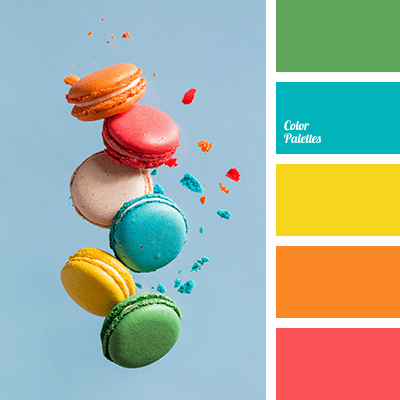
Color psychologists will tell you that colors evoke certain emotions. For example, the warm colors (red, orange, yellow) can generate happiness, stimulation, and excitement (both good and bad). And cool colors (blue, green, purple) can promote calm, relaxation and sleep. In general, we do have a psychological reaction to certain colors, and we associate them with different things. Sometimes they look tasty enough to eat.
Too much of a good thing?
When it comes to creating an end-of-the-day sanctuary for rest and recovery, we need calm, and the cool side of the color wheel is a good place to start. Blue, green, and purple are very popular bedroom colors, for all age groups, but choosing the right version from the fan deck can be tricky. What sometimes happens is that we pick a paint color from the vast display at the store only to roll the actual paint up on the wall and suddenly feel a bit agitated. Partly at not liking the color and partly at the thought of painting it over.
What happened? I thought I was picking a calm color.
Selecting a blue, green, or purple that pops out at you in the store will not necessarily give you a serene room where your toddler can take a nap. Because it’s not the color per se. It’s the saturation that is keeping the room on edge.
So even my wall color needs a therapist?
Maybe. How saturated is it?
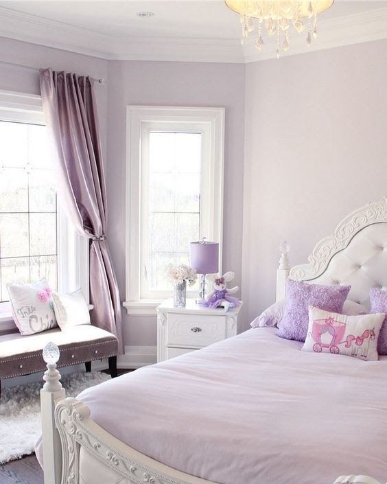
Saturation measures how clear or true a color is. It is the strength of the color often described with words, as Leatrice Eiseman writes in her book The Complete Color Harmony, like “clarity, purity, brilliance, richness, boldness, vividness, and intensity.” You get the picture. Maybe not great for a restful bedroom. For example, royal blue is more saturated than powder blue. In a bedroom, royal blue will shout for attention. The more grayed-down the color, the less saturated it is. In a bedroom painted powder blue, you might not even notice the color.


Bedroom wall color needs to chill.
Again Eiseman describes colors with lower saturation as “subdued, diffused, misty, dusted, subtle, soft, toned-down, muted, restrained, hushed, understated, and quiet.” Perfect for a bedroom. So back to the paint store to find colors with lower saturation that will be restful on the walls of the bedroom.
Can’t I paint the room lighter?
Yes, but going lighter will not make the room calmer — just a lighter value and yes, a little easier on the eyes.
Value measures how light or dark a color is. When you add white to a color you make a tint. The hue (color) gets lighter, and the perception of the intensity changes. It may appear less intense. And that’s important when you are picking a relaxing wall color. Lighter tints are more restful to the eye. To find a tint of a color you move up the fan deck color strip toward the lighter end.


If you add black to a color, you get a shade. It’s darker and perceived as more intense than its lighter version. A dark shade of a color can be very dramatic, and that will influence your color choice. To find a shade of a particular color, you move toward the darker end of the paint color strip in the fan deck.


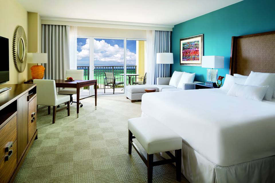
So when you’re picking a wall color for a bedroom, both the Saturation and the Value are important. If the color is too saturated, and there are other colors in the room, it can feel like the walls are vibrating. And that’s okay if you’re going for a room with lots of energy and vitality, like this one.
:max_bytes(150000):strip_icc():format(webp)/225811303_2351425294990524_4394162365566741163_n1-17bd60b7998c436d813211cbca0c5a66.jpg)
Likewise, if the color value is dark, it may feel more intense than a lighter value of the same color.
Okay, my child wants a bedroom makeover. Now what?
As a mom, I think it’s important to let children pick their own bedroom colors. But having said that… if you are concerned about having to prime over a loud or dark color in a few years when they change their mind or go off to college, you can take the hue (color) that they chose and then move a little toward the gray end of the fan deck. Muting that electric blue just a little will give the walls some longevity and allow your child to live with the color longer.
Here are some pairs of examples. The first color is a pure saturated color. The second related color is an alternative that is slightly muted (less saturated) and lighter (in value) as well. The alternative wall color will give you a calmer and perhaps a slightly more sophisticated feeling when you walk in the room. No more anxiety.


When in doubt? It’s only paint. Sleep well!
If you need help with color, feel free to comment below, hit the button for a Color Consultation, or shoot me an email at yourcolorcoach@gmail.com.
I would be happy to help you.
Hope you have a Colorful Day!
Barbara, Your Home & Color Coach
Peach Makes a Splashy Comeback
January 16, 2018 § Leave a comment
Don’t we all love HGTV! It’s such a wonderful antidote from mind-numbing news shows. So it’s not a big surprise that again this year we wander through the fantasy of winning the HGTV Dream Home — this one on the coast of Washington State. Here’s the gallery.
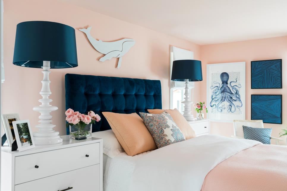
What strikes me most is the wall color in the Guest Bedroom. Peach! It’s been so long since we have seen this color on the cutting edge, and I have to say, Welcome Back! Although many will call this color pink, and you know who you are, it’s on the orange side of the “pink” hue giving it a warmer feel than the bluer-pink, which can be quite chilly.

Peach, this one by Sherwin Williams, is not your clear tropical hue. Its calm sophisticated undertone makes it perfect for an adult bedroom as long as it’s paired with contrast that will give the room some weight, and pardon the expression, masculine vibe.
In this case the designer, Brian Patrick Flynn, chose navy blue to anchor the room not only with a beautiful upholstered headboard but also with art and accessories. He pulls in nautical elements to remind the homeowner, as if they need a reminder, that they can probably see that gorgeous color palette out their bedroom window as the sun sets over Puget Sound.
If you’re not into as much white as the designer has infused into this bedroom, you might add more wood tones in the furniture, much as he did with a dresser on the opposite side of the room. Adding wood elements will balance the light and airy peach, but truly the navy gives the room its updated palette.
Peach can also be introduced into a gray palette in your own home without harkening back to the 1980s. Like yellow, peach is a warm balance to a lot of heavy gray, a trend we are exiting. See this other post for what to do if you feel a bit stuck with too much gray.
In the mean time, welcome back to Peach. We’ll see how long you stick around this time!
Wallpaper: Timeless or Trendy?
March 18, 2016 § 1 Comment
 Wallpaper continues to make design headlines as it rolls back into our homes. From half baths to bedrooms and dining rooms, we’re seeing it in almost every room. If you have an older home that always had wallpaper, then this is no big deal. But for some of us who have enjoyed plain neutral walls throughout, this wallpaper trend is a bit scary.
Here are some guidelines:
- Start Small. See how you like color and pattern on a small area before committing yourself to a big project. Try papering an accent wall in your office or guest bedroom. Or even wallpaper a table top for fun. Small projects are easier to undo or live with than full-room projects. Or break the rules: Dive in and wallpaper your dining room above the chair rail. You’ll love the dramatic change.
- Scale matters. Select a large scale pattern for a large area. That will keep the wallpaper looking contemporary and not left over from a different design era. Or break the rules: If you love the look of small flowers in a guest bedroom, then who’s stopping you.
- Love it. Wallpaper is a little more permanent than a coat of paint. So you should really love the paper you select. Stay in your home’s color palette and choose something that will coordinate with adjoining rooms. Or break the rules: If you really love foil, then it’s only wallpaper. Go for it. Make your home yours.
- Give the walls their stardom. Since you’ve wallpapered the walls, we presume you want people to notice them so back off on the other patterns in your room to let the wallpaper take center stage. Using a neutral sofa in front of a patterned wall keeps the pattern from overwhelming the room. Or break the rules: The latest trend is mixing lots of patterns together to give a room personality. Try to stay in the same color family to avoid room overload. But again, if you love it and it’s you, then own it.
- Take a deep breath. Before making that decision to wallpaper your bedroom ceiling, channel your interior decorator within. Realize that unless you are restoring an historic home to its original wallpapered grandeur, wallpaper for the rest of us is yet another design trend. In 7-10 years, you may very well hate it. So be prepared to undo the trendy foil damask in your half bath. Especially if you are planning to sell your home anytime soon. Wallpaper is what we call taste-specific. Potentially you may be the only one who sees it as timeless. Just an FYI. Or break the rules: Live for TODAY!! Enjoy your wallpapered ceiling and deal with it later.
Photo: This lovely wallpaper is 44 Gatti Secret Image (available at http://www.notonthehighstreet.com).
Green Decorating: The Soothing Hue
March 17, 2016 § Leave a comment
St. Patrick’s Day brings us to thoughts of green. Whether it’s kelly green or any of the variations thereof, green is a versatile, natural hue that brings life and comfort to any room. It is particularly nice in rooms where you spend time revitalizing your mind and body.


Waking up in a green room warms a cold, white, snowy day and cools a hot, humid summer morning. It can bring the color of lush plants and trees to a city skyline view. And it can calm an agitated, overextended lifestyle at the end of another hectic day.


Green can be either warm (yellow-green) or cool (blue-green), and both pair beautifully with white. Coordinating accent colors can add energy (the complementary reds and pinks, opposites to green on the color wheel) or quiet blending (the analogous yellows and blues on either side of green on the color wheel).
I highly recommend adding green, even a mixture of greens, to your home to quiet and soothe your soul. Wherever you need a few moments of ahhhhhhh.
Paint colors above: Top left to right: Waterscape SW 6470, Topiary Tint SW 6449, Honeydew SW 6428, Breaktime SW 6463. Bottom left to right: BM Guilford Green HC-116, Palisades Park BM 439, High Park BM 467, Dartsmouth Green BM 691.
Dramatic Outside Color Creates Dazzling Interior
October 13, 2015 § Leave a comment
 “Bring the outside in” — how many times have you heard that line before — but honestly, what a great idea! And one of the best ways to do it is with an accent wall that pulls a color right out of the view from the window. (Yes, accent walls are back.) This bedroom from a resort in Aruba has an incredible palette of blues and greens from which to choose the accent wall behind the bed. And how spectacular is it!
But you can do the same with the view from your bedroom. Choose a color that pops out at you when you stare out the window — it helps if there’s a beautiful maple in full color or a blossoming bush.
If your bedroom faces a concrete high-rise, not to worry. Your color palette is completely open to a view you might fantasize about. Create a bedroom oasis that reminds you of your trip to Bali (okay, maybe just your favorite House Hunters International on HGTV). Be bold or be subtle. Just be a force of change in your bland bedroom. And go ahead. Bring that outside in!
Ready to Immerse Your Home in Color?
November 25, 2014 § Leave a comment
 As with haute couture in the fashion world, we often look to hotels and other public spaces for trends in home color and design. Look no further than The William, a boutique hotel in New York, where each room immerses its guests in a paint bucket of saturated color punctuated by droplets of white for chroma relief. I am not sure if you can order up a particular color to match your luggage, but nevertheless, your experience there will be unforgettable.
Are we ready to move this color trend into the home? Some already have, but many of us will take a little while to move back into the rich dark hues of a decade ago. I’m just getting used to the freshness and brightness of white walls. But who knows.
 If you are contemplating a project that involves intense color, start with a small space like a guest bath or a guest room where the color will make a huge impact and the cost of painting over it will be minimal. Make sure you have adequate lighting so the color will show “true” and you will not end up in a cave. And remember to punctuate your color with white or cream to make the color “pop” and add bits of black not only to avoid the I-got-lost-in-a-box-of-crayons look but also to add an air of sophistication to the project.
Full color on!
(photos from Dwell magazine)
In a Teen’s Bedroom, It’s Just Paint
February 24, 2014 § 2 Comments
 Letting your child express herself in her bedroom is a wonderful way to uncork inner creativity. You may bristle at the color scheme and opt to keep the door closed most of the time, but allowing your child to have a room of his or her own design is so important to creative development.
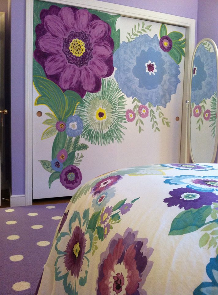
In this room, the young client chose a Pottery Barn Teen bed cover as her inspiration piece. After we selected a new wall color together (a soft purple — and a departure from the previous bubblegum pink), we brought in white accessories and a purple polka dot rug.
I mentioned that sometimes it’s fun to get a little crazy with the closet doors in the bedroom because they present a blank white canvas just begging for color. So guess what … hey, it’s just paint!
What Makes a Great Master Bedroom?
February 5, 2013 § 2 Comments
Ahhhh… the master bedroom — a retreat, a haven, a place to get away from it all. Of course, in practical terms, the master bedroom often houses exercise equipment, an office space, baskets of laundry, and piles of unread newspapers. But what makes a great master bedroom? Here’s my take:
1. A large enough bed to house two people comfortably. Queen size is great because it’s usually big enough but not too big. To me, a king invites the whole family to sleep there including multiple pets. (‘nuf said)
2. A padded headboard. Not only is a padded headboard attractive, but also it’s functional. It sure beats wood when you’re reading in bed.
3. No footboard. Leaving off the footboard allows for more visual space in the room, and it makes the bed look like you can run and jump onto it. Inviting, welcoming, all those things.
4. Good lighting on both sides of the bed. I don’t always call for symmetry in design, but both parties need good lighting so two of the same kind seems fair to me.
5. Really comfy bedding with a cozy throw on top. You’ll be amazed at how handy a throw can be when you’re hanging out on the bed watching TV.
6. A “wallflower” TV. If you must have one in the master bedroom, at least put it over in a corner where it is not the focal point of the room.
7. Two comfortable chairs. If you have a TV and enough space, put at least one or preferably two comfortable chairs in front of it. That way you’re not always lying in bed watching TV. (You’ll sleep better. Trust me on that one.)
8. A wall color that pleases both parties. Something soothing that does not promote controversy. You might avoid red, bright acidic yellow, and girlie pink. Just an observation.
9. Privacy. Locks on doors, shades on windows, and anything else that will shield you from the outside world. This is your haven — a place to regroup and refresh.
10. And what NOT to have. (optimally, of course) A desk, treadmill, laundry folding station, newspaper repository, and holiday decoration storage. It should not be a graveyard of unmatched socks, moldy towels, and unsorted paperwork. How practical is that? Well? These are guidelines…
Spend some time on your master bedroom. You’ll feel better in the morning.
What Color Should I Paint My Ceiling?
November 29, 2012 § 266 Comments
The ceiling is the fifth wall and many decorators and designers feel that keeping the ceiling white is like “throwing a sheet over the room” (Christopher Lowell said that years ago). But there are a few conditions to consider before painting the ceiling anything other than white:
1) Is your ceiling heavily textured? In many old houses, the ceiling is patterned (and God forbid, “popcorned”) and therefore very difficult to paint well. Also, painting it anything other than white will call attention to it and maybe that’s not what you want. One solution is to have your ceilings replastered to match your walls and painted, but if that’s out of the question, I would stick with white.
2) Is your ceiling a smooth plaster? If so, you should definitely paint it. How lucky you are! See below for what color.
2A) Is your ceiling really high? If so, you can paint it virtually any color that goes with the rest of the room. If you’d like to bring the ceiling down visually, consider a color darker than your wall color or a warm color (both will advance and appear to bring the ceiling down to a level that’s more in scale with your room). Also consider adding crown moulding if it’s not already there. The moulding will also bring the ceiling down by calling your eye’s attention to it. And it really finishes the room.
|
|
|


2B) Is your ceiling low or average height? Consider painting it a tint of the wall color. If your walls are a medium blue, then your ceiling would be the very lightest blue on the color swatch or even lighter (white with a dash of blue). This will help to round out the room and make the ceiling part of the overall decor — not just that white sheet over the top.
3) Does your room have enough light? Bright white ceilings do help bounce light back into the room so if your room is already dark, pay special attention to the ceiling color. White can be used effectively, but light tints on the ceiling will also reflect light. Just avoid a ceiling color that is going to absorb all the light and leave the room dark.
4) Are you painting a guest bath? I like to paint the wall color right up over the ceiling in a guest bathroom. Doing that makes the room feel larger by blending the walls and ceiling together and avoiding sharp lines and corners. Or do something kind of exotic on the ceiling, like the Moroccan tent (see photo above).
5) Are you painting a bedroom? In what other room do we lie around and stare at the ceiling? Why not paint it something interesting. In a bedroom, the sky’s the limit (literally) — from puffy blue clouds on a backdrop of sky blue to a quilt of squares in different colors (Candice Olson did a fabulous multi-colored geometric ceiling in a master bedroom). And in kids’ rooms, the ceiling is just one more space to use your creativity.
Hope this helps the “Do I paint the ceiling?” dilemma.
The Renaissance of Wallpaper: With a twist
September 17, 2012 § Leave a comment
 The first thing my husband did when we moved into our house many years ago was rip a long piece of wallpaper off the bathroom wall. “We won’t be keeping this,” he proclaimed. Well, I wasn’t planning to start a bathroom renovation that afternoon (I had to hide the ugly blemish with towels for months), but he certainly had the right idea. All the wallpaper came down eventually and was replaced with paint.
Many of us have visions of homes with old faded wallpaper and knick-knacks everywhere or rooms where every available inch of real estate was covered: ceiling, switch plates, wastebaskets– even the window treatments matched the wallpaper.
The rebirth of wallpaper that we’re experiencing, however, is far different from what you lived through in your grandmother’s parlor.
1) Contemporary wallpaper makes a bold statement either with color, texture, large graphic design, or all three.
2) The wallpaper is a feature of the room, like a piece of art, and not simply a wall covering upon which to layer a hodgepodge of family photos, diplomas, and other objects of interest.
And that’s the major difference. It’s more about what else is going on (or not) in the room and less about the wallpaper itself. Contemporary use of wallpaper involves a more judicious placement in areas like the focal wall in a foyer (as in the photo), the walls in a guest bath, the headboard wall in the master bedroom, and the walls above wainscoting in the dining room. The wallpaper is also selected to be the appropriate scale in the room (you won’t see so many little tiny pink flowers anymore). And the furnishings in a room with bold, contemporary wallpaper harmonize with it, both through color and fabric design and scale.
So be adventuresome. If you’re feeling like your room is just a little too blah, even after you’ve painted a fresh new color, try wallpapering an accent wall. Just for fun. Your grandmother would be proud.
