Let’s Talk About Color: Yellow
May 1, 2007 § Leave a comment
Yellow is a great color if you like sunshine — and who doesn’t. The problem with yellow is that if you end up with a hue that is too lemony, it can really make the energy in the room a bit too intense. Even agitated. But if you select a hue that has a touch of red in it, you get a wonderful golden glow.
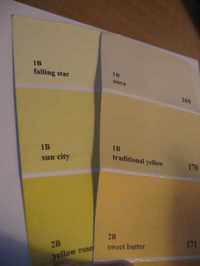
If you have a Benjamin Moore fan deck (or you’re headed to the paint store) check out the difference between sun city (352) and traditional yellow (170). The effect on a room is huge. Although the lemon yellow looks great on the paint chip, picture your whole room in that color. Acrid comes to mind. On the other hand, the orangey lemon is warm and enveloping, like the glow from a candle. If you do decide to use a lemon on your walls, you can temper the color with lots of white and black.
Let’s Talk About Color: Blue
April 27, 2007 § Leave a comment
From the sky to the ocean to a baby’s blanket, it’s no wonder that everybody loves the color blue. As a cool color, blue recedes making rooms appear larger. As a color pulled from nature, blue represents relaxation and peace and is perfect for rooms like bedrooms, babies’ rooms, living rooms, porches, guest baths, and just about every other room where you want to relax. But choosing the right blue can be a real challenge because what appears to be a pretty blue in the paint store may turn out to be a vibrating horror on your walls.
Here’s an exercise. Next time you’re in the paint store, pull a bright clear blue (like Highland Breeze #786 from Benjamin Moore) from the sample rack and put it on a piece of white paper. Then pull what might appear to be gray (like Silvery Blue #1647 from Benjamin Moore) and put it on a different piece of white paper. Now stand back and try to picture what each of those colors will look like on all four walls of your room. What happens with the clear blue is that it feels like it’s vibrating. The clarity of the color makes it so intense in the room that the effect is far from restful, at least for an adult. (Kids and teenagers love clear colors so something like highland breeze might work for their rooms, but make sure you temper the color with a lot of white.)
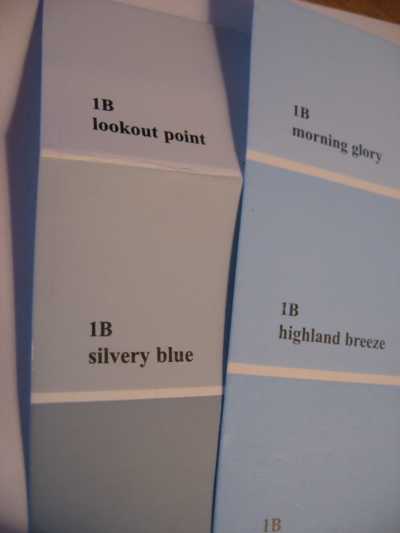
The more restful shade of blue is the silvery blue because it is greyed down. It tends to blend and recede as a restful backdrop and is perfect for any bedroom.
The message to share is that you should notice more than the wall color when you enter a room. If all you see is the walls, then the room is not working. To avoid that wall color trap, look for greyed-down shades and avoid crystal clear hues that resemble the contents of a crayon box. You’ll be happier with the result.
Let’s Talk about Color: Taupe
April 26, 2007 § Leave a comment
Taupe is one of those colors that drive interior decorators crazy. It is fickle. One moment it is a wonderful neutral backdrop to rich woods, cream, and warm autumn colors. The next moment you’re seeing green. Then the next moment you’re seeing pink. Yikes!
All color is influenced and dependent upon light. From sunlight in the afternoon to incandescent bulbs at night to those awful fluorescents that we’re using more and more, the lighting in the room will change the color you actually see on your walls. That’s why the color you choose under the fluorescent lights in your paint store may not turn out to be the color you want in your home.
When you’re selecting color, the best thing to do is buy a little paint (companies are accommodating this practice by offering little pots of selected colors) and paint up a foam core board. Then tape it to the wall in your room and observe the color at different times of the day. And on sunny and cloudy days. Is it the color you want?
This exercise is especially important with taupe. Moving out of the gray tones of taupe and into a warm camel brown (like C2 Paints’ Chai) might solve the chameleon color dilemma in your neutral room.
Let’s Talk About Color: Green
April 25, 2007 § Leave a comment
As a decorator, paint color in my house changes so often that my husband and kids just roll their eyes when they open the door and smell the fumes. They hardly notice any more. But I sure do. I change room color to experiment with light and shadow and depth of color as well as different color combinations and color placement. So wouldn’t you know that two days before my mother-in-law was to arrive, I decided to repaint our master bedroom. Deadlines seem to inspire me.
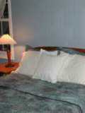
My jumping-off point was the area rug, a mixture of greens and salmon pinks. I had lived with a light shell pink on the walls for quite awhile and was ready for something richer. So I selected a beautiful soft green, not too olivey and not too sagey. Benjamin Moore’s High Park (#467 from their Classic Collection). It turned out to be a very relaxing color, perfect for a bedroom. And mixed with white and cream, the color “pops” (as we too often say).
The upholstered headboard (see other blog entry) was another last-minute inspiration as were the large pillows.
If you’re looking for a soothing, relaxing, ahhhhhh kind of bedroom, consider a soft green. Other favorites are Benjamin Moore’s historical greens like Kennebunkport Green (HC-123) and Nantucket Gray (HC-111). Both work really well in a bedroom and look spectacular with wood. And if you look at nature through your windows, you’ll feel like you’re in a tree house.
You Can Make a Simple Tufted Headboard
April 12, 2007 § 2 Comments
If I can do it, then anybody can. Heard that before? Well here’s the scoop on making padded headboards.
Tools I used: large piece of plywood, scrap wood like small 2x4s, 3-inch foam, quilt batting, spray adhesive, staple gun, circular saw, studfinder, power drill, power screwdriver, pliers, level, pencil, covered button kit, scissors, coordinating fabrics, ear protection for using the saw, and eye protection.
I started my project around 9:00 a.m. and finished around 2:00 p.m. So I wouldn’t call it quick, but it was fairly straight forward.
The design was a very simple rectangular padded headboard with three large tufted buttons. And I planned to mount the headboard directly to the wall above the bed (I had tried leaning headboards up against the wall but they always seemed to flop. Putting it on legs would be fine too but attaching it to the wall seemed most sensible.)
1. Using a studfinder, I found two studs on the wall behind the bed and affixed a piece (around 2-ft long) of scrap lumber to the wall by using long screws.
2. After measuring the width of the bed and deciding how high to make the headboard, I cut the headboard shape, in my case a simple rectangle, from plywood using a circular saw and attached a piece of 3-inch foam to the wood by using spray adhesive. (Electric knives are great for cutting foam.)
3. Using a large sheet of quilt batting material, I covered the foam and stapled the batting to the back of the headboard. (It’s best to cover the batting with a sheet and staple to the headboard for a smooth, professional look — I skipped this step because I was planning to tuft and the fabric was lumpy anyway.)
4. I stapled the fabric to the headboard (put one staple in each side first — top, bottom, side, side — and then proceed to staple the rest. The corners should be neatly folded or cinched — each corner done the same way to match.)
5. Using coordinating fabric, I made three large covered buttons from button-making kits. A great way to customize and dress up a project.
6. I drilled a hole on the back of the headboard opposite where the button was to go. Then I used a turkey-dressing metal “needle” to thread through from the front to the back of the headboard, through the foam and out the hole on the back. Finding the hole was the hardest part of the project but patience helped.
7. With the “needle” through to the back, I put my knee on the button and pushed to cinch in the foam and create the tuft. Then I fed the “needle” through a plain button on the back of the headboard and twisted the metal “needle” with pliers. Voila! Tufting the other two buttons was much easier once I measured and then measured again.
8. Then I mounted a long strip of wood to the back of the headboard and rested the headboard on the wooden wall strip. After pre-drilling, I secured the headboard to the wall mounting with long screws.
Note: The headboard rocked against the wall so I removed it and mounted a small 2×4 directly to the wall in order to brace the headboard from behind. Then I remounted the headboard on the wall. Done.
Interior Decorating for Everyone: Achieving Flow
April 8, 2007 § Leave a comment
You know it when you see it. From the moment you walk into the home, it just looks pulled together. It’s hard to describe, perhaps, because things don’t necessarily match, but something about the way the house is decorated feels right. And you want that same feeling for your own home.
What you’re feeling is what we call “flow.” When you can move from room to room as if the entire home were one big space. Not in physical layout but in visual makeup. Example: The front entry has a red accent wall that grabs your attention. And as soon as you’ve removed your boots your eye moves to the red pillows on the sofa in the adjoining living room. You’re drawn into that room which may have a beautiful colorful landscape over the fireplace. You study that for a moment and then notice that the adjoining dining room has upholstered chairs in some of the same colors that you saw in the painting in the living room. Now you’re beginning to experience flow.
Flow doesn’t mean “matchy-matchy.” When everything matches (for example, if you purchased every piece of the Queen Anne set you saw displayed in the furniture store and put some in every room of your house or you bought the entire bolt of that Waverly fabric you fell in love with and made window treatments, pillows, chair covers, bedspread, and then even found matching towels, lampshades, and toilet seat cover) then you have not achieved flow. You’ve achieved “predictable” and maybe “tiring” but you have yet to achieve flow.
Flow is more subtle. Here are some tips:
1) Avoid being drawn into purchasing everything that matches. Way too easy and a bit boring after awhile, especially if you tire of that style or fabric. You want your home to be dynamic, not set in stone.
2) Walk around your home and see what colors are already there. Perhaps you have a colorful rust, beige and green rug in the dining room and the living room is all beige. Okay, you’re on your way. You’ve found one common color between the two rooms. That will move you toward flow. To enhance flow in this home, you might pick either the rust or the green to use as accents in the living room, either as pillows, window treatments, or artwork. Now your dining room and living room are tied together. But nothing “matches,” they’re just similar colors being spread around the space.
3) If you have white walls everywhere, you don’t need to paint everything the same wall color to achieve flow. Let’s go back to the previous example. You might paint the dining room a soft grey-green to pick up on the green in the rug and bring the rust into the living room with an accent wall. Or vice-versa. Either way you’re spreading the color from room to room and allowing the décor to flow throughout the house.
4) Be careful with wallpaper. Although I’m not a huge fan of wallpaper, it can definitely work if you plan with flow in mind. If you use a big floral design in your dining room, don’t expect to get away with another big floral design in the living room, even if you maintain the palette of colors. Big clash. You have to pick wallpaper and fabric according to color and scale. Mixing two large designs doesn’t work. Pick the large floral first then a stripe, texture, or small-scale floral to go with it. Otherwise you’ve got visual chaos.
5) For furniture, it’s easier to mix countries than it is to mix periods. For example, mixing French and English and Chinese and Early American furniture from the same time period in history is easier than mixing Early American, Shaker, mid-century modern, and urban loft together in one space. The first creates character and interest; the second creates post-garage sale eclectic. Hard to pull off.
Try walking from your front door through your house and see where your eye goes. Is your eye interrupted by furniture, styles, and colors that don’t seem to belong? Or does your eye flow effortlessly from one room to the next? See what your rooms have in common with each other in everything from walls to accessories to wood tones. Start spreading those common elements throughout the public areas and you’re on your way to achieving flow.

