Color Your Walls
July 19, 2007 § 81 Comments


Color is hot. Whether it’s chocolate brown for your bedroom walls, spice for your kitchen, or lime green for your guest bath, color is going up on the walls all over. People move into wonderful new homes with painter’s white walls and wonder why their homes feel so cold. Remedy? Add color.
Sometimes people are hard to convince that a hint of yellow on the walls will add a dash of sunshine to their lives. White walls tend to pick up the other colors in the room and if you stand back and really look at the “white” walls, they appear grey. Recognizing that really makes you want at least a little color on your walls.
For people with real fear of color, it’s usually that they’re afraid the room will be too dark. Solution? Check the lighting first. In one home, after determining that a velvety navy blue was the best color for this room, we called the electrician and added more recessed cans first. What a difference. Between the additional lighting and the rich color on the walls, the room was transformed from boring to bellissimo.
Sometimes people want what they see in a magazine but upon further conversation and a tour through the home, we discover what colors they really love. Color inspiration can come from furnishings, dishes, a painting, cabinet color, or just about anything. A beautiful backdrop color pulls the whole look together.
Consider all adjoining rooms when making wall color selections to achieve “flow” throughout the home. Color can really transform people’s lives. And paint is relatively cheap!
Color Subtleties: What I learned about green from a cactus
July 10, 2007 § 2 Comments
There are times when I catch myself staring at the cactus sitting on the kitchen windowsill. It’s one of those tall cacti, about 30 inches, whose growth shows up in rings of color moving up the long stalk. If you stare at the cactus long enough, you can appreciate the gradation of greens from the olivey older growth to the bluer-green new growth. The colors also have kind of a muted, dusty quality that’s hard to find on a paint chip.

Studying the combination of greens really makes me appreciate how many greens are mixed together in nature. And how you can copy some of those combinations in your own decorating to achieve a refreshing color palette. Whether it’s in your home or on the exterior, feel free to mix some greens and see what you get. Next time you’re killing time in a paint store, check out Benjamin Moore’s apple blossom 479 with corn stalk 542. Or garland green 429 with desert green 443.
You don’t have to mix paint colors to get the effect. Mix up the greens in your landscaping. Add some yellow-green shrubs to a garden of blue-green hosta. Look more closely at the color combinations in the countryside as you drive by. With all its variety within the family, green is a fabulous hue. And if you have a cactus nearby, check it out. Really look at the color green.
Stage Your Own Home
June 13, 2007 § 5 Comments
If you are selling your home, or even if you’re not, there is lots of advice out there for how to prepare your house. Television shows like Designed to Sell (HGTV) give you a crash course in updating, but for many home sellers, the thought of redoing kitchens and baths and floors without the benefit of a designer and crew of workers is just too overwhelming.
Here are a few suggestions for staging your own home, enough to get you started, at least.
After 
 Before
Box up all the stuff. You’ve heard it before, but clutter is the biggest turn-off to people who are looking to buy your house. Clutter makes the house feel smaller and it simply makes the house look like yours and not theirs. And you want the potential buyers to see themselves in your house. But you’ve lived in the house for 20 years and accumulated an overwhelming amount of stuff? That’s okay.
1. Start by taking down all the family photos, wrapping them up and putting them in a box labelled “Family: Open First.” You can even put the box in your car and carry it with you. The hardest part is now done. You can now start thinking of your new house as your new home and your current house as somebody else’s.
2. Now create three piles: Keep, Throw Out, and Recycle. Just like the show Mission Organization, take a day and dedicate it to going through your bookshelves, closets, home office, and kitchen with a quick, yet critical eye for what stays and what goes. When in doubt, throw it out. As a general rule, leave lots of open space on the bookshelves, no small knick-knacks anywhere, and as few cords as possible. If you can live without the printer or the DVD player, box it up.
Lighten Everything Up. You’ve removed all the clutter, but everything seems dark. In older homes with lots of dark woodwork, it’s really important to lighten up the room any way you can.
1. Raise all the shades on the windows, push drapes all the way open or remove completely, turn lights on (for a showing), and add white to the room to create some contrast. In this room, we found a bigger piece of art for over the fireplace, moved a white settee next to the fireplace to highlight the room’s focal point, and put a white pillow in the dark blue chair for contrast.
2. Remove all the extra furniture. Keep all the walkways open, bring the furniture away from the walls, and cluster seating to provide intimate conversation areas. In this room, we removed a sofa table that blocked the entrance.
Make it Squeaky Clean. Whether your house is old and worn or brand new, everything in it needs to be clean. Windows, walls, floors, kitchen counters and cabinets, bathroom tile, sinks and tubs. If your walls are dingy, you’ll need a fresh paint job. The potential homeowner should enter a home that smells fresh and looks really, really clean. The same goes with the outside, especially the front door area. Make sure the yard and the front porch are spruced up.
The Rest is Gravy. After de-cluttering, removing extra furniture, and cleaning everything in sight, you’re almost done. Just make sure that each room’s best selling features are evident. If you have beautiful hardwood floors, make sure you can see them (remove unnecessary scatter rugs). If you have a great view, make sure you can see it (maybe even take the drapes down). If you have a terrific marble fireplace surround, call attention to it (put a comfortable chair next to it or a piece of art over it). Put a bouquet of flowers somewhere visible as you come in the front door and let your house sell itself.
Choosing the Perfect Green for your House Color
June 11, 2007 § 11 Comments

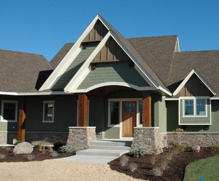
Green is nature’s most prominent color, at least in the spring and summer, and it makes a wonderful color for your house. The challenge is to find the right green, something that appears in nature, does not conjure up images of either toothpaste or lime koolaid, and does not stick out like a sore green thumb. The house at right is somewhere between sage and olive and it definitely works with the landscape around it. The house color does not pop out of the neighborhood and it appears thoughtfully selected.
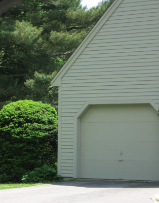
The house below would be better suited for a more tropical locale, perhaps Key West, where the bright seafoam greens and the sun and fun culture set the landscape’s palette. If you live someplace other than a tropical climate and maybe Southern California, stick with the grayed down shades when selecting a green for your house to blend best with the landscape. Benjamin Moore’s Louisburg green (HC-113), Nantucket gray (HC-111), and Saybrook sage (HC-114) are earthy greens that make terrific house colors.

Consider Your Home’s Roof Color: A Major Design Statement
May 31, 2007 § 385 Comments
Not too long ago, roof color was black — or a shade of black. Today, coordinating roof and house colors or choosing a new roof can be quite a project. So many choices and expensive ones at that. It is important to make a wise decision to avoid a long-term design disaster.
If you’re due for a new roof, congratulations! You now have a chance to select your roof color from the myriad choices that are available. Here are a few guidelines and considerations:
Traditional Shingle Roofs
- Gray or blue house. Stay with a traditional roof color like dark gray or black. That way your roof will blend with your house and make the whole structure seem bigger. Any other roof color will stand out too much and make the house look chopped up.
- Cream, tan, or light brown house. Consider the many brown roof options, some of them with a mixture of browns that really make the house look updated and terrific. A brown roof will blend with the cream or tan and make the house look bigger. Black and gray roofs just look ordinary. A brown roof looks like you actually planned out your entire color scheme.
- White house. Dark gray and black are traditional, but they work. Blue is also a terrific option. Red or green metal on a white farmhouse give a traditional country look. Bottom line on a white house: you have lots of options.
- Red, green, or yellow house. You can go either way, a brown or a gray/black roof. I prefer a brown roof for red and green house colors and a black roof for a yellow house.
Of course, the same suggestions apply if you are stuck with your roof color and are looking for a paint color for the house.
- Black/gray roof. The ideal house colors are gray, blue, white, and yellow.
- Brown roof. The ideal house colors are cream, tan, brown, red, green.
- Green roof and other colors. You can either use the roof as an accent color to the house or try to blend it by using a lighter tint of the roof color on the house itself.
Nontraditional Roofs
What about metal roofs? They’re all over Colorado, Upstate New York, and other areas of the world where snow on the roof is a major factor in the winter. Metal roofs come in a rainbow of colors, from red to green to brown to purple. If you have a metal roof, you are making a design statement (whether you mean to or not, of course) and you can treat it as an accent color, kind of like picking a front-door color. However, if you do not want to call attention to your metal roof, choose a natural roof color like dark charcoal, bronze, black, or brown instead of a color like blue.
What about terracotta roofs? These are traditionally seen on Mediterranean style homes and are a definite design feature. Keep the house color neutral to highlight the beautiful roof and the other architectural elements that are undoubtedly present.
Other nontraditional roof materials. Just like a thatched roof on an English cottage, a nontraditional roof is a design feature of the home. Hopefully, you want it that way. Choose a house color that makes the roof look like you planned it as a feature.
Regardless of what kind of roof you have, make sure you consider it when making house color decisions.
