Updating Old Furniture
July 17, 2008 § 9 Comments
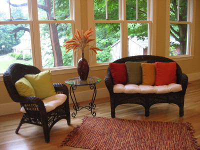 I love a bargain. And if I can get something for free, all the better. I got this wicker settee from a friend moving to a city condo and the chair was a consignment store find. Both original pieces were not so great-looking. The chair was a dingy “white” and the settee a pretty banged-up natural wicker. All it took to update this furniture was two cans of dark brown spray paint and a tarp to cover the grass in the backyard. Within an hour, the furniture had been rescued.
For cushions, I used an inexpensive cotton (even covered some buttons) and splurged on a few new pillows.
Don’t overlook old furniture that can be spruced up with a little elbow grease. It’s really fun and rewarding to take what might have gone to the dump and make it fresh and usable again.
Reviving Old Furniture with Wall Color
May 13, 2008 § 16 Comments
 Do you have a sofa from the 80s that looked great back then but kind of looks sad at the moment? Of course, you can slipcover it, but how about punching up the color behind it. We took a living room with blah beige striped wallpaper and pastel patterned upholstery (in good condition) and brought it to life with a soft blue-green paint color (Benjamin Moore’s stratton blue HC-142) and some new pillows. What a difference. All of a sudden the sofas looked intentional and the room came alive.
The trick here is to pick a wall color that is rich but subdued. You need a greyed down shade for this effect to work. Otherwise, a bright wall color might just make your furniture look even older. But a nice tasteful splash of wall color will give your furniture a few more years of life. And in this age of recycling, re-purposing, and reusing old stuff, it’s all about making what you have work.
Before you drag your old furniture off to the consignment store, try painting your room.
Green Decorating: Shop your local consignment stores
March 17, 2008 § 10 Comments
 Okay, I admit it. I have the consignment bug. I find it incredibly exciting to hunt for and find an item that is not only reasonably priced but also has a history to it.
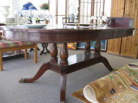
I recently purchased an oval mahogany solid-topped dining table that was, admittedly, a little beaten up on the surface, but the base was unbelievable. Personally, I find the scratches and gouges rather charming, much like the wrinkles on a wise old woman. But I may decide to apply a little loving elbow grease (or a simple table cloth). Regardless, I now have a gem. It took two burly men to haul this solid piece of craftsmanship up the deck stairs and into the dining room. And it’s not going anywhere.
The best part is that there’s a wonderful karma that comes from knowing that perhaps another loving family sat around this fabulous table before ours. It’s not a perfect specimen; it’s been around here for a couple of generations, at least. And I find that history a wonderful addition to our family. Not only that, but by purchasing something that is already here, we are not only saving thousands of dollars but we are decreasing that carbon footprint that everyone is talking about. Purchasing antiques and other gently used furniture and accessories is considered “green.”
Adding Unexpected Color to Your Home
January 9, 2008 § 16 Comments

Next time you feel inspired to add color to your home, consider painting the stair risers on your front staircase. Usually they are painted white, a nice contrast against the wooden stair treads, but how practical is that. It doesn’t take long before the riser is all scuffed up with black shoe marks going up the stairs. Why not solve that problem by painting the risers a different color, something darker that will hide the shoe marks but will coordinate with your decor.
You can take a color out of the tile in the entryway or borrow the color from an adjoining room. Either way, the stairs will become a more important feature in your decorating scheme and yet another place to add some unexpected color to your home.
Spring Decorating: Whatever You Like
January 7, 2008 § 17 Comments

Those of us in the decorating business are already studying the spring color schemes and it seems that almost anything goes. We’ve got Barbara Barry’s new soft green and beige palette, a very subtle sophisticated combination similar to the ice blue/chocolate combination we’ve enjoyed over the past few years.
Then there’s Pottery Barn’s red walls with white furniture and bright yellow, orange, and lime green accents, a flashback to the ’70s but with a twist.
Chocolate brown is still hot, and this year we’re adding bold patterned furniture and pillows in place of the textured neutrals of yesterday.
One color that’s making a comeback is dark teal. I’ve seen it paired with burnt orange this time in a strikingly rich paisley fabric from Calico Corners. The look is rich and perfect for a big upholstered chair in a study. I never thought I’d welcome back teal, but it’s looking good.
Ceilings are getting color in a big way this year. Check out the cover of HOME magazine (shown above). They’re showing bright lemon yellow walls and a robin’s egg blue ceiling. I think we’re coming out of our shell, so to speak…
Looking further into the magazine, we find REALLY brightly colored walls of grape, kelly green, classic royal blue, and canary yellow. What makes these colors work is their pairing with bright white. Very crisp and fresh.
White kitchens are back as are white living rooms, again paired with bright accents. There’s just nothing like white for a clean look — people seem to love it.
The organic neutrals are still in, though, especially for more traditional homes so don’t throw everything out. You can always update your look with new accessories like pillows and lamps. But once again, we’re seeing styles and colors for spring that can fit most everyone’s tastes and that’s a good thing.
More soon.
Before You Color Your Walls, Check the Lighting
October 19, 2007 § 12 Comments
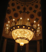 You may not have a chandelier quite as grand as this one for your dining room or entryway, but take a look at your current lighting situation. Although it may seem obvious, good lighting is critical. You need light to see color so before you paint your walls chocolate brown, check to see whether you have enough light in the room to see that gorgeous color. Otherwise it will fade out to gray or black.
You also need adequate task lighting like lamps for reading and pendant lights for cooking. You need some overhead lighting, like recessed cans for highlighting artwork, or chandeliers for mood lighting. But there are other kinds of lighting as well.
Wall sconces are ideal in the bathroom if hung at face level for optimal shaving and makeup application. Sconces are also wonderful for hallways and beside the fireplace to enhance the warm glow in the room. An uplight under a plant in the corner is a quick way to add drama to a room. The light shining up through the plant sends all kinds of interesting shapes onto the ceiling. “Fantasy lighting” creates a mood in a room but is inadequate for actually seeing anything. Soffit lights around the edge of the room give a soft, almost night-light feel to a room. If you’re redesigning a room, look at the lighting first.
Here are a few tips:
- Unless it’s a table lamp, install dimmers on everything from the chandelier in the dining room to the recessed cans in the kitchen. There’s nothing that kills the mood quicker than somebody coming into a room and throwing on the overhead light switch.
- Set up a triangle of lamps. Don’t have all your lighting on one side of the room. Balance it around the room so there aren’t any really dark areas.
- Replace that single bulb in the middle of the ceiling with either a semi-flush-mount light fixture in an up-to-date metal finish or some recessed cans around the perimeter of the room. All on a dimmer.
- Make sure your table lamps are the right scale for your tables. Small lamps are great for the bedroom, but larger lamps really go better in the living room. And tall skinny lamps look good on sofa tables and buffets.
- Don’t forget a floor lamp, excellent for a reading nook.
- And torchieres, like other uplights, throw light up onto the ceiling where it is reflected. Torchieres are a good balance to all the other light that is pointing down into the room.
Have fun with the lighting in your home. You can save money by using energy-efficient bulbs wherever possible, especially in lamps that you leave on a lot. But just remember that those energy-efficient fluorescent bulbs cast a cooler light than either halogens or incandescent bulbs and may change the color of your walls at night. Keep that in mind when you choose your wall color.
Creating a Peaceful Space
October 6, 2007 § 14 Comments
 Sometimes you just want to relax. Whether it’s in a bedroom, a master bath, or some other special place like this library, there are times when you want to enter a room and just say Ahhhhh. When planning that relaxing space, start with the wall color. This room is Gentle Gray (Benjamin Moore) and it reads a very soft blue that is picked up in the carpet color, window shades, and pillows. To add to the earthy Zen feel yet create some warmth, we added a chocolate brown sofa and chair cushions. The texture on the sofa makes it cozy and the silk pillows add some sheen. We topped off the space with satin nickel and glass accents for some sparkle. We kept the accessories spare to avoid visual clutter.
The big tip for creating a peaceful room is to choose colors that are soothing to you and avoid too much contrast that is jarring to the eye. Use texture to add interest instead of bright colors and you’ll have a space you can collapse into at the end of the day.
