Surprising House Color Trend — White
February 12, 2014 § Leave a comment
Classic but always with a modern twist, white is trending now as a house color on new construction. Whether we’re craving our grandparents’ old homestead, or we like a crisp, uncomplicated look, white is in. White siding with white trim. But the surprise element lies in the accessories. Fresh options include silver for the metal color (not the traditional black), white or pastel door colors (nolonger black or red), medium-toned metal roof colors (not just charcoal shingle anymore), mismatched out-buildings (that old classic farm look is coming back in a big way), and even (gasp!) white shutters on a white house.
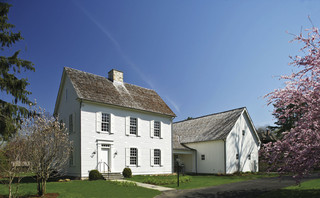
The beauty of white is that it really is timeless. Not only that, but it shows off your colorful flowers and the greenery of your landscaping, the orange patio umbrella and Adirondack chairs, and the turquoise of your backyard pool (okay maybe I’m going a little overboard).
See if a fresh pop of white brings out the character in your house.
Warm Your Soul with Color
January 29, 2014 § Leave a comment
 Those of us with light airy neutral homes are feeling the chill this winter. Whether it’s the frigid temperatures outside or the cabin fever inside, the light, low-contrasting palette we enjoy so much of the year for its calm and cool comfort just isn’t cutting it.
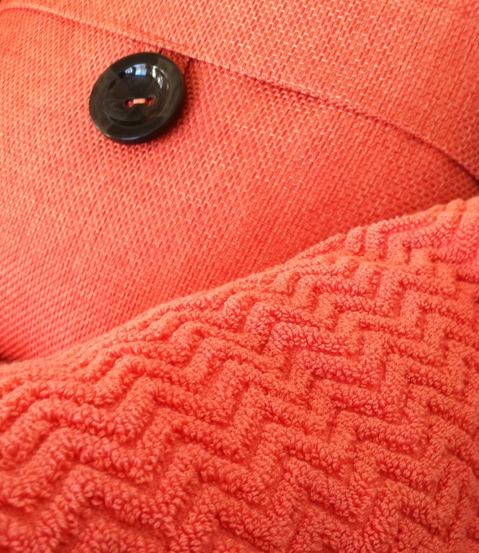
A recent trip to a home goods store had me craving color. On two separate occasions, my eye scoured the store’s palette of spring selections and landed on the same warm vibrant coral. I had to have it. First the pillow. And next time, two towels (for me only, I might add).
Color makes us feel good. Color cheers us up and calms us down. And the right color can make our homes feel cozy and welcoming any time of year. Welcome home, my new coral accents. And if the temps don’t rise soon, I’ll be off to the paint store for a gallon of, you guessed it, coral.
Stay warm, my friends!
Spring Into Unexpected Color
January 22, 2014 § Leave a comment
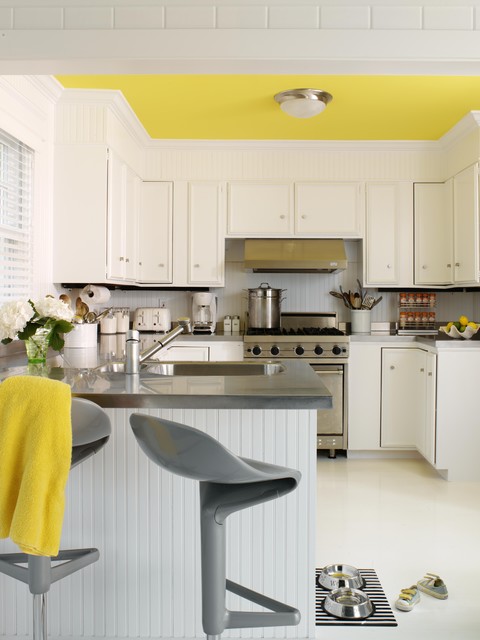
Designers are adding pops of color to the previous year’s light neutral color palette and in the most unexpected places. Look up for an opportunity to add color to your white kitchen. Pull some of that ceiling color down into the room with dishes, placemats, and other accessories. And create “flow” between rooms by adding a touch of your ceiling color to the adjoining room.
Color trends like this year’s fuschia are fun when you can add the color with inexpensive pillows or a single upholstered chair (http://www.worldmarket.com/product/fuchsia-nina-chair.do). Keeping the base of the room neutral lets you change your color palette when fresh new opportunities arise. Or with the seasons.
Pick Paint Colors Last — yes, Last
January 15, 2014 § Leave a comment
 So often I am called to a freshly painted room and asked to help the homeowners find a rug and window treatments to go with the new wall color. As much as I appreciate the homeowners’ enthusiasm for tackling the paint project first, it makes finishing the room much harder to start with the paint.
If you’re planning a room re-do and anticipate purchasing new furniture, window treatments, and a rug, here’s the most efficient order of purchases:
- Pick the biggest-ticket item first, perhaps the new upholstered or leather sectional sofa.
- Then pick the other furniture, like upholstered chairs and a leather ottoman.
- Then pick the rug. There are fewer options at that point, but the rug will introduce additional colors into the palette and you can bring those other colors into the room with art and accessories.
- Then if you want fabric window treatments, pick the fabric next that will complement the other elements.
- After ALL those decisions are made, THEN it’s time to pick the wall color.
There is a multitude of paint colors, shades, and tones from which to choose, but the paint decision will actually present itself more clearly once all the other major decisions are made. And the paint color will then pull the whole room together.
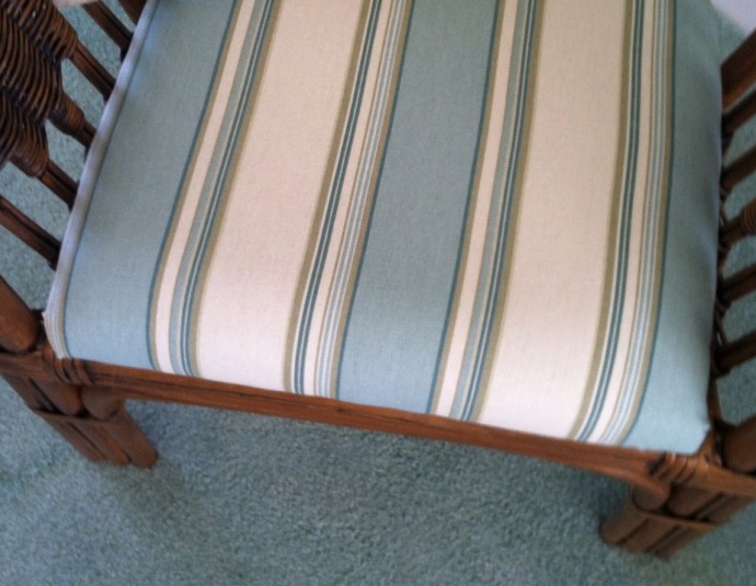 If your furniture and rugs a
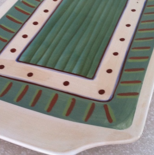
 re neutral, you can find your color inspiration from almost anywhere, including in this case, a hand-painted platter. From that inspiration piece, we pulled in a striped fabric to cover some rattan chairs, and pulled the soft, gray-green paint color out at the end to complement the blues.
It’s Time to Talk Pillows
May 14, 2013 § Leave a comment
It’s spring (sort of) and it’s time to perk things up around the house. Open the windows, clean out closets, and swap your pillows. Huh? Yes, you read that right. Take all the cozy decorative pillows you have in the living room, beat the dust out of them, and put them into storage for a few months. Liven up your space for the summer with fresh, new pillows in light or bright colors in cool fabrics like crisp linen.
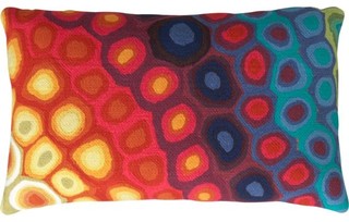
New pillows add color to an outside space as well. Here’s one from CB2. It’s amazing what a few summery accessories can do for your sense of well-being. Go Zen, go nautical, go wild, or go graphic. But go get yourself some new pillows.
Black Brings It
March 20, 2013 § Leave a comment
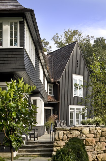
Who says black is not a house color? Certainly not me. Black is to houses what a little black dress is to a stylish woman. A great way to show your stuff.
Black is both dramatic and neutral. It attracts attention and shies away from it. Black blends with almost any environment, yet it makes all other features stand out, like the crisp white windows on this house. Since the trim on the rest of the house is also black, the white windows and window trim take center stage. The natural cedar roof creates warmth and texture. And the bronze gutters look like jewelry.
Another feature that stands out is the rock wall. The backdrop of black allows the depth of color on the rock wall to come forward — much more effectively than if the house were another more typical earth tone.
The mix of siding materials adds an additional layer of texture. The tall board and batten siding on the high gabled section makes a tower of that end of the house. The shakes on the rest bring it on home.
Yes, black maintains its reputation as the color of sophistication. Even for siding.
It’s the House Color, Not Your Dining Room Curtains
February 28, 2013 § 2 Comments
 Sometimes the best house color is one you might skip right over in the fan deck. Like this one: most likely Ben Moore’s Livingston Gold HC-16, a dark mustard-like brown with a definite green undertone. The kind of color you don’t want to see if you’re feeling queazy.
Although you probably would not choose this color for an interior room (for the reasons mentioned above), what a great house color for this old farmhouse with attached garage in natural cedar shakes. The combo is terrific — earthy, aged, and plucked from nature’s rock and wood palette of colors.
I slammed on the brakes to take a photo.
Tired Brick Fireplace Takes Cover
January 9, 2013 § 4 Comments
 Sometimes the “bones” of an old house fall under the category of “What were they thinking?” You could say that about this brick fireplace with its random placement of dark bricks and the outdated brass enclosure. But not to worry. Your family room is not doomed to the styles of 1972 — you have options. One of the best ones is to paint the brick as shown in the after photo (from Southern Living Magazine’s Makeovers).
The homeowners covered the offensive brick with a flat, textured paint in the green wall color. They painted the hearth in a natural stone color. Then they added two bookshelves for a built-in look and painted them the same green. The new fireplace insert in a bronze color blends nicely. A narrower mantel and corbels painted cream pop off the green — art finishes the focal point.
The overall result is a fireplace wall with emphasis on everything but the original dated fireplace. When faced with old brick or other outdated hardscape in your home, consider painting it for an almost instant update without the expense of covering it or replacing it. This makeover was a huge success. No more ugly brick.
Making Sense of Color Trends
January 8, 2013 § 1 Comment
 Is anybody else’s head spinning as you look at the color trends for 2013 or is it just me?
When we look at the Benjamin Moore Color forecast, we clearly see pastels — a look refreshingly optimistic every few years after we finish huddling in our dark, cozy dens and want out. Here we see a pale yellow added tastefully to warm gray walls — a really soft, uplifting combo. (Lemon Sorbet 2019-60 is the Ben Moore paint color of the year if you haven’t already heard.)
The other color combos from Ben Moore introduce Dusty Mauve (2174-40) back into the mix (been a few years, like 30), in combination with Golden Straw (2152-50) and a soft navy (Evening Dove (2128-30). The other trends from Ben Moore show us more Coastal blues and greens (never out of fashion in my book), and more taupes and grays, a trend we have been in for a few years now. Here is a link to the Ben Moore colors and combos: http://www.benjaminmoore.com/en-us/for-your-home/trends-2013
And then there’s Sherwin-Williams. Talk about something for everybody…I’ll say. I wouldn’t call this a color trend. It’s more like a smorgasbord. 
We have the Vintage Moxie Collection, an Easter basket of colors to choose from including Radiant Lilac (SW0074) and Aloe (SW6464, the Sherwin-Williams Color of the Year).
Then if you’re still in a chalky-earthy color mood, there’s the Honed Vitality Collection including all colors we’ve been using already like Unusual Gray (SW7059) and Roycroft Suede (SW2842), both terrific exterior colors. http://www.sherwin-williams.com/architects-specifiers-designers/inspiration/color-forecast/2013-color-forecast/honed-vitality/
Sherwin-Williams went Peter Max with its High Voltage collection — Electric Lime (SW6921) and Feverish Pink (SW6859) are colors I would reserve for a pillow or a picture frame. Maybe a front door color if you’re so inclined. Yikes! http://www.sherwin-williams.com/architects-specifiers-designers/inspiration/color-forecast/2013-color-forecast/high-voltage/
Finally Sherwin-Williams offers the dark, moody, masculine colors for anybody who’s left. The Olde World Gold (SW7700) and Plum Brown (SW6272) are both terrific exterior colors as are most of this Midnight Mystery collection. http://www.sherwin-williams.com/architects-specifiers-designers/inspiration/color-forecast/2013-color-forecast/midnight-mystery/
What Sherwin-Williams has shown us with their lack of consensus when it comes to color trends for 2013 is that we are more diverse in our color likes and personalities than ever before. Pretty much anything goes. So paint what you love. If you are caught up in color trends, then stick to whites and neutrals for your walls and add pops of trendy colors in things like pillows, accessories of all kinds, and even front door colors. Things you can switch out easily when the next hot new trend comes along because who knows what the color experts will throw at us next year.
Return of the Gilded Age, Well Not Exactly
January 3, 2013 § 1 Comment

We have Downton Abbey, Princess Kate, and the popularity of all things English to thank for the resurgence of gold in interior design right now. At least that’s my opinion… And what a welcome sight it is.
After too many years degilding homes of anything that even hinted of gold, brass or yellow, the hue of royalty has returned.
The new interpretation, however, is decidedly fresh as we see in this living room from Traditional Home magazine. The wall color is so subtle that it accentuates even the creamy tan stripe on the window panel and the moldings on the ceiling. The gold demilune table and classic gold-framed art above it pop. As does the Chinese porcelain, as if pulled directly from the painting. Even the floor color is perfect, establishing a solid grounding upon which to layer all those beautiful blues and wheat tones.
The look is not your grandmother’s living room, with all due respect to your grandmother. Gold is nolonger shunned from updated decor.
Welcome back, gold.
Interior designer: Joseph Minton, with Paula Lowes and Michelle M. Wade
