Is Your Wall Color Anxious?
March 7, 2023 § 2 Comments
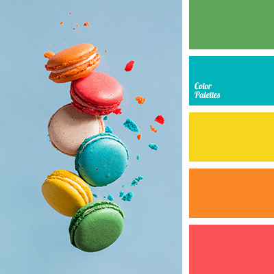
Color psychologists will tell you that colors evoke certain emotions. For example, the warm colors (red, orange, yellow) can generate happiness, stimulation, and excitement (both good and bad). And cool colors (blue, green, purple) can promote calm, relaxation and sleep. In general, we do have a psychological reaction to certain colors, and we associate them with different things. Sometimes they look tasty enough to eat.
Too much of a good thing?
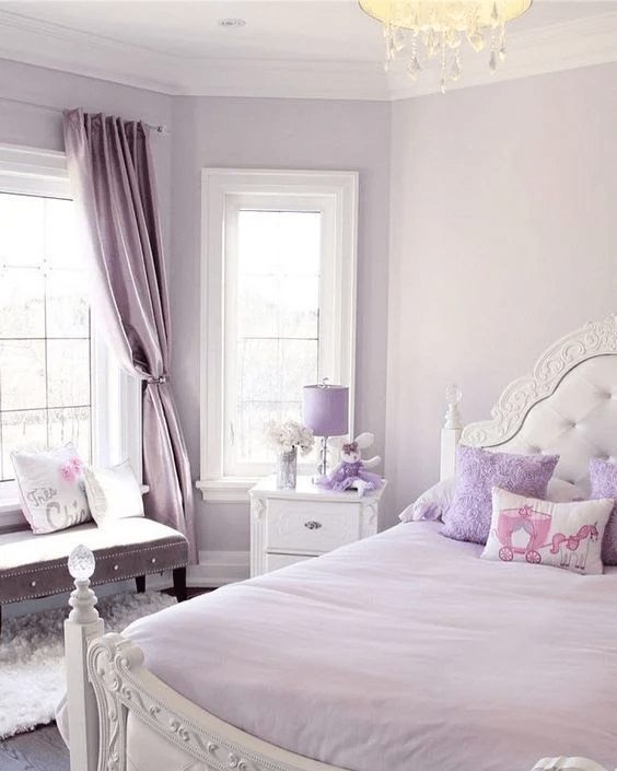
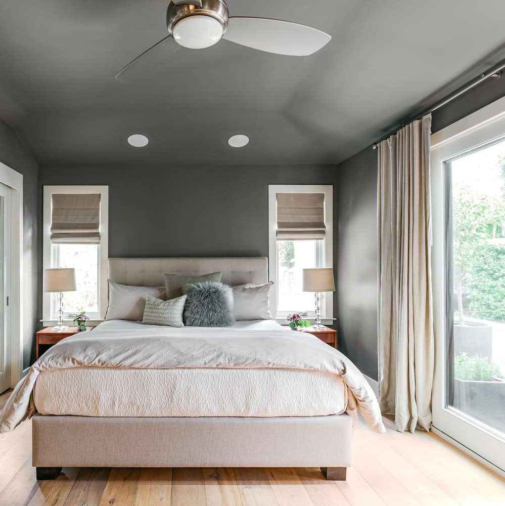
When it comes to creating an end-of-the-day sanctuary for rest and recovery, we need calm, and the cool side of the color wheel is a good place to start. Blue, green, and purple are very popular bedroom colors, for all age groups, but choosing the right version from the fan deck can be tricky. What sometimes happens is that we pick a paint color from the vast display at the store only to roll the actual paint up on the wall and suddenly feel a bit agitated. Partly at not liking the color and partly at the thought of painting it over.
What happened? I thought I was picking a calm color.
Selecting a blue, green, or purple that pops out at you in the store will not necessarily give you a serene room where your toddler can take a nap. Because it’s not the color per se. It’s the saturation that is keeping the room on edge.
So even my wall color needs a therapist?
Maybe. How saturated is it?
Saturation measures how clear or true a color is. It is the strength of the color often described with words, as Leatrice Eiseman writes in her book The Complete Color Harmony, like “clarity, purity, brilliance, richness, boldness, vividness, and intensity.” You get the picture. Maybe not great for a restful bedroom. For example, royal blue is more saturated than powder blue. In a bedroom, royal blue will shout for attention. The more grayed-down the color, the less saturated it is. In a bedroom painted powder blue, you might not even notice the color.
Bedroom wall color needs to chill.
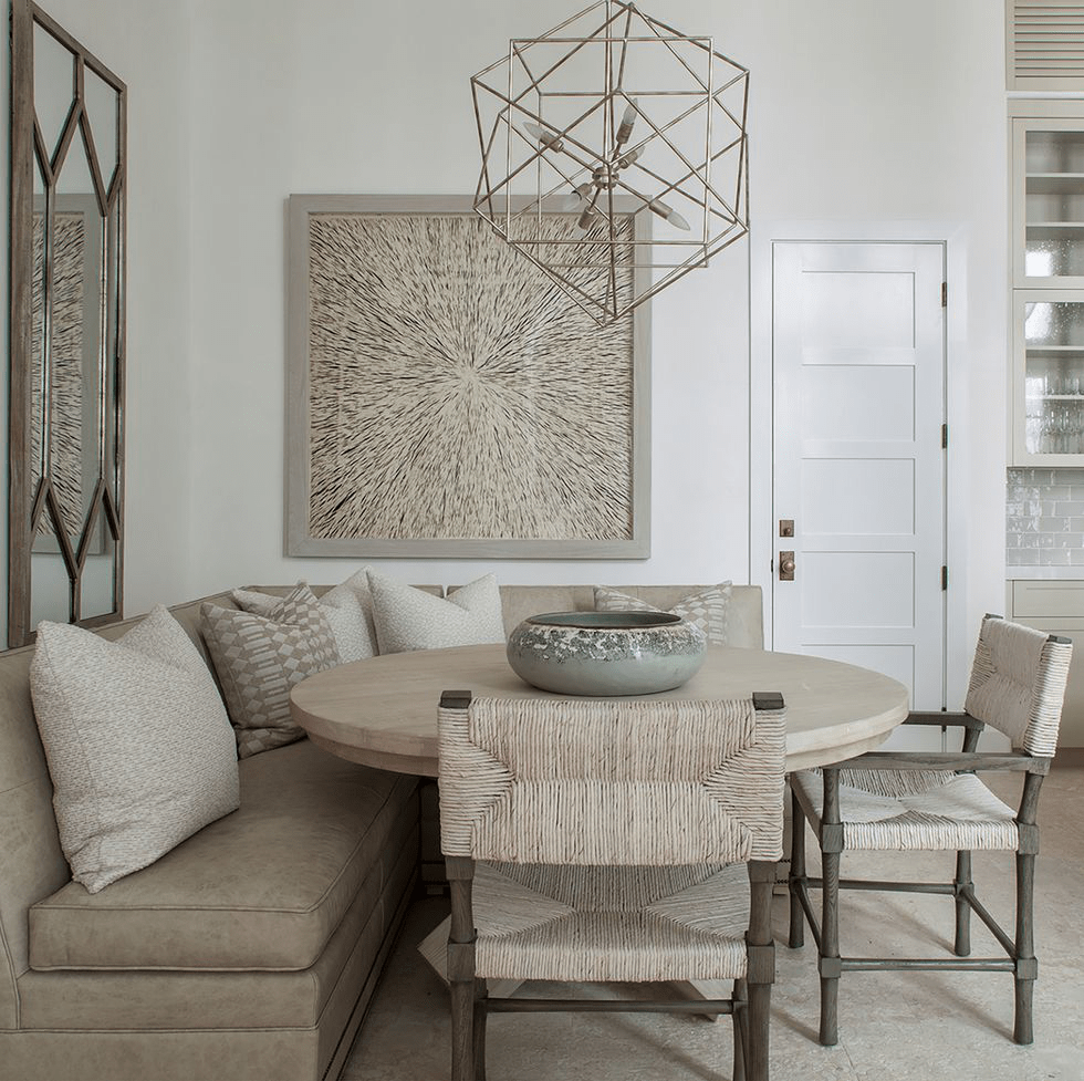
Again Eiseman describes colors with lower saturation as “subdued, diffused, misty, dusted, subtle, soft, toned-down, muted, restrained, hushed, understated, and quiet.” Perfect for a bedroom. So back to the paint store to find colors with lower saturation that will be restful on the walls of the bedroom.
Can’t I paint the room lighter?
Yes, but going lighter will not make the room calmer — just a lighter value and yes, a little easier on the eyes.
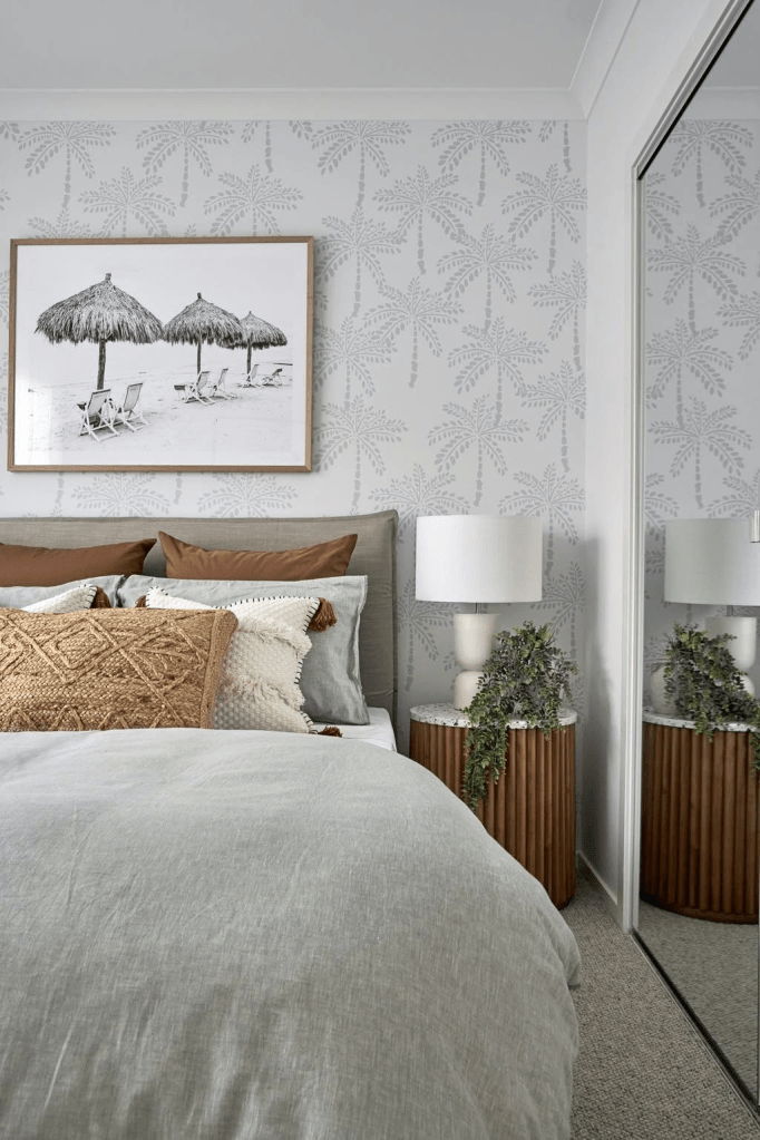
Value measures how light or dark a color is. When you add white to a color you make a tint. The hue (color) gets lighter, and the perception of the intensity changes. It may appear less intense. And that’s important when you are picking a relaxing wall color. Lighter tints are more restful to the eye. To find a tint of a color you move up the fan deck color strip toward the lighter end.
If you add black to a color, you get a shade. It’s darker and perceived as more intense than its lighter version. A dark shade of a color can be very dramatic, and that will influence your color choice. To find a shade of a particular color, you move toward the darker end of the paint color strip in the fan deck.
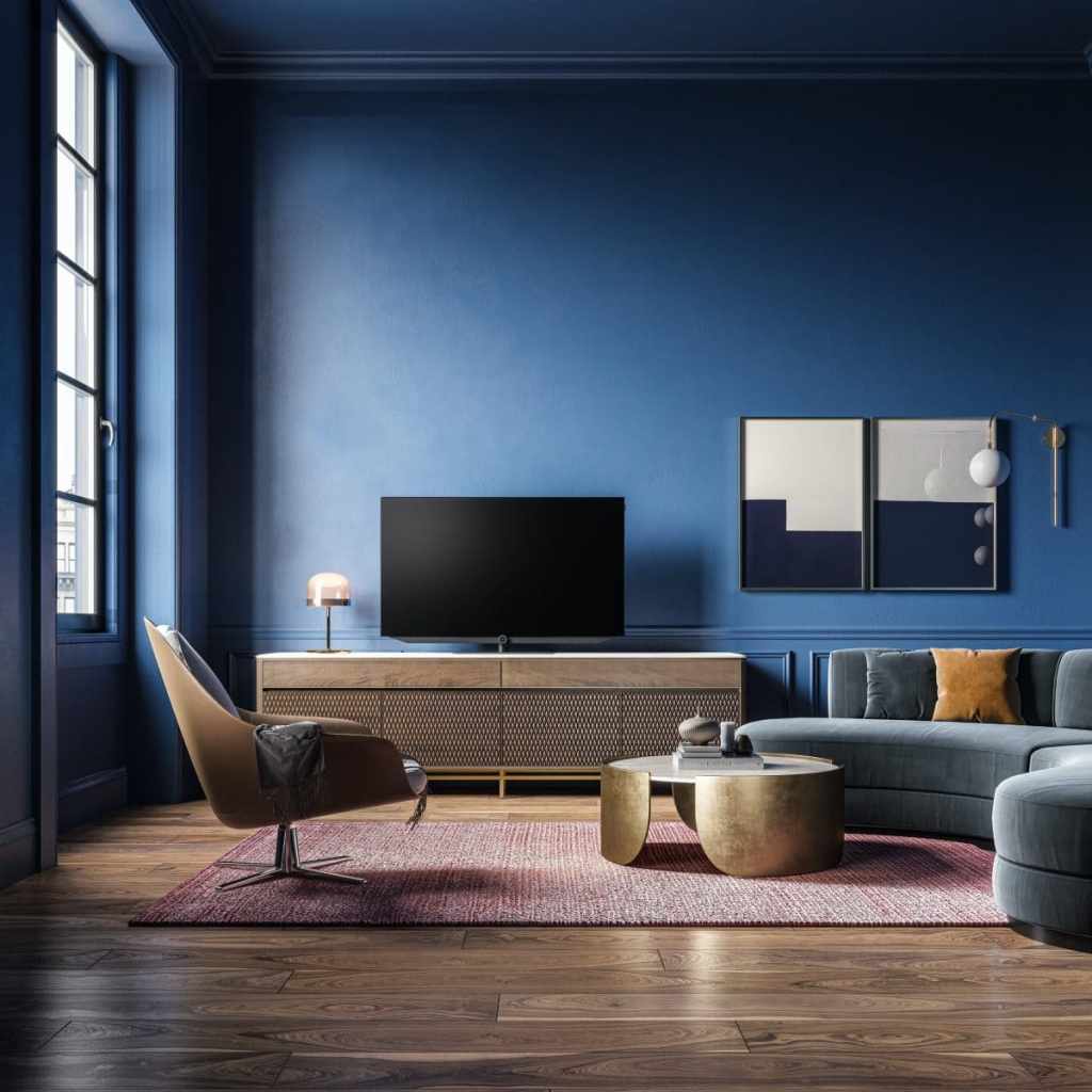
So when you’re picking a wall color for a bedroom, both the Saturation and the Value are important. If the color is too saturated, and there are other colors in the room, it can feel like the walls are vibrating. And that’s okay if you’re going for a room with lots of energy and vitality, like this one.

Likewise, if the color value is dark, it may feel more intense than a lighter value of the same color.
Okay, my child wants a bedroom makeover. Now what?
As a mom, I think it’s important to let children pick their own bedroom colors. But having said that… if you are concerned about having to prime over a loud or dark color in a few years when they change their mind or go off to college, you can take the hue (color) that they chose and then move a little toward the gray end of the fan deck. Muting that electric blue just a little will give the walls some longevity and allow your child to live with the color longer.
Here are some pairs of examples. The first color is a pure saturated color. The second related color is an alternative that is slightly muted (less saturated) and lighter (in value) as well. The alternative wall color will give you a calmer and perhaps a slightly more sophisticated feeling when you walk in the room. No more anxiety.
When in doubt? It’s only paint. Sleep well!
If you need help with color, feel free to comment below, hit the button for a Color Consultation, or shoot me an email at yourcolorcoach@gmail.com.
I would be happy to help you.
Hope you have a Colorful Day!
Barbara, Your Home & Color Coach
Add Color Here but Please Not There
February 23, 2023 § Leave a comment
Color is back in season as we watch the light neutrals fade off into the distance. Here are 5 areas of your home where you can add color with a paint roller or a brush. But scroll to the bottom for a gasp of OMGosh please do not do this!
ADD COLOR TO STAIRS
I am a huge fan of painting the stairs — pretty much anything but white. The ombre effect on the stair risers creates a fresh relaxed look and is a great way to bring in an accent color. Or you can paint the whole stairway. The stained wood treads look spectacular popping off the dark gray woodwork.
ADD COLOR TO SHELVING
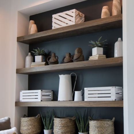
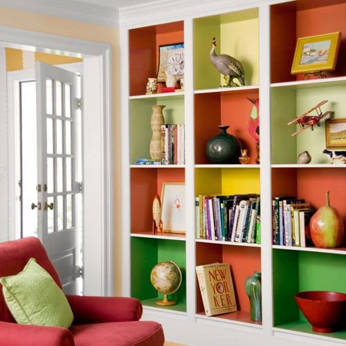
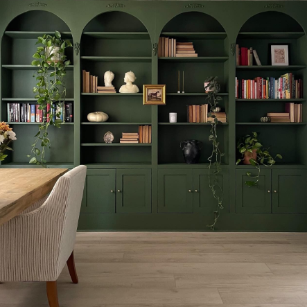
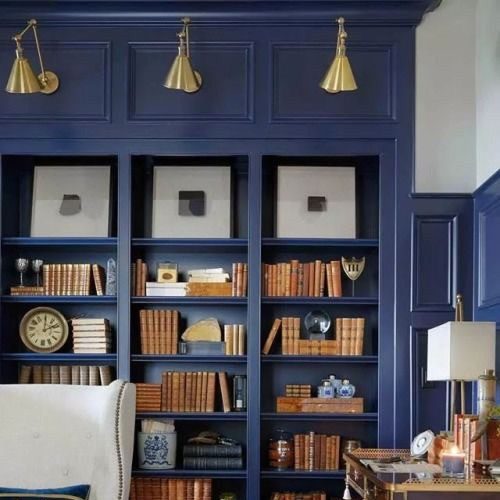
This color application has been around awhile, but I am still a fan! Painting the back of your display shelving is such an eye-catcher. And it can highlight your collections. What an opportunity to add color — and so easy! Or you can paint the whole inside of each display cube a different color for a playful focal wall.
ADD COLOR BEHIND THE TV
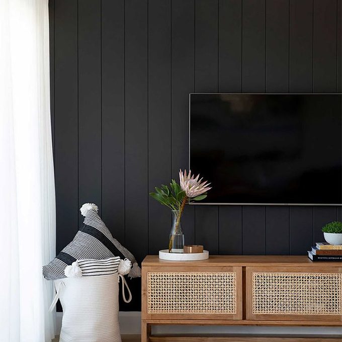
It doesn’t have to be black, but camouflaging the TV is a great idea. Any dark color will help. Or if you rather like a large touch of black, make the TV wall a colorful focal point.
ADD COLOR TO THE CEILING
Whether you want to paint just the ceiling and molding around it as an accent or go up over the ceiling with the wall color to enlarge the room, painting the ceiling will add drama. But white in the room offers a fresh contrast and keeps the room from feeling like a cave.
ADD COLOR TO A WALL OF BOOKSHELVES
Your painter will love you (oh, that’s you?) if you decide to paint the entire wall of bookshelves the same accent color. For one thing, the sheen on the paint will stay the same. And there is no cutting-in or taping-off required. In a light-filled room or a library, this color application will set the mood for sure.
WARNING! DON’T DO IT!
OMGosh… please do not try this last one at home UNLESS you are a designer, your ceilings are high already, and you have enormous windows. Yes, it’s dramatic, cool, and trending to paint walls, trim, and ceiling all one dark, dramatic color. And yes it’s quicker and easier when it’s all the same. But here’s what happens:
- You lose all architectural detail (moldings, fireplace, wainscoting — if you don’t have any, you might not care).
- You lose all contrast that helps you see color (because say it with me, “white makes colors pop”).
- You add reliance on light — either from windows or lamps — to see anything in the room.
- You risk the wall/ceiling color influencing the colors of everything else in the room.
- You risk making your furniture look drab.
- You risk triggering your seasonal depression on a daily basis.
- And the elephant in the room: If you want to sell your home anytime soon, dark-and-moody just doesn’t sell. It will cost a fortune in primer to paint over all that surface area.
But as they say in the biz… it’s just paint!
If you need help with color, feel free to comment below, hit the button for a Color Consultation, or shoot me an email at yourcolorcoach@gmail.com.
I would be happy to help you.
Hope you have a Colorful Day!
Barbara, Your Home & Color Coach
The World’s Favorite Color? Where Have I Been?
February 22, 2018 § Leave a comment
Late to the party here, but better late than never. At least that’s what I said to myself yesterday when I scrolled onto THIS beautiful hue and found out that it was crowned The World’s Favourite Colour. No great surprise since it represents some of the world’s most exquisitely beautiful treasures like Bali — an island so gorgeous its name alone sounds relaxing.
Last summer there was a questionnaire sent out — ’round the globe, as it were — to find out which color appealed to the most people. (I totally missed it! Arrrgh!)

“The competition organised by Hull 2017 UK City of Culture and paper merchant GF Smith invited people to select their favourite shade online by hovering over an infinite palette of shades with their mouse until they landed on the colour they found most appealing.”
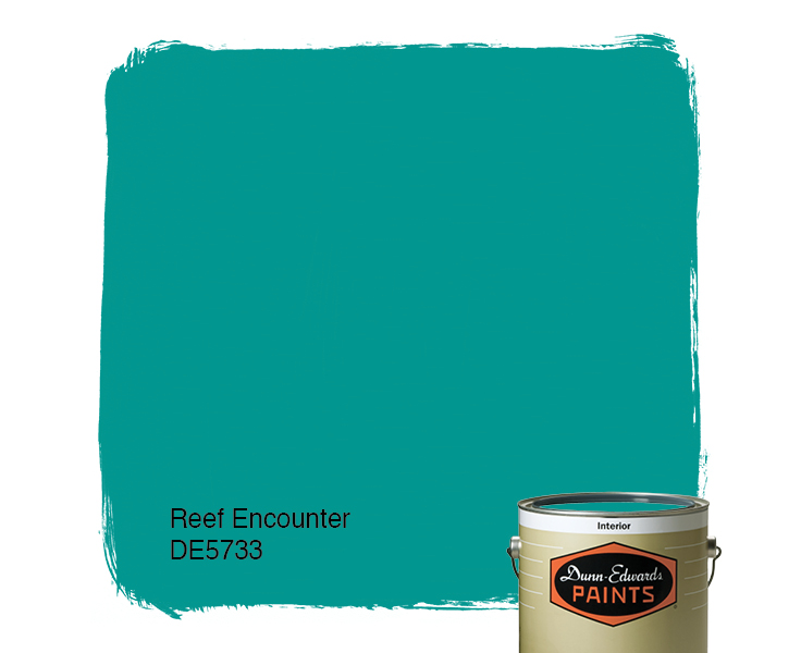
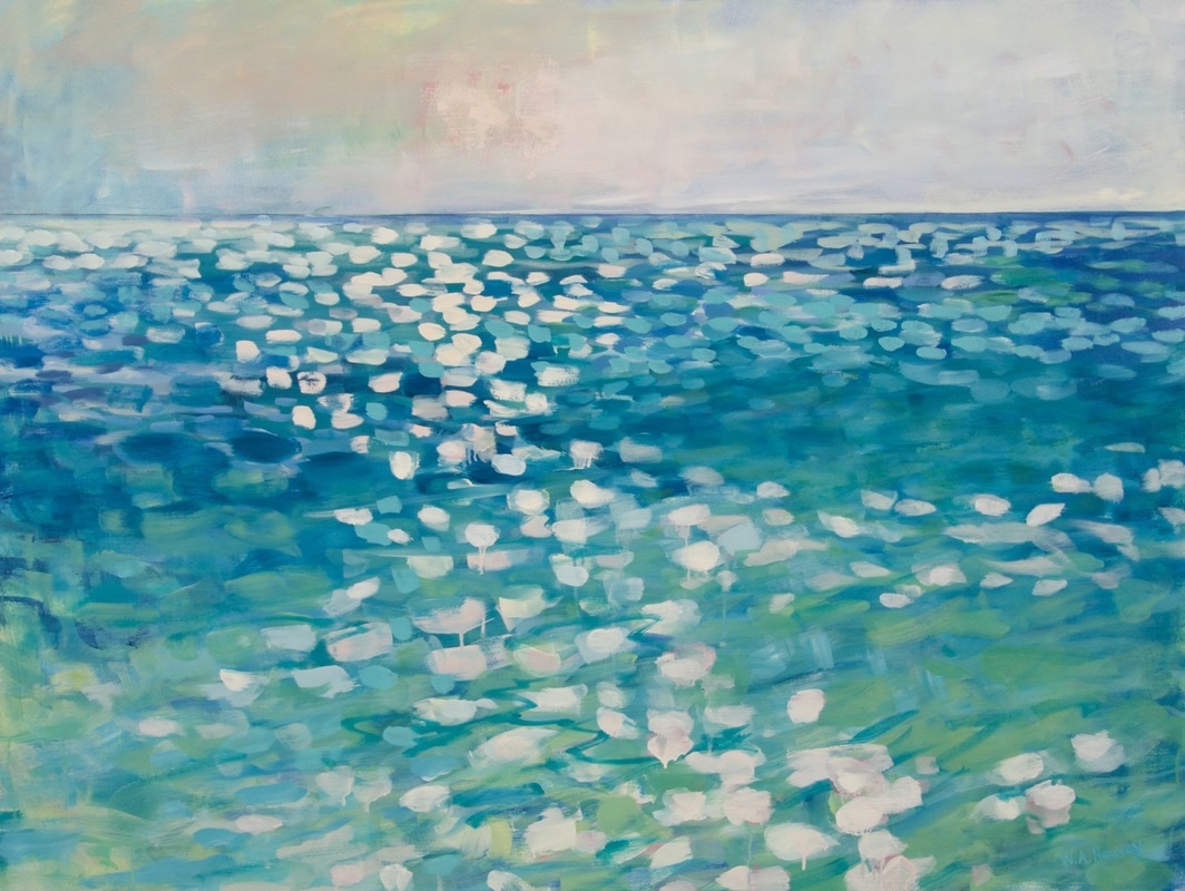
The winner was this rich teal that nature inspires and artists incorporate to capture the beauty that surrounds us.
The closest paint color approximation I could find was a Duron Paints shade, Sea Sphinx. 
But there were others:
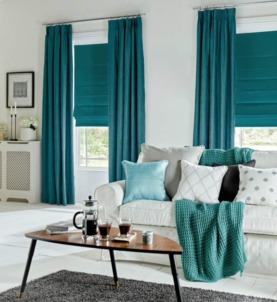
There are plenty of other ways to introduce the color into your decor — window treatments, accessories, and more art, of course.
On an accent wall of Marrs Green, this art pops!
And so does this one!
Though I have blogged about “teal” before, I guess there’s a reason. It appeals to vast numbers of people worldwide. It is a little bit blue, yet a little bit green. It’s the warmest ocean color and a color that appears in natural gems and plant life. It is rejuvenating in all its forms.
It looks great with the full green/blue spectrum and all its values, and it forms a calm backdrop to pops of heat. Marrs Green — The World’s Favorite Color.
Peach Makes a Splashy Comeback
January 16, 2018 § Leave a comment
Don’t we all love HGTV! It’s such a wonderful antidote from mind-numbing news shows. So it’s not a big surprise that again this year we wander through the fantasy of winning the HGTV Dream Home — this one on the coast of Washington State. Here’s the gallery.
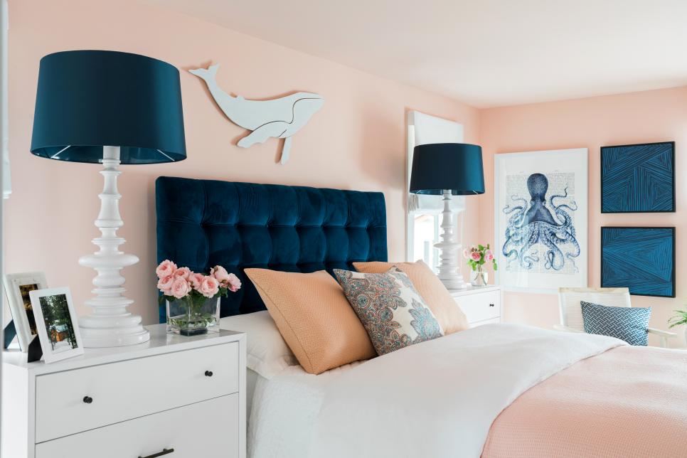
What strikes me most is the wall color in the Guest Bedroom. Peach! It’s been so long since we have seen this color on the cutting edge, and I have to say, Welcome Back! Although many will call this color pink, and you know who you are, it’s on the orange side of the “pink” hue giving it a warmer feel than the bluer-pink, which can be quite chilly.
Peach, this one by Sherwin Williams, is not your clear tropical hue. Its calm sophisticated undertone makes it perfect for an adult bedroom as long as it’s paired with contrast that will give the room some weight, and pardon the expression, masculine vibe.
In this case the designer, Brian Patrick Flynn, chose navy blue to anchor the room not only with a beautiful upholstered headboard but also with art and accessories. He pulls in nautical elements to remind the homeowner, as if they need a reminder, that they can probably see that gorgeous color palette out their bedroom window as the sun sets over Puget Sound.
If you’re not into as much white as the designer has infused into this bedroom, you might add more wood tones in the furniture, much as he did with a dresser on the opposite side of the room. Adding wood elements will balance the light and airy peach, but truly the navy gives the room its updated palette.
Peach can also be introduced into a gray palette in your own home without harkening back to the 1980s. Like yellow, peach is a warm balance to a lot of heavy gray, a trend we are exiting. See this other post for what to do if you feel a bit stuck with too much gray.
In the mean time, welcome back to Peach. We’ll see how long you stick around this time!
Escape from the Blues
January 4, 2018 § Leave a comment

Horseshoe Bay, Bermuda
This is a perfect January day in New England. We are completely snowed in, and nothing is more relaxing than hunkering down in a cozy house as the wind howls outside and the snow banks pile up around us. I love winter!
But that doesn’t mean I like the wintery gray, the limited daylight, and the bitter cold that comes with it. The longer winter goes, the more I yearn for an escape to somewhere warm — even if it’s only in my imagination.
Enter the Sherwin Williams Color of the Year for 2018.
It is an opulent teal that conjures up the ocean and all the warmth of summer at the beach. If a midwinter break in Bermuda is not on your calendar, there are other ways to escape the winter cold — visually. Here are some:
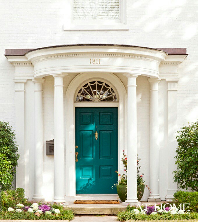
Plan Your Spring Projects. It’s never too early to think about Spring projects, and painting your front door is a doable one. Remember to tie the color in with other accessories and furniture around the yard.
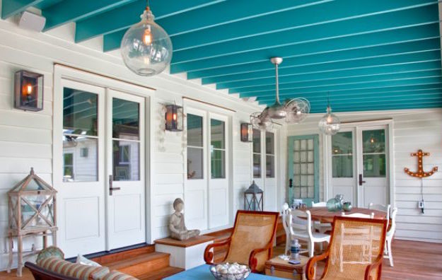
Paint the Fifth Wall. Don’t overlook the ceiling when you’re adding color. Since cool colors recede visually, painting the ceiling a medium teal blue will raise it — like rolling a Utah sky onto your porch.
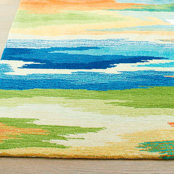
Splash Color Under Foot. Now I’m making it too easy. Add a gorgeous rug and transform your space instantly. There’s something about the combination of blues and greens that soothes and comforts us all. And a rug adds not just color but texture.
Dive into the Pool. Ceramics, art, dishes, pillows, collectibles, throws, lamps… the options for accessories are endless. Be sure when you add a color to your room that you put it in at least three locations to move the eye around the room and create flow.
Enjoy your staycation! With some daydreaming, a little shopping, and a tad bit of rearranging there at home, you can lift your spirits toward Spring and feel warm and cozy at the same time.
Thanks for stopping by!
Orange Twist to the Red Revival
September 18, 2017 § 2 Comments
Apples, pumpkins, falling leaves — there’s something about Autumn in New England that, despite our recent warm temperatures, makes us cozy up to the changing seasons. Maybe that’s why some of us live here.
My newest door color obsession is a revival of the orangey red of another decade, and that may signal the end of the light, neutral, blue and even light lemon yellow door color trend I’ve focused on for the past several years. This red, Million Dollar Red (Benjamin Moore 2003-10) is as perfect on a traditional white colonial as it is on a black modern home. There is no mistaking where the door is — it screams Welcome!
What I love most about it is its “orangeyness.” Orange is a happy color no matter what. So a red on the orange side (versus pink) says this is a happy home. The color also has an updated, contemporary feel as opposed to the more traditional burgundy red (also great, of course, but more serious and refined).
Adding an orangey red as an accent color on the interior is also a great way to torque up the energy. Try it on the back of a white bookshelf, or on a pouf ottoman in the family room, or even on a focal wall in the front entry. A little bit of red warms up a room a lot. So before painting an entire room red, make sure you want to amp up the temperature in there. Using red on items that can be removed in the hot summer makes sense to me: pillows, bedding, throws, and art. Then I look forward to my seasonal exchange when I swap out the cool blue accessories for red.
Enjoy Autumn… whatever it means to you and wherever you are. And love how the color orangey red makes you feel. Warm and Happy.

