Creating Colorful Curb Appeal
January 23, 2018 § 2 Comments
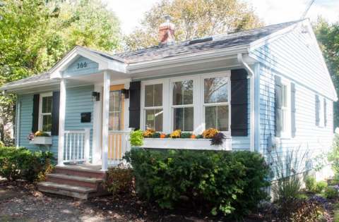
Need curb appeal?? Well, this remarkable ranch re-do will show you how some strategic changes to the front of a rather ho-hum house can make a huge impact, and if you’re planning on selling anytime soon, pay attention. There are some quick easy fixes that may apply to you.
Here is the Before shot: faded vinyl siding, old aluminum windows, dated storm door, dirty white shutters, old iron stair railing, and tree overgrowth. Have you seen a million houses like this one? Yup. Me too. Not exactly a head-turner.

Laurel LaBauve at SoPo Cottage addressed the front facade with a new porch portico. Adding dimension to the front face of the ranch made a huge difference and created a cottage style instantly. She could have stopped there, but onward to new windows (fresh, white, two-over-two) that brought more light into the house and gave it a cute, vintage, styled look. Excellent choice!
Next up? The vinyl siding. Why does the after vinyl look so terrific? Laurel revealed her secret: something called Vinyl Renu, a product that, Laurel reports, brings new life to the color and sheen and is supposed to last 10 years! I’m in! What a difference. If your house has vinyl siding and it needs a refresh, here’s the stuff.
Switching the shutters to black board-and-batten was another great cottagey move. If they’re vinyl, you fooled me. Note: Leaving the brand new windows bare with no shutters would not have been a bad thing. A little more contemporary. But the contrast of the black with the light blue siding and white trim is sharp, and the house looks finished.
Then there’s the front door color. Yellow. One of my faves as it sings Happy House as you walk up the front steps. And the coordinating flowers in the new window boxes (also a cottage style fun-to-have) pull the whole look together. (If you need color help, let me know!)
Even if there is no budget for major changes, here are a few easy fixes that will still make a big difference in your home’s curb appeal. Take-aways for home sellers:
- Trim the trees back so that the house is free of branches and there’s a clear view of the house from the approach. Pay attention to the landscaping, weeding, and overgrown bushes. It’s amazing what a little green thumb elbow grease will do.
- Rev up the vinyl siding with Vinyl Renu to give the color a fresh look.
- Add shutters if there’s room and particularly if the house is a light color. Black will give the house a dressed-up and polished curb appeal.
- Add coordinating accessories like porch lighting and a mailbox.
- Paint the front door a warm contrasting color and tie in the landscape (annuals, flowering shrubs) and any outdoor accessories like Adirondack chairs or deck furniture.
Click here to see how the INside was transformed. Bravo! Laurel, you are quite an inspiration.
Adding Shutters? Look to Paris
November 15, 2015 § Leave a comment
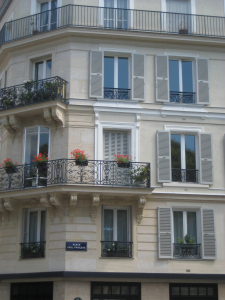 In honor of my beloved Paris, let’s talk about shutters. In my humble opinion, nobody does shutters better than the French. Classic, elegant, tasteful and actually quite functional as opposed to our (often) vinyl interpretations on our side of the pond.
That said… shutters do not have to be functional, and it’s okay if they’re vinyl. But how can we make our vinyl, nonfunctional, imitation shutters look more authentic? Size. Yes, when it comes to shutters, size matters. 
Shutters that are too narrow or too short for the window size look like an afterthought, at best. They add color and dress the bare windows, but they don’t fool anybody. Make sure 1) there is enough room on either side of the windows for properly sized shutters; 2) the width of the shutters fits the scale of the window — they could actually function; and 3) the length is appropriate — if shut, the shutters will cover the window completely and not leave a little hem showing.
Thank you, Paris, for educating me on shutters during my trip in 2010. And my sincere sympathies to you and your people.
Return of the Gilded Age, Well Not Exactly
January 3, 2013 § 1 Comment

We have Downton Abbey, Princess Kate, and the popularity of all things English to thank for the resurgence of gold in interior design right now. At least that’s my opinion… And what a welcome sight it is.
After too many years degilding homes of anything that even hinted of gold, brass or yellow, the hue of royalty has returned.
The new interpretation, however, is decidedly fresh as we see in this living room from Traditional Home magazine. The wall color is so subtle that it accentuates even the creamy tan stripe on the window panel and the moldings on the ceiling. The gold demilune table and classic gold-framed art above it pop. As does the Chinese porcelain, as if pulled directly from the painting. Even the floor color is perfect, establishing a solid grounding upon which to layer all those beautiful blues and wheat tones.
The look is not your grandmother’s living room, with all due respect to your grandmother. Gold is nolonger shunned from updated decor.
Welcome back, gold.
Interior designer: Joseph Minton, with Paula Lowes and Michelle M. Wade
Choosing a Wall Color: Light and Lighting Help
December 27, 2012 § Leave a comment
Have you ever entered somebody’s home in the summer with the hot afternoon sun streaming into their bright yellow living room and felt like you’re drowning in a container of lemon curd? Perhaps a bit too much sunshine! The message? Light matters.
When you’re choosing a paint color for a room in your home, pay attention to which direction the light is coming from, how big the windows are, what the function or desired feel of the room is, and the shade or tone of the color you’ve selected. Here are some things to think about — not rules — just guidelines.
LIVING ROOMS
Function: Gathering, conversation, reading, and TV.
Direction of light coming in: Important as the living room is often the first room you see when you enter your home and where you receive guests, day and night.
Desired feel for the room: Warm and welcoming
Color choice: If your living room faces North, choose a paint color with a slight yellow undertone (as opposed to blue/gray) to add warmth to that North-facing room. If your living room faces South or West, you may want a cool color with the warmer hues reserved for pillows and accessories that can be moved in or out with the seasons. Easy solution? A medium-toned neutral (not necessarily beige) will allow you to bring in any furniture, window coverings and accessories without changing the wall color in the future. Another option: a rich hue on the focal wall (the one you see as soon as you enter the room — it may have a fireplace) and the other walls lighter and more neutral. Canadian designer Sarah Richardson loves this effect– that is one of her designs pictured above. Notice how the black TV disappears in front of the chocolate accent wall? Clever! (http://www.sarahrichardsondesign.com)
BEDROOMS
 Function: Primarily sleeping. Exception: Kids’ rooms. Since kids often play in their rooms, you can ramp up the palette to please them (a topic for another post!).
Direction of light coming in: Not a huge factor since you’re in there primarily at night anyway.
Desired feel for the room: Spacious if the room has little square footage and relaxing for a good night’s sleep.
Color choice: You can go in one of several directions. For the spa feel, look at light grays, gray-beiges, and calm gray-blues/greens. For a cheerful awakening every day, include pops of color like orange, yellow or shell pink like in this bedroom by Nicole Sassaman Designs (http://www.nicolesassaman.com). Luxurious with cream bedding!
DINING ROOMS
Function: Eating and conversation.
Direction of light coming in: Again, not a huge factor since you use the dining room primarily at night. (Exception: dining areas that are in an open-concept layout do have some light considerations.)
Desired feel for the room: Stimulating and dramatic.
Color choice: If you like deep, rich colors, this is your opportunity to use them for maximum effect. But you do not have to go dark with the wall color to be dramatic. Beautiful furniture, artwork, and lighting will make the room dramatic even if paler or more neutral colors are used. And don’t neglect the ceiling in the dining room. You may want something dramatic above the table — designer Troy Beasley’s handpainted canvas on the ceiling certainly gives a dramatic European flair to this dining room! (www.beasleyandhenley.com)
KITCHENS
Function: Cooking, eating, entertaining, and sometimes studying.
Direction of light coming in: Vital since you’re in the kitchen at all times of the day and night!
Desired feel for the room: Warm and welcoming.
 Color choice: Okay, now this is where it gets tricky. Start with your cabinets. Are they dark? What color is the counter top? You’ll want to introduce some contrast in the room either by choosing a lighter tone for the walls or bringing in a complementary color. Are your cabinets light? As long as there is some contrast somewhere in the kitchen, you can choose a light wall color for a light and airy feel to the kitchen like this one by designer Lori Dennis (www.loridennis.com). Lori uses the warmth of the wood floor and different tones of whites and warm grays to warm up this light, open kitchen and adds pops of color on the counters as well.
MEDIA ROOMS
If you have a separate area for watching movies on the big-screen TV, then go medium to dark with the walls and even the ceiling. The idea is to recreate that movie theater feel and eliminate glare at the same time. Gray, navy, eggplant, chocolate and rich red — all great wall colors for the “man cave” like this one by designer Phyllis Harbinger (http://www.dcistudio.com). 
From a Little Girl’s Room to a Teen Girl’s Haven: Navigating the Transformation
September 6, 2012 § Leave a comment
Decorating a teen’s room is way different from decorating a young child’s room, and I’m not just talking about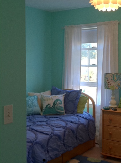 the comforter and the curtains. When you’re decorating a little girl’s room for the first time (when they’re really little), there’s not much push-back from her. She loves flowers, polka dots, pinks and purples. But as she grows older, she develops her own style and wants to do things her own way. As a decorator, we have to take that into account when we’re called upon to work on a young teen’s room. How to take her very strong requirements for her room and mesh them with the aesthetic sensibilities of mom and dad.
 This project is a prime example. The Before Photo shows a bedroom of many colors, stripes and dots in a fairly white room. As you can see from the swaths of color that she painted next to her bed, the teen living there was pretty much done with white walls. So that’s where we started. She picked a cool, vibrant blue-green that was a reflection of her personality (not her mom’s). From there, we found cornflower blue bedding (Pottery Barn) as well as some accent pillows and accessories to pull the colors together.
My major role in this project? To prevent color overload. The remedy? Adding white to the room to offer some visual relief from the intense hues. I found white tone-on-tone polka dot fabric for the window panels (custom-made), a white lamp with a lamp shade that pulled all the colors together (Pottery Barn), and a white fuzzy pillow for the bed (Pier 1). I also added the floral light fixture on the ceiling (Lamps Plus) — a great find for a teen room. The result was a room that all three of us (teen, mom, and decorator) could love.
Color Your Windows
November 4, 2011 § Leave a comment
 Although it’s a commitment, there’s a growing trend in windows to replace white with color — like these beautiful blue mullioned picture windows shown as a backdrop to outdoor furniture from the Ballard Designs catalogue (www.ballarddesigns.com). Red is another great window accent color as is the ever-present forest green.
When choosing a window color, decide whether you want your windows to stand out (white windows already do) or blend into the siding color. Choosing a color that is not in your house palette already except for maybe the front door will pop your windows right off the front of the house. Picking a window color that is already in the palette of your house (taupe, for example, to match stonework) will blend the windows. Particularly nice if you have a lot of little tiny windows and prefer a less busy look for the house.
As with all color selection, contrast or the lack of it will determine the end result. But don’t pick white just to be safe. Think color!
It’s All About the Windows
May 7, 2009 § 14 Comments
Whether we’re all craving light or fresh air, who knows, but the focus these days is on windows. And we’re not talking about the old standard white replacement models anymore, that’s f or sure. Now we have choices from black to almond to green and even red. And whatever the shape of your space, we have a window to fit into it. Awhile back the trend was to update the interior lighting plan with recessed cans and spotlights, uplights, downspots, and all the specialized lamps you could imagine for your space. Now we’ve moved on to creating unique window plans to suit the house: clerestory, stained glass, enormous picture windows, and different styles of window mullions to fit the style of your house, from Colonial to Victorian to Mission. Even new homes can be made to look old — well sort of.
Word of caution: If you have an historic home or a home with a very definite style, you should try to repair the original windows before resorting to a replacement. There’s very good information at the following link to help you with windows in historic homes. Or any window decisions, for that matter.
http://www.oldhouseguy.com/windows.php
If you have old wooden windows, paint the window sash and mullions a coordinating color (black looks spectacular) to add life to your home. Those of us stuck with white vinyl are jealous…
